Background videos can engage site visitors or add a cinematic flair to your site — but they can also be distracting or even harmful for people with cognitive disabilities, vestibular disorders, or motion sickness. It’s best practice for accessibility to provide controls for users to pause, stop, or hide any content that starts moving automatically and moves for more than 5 seconds (WCAG Success Criterion 2.2.2: Pause, Stop, Hide).
Webflow provides a built-in play/pause button setting for background videos so you can give your site visitors the control they need to pause or play your background video content.
Good to know: Autoplaying video with no clear way to pause it is among the top 10 reasons site visitors will leave without accomplishing their task on your site. Giving visitors clear video control will lower the site bounce rate.
In this lesson:
How to add a play/pause button
The Include play/pause button setting is enabled by default for all new background videos added after June 2022. For background videos added prior to June 2022, you’ll need to manually enable this setting.
To add a play/pause button to a preexisting background video:
- Select the Background video on the canvas
- Double-click the Background video or press Enter/Return to open Background video settings
- Check the Include play/pause button checkbox
Important: We strongly recommend leaving the Include play/pause button setting enabled to meet accessibility standards and ensure a better experience for your site visitors. Additionally, if you’ve disabled this setting, site visitors with Prefers reduced motion enabled in their operating system settings will not be able to play your background video.

How to style a play/pause button
Once the Include play/pause button setting has been enabled, you can customize the play/pause button to your liking.
Positioning the button
By default, the Play/pause button is set to position: absolute, relative to the first parent element that isn’t static (in this case, the Background video element). This means it will stay nested within the Background video element and appear on top of any elements that aren’t set to position: absolute. Learn more about position: absolute.
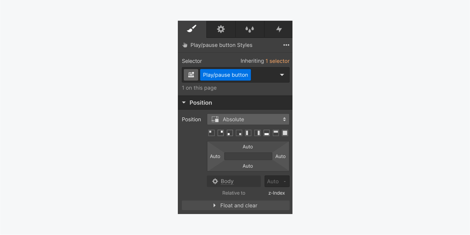
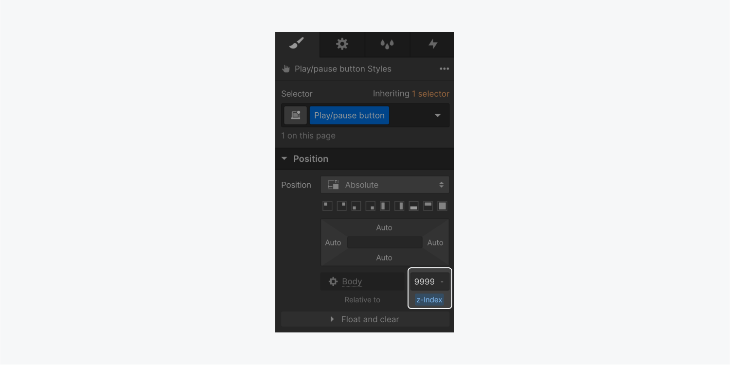
To make sure the play/pause button always appears on top of the Background video, you can select the Play/pause button element and give it a Z-index value. The default Z-index value for any element is 0, so any value greater than 0 will position an element on top. You can feel free to use a ridiculously high Z-index value here, like 9999. Learn more about z-index values.
Customizing button state icons
The play/pause button has two states: Play and Pause.
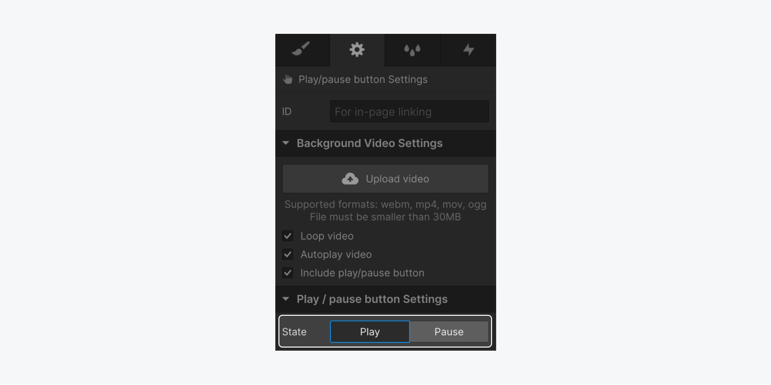
The play/pause button also comes with default icons and built-in alt text for the Play and Pause states, but you can upload any image you want.
Important: If you replace the default icons, make sure to add alt text to your own images so that anyone navigating your site will know the purpose of those buttons. For example, you could add “Play video” as alt text for the image in the Pause state, and “Pause video” as alt text for the image in the Play state.
To replace the default icons:
- Open the Asset panel and click the “cloud” icon to upload the images you’d like to use
- Select the Play/pause button on the canvas or in the Navigator panel
- Click the state you want to style (e.g., Play or Pause) in Settings panel > Play/pause button settings
- Choose the image you’d like to use from the Asset panel and drag it inside the element that matches the current state (e.g., Play state or Pause state)
- Delete the default image from within the state element
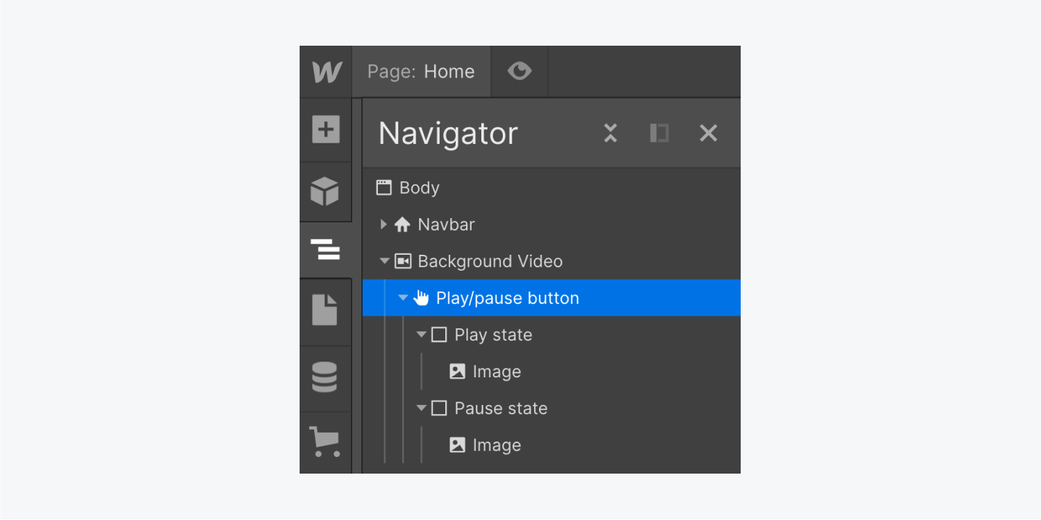
You may use images or icons with different sizes than the default images. You can size your images based on the parent element (e.g.., the Play/pause button).
To size your images based on the parent element:
- Select the Play/pause button on the canvas or in the Navigator panel
- Click the state you want to style (e.g., Play or Pause) in Settings panel > Play/pause button settings
- Select the image inside the element that matches the current state (e.g., Play state or Pause state)
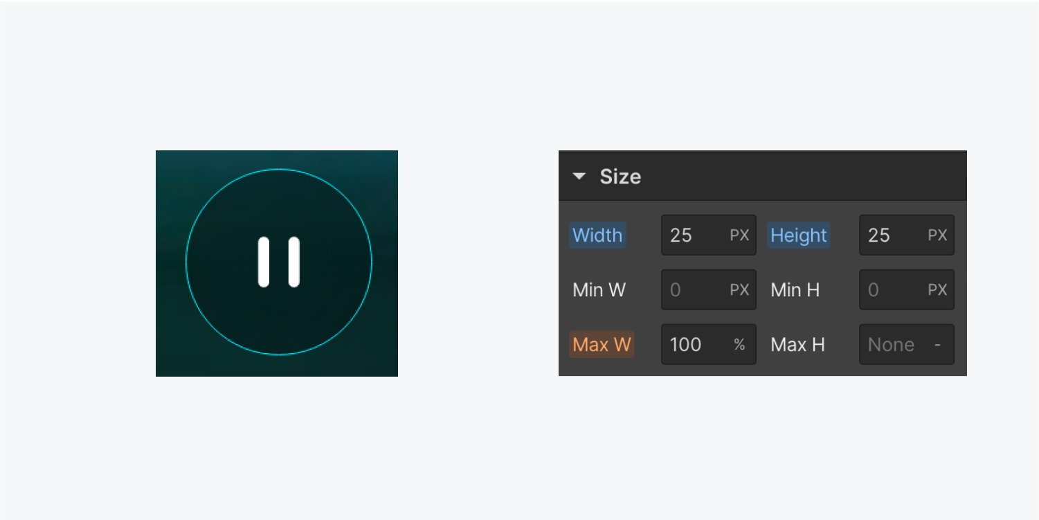
- Open Style panel > Size and set the image’s width and height to 100% to ensure the image takes up 100% of the parent element (e.g., the Play/pause button)
- Select the Play/pause button
- Open Style panel > Size and set width and height to whatever size you’d like
- Open Style panel > Spacing and adjust padding as desired
Note: If you’re using SVG files for your button icons, you’ll need to instead give your image explicitly defined width and height dimensions using pixel values, rather than percentage-based relative units. Otherwise, your images will shrink to 0 pixels because the parent element of the image (e.g., Play state or Pause state) does not use absolute units for its dimensions.
Styling button outlines
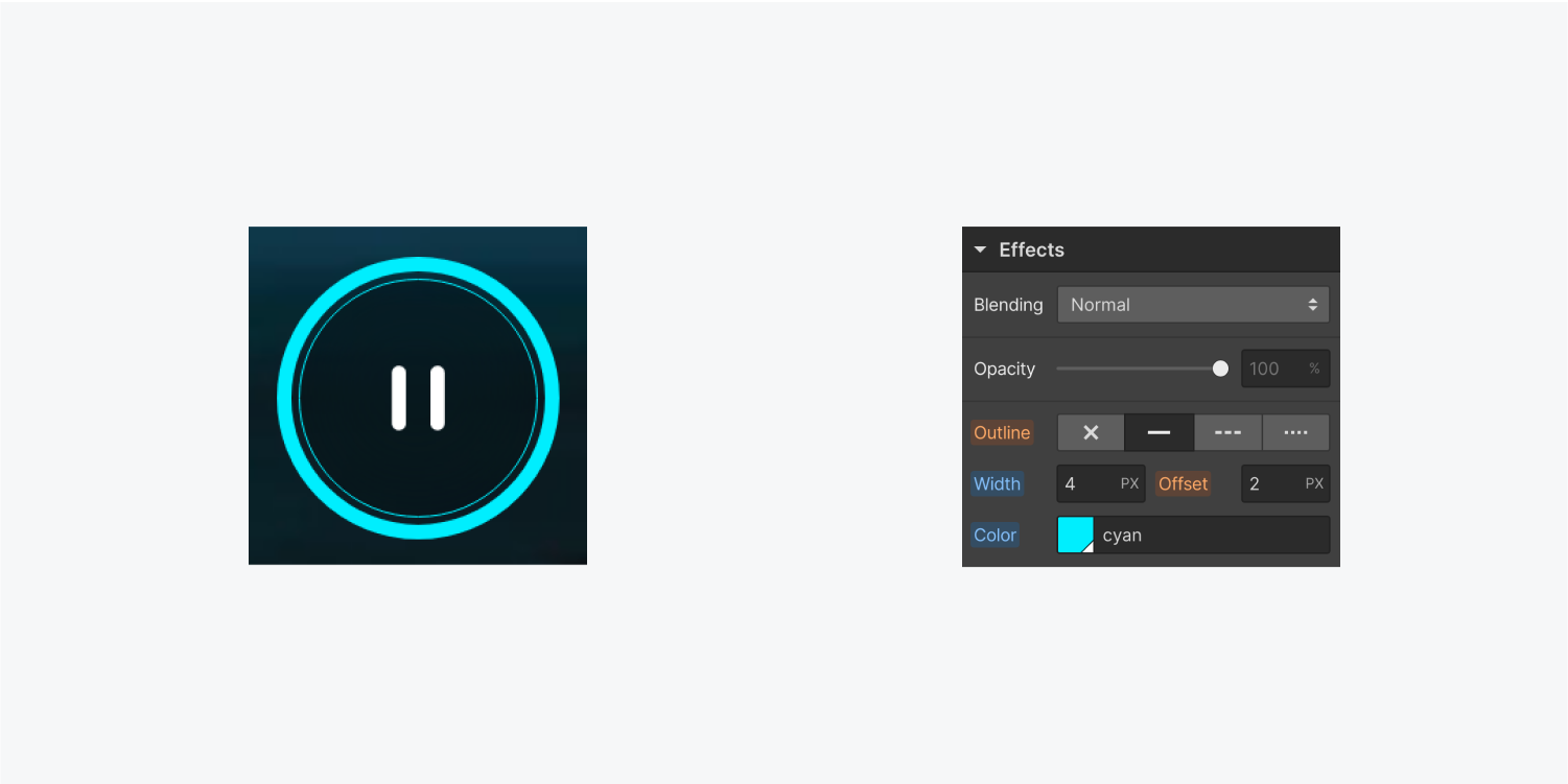
The Play/pause button has a default Focused (keyboard) style with an offset blue outline, but you can style this outline as you wish.
For site visitors navigating your site with a keyboard, this outline makes it clear when the Play/pause button has focus (i.e., when they’re interacting with the button). This outline won’t appear when site visitors use a mouse or a finger tap to interact with the Play/pause button. Learn more about outlines.
To customize the outline on the Play/pause button:
- Select the Play/pause button on the canvas or in the Navigator panel
- Open Style panel and give the Play/pause button a class
- Click the dropdown in the Selector field to open the States menu
- Choose the Focused (keyboard) state
- Scroll down to Style panel > Effects and edit the outline, width, offset, and/or color properties as desired

You can also make any other styling changes you’d like to your button (e.g., border, background, backdrop filter, etc.).


