In this lesson you'll learn about:
Flex parents
The flex parent is the parent element. You can create a flex container out of any element that contains other elements. To create a flex parent:
- Select the element
- Set the display setting to flex in the Style panel > Layout
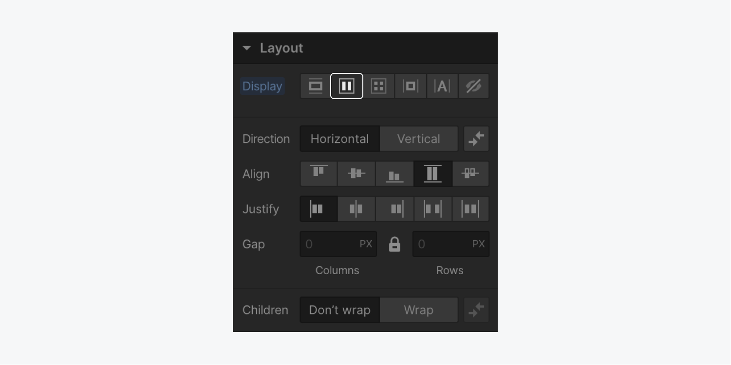
Unlike other display settings, enabling flex on a parent element will affect the layout of the direct children elements inside. When you enable the flex display setting for a parent element, the children align left and stack horizontally by default.

Flex containers will not affect or change the layout of the children within their direct, child elements.
Flex children
Once you’ve turned a parent element into a flex container, the direct children of that element become flex children. To override the layout settings for a flex child, select the element, and adjust the layout settings.
Flex parent settings
Once you change the layout setting of a parent element to flex, you’ll have a number of layout options for both the flex parent element and the child elements it contains.
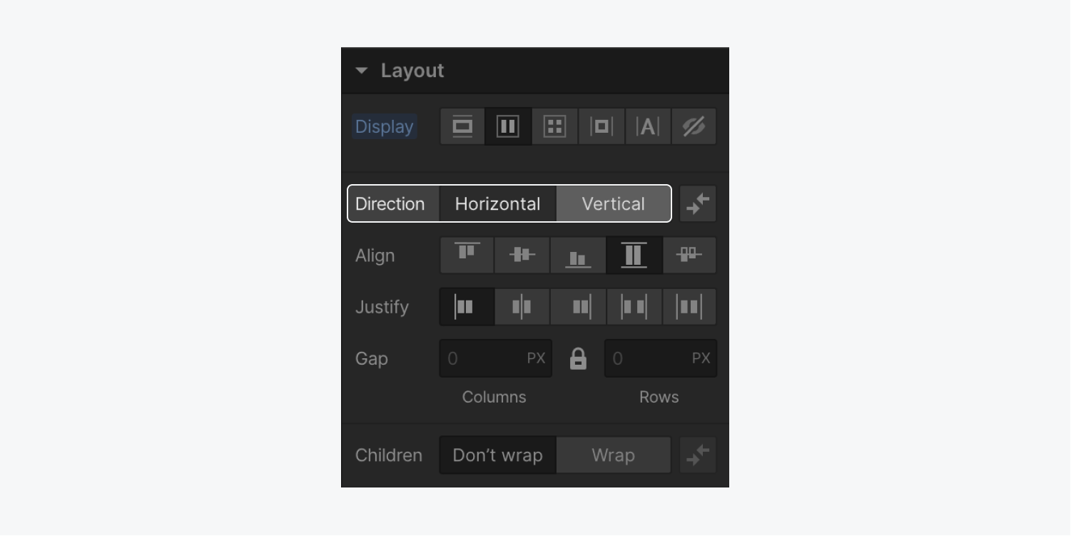
Set the layout direction
The direction of a flex parent is horizontal by default. You can switch the direction to vertical in the flex layout settings in the Style panel > Layout.
Reverse the layout direction
You can reverse the alignment of your flex parent layout in the direction settings in the Style panel > Layout.
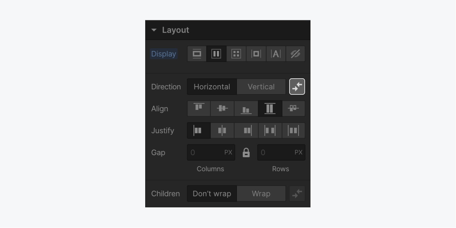
Reversing the layout of your flex parent is especially useful for right-to-left sites and when it’s necessary to reverse layouts on smaller breakpoints.
Update the alignment of flex children
To change the alignment of flex children within a flex parent, select the flex parent, and select your desired alignment under the layout direction settings.
Horizontal alignment options
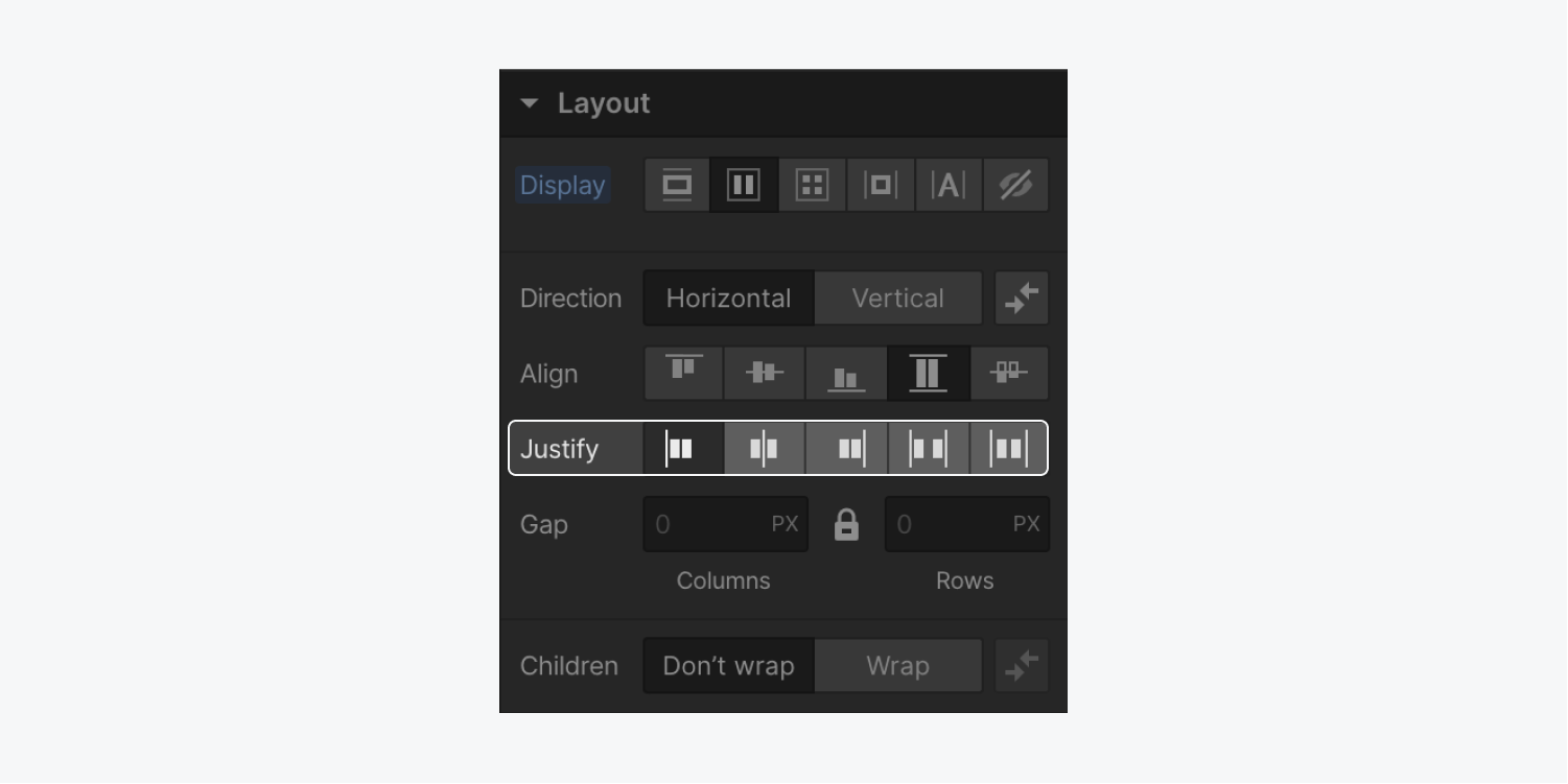
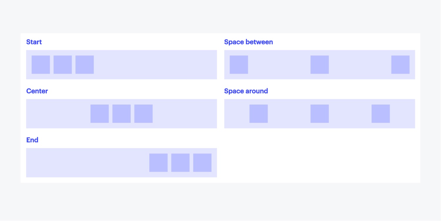
To align child elements horizontally, select one of the following alignment options:
- Start: items are left-aligned
- Center: items are centered
- End: items are right-aligned
- Space between: items are evenly distributed from edge to edge
- Space around: items are evenly distributed along between elements and edges
Vertical alignment options
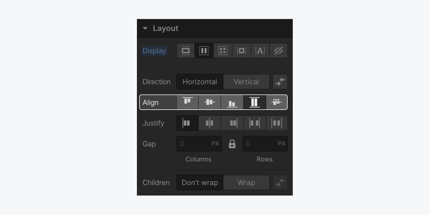
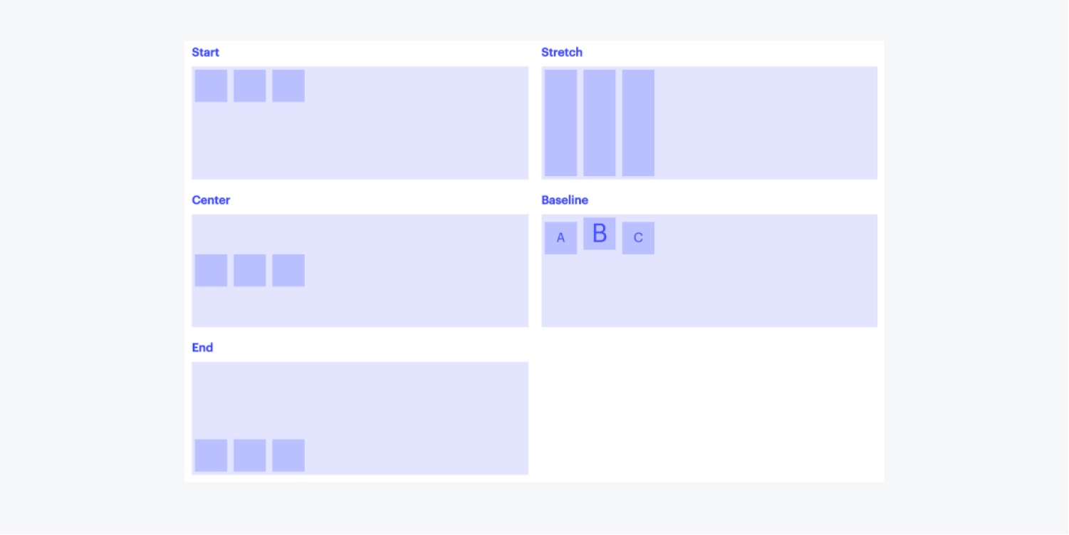
To align flex children vertically, select one of the following alignment options:
- Start: items are aligned to the top
- Center: items are centered vertically
- End: items are aligned to the bottom
- Stretch: items are stretched across the height of the flex container
- Baseline: items are aligned to their baselines (the invisible line that text sits on)
Adjust gaps between columns and rows
Gaps allow you to specify the space between flex child elements without adding margin or padding. To adjust the gap size between columns and rows, enter the desired gap size in the Style panel.
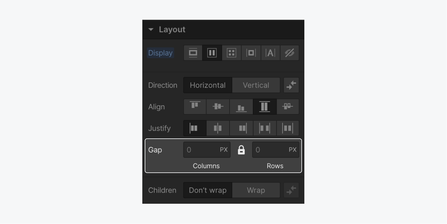
Pro tip: To quickly increase or decrease gap sizes, hold down the Option key (on Mac) or Alt key (on Windows) and drag your mouse left or right over the columns or rows size field.
By default, gaps between columns and rows are locked. This means that if you change the gap size for columns, Webflow simultaneously changes the gap size for rows by the same amount.
To independently adjust the gap space between columns and rows, click the lock button to unlock the relationship between columns and rows.
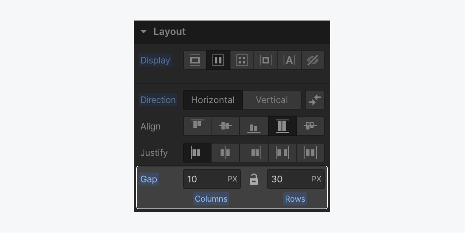
Good to know: Your choice of locked or unlocked persists across the Designer for your browser. This choice also affects the locked or unlocked state of your Grid gaps, and vice versa.
Wrap children
By default, flex children will always try to fit on a single line. You can change that by wrapping the children using the layout setting, Wrap.
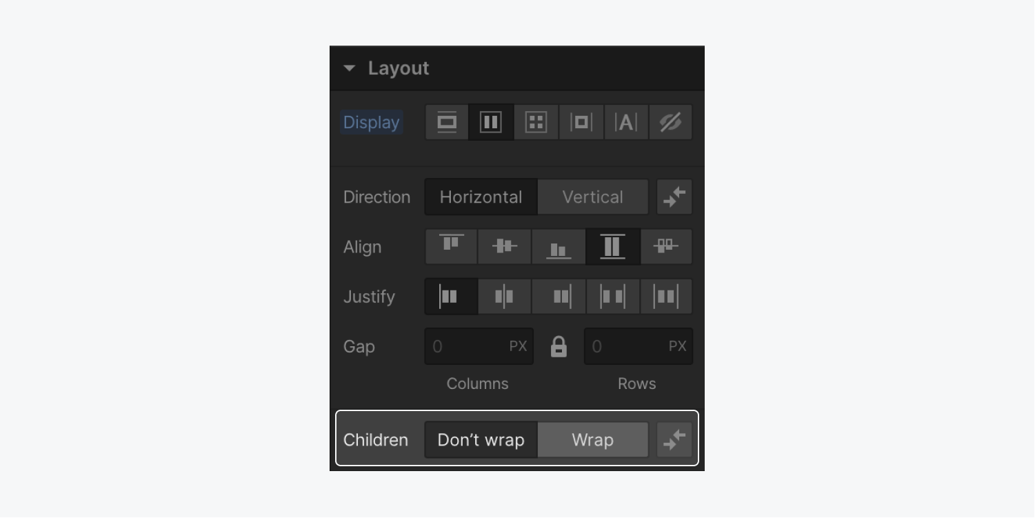
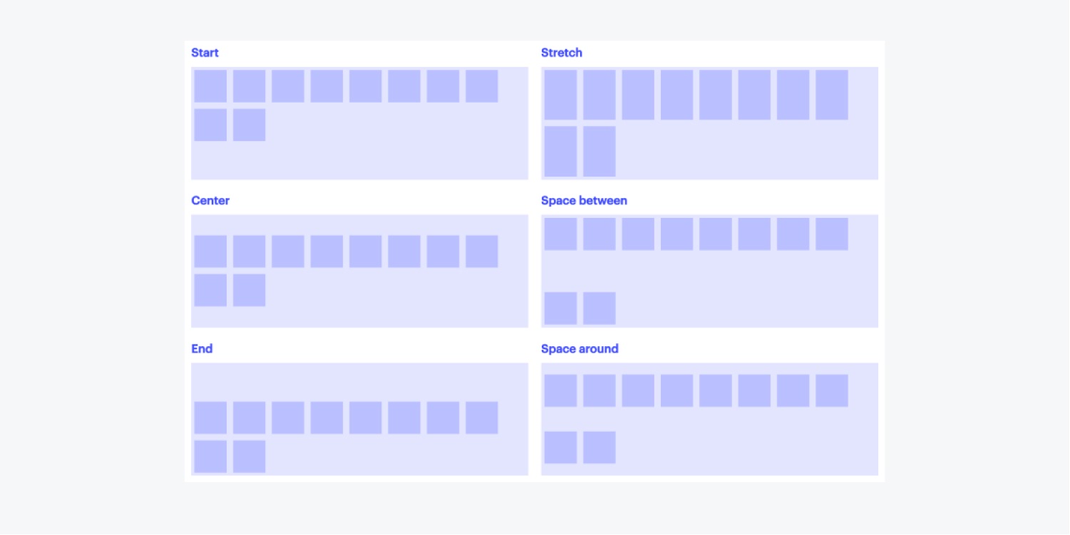
And there are different options for aligning multiple rows of content horizontally:
- Start: rows are aligned to the top of the flex parent
- Center: rows are vertically centered inside the flex parent
- End: rows are aligned to the bottom of the container
- Stretch: rows stretch to fill empty vertical space
- Space between: rows are evenly distributed from top to bottom edges
- Space around: rows are evenly distributed between other rows and edges
Flex child settings
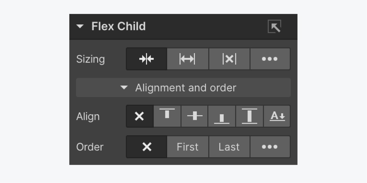
A flex child is the direct child of any flex parent, which is any element that has its display layout set to flex. The default layout of flex children is based on the flex layout set on the flex container.
To configure the layout for a flex child within the flex parent, select the element and change the sizing, alignment, and display order.
Change the size of a flex child
With the main sizing presets, you can tell the flex child how it should stretch in the flex parent. Each flex child can have its own size settings, allowing for a number of layout options:
- Shrink flex child if needed (to prevent overflow)
- Grow flex child if possible
- Don’t shrink or grow flex child
- Customize grow and shrink behavior
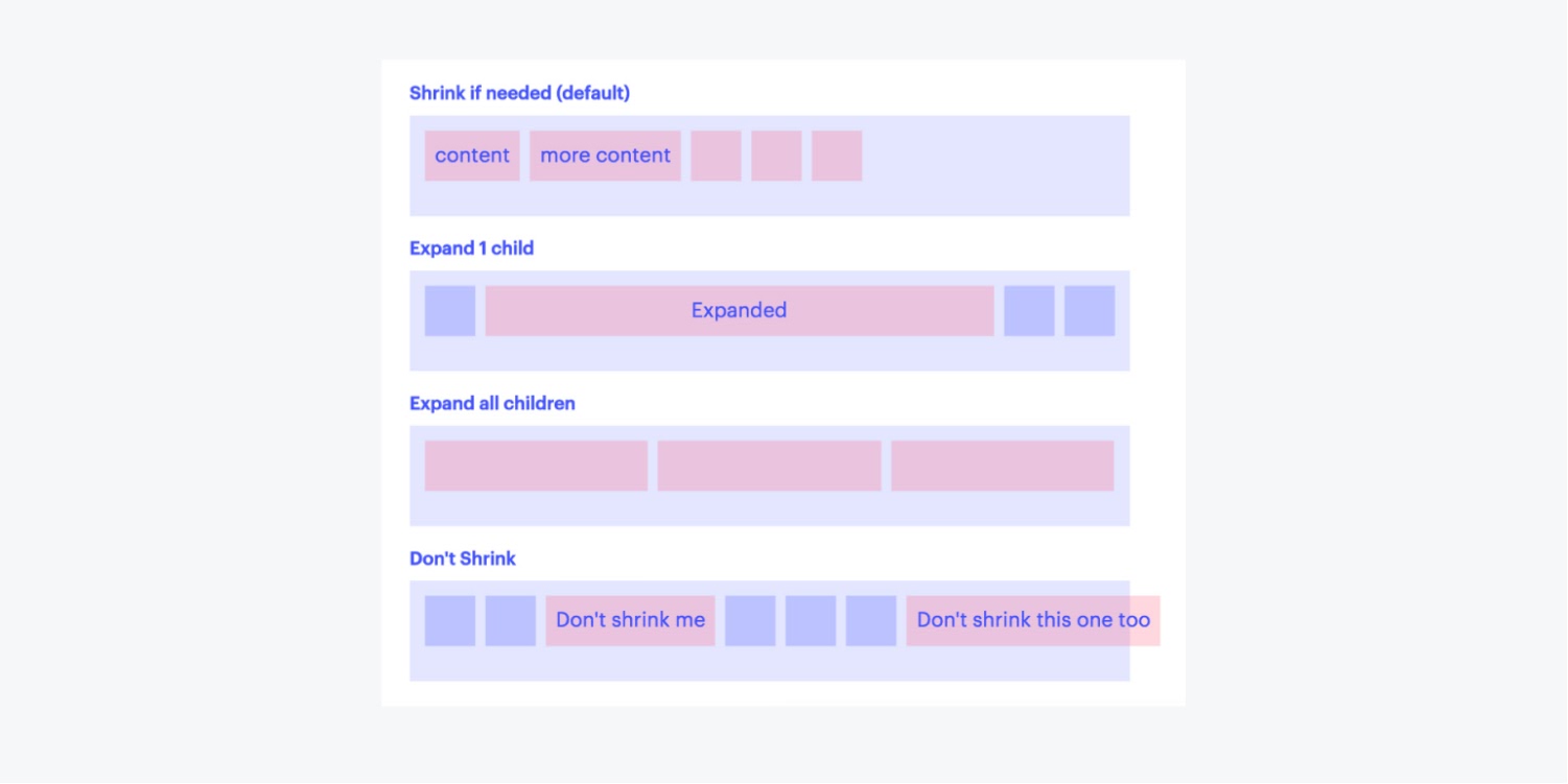
Customize grow and shrink behavior
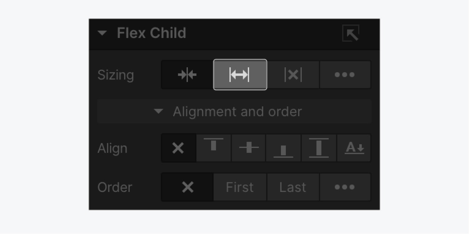
Select the Grow option to size the item grows. Making it fully flexible so that they absorb any extra space along.
If all items are either Grow, Shrink, or Don’t shrink or grow, any remaining space after the items have been sized will be distributed evenly to the items with Grow.
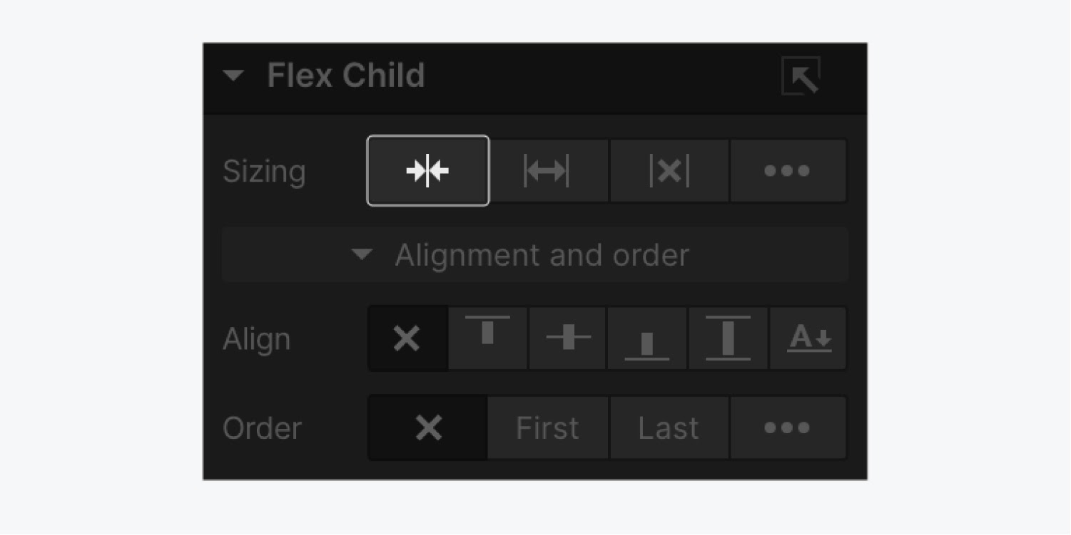
Select the Shrink option to size the item based on its width/height properties (or its content if not set).
It makes the flex item inflexible when there is some free space left but allows it to shrink to its minimum when there is not enough space. The alignment abilities or auto margins can also be used to align flex items.
Set the Don’t shrink or grow option to size the item according to its width/height properties, but makes it fully inflexible. This is similar to flex: initial except it is not allowed to shrink, even in an overflow situation.
If you choose to fully customize the grow and shrink behavior of an element, you’ll enter a number to determine how much the flex child will shrink or grow relative to other child elements.
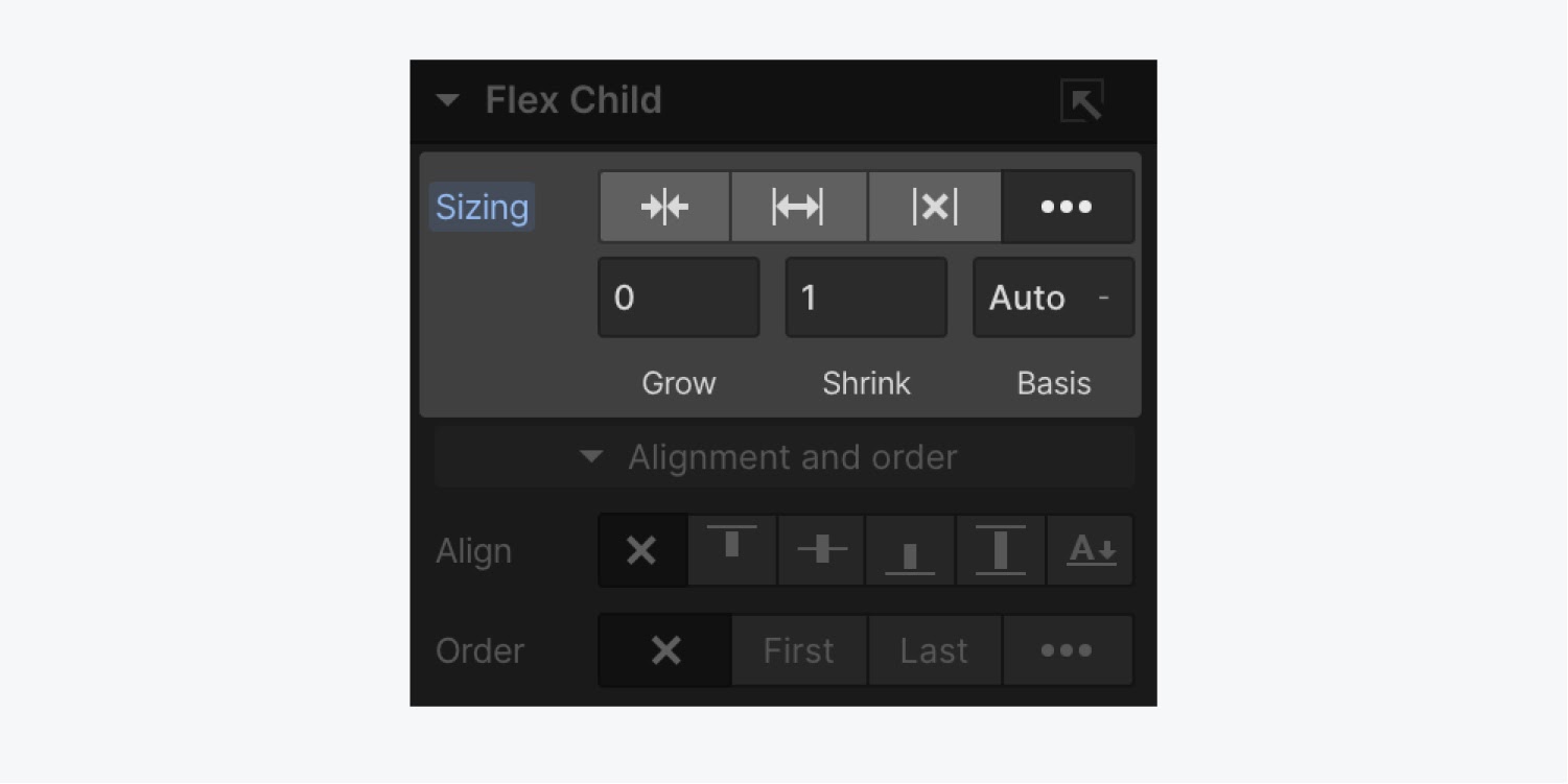
Set the Grow value to define how much a flex child can grow relative to other child elements when free space inside the parent element is distributed. If the value is set to 0, it won’t grow larger than it needs to.
Set the Shrink value to define how much a flex child can shrink relative to other children when negative free space is distributed. If the value is set to 0, it won’t shrink even in overflow situations.
And you can set the Basis value to the default size of an element before flex-grow or flex-shrink come into play. You can set this to a specific dimension (e.g., 20%, 250px, etc.) or Auto. If set to Auto, the default size of a flex child will be based on its width or height (if set) or it’s content. If set to a specific dimension, the content or width/height of an element will be ignored before sharing the size between flex children.
Change the order of a flex child
Reordering flex children comes in handy when you want mobile device users to see different content than users on desktop devices. By default, flex children display in the same order as they are placed in the source code. To override this, you can use the order setting presets or the custom order option.
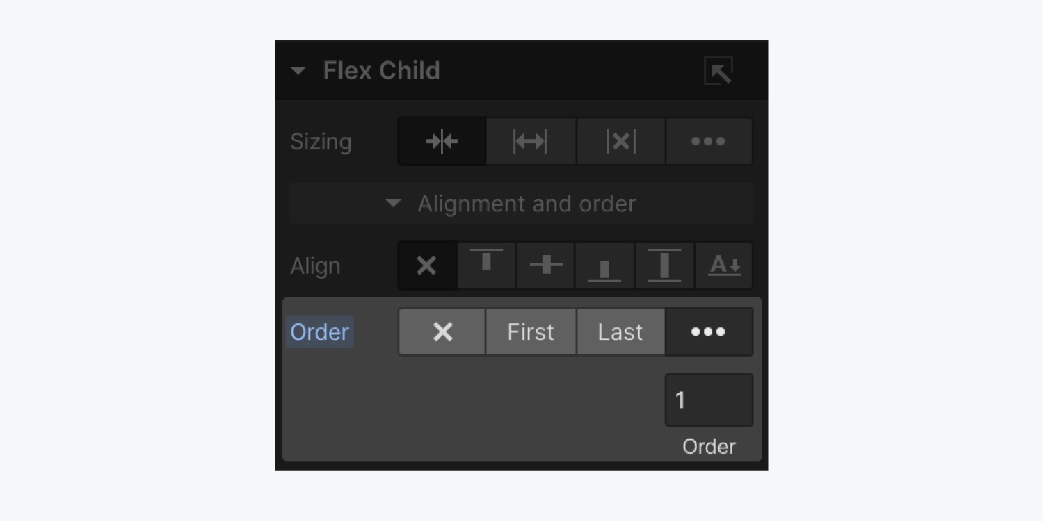
Flex child order settings:
- Don’t change: keep the flex child in its default place
- First: the flex child appears first in the flex container
- Last: the flex child appears last in the flex container
- Customize order: control the display order of several flex children by defining a custom order value
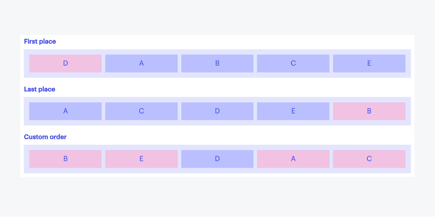
Customize the order
Custom order can be defined as a number, which specifies the order in which the flex child appears inside a flex container. Flex children with the same custom order value will be laid out in the order they are placed originally.
When using custom order, do not use the presets to specify the first or last element in your list. “First” sets the order of the flex child to -1, and “Last” sets the order to 1. When using custom order, any number greater than 1 will place the element after any element with order set to last. Any number smaller than -1 will place the element before any element set to first.
Also, check out:


