You can apply an interaction you’ve previously created to another element on your site. This is useful when you have a repetitive design or elements with the same structure on which you’ll want to apply the same interactions.
There are 2 main controls in Webflow’s interactions to help you reuse interactions:
- Trigger settings — here, you can choose whether the trigger only applies to a specific element (the selected element), or all elements with the same class
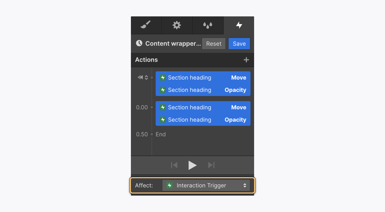
- Action targets — here, you can choose whether actions in animations affect a specific element, a class of elements, or the interaction trigger itself
Note: At the moment, it’s not possible to reuse page interactions. You’ll need to apply page triggers on each of your pages. However, you can set the animations to target the class of an element so you can reuse them on each page. To do so, set the page trigger(s) on the first page and create your animation(s). Make sure you target the class and not the selected element. Then, go to each page, add the page trigger(s) and select the animation(s) you’ve already created.
In this lesson, we’ll walk through 2 reusable animations:
How to create a button arrow move interaction
In this example, you’ll learn how to trigger the same “arrow move out” interaction on all buttons with the same class. You’ll also learn how to make sure that the animation only affects the button arrow a site visitor is currently hovering on.
How to create a custom button
To get started, you’ll first create a custom button which includes text and an arrow (i.e., what you’ll set the animation on later). You’ll need to upload an arrow image to the Assets panel to use in your button. To create the custom button:
- Go to Add panel > Basic
- Drag a link block onto the Webflow canvas
- Go to Style panel > Style selector and set a class on the link block (e.g., “Button box)
- Go to Add panel > Typography
- Drag a text block inside the link block
- Go to Style panel > Style selector and set a class on the text block (e.g., “Button text”)
- Go to Assets panel
- Drag your arrow image into the link block
- Go to Style panel > Style selector and set a class on the arrow image (e.g., “Button arrow”)
- Select the link block (i.e., the “Button box”)
- Go to Style panel > Layout and set Display to Flexbox
Now you’ve created your button! You can add margin and padding, borders, a hover state, or any other styles. You can also duplicate the button for later tests that your interaction is applied to all buttons.
Pro tip: Setting classes on the custom button’s elements (i.e., the link block, text block, and arrow image) allow you to reuse interactions on other elements that have the same class applied. This is useful if you want to reuse the custom button and have the same interaction applied, for instance.
How to create the custom button interaction
Now, you can create the button arrow move interaction, so the arrow moves to the right when a site visitor hovers over the button. To create the interaction, you’ll:
- Create the custom button interaction trigger
- Create the animation to move the button’s arrow on hover
- Create the animation to reset the arrow’s position on hover out
- Apply the trigger to all elements with the same class
- Test the custom button
Create the custom button interaction trigger
The trigger is what starts the animation when a site visitor interacts with the button. In this case, you’ll set a mouse hover trigger, so when a site visitor hovers over the button, the animation (i.e., the arrow moving) occurs.
- Select the link block (e.g., the “Button box”)
- Go to Interactions panel
- Click the “plus” icon next to Element trigger
- Choose “Mouse hover”
Create the animation to move the button’s arrow on hover
Here, you’ll set the hover animation on the button’s arrow, so it moves slightly right when a site visitor hovers over the button.
- Select the link box (i.e., “Button box”)
- Click “Select an animation” next to Action in the On hover section
- Choose “Start an animation” under Custom animation
- Click the “plus” icon next to Timed animations
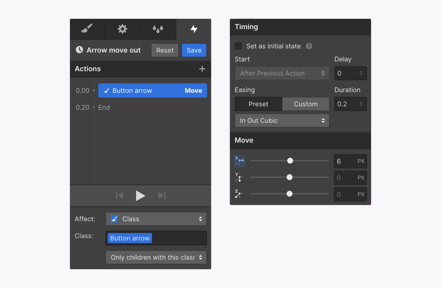
- Name your animation (e.g., “Arrow move out”)
- Select the button’s arrow (i.e., the “Button arrow”)
- Click the “plus” next to Actions
- Choose Move under Transform
- Set a pixel value on the x-axis (e.g., 6 px) under Move
- Adjust the easing and duration, if you’d like
- Select “Only children with this class” next to Class
- Click Save
Note: “Only children with this class” is applied in relation to the trigger element (i.e., the “Button box” link block) and its children with that class applied (i.e., the “Button arrow” arrow). If you don’t limit the animation to affect “only children,” every instance of the arrow on your site would move when a site visitor hovers over 1 of the custom buttons.
Since you’ve set the trigger based on the link block’s class (i.e., “Button box”) and set the animation to affect only children with the arrow’s class (i.e., “Button arrow), the interaction will affect every instance of the custom button on your site — as long as the custom button includes both the “Button box” class and the “Button arrow” class.
Create the animation to reset the arrow’s position on hover out
Now, we’ll set the hover out animation on the button’s arrow, so it moves back to its original spot when a site visitor hovers out of the button.
- Select the link block (e.g., “Button box”)
- Go to Interactions panel
- Select the Mouse hover element trigger
- Click “Select an animation” next to Action in the On hover out section
- Choose “Start an animation” under Custom animation
- Click the “three disclosure dots” icon next to your previously configured animation (e.g., “Arrow move out”)
- Select Duplicate
- Click the “cog” icon next to the duplicated animation
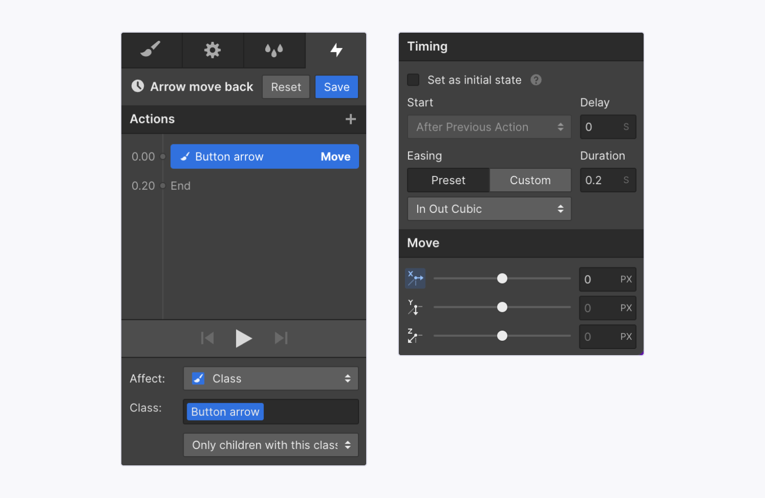
- Rename the animation (e.g., “Arrow move back”)
- Select the arrow’s Move animation on the timeline
- Set the x-axis to 0px under Move
- Click Save
Apply the trigger to all elements with the same class
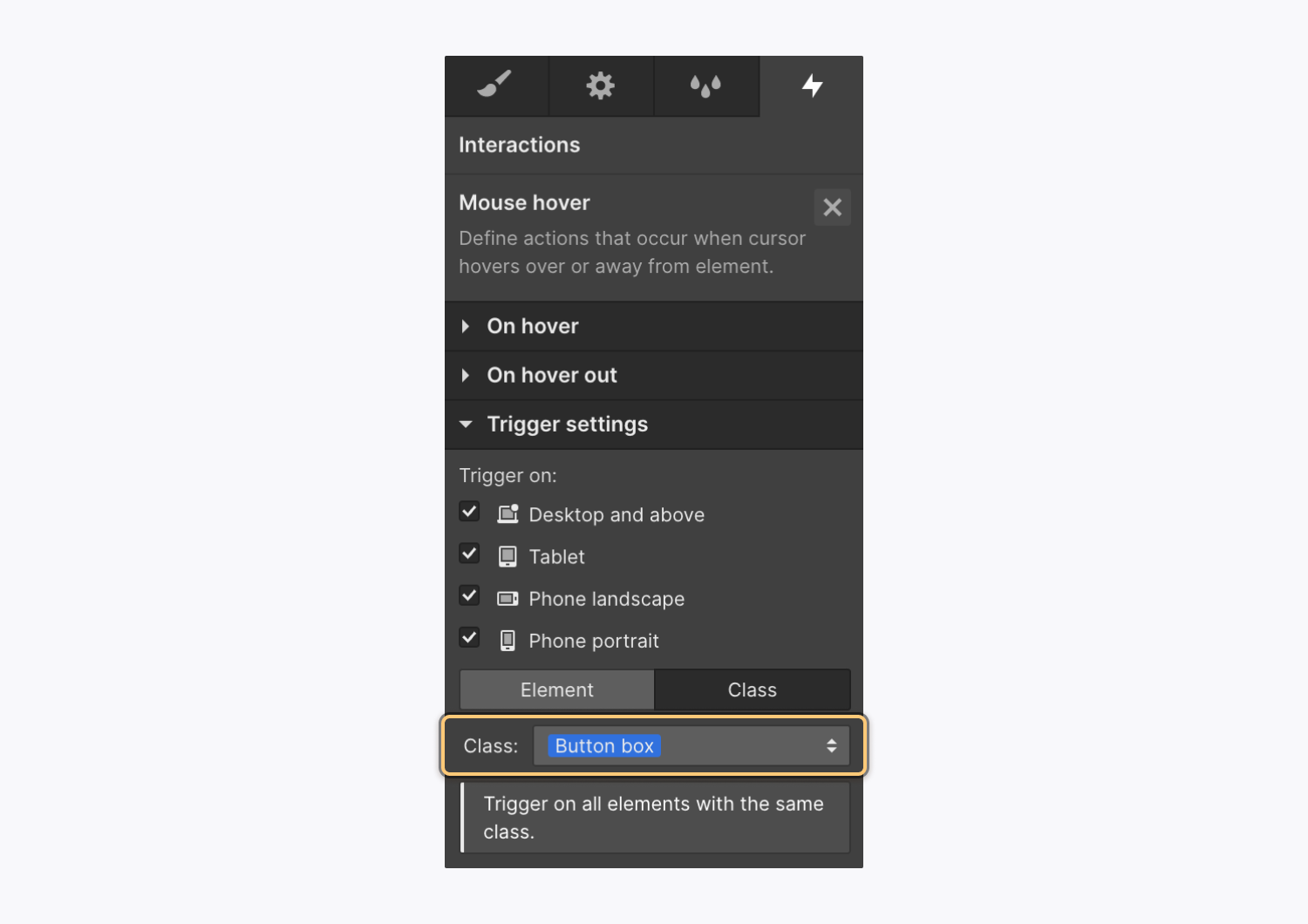
By default, the trigger applies to the selected element (i.e., the link block), but you’ll want to change this so the trigger applies to all elements with the same class (e.g., “Button box) so the interaction occurs on all elements with that class. Then, you’ll be able to duplicate the custom button in your site and the interaction will occur on the duplicates as well.
To apply the trigger to all elements with the same class:
- Select the link block (i.e., the “Button box”)
- Go to Interactions panel
- Select the Mouse hover element trigger
- Select Class under Trigger settings
Now, the interaction applies to each element with that class (i.e., “Button box”). If you duplicate your custom button on the canvas, the duplicate button — which has the same classes applied — will have the same arrow move interaction as your original custom button.
Test the custom button
Now, you can preview your site and hover over your custom button — and any duplicates – to check that the interaction works correctly on all buttons with that class applied.
How to create a scroll into view interaction
When creating a reusable scroll animation, it’s helpful to target the trigger element itself. Here, we’ll walk through building an interaction where a site’s heading slides to the right and becomes more opaque when it scrolls into view.
To create the interaction, you’ll:
Create the scroll into view trigger
To set up the interaction, first create a “Scroll into view” trigger on the parent element you want to animate (i.e., the div block).
- Select the div block – in this example, we set a “Content wrapper” class on the div block
- Go to Interactions panel
- Click the “plus” icon next to Element trigger
- Select “Scroll into view”
Since you’ll want to reuse this interaction on other elements with the same class, you can apply the trigger at the class level. To do this, select Class under Trigger settings. This starts the animation every time an element with that class applied (i.e., “Content wrapper”) scrolls into view.
Create the scroll into view animation
The scroll into view interaction has 2 steps:
- Initial state — you’ll set the element’s opacity to 0% and move it 50px left
- Once scrolled into view state — you’ll set the element’s opacity to 100% and move to the x-axis origin
First, create an initial state for the div block, so that it’s 50px to the left, and 0% opacity before it scrolls into view:
- Select the div block (e.g., “Content wrapper”)
- Go to Interactions panel
- Select the Scroll into view element trigger
- Click “Select an animation” next to Action in the When scrolled into view section
- Choose “Start an animation” under Custom animation
- Click the “plus” icon next to Timed animations
- Name your animation (e.g., “Content wrapper animation”)
- Click the “plus” icon next to Actions
- Choose Move under Transform
- Set a pixel value on the x-axis (e.g., -50 px) under Move
- Check the “Set as initial state” checkbox under Timing
- Click the “plus” icon next to Actions
- Choose Opacity under Style
- Set a value for Opacity to (e.g., 0%)
- Check the “Set as initial state” checkbox under Timing
Now, you’ll set the actions once the heading scrolls into view:
- Click the “plus” icon next to Actions
- Choose Move under Transform
- Set a pixel value on the x-axis (e.g., 0 px) under Move
- Uncheck the “Set as initial state” checkbox under Timing
- Click the “plus” icon on the animation timeline next to the action you just set (i.e., the “Content wrapper” 0px Move action) — this ensure the action will occur at the same time the heading moves back to 0px on the x-axis
- Choose Opacity under Style
- Set a percentage value for Opacity (e.g., 100%)
- Click Save
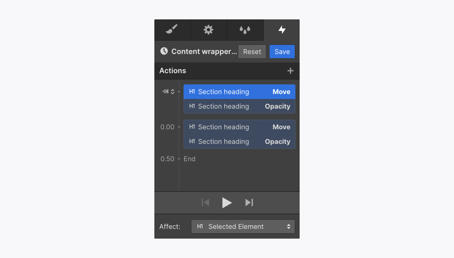
Now, you’ll want to make sure that the animation only affects the element triggering the animation (i.e., the “Content wrapper” div block).
Set the action targets
To set the action targets so the actions affect the interaction trigger:
- Select the div block (e.g., “Content wrapper”)
- Go to Interactions panel
- Select the Scroll into view element trigger
- Click the “cog” next to the animation you previously set (i.e., the “Content wrapper animation)
- Select all actions in the animation timeline (hold Command (on Mac) or Control (on Windows) and click all timeline actions)
- Select “Interaction trigger” in the Affect dropdown
- Click Save
This ensures that the actions affect only the interaction trigger — instead of the specific element you selected when creating the animation. That way, you can reuse the animation and the animation will replace the action’s previous target element(s) with the trigger element of the new interaction.
