Forms are one of the most powerful tools on the web, allowing you to capture information efficiently, whether you’re gathering email newsletter signups or work inquiries from potential clients. With Webflow, you can fully customize and optimize your forms to fit your needs.
In this lesson:
- How to add a form
- Form anatomy
- How to configure form elements
- Success and error states
- Form submissions
- Form data and GDPR
- Troubleshooting
How to add a form
You can add a form from the Add panel (A) > Elements > Forms section.
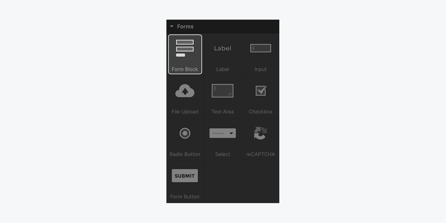
Drag a Form block onto the canvas.
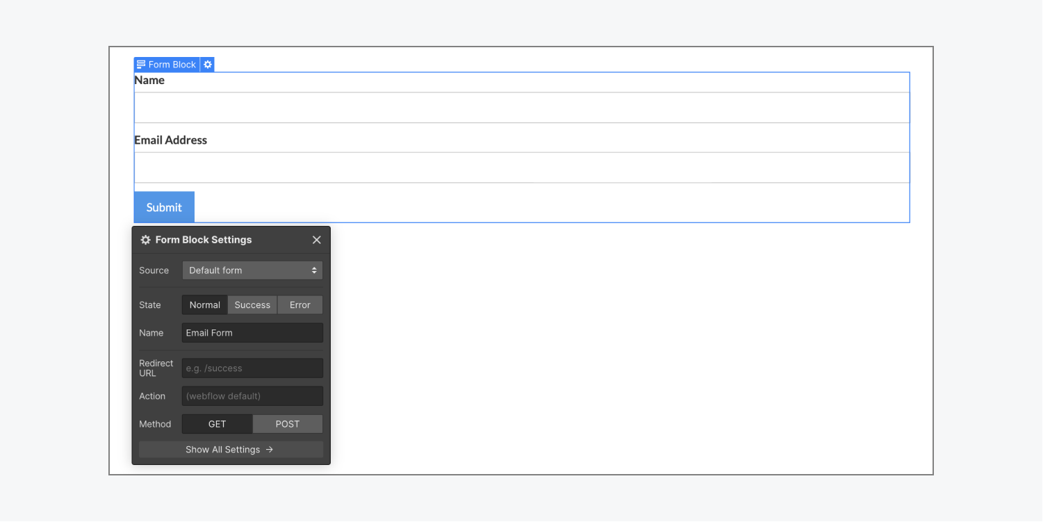
Form anatomy
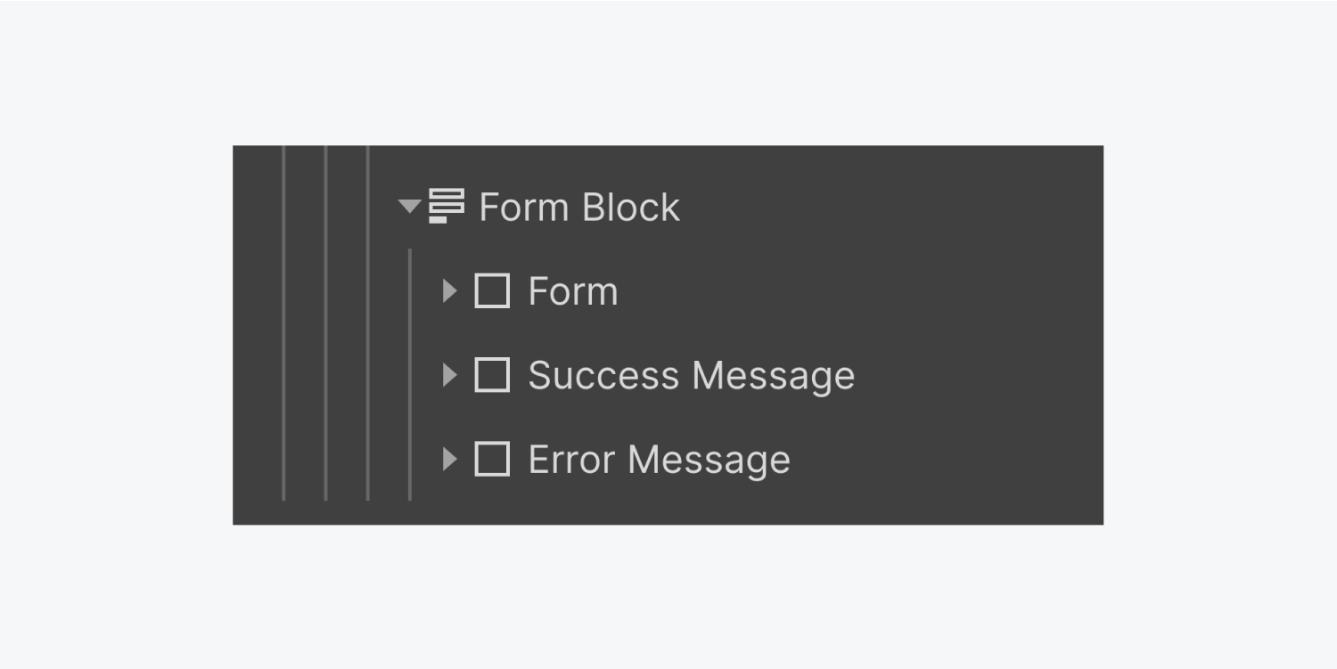
The Form block inherits the full width of its parent element and contains 3 child elements:
- Form — contains all your form inputs and elements
- Success message — the message returned when the form has been successfully submitted
- Error message — the message returned when there’s an issue with form submission
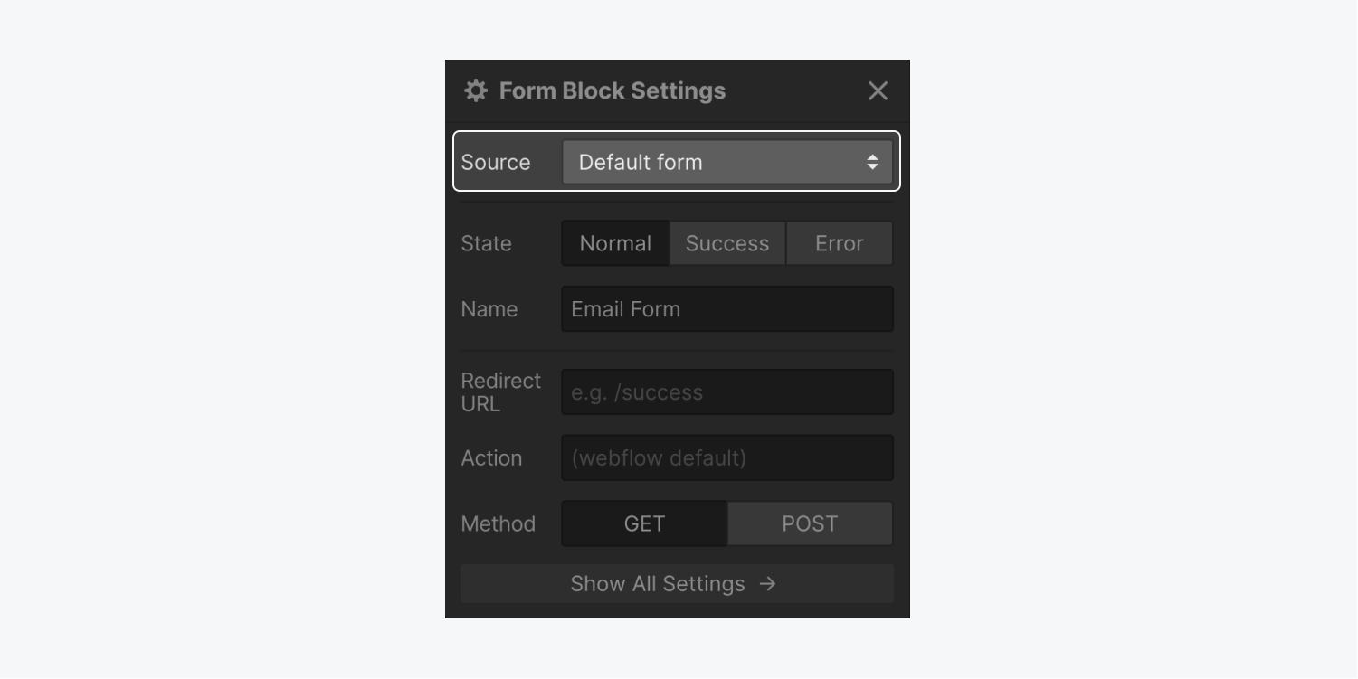
The Form block element also has a Source setting, which lets you connect your form to Logic. You can use Logic to send data from form submissions to other apps, or route form submissions to different content editors or members of your Workspace based on the form submitted or the submission content. Learn more about Logic.
Structure of your form
You can add or delete any form element within the Form, like an Input or a Checkbox, to customize your form as needed.
Form elements
- Field label — A label is used to describe the function or purpose of a form field. Field labels are crucial for accessible navigation of your form, so it’s important that you do not delete these.
- Input — The Input field is used to collect single-line data, like a one-word response to a question (e.g., name or email address).
- File upload — The File upload button allows site visitors to attach a file to their form submission. Learn more about the File upload button and how you can customize it.
- Text area — The Text area field allows visitors to input multi-line data, like a lengthy message.
- Checkbox — Checkboxes are best used for input data where the visitor can select one or multiple options. Learn more about checkboxes.
- Radio button — The Radio button field is best used for input data where the visitor can select only one of many options. Learn more about radio buttons.
- Select — The Select input behaves very similar to a dropdown element, where you can add a list of different options for your visitor to select. You can also allow for multiple selections. Learn more about select inputs.
- reCAPTCHA — reCAPTCHA is a Google service that helps prevent form spam. Learn how to add reCAPTCHA in your forms.
- Submit button — No form is complete without the Submit button! When clicked, this button submits all of the data collected in the form.
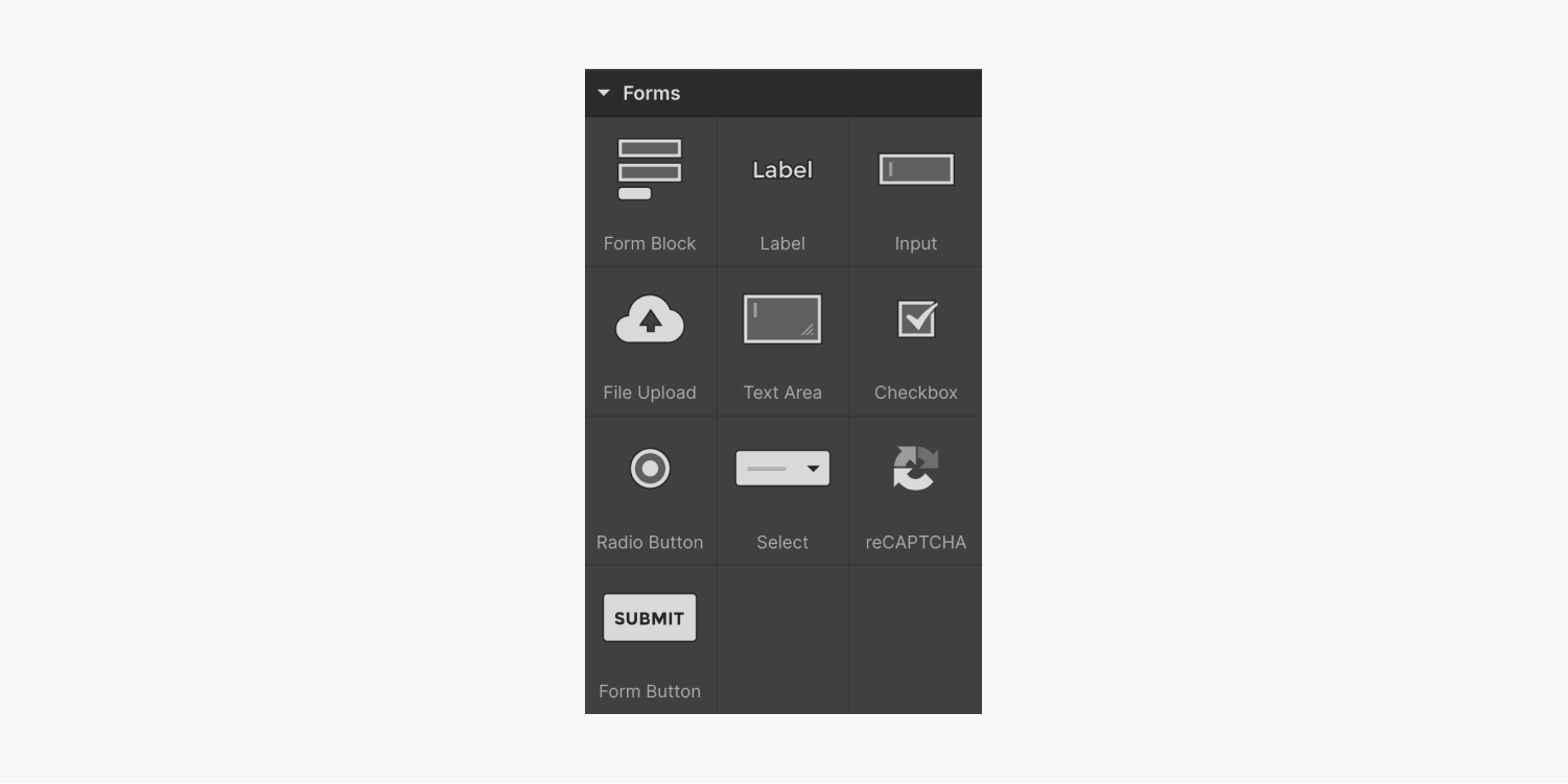
Need to know: Form elements can only be dropped inside of a Form block.
How to configure Form elements
You can double-click a form element (e.g., Input, Submit button) to open its settings. You can also access an element’s settings by selecting the element and pressing Enter/Return.
Input settings
Each form element has different input settings based on its type.
- Name — All form elements have a Name field. This is how you can identify the field on form submissions. By default, all form names are set to “Email Form.”
- Required — Each form element has the Required option. When checked, site visitors won’t be able to submit the form without filling out this field.
- Placeholder— For Input and Text area fields, the Placeholder is the text that displays in an empty input field and is overwritten the moment you start typing in the field. It can be a sample text or a description of the required information. You can style a placeholder text from the states menu.
Important: You should never use Placeholder text as a replacement for a Label, or to provide crucial information or help text for its related input field (e.g., “Password must be between 8-20 characters”), because placeholder text won’t be translated for site visitors using translation tools and isn’t available to assistive technology like screen readers. Additionally, because placeholder text disappears when site visitors start typing in the field, using placeholder text in place of a Label makes it difficult for site visitors to remember what information belongs in the field.
- Text type — The Text type allows you to specify the type of input you’re collecting. For example, an Input field with Text type: email will only accept email addresses. A Phone text type accepts phone numbers and text characters (although the phone text type presents a keypad on mobile devices). A Password text type will hide the typed characters in the input field.
- Autofocus — If you want an Input to receive focus (i.e., the site visitor’s cursor to be inside the Input field) when the page loads, check the Autofocus option in the Form settings. When a form element has Autofocus checked, the page will load and scroll to that element if the form falls inside the portion of the page that a user must scroll to see.
Note: If your page loads and scrolls down automatically, this may be because Autofocus has been checked on an Input field in a form that falls inside the portion of the page that a user must scroll to see. If you don’t want this to happen, make sure to uncheck the Autofocus option for all Input fields in your form. You’ll also want to make sure that the Autofocus option is unchecked for any hidden form fields, as this may cause issues with form submission.
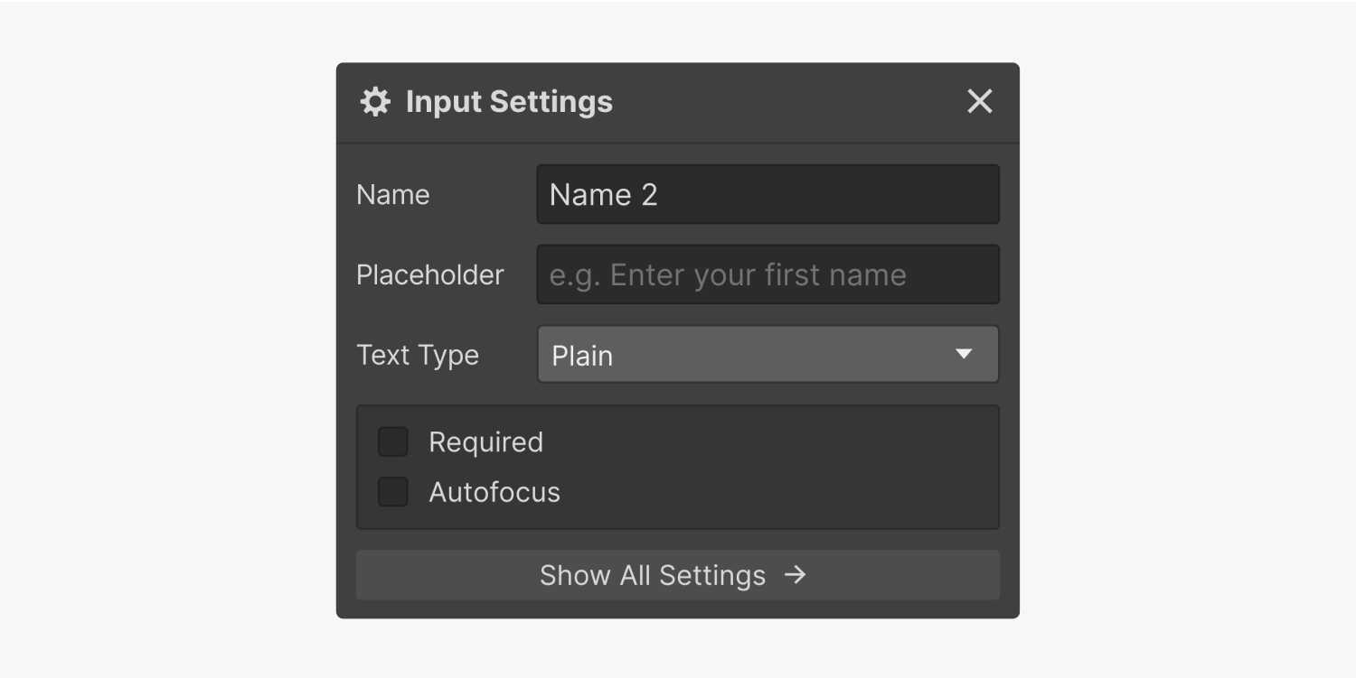
To learn more about input settings, check out our separate guide to checkboxes, radio buttons, and select inputs.
Submit button
The Submit button’s settings allow you to set its Button text and Waiting text.
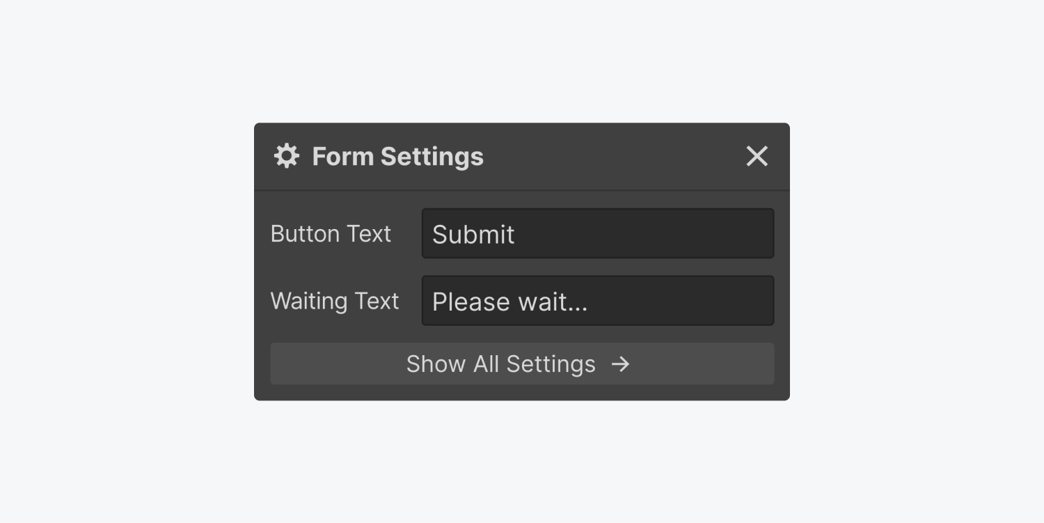
Double-clicking the Submit button brings up its settings modal window. Here, you can change 2 settings:
- Button text — the text that appears on the submit button. The default Button text is “Submit”
- Waiting text — the text that will replace the button text after the submit button is clicked and before the form is submitted. The default Waiting text is “Please wait…”
Success and error states
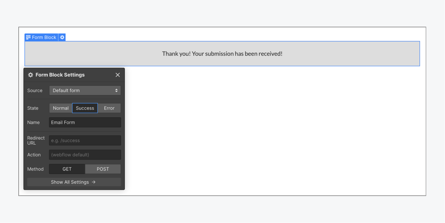
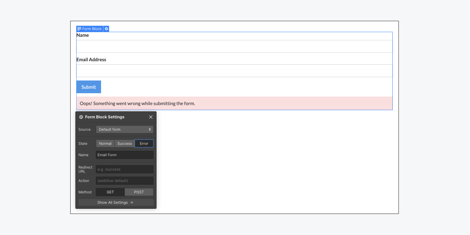
To access the success and error states, select the Form within the Form block and open Settings (D) > Form settings. Here, you can see the State options. Click on the State that you want to edit.
- Normal — the default state prior to site visitors interacting with the form
- Success — the message returned when the form has been successfully submitted. You can change the text and customize this as you like.
- Error — the message returned when there’s an issue with form submission. Again, you can customize the error state as you like.
Pro tip: We recommend including an email address in the error state in case users run into an issue with the form.
Form submissions
When someone submits a form through one of your sites, the submitted data will be sent to the email(s) specified in your Form notification settings — and/or redirected to a third-party location if you’ve set up your form to collect form data elsewhere. If you fully own a website (that is, it’s not a client’s site), then you can also access this data and manage it in your Site settings or in the Editor.
Pro tip: If you want to direct submissions to different content editors or members of your Workspace based on the form submitted or the submission content, you can do so using Logic’s Send email notification block. Learn more about Logic.
Form notifications
You can access the Form notification settings under Site settings > Forms tab.
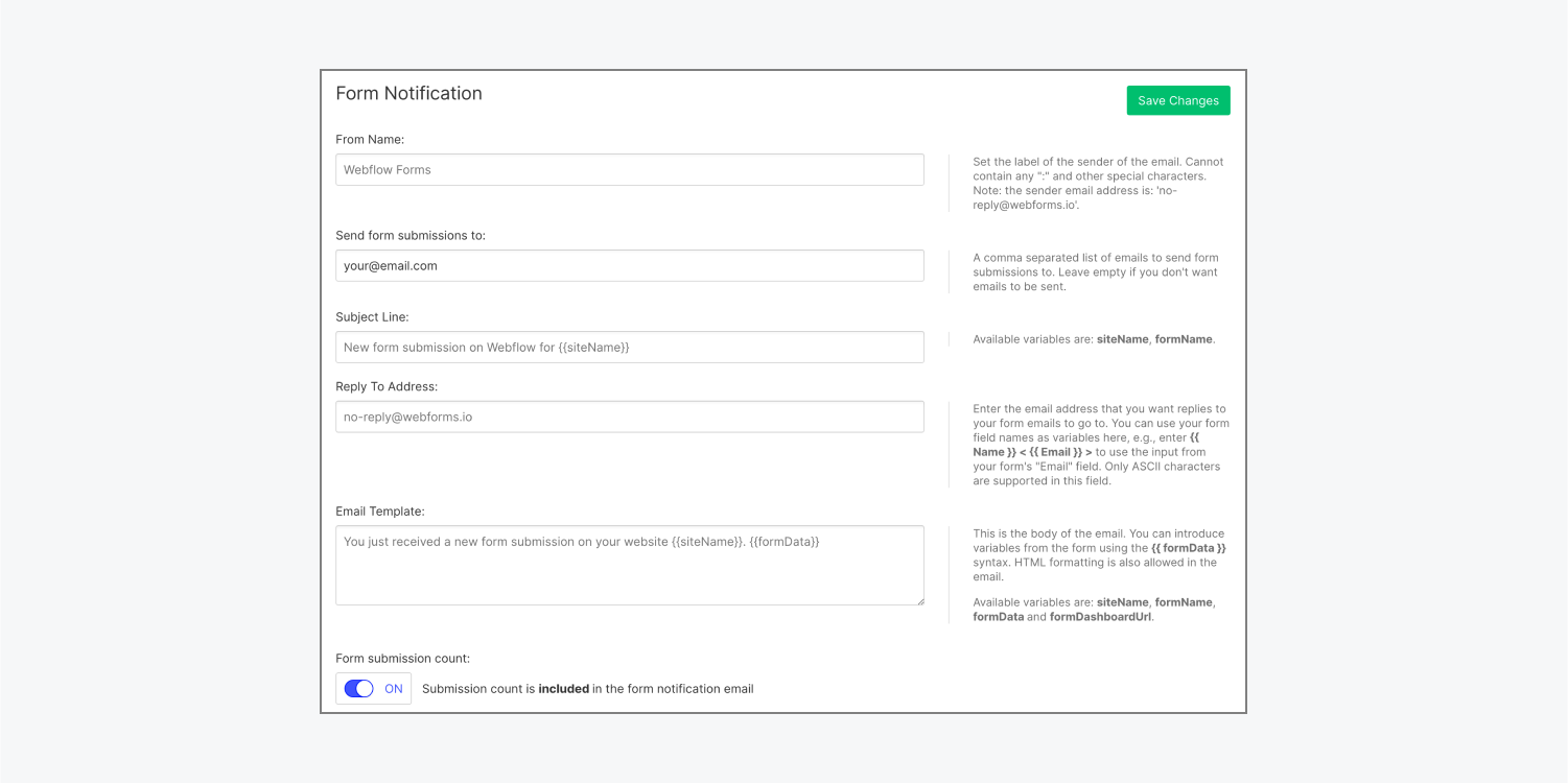
Here, you can configure how and where you want to receive your data. Learn more about setting up form notifications.
Form submissions
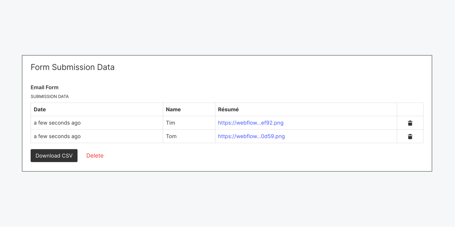
If you own the site, you can also access and manage the submitted data under the Site settings > Forms tab. You can view the submissions there or download the submissions as a CSV file. You can also access form submissions in the Editor. Learn all about form submissions and how to manage form data.
Important: By default, all form names are set to “Email Form.” If you have more than one form on your site and you haven’t set names for them, submission data from all of your forms will appear under “Email Form” in Site settings > Forms tab > Form submission data. We recommend giving your forms descriptive names so you can clearly distinguish between submission data for each of your forms.
Form data and GDPR
Disclaimer: The content presented here is provided only for informational purposes and is not meant to serve as legal advice. You should work with professional legal counsel to determine how the General Data Protection Regulation (GDPR) may or may not apply to you. Learn more in our Privacy FAQs.
If you host websites that collect personal data from EU residents (e.g., via form submissions or third-party scripts), you have responsibilities as a data controller. Take the time to understand your responsibilities as a data controller, and take steps to abide by the GDPR. The UK Information Commissioner’s Office data-protection self-assessment checklist can be helpful.
If you’re creating forms that request personal data in Webflow, make sure to clearly ask for and get consent, unless another lawful basis for processing applies.
If you’re creating websites for clients who collect personal data through their websites, make sure your clients understand their responsibilities as a controller of that personal data.
If you’re using third-party tools (e.g., Zapier) to connect your Webflow forms to external data sources and send personal data using those integrations, make sure to review your responsibilities as a data controller.
Learn more: How to get ready for the General Data Protection Regulation – and what Webflow’s doing
Troubleshooting
If your form can’t be submitted successfully, try the following:
- If you’ve enabled reCAPTCHA on your site, make sure all of the forms on your site contain a reCAPTCHA element. When reCAPTCHA is enabled in Site settings > Forms tab, forms that don’t contain a reCAPTCHA element will fail to submit.
- If you’ve hidden any form fields in your form, make sure that Autofocus is not checked in the settings for those fields.
- Form submissions on unhosted sites (i.e., sites for which you do not have an active hosting plan) on free accounts will max out at 10 form submissions total. If you’ve reached this limit, you’ll need to upgrade your site plan to continue receiving form submissions.
Important: If you’ve exported your site for external hosting, Webflow will not process form submissions on your site. You’ll need to use a third-party tool to collect form submissions on the exported site or embed a third-party form integration.
If your page loads and scrolls down automatically, this may be because Autofocus has been checked on an Input field below the fold. If you don’t want this to happen, make sure to uncheck the Autofocus option for all Input fields in your form.
If the issue continues, please contact customer support.


