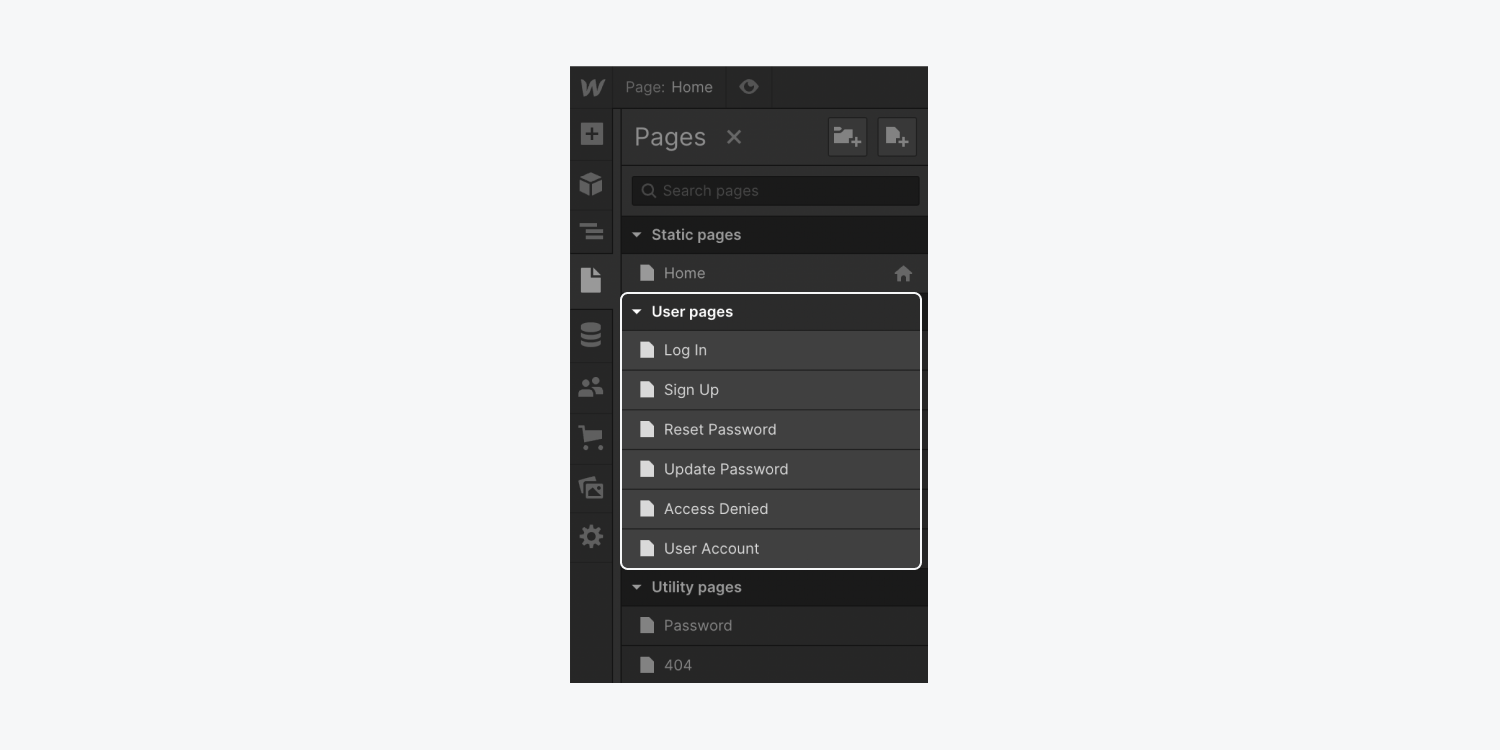
When you click the Pages icon in the Webflow Designer, you’ll see 5 types of pages. These are Static pages, Utility pages (like the 404 error page and the Password page), CMS Collection pages, and Ecommerce pages. Once you’ve added Memberships to your site, you’ll see the User pages section.
In this lesson, we’ll cover:
- How to access User pages
- Log in page
- Sign up page
- Reset password page
- Update password page
- Access denied page
- User account page
- How to customize elements on User pages
- User account settings
- Custom fields
- Reserved URL slugs
- How to exclude a User page from site search results
- How to exclude a User page from search engine indexing
How to access User pages
To access User pages, first ensure that you have Memberships enabled on your site. Then, click on the Pages icon to open the Pages panel. User pages will show up under the User pages section.
Log in page
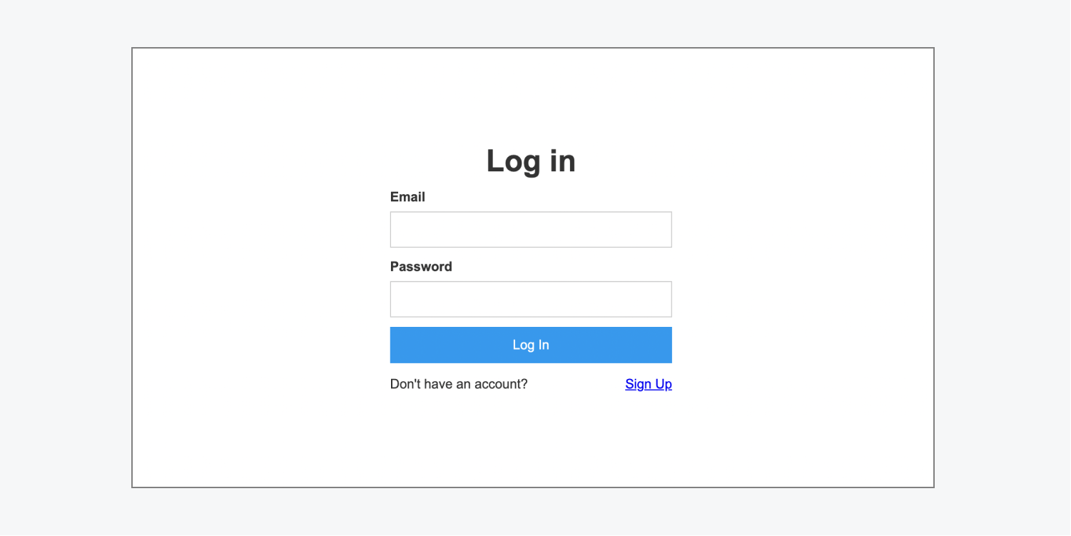
The Log in page is a form that allows users to log into their existing account or sign up for a new account if they don’t already have one.
The Log in form contains a heading, email field, password field, "Log in" button, "Don't have an account?" span, and a sign up link. You can edit the text or styling for any of the elements in the Log in form.
Note: You can't remove the user email field, user password field, or the "Log in" button from the Log in form.
Log in form block states
There are 2 states for the Log in form block: normal and error.
You can edit the log in form in either state to change how each state appears to site visitors. To access these states:
- Select the Log in form block on the Webflow canvas or in the Navigator panel
- Open Element settings panel > Log in form block settings
- Select the state (normal or error) you want to access
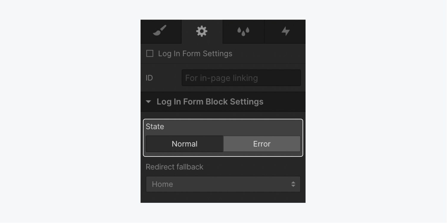
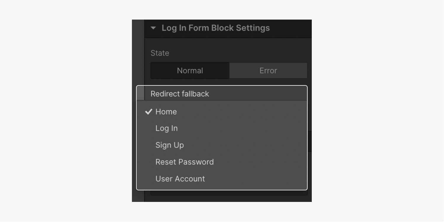
The normal state occurs when the form is submitted successfully. After successful submission, the user is taken to the page specified in the redirect fallback dropdown.
Note: If a site visitor tries to access restricted content while logged out, they will automatically be sent to the Log in page. If they log in successfully, they’ll be sent to the restricted content page they had previously been trying to access, instead of being sent to the specified redirect fallback page.
To change the redirect fallback page:
- Select the Log in form block on the canvas
- Open Element settings panel > Log in form block settings
- Choose a page from the redirect fallback dropdown
The error state occurs when the form is not successfully submitted. An error state div block will appear beneath the log in form block with an error message inside. You can change the error state div block’s default styling, and you can edit the default error message text.
There are 2 error messages that can appear on the log in page: general error and wrong email or password.
- General error – this error message appears when there’s a general error submitting the form. The default error message says: “We’re having trouble logging you in. Please try again, or contact us if you continue to have problems.”
- Wrong email or password – this error message appears when the site visitor inputs an incorrect email or password. The default error message says: “Invalid email or password. Please try again.”

To edit the default text in either error message:
- Select the Log in form block on the canvas
- Open Element settings panel > Log in form block settings
- Choose the error state
- Select the Error message text block on the canvas
- Open Element settings panel > Error message settings
- Click the “pencil” icon on the error message you would like to edit
- Enter your new error message in the Edit text field
Sign up page
The Sign up page is a form that allows users to sign up for a new account, if they don’t already have one, or log in to their existing account.
The Sign up form contains a heading, email field, name field, password field, an “accept privacy policy and terms of service” checkbox, an “accept communications” checkbox, a sign up button, an “Already have an account?” link, and a log in link. You can edit the text or styling for any of the elements in the sign up form.
Note: Keep in mind that you cannot remove the user email field, user password field, or sign up button from the sign up form. You can remove the name field, the “accept privacy policy and terms of service” checkbox, and the “accept communications” checkbox, but you must remove these from the Element settings panel.
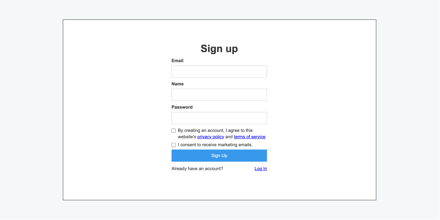
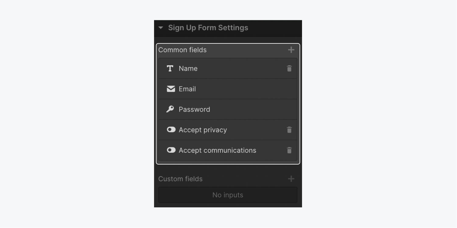
To remove these fields:
- Select the Sign up form on the canvas
- Go to Element settings panel > Sign up form settings
- Click the “trash” icon to the right of the field you want to remove
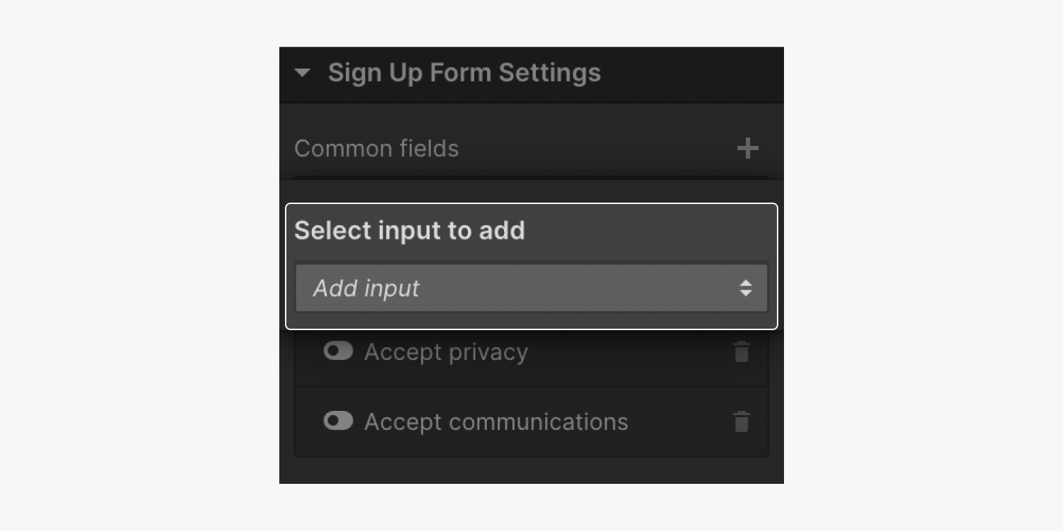
You can also restore these fields to the form:
- Select the Sign up form on the canvas
- Go to Element settings panel > Sign up form settings
- Click the “plus” icon to the right of Common fields
- Select the field you want to restore from the Add input dropdown
If you added a custom field in User account settings, you can also add that to your Sign up form. Custom fields allow you to collect additional information from the user that is not already collected from common fields.
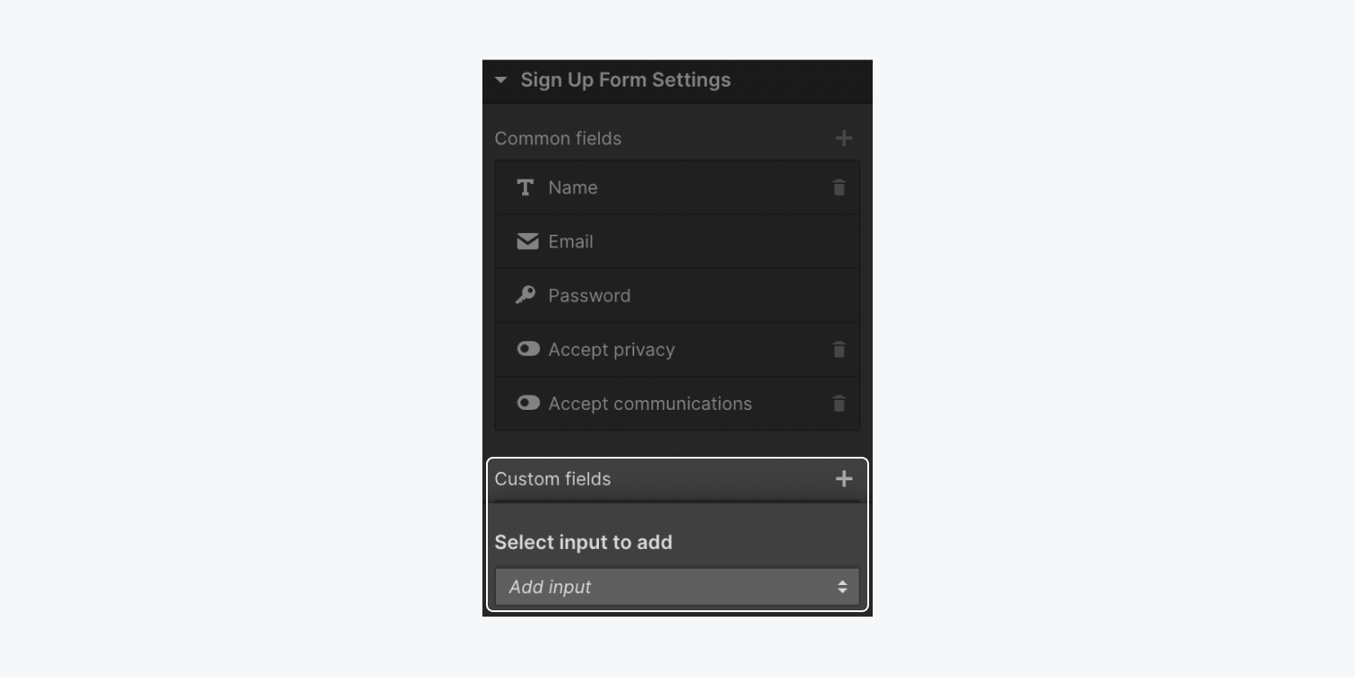
To add a custom field:
- Select the Sign up form on the canvas
- Go to Element settings panel > Sign up form settings
- Click the “plus” icon to the right of Custom fields
- Select the field from the Add input dropdown
If you added a minimum character count or maximum character count to your custom field (via User account settings), you might want to create a note on your sign up form about those limits so users know what to expect and submit valid information.
Sign up form block statuses
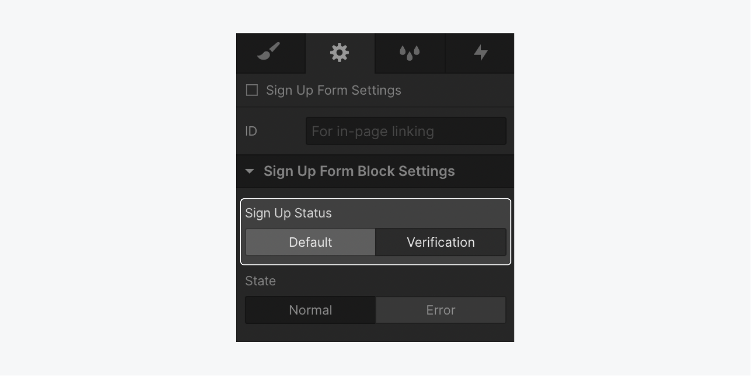
The sign up form block has 2 statuses: default and verification.
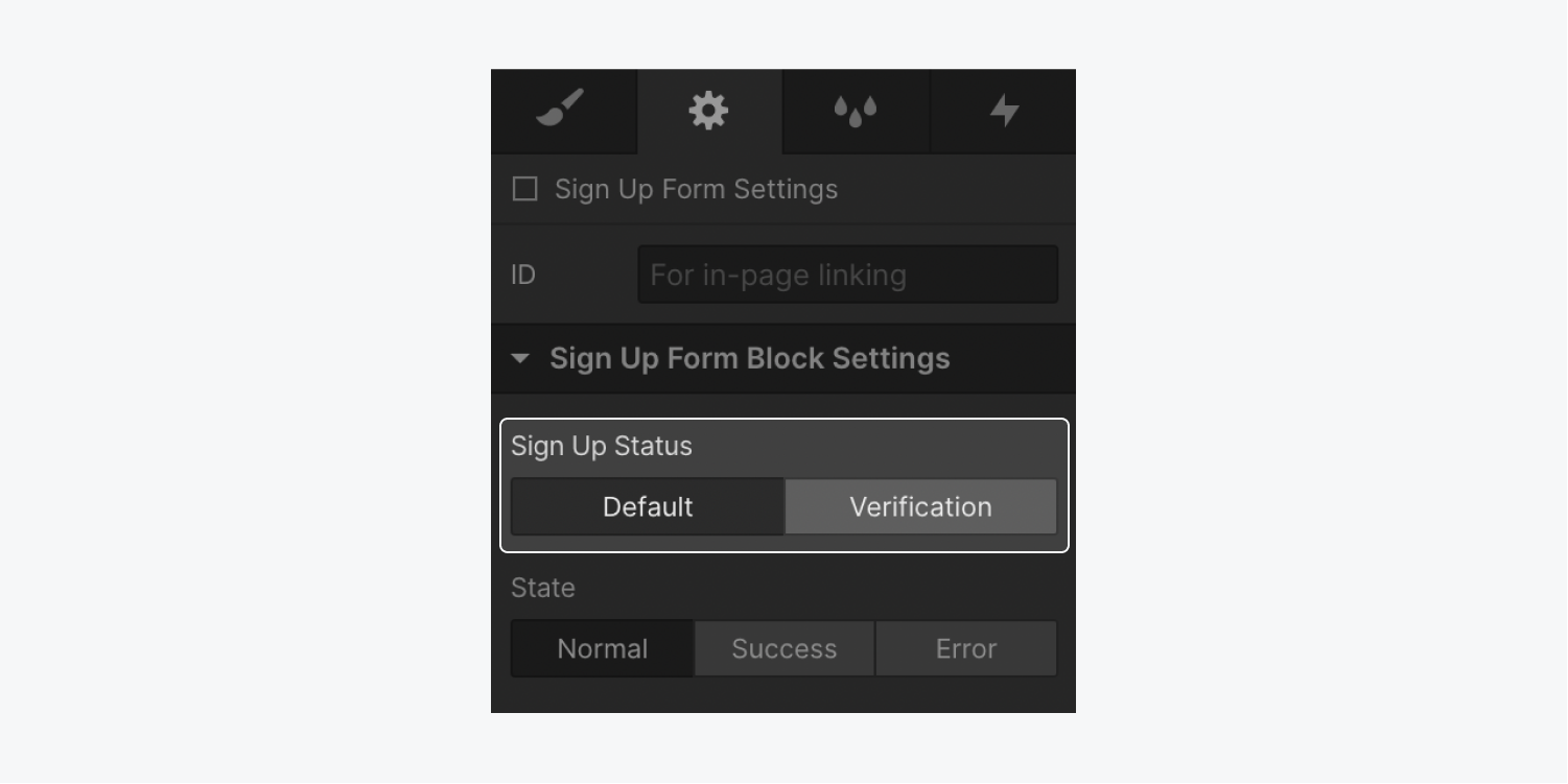
To access these statuses:
- Select the Sign up form block on the canvas
- Go to Element settings panel > Sign up form block settings
- Go to Sign up status and select either default or verification to view that status on the canvas
Default status
The default status shows the sign up form, which allows site visitors to create an account.
There are 3 possible states for the default status: normal, success, and error.
The normal state appears when a site visitor first opens the sign up page. This state shows the empty form. You can edit the text or styling for any of the elements in the sign up form.
Keep in mind that you cannot remove the user email field, user password field, or sign up button from the sign up form. You can remove the name field, “accept privacy policy and terms of service” checkbox, and “accept communications” checkbox, but you must remove these from the Element settings panel.
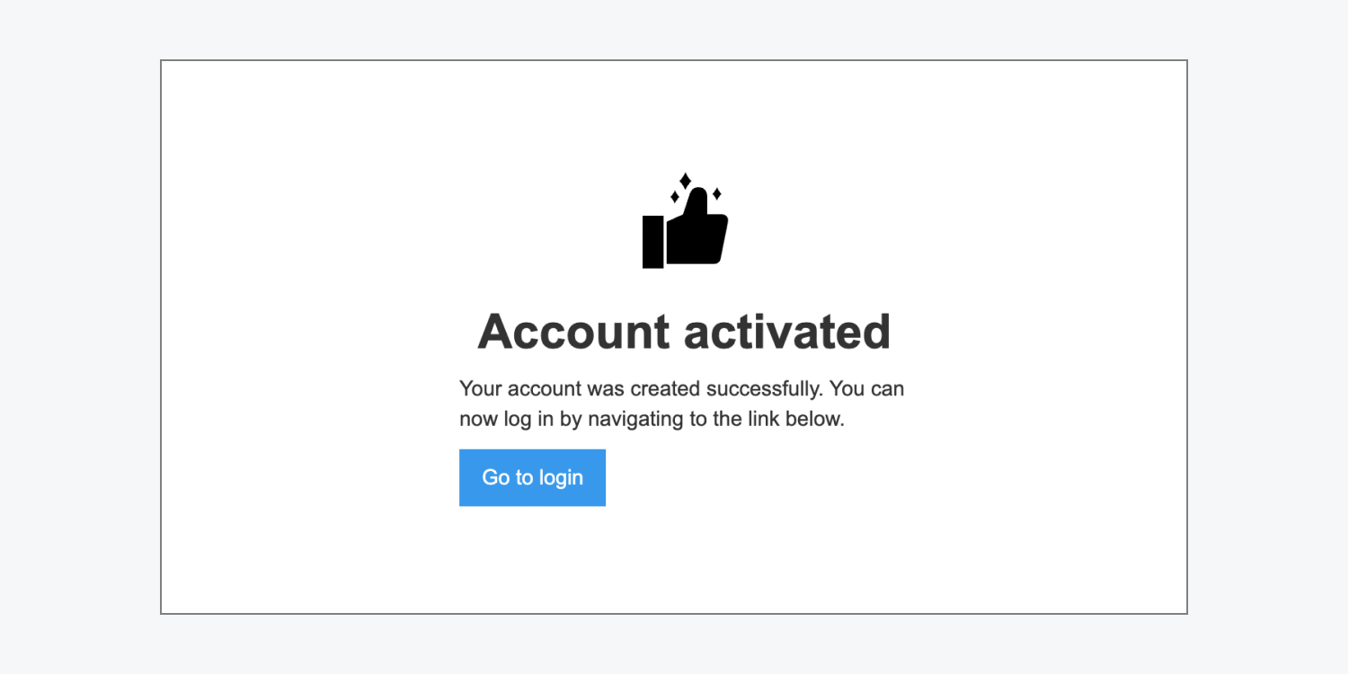
The success state appears after a site visitor’s email has been verified and their account is successfully created. It shows an image, a heading (e.g., “Account activated”), a paragraph, and a call-to-action button prompting the site visitor to go to the login page. You can edit all of the elements on this page.
If there’s an issue submitting the sign up form, an error state div block appears on the sign up page beneath the sign up form. You can change the error state div block’s default styling.
There are 6 error messages that can appear on the sign up form page: general error, email not allowed, invalid email, email already exists, must use invite email, and invalid password.
- General error – this error message appears when there is a general, uncategorized error submitting the form. The default text says: “There was an error signing you up. Please try again, or contact us if you continue to have problems.”
- Email not allowed – this error message appears if the site visitor tries to sign up with an email that is not allowed (e.g., if they submit a non-email). The default text says: “You're not allowed to access this site, please contact the admin for support.”
- Invalid email – this error message appears when the site visitor tries to sign up with an incorrectly formatted email address. The default text says: “Make sure your email exists and is properly formatted (e.g., [email protected]).”
- Email already exists – this error message appears when the site visitor tries to sign up with an email address already associated with an account on the site. The default text says: “An account with this email address already exists. Log in or reset your password.”
- Must use invite email – this error message appears when the site visitor signs up via an invitation link, and uses a different email address from the one their invitation was sent to. The default text says: “Use the same email address your invitation was sent to.”
- Invalid password – this error message appears when the site visitor tries to sign up with a password that is fewer than 8 characters long. The default text says: “Your password must be at least 8 characters.”
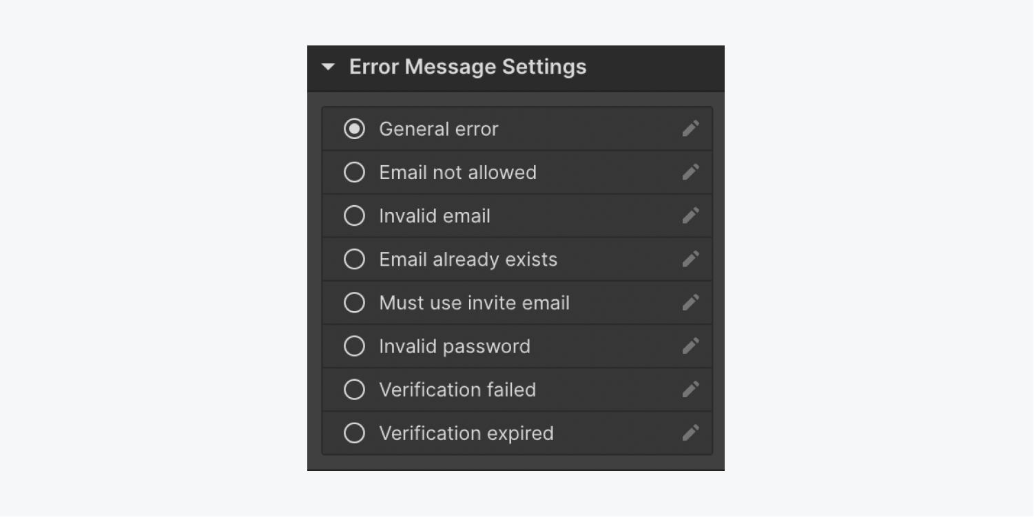
To edit the text on these sign up error messages:
- Select the Sign up form block on the canvas
- Go to Element settings panel > Sign up form block settings > State and select error
- Select the Error message on the canvas and go to Element settings panel > Error message settings
- Select the “pencil” icon to the right of the error message you want to edit
- Enter your new error message in the Edit text field
Verification status
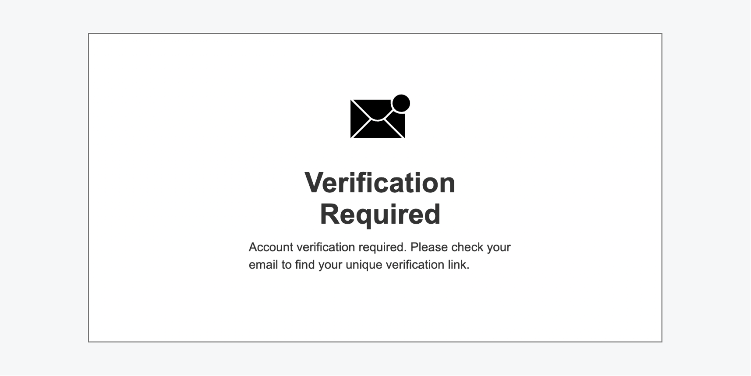
The verification status shows a message that appears after the form is submitted, directing the user to check their email for a verification link to verify their account.
Note: A site visitor must verify their email address for their account to be successfully created.
The verification status has 2 possible states: normal and error.
The normal state has an image, heading, and paragraph directing the user to check their email for a verification link. Any of these elements can be edited.
The error state appears if there is an error with account verification. It will show up as a div block and message on the verification page beneath the original verification message. The div block has default styling, which can be changed at any time.
There are 2 error messages that can appear on the verification status page: verification failed and verification expired.
- Verification failed – this error message appears when there is a general error and the verification fails. The default error message says: “We couldn't verify your account. Please try again, or contact us if you continue to have problems.”
- Verification expired – this error message appears when the verification link in the site visitor’s email is expired. Verification links are valid for 24 hours. The default error message says: “This verification link has expired. A new verification link has been sent to your email. Please try again, or contact us if you continue to have problems.”
To edit the text on these verification error messages:
- Select the Sign up form block on the canvas
- Go to Element settings panel > Sign up form block settings > Sign up status and select verification
- Go to State and select error
- Select the Error message on the canvas and go to Element settings panel > Error message settings
- Select the “pencil” icon on either the verification failed or verification expired error messages
- Enter your new verification error message in the Edit text field
Reset password page
The Reset password page is a form that allows users to reset their password if they are unable to log in to their account.
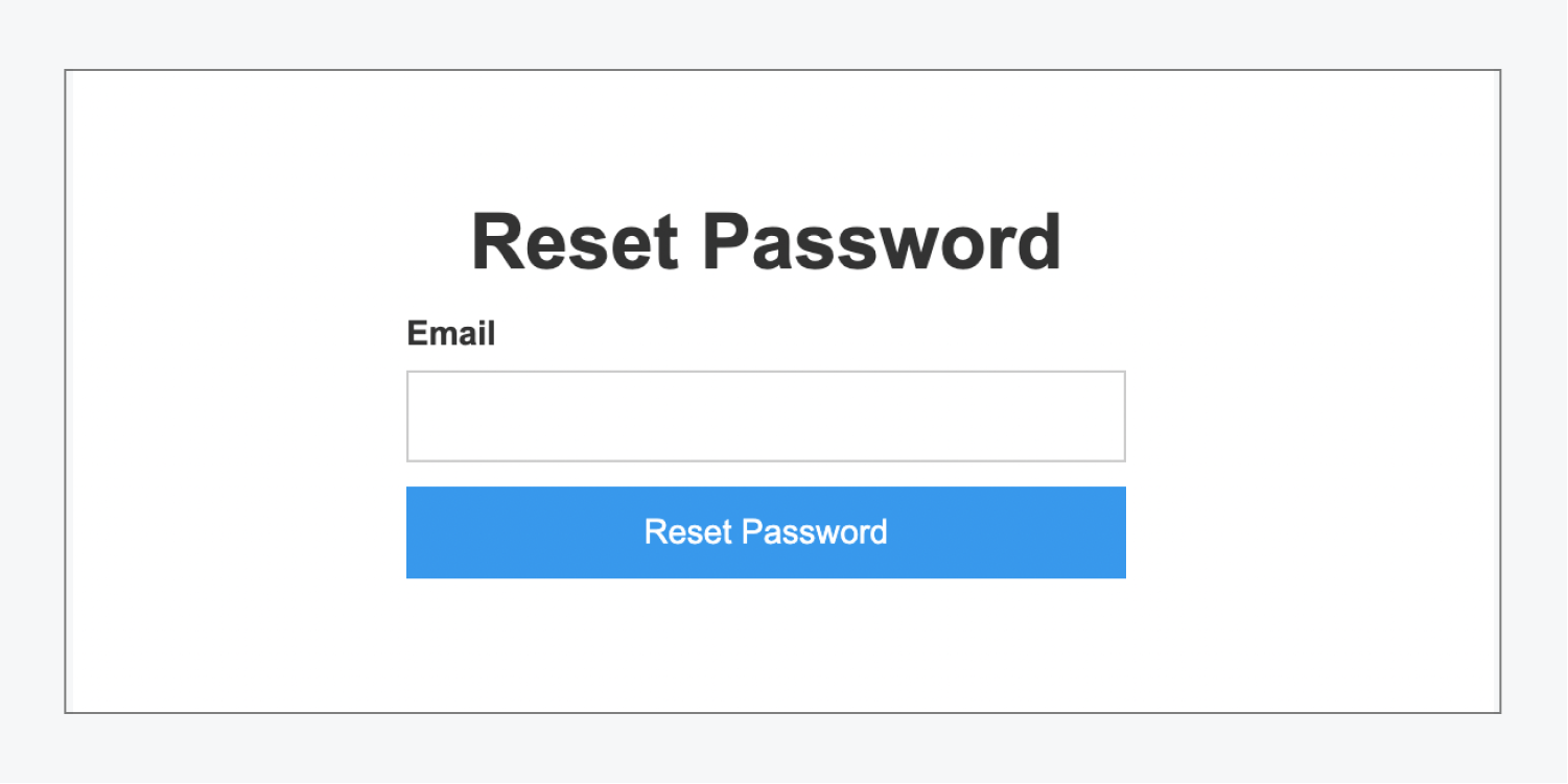
The Reset password form contains a heading, user email field, and a “Reset password” button. All elements in the form can be styled.
Note: The user email field and “Reset password” button can’t be removed from the reset password form.
Reset password form block states
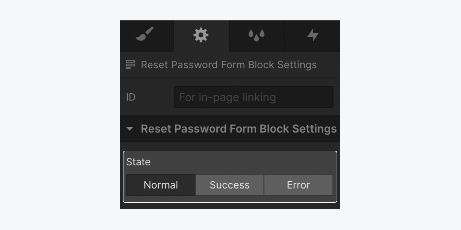
The reset password form block has 3 states: normal, success, and error. To access these states:
- Select the Reset password form block on the canvas
- Go to Element settings panel > Reset password form block settings
- Select the state you would like to access (e.g., normal, success, or error)
The normal state appears when the user first visits the reset password page. It allows the site visitor to submit their email address to reset their password.
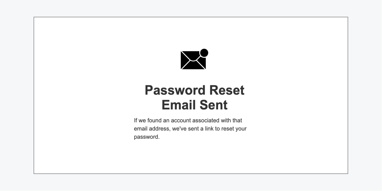
The success state appears when the user submits a valid email address in the reset password form. It contains an image, heading, and paragraph text which tells the user that an email was sent to that email address if there was an account associated with it. Any element in the success state can be edited or styled.
The error state appears when a site visitor submits an invalid email address. It shows a div block underneath the original reset password form with an error message inside.
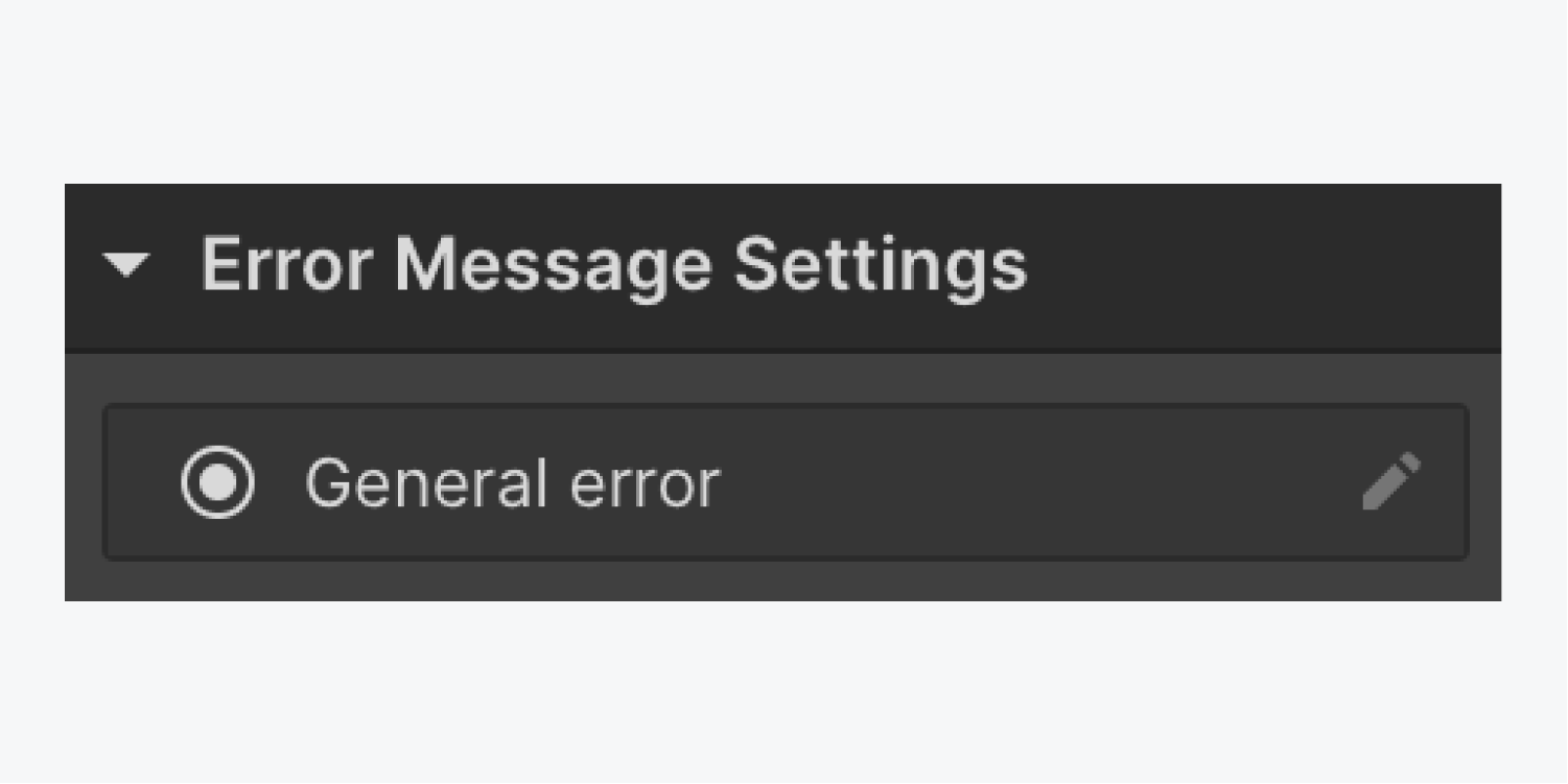
To edit the text on the error message:
- Select the Reset password form block on the canvas
- Go to Element settings panel > Reset password form block settings > State and select error
- Select the Error message on the canvas and go to Element settings panel > Error message settings
- Select the “pencil” icon to the right of General error
- Enter your new error message in the Edit text field
Update password page
The Update password page allows users to update their password. Users can access this page by clicking the “Reset password” button in the Reset password email they receive after submitting the reset password form.
The Update password form contains a heading, explanation paragraph, new password field, and an “Update password” button. All elements in the form can be styled.
Note: The user password field and “Update password” button cannot be removed from the form.
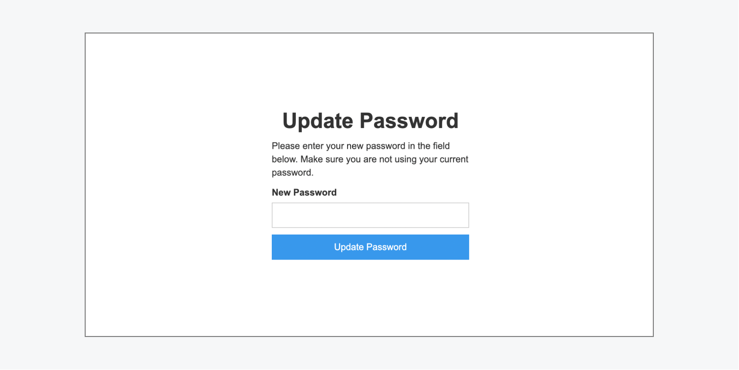
Update password form block states
The update password form block has 3 states: normal, success, and error.
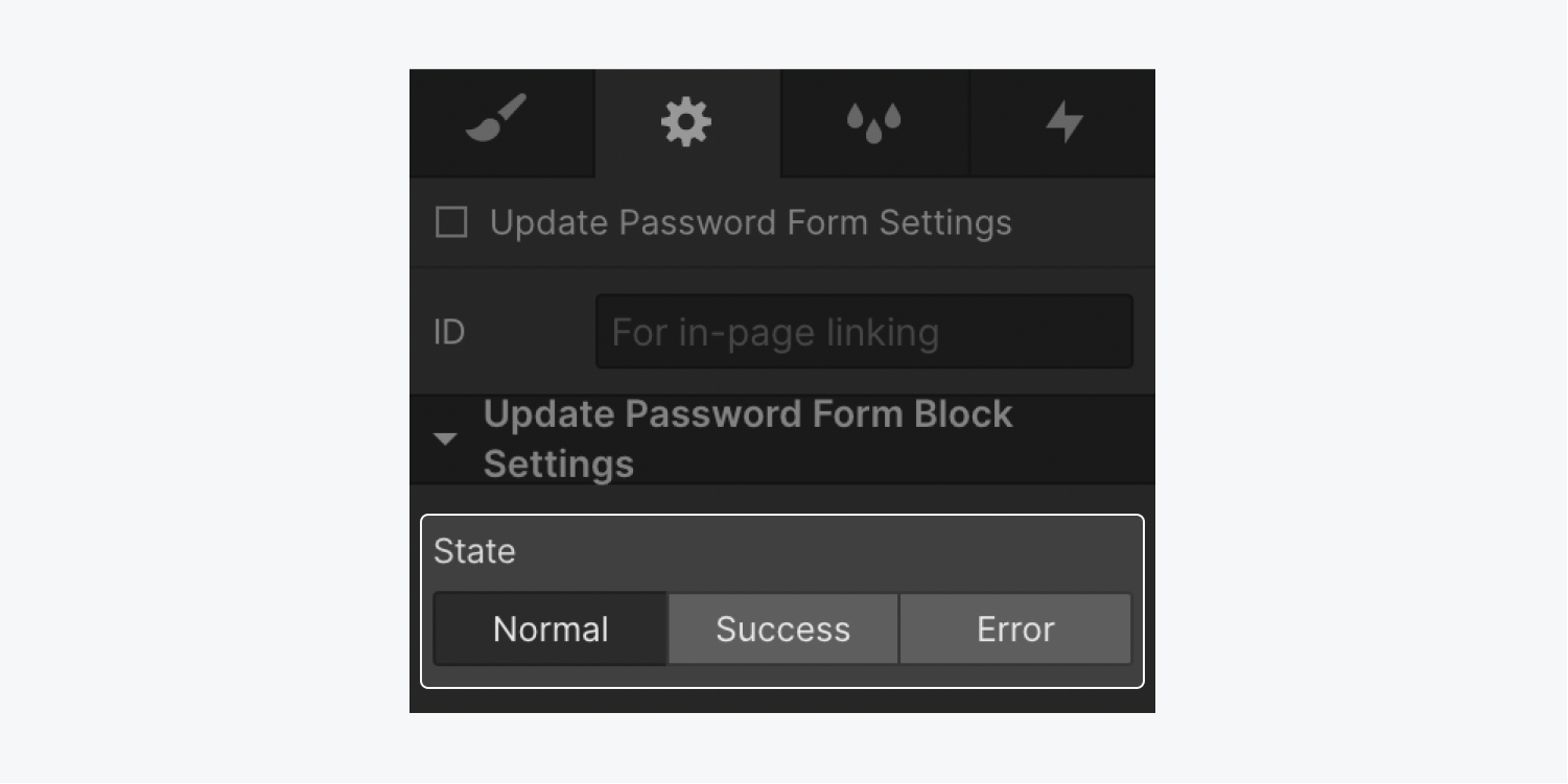
To access these states:
- Select the Update password form block on the canvas
- Go to Element settings panel > Update password form block settings
- Select the state you would like to access (e.g., normal, success, or error)
The normal state appears when the user first visits the update password page. It will allow the user to submit a new, updated password which needs to be at least 8 characters long.
The success state appears when a user submits a new, valid password. It contains an image, “Password updated” heading, paragraph text telling the user that their password was updated successfully, and a call-to-action button to take them to the homepage. When the user clicks the link to go to the homepage, they’ll be automatically logged in. Any element in the success state can be edited or styled.
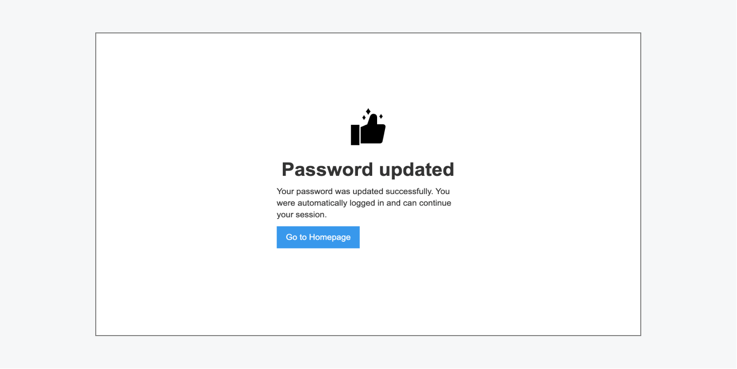
The error state appears when a user submits an invalid password or there is a general error submitting the form. It shows a div block underneath the original update password form with an error message inside. The div block and error message can be edited or styled.
There are 3 error messages that can appear on the update password page: general error, weak password, and repeat password used.
- General error – this error message appears when there’s a general error submitting the form. The default message says: “There was an error updating your password. Please try again, or contact us if you continue to have problems.”
- Weak password – this error message appears if the user submits a password fewer than 8 characters. The default error message says: “Your password must be at least 8 characters.”
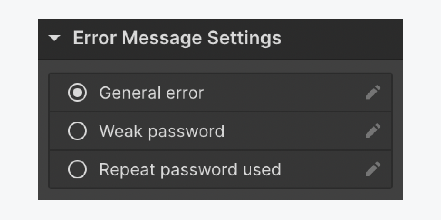
You can edit default error message text at any time:
- Select the Update password form block on the canvas
- Go to Element settings panel > Update password form block settings > State and select error
- Select the Error message on the canvas and go to Element settings panel > Error message settings
- Select the “pencil” icon to the right of the error message you want to edit
- Enter your new error message in the Edit text field
Access denied page
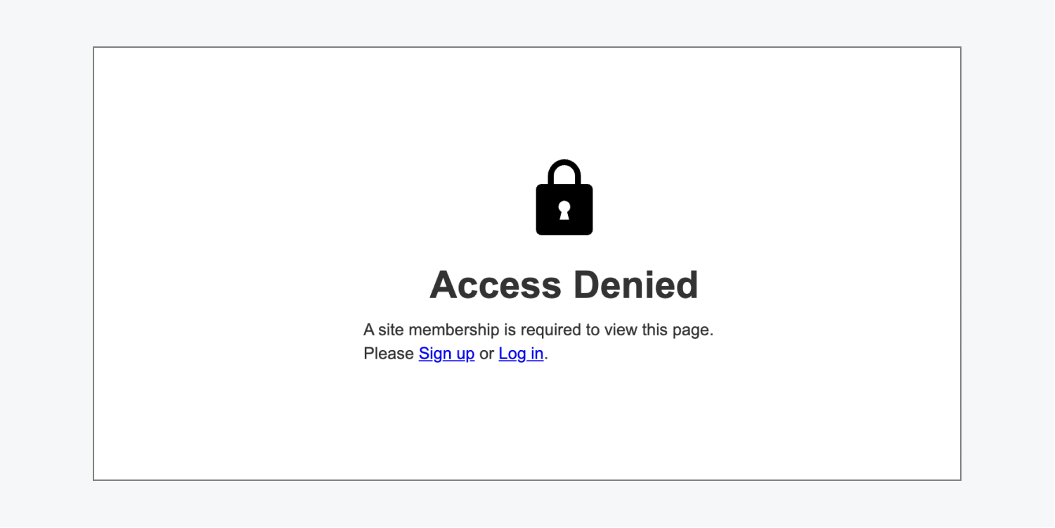
The Access denied page lets users know they have attempted to access a page that they do not have access to at that time. Users can only access that page if both of the following requirements are met:
- They are logged in
- They are part of the access group that allows them to access that particular restricted content
The form header contains a “lock” image and an “Access denied” heading. The paragraph underneath the form header explains that a site membership is required to view the requested page and contains 2 links, which point to the Sign up and Log in pages. You can style every element on the access denied page.
User account page
The User account page is where users (verified or unverified) can see their account information, such as their email, name, or consent to receive marketing emails. This page will show up pre-filled with the user’s data that they provided upon signing up for an account on your site. Additionally, if you have added any custom fields to your sign up form on the sign up page, you can add those fields here. A Reset password page link is also provided to the user if they need to reset their password.
The page consists of a heading (“My Account”) and a User account form, which contains a user email field and a name text field. Beneath the form fields, there’s a “Password settings” heading with a “Reset password” link below, a “consent to receive marketing emails” checkbox, a “Save changes” button, and a “Cancel” button. You can also add any custom fields that you have added to the sign up form on the Sign up page, or custom fields that you want visible only on the User account page. If the custom field is added to the sign up form on the sign up page, it will auto-populate with the answer(s) that users provided in the custom fields upon signing up for an account on your site. Additionally, if you have Ecommerce enabled on your site, you can add a Subscription element to the User account page so that users can manage their site subscriptions.
You can style all the elements in the form and on the User account page.
Note: The user email field cannot be removed from the user account form.

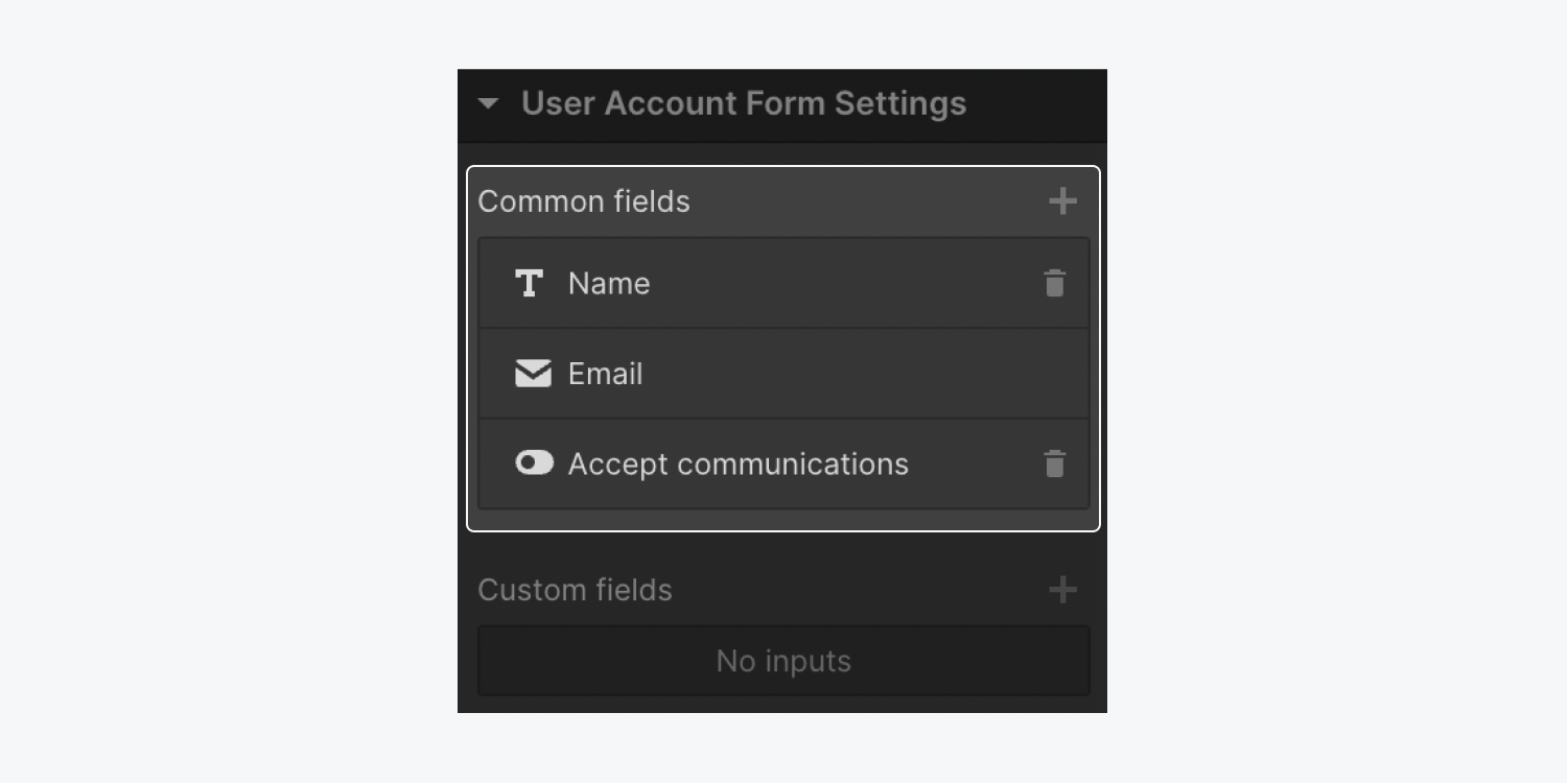
To add a common field:
- Select the User account form
- Go to Element settings panel > User account form settings
- Click the “plus” icon to the right of Common fields
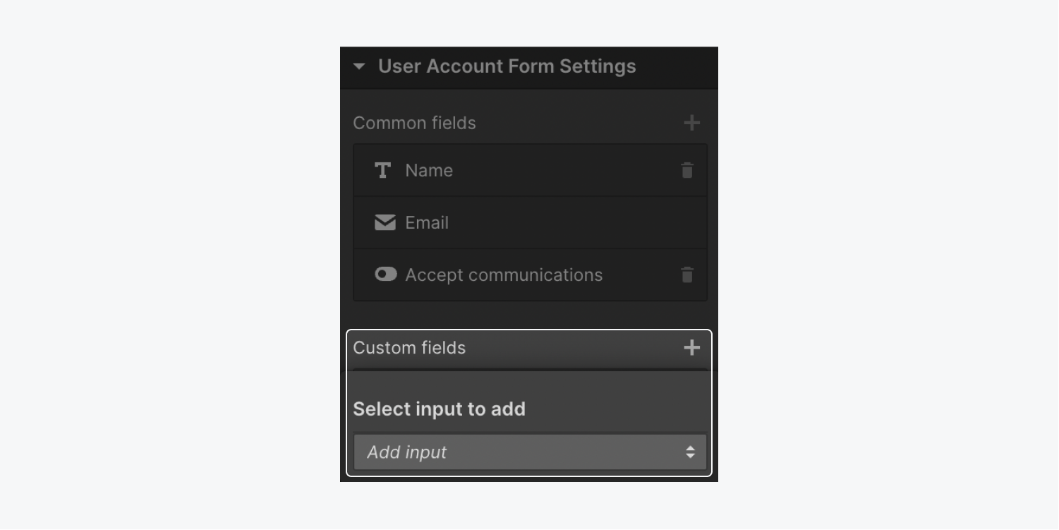
To add a custom field:
- Select the User account form
- Go to Element settings panel > User account form settings
- Click the “plus” icon to the right of Custom fields
- Select the field from the Add input dropdown
To remove a field:
- Select the User account form
- Go to Element settings panel > User account form settings
- Click the “trash” icon to the right of the field you want to remove, in either Common fields or Custom fields
Note: The “accept privacy policy and terms of service” checkbox does not appear as an option on the User account page. This is to ensure that users don’t un-accept the website’s privacy policy and/or terms of service.
User account form block states
The User account form block has 3 states: normal, success, and error.
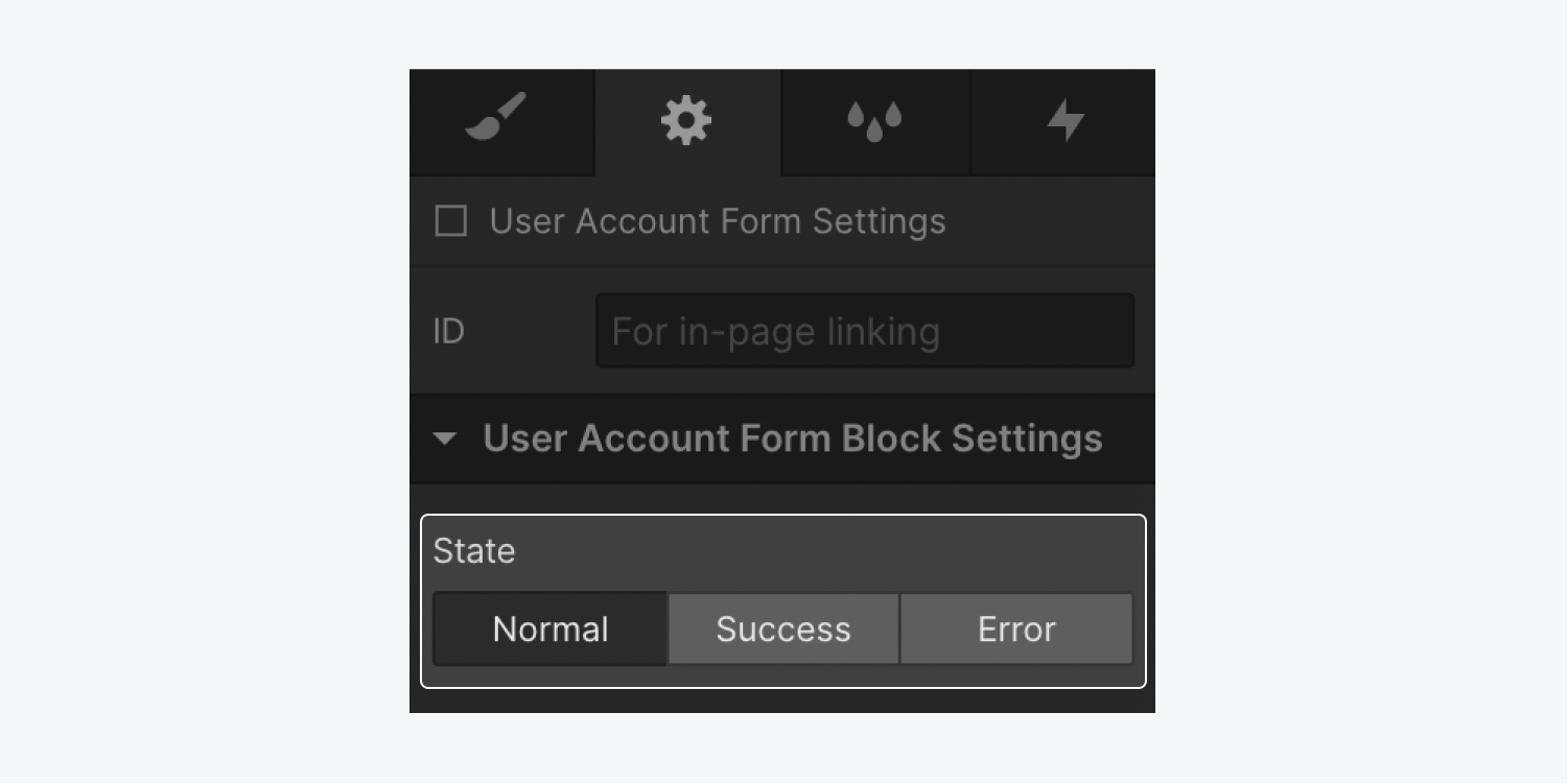
The normal state appears when a user first visits the User account page. It allows the user to see their personal information in the form, check or uncheck the “consent to receive marketing emails” checkbox, and save any changes they make.
The success state appears after the form is submitted and the user’s account is updated successfully. A paragraph will appear under the User account form, which says: “Your account was updated successfully.” This message can be edited or styled.
The error state appears when the form does not submit successfully. It shows a div block underneath the User account form with a general error message inside, which says: “There was an error updating your account. Please try again, or contact us if you continue to have problems.”
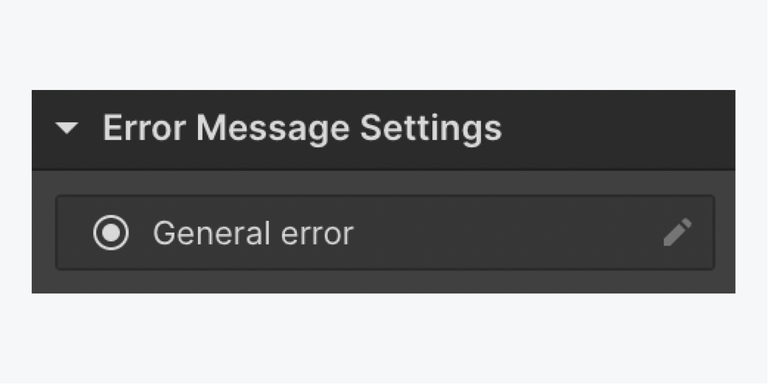
To edit the error message:
- Select the Error message on the canvas
- Go to Element settings panel > Error message settings
- Click the “pencil” icon to the right of general error
- Enter your new error message in the Edit text field
Subscriptions element
The prebuilt Subscriptions element can be added to the User account page so users can manage their site subscriptions directly from their User account.
Note: You must have both Memberships and Ecommerce enabled on your site to have access to the Subscriptions element. Please keep in mind that once Ecommerce is enabled on your site, there will be certain Collections, pages, and settings that you won’t be able to remove.
To add a Subscriptions element:
- Ensure that you are on the User account page
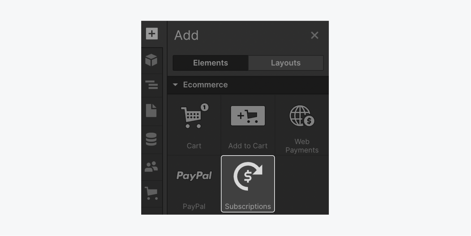
- Open Add panel > Elements > Ecommerce
- Drag the Subscriptions element onto the canvas
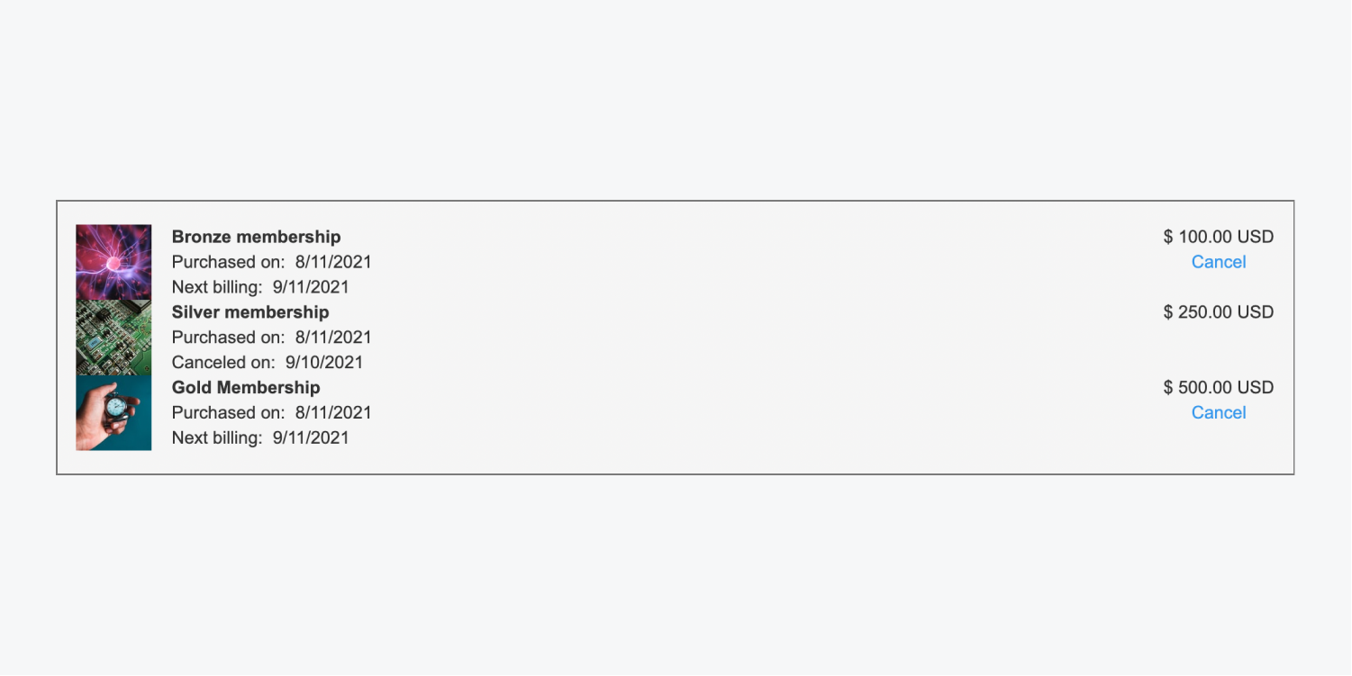
The Subscriptions element contains placeholder images and subscription details, such as the subscription name and price, purchase date, and next billing date (or upcoming cancellation date). It also contains a “Cancel” button, which allows users to cancel subscriptions directly from the User account page.
Important: Users must create and verify their account before they can purchase a membership product.
How to customize elements on User pages
Re-adding forms to User pages
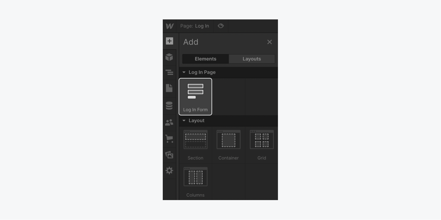
If you want to delete and re-add a form to a User page, you can do so by adding the form from the Add panel to its respective user page (e.g., you can add a Log in form to the Log in page). This is useful if you want to style the page's form from its original state.
Note: This option is only available on the Log in page, Sign up page, Reset password page, Update password page, and User account page. It is not available on the Access denied page.
Checkbox
By default, checkboxes appear on the Sign up page and the User account page. The sign up page comes with 2 checkboxes: the “accept privacy policy and terms of service” checkbox, and the “accept communications” checkbox. The user account page comes with 1 checkbox to consent to receive marketing emails.
You can style and customize any of these checkboxes.
In Checkbox settings, you can change the name of the checkbox. You can also switch the checkbox style between default and custom. Custom allows you to style the checkbox using the Style panel.
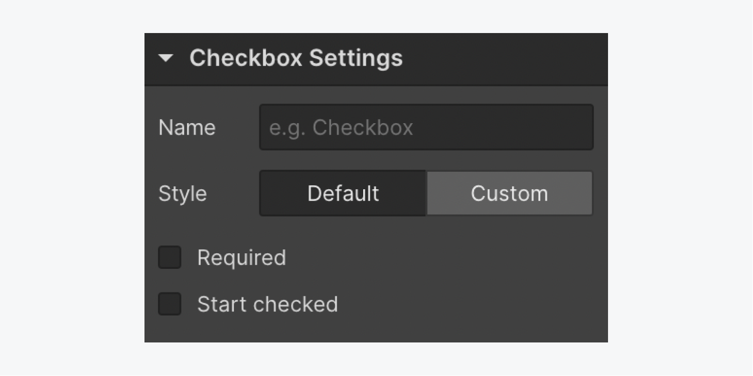
To make a checkbox required for form submission on either the Sign up page or User account page:
- Select the Checkbox on the canvas
- Open Element settings panel > Checkbox settings
- Check the “Required” checkbox
You can also uncheck the “required” checkbox if you don’t want a checkbox to be required for form submission.
To make a checkbox checked by default when either the Sign up page or User account page loads:
- Select the Checkbox on the canvas
- Open Element settings panel > Checkbox settings
- Check the Start checked checkbox
You can also uncheck the Start checked checkbox if you don’t want a checkbox to be checked by default when the page loads.
Text field
By default, text fields are included on all user pages except the Access denied page.
Placeholder text
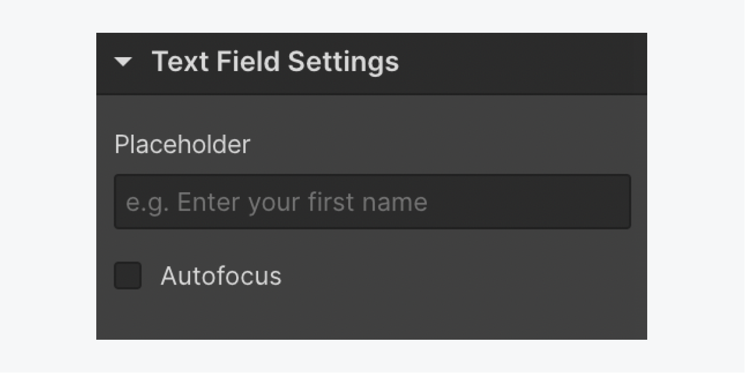
You can add placeholder text to any text field (e.g., regular, password, and custom fields). Placeholder text shows up as lighter text in the body of the text field and is usually used to add context to the purpose of the field (along with the field label itself). This placeholder text disappears once a site visitor starts typing in the field.
To add placeholder text:
- Select the Text field on the canvas
- Go to Element settings panel > Text field settings
- Add text to the placeholder field
Note: Depending on which text field you are editing, the field may be called something different than “Text field” (e.g., “User email field,” “User password field,” etc.).
Important: You should never use placeholder text as a replacement for a field label, or to provide crucial information or help text for its related input field (e.g., “Password must be between 8-20 characters”), because placeholder text won’t be translated for site visitors using translation tools and isn’t available to assistive technology like screen readers. Additionally, because placeholder text disappears when site visitors start typing in the field, using placeholder text in place of a label makes it difficult for site visitors to remember what information belongs in the field.
Autofocus
You can add autofocus to any non-password text field (e.g., regular and custom fields). When a field has the autofocus checkbox checked, the site visitor’s cursor will be inside the text field when the page loads. Typically, autofocus is set on the first text field in a form.
To add autofocus to a field:
- Select the Text field on the canvas
- Go to Element settings panel > Text field settings
- Check the autofocus checkbox
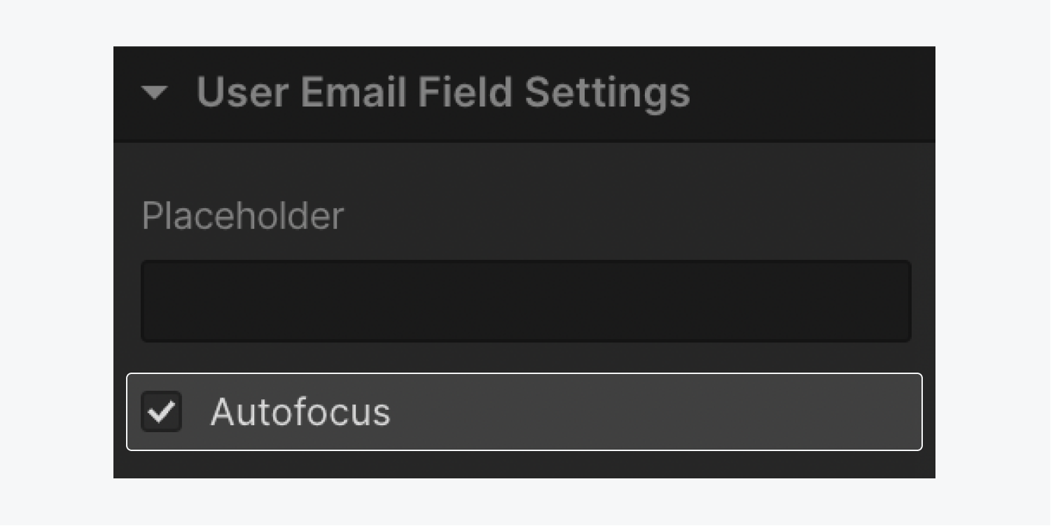
If you accidentally add autofocus to 2 or more fields in a form, the autofocus will be set on the first field in the page navigation.
Additionally, it’s best practice to ensure that the autofocus checkbox is unchecked for any hidden form fields, as this may cause issues with form submission. Learn more about autofocus in forms.
Buttons
Submit button
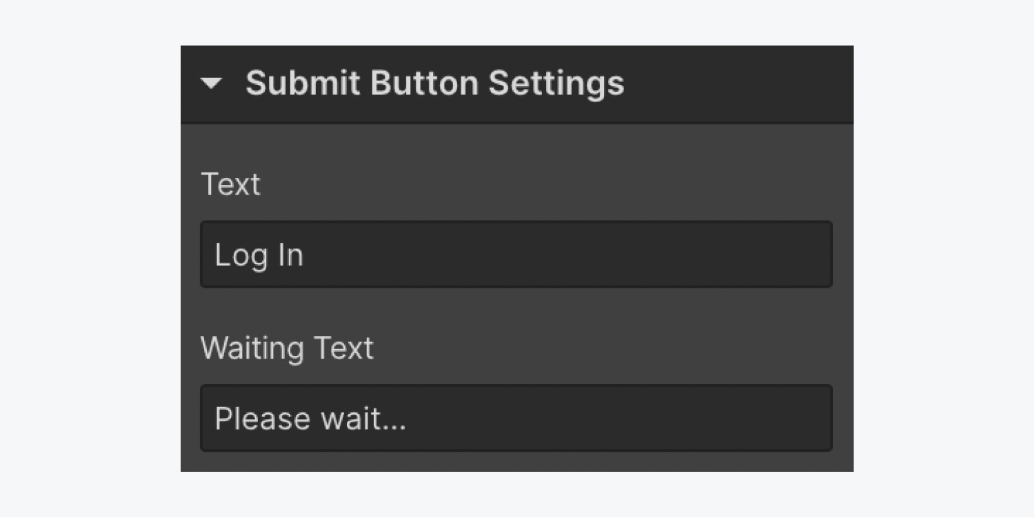
You can customize the default and waiting text of any submit button on the user pages. The default text appears when the page loads. The waiting text appears while the form is being submitted and often says something like: “Please wait…”
To edit the default text on a submit button:
- Select the Submit button on the canvas
- Open Element settings panel > Submit button settings
- Edit the text in the Text field
To edit the waiting text on a submit button:
- Select the Submit button on the canvas
- Open Element settings panel > Submit button settings
- Edit the text in the Waiting text field
Cancel button
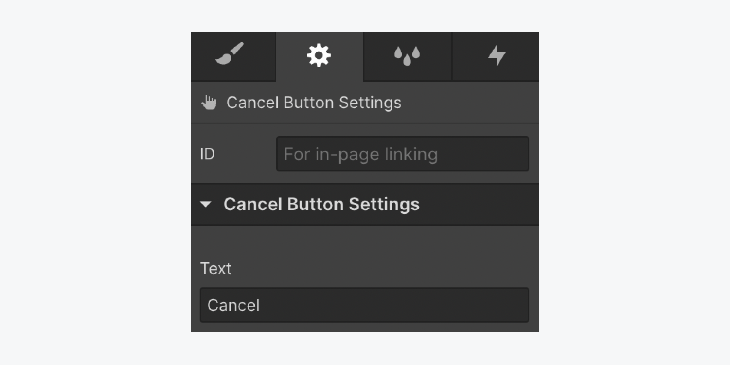
You can customize the cancel button’s default text on the User account page. The default text appears when the page loads.
To edit the default text on the cancel button:
- Select the Cancel button on the canvas
- Open Element settings panel > Cancel button settings
- Edit the text in the Text field
Links
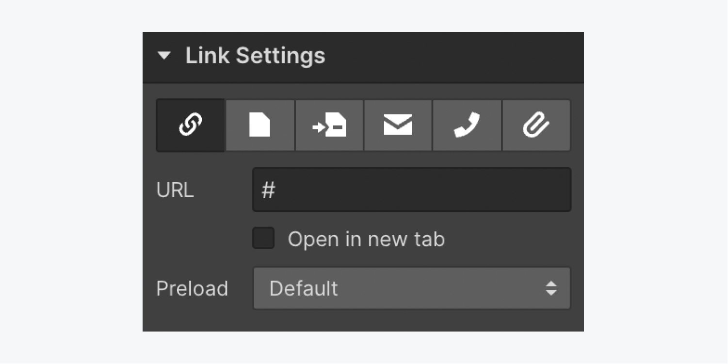
You can change link settings and where a link will send users when they click on it. By default, all user pages (except for the Reset password page and Update password page) have links.
To access link settings:
- Select the Link on the canvas
- Open Element settings panel > Link settings
User account settings
The User account settings tab allows you to see the User data fields available to you in Memberships (Basic info and Custom fields). You can also view a Form preview in User account settings, which displays how users will see form fields when entering their information.
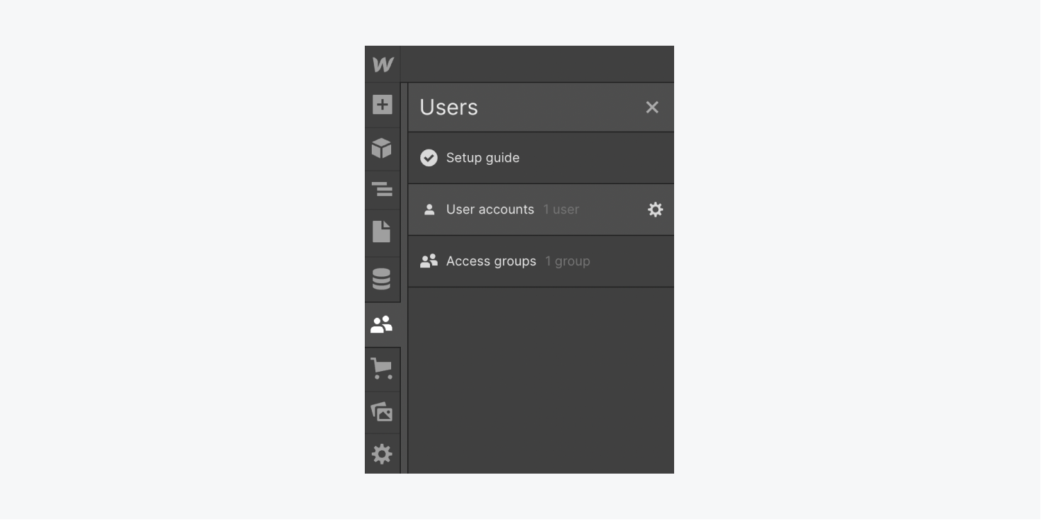
To access User account settings:
- Open the Users panel
- Hover over the User accounts tab and click the settings “cog” on the right side
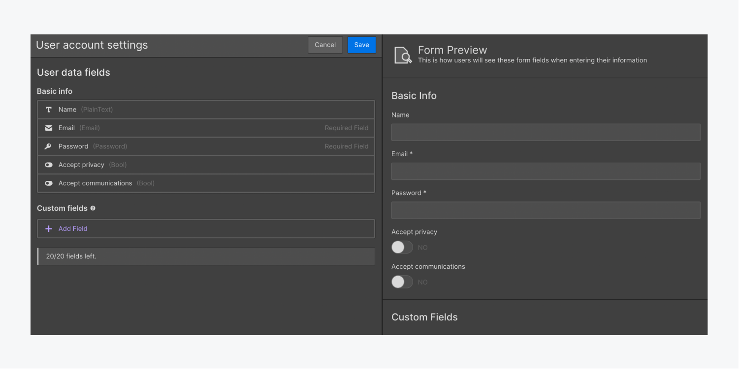
Custom fields
There are 2 types of input fields in User pages forms: common fields and custom fields. Common fields are typically included in sign-up forms, such as an email address field, a name field, and a password field. You can create Custom fields to collect additional information that is relevant to your site (e.g., an “Industry” field for a career networking site).
You can add custom fields to the sign up form on the Sign up page, and to the user account form on the User account page. You can add up to 20 custom fields per site, which allow you to collect additional information from users. This data can be accessed by site owners in User accounts and by users from the User account page.
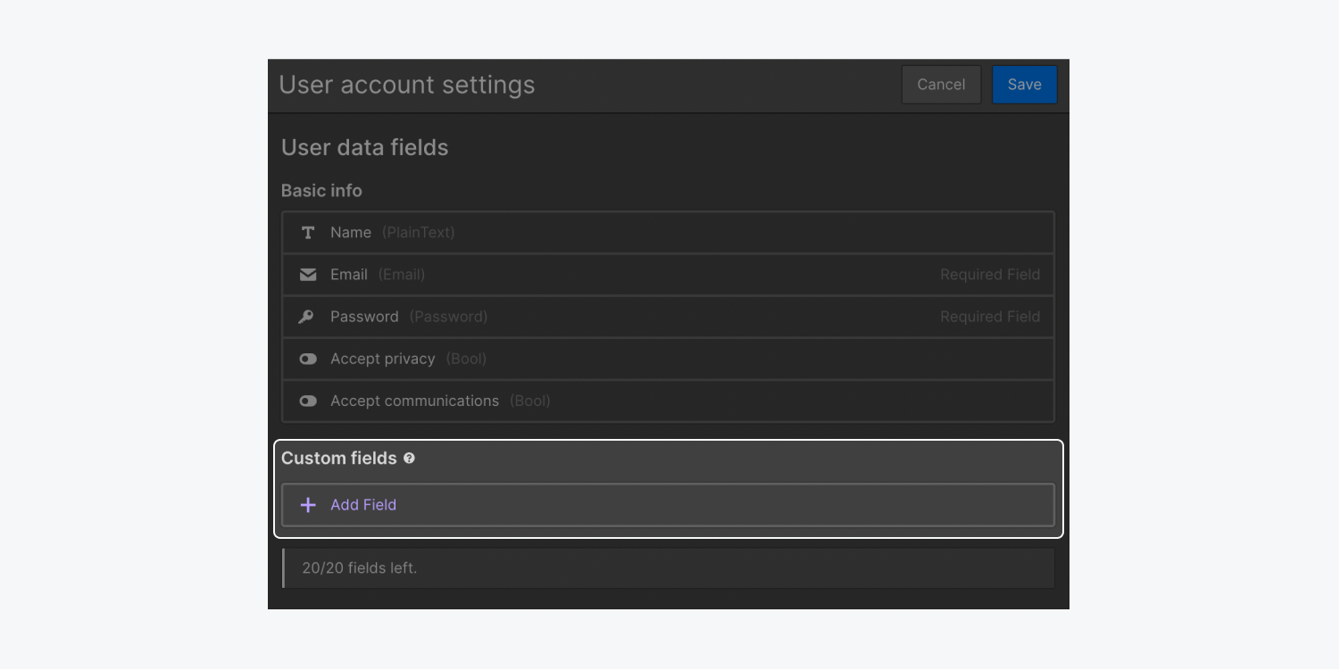
To add a custom field:
- Open the Users panel
- Hover over the User accounts section and click the settings “cog” icon that appears on the right side of the section
- Click Add field in the Custom fields section
- Select a Field type
- Input the custom field name, which will appear above the field as a field label
- Input the custom field slug
- Set other fields as needed
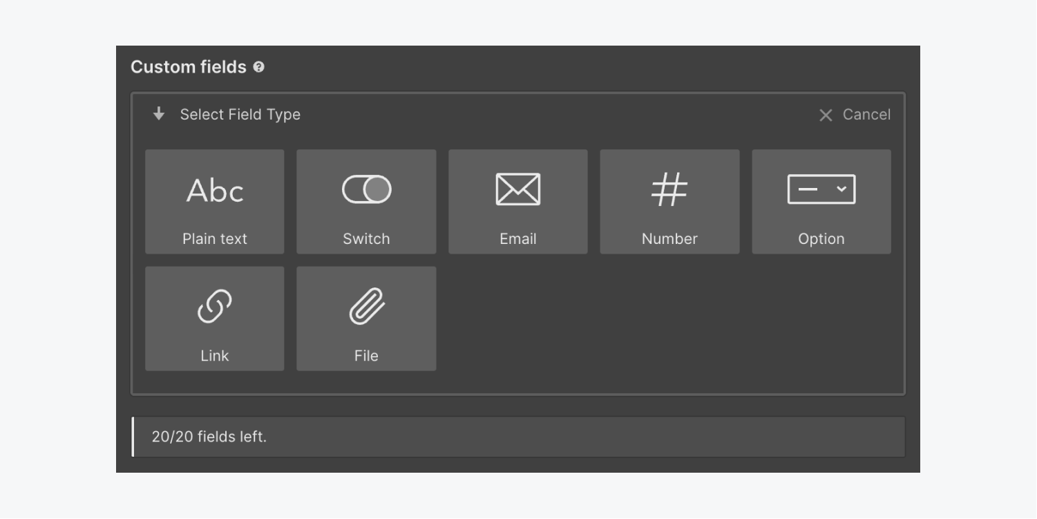
Keep in mind that your custom fields must be added to the Sign up page and User account page after adding them in the User account settings. They won’t automatically show up in the default forms.
Note: Minimum and maximum character counts are useful if you want to control the information a user inputs into a custom field. For instance, if you would like a user to submit their 2 letter country abbreviation, you can set both the minimum and maximum character counts to 2. If you add a minimum character count or maximum character count to your custom field, you might want to create a note on your form about those limits so users know what to expect and submit valid information.
Note: If you set a field as “required” when creating or updating a custom field, that setting will transfer automatically to the custom field in the Designer. You can’t change whether a custom field is required or not required in the Designer. You have to change this setting in User account settings.
To update a custom field:
- Open the Users panel
- Hover over the User accounts section and click the settings “cog” icon that appears on the right side of the section
- Go to the Custom fields section
- Hover over the custom field you want to update and click the settings “cog” icon that appears on the right side of the custom field label
- Update the selected custom field
To remove a custom field:
- Open the Users panel
- Hover over the User accounts section and click the settings “cog” icon that appears on the right side of the section
- Go to the Custom fields section
- Hover over the custom field you want to update and click the settings “cog” icon that appears on the right side of the custom field label
- Click the “trash” icon at the top of the selected custom field settings
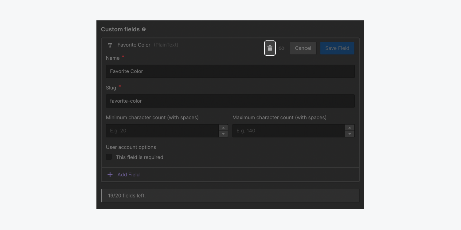
Reserved URL slugs
When Memberships User pages are added to your site, each page has a preset slug:
Log in page: /log-in
Sign up page: /sign-up
Reset password page: /reset-password
Update password page: /update-password
Access denied page: /access-denied
User account page: /user-account
These user page slugs can’t be edited. Additionally, if you decide to remove Memberships from your site in the future, you won’t be able to use these reserved slugs for new pages.
How to exclude a User page from site search results
You can exclude a User page from site search results to ensure that users won’t be able to find this page when searching your site.
To exclude a page:
- Click on the Pages icon to open the Pages panel
- Hover over the User page that you would like to exclude and click the settings “cog” icon that appears on the right side of the page label
- Go to Site search settings
- Check the “Exclude this page from site search results” checkbox
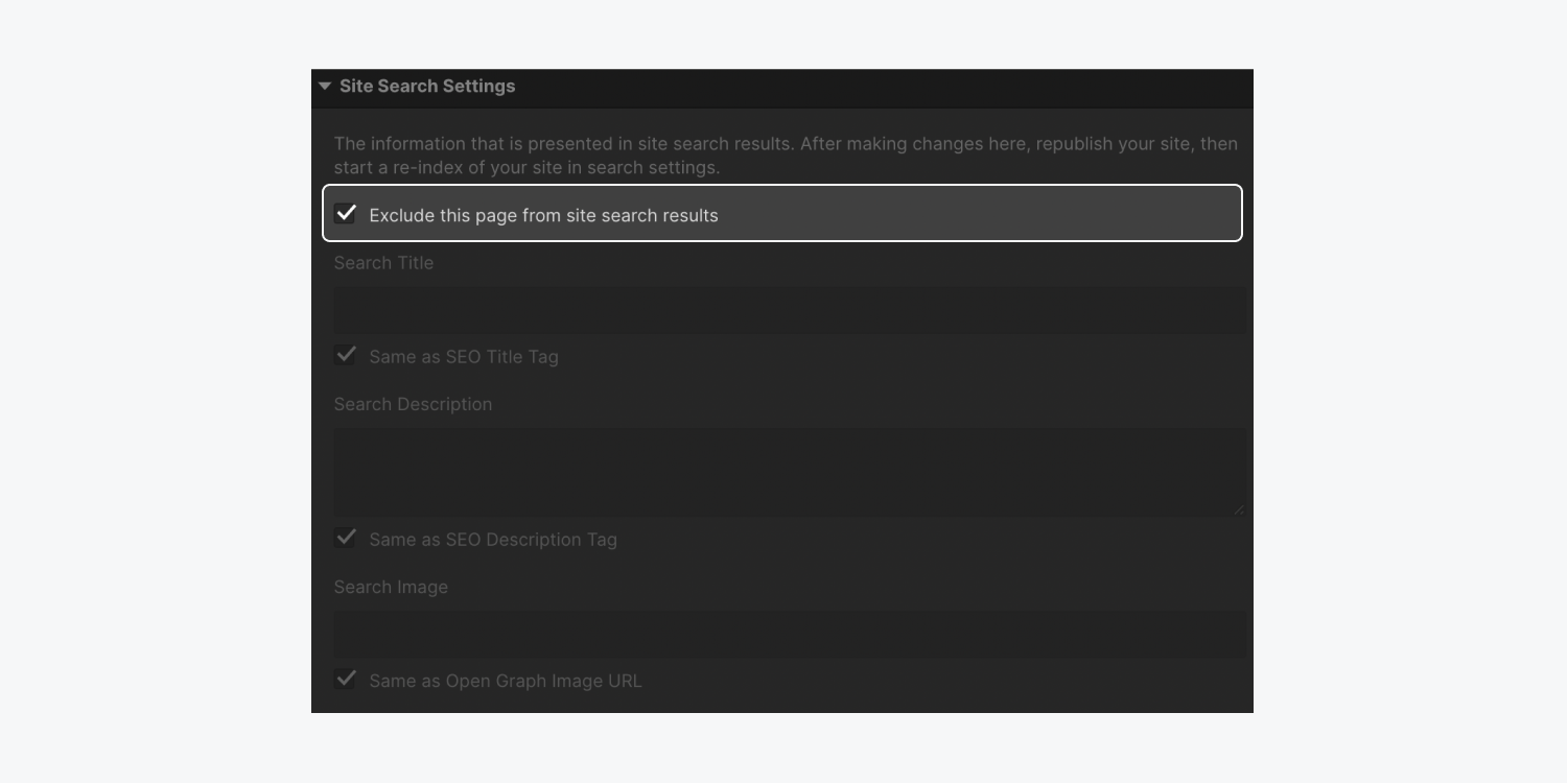
Learn more about excluding static pages.
How to exclude a User page from search engine indexing
You can disable search engine indexing of your user pages to ensure that search engines won’t index those site pages or list them in search results.
To disable search engine indexing of your user pages, add robots.txt rules to your site. If your user pages have already been indexed by search engines, use the noindex meta code to remove that content from search engine indexes.


