The menu button is an element inside the Navbar that organizes the nav links when there is limited horizontal space, like on a mobile device. It is sometimes referred to as the “hamburger menu."
The menu button and its functionality are built into the Navbar element, and can be accessed and configured in a number of ways. We’ll cover four aspects of the menu button:
Triggering the menu
By default, the nav menu button appears on tablet breakpoint and below. You can go to preview mode and see the menu appear in your navbar when you switch to these devices. Clicking that menu button will expand the nav menu and clicking the button again collapses the nav menu.
On the desktop breakpoint, you can see that the nav links are nested inside the nav menu element. This nav menu is the same element that displays when the menu button is clicked—it just displays the nav links in a vertical list.
Triggering the menu in the Designer
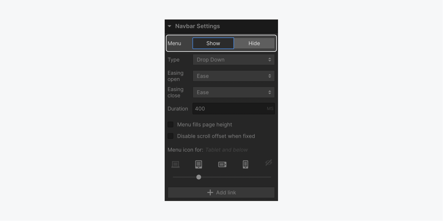
You can open the nav menu in the Designer with the following steps:
- Select the Navbar or any element inside it
- Open Settings panel > Navbar Settings
- Choose to Show the menu
Device visibility
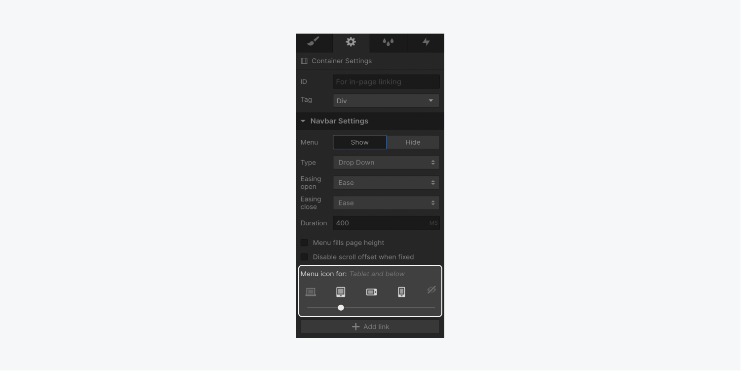
By default, the Navbar menu button appears in the tablet breakpoint, but this can be changed. The button can be made visible on all breakpoints or none at all. Follow these steps to change the visibility:
- Select the Navbar or any element inside it
- Open Settings panel > Navbar Settings
- Use the device options slider to choose where the Menu button first appears
Menu animations
There are three types of reveal animations that can be used for the menu:
- Drop down
- Over right
- Over left
You can select the reveal animation in the Settings panel.
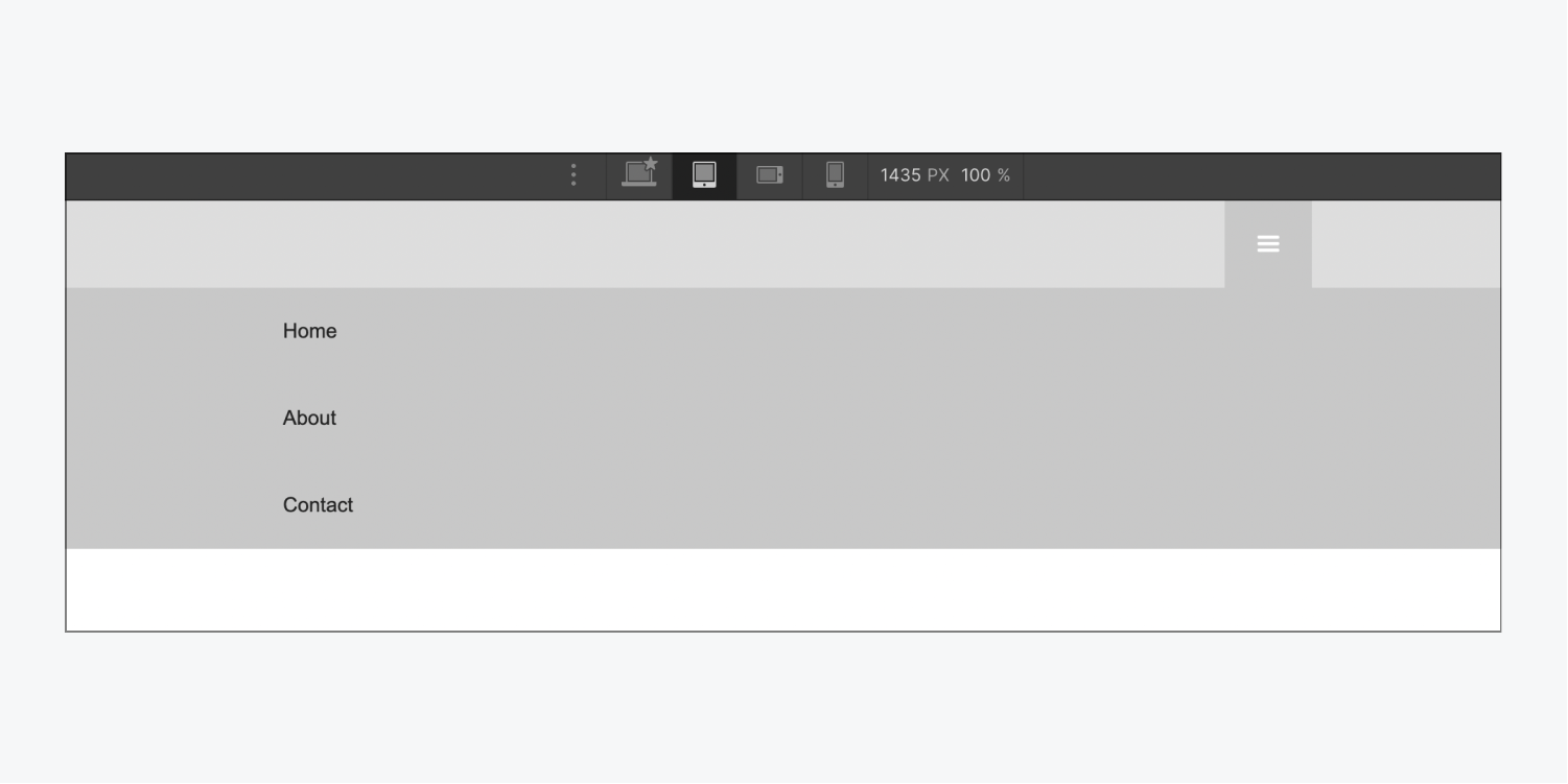
Dropdown
This is the default menu type. When the menu button is clicked, the nav menu will drop down from the Navbar. The nav menu will take up the full width of the browser window by default.
Over Right
When this menu type is selected, the nav menu will move over from the right side of the screen when the menu button is clicked. Note that this menu type will take up the full height of the browser window.
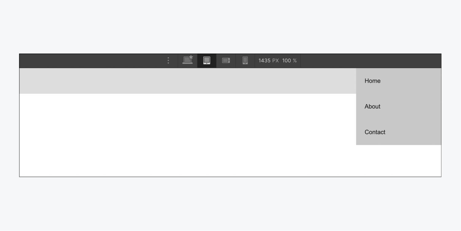
Over Left
This menu type is the same as Over Right, except the nav menu will move from the left. This menu type will also take up the full height of the browser window.
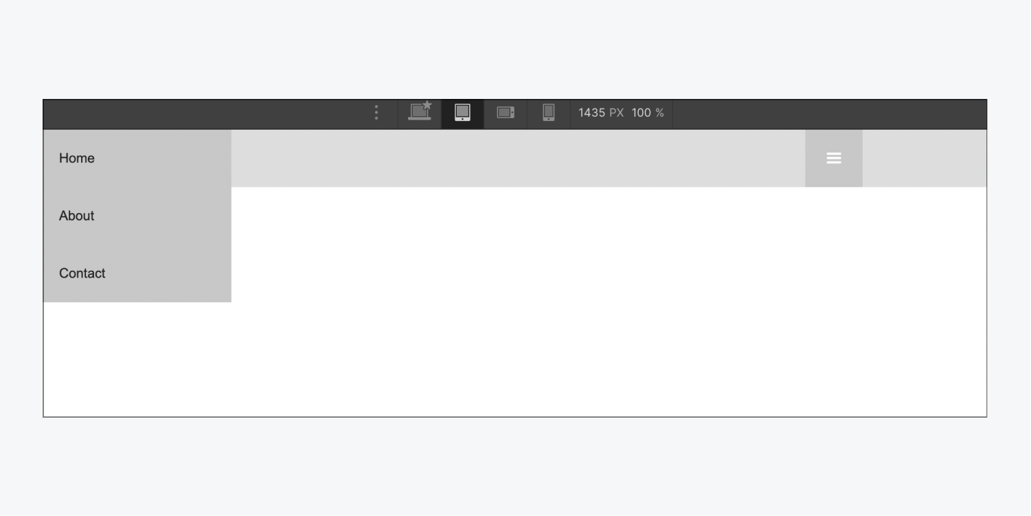
Menu easing and transition
For all these menu types, you can control the type of easing curve that's used to animate the open and close transitions. You can also adjust the duration of the transition.
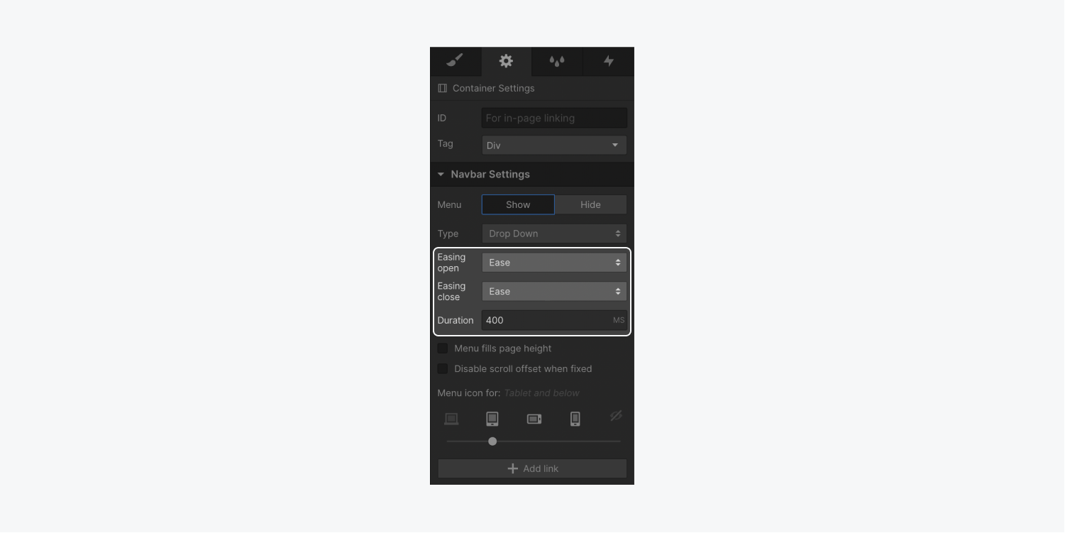
Styling the menu button
You can style any aspect of the Navbar or the nav menu. Since styles cascade down from larger breakpoints, select the highest breakpoint that you have the Navbar menu button enabled and then add styles.
Styling the button
When in tablet view, for instance, you can select the menu button and set the button’s background color.
- Select the menu button
- Open Style panel > Backgrounds
- Click the swatch to open the color picker and choose a color
Styling the icon
You can also style the menu icon using typography settings. The icon will inherit these typography styles from its parent element, the menu button.
To change the size of the menu icon:
- Select the menu button
- Open Style panel > Typography
- Change the Size to make the menu icon larger or smaller
You can also change the color of the menu icon by adjusting the font color.
To change the color of the menu icon:
- Select the menu button
- Open Style panel > Typography
- Click the swatch to open the color picker and choose a color
Note: The contents of the button are customizable. The menu icon can be deleted and replaced with a custom image or a text element.
Styling the open state
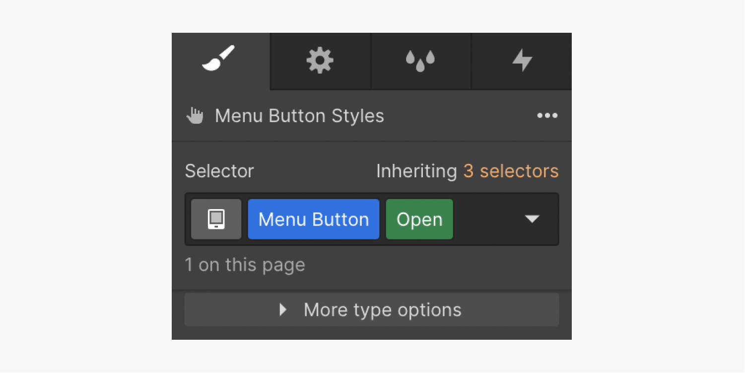
The appearance of the menu button can be customized based on the state of the menu (Show or Hide). When you have Show menu enabled, and make a style change to the menu button OR add a class to it, a special “Open” class is automatically added in the selector field.
Similar to how styling works on the default state you can apply background and typography styles on the menu button to change the background color and icon color.
