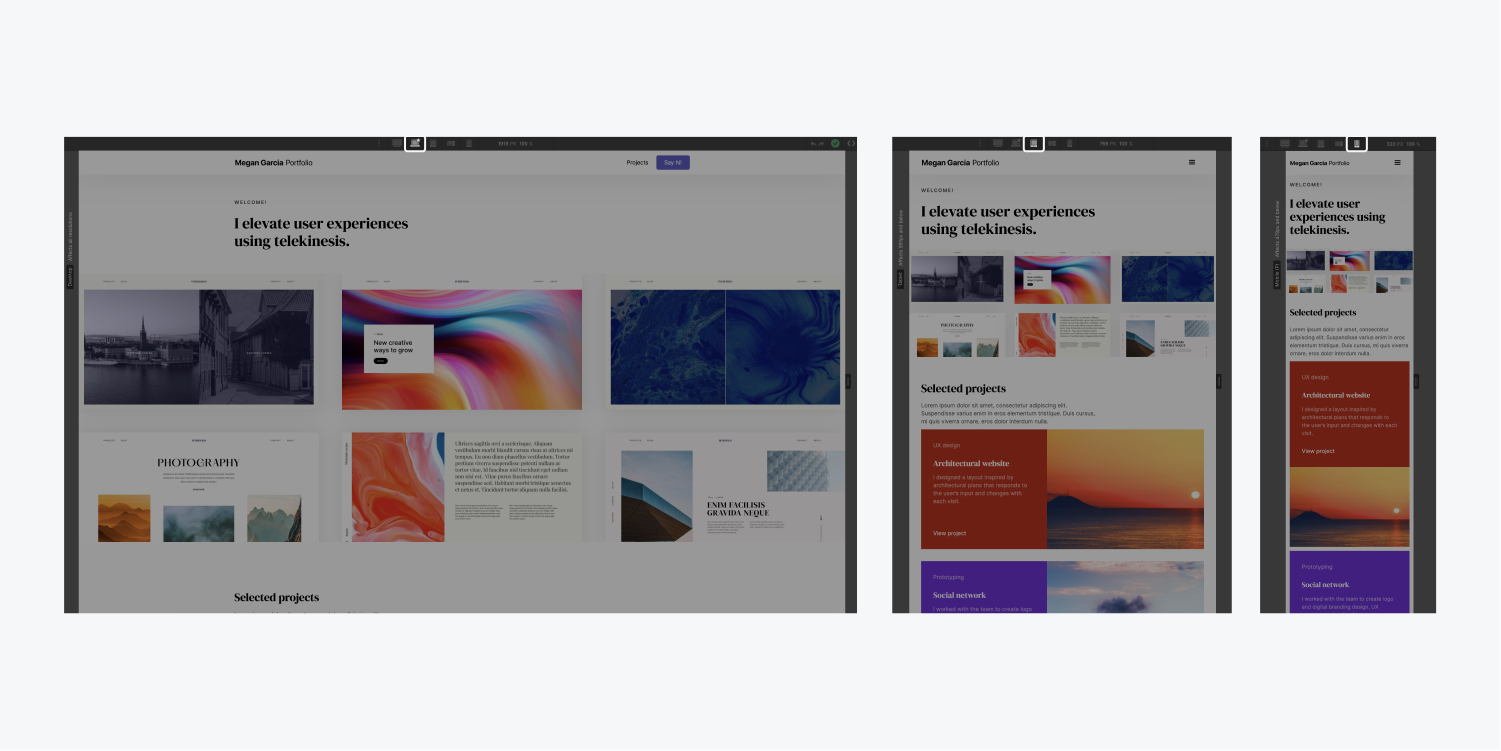
When you visit a site on your mobile device, you may see a desktop version of the site crammed into a smaller screen—forcing you to zoom and pan to see any content. You may also land on a watered-down mobile version that lacks the content and experience that makes the desktop version superior. Hopefully, though, you see a responsive website—a design that reflows and repositions content based on the width of the browser.
There are three different aspects to responsive design we’ll be covering here:
- Reflowing content
- Fixed sizing
- Relative sizing
- Breakpoints (media queries)
Reflowing Content
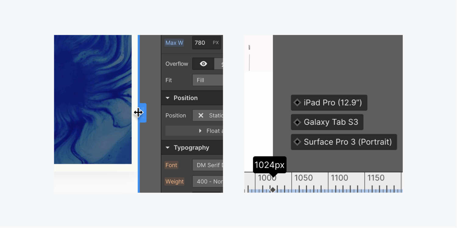
Reflowing content refers to content that adjusts its width based on the browser’s viewport width. For example, a paragraph with default settings will automatically wrap it’s content as a browser’s width gets smaller. This behavior can be emulated by dragging the edge of the Designer canvas.

Fixed sizing
It’s important to be mindful when using fixed pixel widths. For example, if you give an image a width of 500px it may look great on a desktop or a tablet. However, when viewing the image on a smaller mobile device, the image width will be stuck at 500px and not adapt to the smaller viewport (usually less than 500px).

Relative sizing
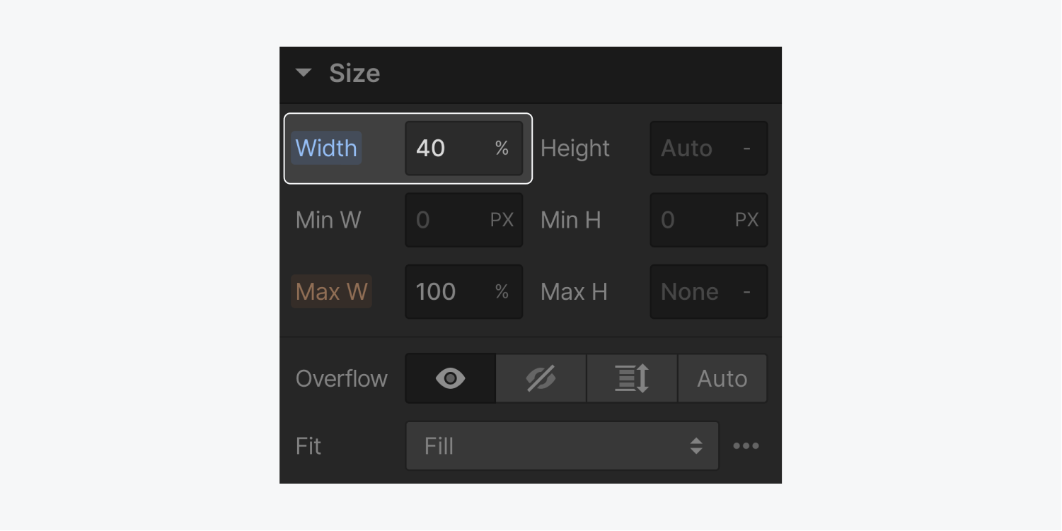
This refers to setting an element’s size relative to other things such as the browser width or a parent element. For example, instead of using a pixel-based size for an image, consider using different units such as %, VW (viewport width), or VH (viewport height). If you use % on an image and adjust the browser width, you can see that it will adapt accordingly while a px based image will not.

Learn more about applying different units to control element width and height.
Breakpoints

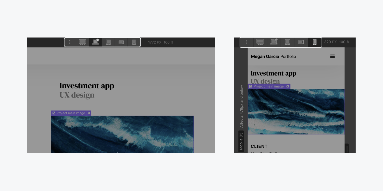
Layouts are usually much more complex than managing one image’s width. Using breakpoints (also known as media queries) allows you to not only test reflowing content, but also to modify the design and layout based on different device width ranges.

Get an introduction to breakpoints and learn about styling across multiple breakpoints.


