With text columns, you can use horizontal space efficiently and maintain readability. In the Style panel, you can create columnar text that applies to text elements and other elements, such as forms. You can also set headings to span multiple columns or wrap within their column.
Columns
To wrap your content in multiple columns, set the column count, or number of columns, in the input field.
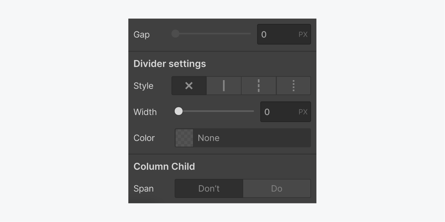
Open the text column properties to customize the column settings.
Column count
The default value in the column count input field is set to auto, or one column.
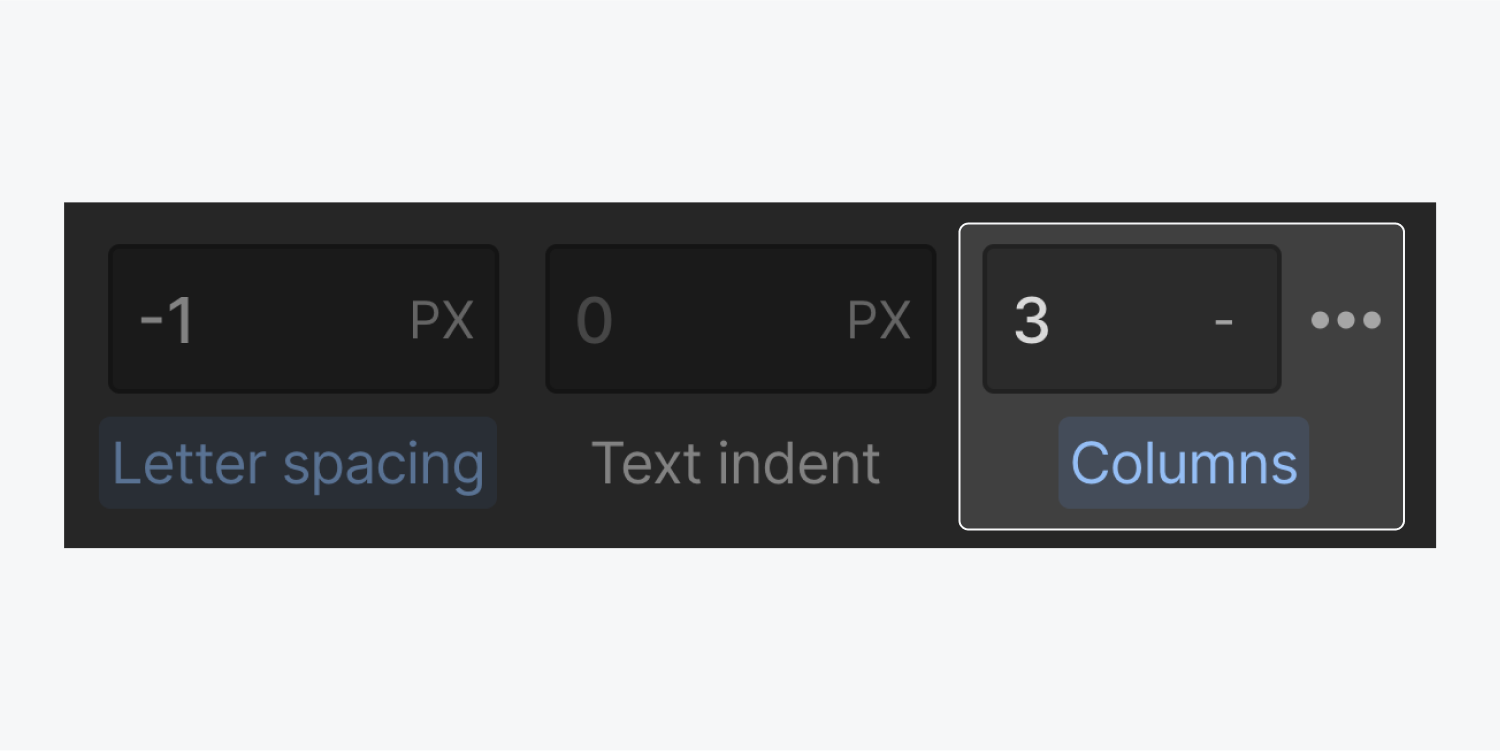
You can specify the number of columns in the column input field. To make sure content displays in one column on mobile devices, open the mobile view and set the column count to auto.
Text column properties
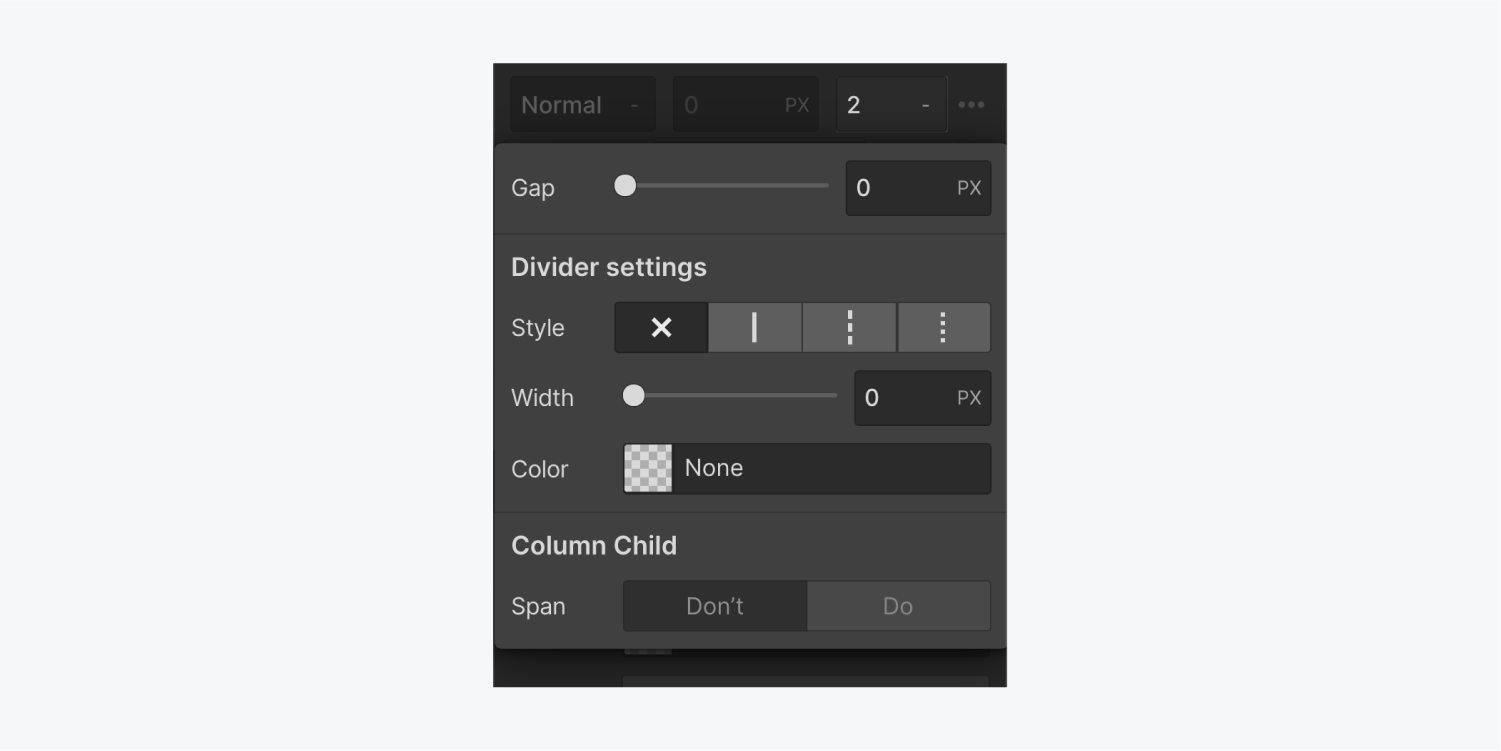
Once you’ve specified the number of columns, open the text column properties next to the column count input.
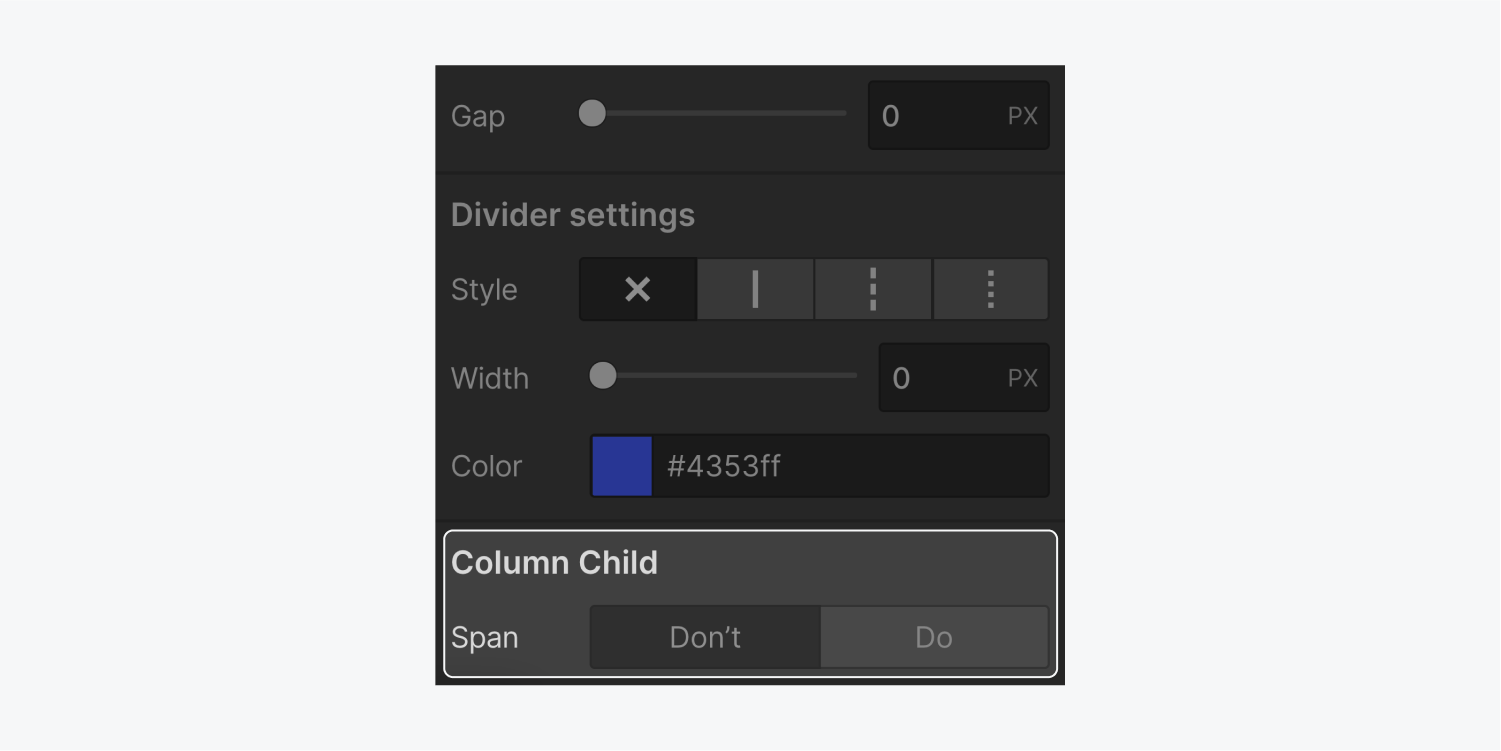
Here, you can define the gap between your columns, add and style a column divider, or set a column child to span all columns.
Gap
The default gap (the space between columns) is 0 px. You can customize it in the column properties.
Learn more about input values and units.
Divider settings
You can add a divider (a line or rule) between the columns if you’re going for a newspaper look. You can customize the style, width, and color of this divider here.
Style
Choose between the following line styles:
- No rule (x)
- Solid ————
- Dashed -------
- Dotted …….
Width
Use the selector or input field to specify how thick your divider is. You can use both integers and decimals.
Color
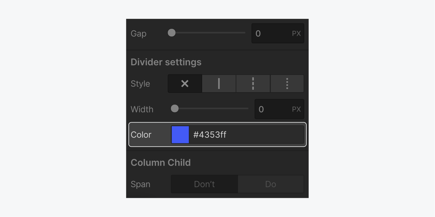
Specify the color of this divider by typing the color value or name in the input field or using the color picker.
Column child
Once you apply the columns property to an element, any element inside becomes a column child. By default, column children wrap to the next column — their span setting is set to “don’t.” You can override this setting for specific children.
Span
By default, column children are set to don’t span. If you want an element, such as a heading, to span all columns, select the element and change the span setting to “do”.


