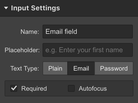
Forms are great for lead generation, gathering feedback, and other valuable business use cases. Learn how to use forms. Form elements can also be styled and positioned in unique ways.
In this lesson
You can customize most of the form elements — such as remove the input field borders, change the background color, etc... You can also customize and style the file upload button in its various states as well. Read the in-depth guide on form file upload. In this lesson however, we cover the following:
- Styling form typography
- Styling form states
- Styling the focus state of form fields
- Using columns to quickly layout form elements
Styling form typography
You can style the field labels, the placeholder text, as well as the input text.
Styling field labels
If you're using field labels, you can add a class to each label. This will let you make styling changes that apply to each field label that has that class.
Pro tip — Field labels vs placeholder
Field labels can be helpful to show the purpose of a form element. If you prefer a more minimal approach, you can delete them from your form by selecting them and pressing delete. Then add placeholder text for your fields.

Styling the placeholder text
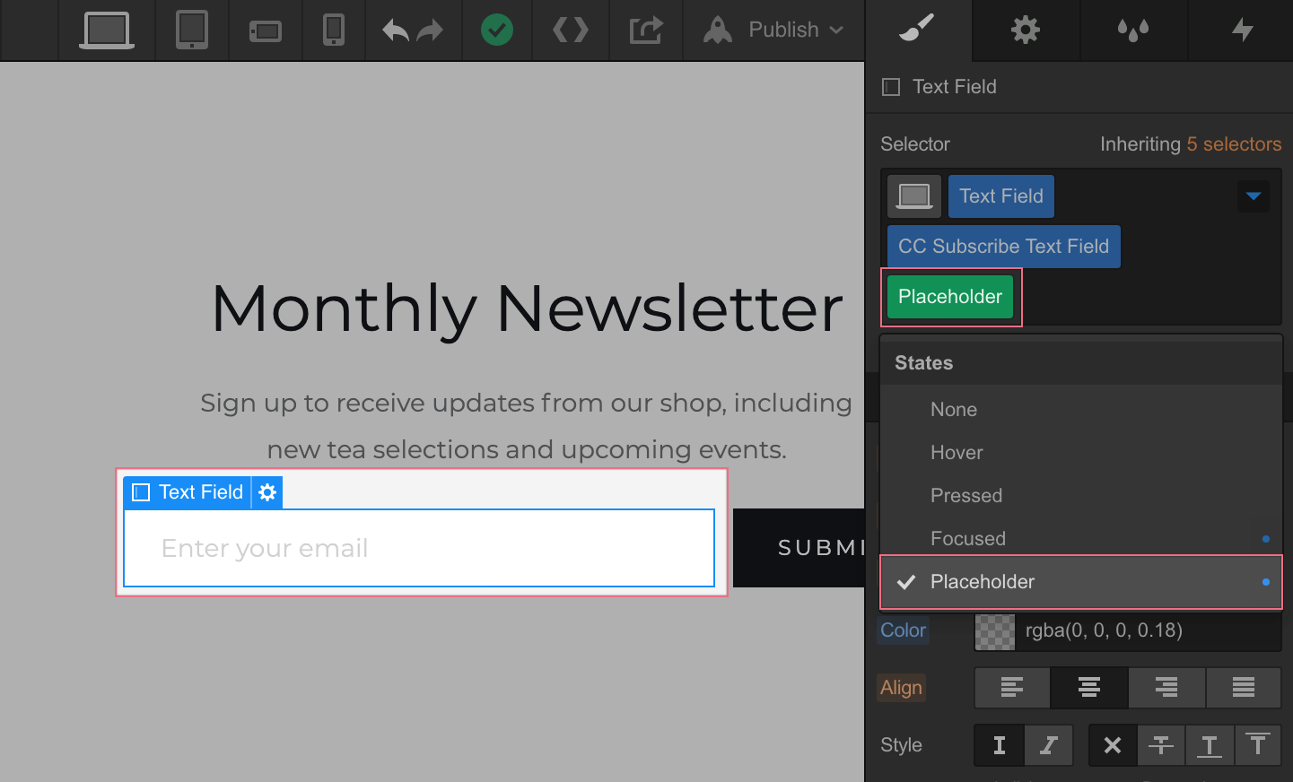
You can style the placeholder text through the states menu of the selector. You can style the typography, the background, and shadows.

Styling input text
When you add typography styles to a text field or text area it will affect the text that is typed inside of it. To style this text, you need to add sample text first. Follow these steps to add and style the input text:
- Create a new class and apply that class to each text field in your form.
- Toggle Preview mode
- Type in some sample text into any text field.
- Toggle Preview mode again to return to the Designer. The sample text will be visible in the input field.
- Select the text field
- Go to Style Panel
- Make your Typography styling changes and see them update on the Canvas
Styling form states
You can edit the default success and error messages by replacing the text or even adding other elements in the error or success wrappers. You can style each of these elements as well as the wrappers. To access success and error messages:
- Select the Form Wrapper
- Go to Elements Settings tab
- Under Form Settings, click the state that you want to edit
- Select any element that appears and style it to your liking
Learn more about success and error messages.
Field focus state
A text field is focused when you click inside the field or when you navigate to it using the Tab key on your keyboard.
When an HTML element is focused, many browsers will add a solid blue border around it. You can override this default browser value by styling the Focused state of any element.
To access the focused state:
- Selecting the text field
- Go to the Styles Panel
- Above the selector field, click States
- Select Focused from the menu
The styling changes you make here are what users will see when they click inside the text field. You can style the focused state anyway you like. You can add borders or box shadows and adjust some of the properties to make it more obvious to the user that this particular field is focused. You can preview the page, and click through the different text fields to see how it'll look once it's published.
Learn how to edit other states for any element.
Quick layout with Columns
There are many ways to visually structure a form. Columns can be extremely helpful. Learn more about Columns.
To use columns to structure your form:
- Drop a columns element into the form.
- Set the element to have four columns in column settings
- Drag and drop each of the form elements into the columns
The fields automatically take up the full width of whatever they're inside, so you don't have to manually size them.
By default, buttons will be only as wide as its text content. You can set the width of a button to 100% or the display setting to Block so that it spans the full width of a column like the form fields.
Things may get a little tight in Tablet view. To adjust how your Row will look on different devices:
- Select the Row
- Open the element settings panel
- Adjust the settings for other views under column options


