In this lesson:
You can add most of these effects on the hover state or any other state in the states menu.
Learn more about how to set effects on different states.
Blending
Blending modes in Webflow offer a variety of different ways for an element to blend with (or overlap) other elements below it — all without the necessity of custom code. Webflow takes care of the mix-blend mode CSS property for you, and allows you to set how an element’s content should blend with the content of the element’s parent and the element’s background. Blending modes allow you to unlock a ton of creative possibilities to go beyond element opacity adjustments.
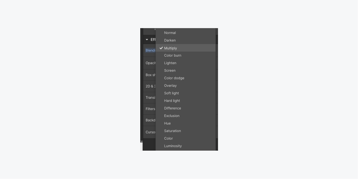
There are 16 blending modes. Modes that behave similarly are placed next to each other in the blending mode dropdown. These mode groupings consist of:
- Default mode (Normal)
- Darken modes (Darken, Multiply, and Color burn)
- Lighten modes (Lighten, Screen, and Color dodge)
- Contrast modes (Overlay, Soft light, and Hard light)
- Comparative modes (Difference and Exclusion)
- Composite modes (Hue, Saturation, Color, and Luminosity)
To see examples of each blending mode and read more about how to use them, check out our Blending mode lesson.
Opacity
To customize the transparency level for an element and its children, change the opacity in the effects settings. You can change the opacity by entering a value in the input field or by dragging the opacity slider to your desired value.
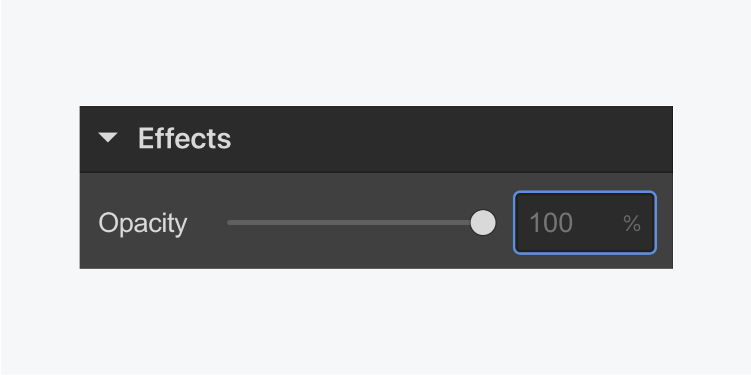
Opacity values are set in percentages. 100% is opaque and 0 is completely transparent.
Outline
Outlines are meant to help your site visitors navigate through your design as they tab through your interactive elements with their keyboard. The outline that appears around an element makes it clear to your visitor they’re interacting with — they’re focused on — one particular element. If they press Tab again on their keyboard, the outline will appear around the next newly focused element.
Because of this, it’s essential to add an outline to the Focused (keyboard) state or the Focused state of your element.
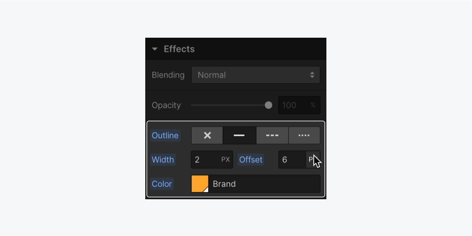
You have the following controls in the Outline settings:
- Style: The style determines the kind of outline that will surround an element. An outline can be solid, dashed or dotted.
- Width: The width determines the thickness of the outline. This value can use any CSS unit from the list available in the unit dropdown.
- Offset: The offset determines the amount of space between an outline and the edge or border of an element. This value can use any CSS unit from the list available in the unit dropdown.
- Color: The color specifies the outline’s color.
Learn more about input values and units.
Important: While it may be tempting to choose “None” for the Outline style if you want to remove it and return to default browser settings, remember that this will not remove any other properties that have been set (e.g., width, offset, or color), and will make your outline completely disappear, which is not accessible.
Check out our entire lesson on Outlines.
Box shadows
Box shadows add styling outside or inside of an element’s rectangular boundary. Box shadows can be used to add focus or depth to buttons, sections, div blocks, or any other element in your project.
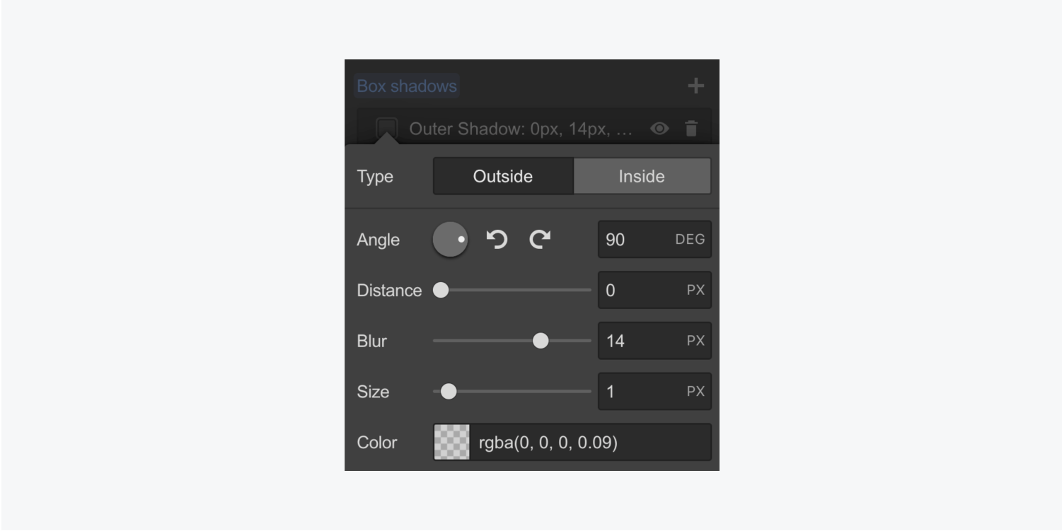
You can add a box shadow, or create multiple box shadows to layer outside of an element, in the box shadow settings of the Style panel.
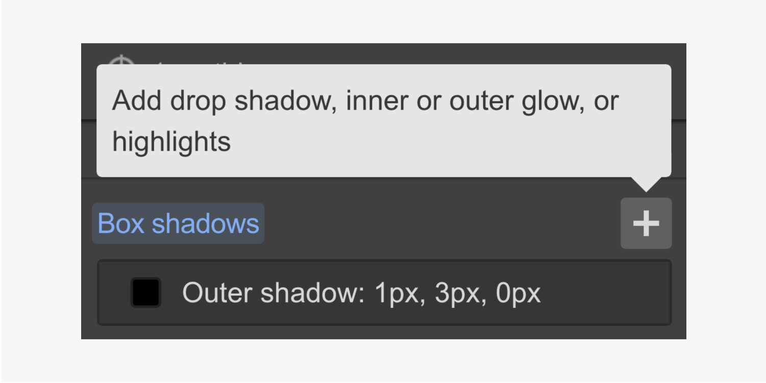
Select the box shadow to customize the type, angle, distance, blur, size, and color of the shadow.
Stacking
You can add multiple layers for most effects in the Style panel. For example, you can add and layer multiple box shadows to an element.
In the effect settings, you can toggle the visibility of each layer by selecting the eye icon and delete each layer by selecting the trash icon. To change the order of each effect, simply select the layer you’d like to reorder and drag it to your desired order number.
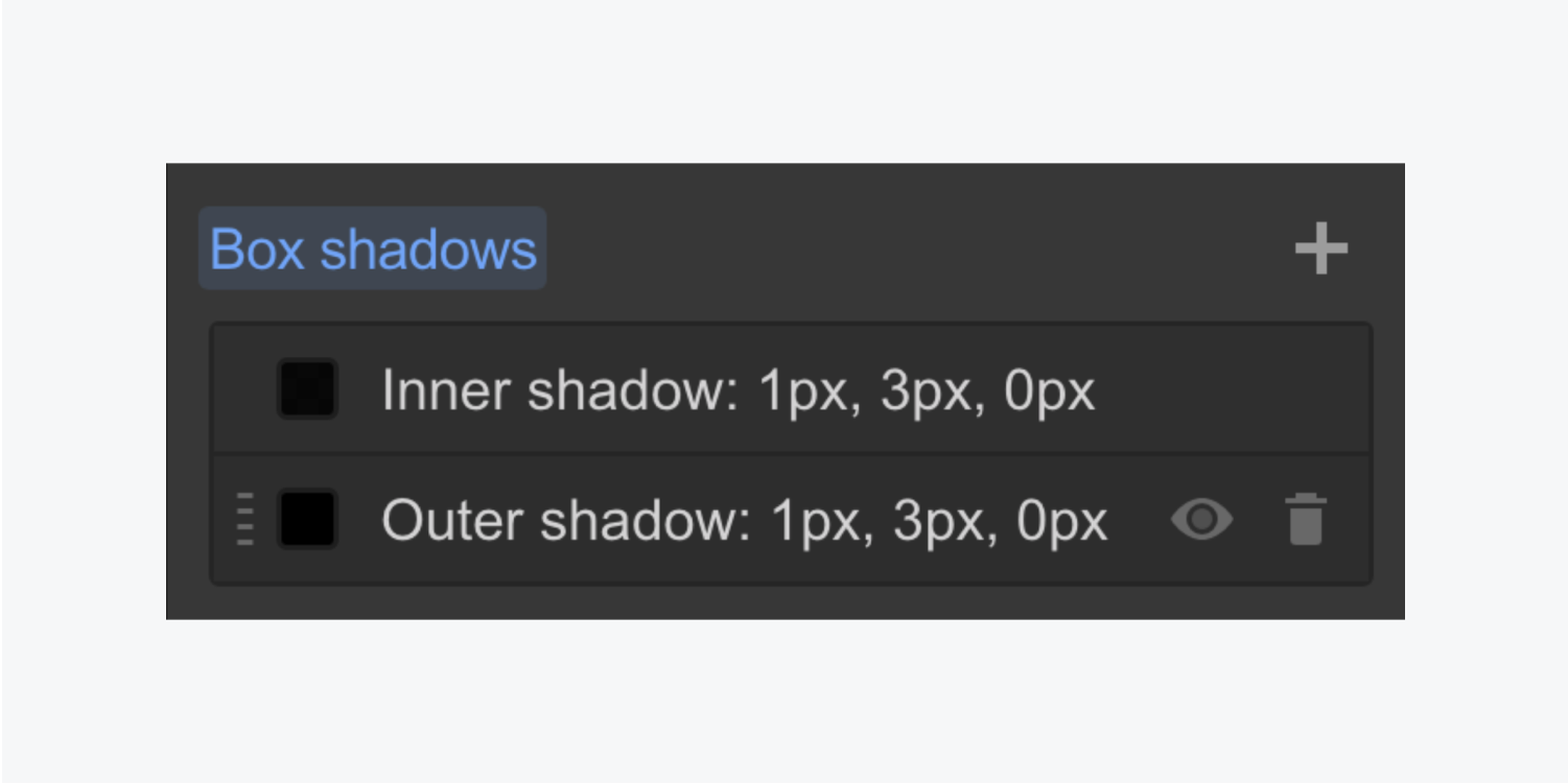
You have the following controls in the box shadow settings:
- Type: applies the shadow inside or outside of the element’s boundaries
- Angle: changes the direction of the box shadow — adjust the angle by clicking and dragging the dial, clicking anywhere on the dial to set that position, clicking the arrows to rotate the angle, or entering the angle value in the input field
- Distance: moves the shadow closer or farther in the direction specified by the set angle
- Blur: affects how focused the shadow blur is
- Size: specifies the spread of the shadow relative to the boundaries of the element it’s on
- Color: changes the color and opacity of the shadow
Learn more about input values and units.
Important: Animated blurs are very slow and not recommended.
2D & 3D transforms
You can add transforms from the Style panel > Effects > 2D & 3D transforms to manipulate an element's appearance and position on different states, such as hover.
There are 4 types of transforms:
- Move
- Scale
- Rotate
- Skew
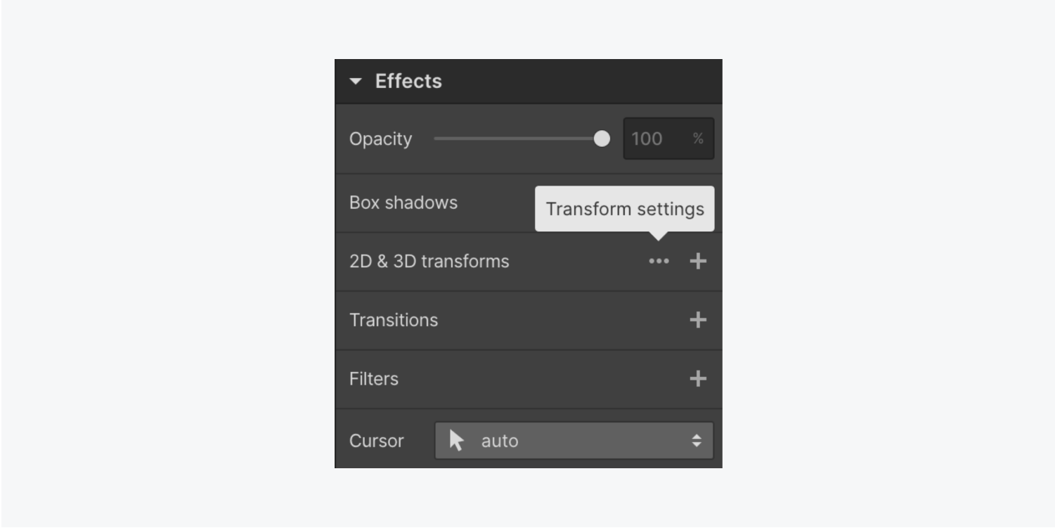
Click the ellipsis next to 2D & 3D transforms to access the Transform settings and adjust transform origin, backface visibility, self-perspective, and children perspective.
Similar to stacking effects, you can add more than one type of transform without losing any of your previous settings. Use the plus icon to add an additional transform.
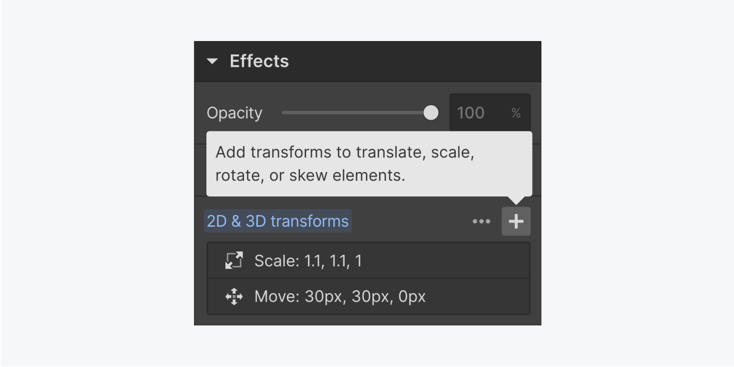
Learn more about transforms.
Transitions
Transitions create a smooth animation between different states of an element. A duration and easing type effect can be customized to create a unique transition. A common use of transitions is for hover states on elements so that they don’t abruptly change on hover.
By default, transitions are set to none, meaning that they’ll apply to all states automatically. You should add a transition for each property/style that you have added in any state.
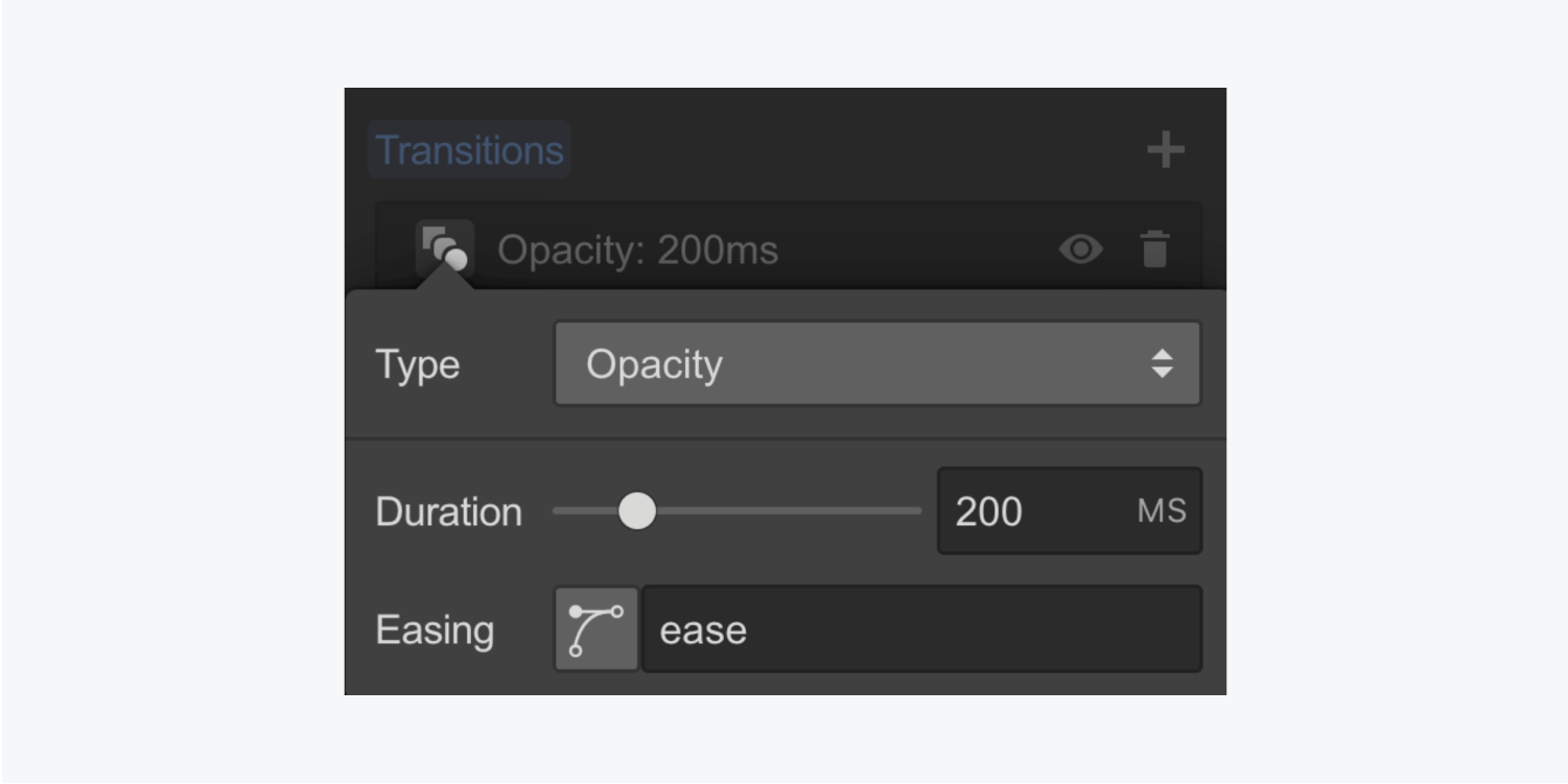
Add a transition element and specify the following properties:
- Type: the type of property affected by the transition.
- Duration: specifies the duration of the transition in milliseconds (ms.) You can change the duration, set to 200ms by default, by using the slider or entering the duration value into the input field.
- Easing: gives you the option to type in a value or open the easing editor, which allows you to browse presets or create unique easing effects.
Filters
Filters apply a unique visual effect to an element. Filters can also be used to create changes on hover states. You can add filters on an image, background video or any other element. Filters change the appearance of the entire element, including its children.
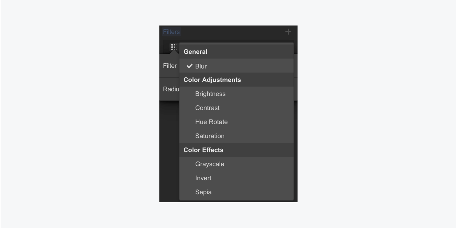
To add a filter, use the add menu and choose any of the filter effects in the dropdown:
- Blur: blurs the content of an element. A larger blur radius value will increase the blur level. 0 will have no effect.
- Brightness: specifies the amount of brightness between 0 and 200%. A value of 100% will return the element back to its original brightness.
- Contrast: specifies the amount of contrast between 0 and 200%. A value of 100% will return the element back to its original contrast.
- Hue rotate: shifts the colors/hue of an image or element. The value unit is in degrees. A value of 0 or 360 brings it back to the original hue. You can change the hue in one of the following ways: clicking and dragging the dot on the direction dial, clicking anywhere on the dial to set that position as the direction of the angle, clicking the arrows to rotate the angle in increments of 45 degrees clockwise or anticlockwise, or typing in the desired angle in the input field.
- Saturation: defines the intensity of the colors. Value can be between 0% and 200%. A value of 100% will bring it back to the original saturation.
- Grayscale: converts all colors to grayscale. 0% will show the original image and 100% will make the image completely grayscale.
- Invert: inverts all the colors in the element. A value of 0% will show the original image and 100% will completely invert the colors.
- Sepia: gives your image a vintage off-yellow look. 0% represents the original image and 100% is fully sepia.
Important: Animated blurs are very slow and not recommended.
Any filters you add or adjust will be previewed on the canvas. You can also add multiple filters to a single element and toggle their visibility and order in the filter settings.
Backdrop filters
Adding a backdrop filter to any element lets you apply filter effects (e.g., blur, color shift, contrast, etc.) to transparent areas inside the element’s boundary. Anything behind the element that’s visible through the transparent areas is affected by the backdrop filter.
You can also apply multiple backdrop filters to a single element. You can layer and combine the backdrop filters together to create a variety of visual effects.
Good to know: Because the backdrop filter applies to everything behind the element, to see the effect you must make the element, portions of the element, or its background at least partially transparent.
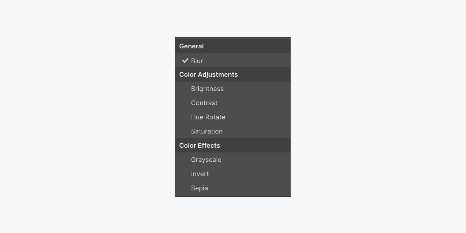
There are 8 Backdrop filters. Filters that behave similarly are placed next to each other in the Backdrop filters dropdown. These filter groupings consist of:
- General (Blur)
- Color adjustments (Brightness, Contrast, Hue rotate, and Saturation)
- Color effects (Grayscale, Invert, and Sepia)
To see examples of each backdrop filter and read more about how to use them, check out our Backdrop filters lesson.
Cursor
Using the right cursor is important to indicate to users what's going to happen as they navigate a page. Using a cursor that doesn’t match the result can lead to confusion or inaction.
The default cursor value is auto. It will render the default cursor for specific element types, as specified by the browser’s default settings. For example, hovering over links will show a pointer cursor, and hovering over text will show a text cursor.
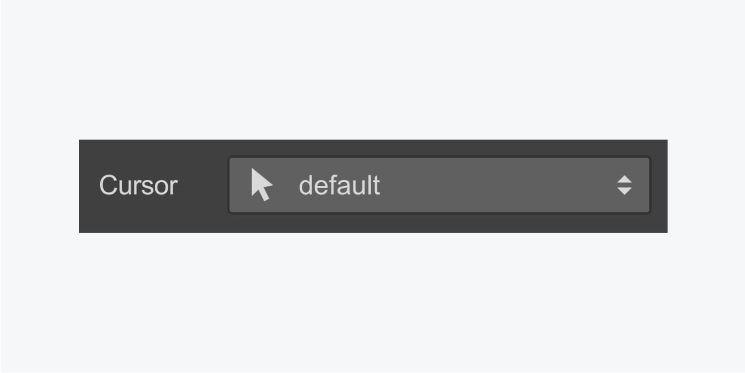
In most cases, it’s best to keep this default setting and allow the browser to pick the right cursor. That said, you can override the browser’s default cursor for an element by changing the cursor value in the Style panel.
You can test and see how your cursor will change when you hover over your styled element in preview mode.
Want to create your own playful, custom cursors? Check out our guide to custom cursors in Webflow.


