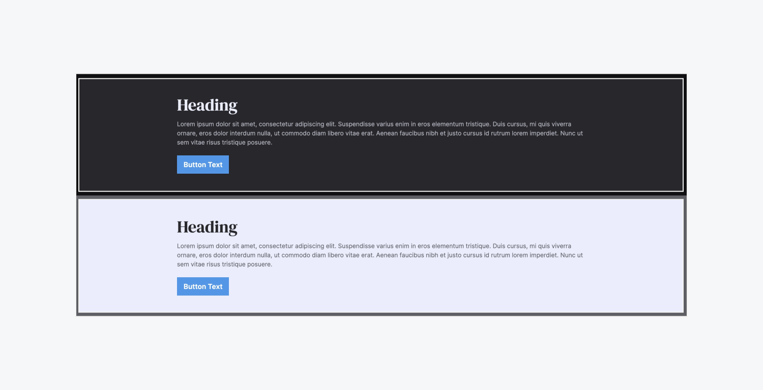
A section is a layout element with a width of 100% that extends across the full width of the browser window. Sections play an important role in the structure and layout of a page. Sections let you create separate blocks of content and divide the page into meaningful segments.
In this lesson:
Add a Section

You can add a Section element to your page from the Elements panel (A). By default, the Section will span across the full width of the body.
Also by default, sections don't have padding inside. If you don’t want your content to span the width of the body, drag in a Container to keep elements centered on the page.
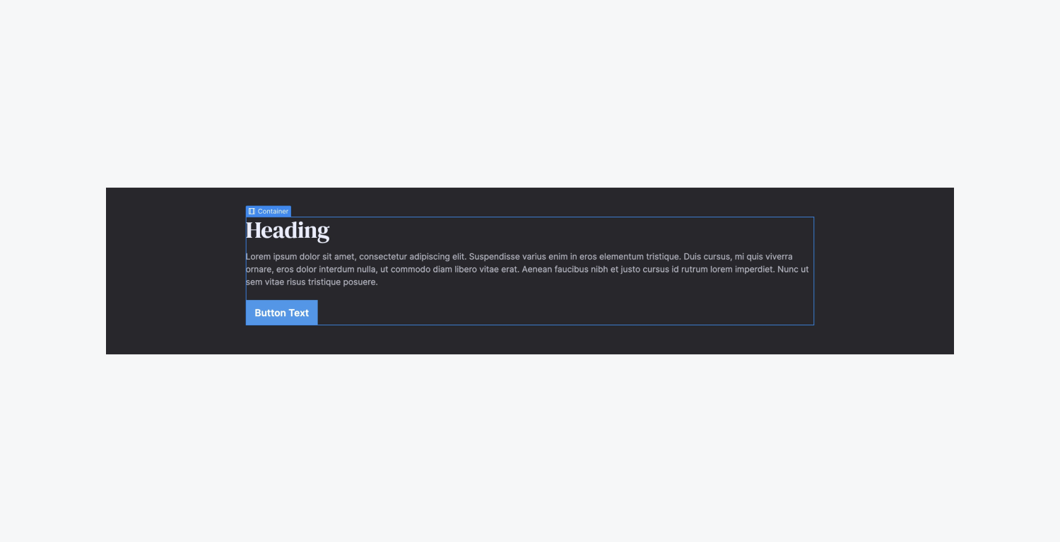
Pro Tip: To have a good, consistent website structure, add sections in the body element, then organize your content in containers placed inside these sections.
Style a Section
The height of a Section automatically adjusts to its content — as you add elements, the section grows taller. You can also set a specific height in the Style panel.
Combo classes
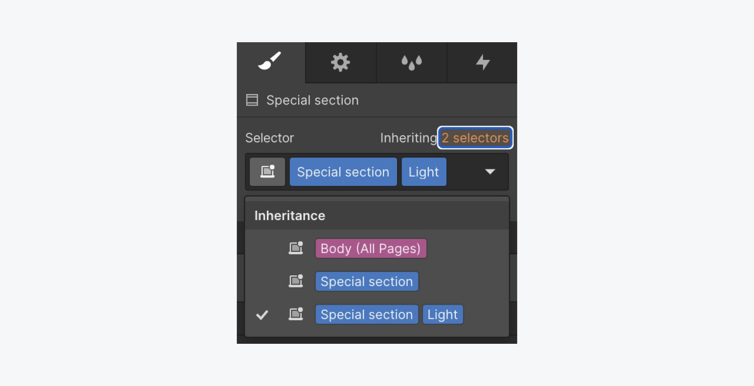
Combo classes let you add combination styles and are based on the original section class — you can override styles and add style on top of the combo class.
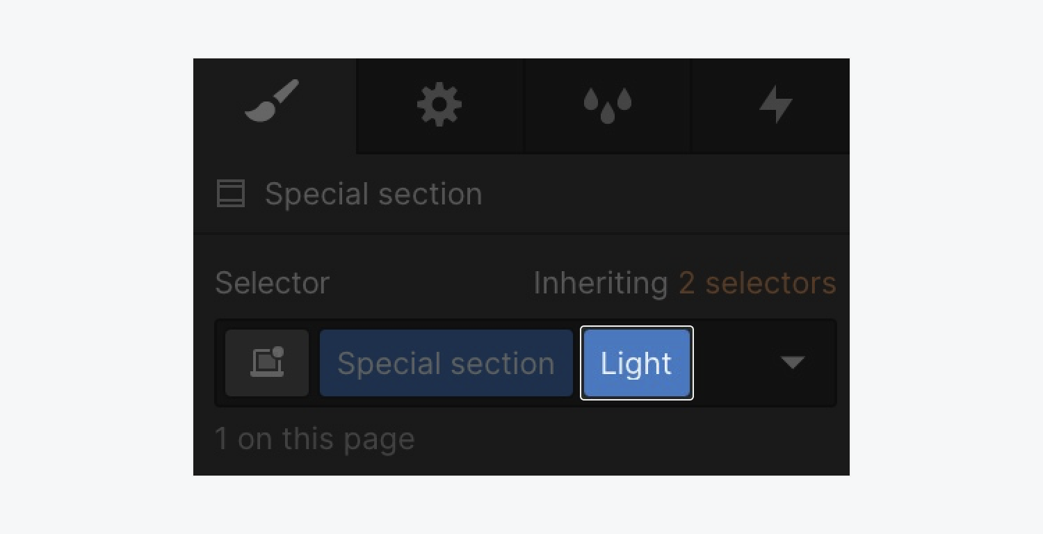
If you make a change to the original section – you’ll see that change pass along to all instances of that section (as long as it’s not overridden on the combo class).
You can also override on the combo class. As you design and develop another Section, you can add the original section class.
Auto height
When you add text and media to a Section, the height changes to define the height. No matter how much content you add, the Section height respects the content inside.
A Section's padding also affects its height. It’s best practice to set a Section's top and bottom padding and add content to let it adjust accordingly.
Minimum height
To set a specific height on a Section, it's a good idea to set a min-height (e.g. 500px) so the Section can expand with its content.
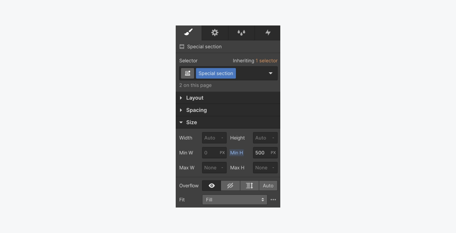
If you set a normal height, content will eventually spill out or get cut off.
Using flexbox to center content
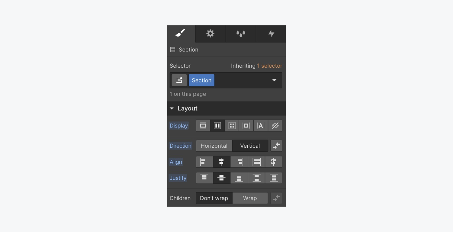
With your container in the Section, select the Section, and set it to flex. Then you can vertically center its child elements (vertically centering the Container).
Viewport height (vh)
In some cases, like when creating hero sections, you may give a Section a specific height. In this case, use the viewport height (vh) unit to specify the Section height.
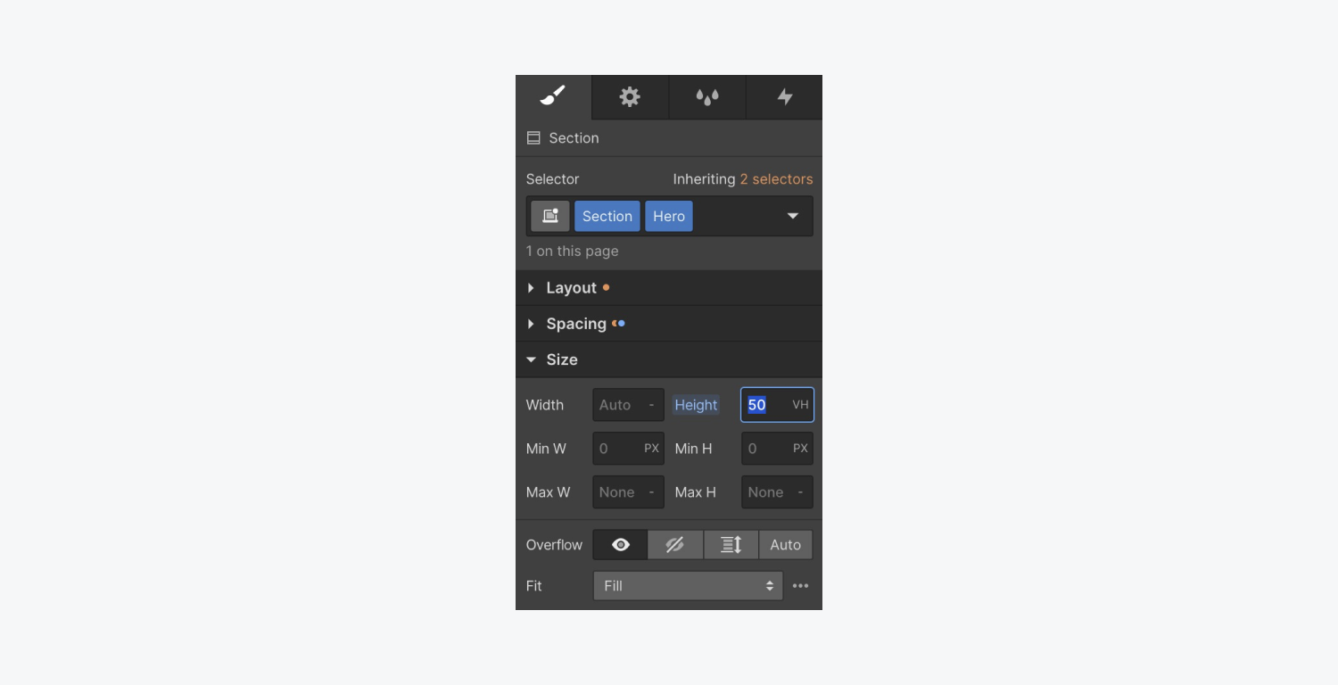
For example, 100vh will fill 100% of the viewport height. Setting it to 50vh will fill 50% of the viewport height, and so on.

Learn more about the different widths and heights units you can set on elements.
Pro Tip: Set your section’s display setting to flex to center the container and its contents vertically inside the section.
Add 3D perspective
If you have children of a Section (any elements inside a section, even if they’re inside other elements inside a section), you may want to add a rotation or a movement in 3D space. If each element has the same class applied, you’ll style all of them at once.
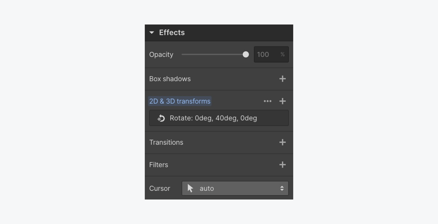
And you add a 3D transform, any type of 3D move looks sort of flat (this is because it’s an isometric projection, and the effect we may want is a perspective projection.)
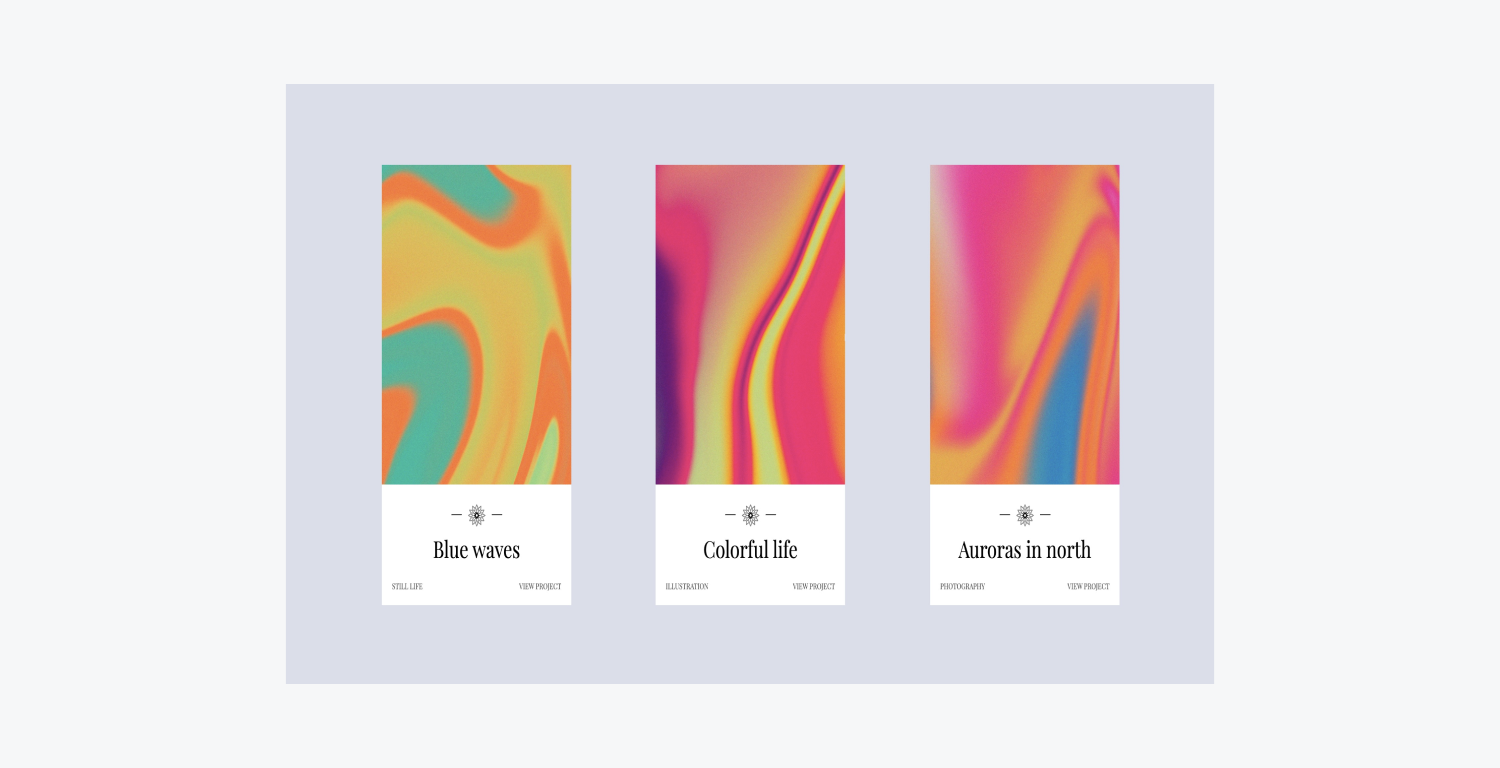
To demonstrate perspective projection, leave your rotation as is, and enable the 3D camera effect.
With the Section selected, click into the Transform settings and add a Child perspective (perspective that affects child elements).
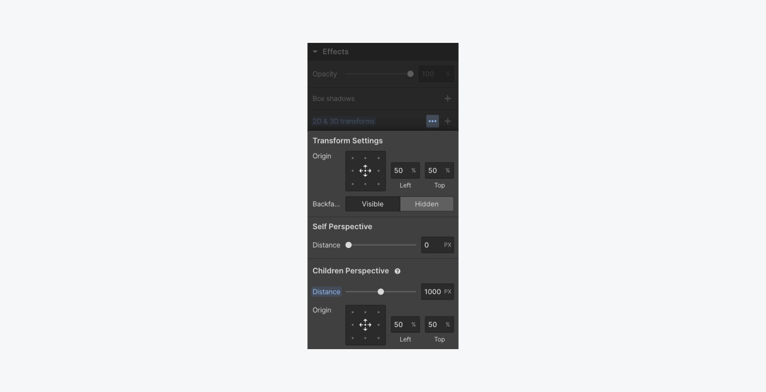
A higher value for Children perspective is a flatter effect, like a camera pointed at objects far away with a telephoto lens — and a lower value is like being closer to the objects with a WIDE angle lens.

Child perspective turns an element like a Section into a camera-like effect, enabling 3D for any of its child elements (any children lower in the hierarchy).
And that’s an overview of Sections in the Webflow Designer. Nice work!


