The cart component lets you add a shopping cart to your project. You can customize the look and feel of the cart button, which not only allows online shoppers to open the cart, but can also give them a quick overview of the number of items in their cart as well as the subtotal.
You can also customize and style the cart itself. This is where an online shopper can edit their cart content and check out when they are ready to complete their purchases.
In this lesson
- The cart component
- The cart button
- The cart
The cart component
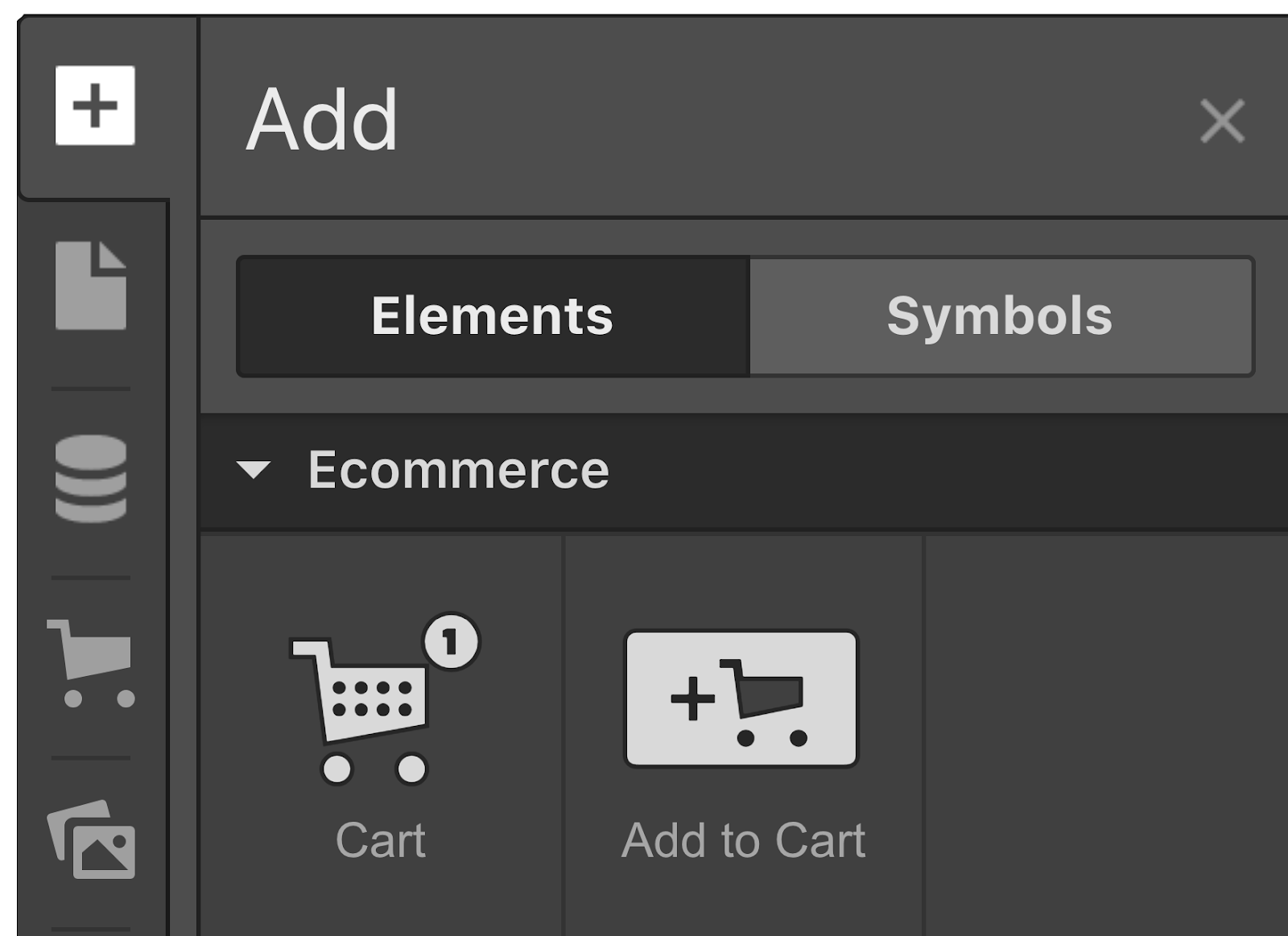
You can add a cart component from the add panel or using Quick find (CMD/CTRL+E).

Anatomy of the cart
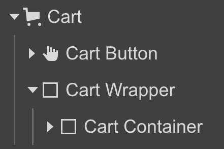
The cart component is made up of two wrappers:
- The cart button
- The cart wrapper — which includes the cart container
The cart button
By default, the cart button has an icon, a text block, and the cart quantity element. You can add other elements, such as a different image or text blocks and style the cart button as you please.
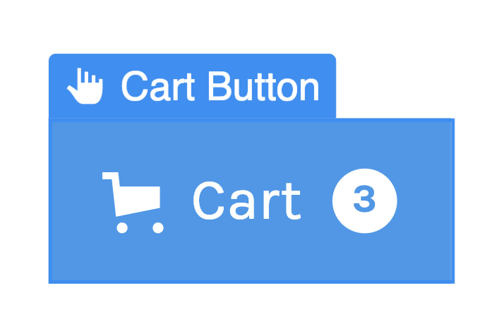
You can connect any text element inside a Cart button to the total quantity of products in the cart or the subtotal amount of the cart items.

Cart quantity
The cart quantity element shows the total quantity of items in a cart. You can hide this element by toggling it off from the Cart button settings in the Element settings panel. The setting is available when the Cart button wrapper is selected on the canvas.
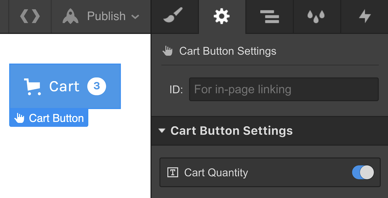
Hide the Cart quantity element from the Element settings → Cart button settings.
Hide when the cart is empty
You can also choose to only hide the cart quantity when the cart is empty. To access the Cart quantity settings, double-click the Cart quantity element on the canvas.

Hide the Cart quantity when the cart is empty under Element settings > Cart quantity settings.
Learn more: Customizing the cart button
The cart
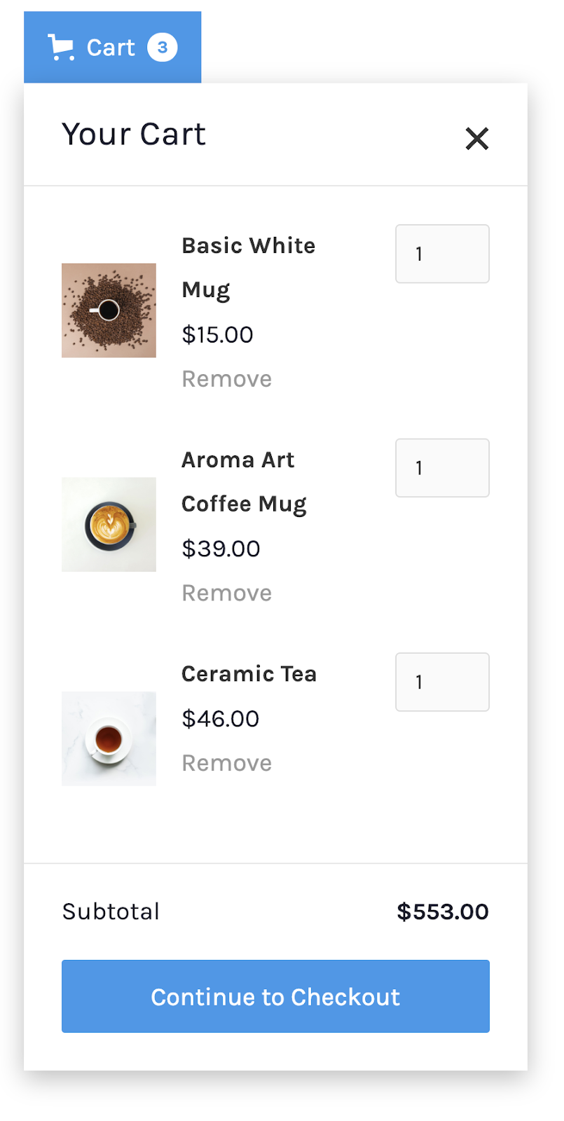
The cart wrapper is the div block that contains the cart container. The cart container is a component of many smaller components. It has a header and a form wrapper. The form wrapper houses the cart list, the cart line item, and checkout actions. You can customize and style most of these wrappers and their child elements. The cart also has empty state and error state messages that you can customize.
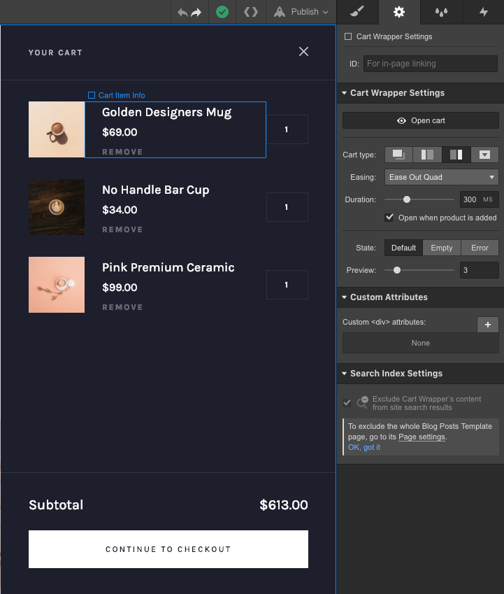
Must know : Some items can't be removed from the cart to preserve cart functionality.
Cart list
This is a collection list connected to the products collection and shows the items (or a sample of the items) that are added to the cart. Except for some limitations, you can update the structure and design of the cart list items.
Cart line item
This shows the subtotal of the cart. You can duplicate this wrapper and customize it to also show the total number of items.
Good to know: Any text link in the cart line item can be connected to the subtotal or quantity of the cart from the Element settings panel.
Checkout actions
The Checkout actions wrapper allows users to finalize their purchases. By default, this contains the Checkout button and Web payments button, which you can customize from the Element settings panel. You can also add a PayPal button from the Add panel.
Note: If your store only uses PayPal, the Checkout button in the cart will be hidden automatically on the published site, since PayPal checkout uses a different page.
Learn more about Web Payments and PayPal checkout.
The cart wrapper settings
To edit and customize the cart, select the cart on the canvas, then open the cart from the Cart wrapper settings in the Element settings panel (D). Here, you can choose the cart type, the easing and duration of the opening and closing animation, and the number of items to show in the cart preview. You can also specify if you want to open the cart when a product is added to it. And access the various states of the cart to style them separately.
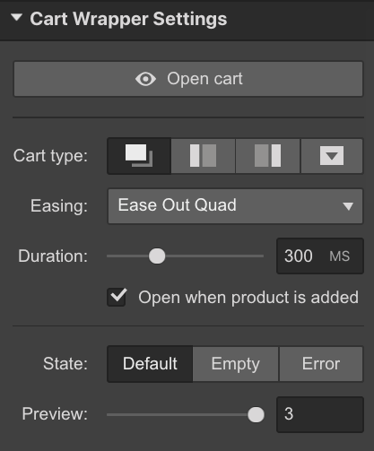
Open cart
Open or close the cart to see and edit the cart wrapper.
Cart type
Choose from the pre-defined cart types:
- Modal (default)— if you want the cart to open as a popup in the middle of your page
- Sidebar-left — if you want the cart to show as a sidebar on the left
- Sidebar-right — if you want the cart to show as a sidebar on the right
- Dropdown — if you want the cart to open up as a dropdown right below the cart button. For this cart type, you can also specify whether the cart aligns to the left or right of the cart button. You can also specify whether the cart opens on click or on hover.
Easing
Set the easing, how the animations plays out, when the cart opens and closes. The default easing is “Ease out quad.”
Duration
Set the duration of the animation in milliseconds(ms). The default value is “300ms.”
Open when product is added
Check this box if you want to open the cart each time a new product is added to the cart.
State
Toggle between the different states of a cart to edit and customize each of them.
- Default — view and style the cart when it has items in it. You’ll see sample items in the Designer so it’s easy for you to style the default state of a cart.
- Empty — view and customize the look and feel of your cart cart when it’s empty
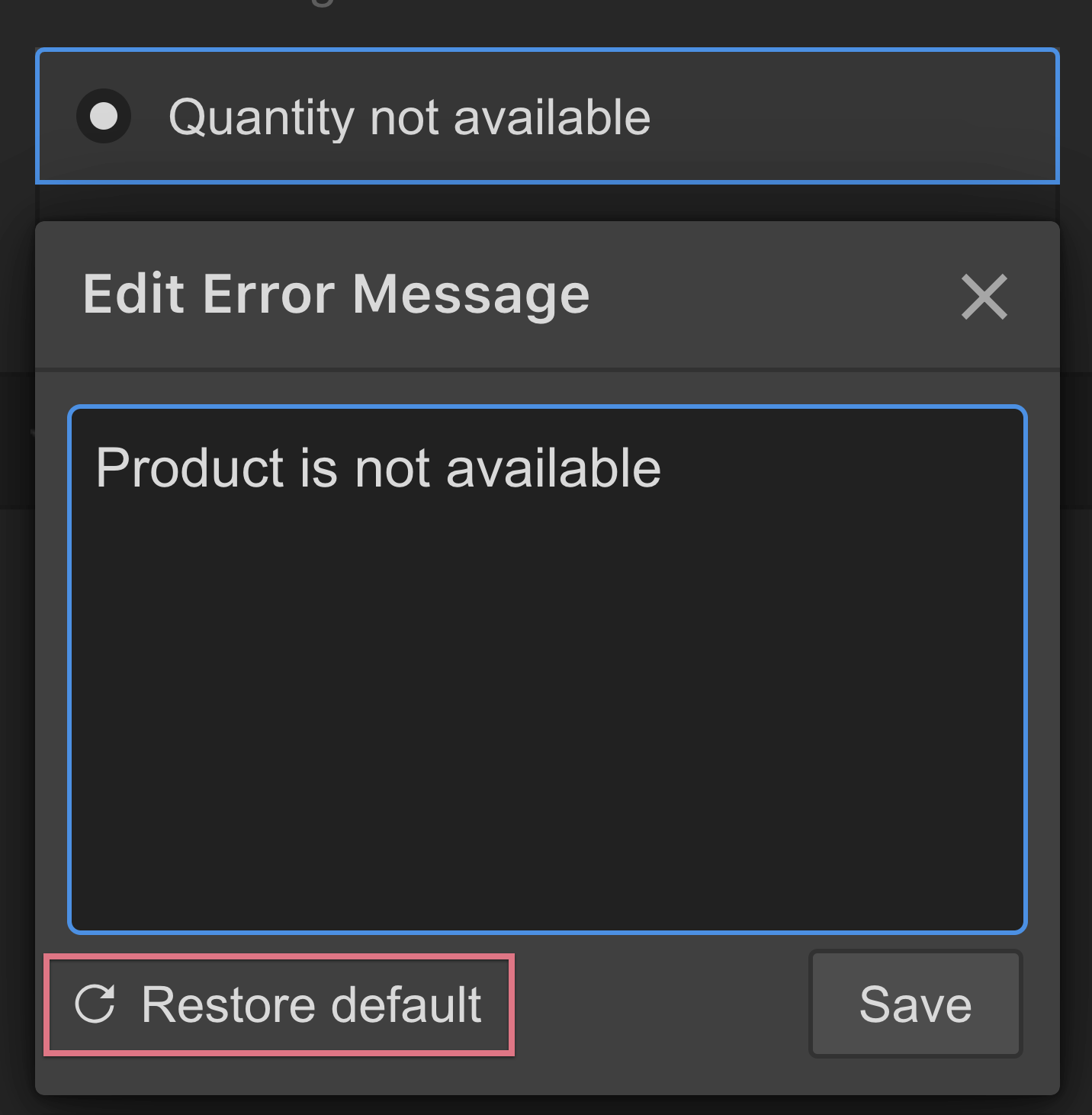
- Error — view and customize error messages that may appear when the checkout fails. Select the Error message text block to access the Error message settings. Select each message in the setting to view it on the canvas. To edit the message, click the pencil icon that appears next to the message in the setting when you hover over it.
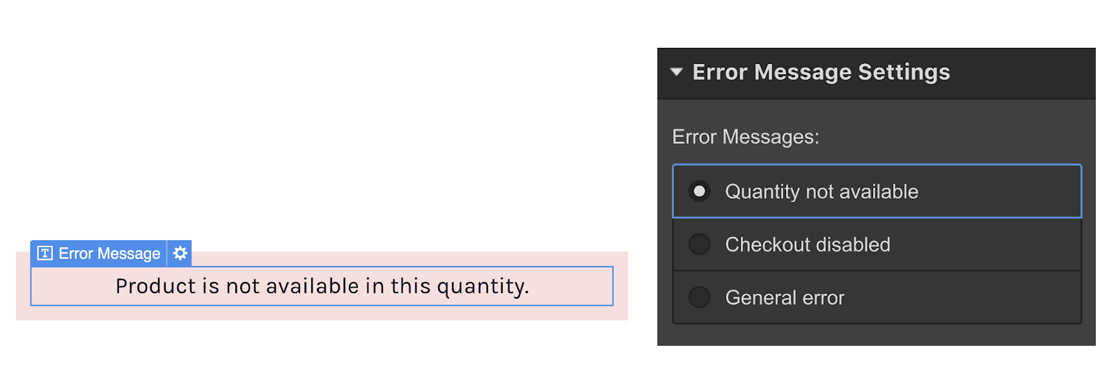
You can restore default error messages from the error message editor.
Preview
Choose how many items to show in the cart. You can choose to show a single item or up to 15 items. The default is “3” items.


