You can customize your site design for different screen sizes using Webflow's built-in responsive breakpoints (also known as media queries). When you load a site, the default breakpoint is the desktop view, but there are also 6 additional breakpoints.
In this lesson:
- Styling on different breakpoints
- Adding larger breakpoints
- Scaling the canvas
- Overriding styles on breakpoints
- Clearing styles
- Testing responsiveness and fluidity
Styling on different breakpoints

Style changes cascade both up and down (bidirectional cascade). They cascade up starting from 992px (desktop) and down from desktop to mobile. This means that styles applied on desktop, 1280px, 1440px, and 1920px cascade up to larger devices and styles you set on the desktop breakpoint cascade down and apply to the tablet and both mobile device sizes. All styles set on tablet will be carried over to the mobile breakpoints. You can override any styles inherited from a higher breakpoint.
This cascading nature applies to textual styles unless a style is overwritten. You can customize your designs for small and large screens using breakpoints.
Switching breakpoints
Whether you are in design mode or in preview mode, you can switch between different breakpoints using the device icons located in the top bar of the Designer.
You can also resize the Designer canvas to preview your site’s responsiveness on different devices.

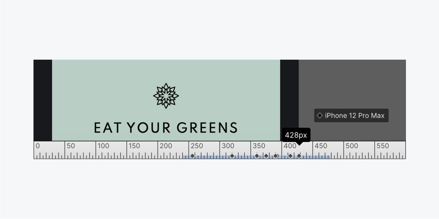
While resizing the canvas, you can see what devices fall under the current canvas width.
Determining style inheritance
Styles can get their value in two different ways:
- It’s set on a specific breakpoint
- It’s inherited from a cascading breakpoint
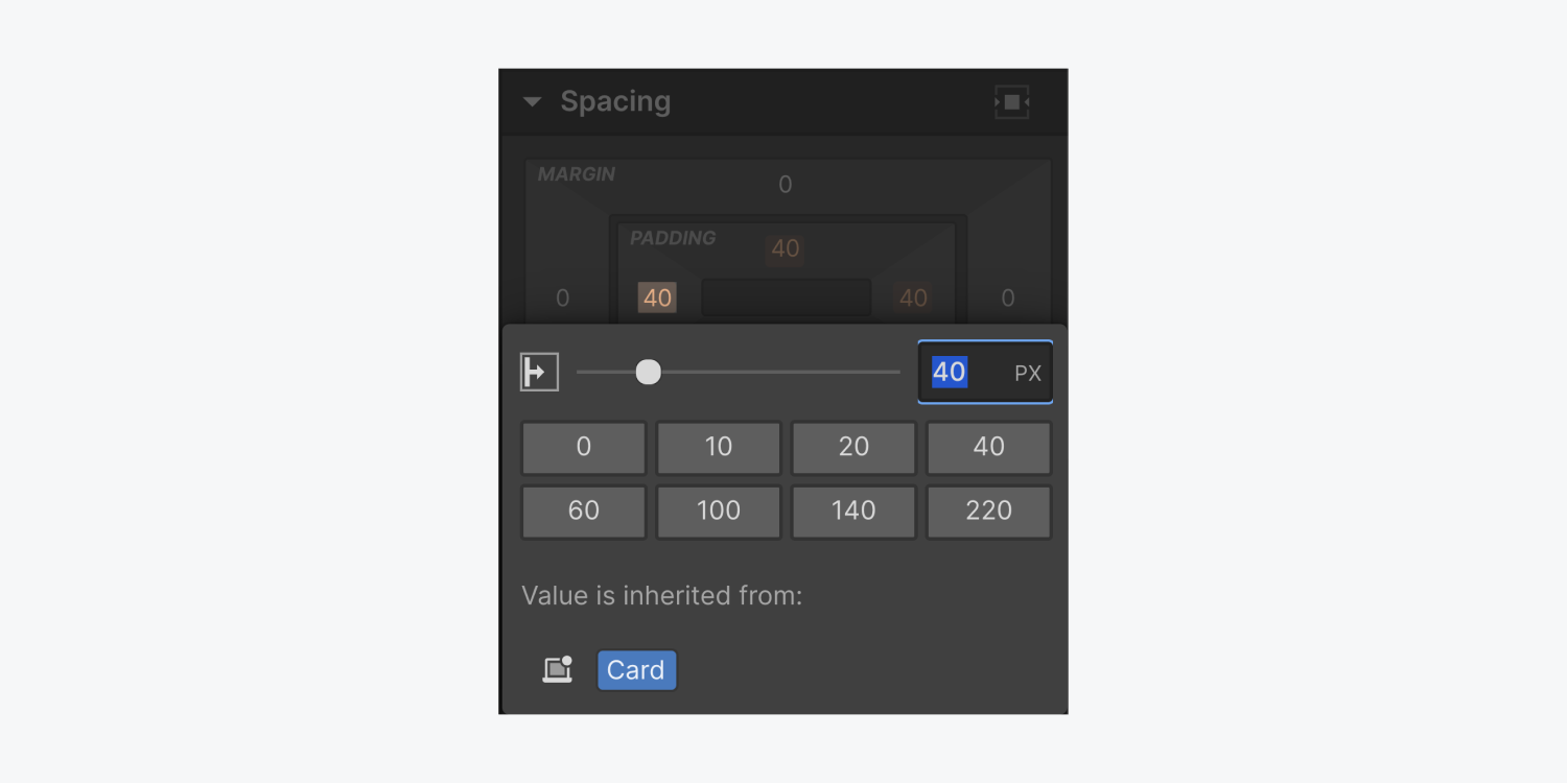
For example, a style on the mobile breakpoint can be from the mobile breakpoint or from a change on the tablet breakpoint that cascaded down. You can see the inheritance of a style in the Style panel by clicking the blue or orange labels and icons next to style properties.
Adding larger breakpoints
We live in a world where all sorts of electronics can access websites — desktop computers, tablets, big phones, little phones, and even smartwatches. Each of these has a different viewport size — a different screen size — to view web content.Your site layout should be responsive to each of these viewports by using breakpoints. A breakpoint is the screen width at which your layout will change to fit the new viewport.
For instance, in the Webflow canvas, the tablet breakpoint begins at a width of 768 pixels. When someone is visiting your website on a screen with a width of 769 pixels, your website will appear how it does at the desktop breakpoint in the Designer (the next breakpoint larger than the tablet breakpoint). However, once someone’s screen is 768 pixels wide (but still greater than 568 pixels wide, which is the next smaller breakpoint), your website will appear how it does at the tablet breakpoint in the Designer.
Using breakpoints when designing ensures that your site visitors have the best possible experience on any screen size.
Webflow has 4 preset breakpoints:
- Desktop
- Tablet
- Mobile Landscape
- Mobile Portrait
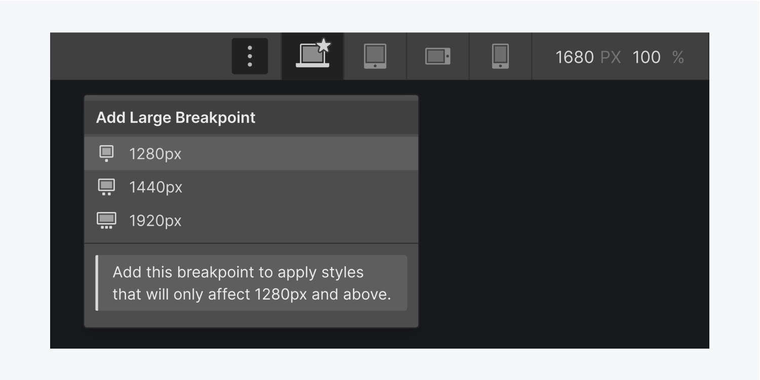
You also have the option to add 3 larger breakpoints:
- 1280px
- 1440px
- 1920px
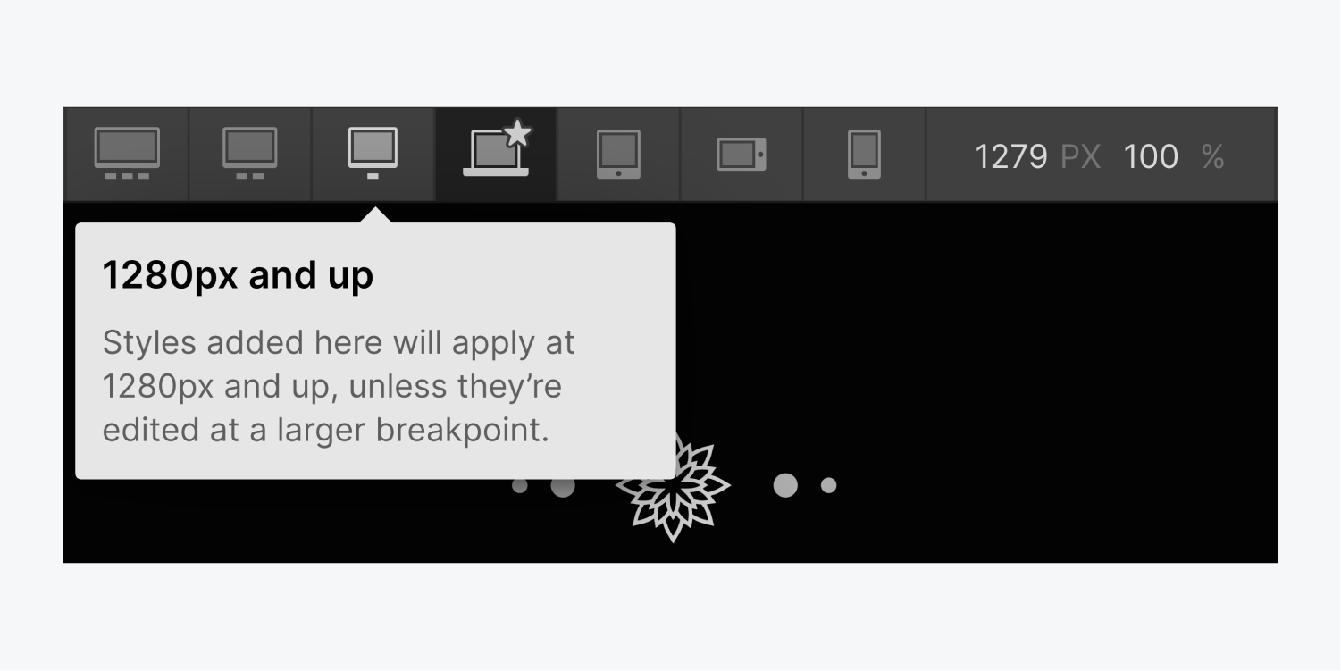
To add a breakpoint, click the breakpoint dropdown (to the left of the desktop icon in the top toolbar) and choose from the dropdown.
Important: You won’t be able to remove a larger breakpoint after it’s added to your site.
The breakpoint you add will show up in the top bar and automatically be selected. While you cannot remove larger breakpoints from the top UI bar, you can eliminate all the unique styles attached to that breakpoint by switching to that breakpoint and hitting Option + click (Mac) or Alt + click (Windows)on the styles whose labels are blue, which indicates they have styles set for this specific device.
Scaling the canvas
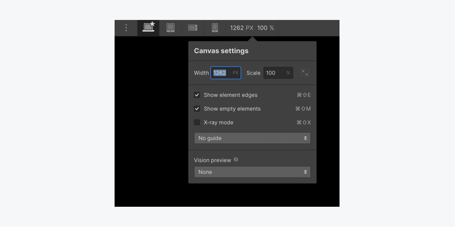
If you’re designing on a laptop or if your browser’s viewport is narrower than some of the larger breakpoints, the canvas will automatically scale down.
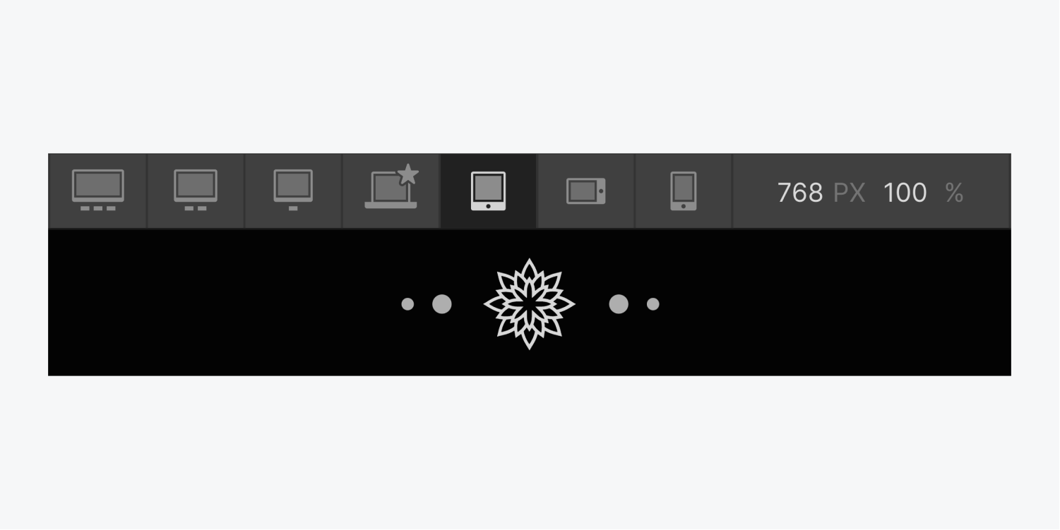
You can also manually enter values inside the canvas settings from the dropdown.
Overriding styles on breakpoints
You can override these cascading styles for a breakpoint at any time by changing the values while on that specific breakpoint. By default, all breakpoints will inherit styles from the desktop (base) breakpoint.
But you can override the styles from the desktop breakpoint. For example, you can change the Body background color on the tablet breakpoint. The background color in the desktop and breakpoints 1280px and above will stay the same but both of the mobile breakpoints show the newly updated background color. This is because styles applied on the tablet breakpoint will only cascade down to smaller breakpoints (mobile landscape and mobile portrait).
These 7 breakpoint views let you preview and style your website for different device sizes.

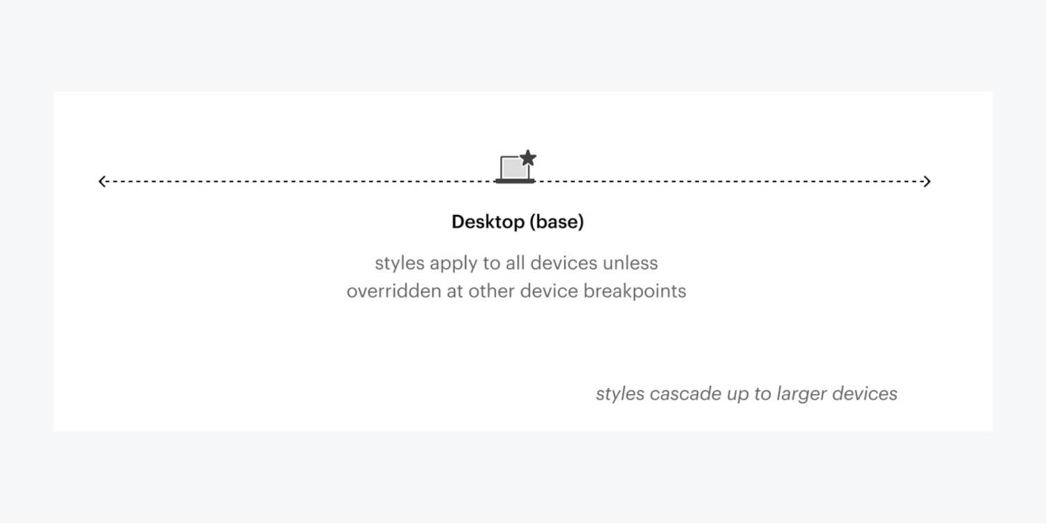
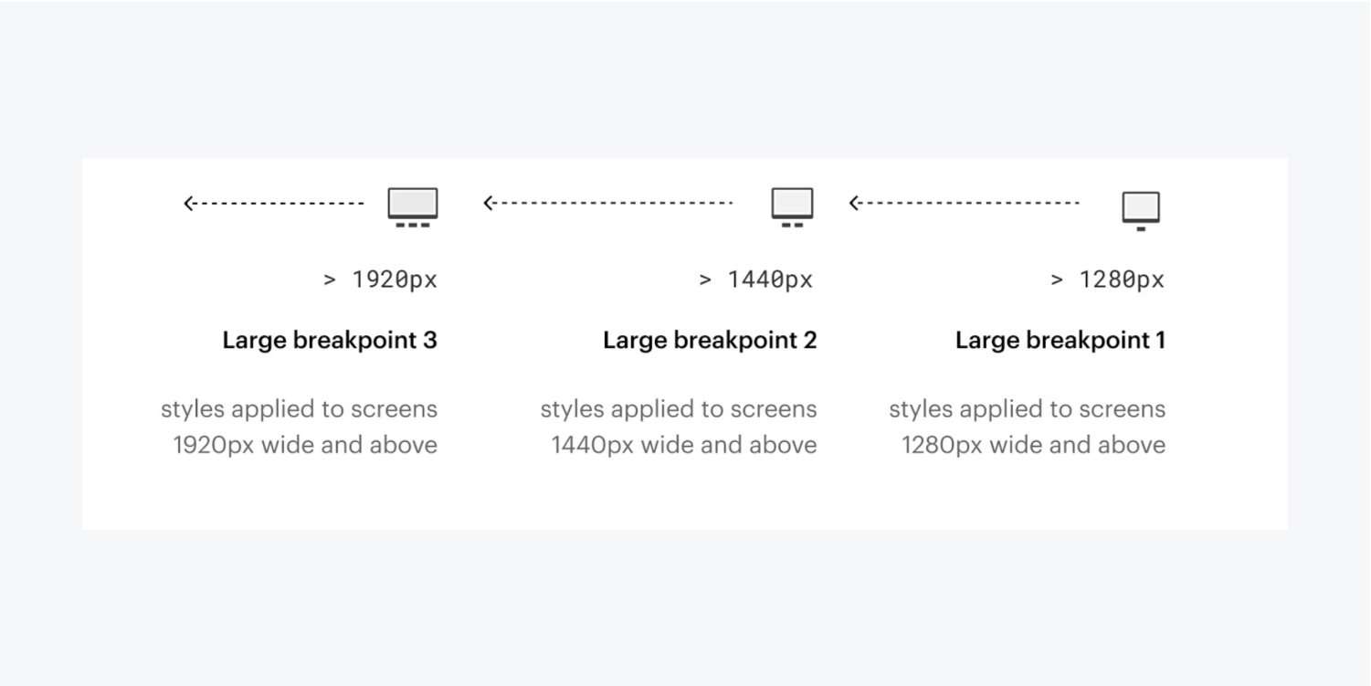
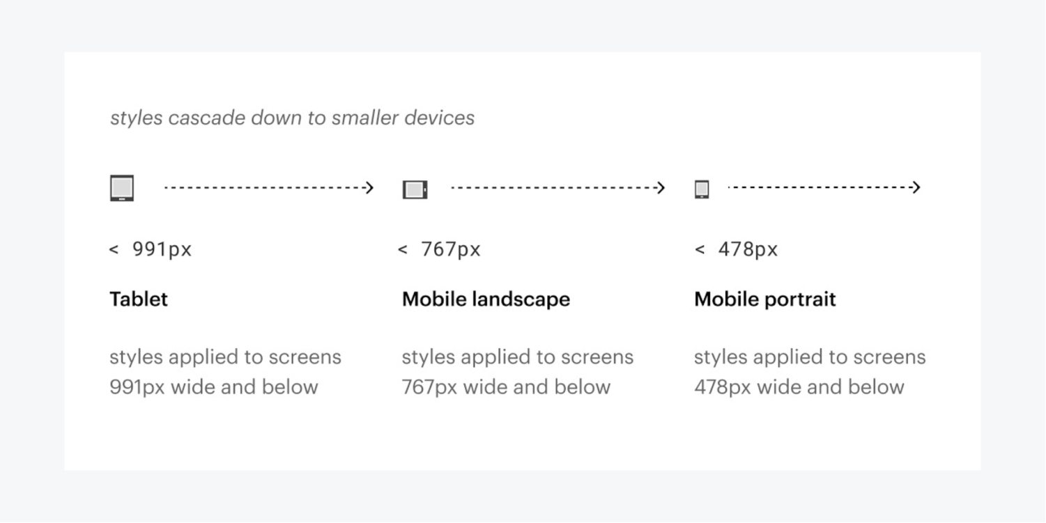
Each view is used to style elements for a particular viewport range:
- 1920px: styles applied to screens 1920px wide and above
- 1440px: styles applied to screens 1440px wide and above
- 1280px: styles applied to screens 1280px wide and above
- Desktop (base): styles apply to all devices unless overridden at other device breakpoints
- Tablet: styles applied to screens 991px wide and below
- Mobile landscape: styles applied to screens 767px wide and below
- Mobile portrait: styles applied to screens 478px wide and below
You can override any textual styles inherited from other breakpoints and create different layouts for each breakpoint.
Here are the rules for customizing breakpoints:
- Styles cascade up and down from desktop, so everything to the right of desktop cascades down (tablet > mobile landscape > mobile portrait) and everything to the left of desktop cascades up (1280px > 1440px > 1920px)
- Styles that are set on breakpoints smaller than desktop will override styles set on the breakpoint above (e.g., styles set on mobile landscape will override styles set on tablet)
- Styles that are set on breakpoints larger than desktop will override styles set on the breakpoint below (e.g., styles set on the 1440px breakpoint will override styles set on the 1280px breakpoint)
- Overriding a style means that the style will no longer inherit changes from the breakpoints above (in breakpoints smaller than desktop) or below (in breakpoints larger than desktop)
- Only changes in the Style panel cascade up or down (an exception is grid edit mode, where you can edit the Grid’s styles directly on the canvas, and those will cascade up and down)
- Any changes in the order of elements (on the canvas or in the Navigator) or an element’s settings (from the Settings panel) affect all breakpoints
- Deleting elements affects these elements on all breakpoints. You can hide elements on devices by opening Style panel > Layout and setting display to “none.”
Smaller breakpoint example
If you set the width of a div block to 400px on desktop, the width of the div block will still be 400px on all breakpoints unless you override styles on another breakpoint.
Let's say you make the width 100% on mobile landscape. This will also change the width to 100% on mobile portrait, but the div block will still have 400px width on desktop, tablet, and all larger breakpoints.
Now, if you change the width on desktop to 500px, both the mobile breakpoints will still have the 100% width value. If you remove the styling on the mobile landscape, the value will be inherited again from the desktop and now the div block will have a width of 500px on all breakpoints.
Cascading styles
Breakpoints allow you to set specific styles for different screens. This allows you to customize the design for each screen, without breaking it on others.
Style changes cascade both up and down (bidirectional cascade). They cascade up starting from 992px (desktop) and down from desktop to mobile. This means that styles applied on desktop, 1280px, 1440px, and 1920px cascade up to larger devices, and styles you set on the desktop breakpoint cascade down and apply to the tablet and both mobile device sizes. All styles set on tablet will be carried over to the mobile breakpoints. You can override any styles inherited from a higher breakpoint.
The best approach for responsive design is to start designing for desktop, then move down the device spectrum and adjust your design as needed.
Changes that affect all breakpoints
When customizing your design on specific breakpoints, you may be tempted to move elements around, change their settings, or even delete them. Keep the cascade effect in mind and be sure to check all the breakpoints affected by these changes, not just the breakpoint you’re currently editing.
Element Settings
Only changes made in the Style panel will cascade up to larger breakpoints and down to smaller breakpoints. Any changes in the Settings panel, or in any settings modal, will impact the element on all breakpoints, regardless of what breakpoint you’re currently editing.
Content
If you replace an image, or the text, or any content on your page while styling on a smaller device, the content will change on all breakpoint views regardless of the current view or device width.
Element Order
You cannot change the order of elements on the canvas or in the Navigator panel for a specific breakpoint by moving elements around. Any re-ordering of elements like this will impact the design on all breakpoints regardless of the current view or device width.
Need to know: You can change the order of elements on smaller devices by using flex in the Style panel. You can also change the position and order of elements that are direct children of a grid container on the canvas on any of the breakpoints. Learn more about on-canvas grid controls.
Hiding elements on different breakpoints
If you delete an element on any breakpoint view, it will be deleted on all views. However, you can hide elements on different breakpoints to create different layouts by setting the display to "none" in the Style panel. Display is a style, so it will apply to all elements with the same class, and the setting will also cascade down to smaller breakpoints.
Note: Although hidden elements are invisible in the website, they still exist in the HTML on the published site.
Clearing styles
You can clear a set style value anytime by clicking the blue or pink indicator (text or icon label next to the style) and choose Reset. You can also hold Option/Alt on the keyboard and click the indicator to quickly remove it.
If you have a style on the tablet breakpoint that is cascading down to mobile breakpoints, clearing that style on tablet will also make the mobile breakpoints inherit the style from desktop.
Testing responsiveness and fluidity
In responsive design, elements on the page respond based on the width of a device, or in the case of a desktop computer, the width of the browser's viewport. You can test how your design will respond by clicking through each breakpoint at the top of the Designer.
As you resize the canvas, common device widths will display at the bottom of the viewport.
