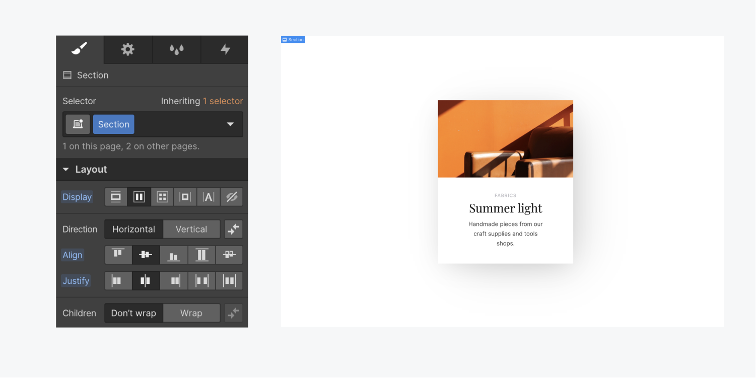
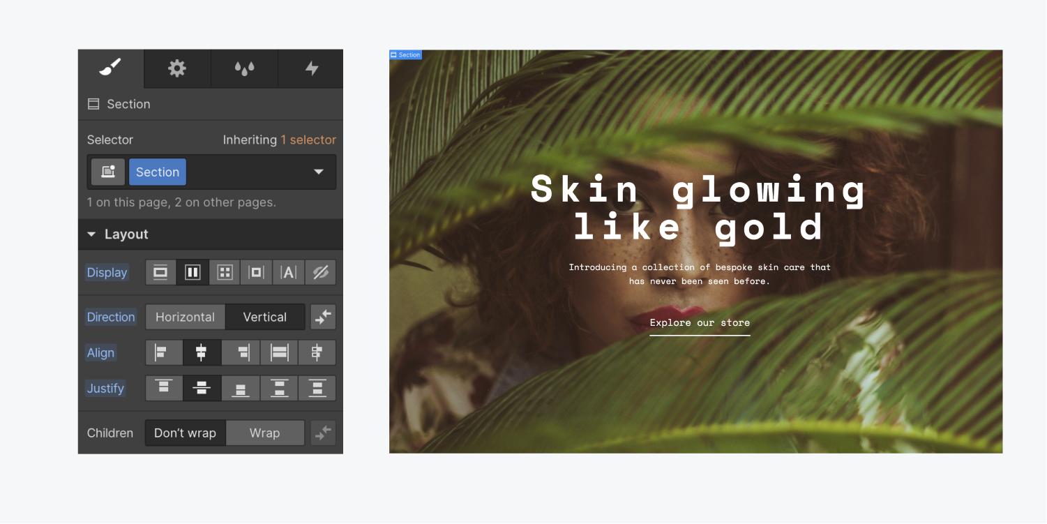
Centering elements vertically has always been a challenge in web design, until flexbox arrived on the scene. With flexbox it’s easy to center elements vertically in their parent element.
In this lesson:
In all of these examples, the parent element has been set to a height of 100vh, which is 100% of the viewport height.
Learn how to use all the flexbox properties.
Center a single element
To center one element in the middle of a section both vertically and horizontally:
- Add an element you wish to the section
- Select the section
- Set the display setting to flex in the Style panel
- Set the flex layout to justify: center and align: center

The process is the same for when you want to center a single element that contains multiple elements. For example, if you want to vertically center a container that holds a lot of content. Set the parent element to flex, then justify and center.

Center multiple elements
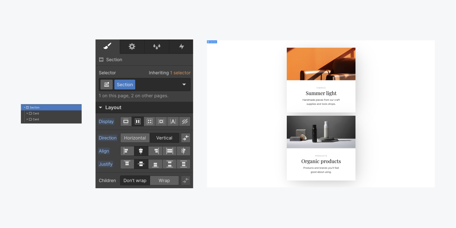
You can center multiple elements as well. For example, if you have 2 cards and they all need to be stacked and centered horizontally and then centered vertically, you can use flexbox:
- Add all the elements to a section element
- Select the section element
- In the Style panel set the display setting to flex
- Set it to Vertical Direction
- Set justify: center and align: center


