Borders define the radius of an element and create outlines on one or more sides of an element's boundary. You can define the border and radius of any selected element in the Style panel.
In this lesson:
Borders allow you to create outlines on one or more sides of an element's boundary. Borders take up space, expanding the dimensions of an element. In the case of elements with a defined size, borders will push against the content inside.
To add a border effect without expanding an element’s dimensions, add an inside or outside box shadow with a blur of 0.
Radius
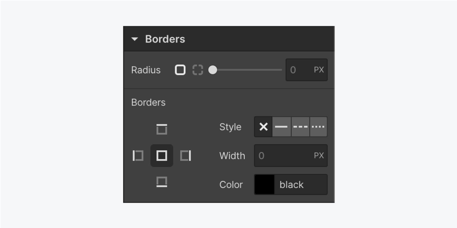
Define the radius of all corners or individual corners of an element to create rounded corners.
By default, the radius is set in pixels (px). To use percentages, enter the percentage value and character (%) into any border input field. You can also use any CSS unit from the unit dropdown.
Learn more about input values and units.
Style
The style property determines the kind of border that will surround an element. A border can be solid, dashed or dotted. You can even hide your border settings by setting the style to none.
Some built-in elements come with default borders, such as form input fields and block quotes. You can remove default borders by setting the border style to none.
Width
The width determines the thickness of a border. This value can have any CSS unit from the list available in the unit dropdown.
Learn more about input values and units.
Color
In the Style panel > Color, you can specify the color and opacity for any element’s border in border settings. If you change the color of one side of the border, you’ll get a bevel or a picture frame effect.
Shapes
By default, setting an element's radius will apply the value to all corners. You can set a value by dragging the slider or typing a value into the input field.
Use pixel values to get rounded corners and percentages to get elliptical corners with the same aspect ratio.
Capsule shapes
For capsule shapes, set your radius to a pixel value that’s larger than half the element’s shortest dimension. A larger number like 500 usually works if you want to skip the calculations.
Ellipses
For ellipses, set the radius to 50%. Percentages base themselves on the width and height of an element
Note: When you have elements with different dimensions, ellipses can appear inconsistent.
Circles
For circles, set the radius to 50% and make sure the element width and height are the same.
Unique shapes
You can set different values on each corner to create unique shapes.
Rectangle to circle
To make a rectangular image circular without distorting it, you can use radius and object fit to place the image inside a Div block — here’s how:
- Drag a Div block onto the canvas
- Drag the image inside the Div block
- Select the Div block
- Click into the Style panel > Selector and create a Class (e.g., Image holder thing)
- Set an equal height and width (e.g., 400px)
- Set the radius to 50% (to make it circular since the width and height are equal)
- Set overflow to hidden (to hide any part of the image that’s outside the circle)
- Select the image on the canvas
- Set the image width and height to 100%
- Set fit to cover (to cover the space inside the circular div block)
- Click into the ellipses next to fit to position the circular cover (to anchor it to a corner or to the center)
Sides & edges
In the Style panel > Borders, you can style all sides at once (by clicking in the middle) or individual sides.
If you create and style a border on the top, it only affects the top. If you create and style a border on the left, it only affects the left.
Bevels
Bevels add depth to an image.
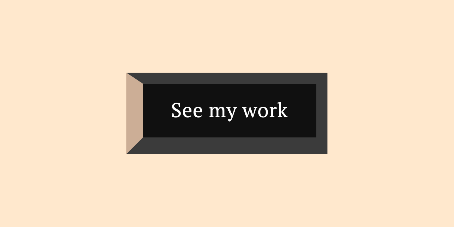
To add a bevel effect to a button, open the Style panel > Borders:
- Add a border to all sides of the button (e.g., give all sides a width of 10px)
- Add a border color (different from the button color) to all sides
- Click one side of the border in the Style panel
- Click color and add a color (different from the original border color)
- Change the width of one side
Animated transitions
You have the power to style anything in the Style panel — let’s style a button to animate on hover.
To give your button rounded corners on hover:
- Select the button on the canvas
- Click into the Style panel > Selector and choose Hover from the dropdown
- Scroll down to Borders and add a radius (e.g., 10px)
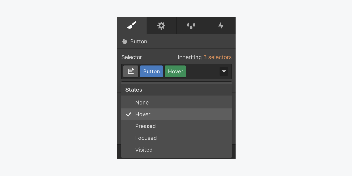
To make the button return to its original state off hover and create a smooth transition:
- Select the button on the canvas
- Click into the Style panel > Selector and choose None from the dropdown
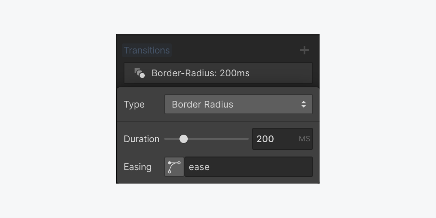
- Scroll down to Effects > Transitions > Type > Property > Border radius
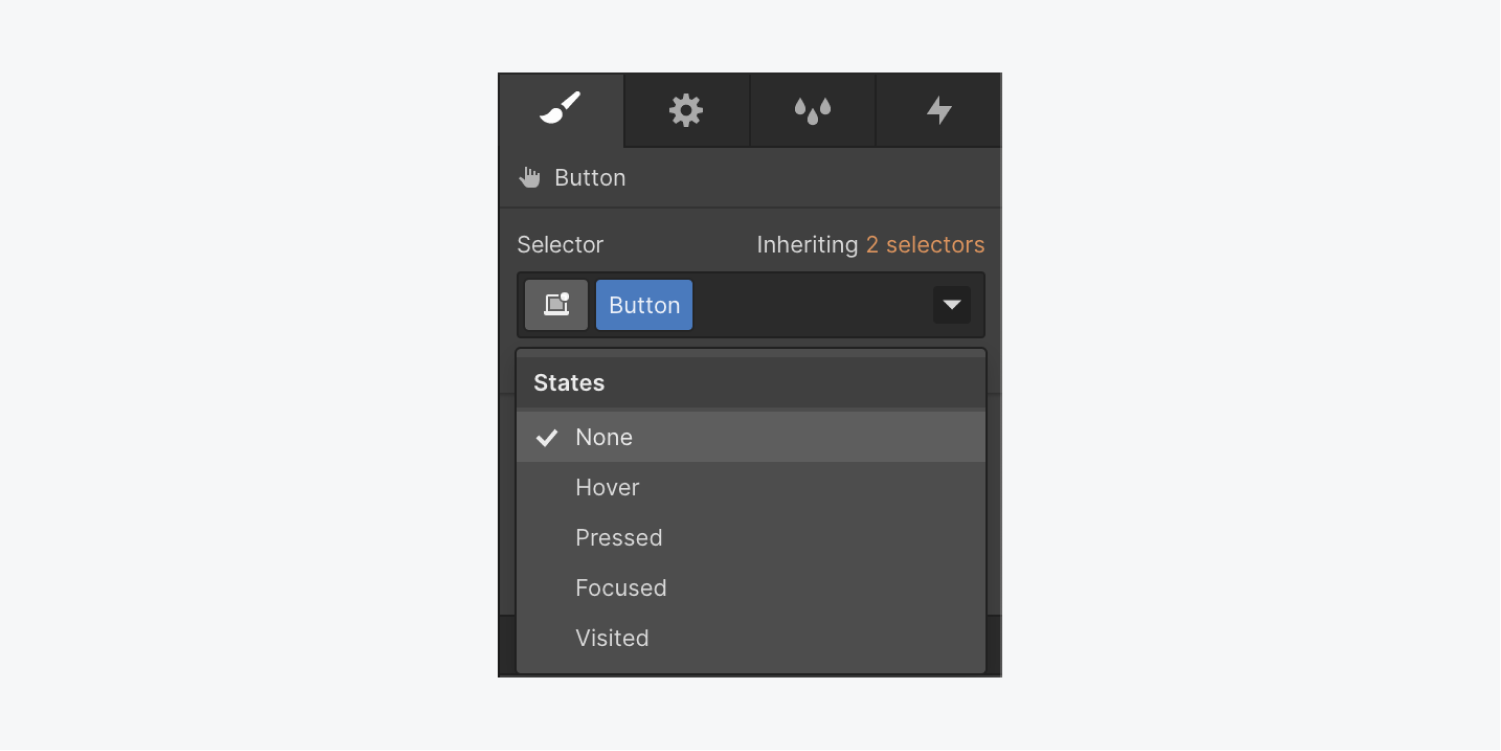
To remove this animation:
- Select the button on the canvas
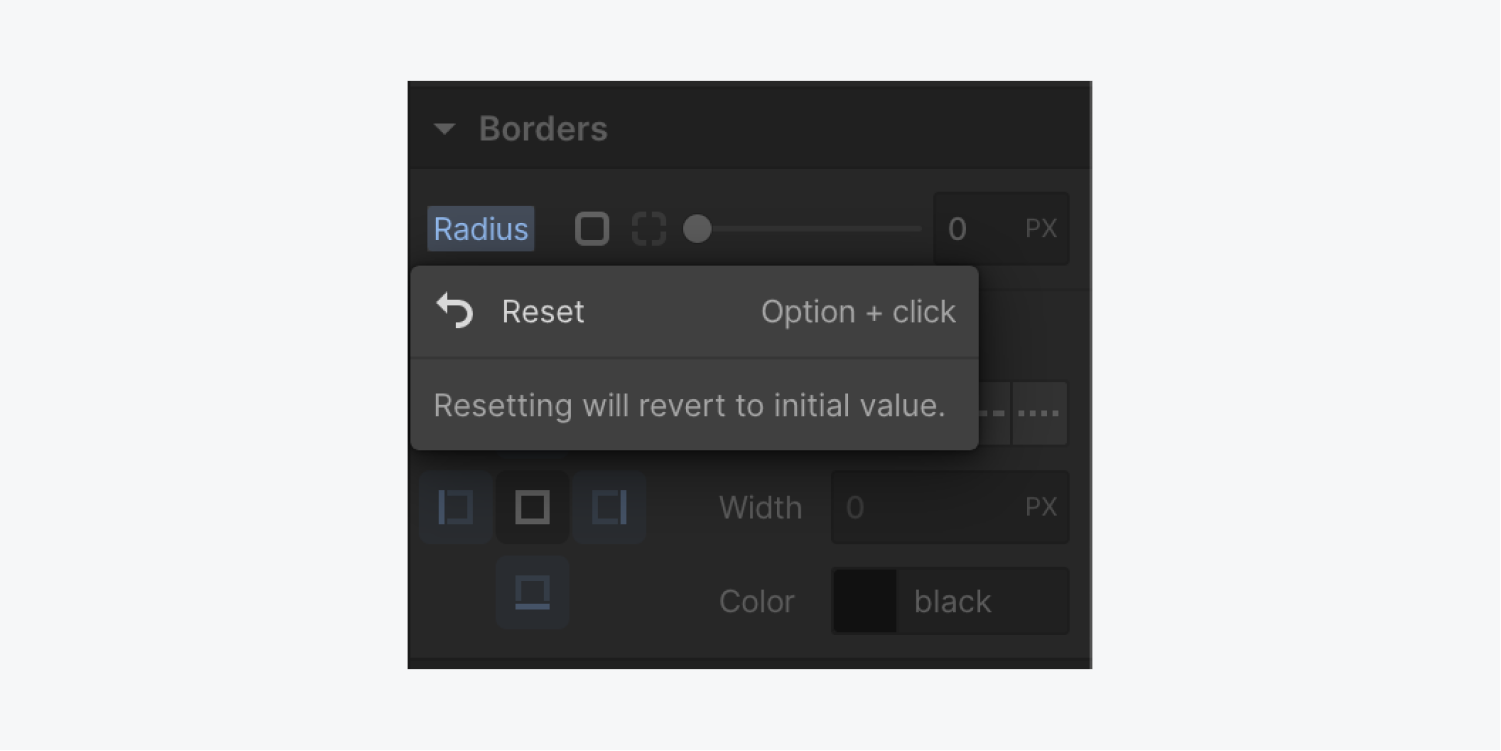
- Click into the Style panel > Selector and choose Hover from the dropdown
- Scroll down to Borders > Radius > Reset
To give your button rounded corners on click:
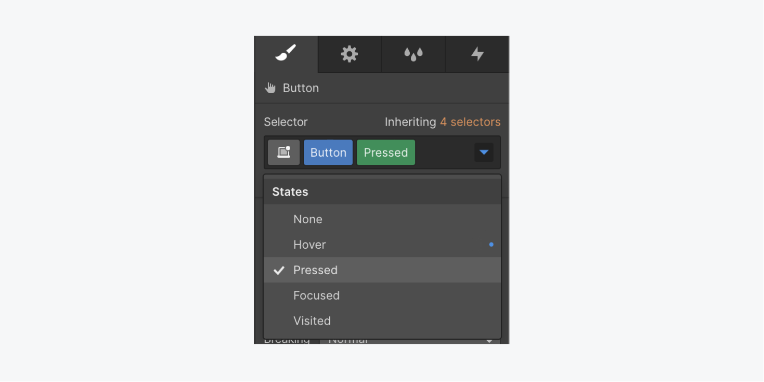
- Select the button on the canvas
- Click into the Style panel > Selector and choose Pressed from the dropdown
- Scroll down to Borders and add a radius (e.g., 10px)
You can use the same steps above to add a transition and animate things like the border color or border width on hover or click. Have fun with it!
And be sure to check out our full course on animations with After Effects and Lottie.


