In this lesson:
- Create and edit a grid
- Place content in a grid
- Move, span, and align grid content
- Design a responsive grid
The grid layout in Webflow brings CSS grid to life on a completely visual canvas. This gives you more direct control over your layout and design. With grid, you can reposition and resize items anywhere within the grid to produce powerful, responsive layouts — faster.
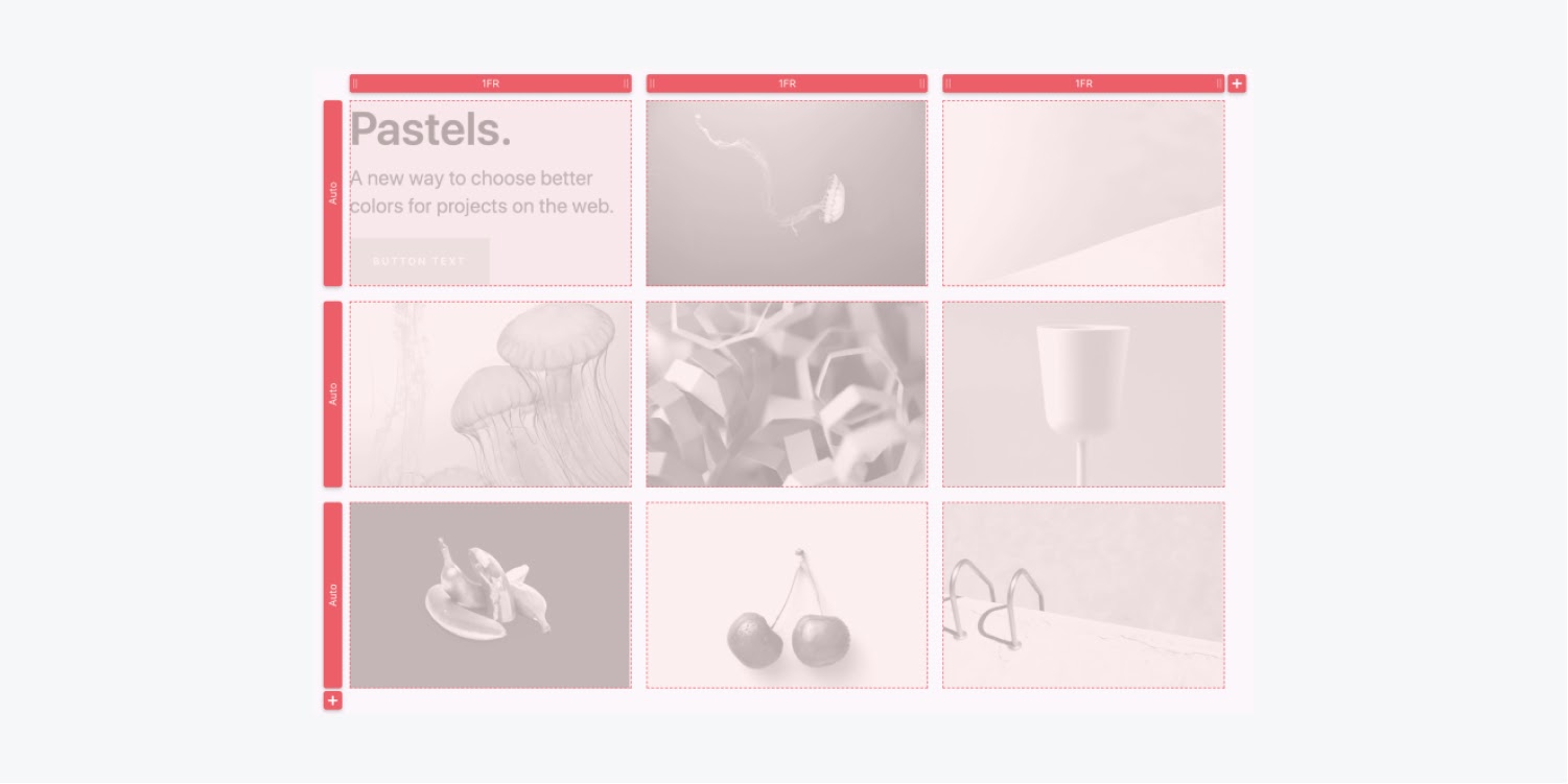
You can use grid to create various layouts. For example, you can use it to create a table that you can easily convert into cards on smaller devices.
Create and edit a grid
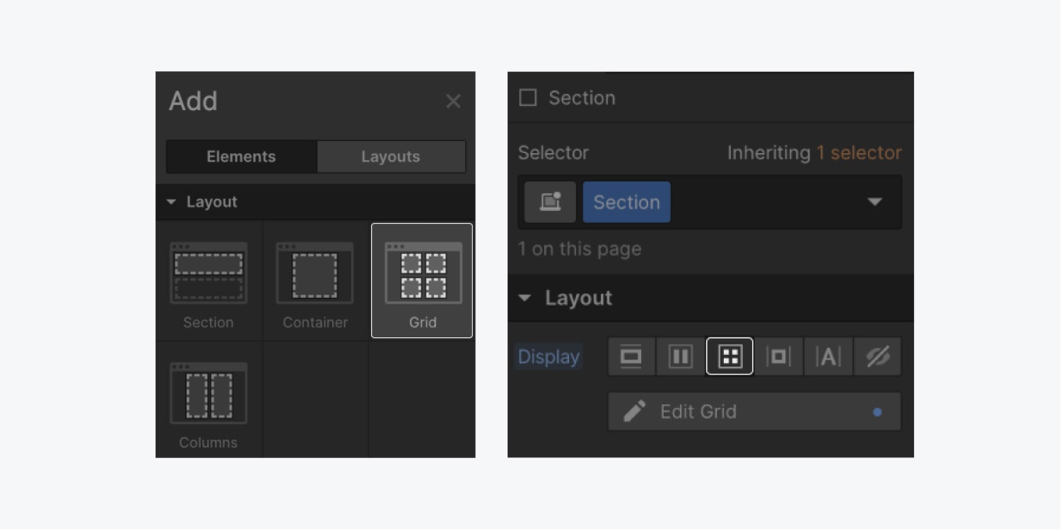
To create a grid, select the grid element from the Add panel. You can also apply the grid layout to any existing element in the Style panel.
Edit a grid
To edit a grid, click Edit grid under Layout in the Style panel when you have the grid selected.
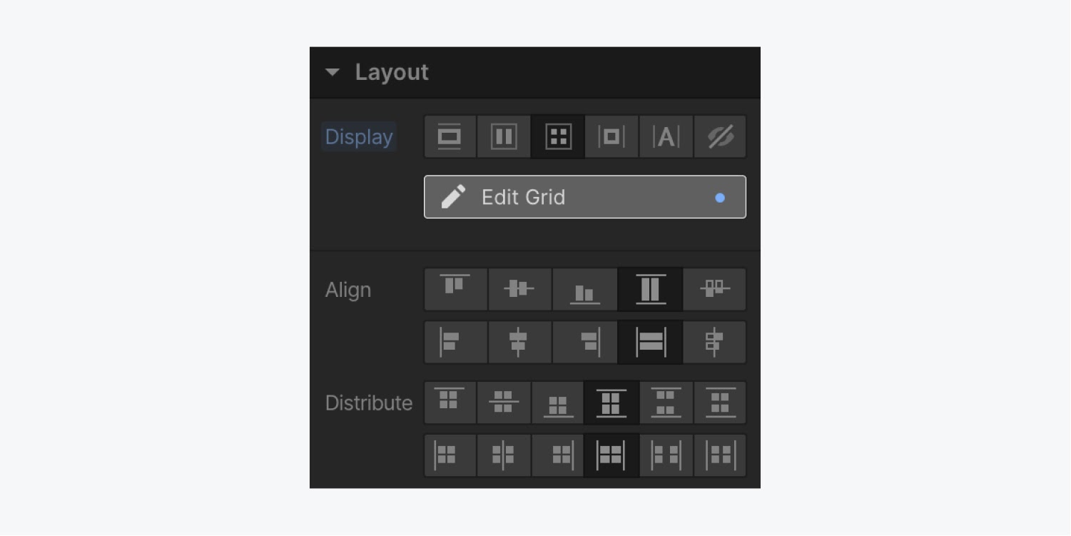
To exit the grid edit mode, press ESC or click Done on the canvas.
Add columns and rows
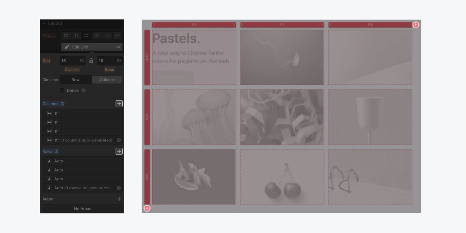
To add columns and rows, select the Add buttons that appear on the canvas or in the Style panel.
Duplicate and delete rows and columns
To duplicate or delete a column or row, right-click the column or row header and select Duplicate or Delete.
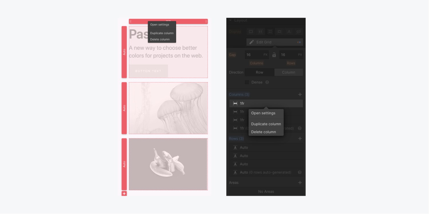
You can also delete or duplicate any row or column in the Style panel when you hover over a column or row.
Reorder rows and columns
To reorder rows or columns in the Style panel, open the grid settings and hover over the row or column you’d like to move, then drag the handle that appears.
Adjust gaps between columns and rows
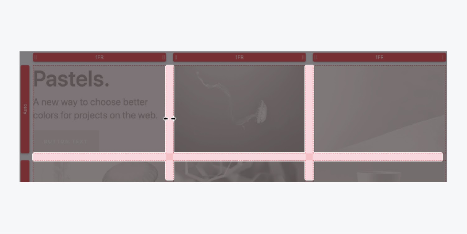
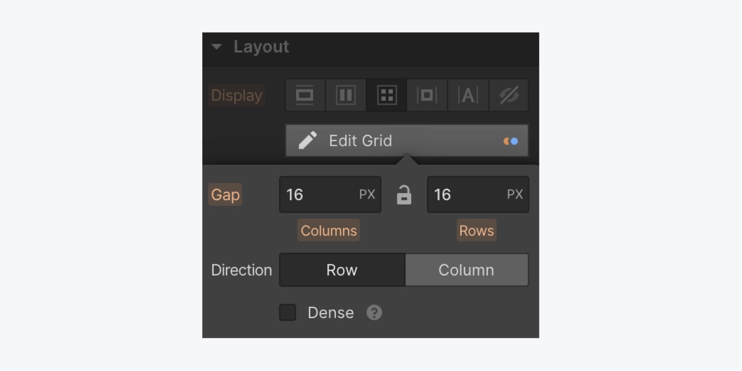
Gaps allow you to specify the space between grid items without adding margin or padding. To adjust the gap size between columns and rows, click and drag the gaps on the canvas.
Or, you can enter the desired gap size in the Style panel.
Adjust columns and row sizing
To adjust the size of grid columns, select and drag the column heading to the desired size on the canvas.
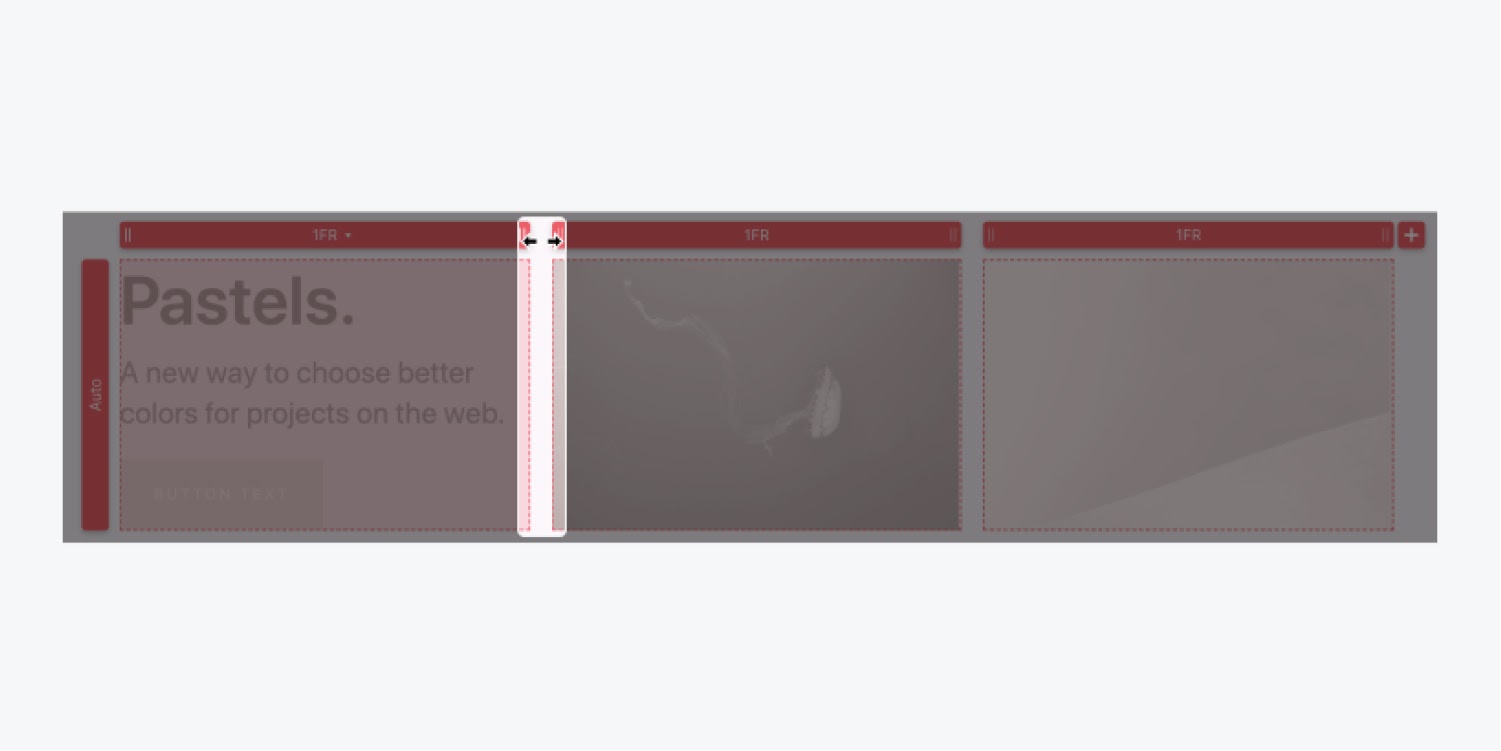
You can also enter a custom size for both columns and rows in the row or column heading on the canvas or in the Style panel.
The FR unit
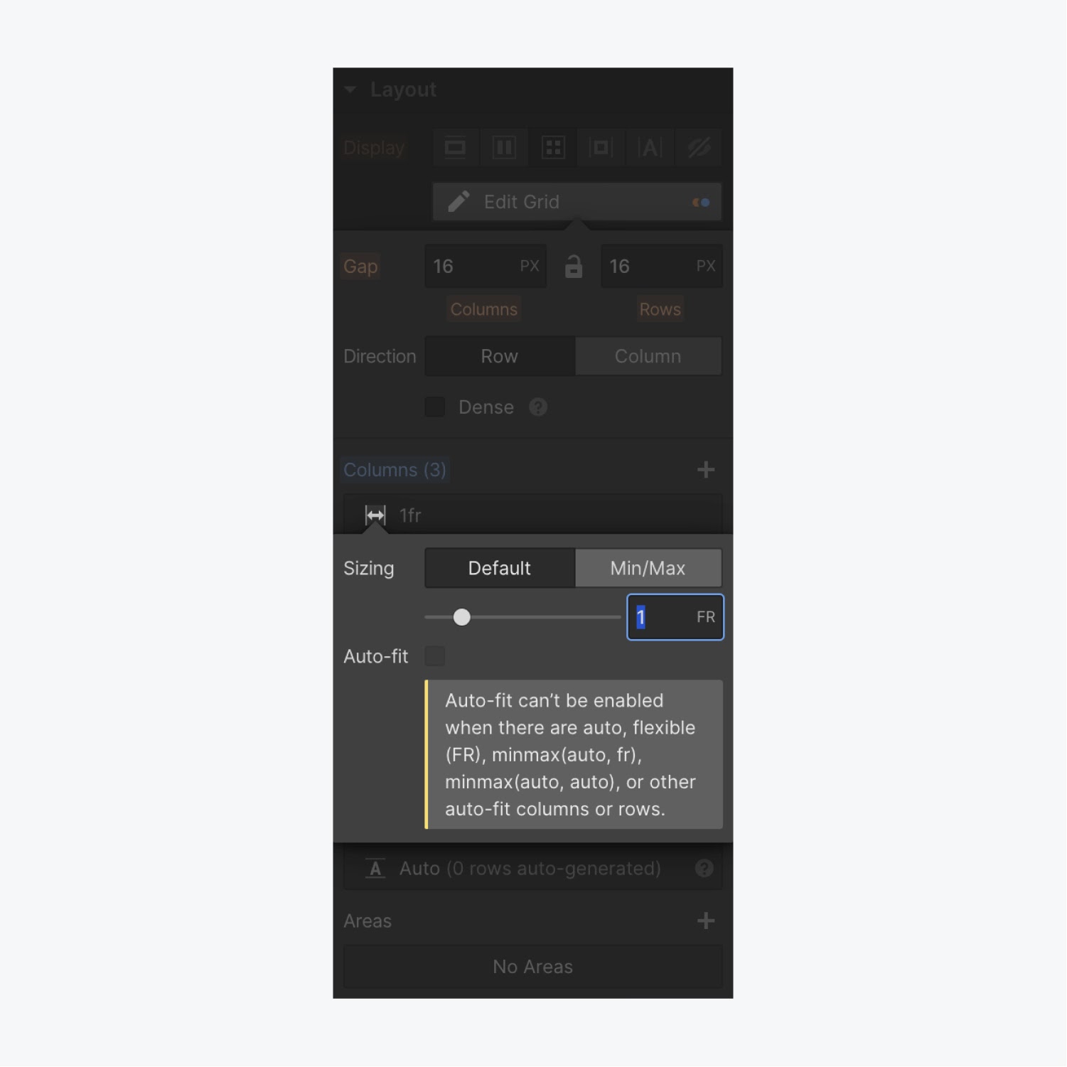
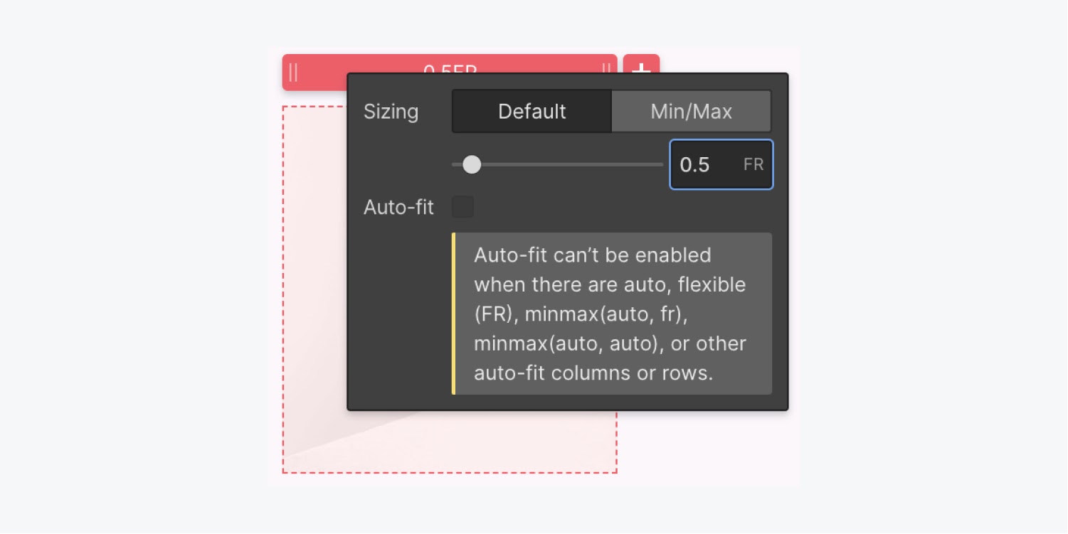
The grid layout introduces an extra length unit to help us define a grid: the FR unit. The FR unit represents a fraction of the available space in the grid container. You use it to define the length of rows and columns just like a percentage or pixel unit. But, unlike fixed percentages or pixel units, the FR unit automatically calculates cell space while adjusting for gaps.
Columns with a sizing value of 1FR will stretch or shrink to fill the available space in a grid container. If you add or delete columns, all columns with 1FR unit will adjust accordingly.
Min/Max settings
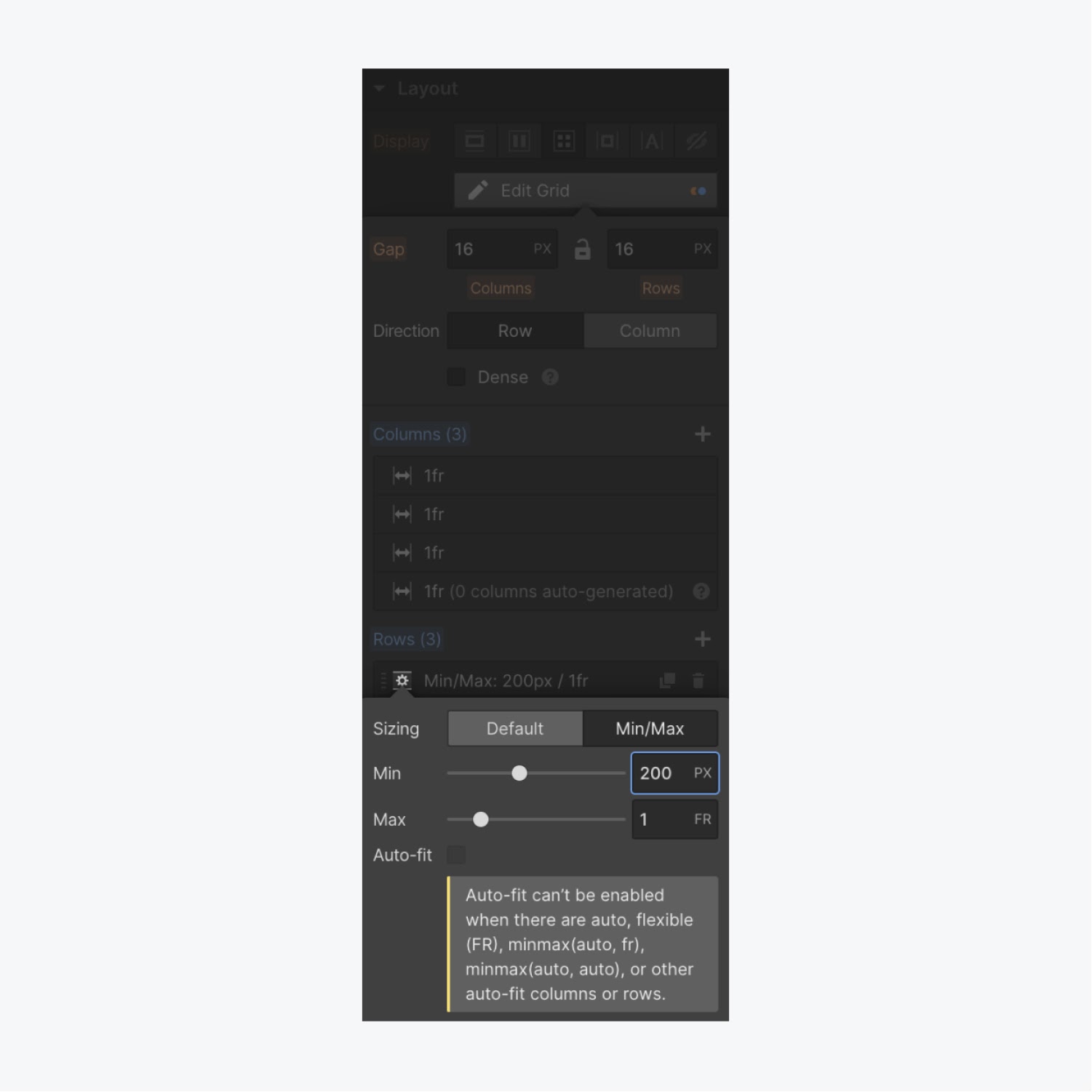
Setting min/max values ensures your rows and columns don’t shrink beyond a set minimum value or expand beyond a set maximum value. For example, a row has a default height of auto and will expand or shrink to fit the content inside.
If you want your rows to have a minimum height of let’s say 200px, you can set the min value to 200px and the max value to Auto. This way, the row will grow based on the content and never shrink beyond 200px. You can do the same with columns.
To enter a min/max value for any column or row, enter the desired values in the track heading on the canvas or in the Style panel.
Place content in a grid
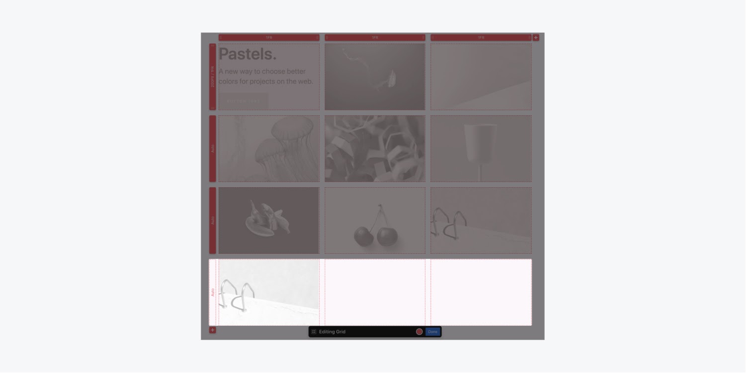
You can add anything inside a grid: a heading, an image, a div block, and even another grid. Anything you add to the grid becomes a child element of that grid. By default, every new grid child will populate an individual grid cell — filling in the next available cell from left to right. If there are no more available cells in a row, a new row will generate to house new grid children.
Change the direction in which grid content flows
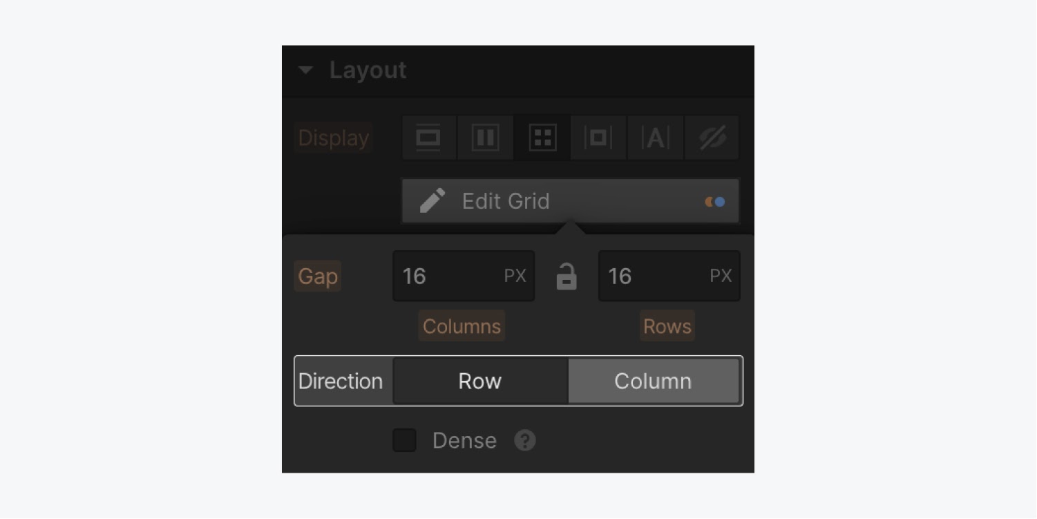
You can change the direction of the grid children by updating the direction settings in the Style panel. Here, you can select the default row setting, which places children from left to right. Or, change the direction to column, which places children from top to bottom.
Manually position content in a grid
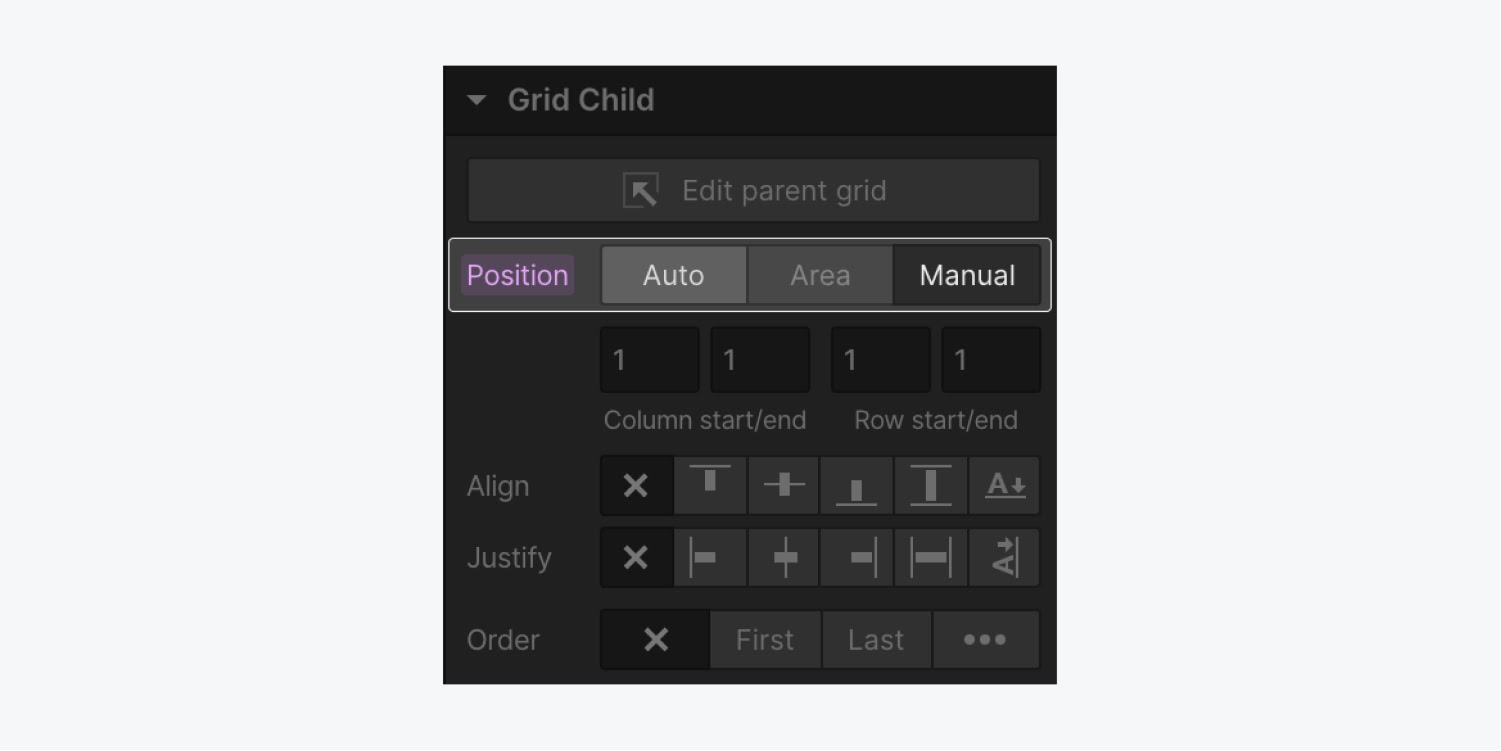
To override the auto placement settings to manually position an item in the grid, hold Shift while you drag the element into the grid. Any item manually positioned in the grid will keep the manual position setting.
To change the position setting of an existing grid child to manual, select the grid child and update the position setting in the Style panel.
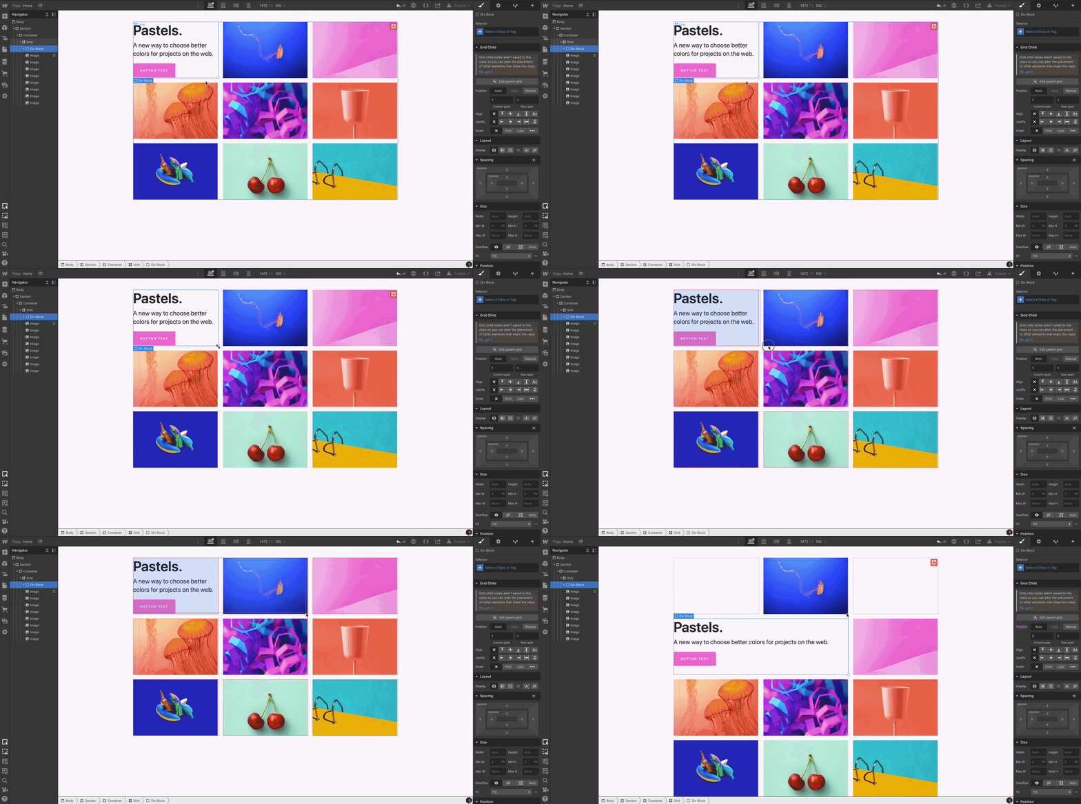
Manually placed grid children will remain in their designated grid cell. While automatically placed grid children move into the next cell to accommodate new grid children.
Nest multiple elements in a grid cell
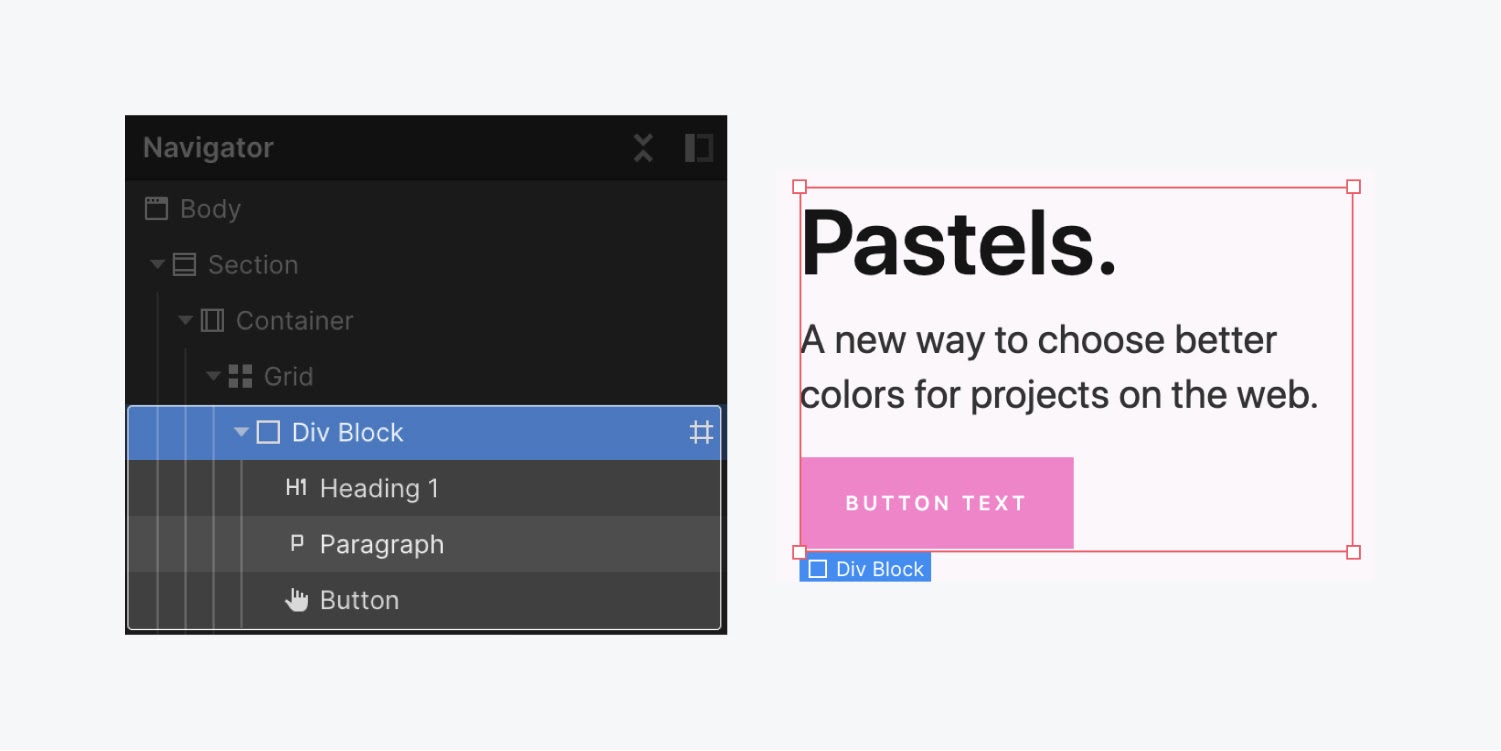
You can add multiple elements to a single grid cell by nesting elements within the grid child. To do this, you’ll first want to add a layout element, such as a Div block, to the grid as the direct grid child.
Once you’ve added the layout element (like a Div block) as the grid child, you can add other elements to that Div block by holding Control while you drag the elements into the grid cell.
Duplicate content in a grid
There are 2 ways you can duplicate a grid child to reuse the same content in more than one cell in your grid:
- Hold Alt (on Windows) or Option (on Mac) and drag the content to create and move the duplicate into a new grid cell
- Select and copy the content, then select the grid and paste the content
Move, span, and align content in a grid
Once you’ve placed your content in a grid, you can manipulate them as you please. You can move the content around to reposition them in different cells. You can span the content to take up multiple cells. You can also adjust the alignment of the content within the grid.
Move grid children
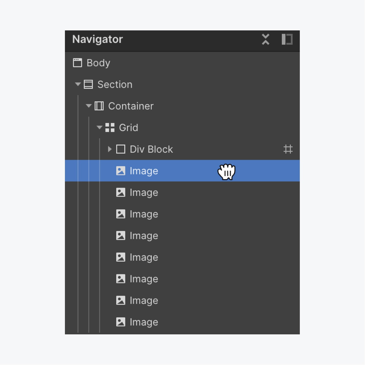
To reposition content in the grid, select and drag the grid child to the desired location on the canvas, or in the Navigator.
Set grid child order
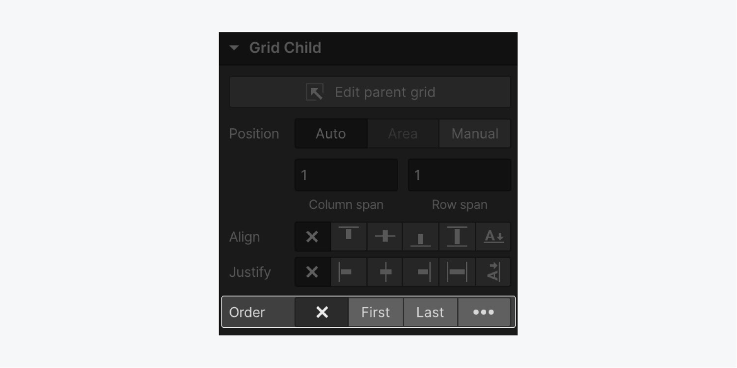
You can also set the order of grid children in the grid child settings section of the Style panel.
Align content in a grid
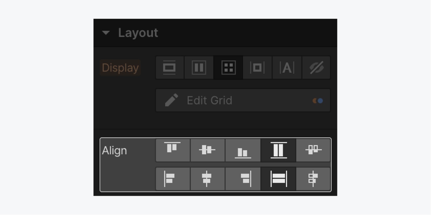
To update the alignment for all children within a grid, select the grid and change the alignment settings in the Style panel.
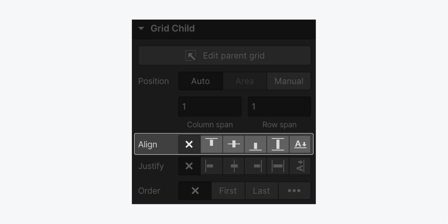
To change the alignment of a single grid child, select the grid child and update the self alignment settings in the grid child section of the Style panel.
Span grid children
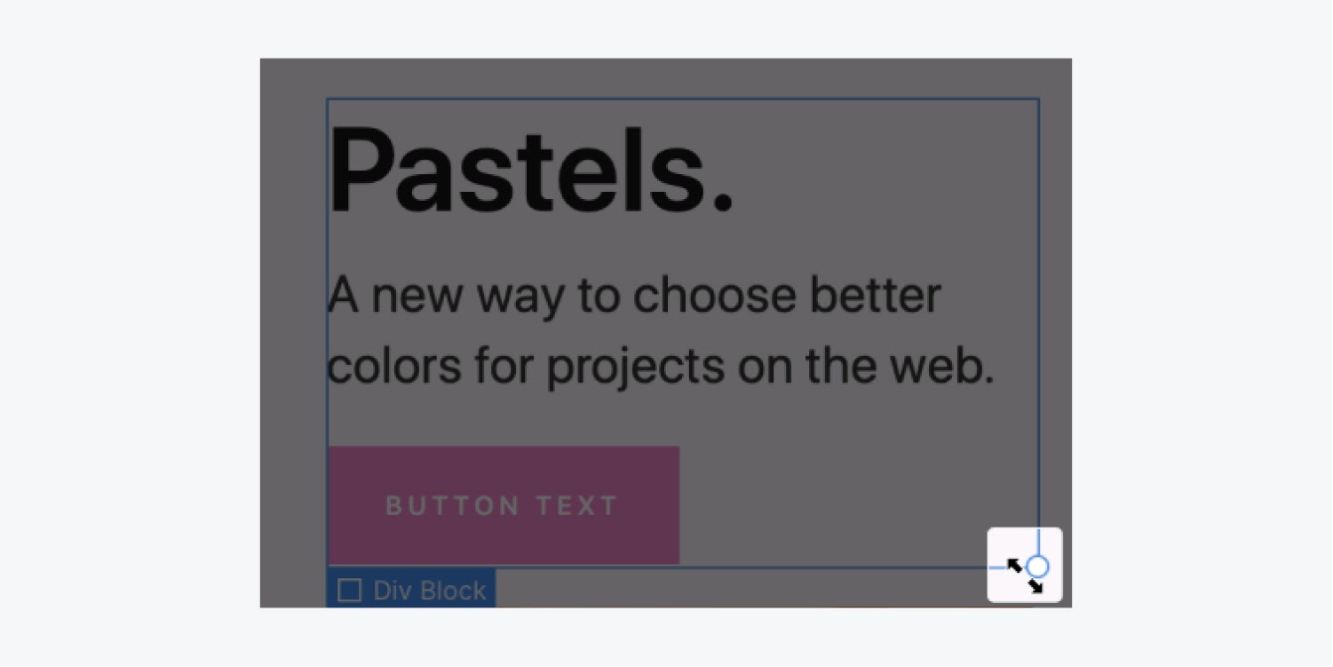
To span a grid child across multiple grid cells, select the grid child and drag the handles that appear in the corners of the grid cell.
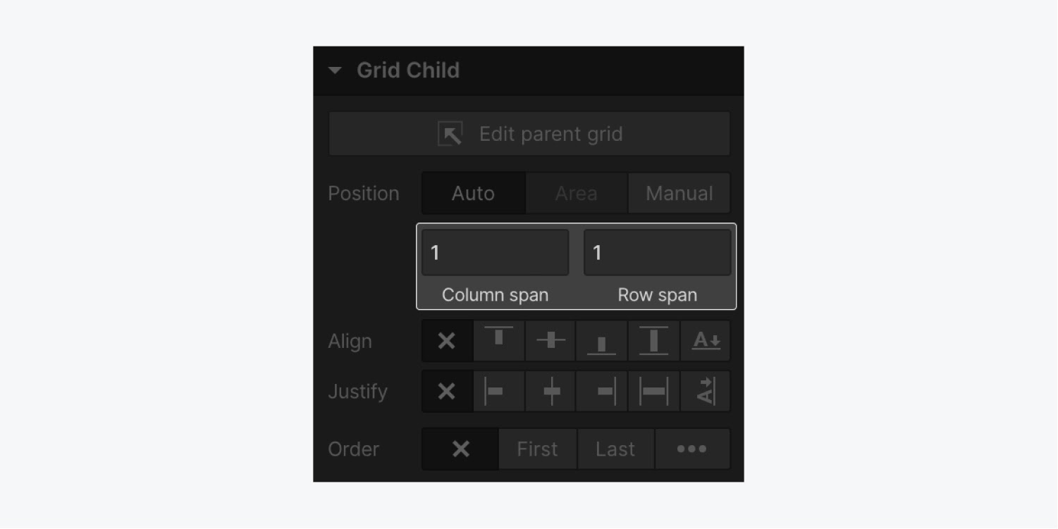
You can also span grid children in the Style panel. For a grid child with automatic positioning, specify how many columns and how many rows the child should span.
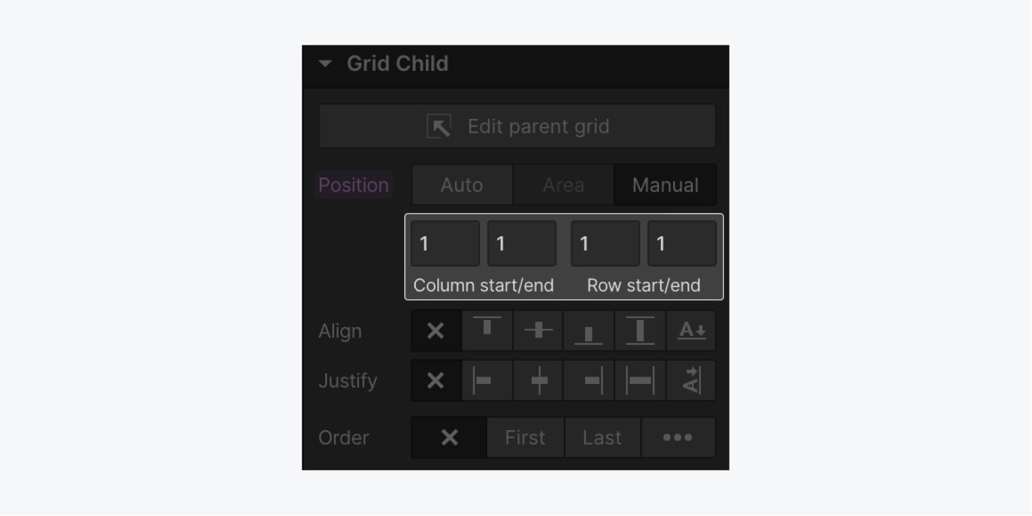
For children positioned manually, enter which column and row the item starts and ends in.
Watch a video tutorial on Spanning content in a responsive grid.
Lock grid child positioning
Negative grid child positioning values are great if you:
- Don't want to re-span your navbar to fill all columns each time you add new columns
- Want to keep your footer in the last row of the grid no matter how many rows you add to your grid
- Want to keep the main content section always centered in your grid
Negative numbers allow you to position children relative to the end of the grid — they reference cells from right to left or bottom to top.
To keep your navbar spanning across all columns, position it between column 1 (the first column) and column -1 (the last one).
To keep your footer in the last row of your grid at all times, position it in row -1/ -1.
If you want to keep a child centered in the grid with the same number of columns on each side, set the "end" value to be the negative equivalent of the "start" value. Example 3/-3 or 2/-2. Now if you remove columns on smaller breakpoints, the child will remain centered.
Clear grid child settings
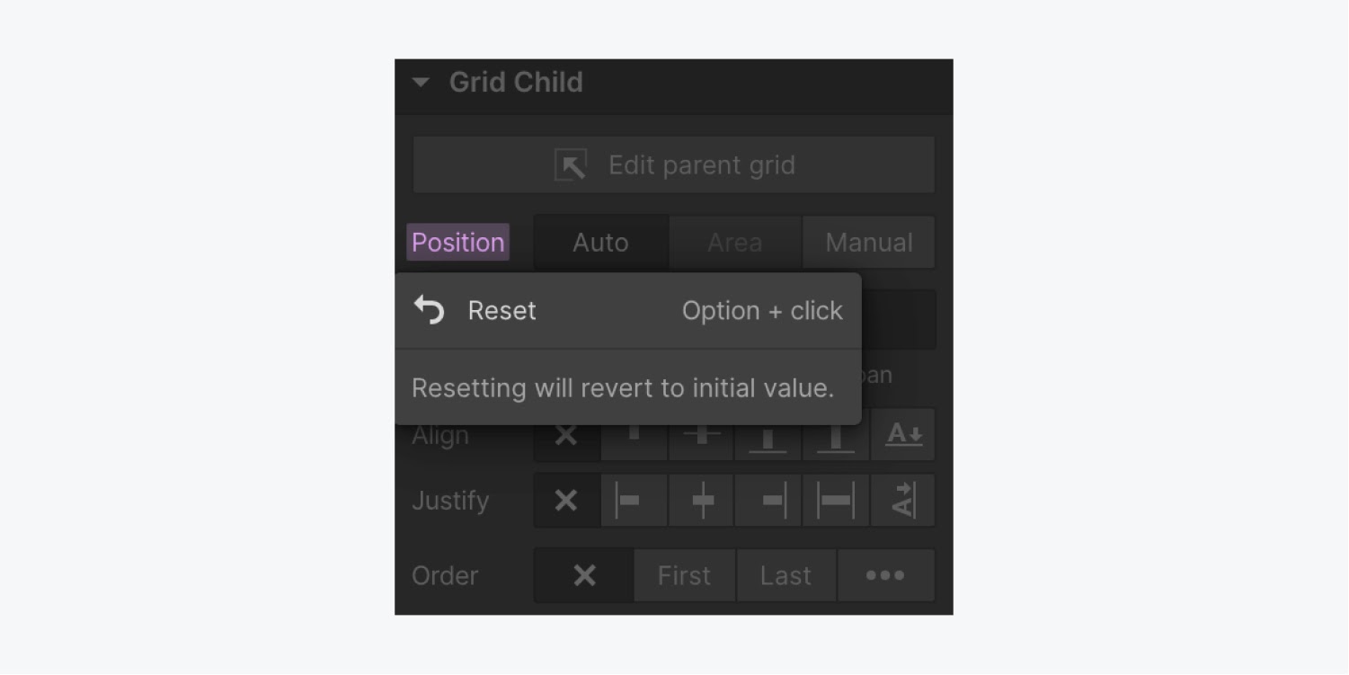
Grid child settings apply only to the selected element and they aren't saved with the class. Pink labels in the Style panel show the changed settings applied to the selected element on the current breakpoint. These styles do cascade to lower breakpoints and are indicated with orange labels. The indicator will turn pink again when you override an inherited (orange) style on smaller breakpoints.
To remove any applied grid child setting, click the pink label, then click reset.
Overlap grid children
Grid children with manual positioning will automatically overlap when they intersect in the same cell(s). You can also control the stack order of those overlapping elements. You can do this by repositioning them in the Navigator, or by adjusting positioning and z-index settings.
Watch a video tutorial on Overlapping grid content.
Fill empty grid cells
Empty cells may remain in the grid when you have spanned grid children. To automatically populate these cells with content, enable the dense setting in the Style panel.
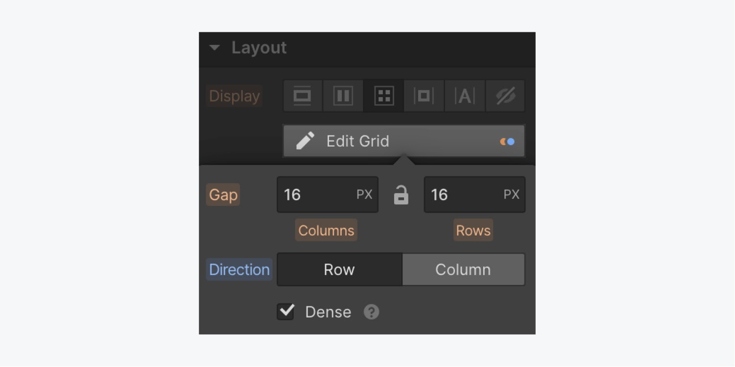
Note: Dense attempts to fit grid children into empty cells of your grid. This can be bad for accessibility, as it only alters where items display, not where they appear in the page’s source.
Design a responsive grid
To design your grid so it's responsive across screens, you can either manually delete columns on smaller viewports or enable auto-fit to automatically generate columns and rows to accommodate smaller screen sizes.
Manually style the grid layout across breakpoints
To make sure your grid is responsive on all devices, view your grid on smaller breakpoints and remove columns as needed.

If you can't remove columns on smaller breakpoints, try:
- Setting your grid direction to row
- Making sure you haven't manually-positioned grid children in those columns
- Making sure you don't have child elements spanning those columns
Enable Auto-fit
Auto-fit is one of the most powerful features of CSS grid, it allows you to repeat and wrap columns automatically so that you can build a layout that works across every single screen size — no per-breakpoint adjustments needed.
To enable auto-fit, delete all but one column and one row. Set minimum and maximum dimensions for the column and enable auto-fit.
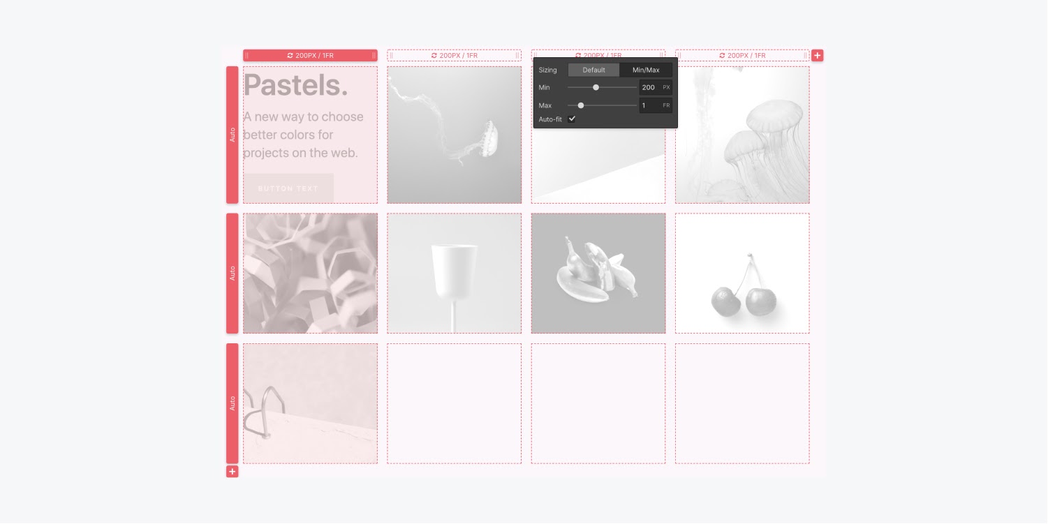
More columns will automatically generate and repeat to distribute content responsively.
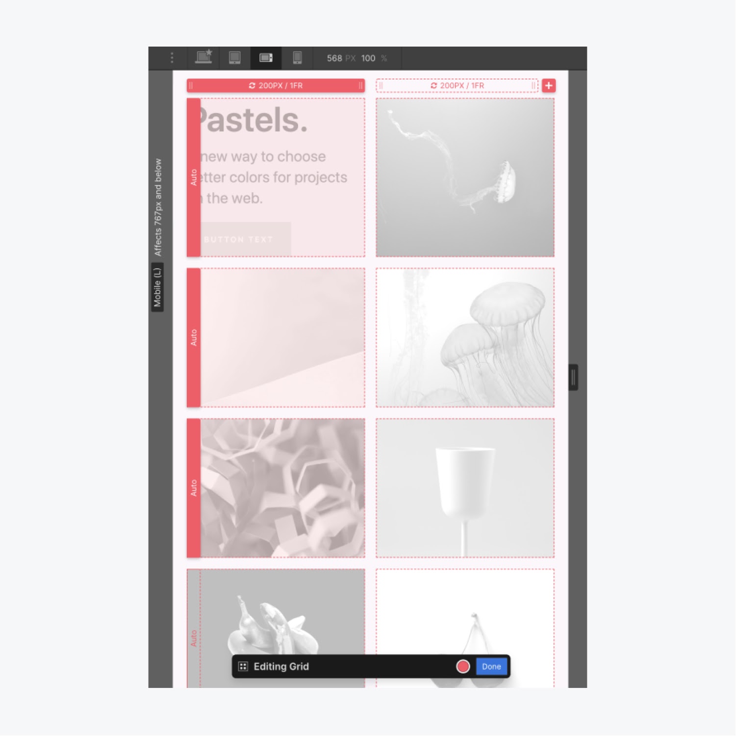
Watch a video tutorial on using auto-fit to turn a collection list into a responsive grid.
Once you perfect creating a grid, learn how to use grid areas to create reusable layout templates.


