We’ll show you how to build a pop-up that’s a tad different — one that's user-initiated. The user clicks a button to start the pop-up animation, which shows a form. (Of course, you can also switch up the trigger to meet your needs.)
In this lesson:
- Create a fixed modal
- Add a button to your project
- Set up the pop-up trigger
- Set up the pop-up animation
- Set up the close animation
Create a fixed modal
You’ll need to create an overlay for your content — you can do this in 3 steps:
Create a pop-up wrapper
To add a Div block to serve as the wrapper for the modal, press A on your keyboard to open the Add panel (or click the plus icon in the top left) and drag a Div block element into your project.
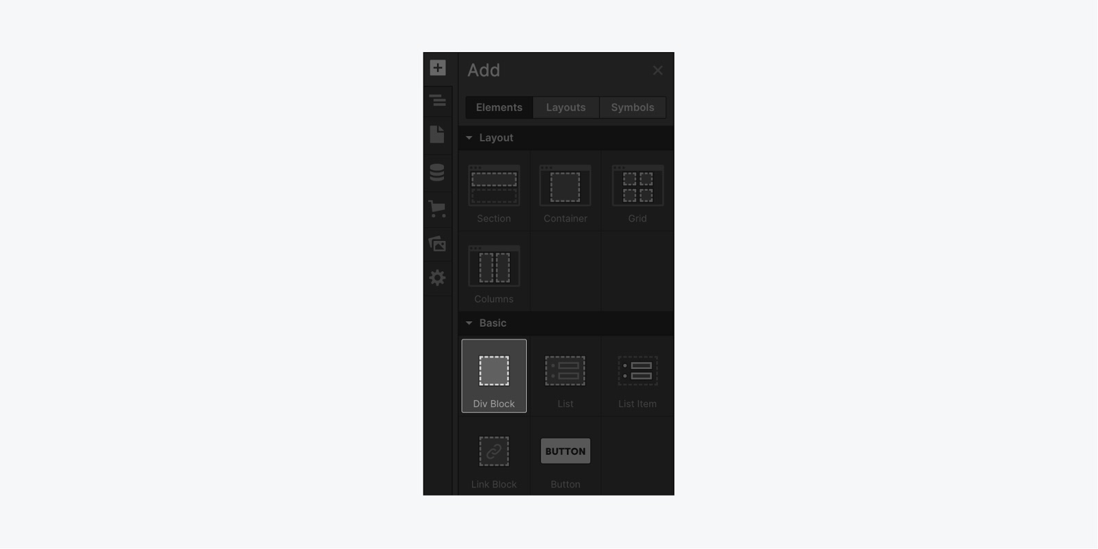
To help keep your project organized, place the Div block at the top of your project's Body element (it is not required that we place this element at the top, but it helps with organizing the elements). To make this easier, drag the element into the Navigator and place it inside the Body element.
With the Div block selected, give it a class name like “Pop-up wrapper” and add style in the Style panel:
- Display: flex
- Flex layout: vertical, center, center (this style will center our form)
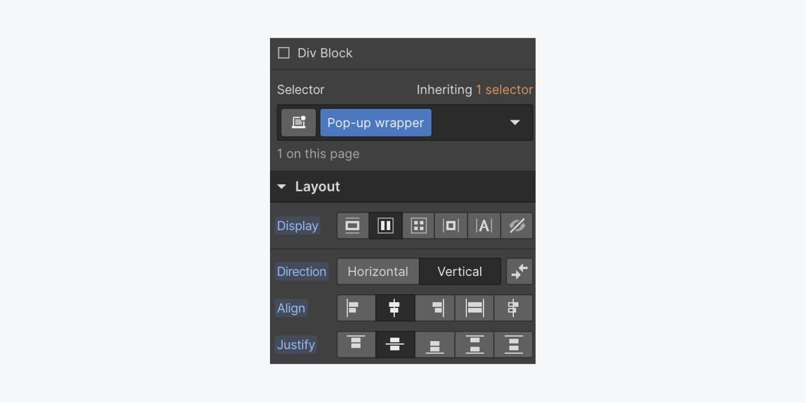
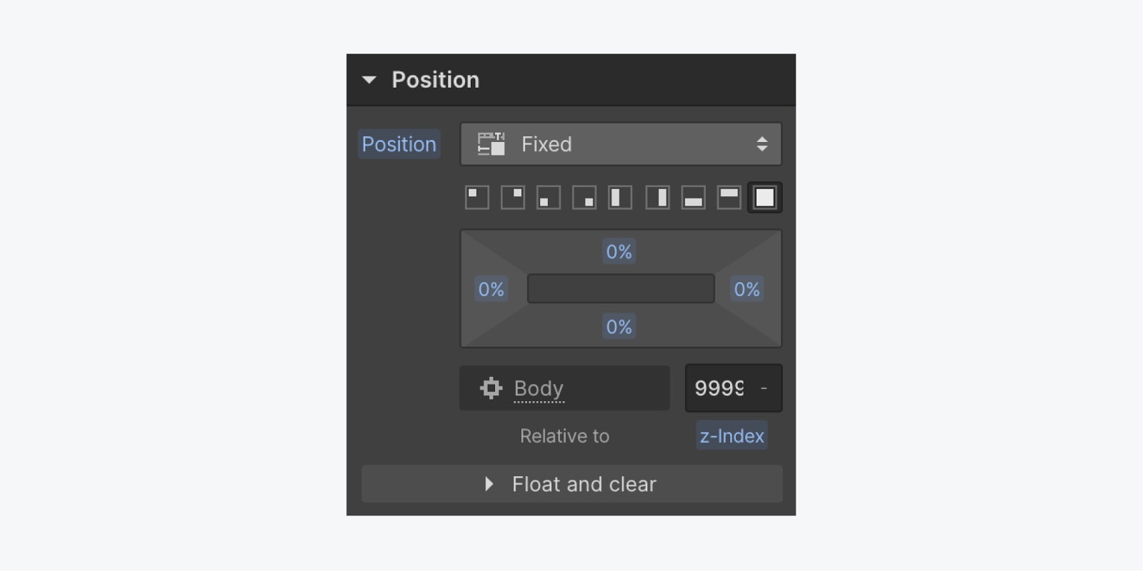
Scroll down the Style panel to add the next few style settings so that the wrapper is taking up the full view
- Position: Fixed, full
- Z-index: 9999 (this z-index will help make sure our wrapper sits on top of all other elements in our project)
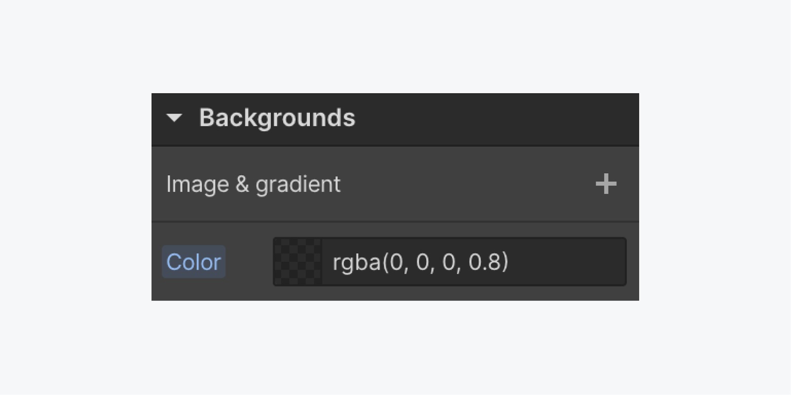
Add a background color to help the pop-up standout from the rest of your project’s content. Try #000000 with an opacity of 80% — or, any background color that fits your project.
Add a form element
To have a pop-up with a form, you'll need a Form element inside the wrapper.
With the wrapper selected, add a Form using the Quick Find feature:
- Press Command + E (on Mac) Control + E (on PC)
- Type "form,"
- Choose the Form element and place it in your “Pop-up wrapper” (because of the previously added styles on the wrapper, the Form will be centered using Flexbox)
- Style your form to fit your project (e.g., 500 pixels of max-width and 100% width)
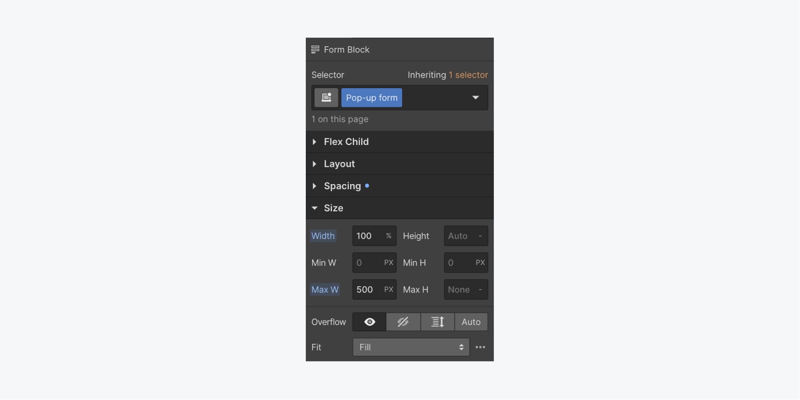
Using this combination of style keeps your form from being larger than 500 pixels (500px max-width) while making sure that it’s responsive to various device sizes (100% width). Learn more about responsive design in Webflow.
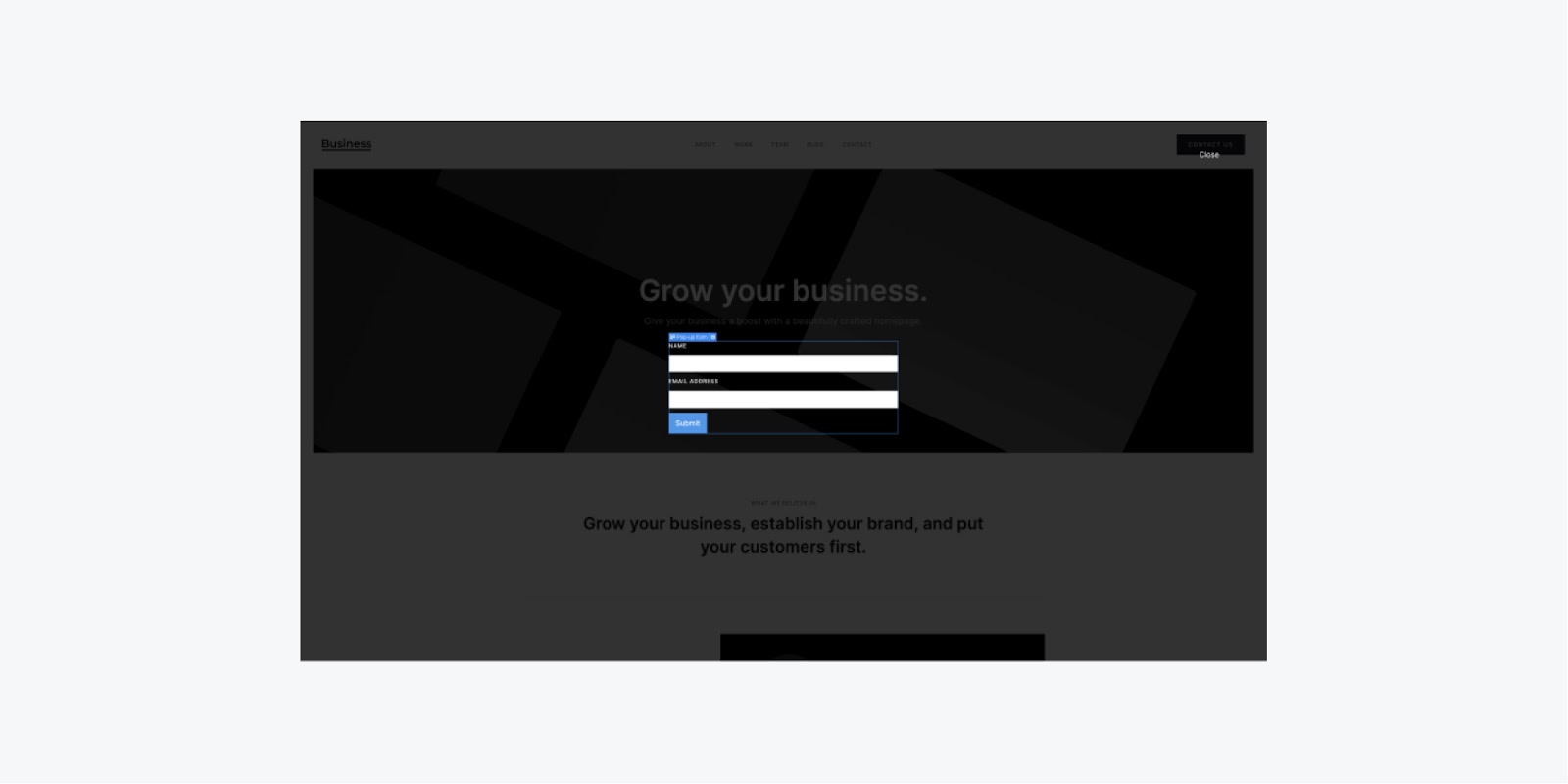
Create a "close" link
Next, we’ll add a text link so people can close the pop-up once they’ve submitted the form.
To do this - drag a Text link in the Navigator to the top of our “Pop-up wrapper” (again, it is not required that we place this element at the top, but it helps with organizing the elements).
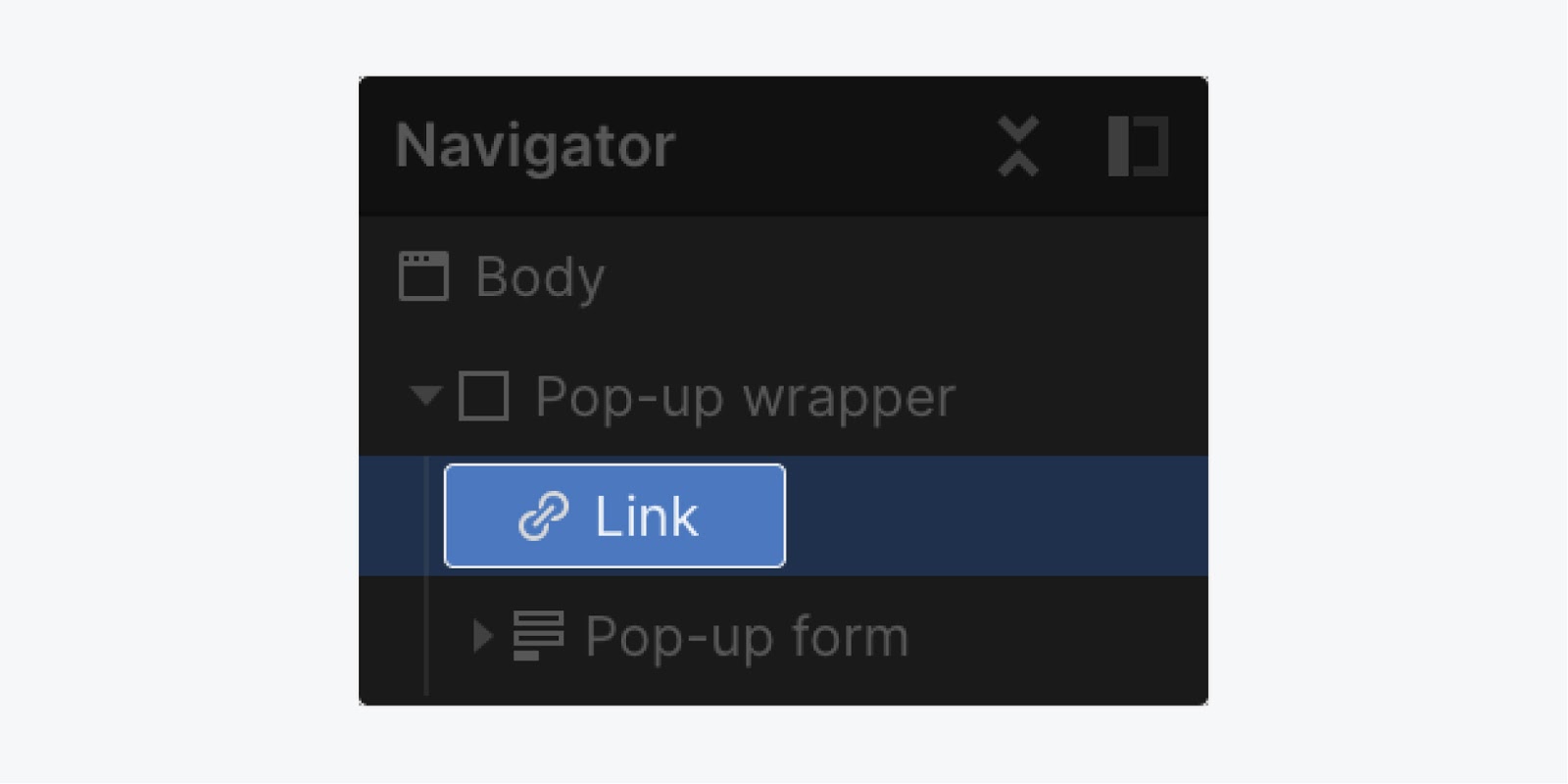
And with it selected, give the link a class name (e.g., Pop-up close) and add some style to it:
- Position: Absolute
- Top: 5%
- Right: 5%
- Bottom: Auto
- Left: Auto
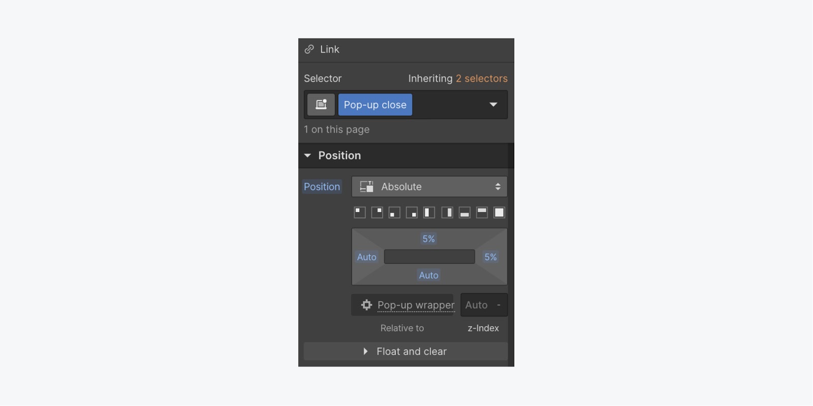
Using this combination of style keeps your close link at the top of your pop-up wrapper.
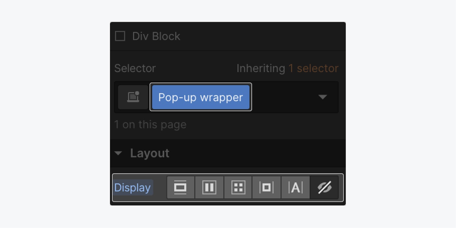
Now, you have all of your elements created in your pop-up. Next, set the display style of the “Pop-up wrapper” to None so that it is hidden when it is not in view.
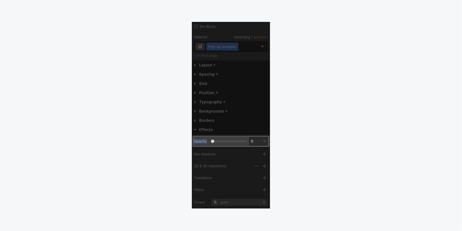
Let’s make the opacity of the “Pop-up wrapper” 0%. Changing the opacity to 0% will set you up to create a smooth fade-in animation when you build the interaction.
Add a button to your project
The last thing you need for your project is an element to trigger the pop-up, like a button. Clicking the button will trigger the pop-up to open.
To add a button:
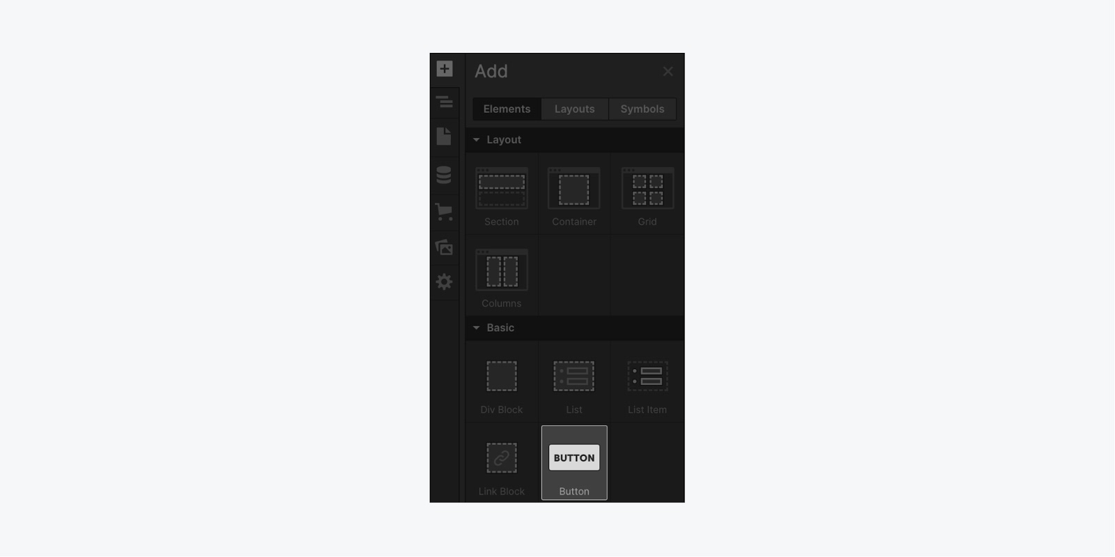
- Press A on your keyboard to open the Add panel (or click the + icon at the top-left side of the Designer)
- Drag a Button element where you would like it into your project
Set up the pop-up trigger
With your button added to the project, you can now set up an interaction to trigger the pop-up to show when the button is clicked.
Traditionally, interactions were highly-specific JavaScript libraries, requiring any number of tools and plugins complete with conflicts, quirks, and obscene code-based learning curves. With Webflow, we can create our pop-up interaction visually.
And, you can do this by first selecting the button on the canvas. Then, click the Interactions icon to open the Interactions panel
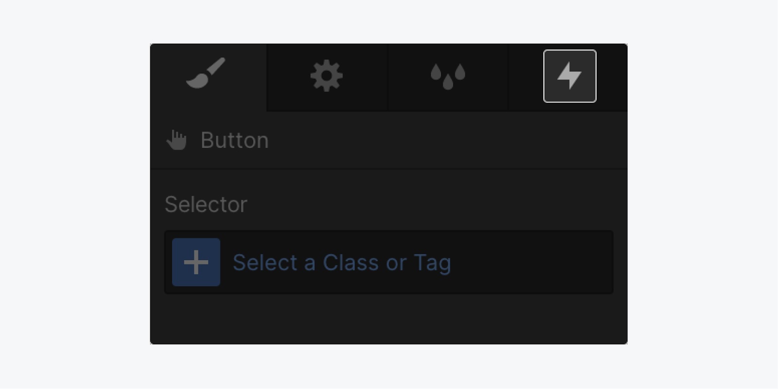
In the Interaction panel, click the + icon for Element trigger, and select the Mouse click option.
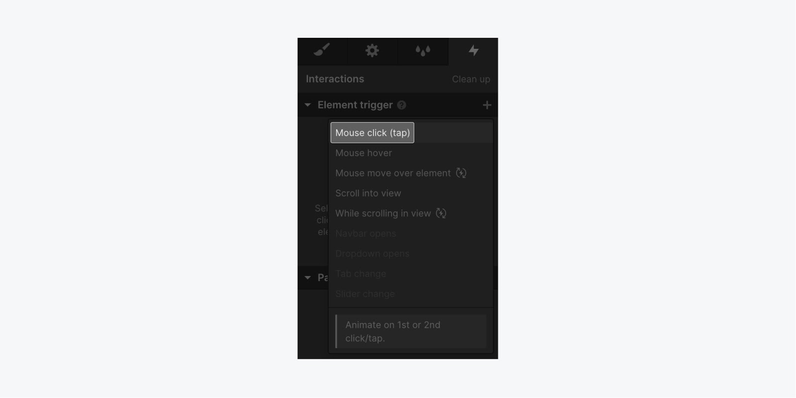
Set up the pop-up animation
Webflow gives a few pre-created interactions, but you’re going to create a custom interaction to show your pop-up. And, your pop-up is going to fade-in when someone clicks on your button. To do this - under On 1st click - click the Action dropdown to select the Start an animation option. Next, click the + icon to add our timed animation
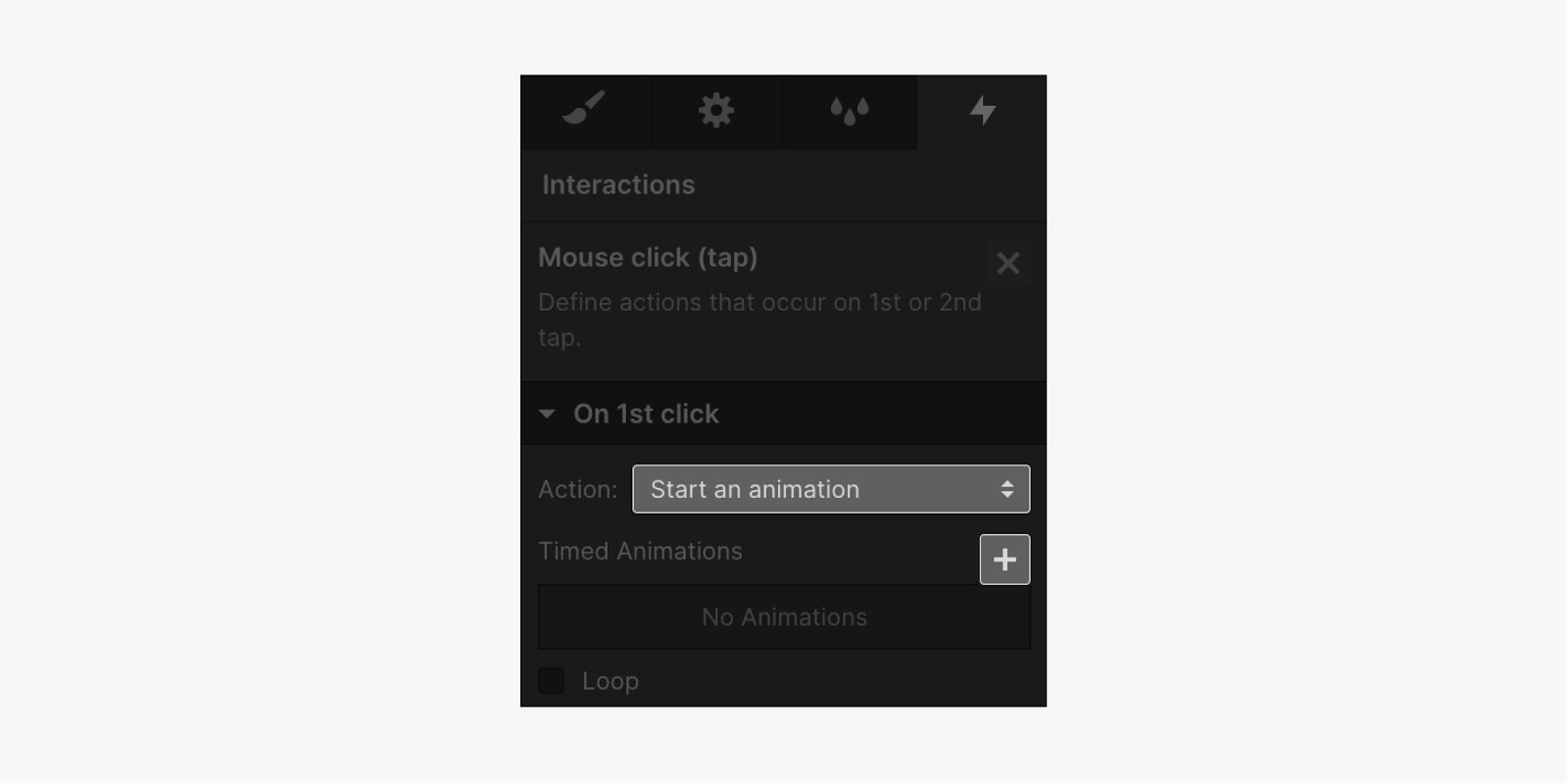
Now, you can name your animation (e.g., Pop-up), and then select the element you want to animate.
Note: Make sure you select the element while the Interaction panel is open.
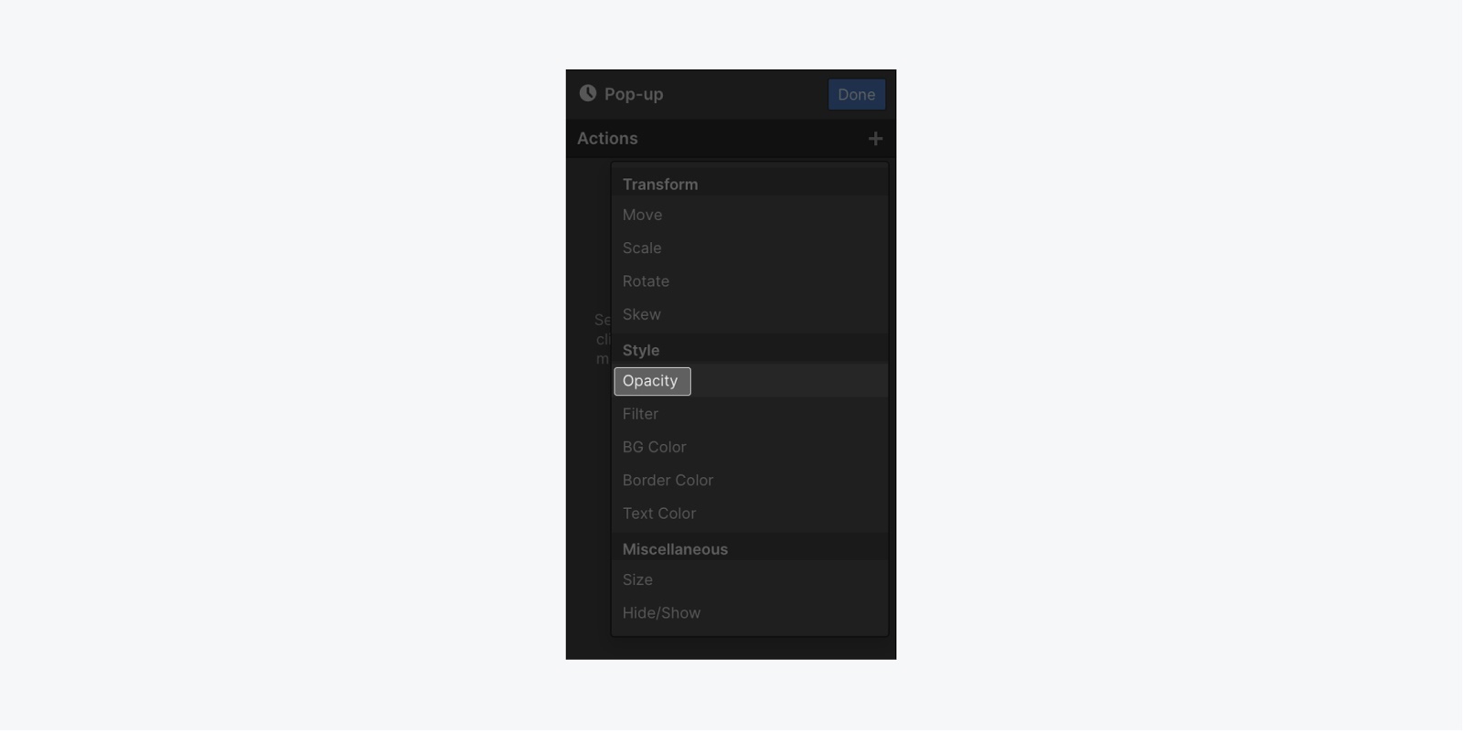
For this project, you’ll select the “Pop-up wrapper” element from the Navigator. Next, click the + icon next to Actions, then click Opacity (this will first set the initial state of our opacity).
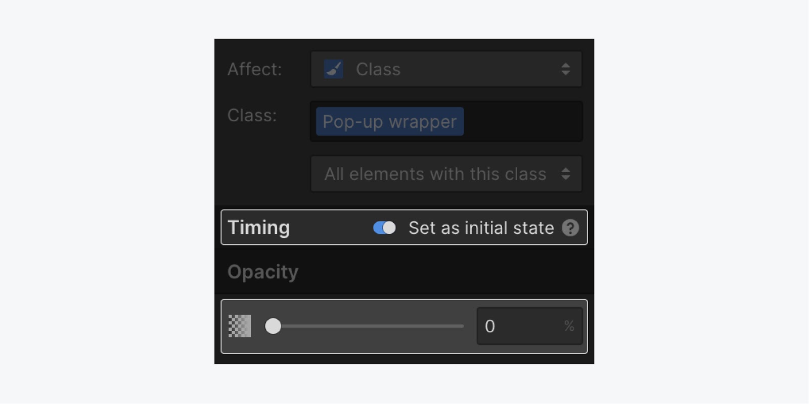
Now, for our timing (and we can see our timing at the bottom of the panel) you want to first toggle on the Set as initial state option, and set the value to 0%.
Next, click the + icon next to Actions, then click Hide/Show (this show our hidden pop-up, but the opacity will not yet reveal it). And, we want to set the Display to Flex.
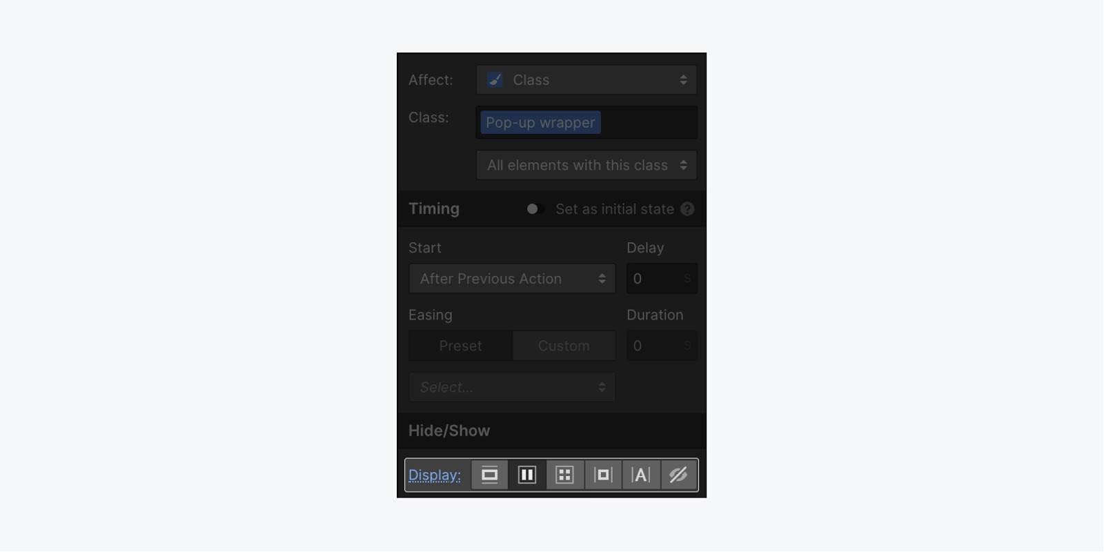
The last step we want to build is to change the opacity from 0% to 100%. To do this, click the + icon next to Actions, then click Opacity (adding this step automatically sets it to 100%).
Finally, click the Done button, and publish your project. Now, when you click your button - it will show your pop-up. But, you can’t close it, so we’ll need to create an interaction on the “Pop-up close” link.
Set up the close animation
To create a close interaction, you first need to select the “Pop-up close” link in the Navigator.
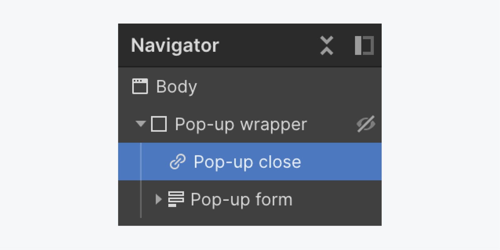
Then, you can create your interaction to close your pop-up when the link is clicked.
To do this:
- Click the Interaction icon to open the Interaction panel
- Select the Mouse click option
- In the Action dropdown, select the Start an animation option
- Next, click the + icon to add your timed animation
- Then, name your animation (e.g., Close pop-up)
- With the Interaction panel open, select the “Pop-up wrapper” element in the Navigator
- Next, click the + icon next to Actions, then click the Opacity option
- Change the opacity to 0%
- Then, click the + icon next to Actions, then click Hide/Show
- Select the None option for the Display setting
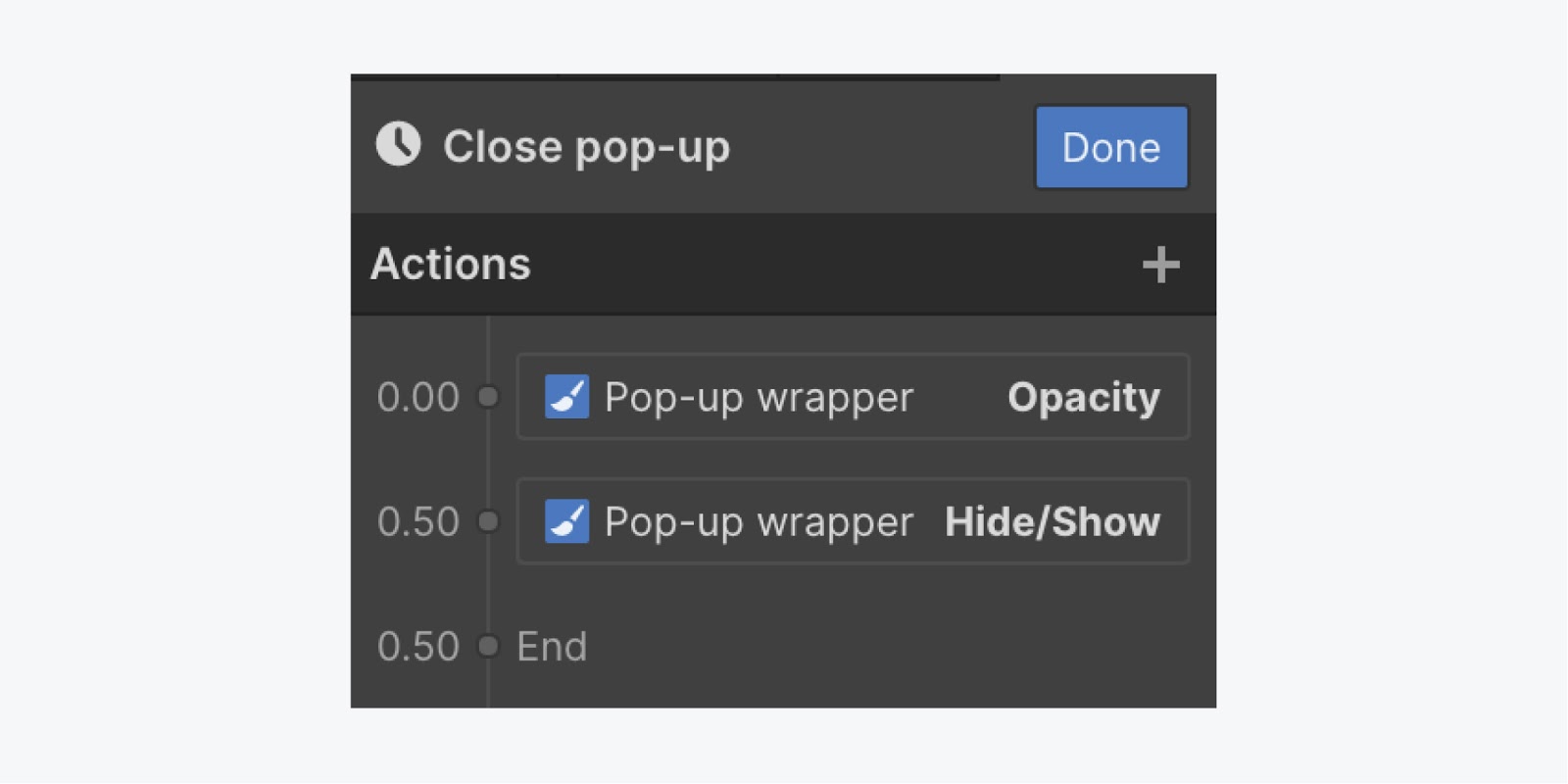
Finally, click the Done button, and republish your project to test your pop-up.
And that’s building a pop-up with fixed positioning. Nice work!


