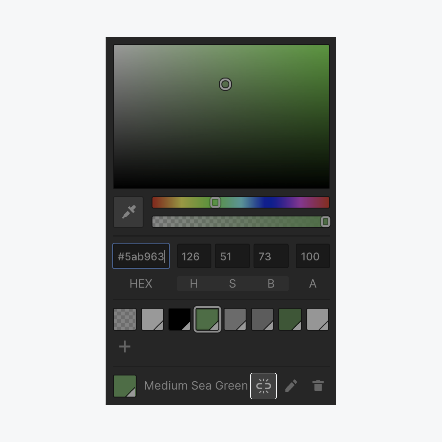
Choosing a color for fonts, backgrounds, borders, or whatever is one of the most common operations when designing a website. The color picker has different tools that allow you to:
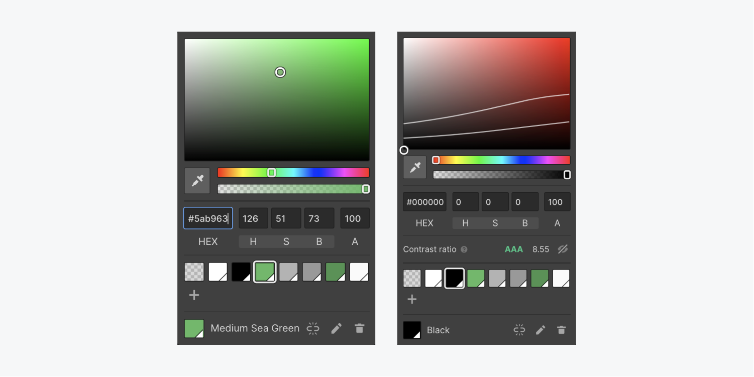
Pick a color and set its opacity
You can pick a color in one of the following ways:
- Using the eyedropper tool
- Using the color plane and sliders
- Typing in values in the appropriate input fields.
If you’re styling something that you can see on the page, color changes will update in real-time.
You can check the contrast ratio of text on your site directly from the color picker in Webflow, which displays not only the contrast ratio of text but also the WCAG level rating that corresponds to that contrast ratio.
Contrast ratio impacts your site’s accessibility. Sufficient contrast ratio depends on the foreground (your text) and background colors (the background over which the text appears), font size, and font weight.
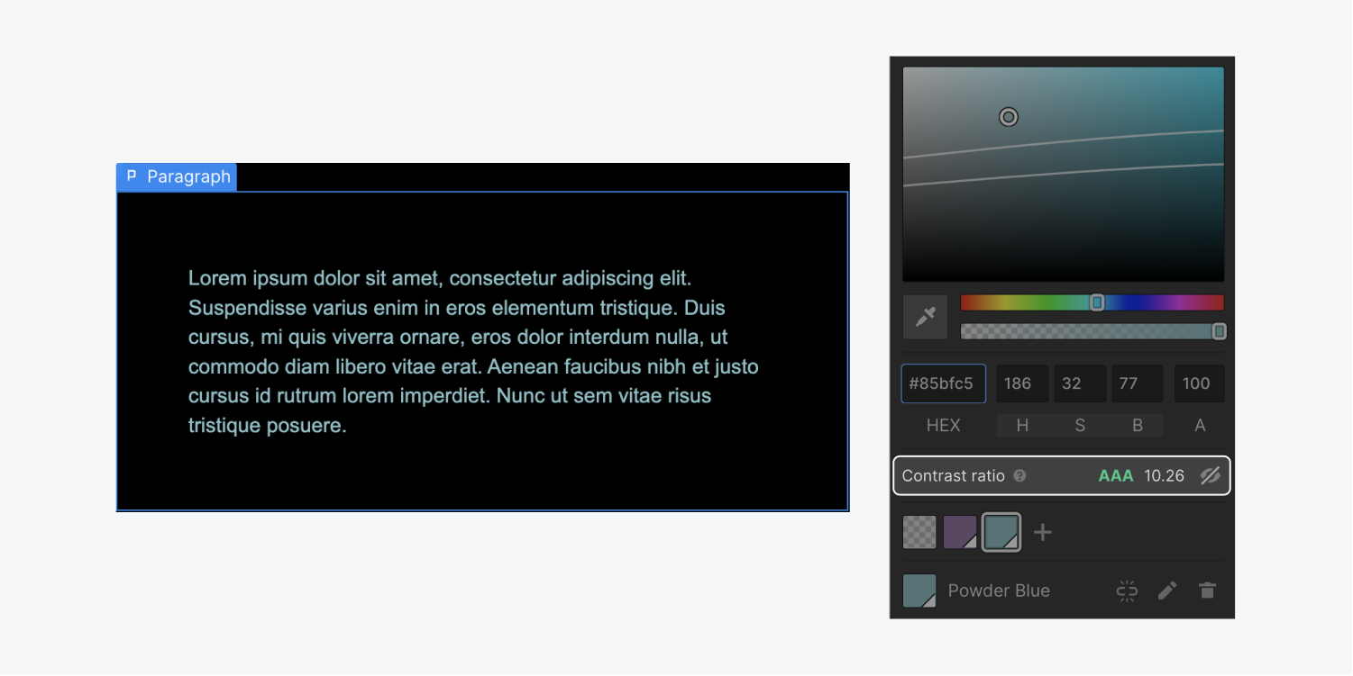
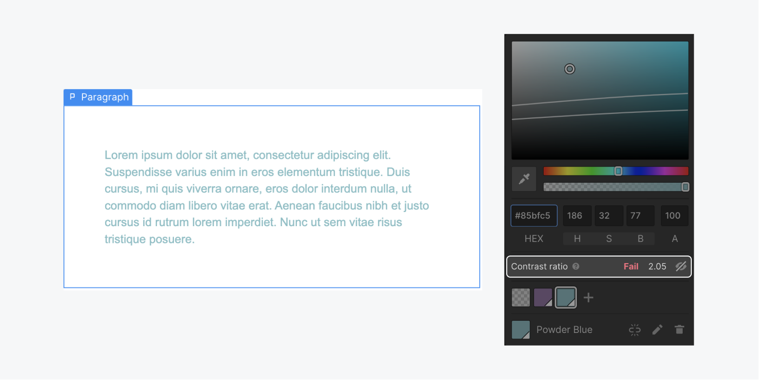
You can also toggle the "eye" icon in the contrast ratio area of the color picker to see the curves between AA, AAA, and a Fail rating on WCAG.
Using the eyedropper tool
To pick a color from any element on the canvas or outside your current browser window, use the eyedropper tool.
Note: To access the eyedropper tool, you must use Chrome or Edge as your browser (e.g., a Chromium-based browser). In the future, the eyedropper tool may become available on other browsers (e.g., Safari, Firefox, etc.) as support for it is developed. However, in the meantime, you will need to use Chrome or Edge to access the eyedropper tool now. Check out a list of Webflow’s supported browsers.
Eyedropper
The eyedropper tool is a great way to pull a precise color from anywhere on the canvas or outside your current browser window. So if you want to pull a color from an image, an existing class on the page, or a graphic from another application on your computer, you can do that using this tool.
Pro tip: Press the spacebar key to show or hide RGB numbers for the target color.
Using the color plane and sliders
To pick a color from the spectrum, use the hue slider to choose a hue, then use the color plane to pick the right shade. If you want to make the color less opaque, use the opacity slider.
Color plane
The color plane allows you to pick the shade of the color you want to use. You can move the picker along the x-axis to adjust the saturation of the color, and along the y-axis to adjust the brightness. To change the color, use the hue slider below.
Hue slider
The hue slider allows you to pick the hue of the color you want to use from the color spectrum. You can, then, pick the right shade using the color plane above.
Opacity slider
The opacity slider allows you to specify the transparency level of your color. 100% will make the color fully opaque, any value below that will make the color see-through. This is useful when adding color overlays on images or creating see-through backgrounds.
Typing in values in the appropriate input fields
If you want to get more precise when choosing a color, you can use web color names, Hex codes, HSB/HSBA values, or RGB/RGBA values. You can paste these values in in any color field in the Style panel or in the HEX input field in the color picker. Alternatively, you can breakdown the code and input each value in its own field:
- Hex values in the HEX field
- HSBA values, broken down, in the H S B and A fields
- RGBA values, broken down, in the R G B and A fields
You can toggle between HSB and RGB by clicking the labels.
HEX input field
This input field supports all web color formats. So, you can type in or input any HTML color value. All values will be converted to HEX.
Learn more about HEX codes and web color formats.
HSB and RGB inputs
Next to the HEX input field, you’ll notice 3 input fields labeled “H S B”. If you click the label, it will switch to “R G B”. You can click the label again to switch back.
“H” stands for hue, and you’ll notice as you change the color using the hue slider, the value in the field labeled “H” will change as well. “S” stands for saturation and “B” stands for brightness. These values will be updated as you move the picker in the color plane. If you know the HSB values of the color you want to use, you can input the values in the appropriate fields.
If you know the RGB values of your color, click the HSB label and input the value for Red “R”, Green “G”, and Blue “B”. These fields will also automatically show the correct values no matter what tool you’ve used to pick your color.
“A” or Alpha input field
“A” stands for alpha channel. The alpha channel determines the transparency of the color. This value is impacted by the opacity slider. The Alpha value can be anything between 0 and 100%. If you know the alpha value of your color, multiply it by 100 and type it in this input field.
Learn more
Create swatches
Once you pick a color, you can save it as a swatch to reuse it across your project.
To save your swatch:
- Open the color picker
- Choose your color
- Click the “plus” icon at the bottom left of the color picker to add your color as a new swatch
- Give your swatch a name (or use the default name that appears)
- Press Create to save your swatch
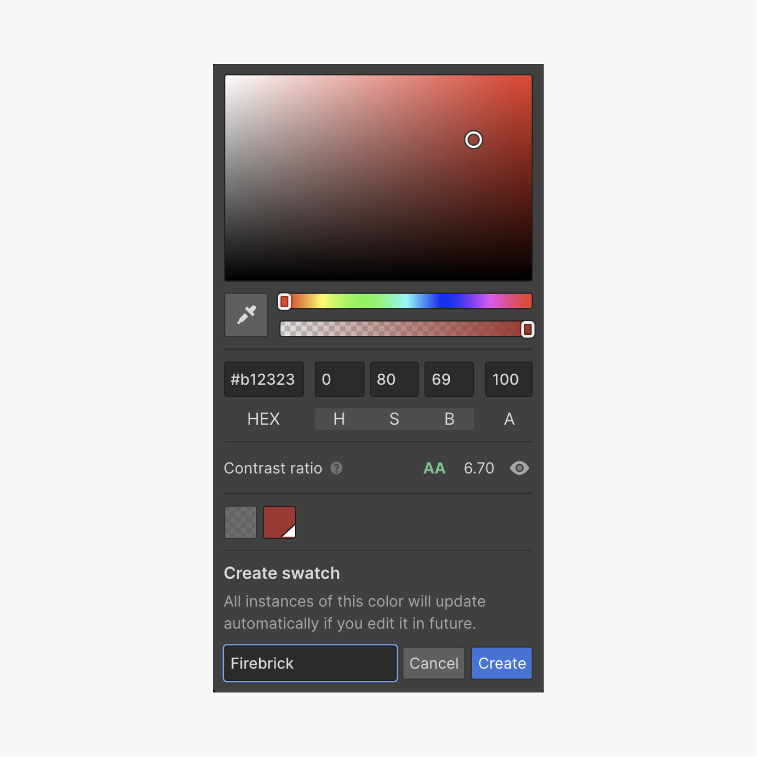
Part of the power of swatches is that you can update the swatch’s color in the future, and immediately change the colors of all elements that use the swatch you’re updating. This is a great way to maintain color consistency across your project, quickly and easily.
To edit a swatch’s color:
- Open the color picker and click the swatch you want to edit
- Click the “pencil” icon
- Choose your new color
- Rename the swatch if you’d like
- Press Save
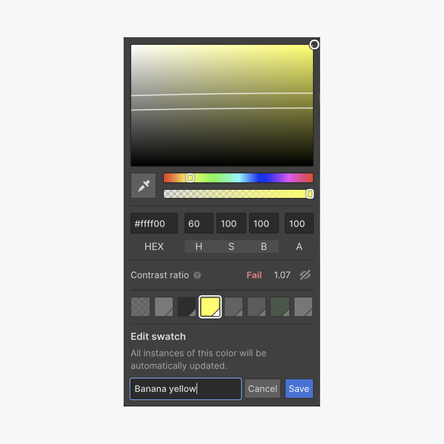
If you have an element whose color uses a swatch, you always have the option to unlink the color from the swatch. This could be useful if you plan on editing the swatch color in the future, but don’t want it to affect a particular element.
To unlink a color from a swatch:
- Select the element whose color you want to unlink from the swatch
- Open the color picker
- Click the “unlink” icon
The color is displayed with its HEX value only, and any changes to the original swatch color will not affect the unlinked element.
