Whether you're creating a survey, a signup form, or any type of form for that matter, you can include 3 types of form inputs that allow your site visitors to make single or multiple choices.

In this lesson
- Checkboxes — for yes or no type of choices or multiple options
- Radio buttons — for choose-one-option type of questions
- Select lists — for single or multiple choice selection dropdowns
And a bonus "customizing checkboxes and radio buttons" section.
Before getting started
Keep in mind that all form inputs can only be placed inside of a form block. Make sure you read intro to Forms to learn how you can use these are other form inputs.
Also, check out styling forms to learn more about styling other form elements.
Checkboxes
Checkboxes allow a user to select multiple choices.
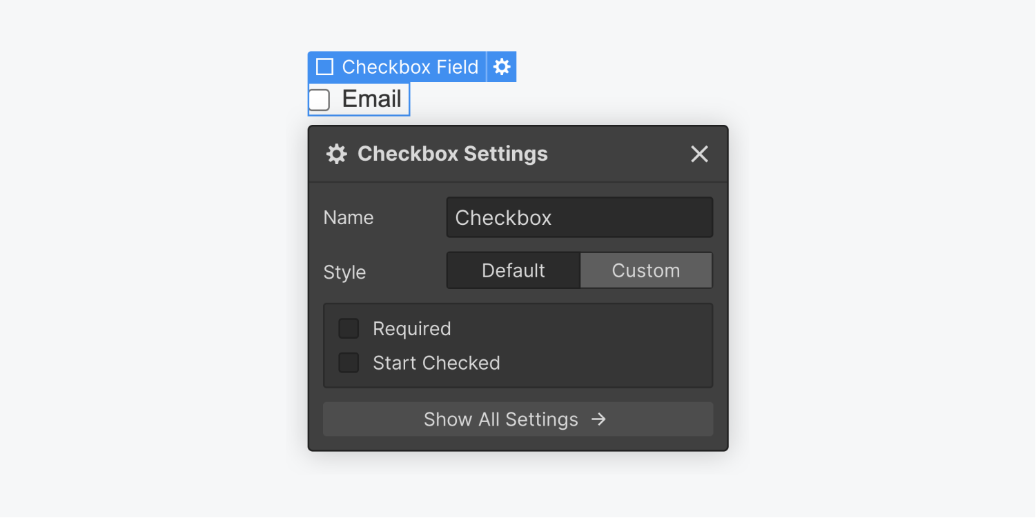
Set the Name of each checkbox so you can identify them in the form submission data.
Checkboxes have Default styling. To override this default style, choose the Custom option in the Checkbox settings.
You can also set if a checkbox should be checked by default by ticking the Start Checked box.
If you want your users to tick a checkbox to confirm for example that the information provided is accurate, you can check the Required field in the checkbox settings.
Radio Buttons
Radio buttons allow a user to select a single option among multiple options.

You can set the Choice Value of each option, for each button, as well as group these buttons by giving them the same Group Name.
Radio buttons have Default styling. To override this default style, choose the Custom option in the Radio settings.
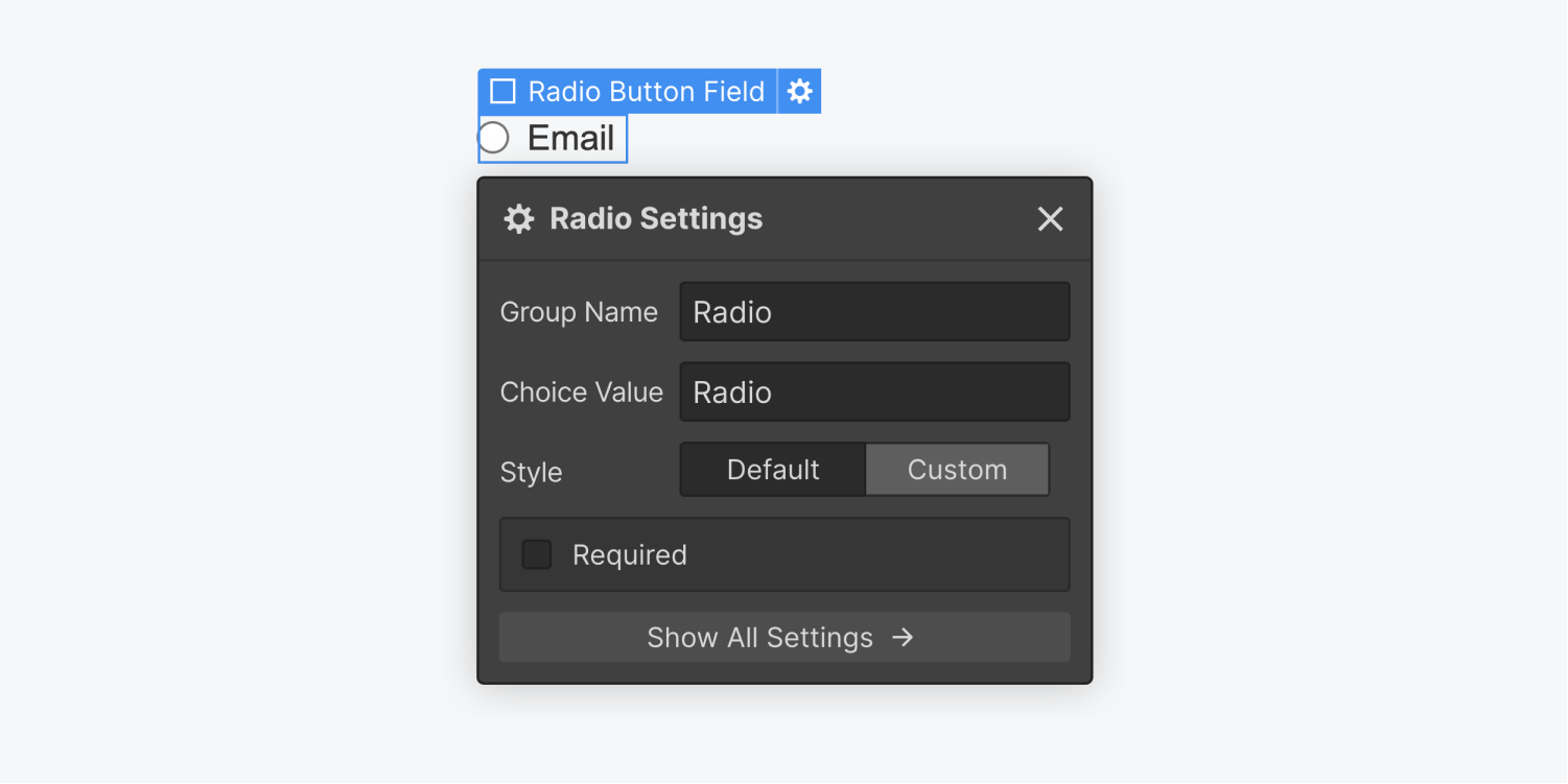
Let's say you want to create a group of radio buttons for a question with values yes and no. You can group the two buttons by adding the same Group Name to both: "Do you enjoy long walks on the beach?" and setting the Choice Value of one to "Yes" and the other to "No".
Now, let's say you want to add another group of options as a response to "Will you attend the next conference?" The values will be: yes, maybe, and no. So, you add three radio buttons and make sure all three of them have the same group name: "Attending". Then, you set the Value of each one separately.
Select lists
You can also add a dropdown list of choices.
By default, a single choice can be selected from this dropdown. However, you can Allow Multiple Selections as well by enabling the setting in the Select Field setting panel.
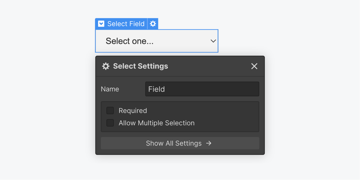
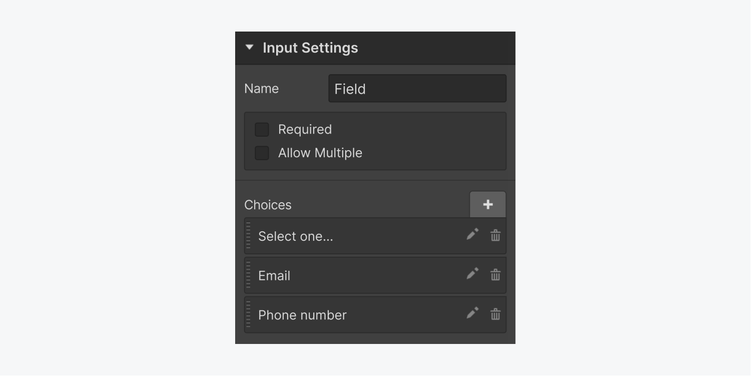
You can set the choices for the Select field in the advanced input settings in the Settings Panel on the right.
- Click the plus (+) sign to add a choice
- Click the pencil icon to edit the choice
- Click the trashcan icon to delete a choice
- Click & drag the dotted line to reposition a choice
Customize form checkboxes and radio buttons
To override the default styling of checkboxes or radio buttons, enable the Custom style option in the checkbox or radio button settings. Then head over to the Style panel and customize the buttons as you please.
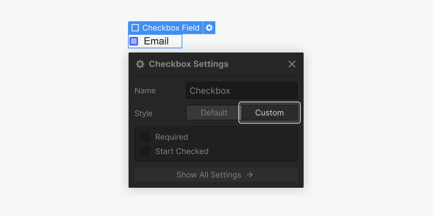
And if you ever want to switch back to the default styling, you can do that by choosing the Default option.
If you set custom styling, then reuse the same class name on another form - make sure the custom option is selected again.
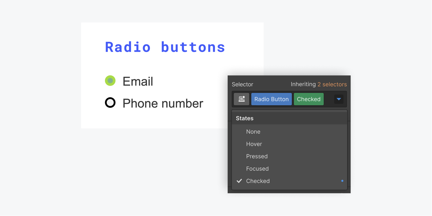
Customize the “checked” state to control how checkboxes and radio buttons look when selected
Once you enable Custom styling for these elements, you can select the buttons themselves and style them in all states, including a custom “checked” state that you can use to control how these elements look when they’ve been selected.
To keep radio buttons and checkboxes accessible for people using arrow keys to navigate through forms, the focused state of both elements come with a default blue shadow.


