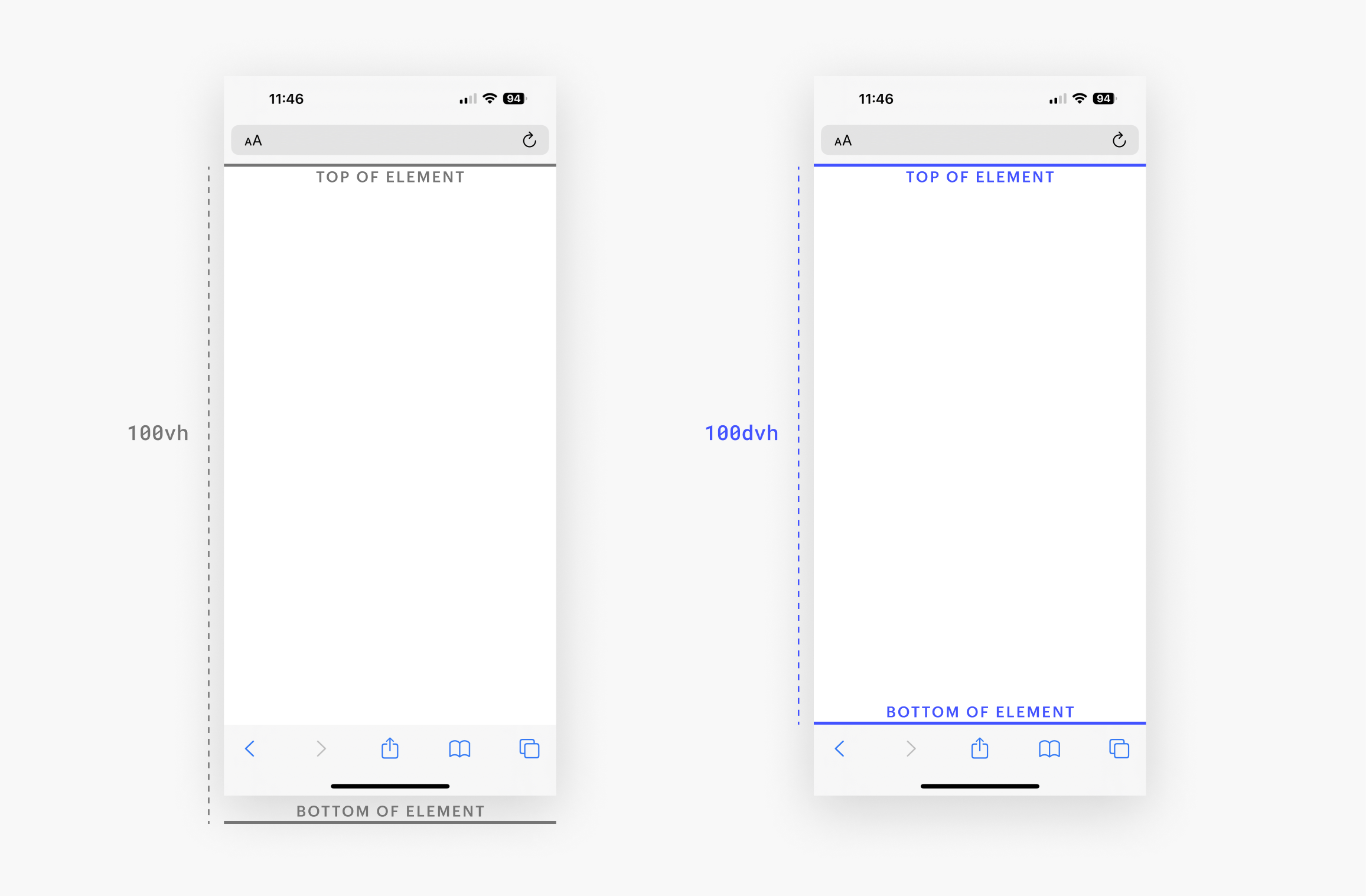
Viewport units are relative to the size of the viewport — the browser window in which a webpage is displayed. However, regular viewport units don’t account for mobile browsers with dynamic toolbars (i.e., a toolbar that dynamically hides and becomes visible based on a site visitor’s scrolling behavior). In this case, you can use small, large, or dynamic viewport units which account for the space taken up by dynamic toolbars.
If you use regular viewport units (i.e., VH and VW), elements sized at 100 VH or 100 VW may extend out of the viewport on browsers with dynamic toolbars. In this case, it’s better to use small, large, or dynamic viewport units, so your site’s elements remain fully visible.

Note: Not all browsers support dynamic viewport units. Check here to ensure that small, large, and dynamic viewport units are compatible with the browser of your target audience.
You can style with the following viewport units:
- DVH — relative to the dynamic viewport height
- DVW — relative to the dynamic viewport width
- SVH — relative to the small viewport height
- SVW — relative to the small viewport width
- LVH — relative to the large viewport height
- LVW — relative to the large viewport width
- VH — relative to the viewport height
- VW — relative to the viewport height
Units with an LV prefix correspond to large viewports, which is the visible viewport area when a dynamic toolbar is hidden on a mobile browser. Units with an SV prefix correspond to small viewports, which is the visible viewport area when a dynamic toolbar is present on a mobile browser.


