The display settings, located in the Style panel, control the layout behavior of an element and the content around that element. Here, you can control how elements are displayed in relation to each other — whether they’re stacked on top of one another or laid out side by side.
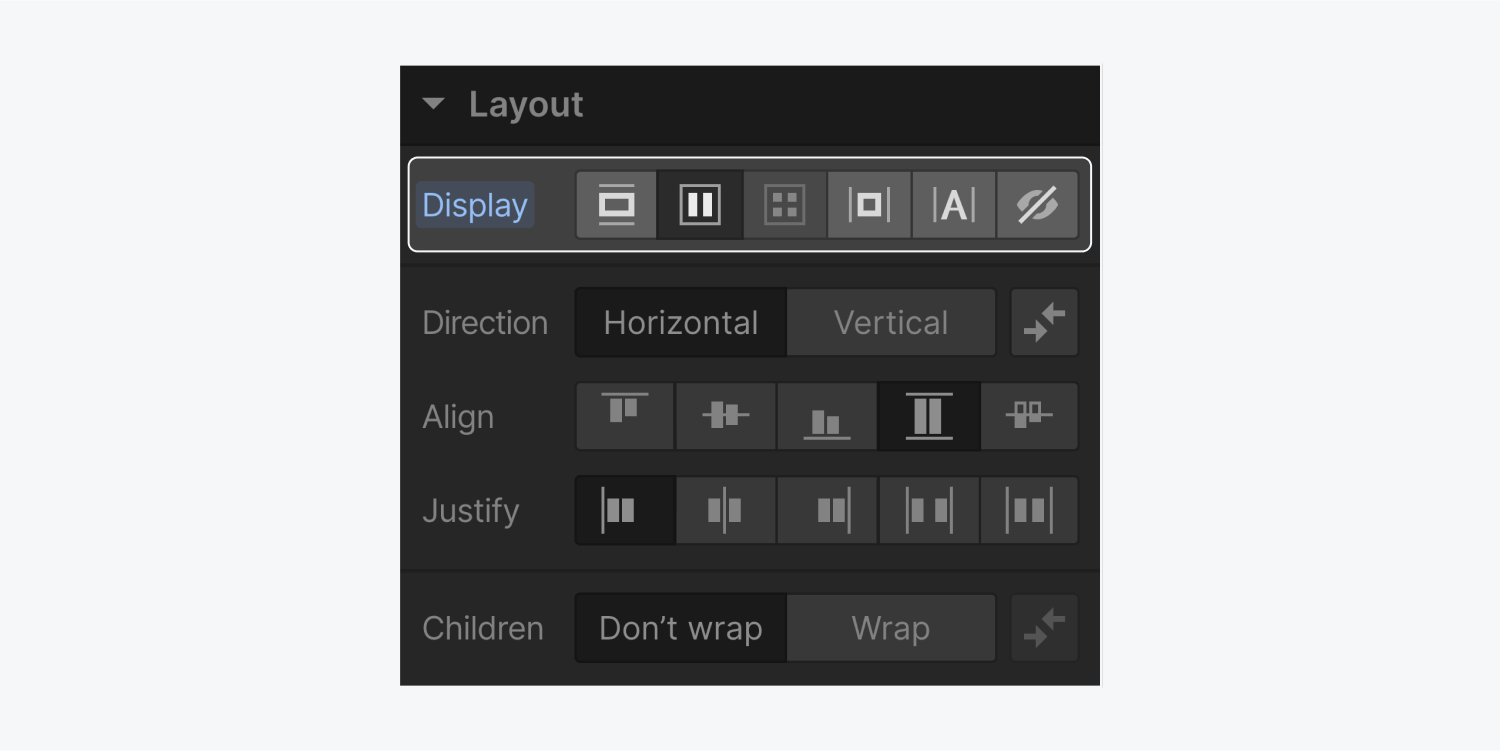
In this article, we’ll cover each display setting in the Style panel:
- Block
- Flexbox
- Grid
- Inline block
- Inline
- Display: none
Block
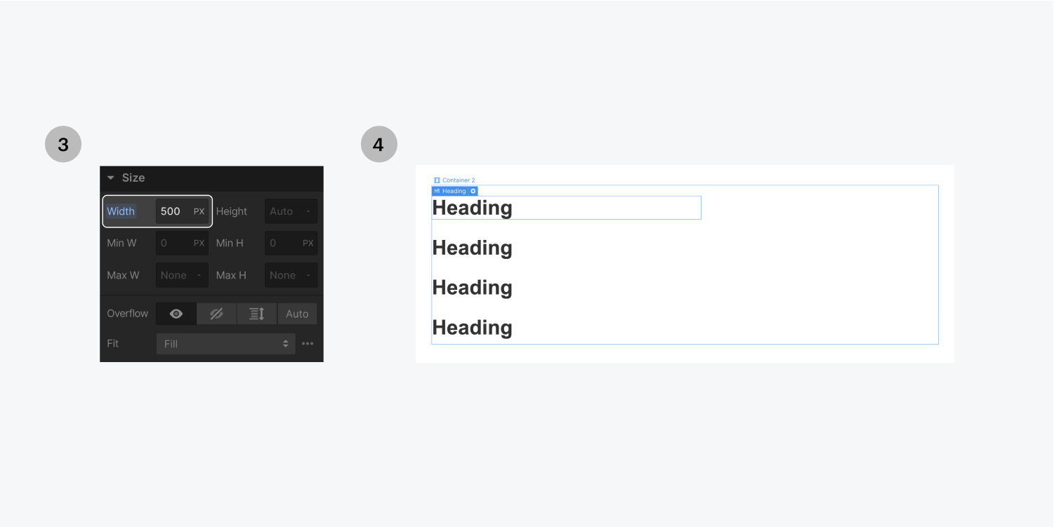
Block is the default display setting for most elements. Each block element starts on a new line and takes up the full width of its parent element unless a custom width is set.
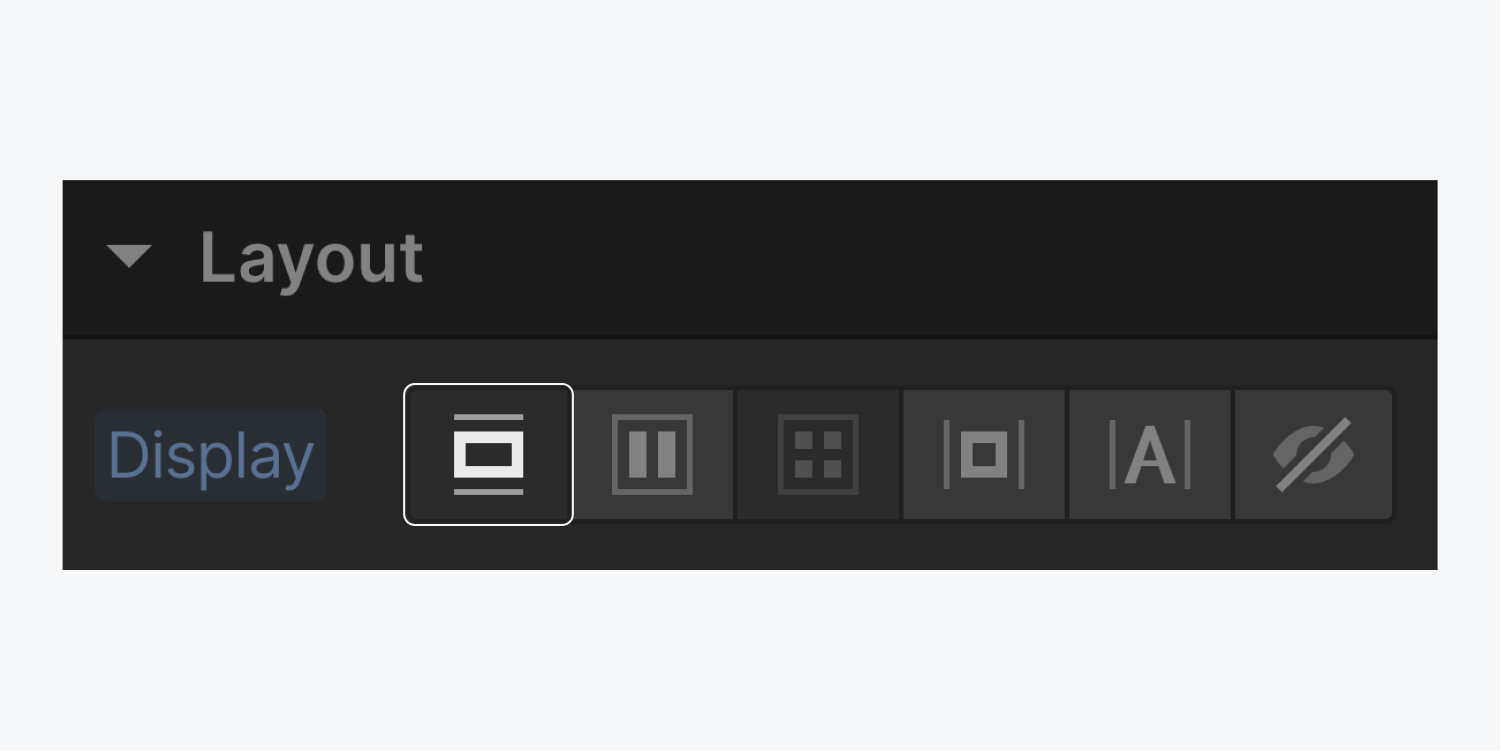
Regardless of its width, each block element will push the next element onto a new line. To lay elements side by side, select a different layout setting, such as inline-block.
Flexbox
Elements with a flex layout arrange their direct children horizontally or vertically.
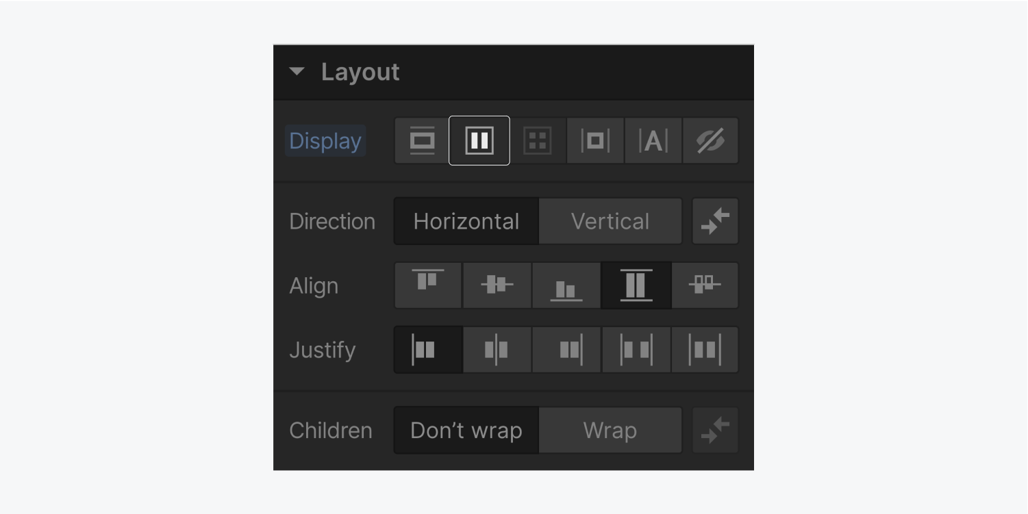
You can customize how the direct children stack, when they wrap, how they are aligned and justified within the flex container.
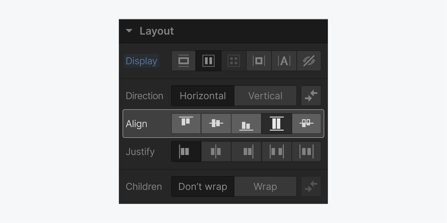
When you create a flex container, all direct children of that parent element become flex children. You can add to and override the layout of flex children in the flex child settings.
Learn more about flex layouts.
Grid
Elements with a grid layout arrange their direct children across multiple columns and rows.
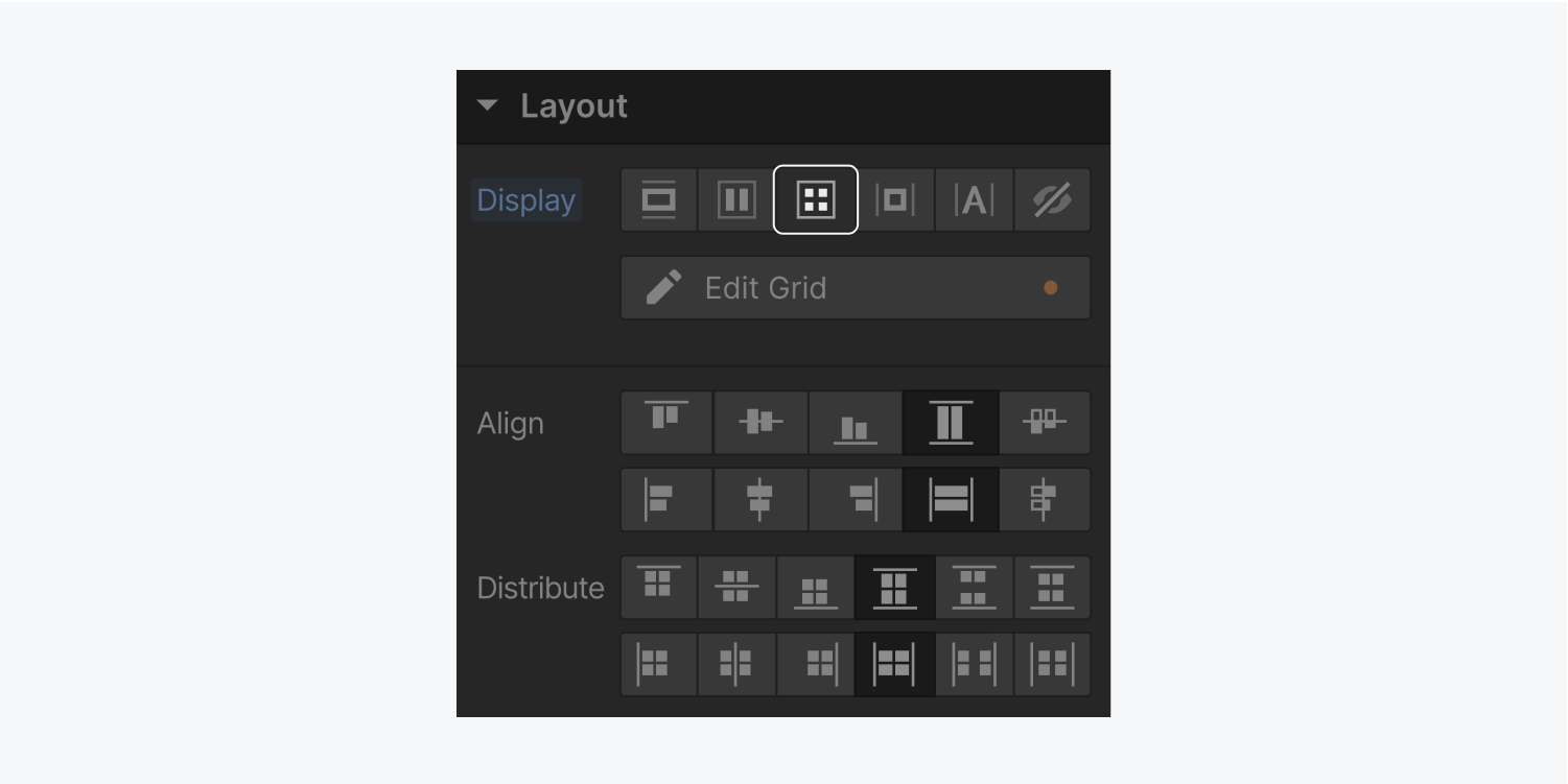
You can customize how the direct children are positioned, aligned, and distributed within the grid components: the container, the individual cells, group of cells, or tracks.
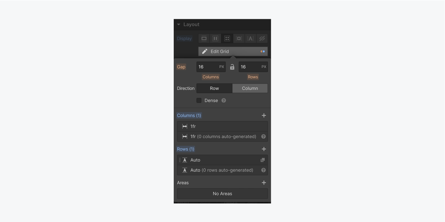
With grid layouts, you can specify gaps between columns and rows, referred to as tracks. You can also use the FR unit to create fully fluid grid layouts.
Grid child settings appear at the top of the Style panel when a child of a grid container is selected. These allow you to override the grid container settings for alignment and justification.
Learn more about grid.
Grid vs Flex
Flexbox and grid are both great layout options. Flexbox gives you layout controls in one dimension — either vertical or horizontal. Grid gives you layout controls that work in two-dimensions, which is great for magazine layouts, for example.
For more detail on each layout option, the differences between them, and when you may want to use one instead of the other, check out our video lesson on flexbox versus grid.
Inline block
Inline-block elements are stacked side-by-side and their width is determined by the content inside.
Inline-block elements will also wrap when the content hits the boundary of the parent element. In the Style panel, you can apply specific width, height, padding, and margin settings to inline-block elements.
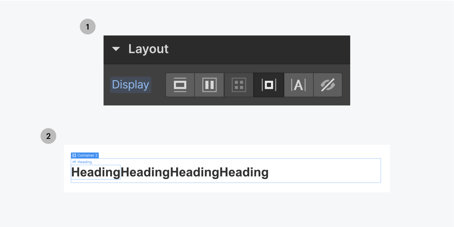
A common problem when using inline-block elements is that whitespace in HTML becomes visual space in the site design. Learn how to fix whitespace issues.
Inline
Inline is the default display setting for any text content inside an element. You can change the layout of an inline element by changing its margins and padding but you cannot change its width or height.
Display: none
To hide an element completely, set its display setting to none.
Elements set to display none will not be rendered by the browser, which can be handy for altering how content displays on mobile devices.


