This article features the legacy interface for Interactions, which you can activate in the Designer by using the switch at the top of the Interactions panel. To see the relevant article which uses the new Interactions 2.0 panel, check out our updated course on this topic.
Interactions overview
Interactions bring websites to life. With Webflow, you can quickly and easily create custom interactions that move, scale, rotate elements, and much more. You can also change an element's width, height, opacity, or how it displays.
Structure of an interaction
Every website interaction has two parts: triggers and steps. Triggers tell the browser “when” to run an interaction. Steps are the visual changes that happen after the Trigger.
Trigger
The first thing you set up when creating an Interaction is a trigger. Depending on the complexity of your Interaction, you can have one trigger or many. And with eight different trigger types at your fingertips, the sky’s the limit when it comes to interactivity.
Here are the eight triggers you can use:
- Page Load: when the webpage finishes loading
- Click: when an element is clicked
- Hover: when an element is hovered over
- Scroll: when an element scrolls in and/or out of view
- Tabs: when a tab opens and/or closes
- Slider: when a slider comes in and/or out of view
- Navbar: when a navigation menu opens and/or closes
- Dropdown: when a dropdown menu opens and/or closes
Trigger settings
You can customize your triggers with the following settings:
- Affect other elements: Set one element as a trigger to affect other elements with a specific class
- Limit to nested elements: Set a parent element as a trigger to affect a child element
- Limit to sibling elements: Set a sibling element as a trigger to affect another sibling.
- Loop: Continuously repeat an interaction
Steps
As soon as someone interacts with a trigger, your steps will run in sequence from top to bottom. You can string together many steps to produce some amazing animations.
Here are the steps you can use in Webflow:
- Move: Move an element to a new position on the page
- Scale: Enlarge or shrink an element
- Rotate: Rotate an element
- Width & Height: Adjust an element’s width and/or height property
- Opacity: Increase or decrease an element’s opacity
- Display: Change an element’s display property (e.g., inline to none)
- Wait: Add time between steps
Initial appearance
An element’s initial appearance defines how it looks before an interaction affects it.
Setting an element’s initial appearance allows you to continue building your site while in the Designer and only makes visual changes when someone visits your published site.
Creating interactions
To create an interaction using interactions 1.0:
- Select the element you want to interact with
- Go to the Interactions Panel (H) on the right
- Click the + button
Name your interaction
Give your interaction a name that describes what it does, so you can easily find it later. Here are a few good names for a single interaction:
- Fade In Logo on Page Load
- Logo: Fade In on Page Load
- On Page Load: Fade In Logo
If you’re not careful with your names, you could find yourself wasting time looking for the right one, overwriting other interactions, or even accidentally deleting interactions.
Trigger
Triggers define the user actions that will start an interaction. The most common triggers are Click and Hover, but Webflow offers 8 different triggers. Spend some time exploring each and you’ll discover fun new ways for people to interact with your website.
To define your trigger:
- Click Add Trigger
- Select the trigger that fits your needs
Steps
Steps are the different phases of visual change that make up an interaction. They offer you a fun way to enhance your website’s user experience with visually stunning effects and animations.
Each step runs independently from top to bottom, but every property you change in a single step happens simultaneously.
Load trigger interactions 1.0
The Load Trigger will set your interaction into motion when the page loads. Because of this, it is best to have the load trigger only on elements that are within view when the page loads (for example, in the hero image at the top of your page).

Creating a staggered load effect
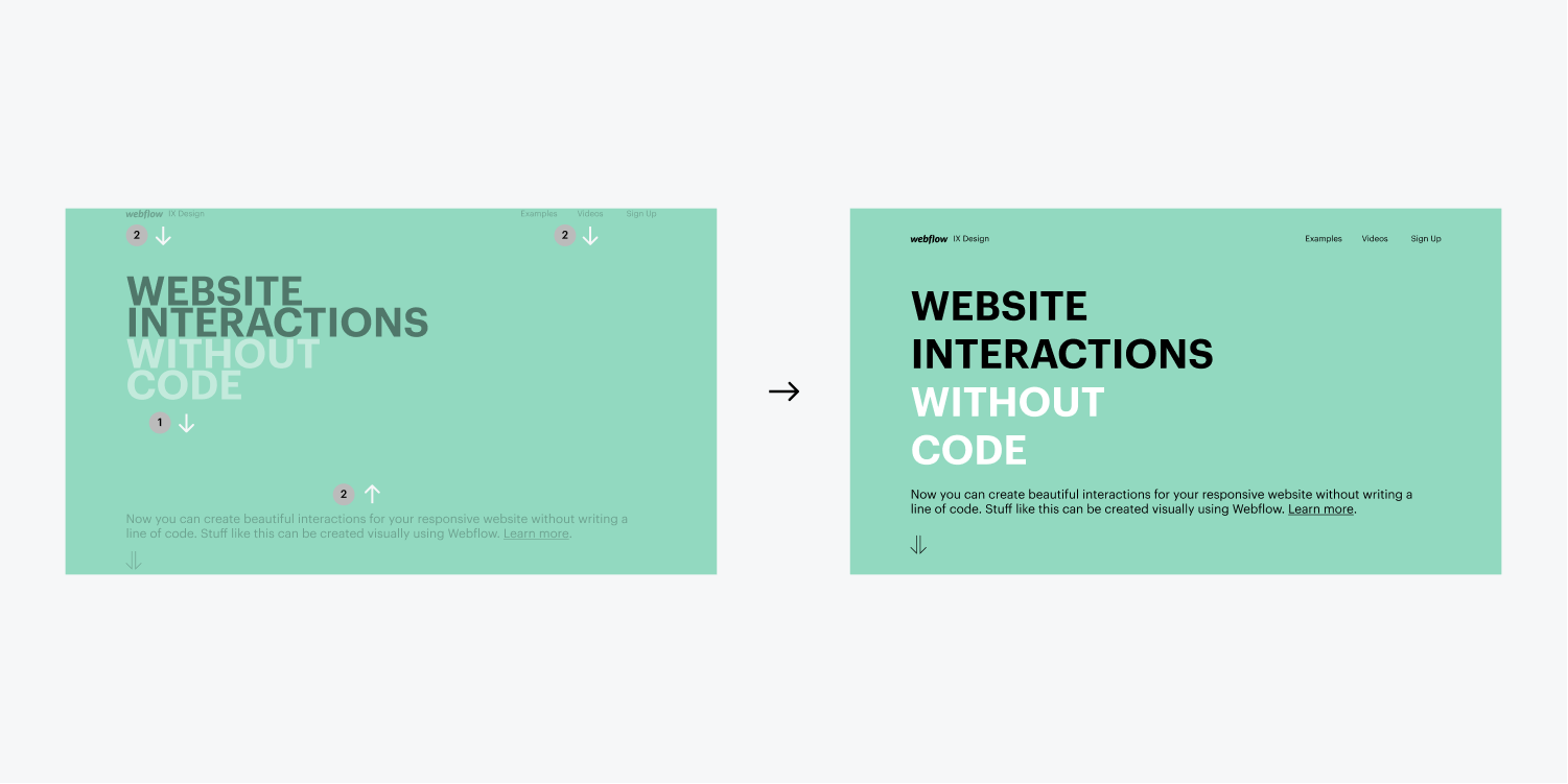
A common use case for the load trigger is to space out the interaction time of different elements so that they enter the page at different times. This is what we call creating a Staggered Load Interaction (Notice the example above).
To do this, you need to space out the time each trigger will occur by adding a Wait step prior to any animations taking place. By using a Wait step, you can add a set time period in which no animations will occur. To create a staggered effect, simply increase the wait time of each element in the order you want them to appear.
Load trigger interaction best practice
When using the load trigger, it’s important to keep in mind the location of the element in which you are adding the interaction. Because the load trigger occurs when the page loads, it is best to add to elements that are at the top of the page so that the user can experience the interaction.
If you add a load trigger to an element that is further down the page, they may not see the interaction take place (as it is happening below the monitor’s viewpoint).
Scroll trigger interaction 1.0
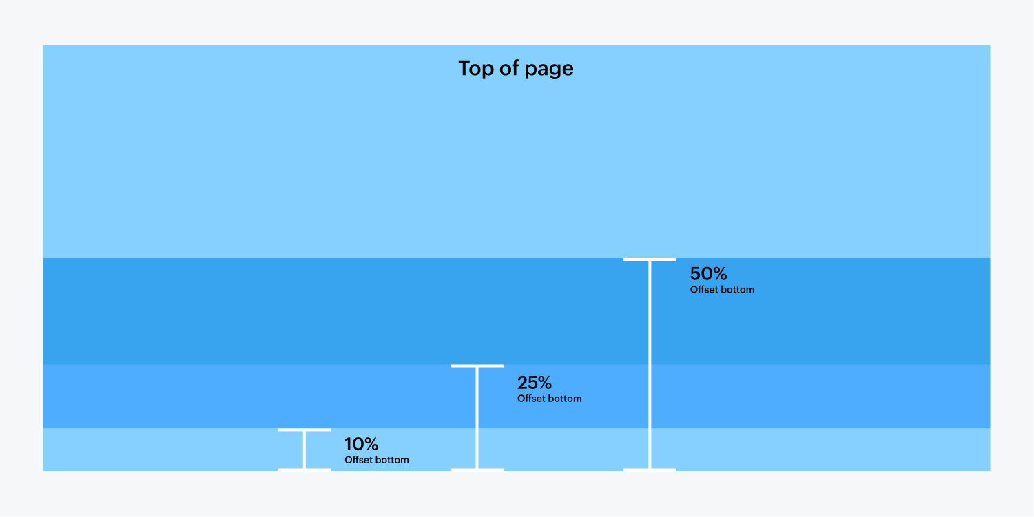
A scroll triggered interaction is one that occurs as you scroll up and down your site. The interaction allows you to customize both the Into View and Out of View states, adding customized effects to each. The ability to choose an Offset also allows you the ability to choose where on the screen the scroll will trigger the animation to occur.
Into view and out of view
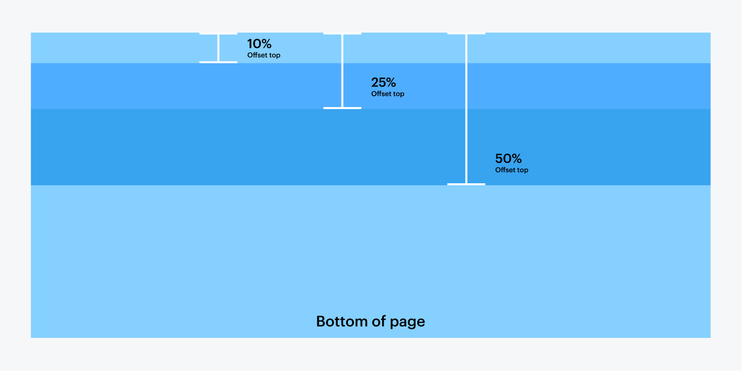
When working with scroll triggers, you are given the ability to add effects both when your object comes Into View, and when the object goes Out of View. In order to correlate where the trigger takes place, you need to add an Offsets for the top and/or bottom.
Into view
The Into View property allows you to add an effect (or list of effects) when the object comes into view as you are scrolling down the page. Think of it as the initial effect for the element you are adding a scroll interaction to.
Out of view
The Out of View property is where you will add effects to the element as they scroll out of view (i.e. when the user has passed them as they scroll down the page). For this reason it is beneficial to work from an offset off the top.
Offsets
Bottom offset
For Into View, you select a Bottom Offset, meaning the percentage value off the bottom of the page you want your object to perform its scroll interaction.

Top offset
For Out of View, you select a Top Offset, which is the percentage value off the top you want the object to perform its effect. Once the user has scrolled past the object entirely, the offset percentage used here will also be the defaulted Out of View offset value for when the user scrolls back up the page.

Need to know - Scroll disabled on mobile (iOS only)
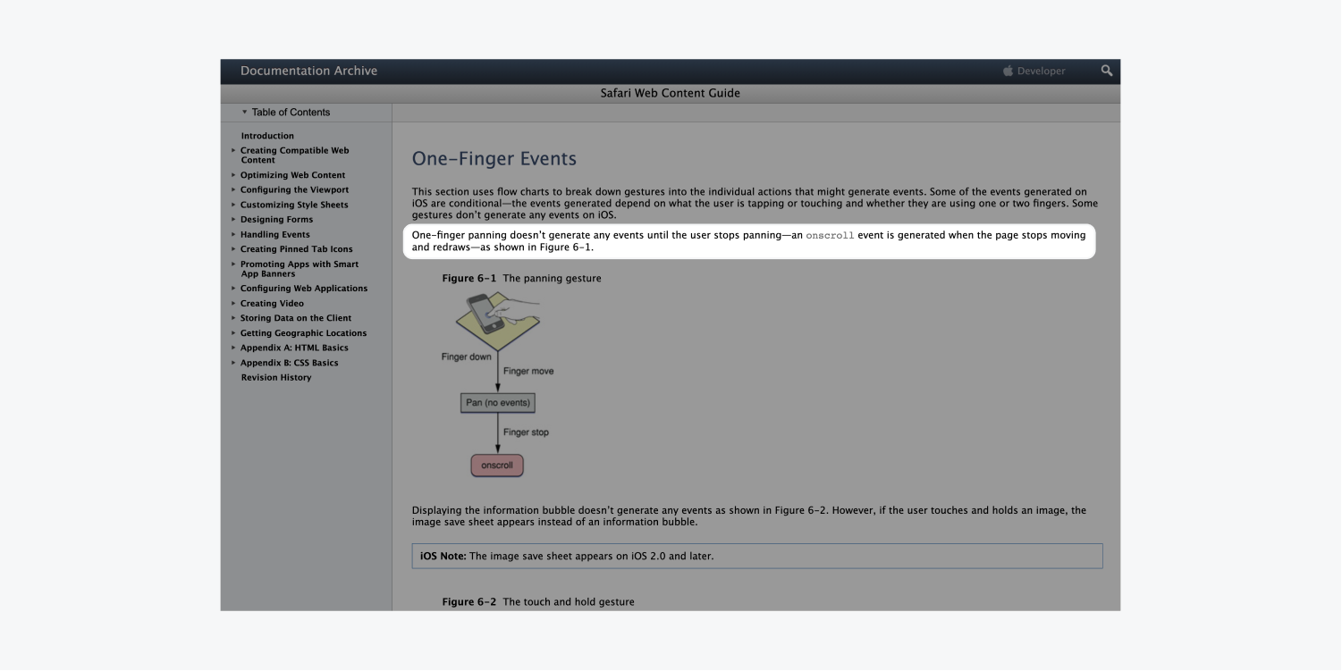
You may have noticed that our scroll triggers do not work on certain mobile devices. This is a limitation specific to iOS (iPhone, iPad, iPod). Even on the latest devices, Apple does not give developers the power to run scripts while the browser is being scrolled. For more information on this, please refer to the Apple developer library. Once Apple opens this up to developers, we will be happy to enable scroll triggers again!

Click trigger interaction 1.0
The click trigger lets you add an interaction when someone clicks a button, link, or other interactive elements.
When you create a click interaction, you can define different effects for the first and second clicks.
Common use cases
You’ll usually use the click interaction to affect another element on the page. Using the above example, the interaction is actually placed on the Button, not on the hidden text field. The Button is simply using an interaction that affects a separate element on the page (i.e. the Hidden Text Box).
Using a second click
Second clicks usually undo the original click effect, like a toggle. Think of it as opening a box (first click), then closing the box (second click).
Hover trigger interaction 1.0
Hover trigger interactions allow you to define different effects when you hover over an element and hover out of an element.
Common use cases
- Show an icon when you hover over a button
- Animate an icon when you hover over a button
- Show some text info about an image when you hover over it
Tab trigger interaction 1.0
A Tabs Interaction allows you to add a Tab-triggered interaction for both when a tab is open (selected) and close (deselected).
This opens up the possibility for an unlimited amount of creativity and interaction that can be placed not only on your Tab Links, but also on other elements on your page. Below is an example of Tab component that includes multiple Interactions.
Adding Interactions to Tab Links
The Tab Links are the elements that act as the trigger to switch between your different Tab Panes (i.e. the content in your tab). Adding interactions can lead to unique interactions when the user both clicks on a tab link, then clicks off the tab link.
Take a look at the examples below and follow the steps to recreate it.
STEP 1
First we need to style the tabs accordingly, and also add an Arrow Icon. The above Tab Links were designed by adjusting these Style Properties:
- Width: The width of these Tab Links were adjusted to 23%
- Margin Right: To give spacing on the sides of the tabs, a Margin of 2%was added on the Right of the Tab Link.
- Increase Padding: The defaulted Padding was adjusted on the Top and the Bottom to be 13px each.
- Fill Color: The Fill Color was changed to a light gray (#c0ccd1), whereas the Current Tab Link was given a Fill Color of Blue (#3496de).
- We also gave a Class to the Arrow Icon, and assigned the following CSS Properties.
- Position: So that the icon sits at the bottom of the Tab Link we changed the Position toAbsolute. Using the Absolute Position tool, we position it at the bottom.
- Margin Auto: To center the icon, we have changed both the Right and Left Margin toAuto.
STEP 2
Now to add the Interactions! The first step is to click on the Tab Link (a non-current Tab Link), then navigate over to the Interactions 1.0 panel. Here you will add a new Interaction.
STEP 3
The Initial Appearance will be left blank, so the next step will be to add a Trigger. Here you will select a Tabs Trigger.
STEP 4
The Interaction will be performed by duplicating what is in the image below. Notice there are two Interactions for both the Tab Open (when the tab is clicked), and the Tab Close (which will occur when you click a separate tab). That’s it!
STEP 5
Now to add a separate Interaction for the Arrow Icons. Simply click on the arrow Icon and repeat Step 2. This time around we will be adding an Initial Appearance to this interaction. In this case, we will choose to move the Arrow Icon up 6px, and have an opacity of 0%.
STEP 6
Repeat Step 3 and choose the Tab Trigger. The remainder of the Arrow Icon interaction will be as follows. You’re done! Be sure to add the Interactions to all of your Tab Links and Arrow Icons.
Slider trigger interaction 1.0
The slider interaction allows you to add an interaction onto an element inside of a slider element.
Navbar trigger interaction 1.0
The navbar interaction allows you to add an interaction onto an element inside of a navigation element.
This article features the legacy interface for Interactions, which you can activate in the Designer by using the switch at the top of the Interactions panel. To see the relevant article which uses the new Interactions 2.0 panel, check out our updated course on this topic.


