If you don’t experience vision impairments, it can be difficult to imagine how your design appears to someone else. You can use Webflow’s Vision preview throughout your design workflow to help approximate how your design might look to someone with vision impairment — and ensure they don’t miss out on important information.
Note: Vision preview isn’t available in Safari. Alternatively, you can use Vision preview with Firefox and Chrome browsers.
In this lesson you’ll learn:
- How to access Vision preview
- How to avoid color-reliant UI
- How to simulate color blindness
- How to evaluate design legibility
Before jumping into the lesson, remember that the following examples are approximations. Many factors influence how someone perceives your site:
- Your own vision
- Your lighting
- Your screen calibration
- Your operating system
- Etc.
Overall, it’s critical to think about best practices that don’t necessarily rely on your exact vision or your exact hardware setup.
How to access Vision preview
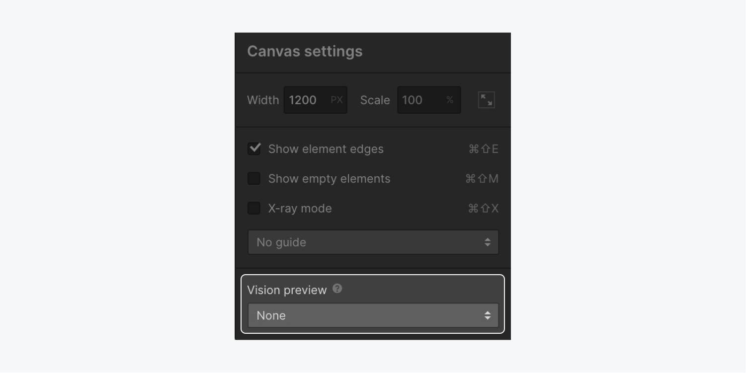
You can access Vision preview options by clicking Canvas settings at the top of the Designer.

Choose the type of vision impairment to preview from the bottom of the Canvas settings modal.
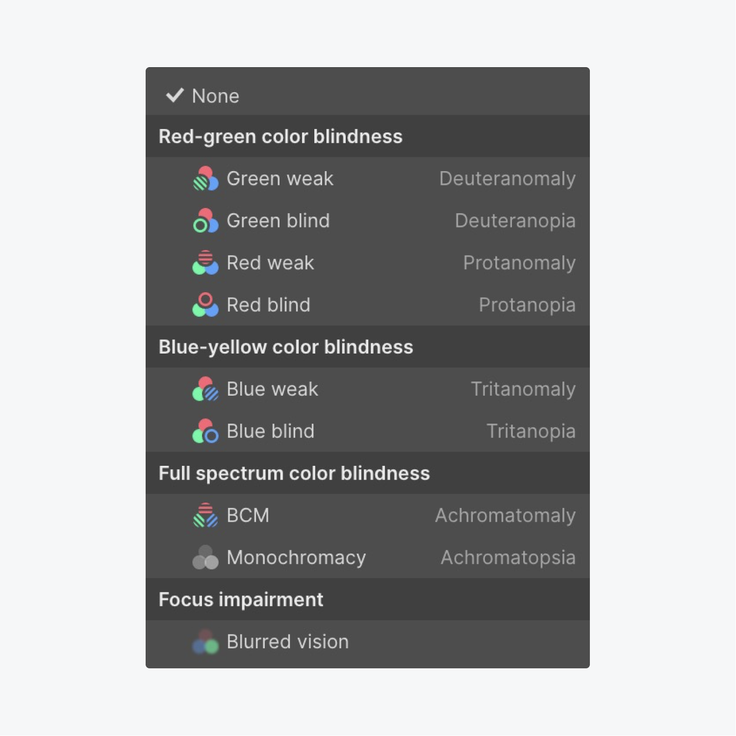
You can choose from:
- Red-green color blindness (Green weak, Green blind, Red weak, and Red blind previews)
- Blue-yellow color blindness (Blue weak and Blue blind previews)
- Full spectrum color blindness (Color weak and Monochrome previews)
- Focus impairment (Blurred vision preview)
The vision impairment you’ve selected is indicated by an icon to the right of the Canvas settings.

To stop previewing your design from a vision impaired perspective, click Canvas settings again and change the Vision preview to None.
How to avoid color-reliant UI
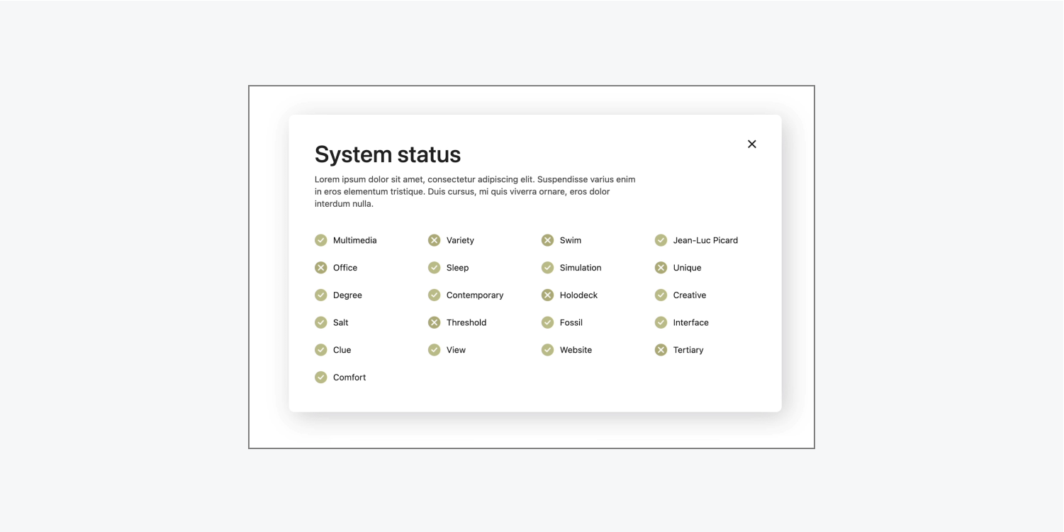
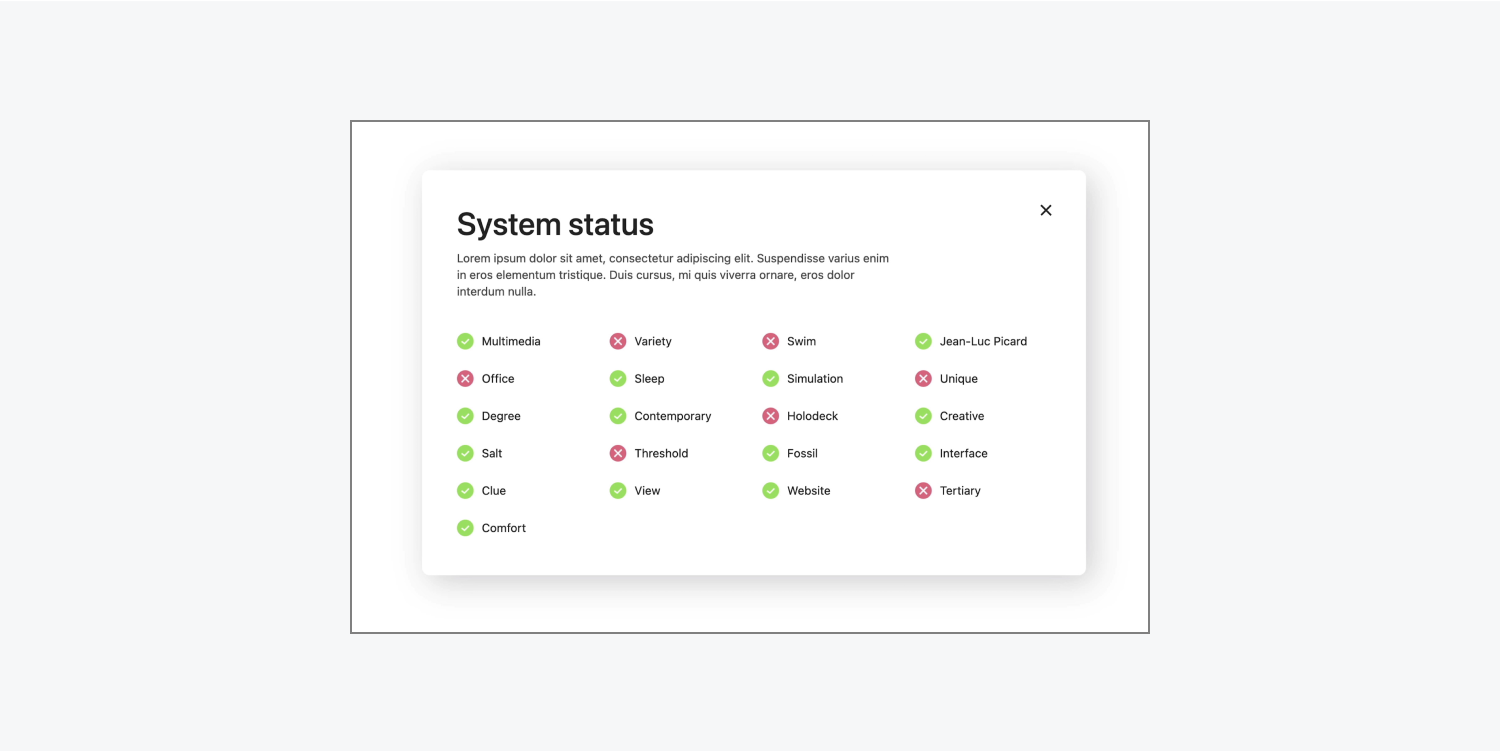
Let’s say you’ve designed an interface that indicates a system is functioning properly when it’s green, and that the system is malfunctioning when it’s a shade of red.
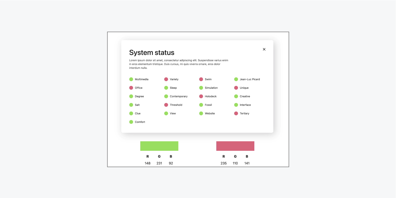
Let’s use Vision preview to check out what this interface might look like with different vision impairments:
- Click Canvas settings at the top of the Designer
- Click the dropdown menu under Vision preview and choose a vision impairment to preview (e.g., Green blind and Red blind)
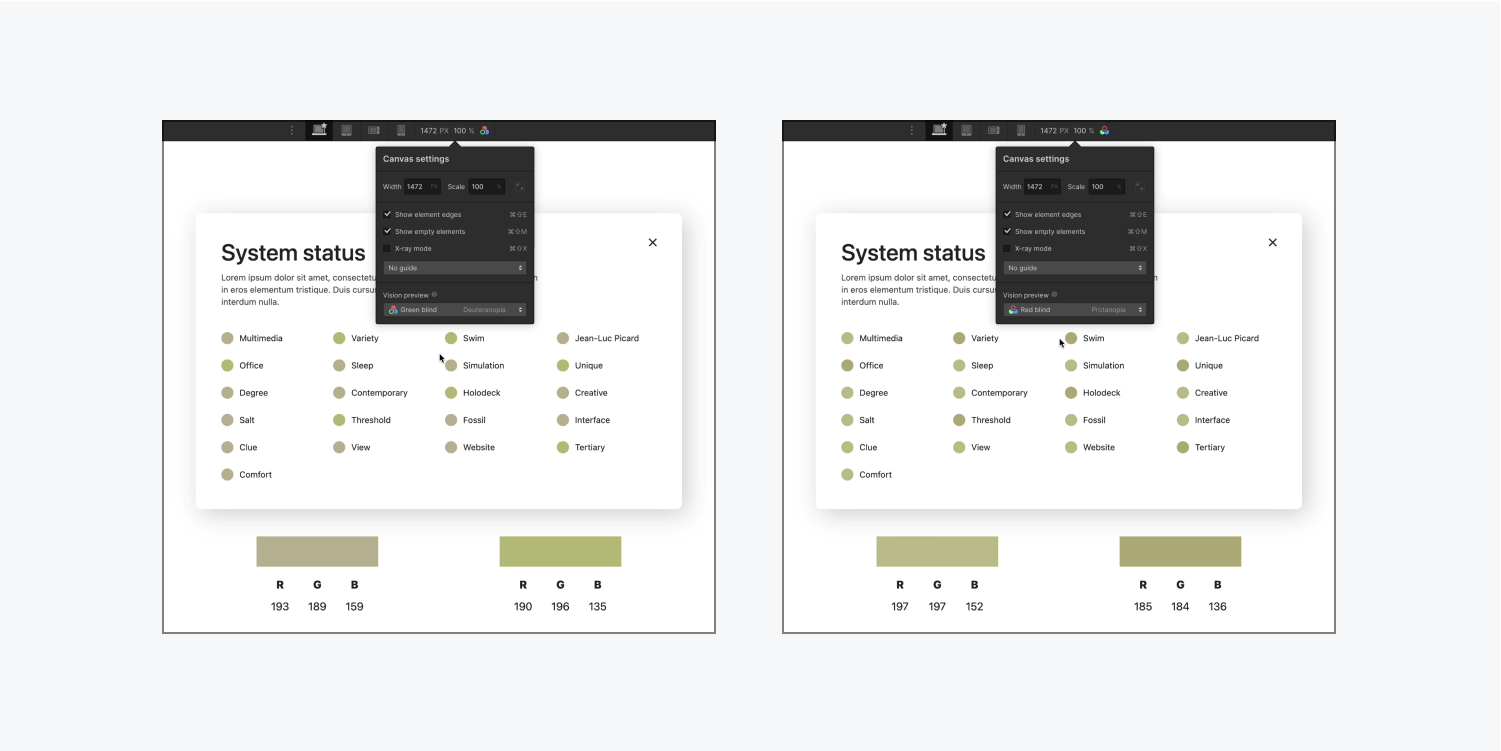
After using Vision preview, it becomes clear the green and red color values don’t look so different from each other. This is the problem with relying on color to convey meaning — it’s far less likely to be effective than, for instance, adding a symbol (e.g. an “x” or a “checkmark”) to indicate functioning versus malfunctioning.
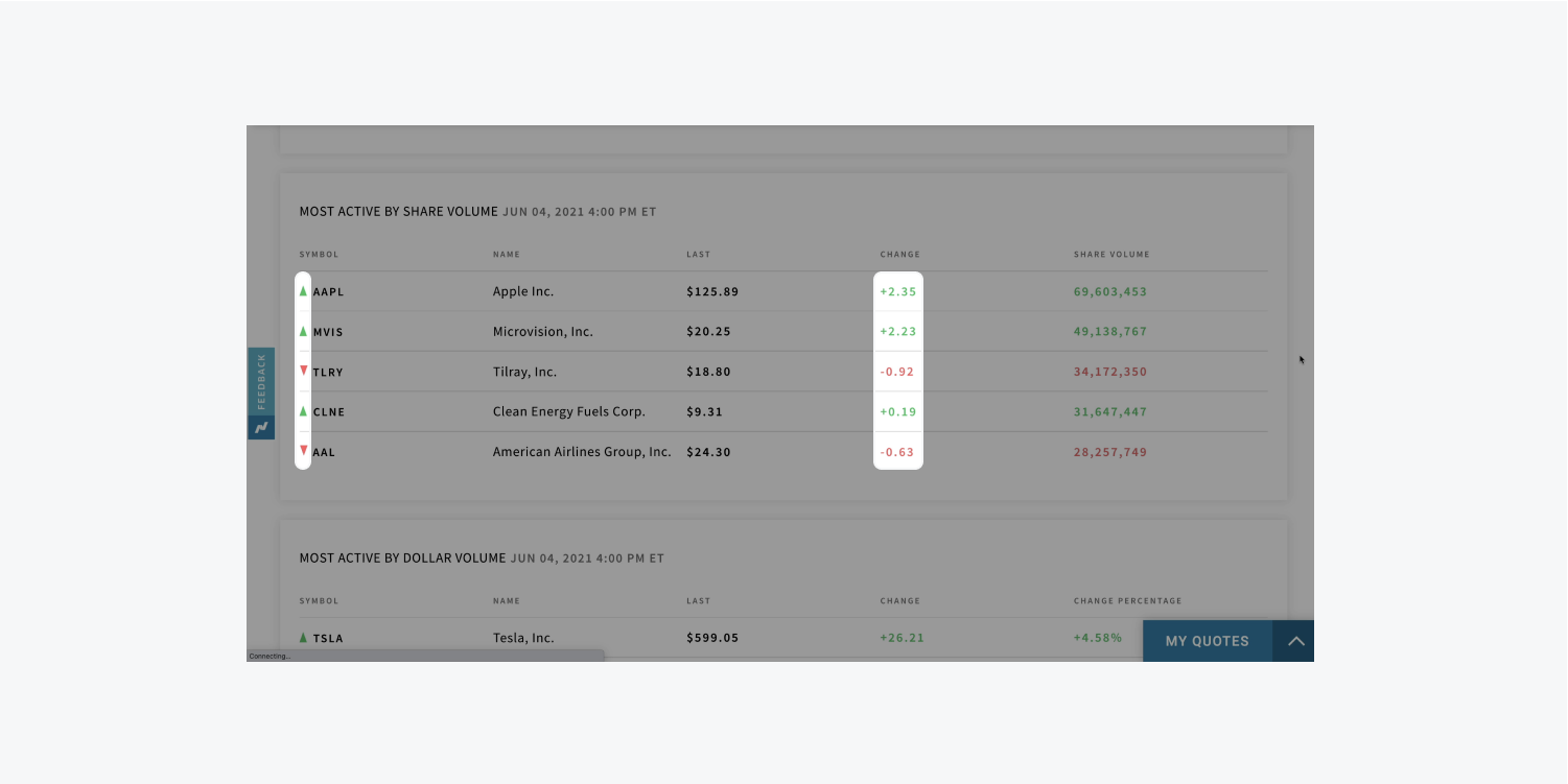
Finance trackers often do this very well. They’ll use color, but they only use it to reinforce their main idea, which is conveyed by an up or down arrow to note whether the stock price has increased or decreased. (Or they’ll use a plus or minus.)
There’s a common misconception that you can’t use colors in your interface at all. For example, you can still use red and green colors in your interface, but it’s critical that you don’t rely only on color to convey essential information to your site visitors. Instead, make sure you’re also using text, shapes, and symbols to convey meaning (alongside your color choices).
How to simulate color blindness
To illustrate how color blind visitors may perceive your design, the following example is one that’s less practical, but it's a great demonstration of what happens when meaningful content relies on the distinction between colors.
The intended content should display the numbers clearly.

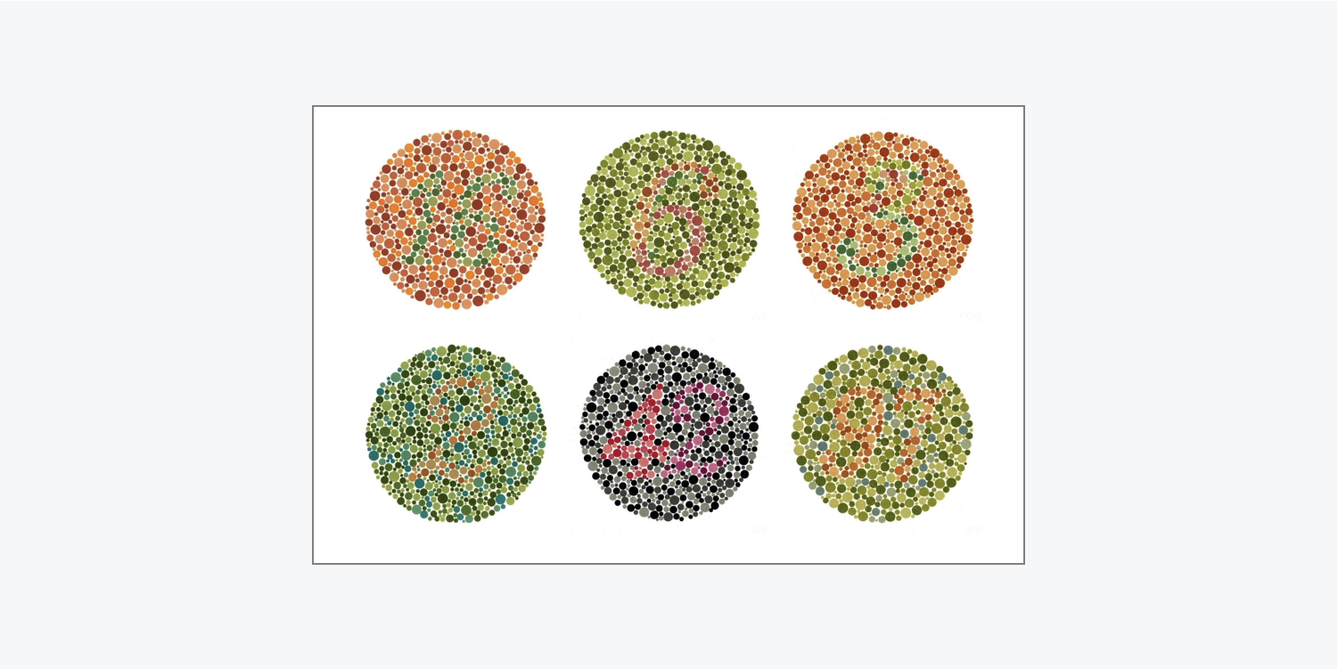
When simulating color blindness the numbers become illegible.


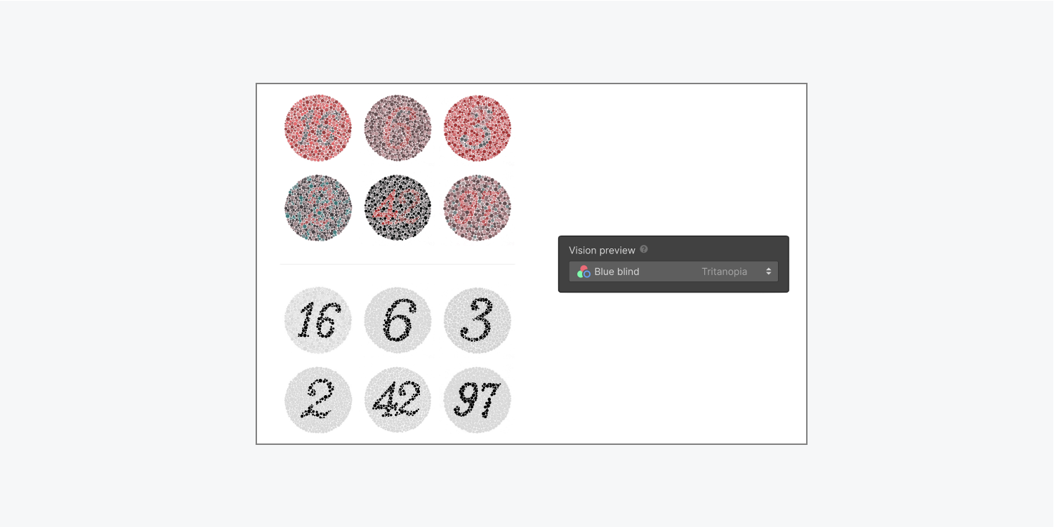
Therefore, it’s critical to regularly check that the content in your images is more visually accessible under different vision considerations.
How to evaluate design legibility
You’ll also want to approximate the legibility of your design. We’ll go through examples that show legibility issues with:
Thin font
For example, you may have a paragraph with a thin font that upon initial glance looks okay to you. However, if you approximate how it appears to someone with blurred vision, the thin font is illegible — it nearly disappears.
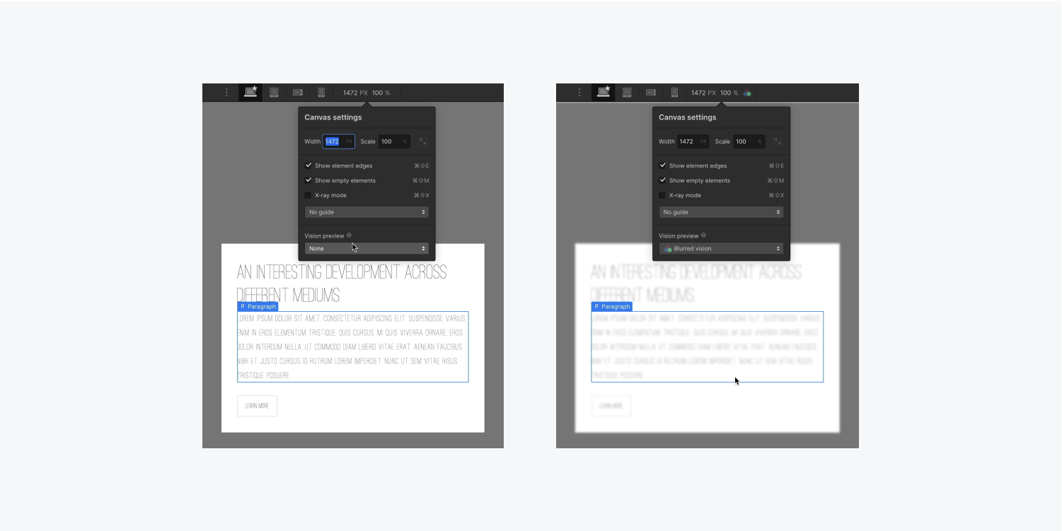
To fix the illegible paragraph, you can use a more legible, thicker typeface (e.g., a thicker width on the font).
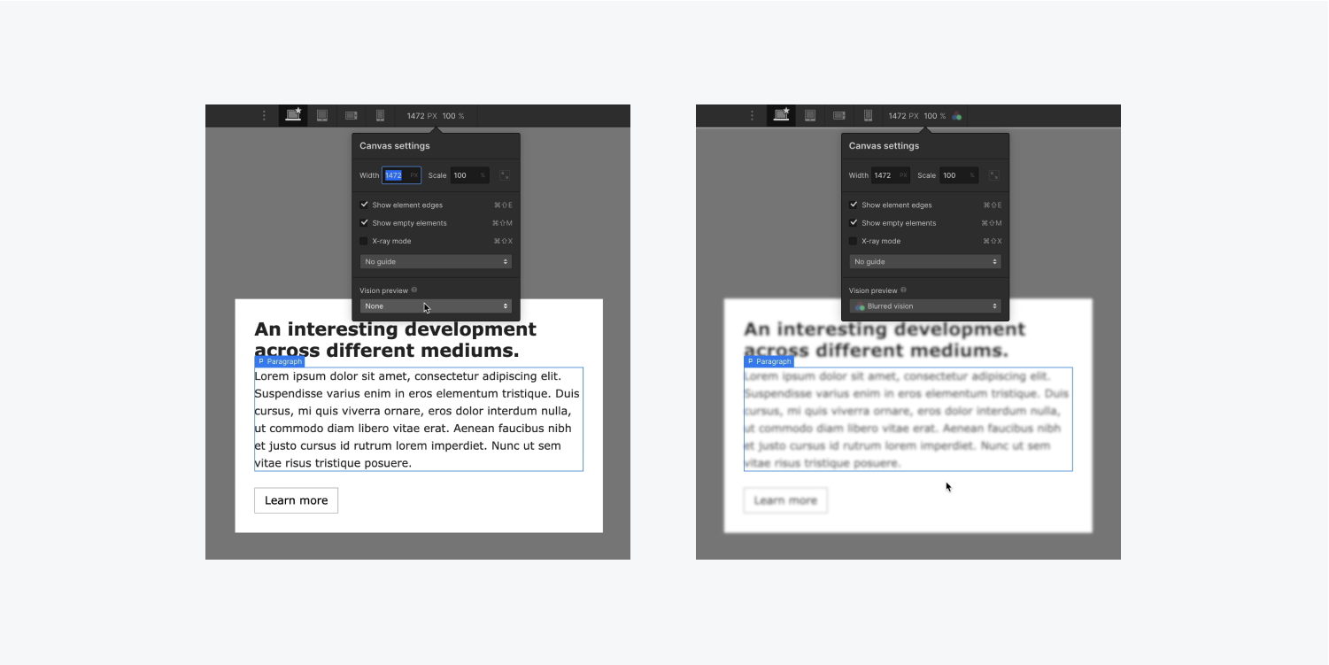
Now that you’ve changed the typeface to something that’s thicker, when you return to Vision preview and approximate what the updated paragraph looks like to someone with blurred vision, it becomes more legible.
Typography scale on browser zoom
Thinner fonts, or even thinner UI elements, can sometimes be too small to be viewed easily. In fact, many people set an increased zoom percentage on their browser to make their browsing experience more legible.
Because of this, it’s important to be mindful of how you use relative units like VW (viewport width) on typography — especially on your meaningful content.
The goal with VW in typography is to make text scale based on the width of the viewport. In the following example, all the text gets larger (or smaller) based on the width of the viewport as it’s scaled, which is expected.
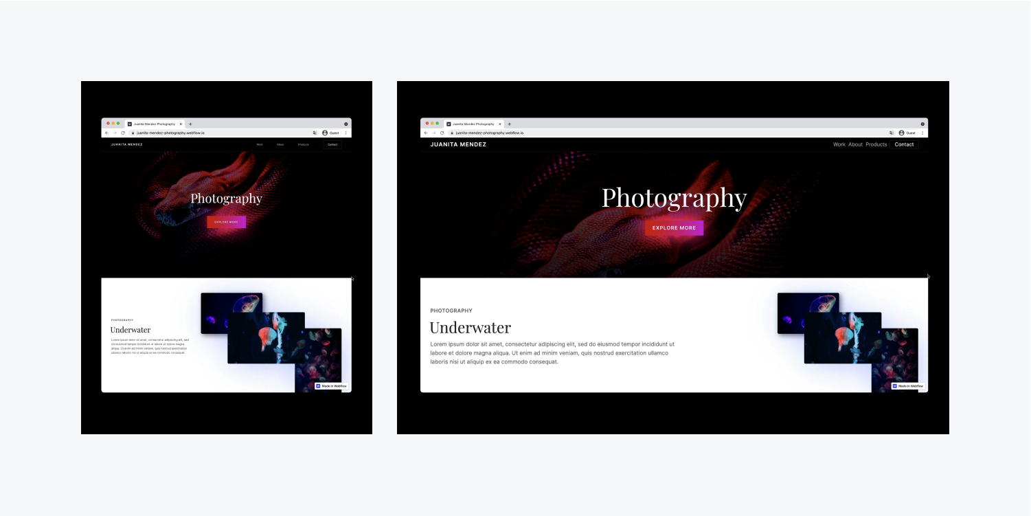
However, using VW on typography can become problematic when people zoom their browser to increase the scale and make text more legible.
For example, when using VW for typography, even though other content scales as the browser is zoomed (e.g., the images get larger), the text size doesn’t change. That's because typography using VW relies on the width of the viewport to determine when it scales, and browser zoom doesn’t change the viewport width.
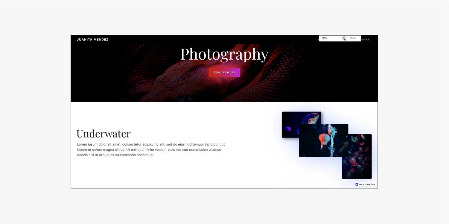
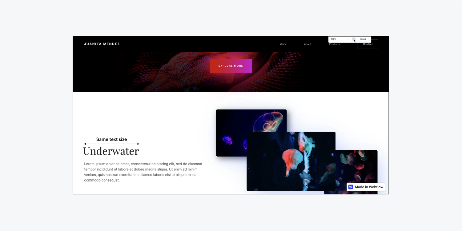
To allow your text to scale up as browser zoom increases, set your typography size to use a unit of EMs, REMS, or pixels. (This is especially important for your meaningful content.)
Learn more about typography units.
Unclear UI
It’s important to make sure your user interface is accessible, too. In the following example, if you have blurred vision turned on in Vision preview, it’s not clear what action your site visitor needs to take.
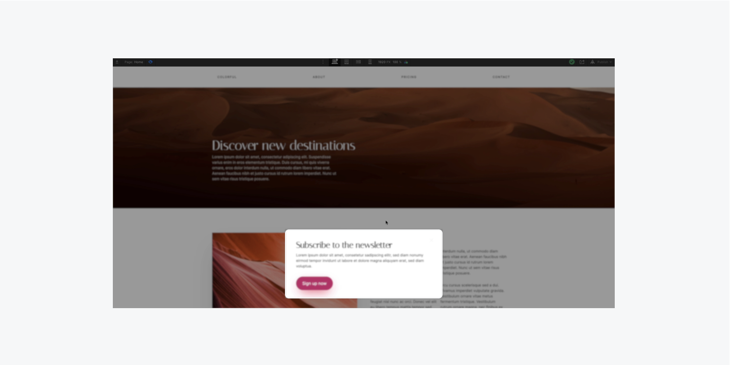
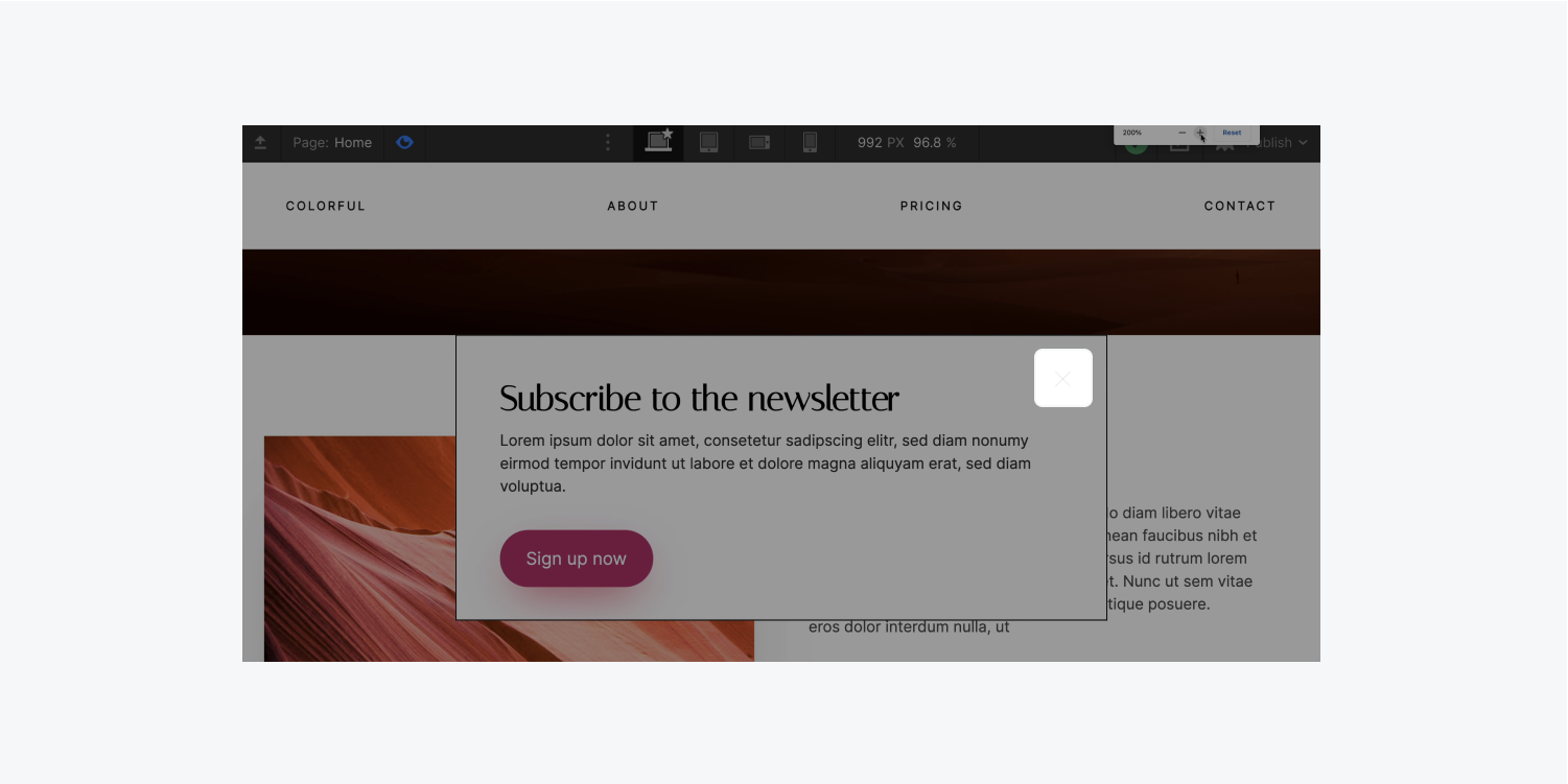
If you turn off the blurred vision preview and zoom in, you can see a tiny, thin “x” meant to close the obtrusive popup. This is an excellent example of design choices that don't just create bad user interfaces — they create illegible or impossible-to-use user interfaces.
Along with the considerations mentioned above, take your accessible design up a notch and enroll in the entire accessibility course, and read more about how to make your site more accessible.


