Image resolution refers to the width and height of pixel-based images. High image resolution means that an image will appear high quality or crisp. Low image resolution means that an image will appear low quality or grainy.
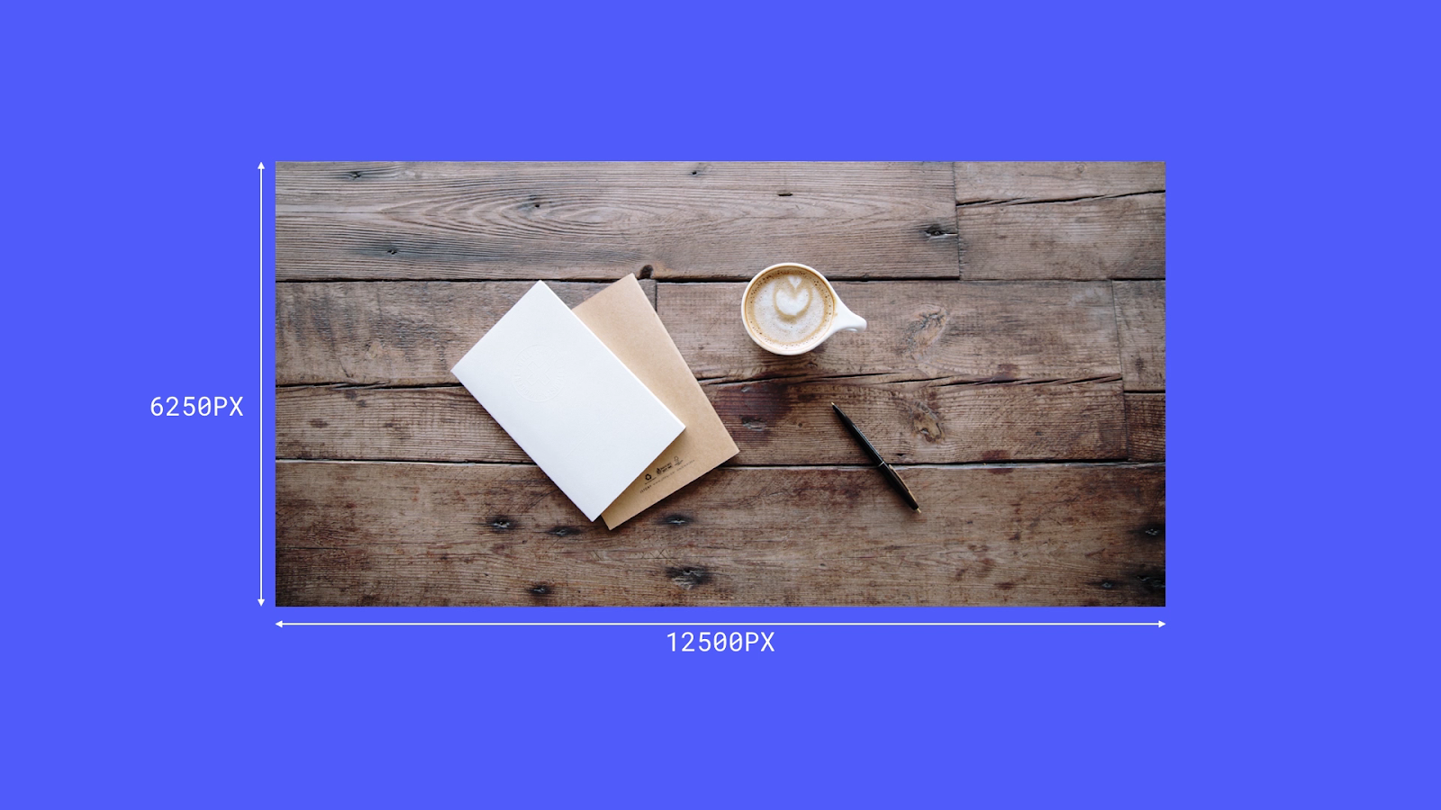
Most images captured by a camera or created by a graphic designer are saved at high resolution, like the image below.

Appropriate sizing
If you want to have an image cover the full width of a display, first make sure that image is sized properly.
Image is too small
A photo that has a resolution of 200 x 150 will fit inside a space that has a width of 100 pixels and a height of 75 pixels. But if it’s enlarged to cover a display with a width of 800 pixels and a height of 600 pixels it will look blurry and pixelated. The resolution would be too low, in the second case.
Image is too big
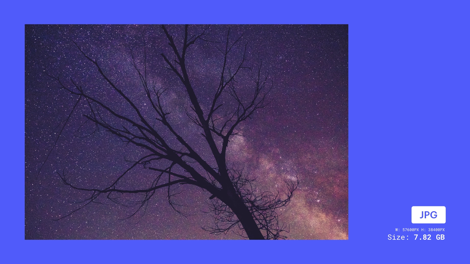
A photo that has a resolution of 57600 x 38400 will look fine when scaled down to cover an 800 x 600 display. But a much smaller image resolution (e.g., 1000 x 800) would be fine and wouldn’t include extra data. An image with an overly large resolution would be inefficient and would take much longer to upload and/or download. It would also slow down your web page.

Image resolution best practices
Before uploading your images to your site, make sure to:
- Choose the right image format
- Optimize your images
The best image file formats to upload are PNG, JPEG, SVG, and WebP. Learn more about the most common image file types used on the web.
Using images in Webflow
You can use images in your Webflow site in 2 ways:
- as inline images
- as background images
Inline images
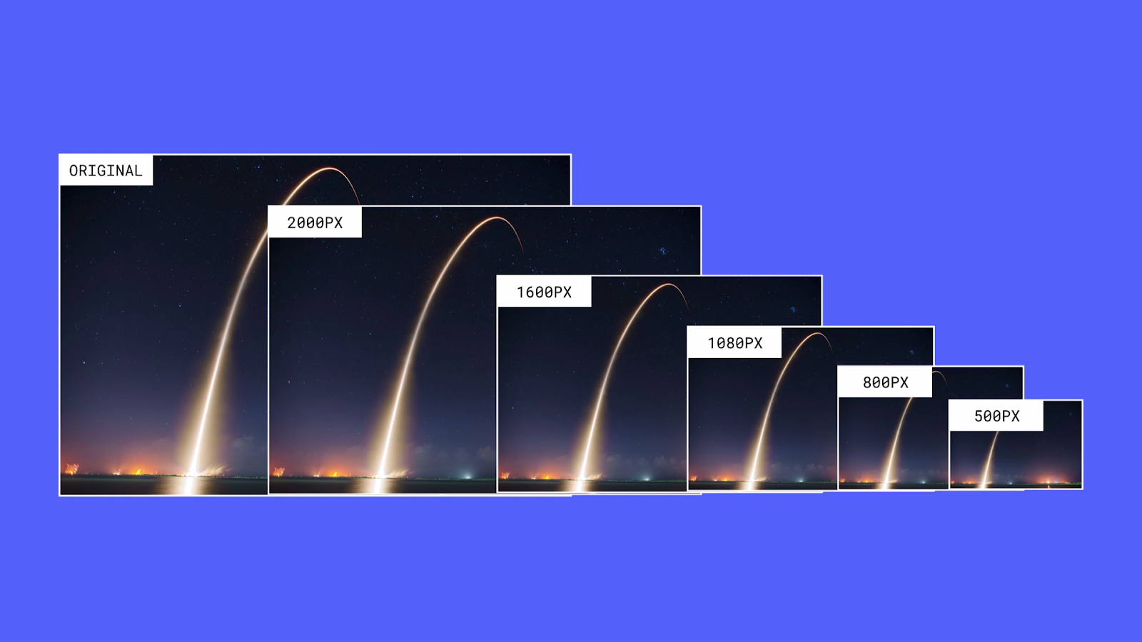
When you add an inline image to your site, Webflow will automatically optimize and create variants of this image at different resolutions.

When a site visitor opens a page that contains an inline image, the browser will serve the best image based on that site visitor’s screen resolution. Learn more about responsive images.
Background images
If you’re setting a background image on an element, like a section or container, the original image will be used. Webflow does not create responsive variants for background images. This means that you’ll want to upload an optimized image with the correct resolution.
The best way to optimize images is to design for common, practical displays, and to consider your site’s audience.
The 15-inch MacBook Pro, for instance, has a resolution of 2880 x 1800. An image with a width of 3000 pixels would work well for this display. On a larger display, the image can scale up and still look great.
However, site visitors on mobile devices will download the same large background image that’s used on larger breakpoints, which isn’t ideal. You can upload variants for the background image and add a new background image variant to each breakpoint. This optimizes your background images for larger or smaller breakpoints.
How to adjust image compression
You can use image editors like Photoshop to adjust the quality of image formats. Image editors can compress images and reduce your file size.


