In this lesson:
Add tabs
To add the tabs element, go to the Add panel and scroll down to the components section. Then click and drag the Tabs element to place it on the canvas. It will automatically fill the width of whatever element it is placed in.

Anatomy of tabs
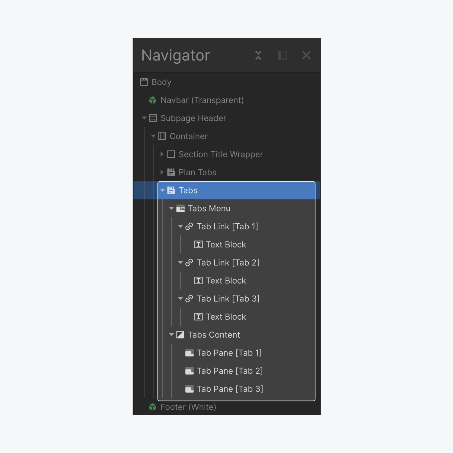
The Tabs element is made up of the Tabs Wrapper, which has inside it the Tabs Menu the Tabs Content.
Tabs menu
The tabs menu contains all the tab links. By default, there are three tab links. Within each tab link is a Text block.
Tabs content
Nested inside the tabs content are the tab panes, where the content for each tab is kept. By default there’s three panes (matching the number buttons).
Creating a tab
By default there are three tabs. You can add more with the following steps:
- Select any element within the Tabs
- Go to the Element Settings panel
- Under Tabs settings click the plus icon
When you create a new tab, a tab link and a tab pane are automatically created in the correct locations.
Deleting tabs
- Select any element within the Tabs
- Go to the Element Settings Panel
- Find the Tabs Settings section
- Click the trash icon next to the tab you want to delete
If you delete a Tab Link, the corresponding tab pane will also be deleted, and visa versa.
Renaming tabs
In the tab settings, you can also rename the tabs for internal organization (this will not rename the tabs on the canvas).
Switching tabs
There are several ways you can switch to different tabs:
- Select the tab from the Set Active Tab list. Be aware: this will also set the default tab when the website is loaded
- Select the tab you want to view in the Navigator
- Select a tab Pane on the canvas and use the left and right arrows on the keyboard to select adjacent tab panes

Add content to a tab
After switching to a tab you can add elements to the tab pane in a couple ways:
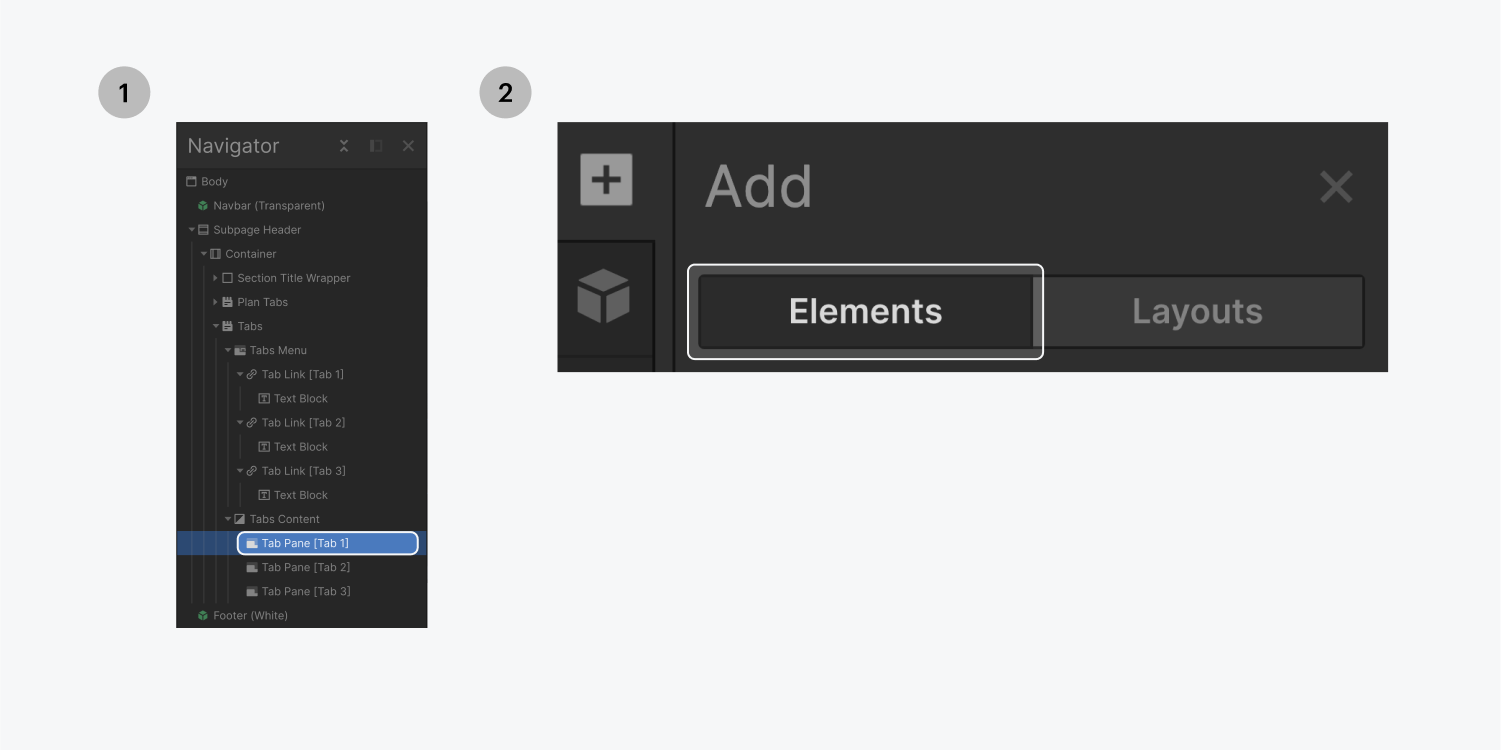
- With the tab pane selected, click on elements in the Add panel to instantly insert them
- Drag and drop elements from the Add panel into the tab pane
You can also preview the content of each tab by going to Preview mode and clicking through each tab button.
Style tabs
You are able to style every element within the tabs component.
Tabs menu
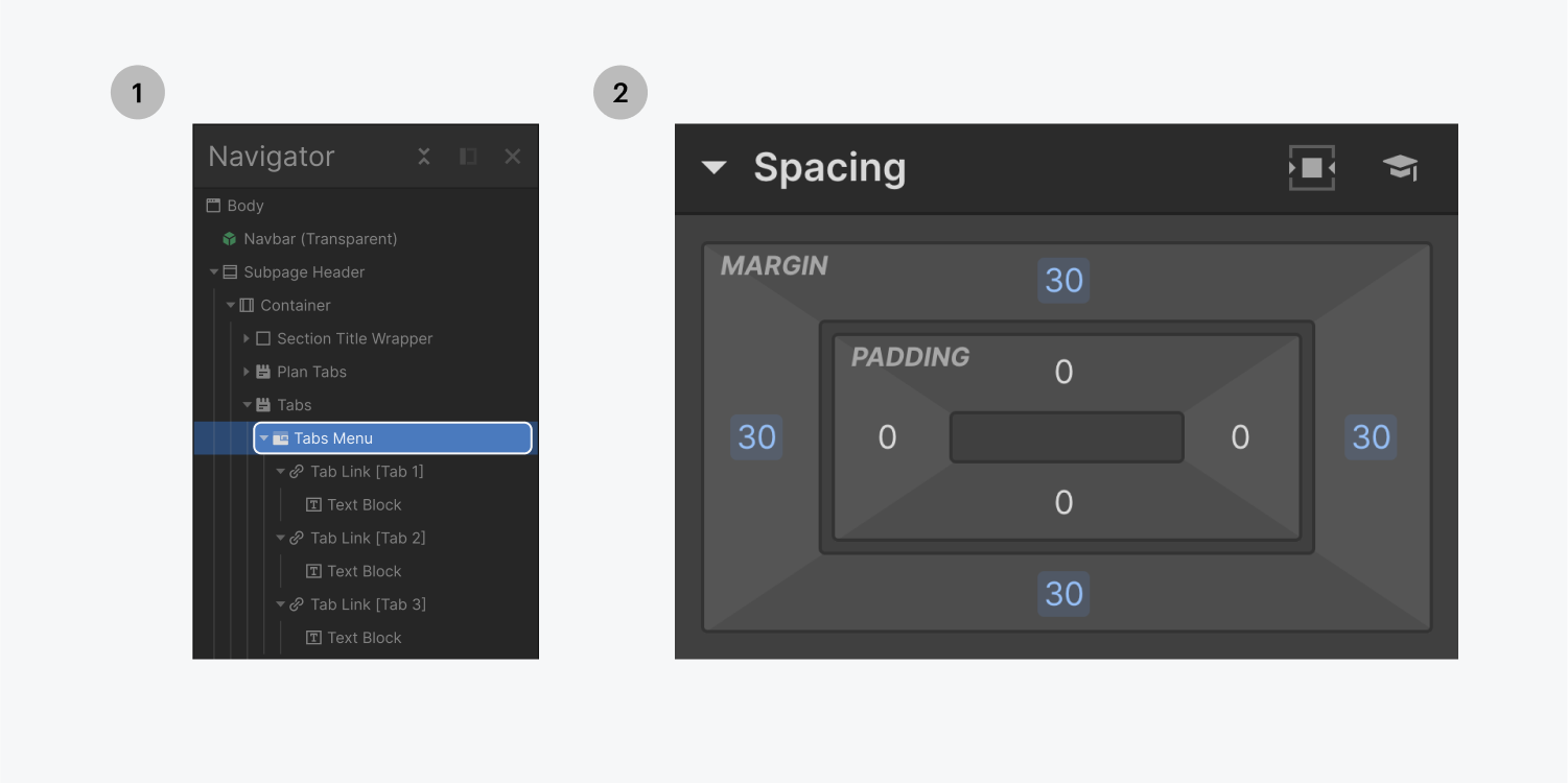
You can style the tabs menu by first selecting it on the canvas or from the Navigator and then going to the Style panel. For example, you can choose to add bottom margin to create space between the tabs and the content within the tab panes.
Tab links
First, select a tab link, and create a new class. Then add this class name to all of the other tab links so they share the same styles. This green Current class is automatically applied whenever a tab is selected on your site.
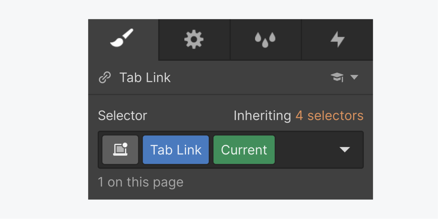
Once all Tab Links have the same class name, select one of the tab links without the Current class. You can style one of these Tab Links and the changes will be applied to all of them. For example, you can edit the font color, font size, and background color.

Styling the current tab link
You can choose to style the current tab differently than the normal tab to differentiate between active and inactive tabs. For example, you can edit the font color and background color to be different than a normal tab. To style the current tab, simply select the active tab link.

Hover styling for tab links
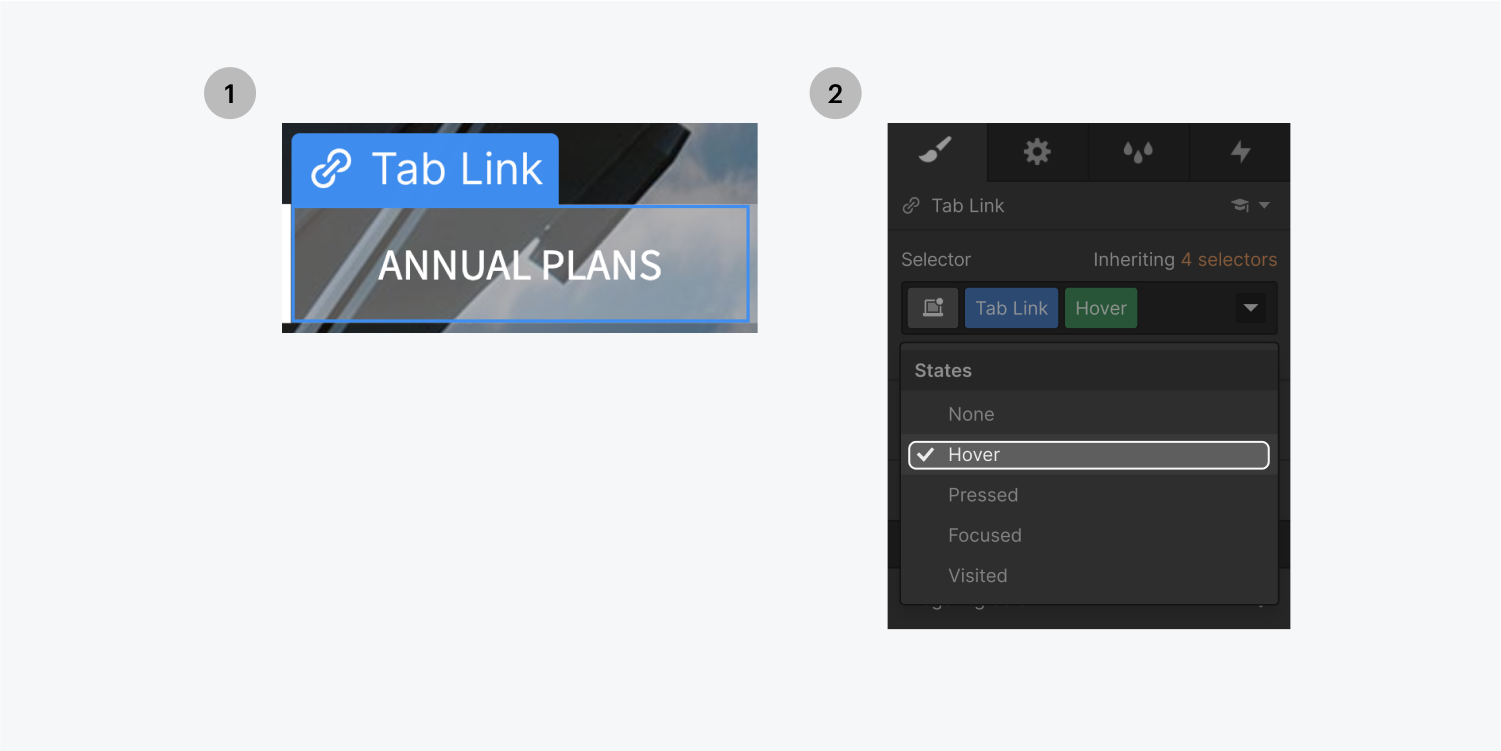
You can add a hover effect to the tab links with the following steps:
- Select a tab link that isn’t current
- Choose Hover from the States dropdown menu
- Style the tabs how you want them to appear on hover
- Select None from the States dropdown
- Add a transition in the Style panel with the desired easing and duration
Transitions
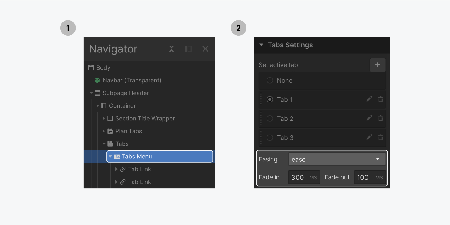
To control the transition between different tab panes:
- Select any of the tab elements
- Go to the Element Settings panel
- Choose the easing from the Easing Method dropdown
- Set Fade In/out duration (ms)
