In this lesson you’ll learn how to create a simple card flip animation with CSS 3D transforms — without writing any code. Card flips are a great way to add visual interactivity when you want to reveal additional information. For example, you could use a card flip animation to show more details about a product you’re selling.
In this lesson:
- Create a Section and Div block to hold your card image elements
- Create card front and back image elements
- Set the child perspective on the parent element
- Set transform properties on the card image elements
- Animate the Card wrapper to rotate on hover
Create a Section and Div block to hold your card image elements
To get started, add a Section to your page:
- Open the Add elements panel from the left toolbar
- Drag a Section onto your page
Place a Div block in the Section you just added:
- Drag a Div block from the Add elements panel and place it in the Section you just created
- Give the Div block a class (e.g., “Card wrapper”)
Create card front and back image elements
To add and prep your card image elements:
- Drag 2 separate Image elements from the Add elements panel and place them in the Card wrapper Div block you just created
- Choose your first image and give it a Class name of Card front. Repeat this for your second image, but give it a Class name of Card back.
To make images stack:
Choose each image and under Layout, set them to Display: Block. Make sure you do this for both images to make them sit on top of each other.

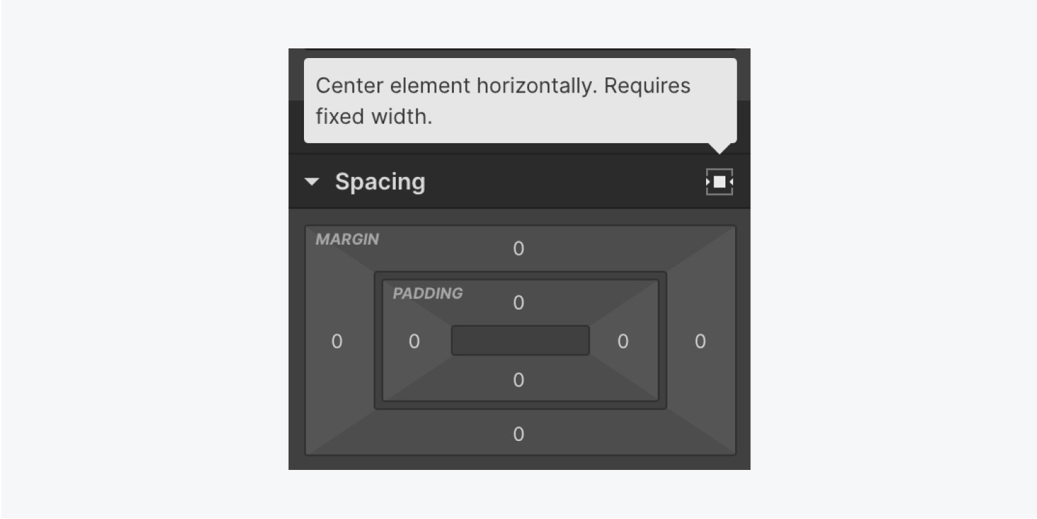
Center the images in the middle of the Card wrapper Div block. Go to Spacing and set each image’s left and right margins to Auto. If you’d like a quicker way to center your images, click the Center element horizontally button to set your margins automatically.

To allow the images to sit stacked on top of one another, you’ll need to add a CSS style. In the Style panel > Position, set each image to Absolute and choose the Top position.
Because you absolutely positioned your card images, both of the cards are stacked. Your Card back is located behind Card front.
To be able to work with the back card, let’s hide the front card from view:
- Choose the Card front image
- Go to Layout
- Temporarily set the Display to None
Set the child perspective on the parent element
Remember the Section you dragged onto your page earlier? Because it’s the parent element of the Card wrapper Div block, we need to set the section’s Children perspective. By setting this perspective, it allows us to see our transform in 3D.
- Choose the Section
- Open the Style panel > Effects > 2D & 3D transforms
- Click the 3 disclosure dots to open Transform settings
- Under Children perspective, set a Distance of 1234 pixels (you can always adjust this later to make your 3D card flip look exactly the way you envision it)
Set transform properties on the card image elements
Now that your Section has its children perspective set and your back card is visible, let’s set up the back card’s transform properties.
- In the Style panel, go to Effects and add a 2D & 3D transform with the plus button
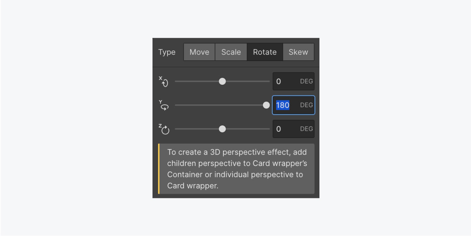
- Choose Rotate and rotate the image element by 180 degrees on the Y-axis
Because you’ve rotated the back card, you can see the mirrored view of the back of the card. Essentially, this 180-degree transform has rotated the Card back so it faces the opposite direction, pointing away from us. As a result, the portion of the card that’s visible to us is the card’s Backface. Keep in mind, our goal with the card flip animation is for each card’s Backface to be hidden.
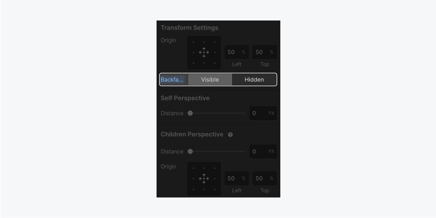
To set the Backface of the card to be hidden:
- Return to Effects > 2D & 3D transforms
- Click the 3 disclosure dots to open Transform settings
- Set Backface to Hidden

Next, re-enable visibility of the Card front image element.
- Choose the Card front image element
- Go to Display and set it to Block
You’ll also want to hide the Card front’s Backface in the same way you did for the Card back.
- Select the Card front element.
- Go to Effects > 2D & 3D transforms
- Click the 3 disclosure dots to open Transform settings
- Set Backface to Hidden
Animate the card wrapper to rotate on hover
It’s time to add the animation to flip the card and reveal the Card back on hover.
Choose the Card wrapper Div block. This allows the flip animation to affect the entire Card wrapper Div block as well as both of our child card elements.
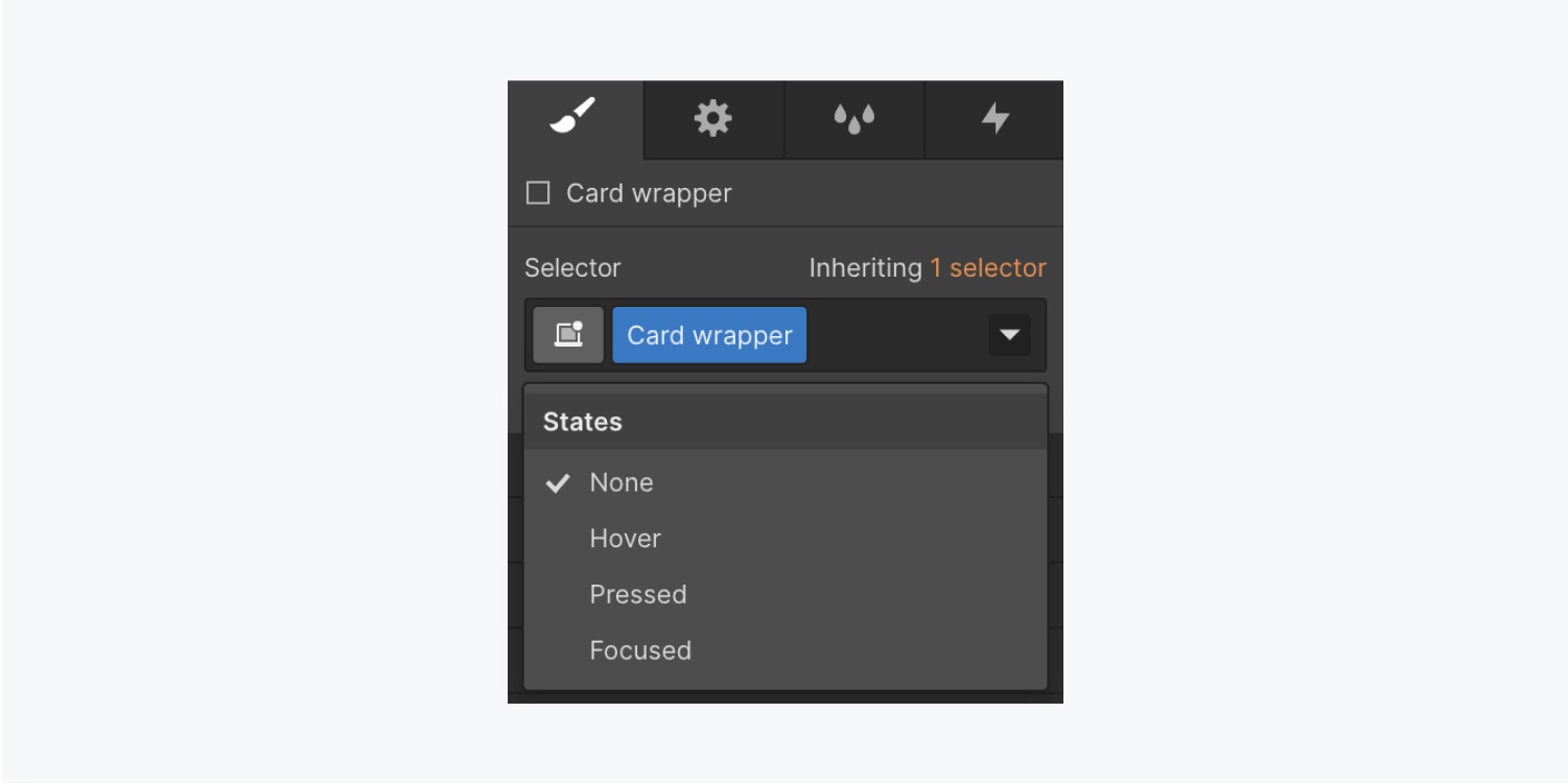
- Go to the Selector field for the Card wrapper Div block
- Choose the Hover state within the States dropdown menu

- With the Hover state active, scroll down to Effects > 2D & 3D transforms
- Click the + and choose the Rotate option
- Set the Card wrapper to rotate 180 degrees on the Y-axis

To see the flip animation you just created, return to the original state of the Card wrapper Div block by setting the State to None.
Lastly, add a transition to the Card wrapper Div block.
- Open the Style panel > Effects > Transitions
- Add a new transition with the plus button
- Under the Type dropdown menu, choose Transform
- Add a duration of 1000 milliseconds
Time to celebrate — you’re done! Click the preview button in the Designer to test your card flip in action. Hover over the card and back out again to see the card flip transition come to life! Flipping awesome!
Related resources


