Whether you’re specifying spacing values, setting the size of an element or a font, or rotating an element using transforms, you can enter the value and unit in the appropriate input field. You can even do the math in any numeric field input field. Want to double the size of your div block? Type *2 right after the current value and press enter.
When you add an element to the canvas and adjust its size, that element’s starting width and height will match the “natural” size of the element, based on how it flows within the existing layout.
Changing input values using your keyboard
When a numerical field is focused, you can use the up ↑ and down ↓ arrows on the keyboard to increase or decrease the value by 1. Holding Shift while doing this will increase or decrease the value by 10. Press ESC to unfocus the input field.
Adding spacing presets to multiple sides
To add space to multiple sides using a preset:
- In the Spacing section, click on a value at one of the sides
- Hover over the preset value you would like to select
- Hold Option (on Mac) or Alt (on Windows) and click the value of your choice

Doing this will apply the preset to both sides of an element — or you can hold Shift to apply the value to all sides.
Changing input values with your mouse
Once you’ve got your cursor in a numeric input field, you can hold Option (on Mac) or Alt (on Windows) then click and drag your mouse to adjust the value (dragging left to decrease the value or right to increase the value). No need to take that right hand off the mouse.
Incremental values
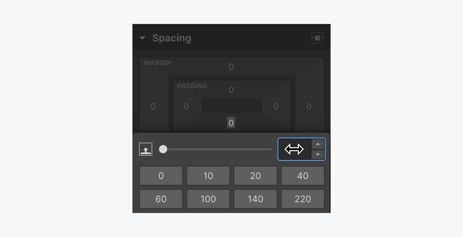
You can hold Option (on Mac) or Alt (on Windows) to see the incremental arrows next to your input field to add or subtract incrementally by clicking the up or down arrow next to your value.
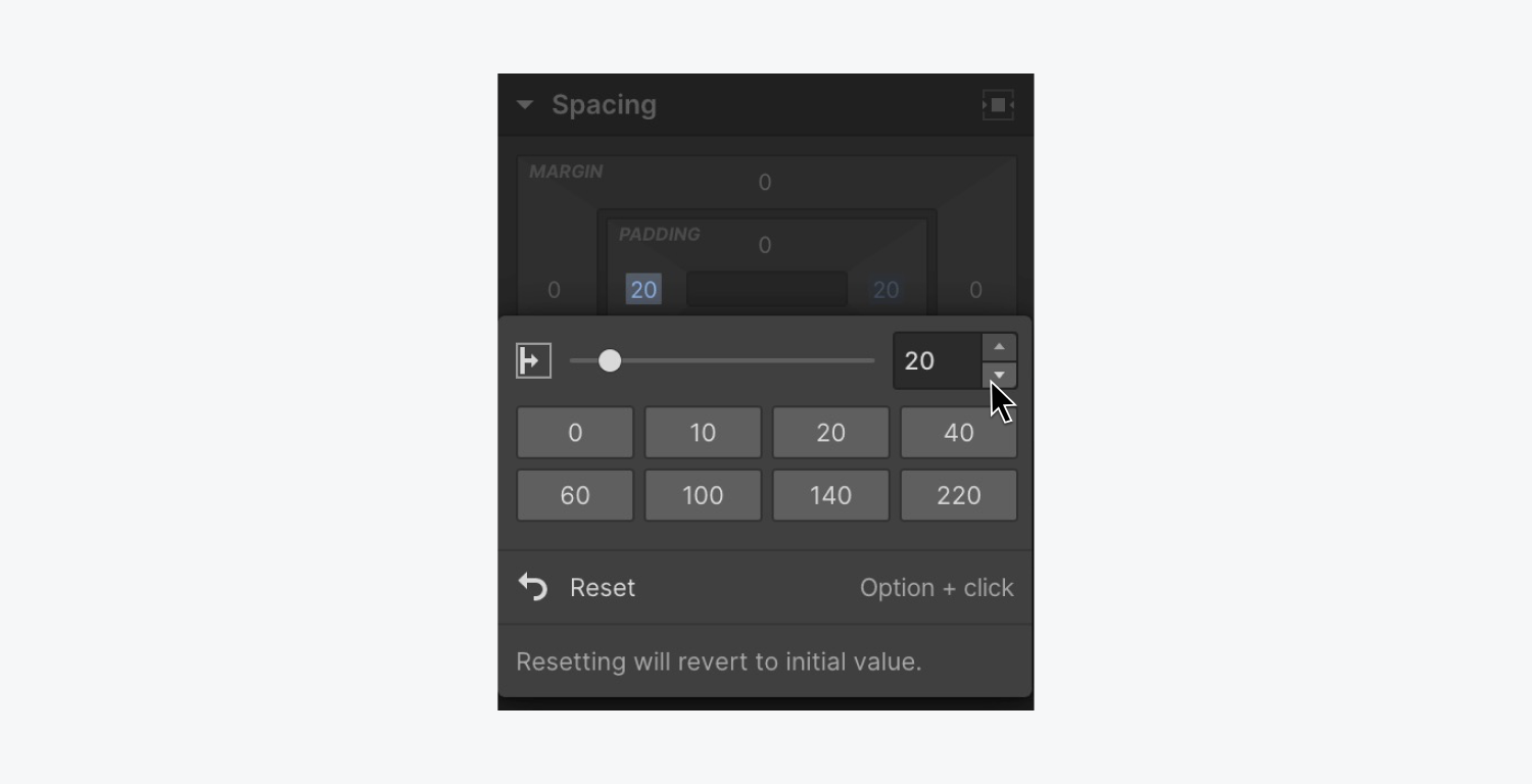
Adjusting spacing values on multiple sides
You can hold Option (on Mac) or Alt (on Windows) while dragging the margin and padding controls to apply the same value to both sides — or hold Shift to apply the value to all sides.
Changing units
You can change the unit in an input field using the unit dropdown or by typing the unit after the value.
When you change the unit from px to % we will auto-compute the approximate conversion for you.
CSS units
Most input fields allow you to choose between the following units:
- PX (Pixels) – relative the screen resolution
- % (Percentage) –— relative to the parent element
- EM – relative to the font size of the parent element
- REM – relative to the font size of the body element
- VH – relative to the viewport height. The viewport height is 100vh.
- VW – relative to the viewport width. The viewport width is 100vw.
- - – no unit
- Small, large, and dynamic viewport units (i.e., DVH, DVW, SVH, SVW, LVH, and LVW)
For some fields, you can replace the unit with a value such as:
- Auto
- None
Note: When using units in an input field in the Designer, you won’t see SVH, SVW, LVH, or LVW units in the unit dropdown. To use these units in an input field, type the value and the unit letters (e.g., 100 SVH) in the input field and press Enter.
Typography units
When you set values for style properties such as font size or line height, the default unit applied to the numerical value that you enter in the field is pixels (px). There are a handful of other units you can choose from that change how typography sizing behaves.
Pixels (px) [Default]
Pixel values for font size can scale proportionately with images and other elements that have an assigned pixel value. To use the default pixel value, just type a numeric value, for example 90, and press enter. The value will be 90px.
Ems (em)
Every browser has a default font size, which is usually 16px. When you set the font size of an element on your site to 1em, then 1em will equal 16px. And 2ems will be equal to 2 x 16px = 32px.
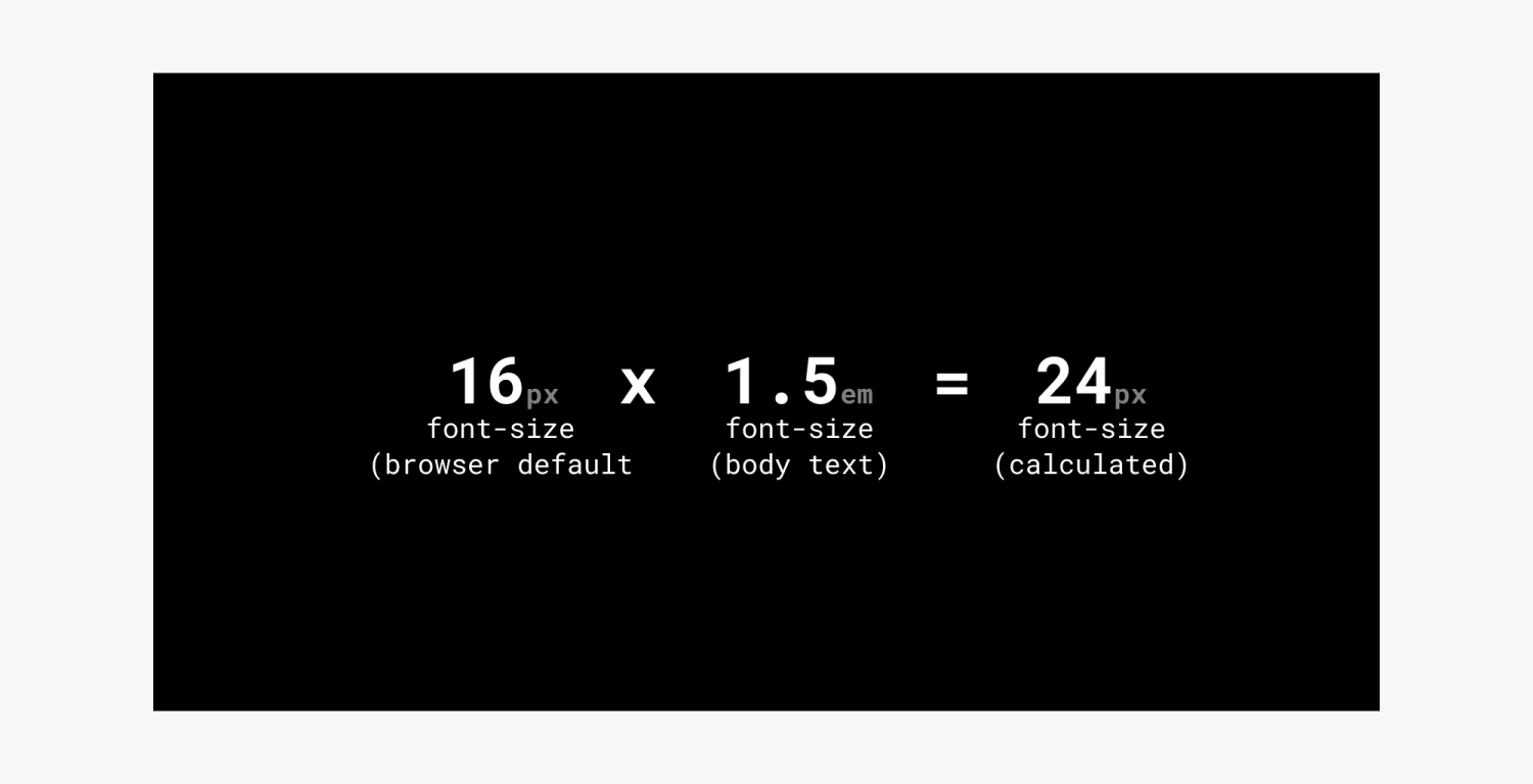
Ems are relative to the font size of their parents. So, if a parent section has a value of 0.5ems the child paragraph with 1em value will have a font size of 16 x 0.5 = 8px while another paragraph in the body with 1em font size may have a font size of 16px.
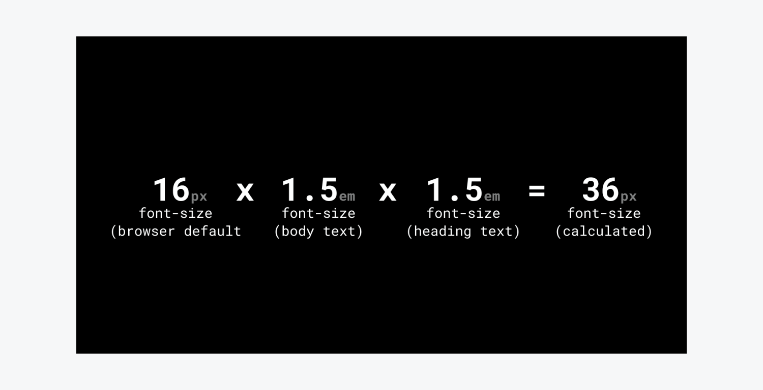
Rems or- Root ems (rem)
As an alternative to ems, you can use rems, aka root ems. Rems are relative to the HTML font size. Which is going to respect the browser's default font size. So, any element with value 1rem will be equivalent to 16px regardless of the font size of its parent element. Even if you change your default font in the body.
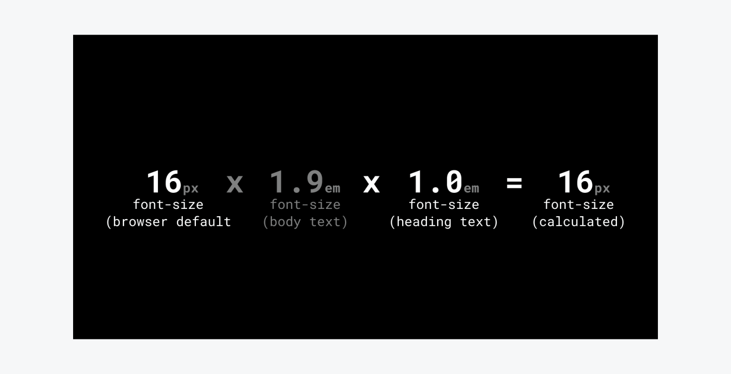
Percentages (%)
Like ems, the percentage refers to the parent element's font size.
Viewport Units (vw & vh)
Viewport units can be used to create responsive fonts. Viewport width (vw) is based on the width of the viewport. This is used when you want to scale a text proportionally to the viewport width. Viewport height (vh) is based on the height of the viewport. This is used when you want to scale a text proportionally to the viewport height.
When using viewport units, test on actual devices especially when using vh. These font sizes will vary greatly on different devices.
Line height units
Unitless [Default]
Using the “unitless” unit is the best option for line height because it makes the line height a multiple of the font size. When the font size changes, the line height scales automatically.
To set the “unitless” unit, choose the “-” from the unit menu or type "-" after the value and press enter.
Percentage (%)
Percentage values for line height also multiply the font size. However, there are inheritance issues that can arise with %, so it’s recommended to use unitless instead.
Fixed units
If you want to have more control over line height, you can use fixed values like px, em, or rem.
Angle units
Shadows, transforms such as rotate and skew, and the hue rotate filter use angle units. You can use positive to rotate clockwise and negative values to rotate counter clockwise.
- DEG (–degrees) – range from 0 to 360deg. 0 and 360 have the same value.
- RAD (–radians) – equal to 180/π degrees or about 57.3deg
- GRAD ( –grads) – equivalent to 1⁄400 of a full circle
- TURN (– turns) – one rotation. One turn is 360deg.
Time units
Time units are used in duration settings in transitions and interactions.
- MS – milliseconds. 1000 milliseconds is 1 second.


