Columns help you place and organize content side by side. Each column element consists of a single row of columns.
Adding columns
Drag a Columns element from the elements panel and drop it onto your page.

Selecting a layout
By default, when you drop a columns element, you get two columns.
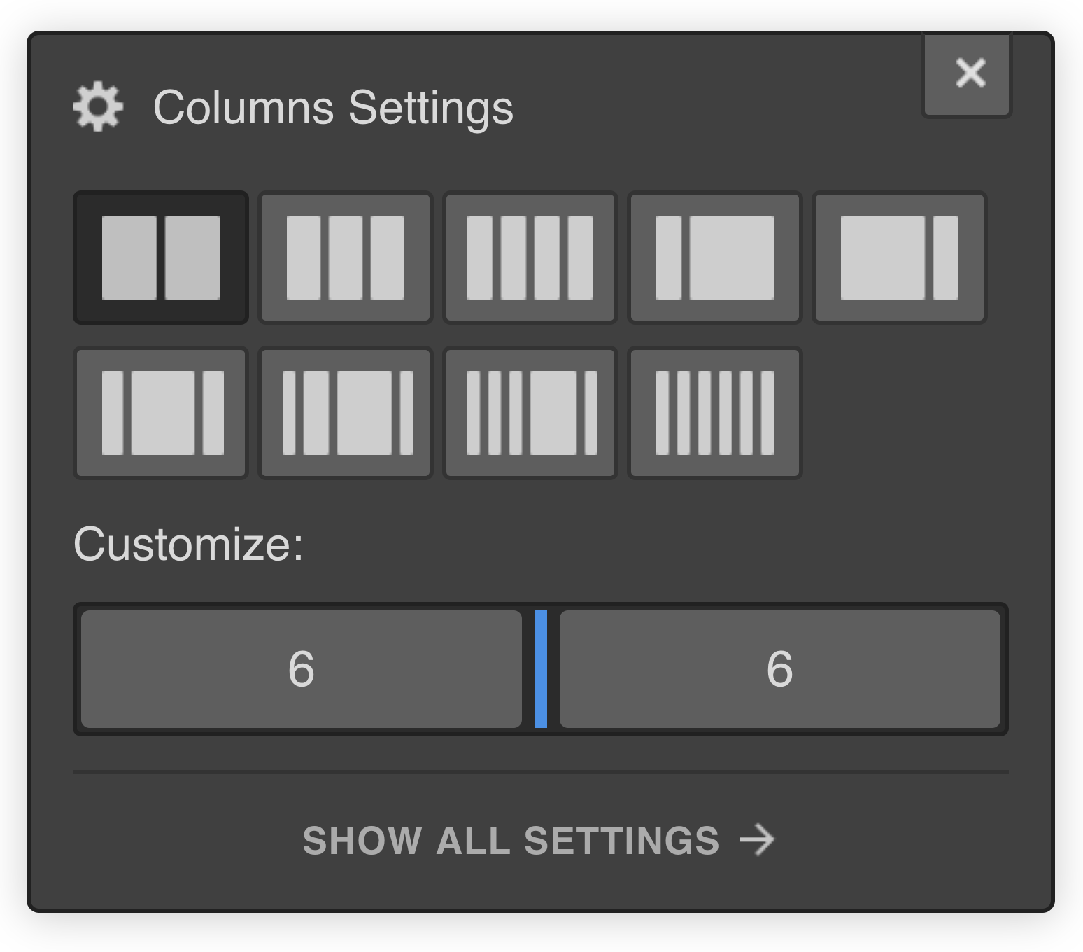
From the columns settings, you can select a layout option, and you'll see the layout change right on the canvas. Here, you can select the number of columns you want and their proportional widths.
This is also reflected under columns settings → customize.

You can also adjust the size manually under customize. The numbers show the proportions, and they always add up to 12. So, you can customize the layout precisely how you want to.
Adding your content
Drag and drop new or existing content directly inside of the columns.
By default, columns have 10px padding on the left and right, but you can adjust that in the style panel. Once you’ve done that on one column, you can double click and rename the class to reuse it with the other columns.
Select the next column and apply that class again. As you do that, you can see the padding update. And if you change the padding again while you are editing that same class, it will update all the columns that use that class.
Make changes to your columns layout
You can always go to element settings and make any changes to resize your columns, or even add or remove columns. You can also access the columns settings by selecting the element and pressing enter.
Make your columns responsive
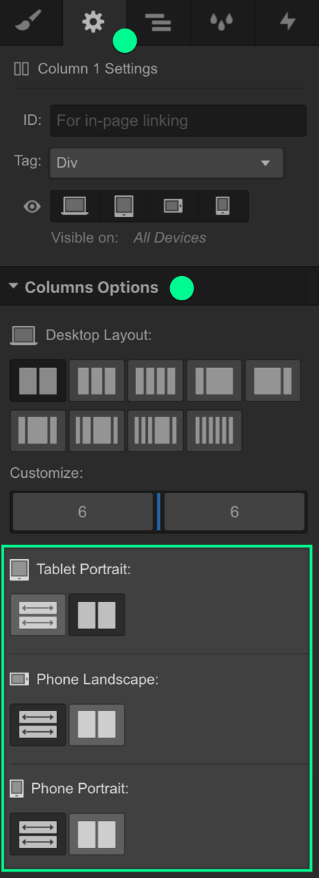
You can also make changes to how your columns show on various breakpoints under element settings → columns options.

This option lets you customize the columns layout so it can more adapt to different screens.


