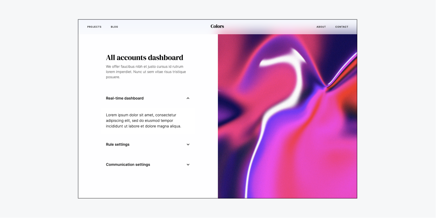
You can create a custom accordion by using a dropdown element and interactions. In this lesson, you’ll learn:
- How to add a dropdown element
- How to customize your dropdown toggle
- How to style your accordion
- How to create your custom animation
How to add a dropdown element
The dropdown element has default built-in actions that make it useful as a custom accordion — it opens the dropdown list when clicked and closes it when a different element or part of the page is clicked.
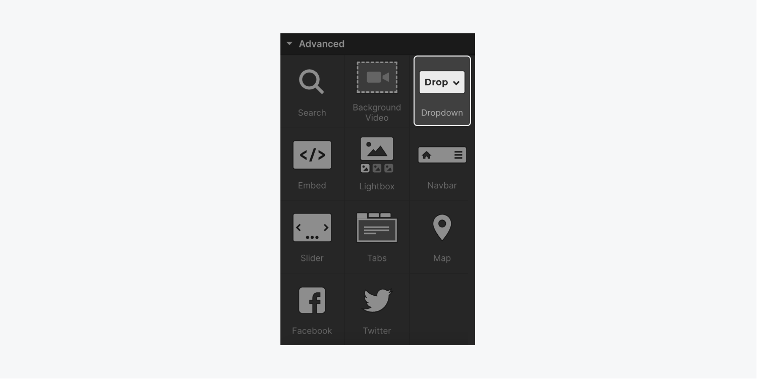
You can add a dropdown element to your site by going to Add panel (A) > Elements > Advanced and dragging the dropdown element onto the canvas.
How to change the default dropdown styles
To use the dropdown in your custom accordion, you’ll need to change the default dropdown element styles. In particular, you’ll need to adjust the width so that the dropdown completely fills the space of its parent element (i.e., whatever element holds the custom accordion).
Pro tip: Give your dropdown a class (e.g., “Accordion item”) to make your styles reusable. Learn more about styling with classes.
To change the default dropdown styles:
- Select the parent dropdown element on the Designer canvas (we gave it a class of “Accordion item” for this example)
- Go to Style panel > Size
- Set Width to 100%

How to customize your dropdown toggle
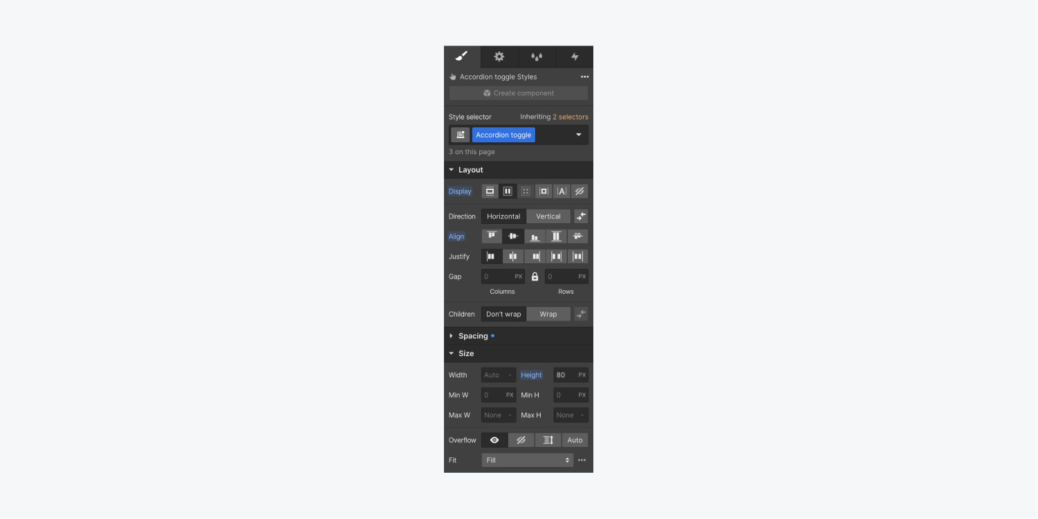
Now, you’ll need to customize your dropdown toggle so it completely fills its parent element (i.e., the element holding it) and hides the content inside of the dropdown list when the accordion is closed. To do this, you can adjust the dropdown toggle’s display and height properties:
- Select the dropdown toggle on the canvas and give it a class (e.g., “Accordion toggle”)
- Go to Style panel > Layout
- Set Display to flexbox to fill the horizontal space
- Set Align to center to vertically center the text on your accordion
- Go to Style panel > Size
- Set a Height value (e.g., 80px)
How to style your accordion
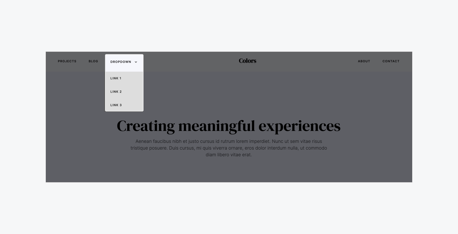
At this point, if you preview your site and click on your accordion, you may notice that the accordion opens, but the default content inside will overlay any content around it. This happens because the default position style for the dropdown list is absolute. For traditional dropdown use cases like in menus or navbars, this is the desired behavior, but you’ll need to adjust the default position for your custom accordion so the content around the element makes room (e.g., slides down or up) when the content inside the accordion expands.
To style your accordion:
- Select the parent dropdown element on the canvas (e.g., the “Accordion item”)
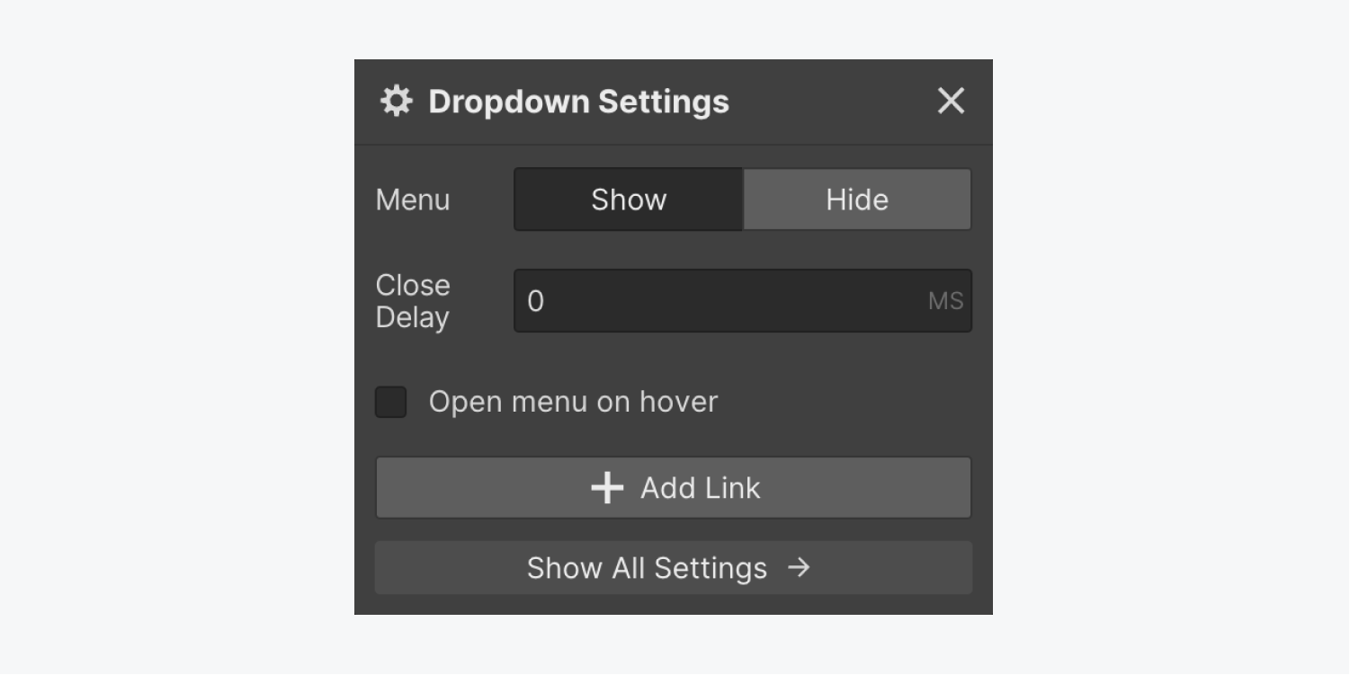
- Click the “cog” icon to open Dropdown settings and click “Show” next to Menu
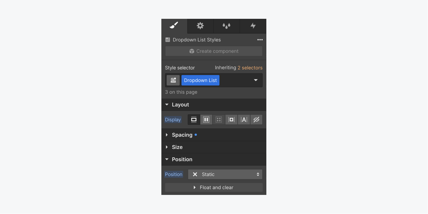
- Select the Dropdown list element on the canvas
- Go to Style panel > Position
- Set Position to static
- Select the parent dropdown element (e.g., “Accordion item”) on the canvas
- Go to Style panel > Size
- Set Overflow to hidden to hide any content that spills outside of the accordion area
How to create your custom animation
Now, you’ll create a custom animation that will both open and close your custom accordion with the following steps:
Create initial actions
You’ll start by creating 2 initial actions (i.e., styles applied to the element before the page loads) for your accordion.
First, you’ll create an initial action for your dropdown:
- Select the dropdown element on the canvas (e.g., “Accordion item”)
- Go to Interactions panel > Element trigger and click the “plus” icon to create a new element trigger
- Choose Dropdown opens
- Click Select an action under Menu opens
- Choose Start an animation under Custom animation
- Click the “plus” icon next to Timed animations
- Give your custom animation a name (e.g., “Accordion opens”)
- Click the “plus” icon next to Actions to add an action to your animation
- Choose Size under Miscellaneous
- Check the “Set as initial state” checkbox under Timing
- Enter a height value (e.g., 80px) under Size that matches the height you gave your dropdown toggle (e.g., the “Accordion toggle”) in the previous steps
- Click Save
Next, you’ll create an initial action for the toggle icon:
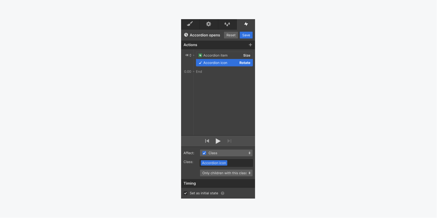
- Select the Icon within the dropdown element
- Go to the Style panel and give your icon class (e.g., “Accordion icon”) — now you can make the animation affect all instances of the icon
- Select your parent dropdown element on the canvas (e.g., “Accordion item”)
- Open the Interactions panel
- Select the Dropdown opens interaction you created in the steps above
- Click the “cog” icon next to the custom timed animation you created in the steps above (e.g., the “Accordion opens” interaction)
- Select the icon (e.g., “Accordion icon”)
- Click the “plus” icon next to Actions to create an initial action for the icon
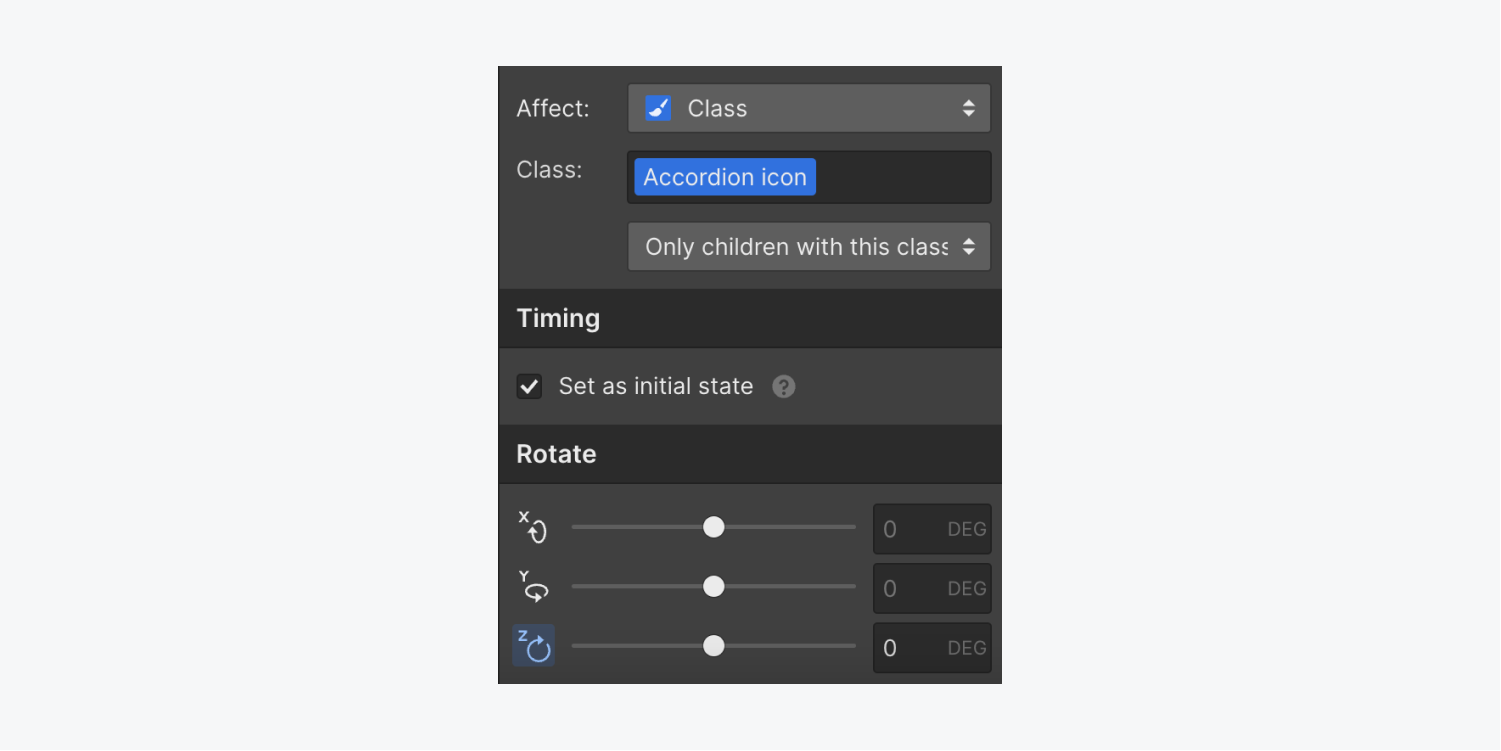
- Choose Rotate under Transform
- Check the “Set as initial state” checkbox under Timing
- Go to Rotate and set the z-axis to 0 degrees
- Click Save
Animate the accordion opening
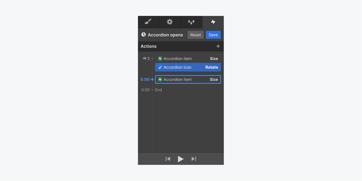
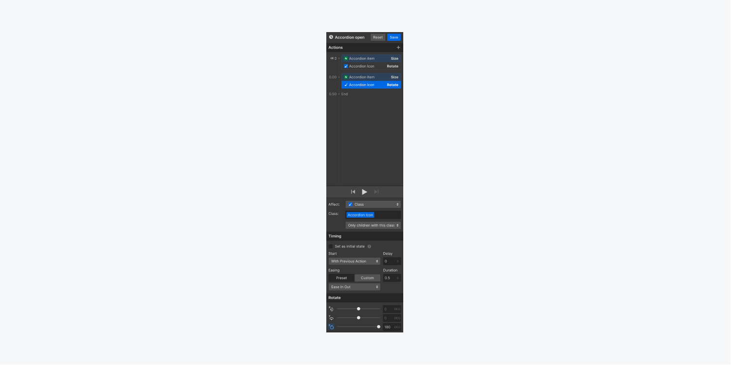
Now, you’ll create the accordion opening actions that occur simultaneously when the accordion is clicked — the “Accordion item” size will change to the size of the content inside it, and the “Accordion icon” will rotate 180 degrees.
To change the size of the “Accordion item” and rotate the “Accordion icon” when the accordion is opened:
- Select the parent dropdown element on the canvas (e.g., “Accordion item”)
- Open the Interactions panel
- Choose the Dropdown opens interaction you created in the previous steps
- Click the “cog” icon next to the custom timed animation you created in the previous steps (e.g., the “Accordion opens” animation)
- Click the “plus” icon next to Actions to add an action to your animation
- Choose Size under Miscellaneous
- Uncheck the “Set as initial state” checkbox under Timing
- Go to Size and enter “auto” for the height — this matches the height of your accordion to its content inside
- Select the icon (e.g., “Accordion icon”)
- Click the “plus” icon next to the “Accordion item” Size action you just created to add another action at that timestamp — this ensures that both of these actions animate simultaneously
- Choose Rotate under Transform
- Go to Rotate and set the z-axis to 180 degrees — this rotates the icon so that it points up when the accordion opens
- Click Save
Note: You can change the easing (i.e., the acceleration and deceleration of the animation transition) of each action. Learn more about interpolation, easing, and smoothing.
Animate the accordion closing
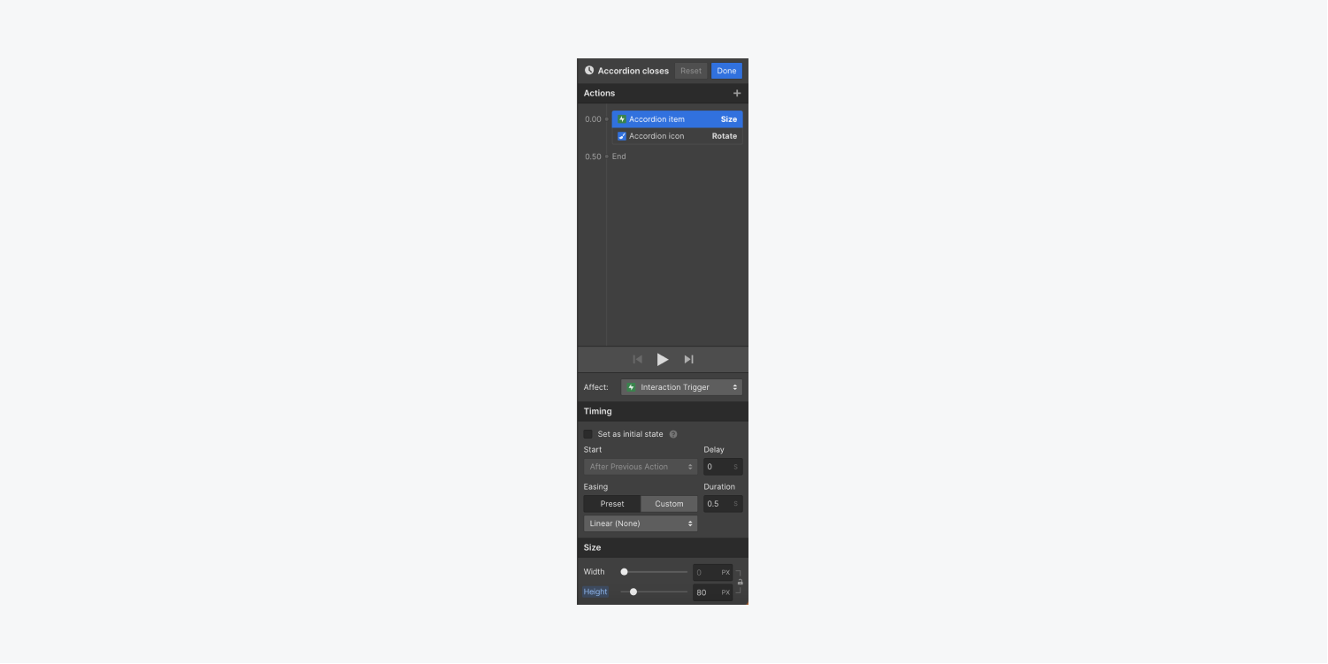
Now, you’ll create an interaction for the accordion closing. This interaction will include the actions that occur when the accordion item is clicked a second time or when a site visitor clicks outside the accordion item — the accordion item will revert to its initial size, and the icon will rotate back to 0 degrees.
To animate the accordion closing:
- Select the parent dropdown element on the canvas (e.g., “Accordion item”)
- Open the Interactions panel
- Choose the Dropdown opens interaction you created in the previous steps
- Click Select an action under Menu closes
- Choose Start animation
- Click the “plus” icon next to Timed animations to create a custom animation
- Give your custom animation a name (e.g., “Accordion closes”)
- Click the “plus” icon to add an action to your animation
- Choose Size under Miscellaneous
- Enter a height value (e.g., 80px) that matches the height you gave your dropdown element for its initial state in the previous steps
- Select the icon on the canvas or in the Navigator (e.g., “Accordion icon”)
- Click the “plus” icon next to the “Accordion item” Size action you just created to add another action at that timestamp — this ensures that both of these actions animate simultaneously
- Choose Rotate under Transform
- Go to Rotate and set the z-axis to 0 degrees — this rotates the icon back to its initial position so it points down when the accordion closes
- Click Save
And that’s it! You just successfully created a custom accordion using interactions!


