Bring your elements to life with transform effects. Move, scale, rotate, and skew your elements to give them a 3D appearance.
Before getting started with this guide, check out intro to 3D.
In this lesson:
- Understand Transforms
- Move an element
- Scale an element
- Rotate an element
- Skew an element’s proportions
- Edit transform settings
Transforms overview
There are 4 types of transforms:
- Move
- Scale
- Rotate
- Skew
You can add a transform or multiple transforms to an element in Style panel > Effects > 2D & 3D transforms.
Move an element
In this example, let’s add transforms to a Link block. We’ll do this in the Hover state:
- Drag a Section from the Add elements panel onto your page
- Give the Section a class (e.g., “Main section”)
- Drag a Link block from the Add elements panel into the Section you just added
- Give the Link block a class, (e.g., “Link block”) and style it as you’d like
- Copy/paste the Link block to create a total of 3
- Select the Link block
- Open Style panel > Selector field and choose Hover from the dropdown
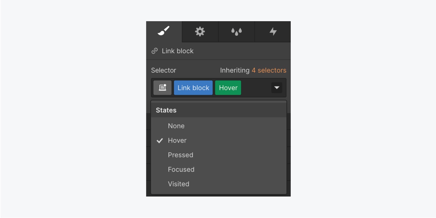
Let’s add a Move transform to the Hover state of the Link block:
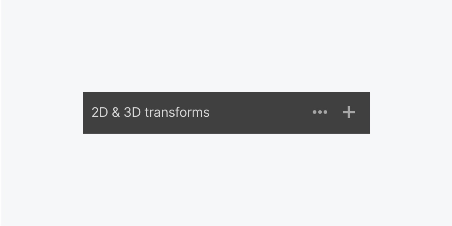
- Open Style panel > Effects > 2D & 3D transforms
- Click the plus icon to add a new Transform
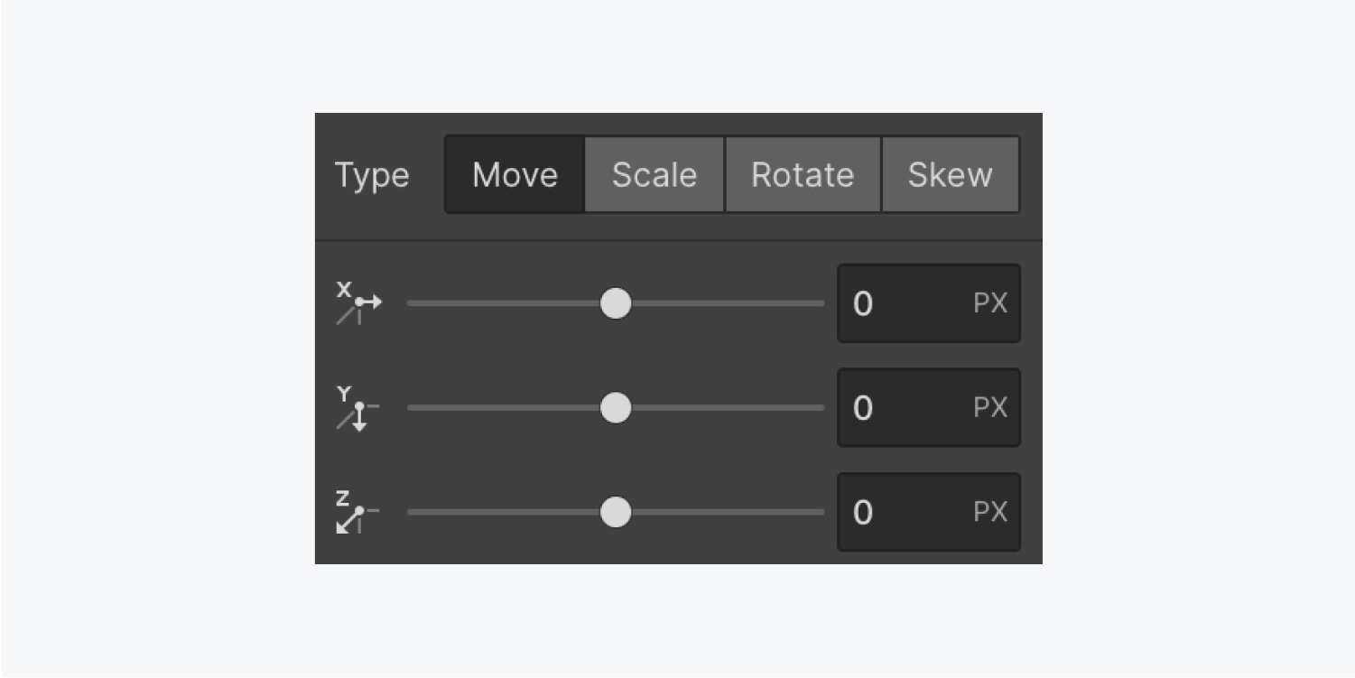
The Move transform is the default selection, and the default unit for Move values is pixels (px). You can change the unit by clicking PX and selecting your preferred unit from the dropdown.
Learn more about input values and units.
With the Move transform, you can adjust an element’s position left and right along the horizontal (X) axis. You can also adjust the position up and down along the vertical (Y) axis. Adjusting both the X and Y axes moves the element diagonally.
Moving the element along the Z-axis changes the element’s perceived depth. But there won’t be an effect unless you set a Children perspective on a parent element first.
In our example, the Section you added is the parent element to the Link block. Let’s adjust its Children perspective:
- Choose the Section
- Open Style panel > Effects > 2D & 3D transforms
- Click the 3 ellipses to open Transform Settings
- Change Children perspective > Distance to 1000 px
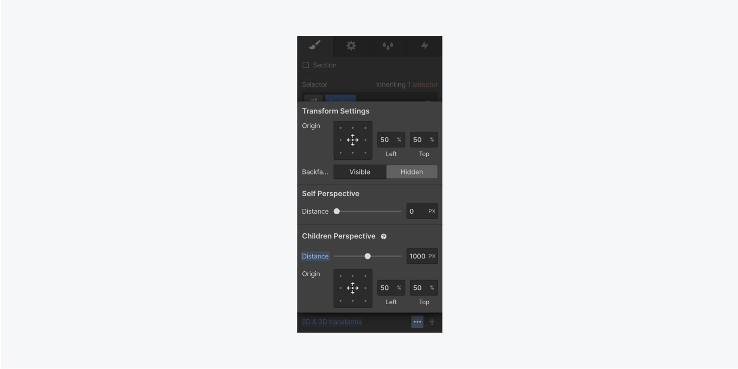
Now that the Children perspective has been set on the Main section — the parent element of the Link block — let’s change the Link block’s Z-axis value:
- Choose the Link block
- Open Style panel > Selector field
- Click the dropdown arrow and choose Hover
- Scroll to Effects > 2D & 3D transforms and click the Move transform you previously created
- Change the Z value to make the depth perspective more apparent
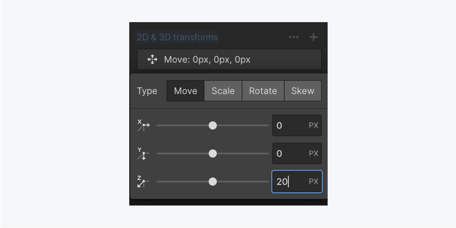
Hover over any of the Link blocks to see the transform effect in action — in our example, the effect is currently too abrupt.
To smooth out the effect:
- Select your Link block and ensure it’s in the None state
- Open Style panel > Effects > Transitions
- Click the plus icon to add a transition
- From the dropdown, choose Transform
- Set the Duration to 500 ms
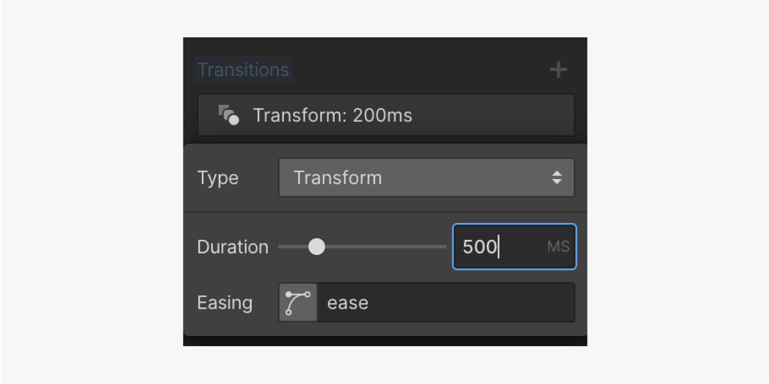
If you hover over your Link blocks now, the Move transform is much smoother.
Note: Once you specify the type of the transform on an element, you can set the values for one or more of the axes. However, if you switch between transform types (e.g., from Move to Scale) while setting transform values, your first transform settings will be lost.
To add more than one type of transform without losing any of your previous settings, add an additional transform using the plus icon.
Scale an element
Let’s add a separate Scale transform to our Link block:
- Choose the Link block
- Open Style panel > Selector field
- Click the dropdown arrow and choose Hover
- Scroll to Effects > 2D & 3D transforms and click the plus icon to add a new transform
- Click the Scale button and make changes to the X and Y axes
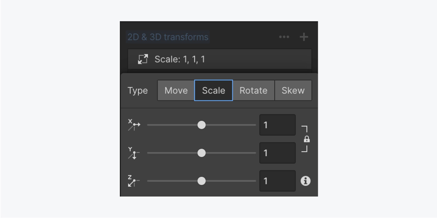
Scale transforms cause an element to appear larger if the value is higher than 1, or smaller if it’s between 0 and 1. By default, both the X and Y values are linked so the element scales proportionately. To edit each value independently, you can unlink the X and Y values by clicking the lock icon.
Hover over the Link blocks to see your Scale transform in action.
Note: You can create a very powerful 3D effect by scaling along the Z-axis. This effect works on parent elements that have children with varying Z values.
Learn more about 3D perspective.
Rotate an element
Before you add a Rotate transform, let’s remove the existing Move and Scale transforms:
- Select your Link block and ensure it’s in the Hover state
- Open Style panel > Effects > 2D & 3D transforms
- Hover over each transform and click the trash icon (Remove)
Now add the Rotate transform:
- Choose the Link block
- Open Style panel > Selector field
- Click the dropdown arrow and choose Hover
- Scroll to Effects > 2D & 3D transforms and click the plus icon to add a new transform
- Click the Rotate button and make changes to the X, Y, and Z axes
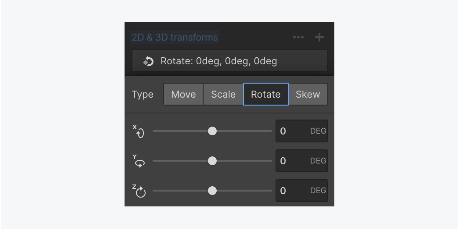
To rotate an element clockwise or counter-clockwise, you’ll need to rotate along the Z-axis. If 3D perspective is not set on the parent element, the X and Y-axis rotations appear flattened by default.
To make the X and Y-axis rotations look 3D, enable 3D perspective — the Children perspective — on the parent element. In our example, you have already set the 3D perspective on the Link block’s parent element — the Section.
Hover over the Link blocks to see your Rotate transform in action.
Skew an element
Before you add a Skew transform, let’s remove the existing Rotate transform:
- Select your Link block and ensure it’s in the Hover state
- Open Style panel > Effects > 2D & 3D transforms
- Hover over the existing transform and click the trash icon (Remove)
Now add the Skew transform:
- Choose the Link block
- Open Style panel > Selector field
- Click the dropdown arrow and choose Hover
- Scroll to Effects > 2D & 3D transforms and click the plus icon to add a new transform
- Click the Skew button and make changes to the X and Y axes
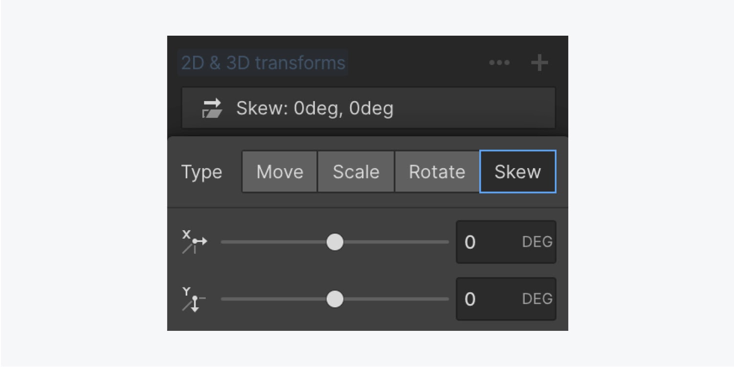
You can adjust sheering along the X or Y-axis with the Skew transform. Applying a 3D perspective on the parent element has no effect on skew transforms.
Edit transform settings
Transform settings allow you to control the high-level options that affect all transforms applied to the element. These include the transform Origin, Backface visibility settings, Self perspective, and Children perspective.
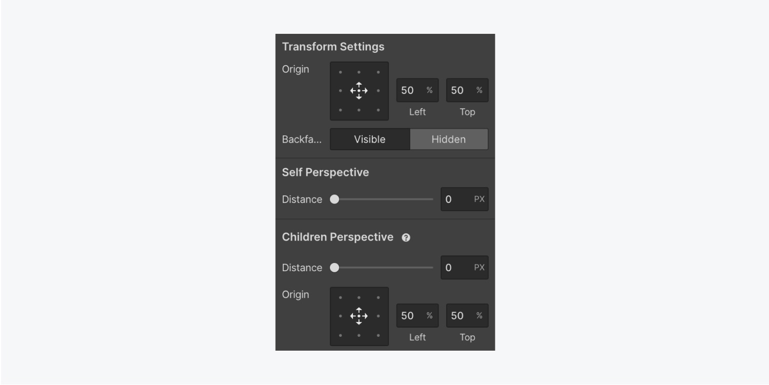
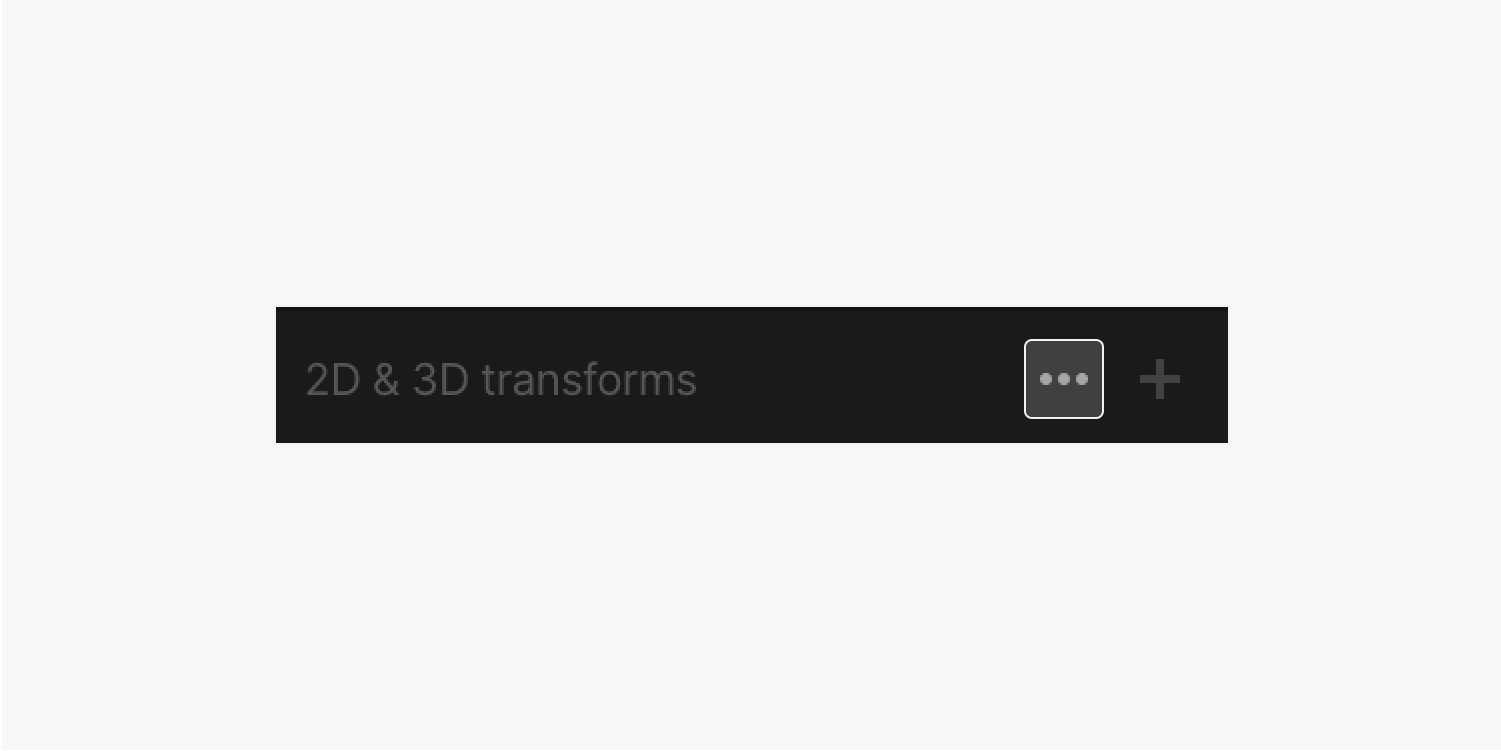
You can access the transforms settings through Style panel > Effects > 2D & 3D transforms. Click the 3 ellipses to open Transform Settings.
Origin
The transform Origin determines the origin, or anchor point, from where the transformation happens. By default, the Origin is set in the center, meaning all transforms will take place from the center of the element.
Let’s adjust the transform Origin for the Link block:
- Choose the Link block
- Open Style panel > Selector field
- Click the dropdown arrow and choose Hover
- Scroll to Effects > 2D & 3D transforms and click the 3 ellipses to open Transform Settings
- Adjust the point of Origin
- Test out your change by hovering over the Link block
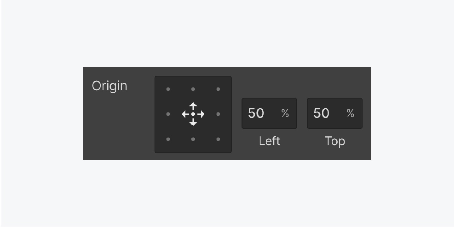
You can set the Origin by clicking one of the points in the Origin control. You can also manually adjust the positioning by typing the values for the horizontal position (left) and the vertical position (top). You can also change the unit of the values between the px, % (default), vw, and vh.
If you adjust the Origin to the bottom right, for example, your transforms start from that location. This only applies to Scale and Rotate.
3D Perspectives
When you haven’t set a perspective, all 3D-compatible transforms (e.g., rotate X, rotate Y, move Z, and scale Z) will either have a flat, two-dimensional appearance or no effect at all. Enabling a 3D perspective makes it possible to move, rotate, and scale elements in 3D space.
You can set a perspective on a parent element and affect all of its children, or just on the element itself. You can also add a 3D perspective to your element when you define the distance between the Z-axis and the viewer.
The distance value of the perspective determines how intense the 3D effect is. For a more impressive effect, set a small value (less than 1000px). This brings the viewer closer to the Z-axis. Set higher values to make the effect more subtle.
Self perspective
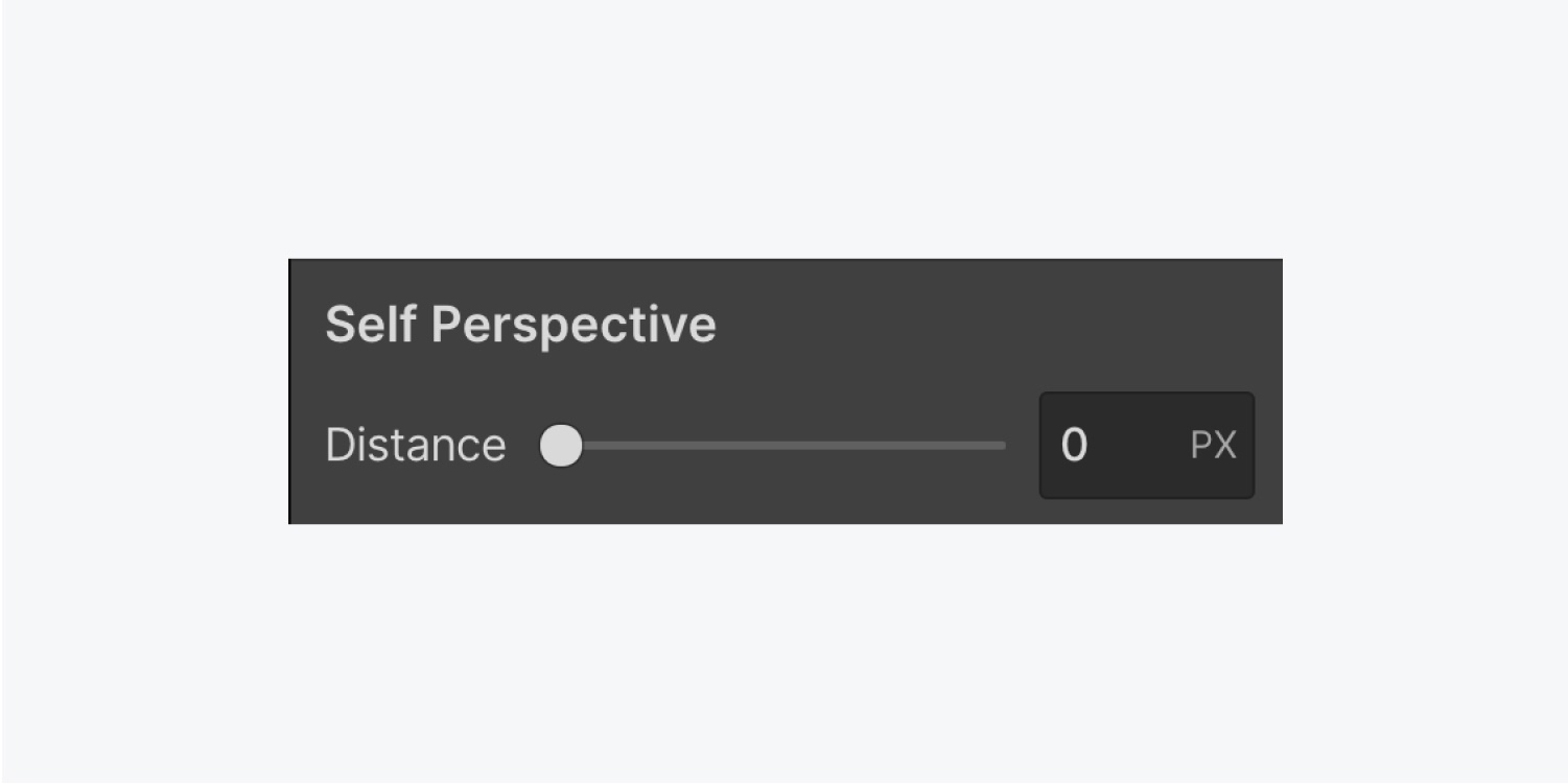
You can set a Self perspective on an element if you want a 3D effect applied only to that element and its children. However, the effect isn’t as realistic as setting a Children perspective on the parent element.
To set a Self perspective:
- Choose the element you want to affect
- Open Style panel > Effects > 2D & 3D transforms and click the 3 ellipses to open Transform Settings
- Define a distance value for Self perspective
Children perspective
Setting a Children perspective on a parent element creates a realistic-looking 3D effect on all of its child elements.
To set a Children perspective on a parent element:
- Choose the parent element whose Children perspective you want to change
- Open Style panel > Effects > 2D & 3D transforms and click the 3 ellipses to open Transform Settings
- Change the Distance and Origin for your transforms
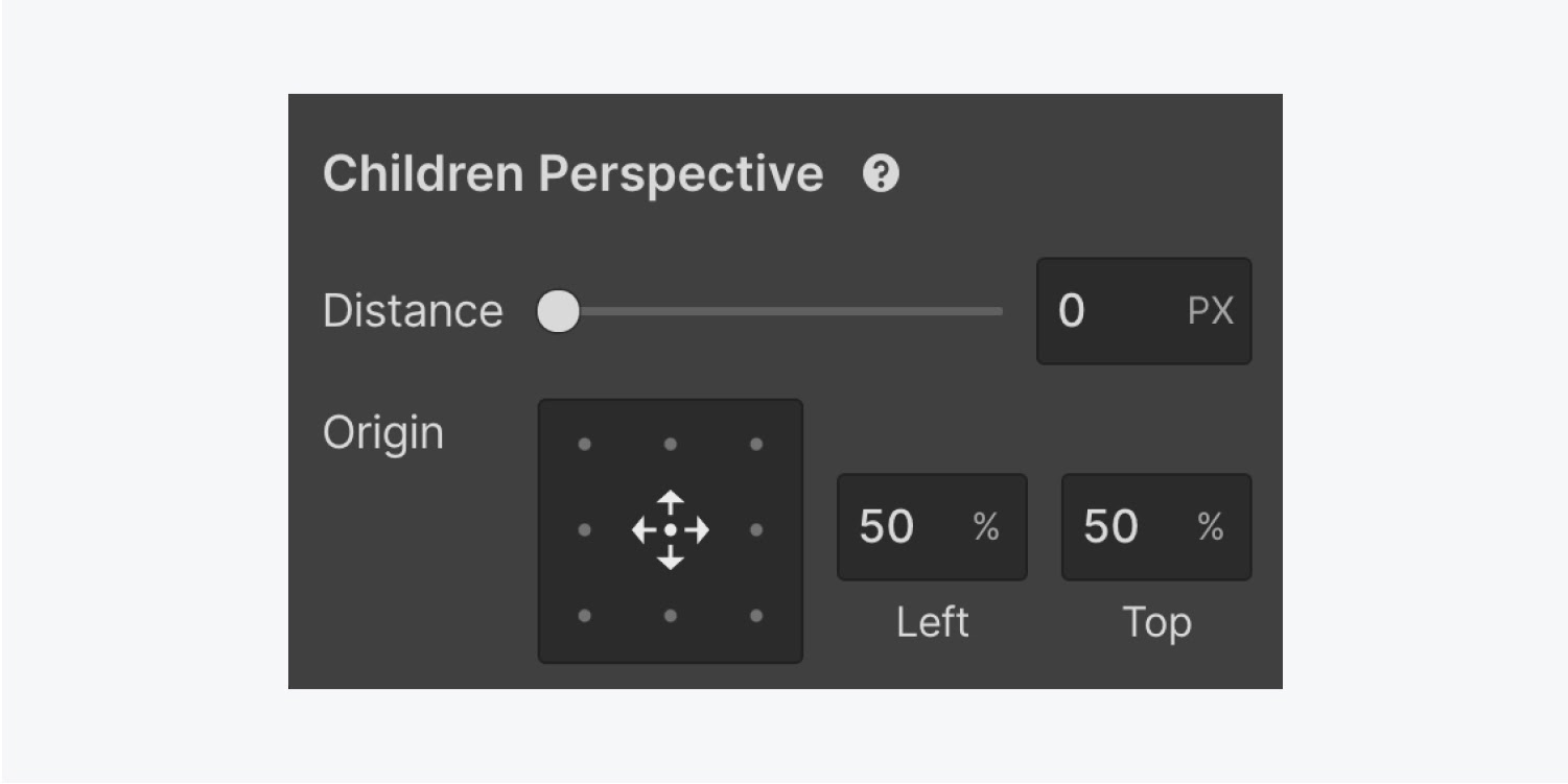
These 3D settings will apply to transform properties set on the children of the parent element.
Backface
Backface allows you to set the visibility of the back side of an object.
By default, when you rotate an element 180° along the X or Y-axis, it looks reversed, as if looking at it from behind. Any text content within the element will look reversed as if you’re holding it against a mirror.
You can show or hide the Backface part of an element in the element’s transform settings:
- Choose the element you want to affect
- Open Style panel > Effects > 2D & 3D transforms and click the 3 ellipses to open Transform Settings
- Choose Visible or Hidden for Backface
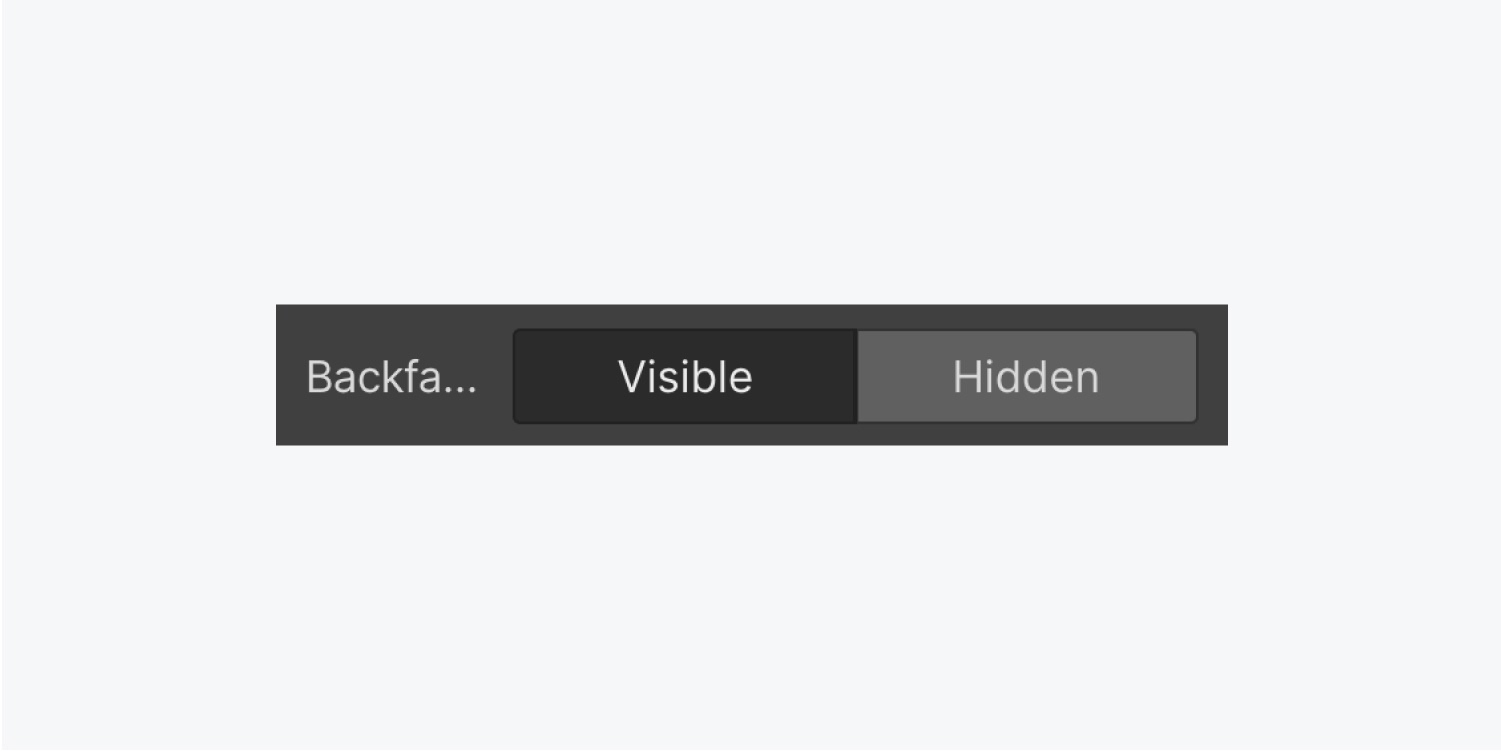
This is useful when creating rotating cards that reveal content on the back side.
And there you have it — make those elements dance!


