When using the columns element it’s nearly impossible for all the columns to have equal heights, especially when each column has different content inside. You can set a fixed pixel height, but this can cause reflowing issues. Here we’ll cover how create equal height layouts using flexbox.
In this lesson
- Creating the layout
- Setting the parent to flex and aligning the children to stretch
- Setting column width
- Auto margin trick
Before you get started
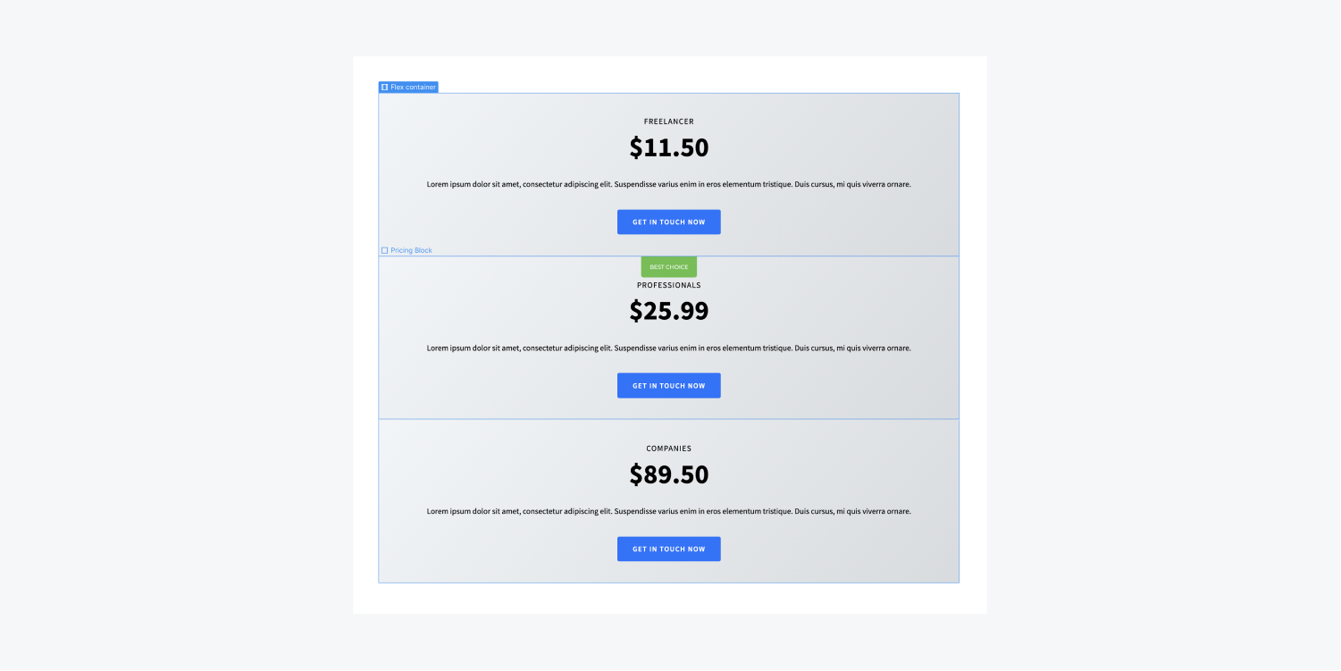
To recreate the initial layout we start this video with, add a div block onto your page. Add some content inside: a heading, a paragraph, a button. Duplicate the div block twice to have 3 div blocks with content inside. Replace the content if you wish to do so.
Creating the layout
As an example, we have three div blocks with content inside already on the page and they each have the same class names and styles. We are going add a container to the page, give it a class, and drop those three div blocks inside.

Setting the parent to flex and aligning the children to stretch
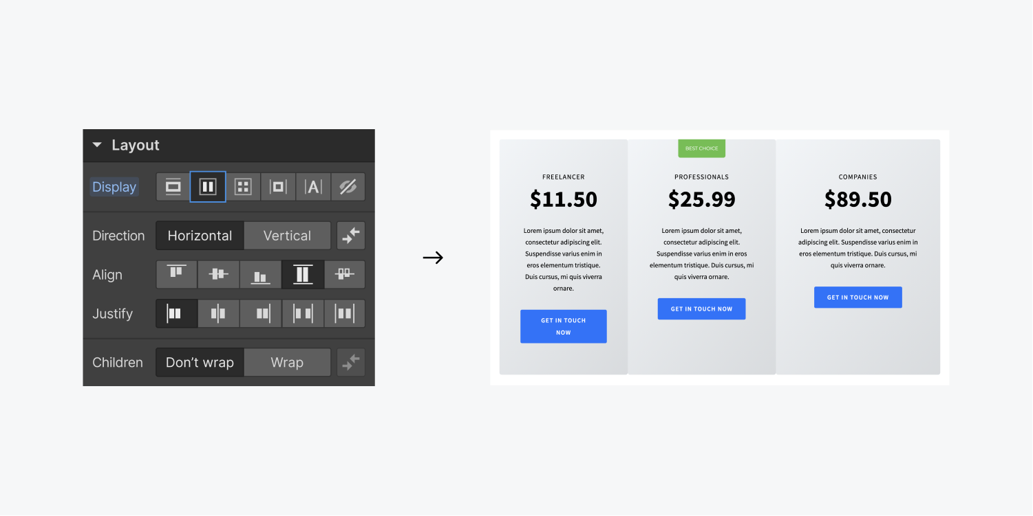
Once the three div blocks are nested inside the container we can set the container’s display setting to flex.
The default flex settings are set to Direction: Horizontal, Justify: Start, and Align: Stretch which are the exact settings we need for equal height.

Setting column width
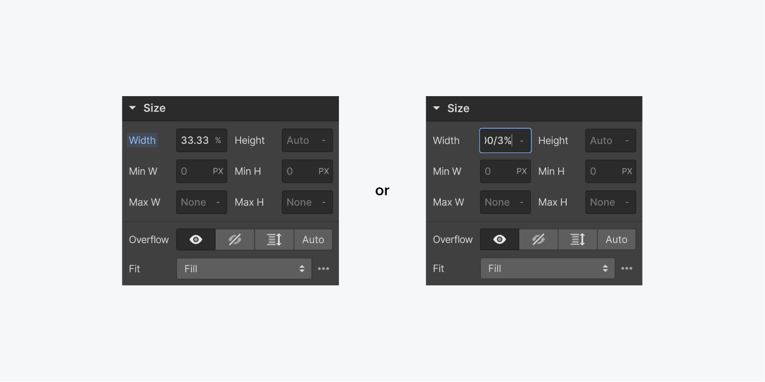
Notice, though, that the div’s widths aren’t equal. You can make them equal by setting the div blocks’ width to be 33.33% (you can also do math here like 100/3%, then press enter). Alternatively, you you can set the div blocks’ flex child settings to Expand.

Auto margin trick
In this example we also want the content in the divs to align with one another. We can do this with flexbox settings too.
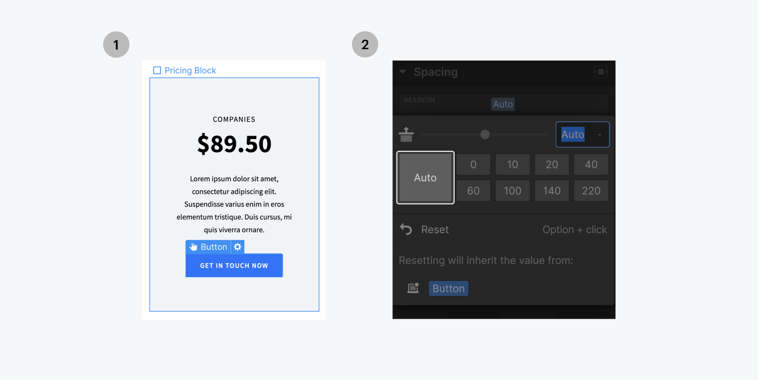
- Select one of the divs
- Set its display setting to flex
- Set the Flex layout to Vertical
- Select the button
- Set its top margin to auto
Now the button’s margin will automatically adjust resulting in all three buttons aligning together.


