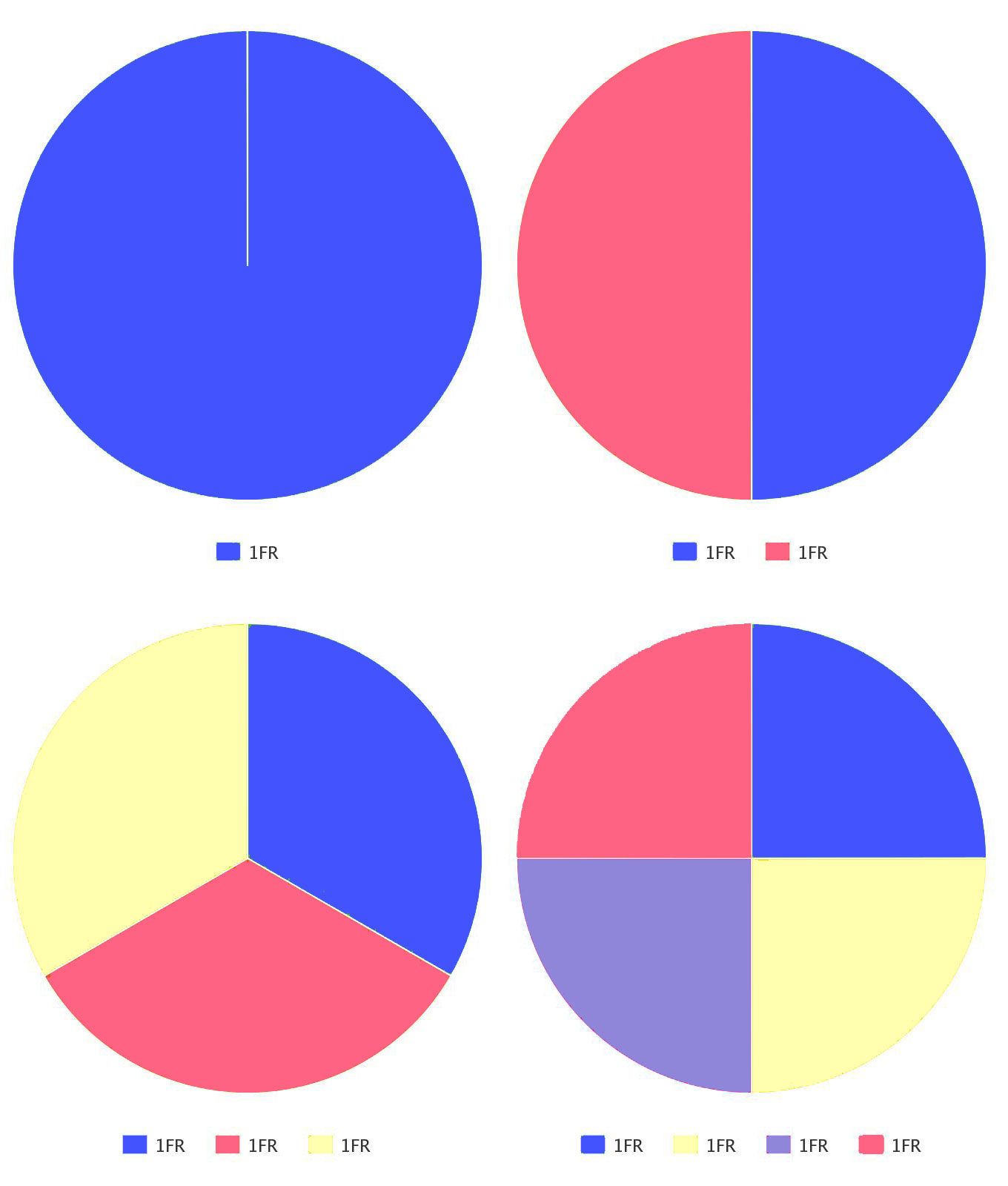
Fractions — or fractional units — are life-changing. Why? Because they are the most flexible and responsive units out there! Too bad they only exist within a grid.
What's a fraction (1FR)?
A fraction or 1FR is one part of the whole. 1 fraction is 100% of the available space. 2 fractions are 50% each. So, 1FR is 1/2 of the available space. If there are 250 fractions? Then each fraction(1FR) is 1/250 or 0.4%.
So, 1 fraction is 1 (or 100) divided by the total number of fractions. We'll explore this more below.

How much is 2FR?
It’s 2 fractions!

Fractions vs percentages
Whether you're going to use fractions or percentages, the first thing you'll need to do is:
- Decide how many tracks (columns or rows) you need
- Do the calculations
- Create the tracks
- Apply the values to each track
Let's use percentages
For example, you have four columns. You want them all to be equal in size and fill the available space. You could set each column to be 100/4=25% wide.

But what if later you decide to make one of the columns twice as large as the others? (2X+X+X+X=100, how much is X?)

What if you need to add another column? Now five columns need to add up to a total of 100. So, each needs to be 100/5=20%. You'll need to update the value of each column if you do not want an overflow.

And what if you need to delete a column? or add gaps? You get the point, right? With percentages, each time you need to add or delete a column, change its sizing, add gaps, or change gap sizing, you'll need to:
- Recalculate the size of each column
- Reapply the new sizing value to each column
So, how can fractions (FR) save the day?
Again, you have four columns. You want them all to be equal in size.
- Create 4 columns
- That's it! Each column has a width of 1FR by default

What if you want one to be twice as large as the others?
- Set that one column to 2FR
- That's it!

Now you have 4 columns but a total of 5FRs so automatically each fraction takes up 20% of the available space. So, the first column takes up 2 fractions of the space, that's 40%. No need for you to do any calculations or to update the sizing of each of the columns.
What if you add a column or delete one? You do nothing! Fractions just work!

Let's add some gaps. Fractions will adapt to welcome the gaps in their midst.

So, what is 1FR equal to?
- In fractions: 1FR=1/total number of FRs
- In percentages: 1FR=100/total number of FRs
In examples:
- We have 3 columns, each is 1FR wide. 1FR = 1/3 = 33.333% of the available space.
- We set the grid container to be 1200px wide. Now each FR is 1200/3 = 400px wide.
- We add another column. We have 4 columns now. The columns adjust to fit 1/4th of the available space. That's 25%.
- We make the first column 2FRs wide. The rest are still 1FR wide. The total is now 2FR + 1FR + 1FR + 1FR = 5FRs. So, 1FR is now 1/5th = 20%. The first columns is 2FRs = 2/5th = 40%.
- We make the first column 200px wide. The rest are still 1FR wide. The total is now 200px + 3FRs. 1FR = 1/3rd or 33.333% of the available space. What is the available space? It's the width of the grid container (1200px) minus width of the first column (200px) = 1000px. Do we need to calculate the value of each FR? No! The FR unit does it for us.
- Now, let's restore the first column to 1FR and add gaps. Let's set the column gap to 16px. Each column is still taking up 1/4th of the available space. The available space is again 1200px - total number fo gaps (3*16px). 1 Fr is ... doesn't matter! It just works!
1FR and content
A fractional unit is 1 part of the total as long as the content is flexible. Meaning, 1FR tracks are equal in size as long as the content inside can scale to fit the column or row. However, once the content stops scaling to fit in the track, the track with an FR value will adjust to make the content fit. So, if one column has a grid child of fixed width, the width of that column will never be less than the width of the grid child.
So, a column with 1FR width has a minimum value equal to the content width whether that width is a set fixed unit like 400px, or it's the longest word in a text element.
But what happens to the other columns in the grid? They shrink proportionally. Why? Well, here's what happens:
- We have 4 columns. Each has a width of 1FR. Each column is equal. 1FR=25% of the available space.

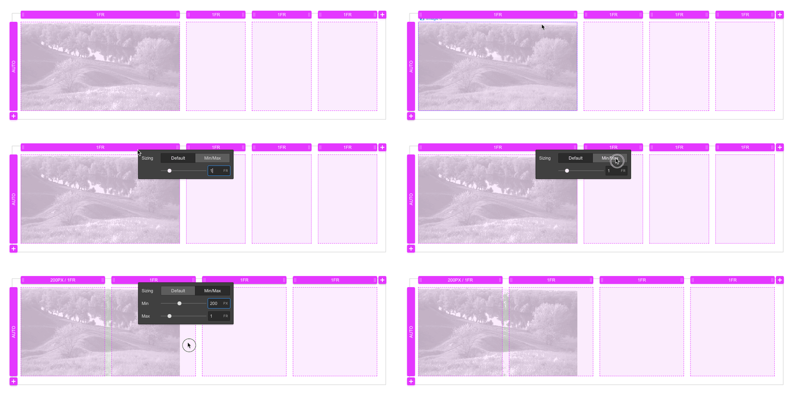
- In one column we add an image of width: 400px and max-width:none. Now this column cannot be less than 400px. But that doesn't mean that 1FR=400px now. It means that the first column is now 400px wide.

The same is true for rows, a row of 1FR height has a minimum value equal to the content height unless you set overflow:hidden on the grid child.
FR automatically sets minimums which will respect the content inside. So with FRs, the minimum is automatic (or auto), the maximum is the value we've set (1FR, 2FR..)
Min/Max
So, 1FR is technically min/max(auto, 1FR), meaning min=auto, max=1FR.
Now, you can of course override this minimum by switching the sizing settings from default to min/max. The maximum will be 1FR and the minimum can be anything you specify. However, note that any content inside this track with a fixed width larger than the minimum you set here will overflow the grid cell.

You can specify any value for the minimum and the maximum size of a track in the min/max settings. A track with min/max values will be greater than or equal to the min value and less than or equal to the max value.
For example, by default, a row has a height of auto. This allows it to expand or shrink with the content within. Setting min/max values to rows is a great way to create flexible rows that don't shrink beyond a set minimum value. Let's say you want to have a row that's at least 5VH tall but don't want any content inside to overflow the row or get cropped. All you need to do is set the row size to min=5VH, max=auto.


