We often design on displays that aren’t 27 inches wide. Especially on laptops, like the MacBook Pro. When we’re looking at content on a website, it looks great on the smaller devices.
But when the browser is stretched out on a larger device (like the iMac) things don’t look so great.
And this is because Sections (the sections holding our content) look too wide.
In this lesson, we'll cover:
In our example, we have a Section element inside of the Body element. In that Section, we have a Container element that holds our content.
Sections are just divs. They take up the full width available to them. That’s why, on larger displays, they seem to go on forever. Because they do.

You can add a Section element to your page from the Elements panel (A). By default, the Section will span across the full width of the body.
Pro Tip: To have a good, consistent website structure, add Sections in the body element, then organize your content in a Containers placed inside these Sections. Learn about Sections.
Now, you can place your Sections into a Div block. A div that is a parent element to those sections.
Creating a wrapper
You can add a div right into the Body element.
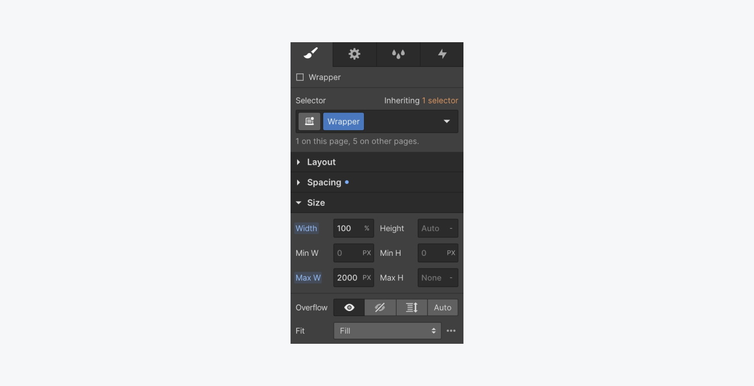
And you can put your content inside (placing each Section into the Div block). On that Div block, you’ll want to set the width, margins, and maximum width. You can do that in four steps:
- First, give the Div block a class name (e.g. Wrapper)
- Set your width to 100% (that’s full value)
- Set both the left and right margins to auto (that’ll center it)
- Set a maximum width (e.g. 2000 pixels)

When we preview what we’ve done on our laptop (that is smaller than 2000 pixels wide) - you see no changes. Why? The maximum width we set our “Wrapper” was 2000 pixels. That maximum width is larger than the width of our current laptops.
Testing your design
There are two ways we can test our “Wrapper” element:
- Add larger breakpoints
- Chrome devices tool
Preview larger breakpoints
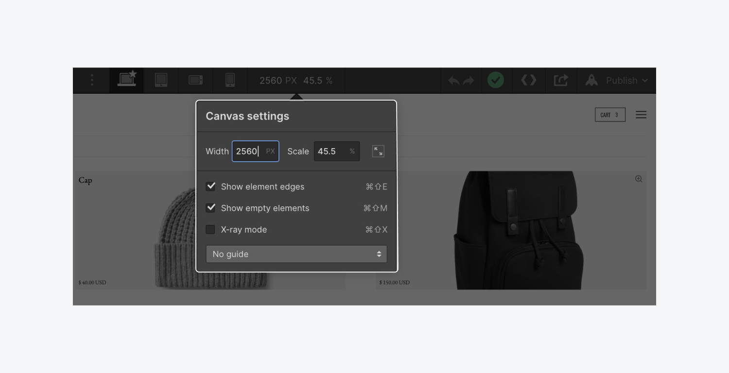
You can preview the width of larger breakpoints right inside the Designer to see what the design might look like on a full screen 27-inch iMac.
To do this:
- Click the Canvas settings option
- Type in a pixel value (e.g. 2560)
- Press Return on your keyboard

You will then see how each change we make essentially affects the scale setting (e.g. 45.5%) so that you can see how things would look like on a viewport almost twice its size now.
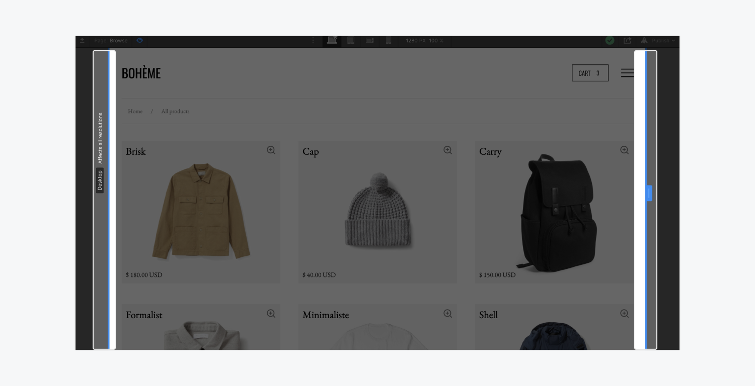
When you're testing in preview mode, regardless of your canvas size, you can drag across all breakpoints from desktop to tablet to mobile devices.

Chrome devices tool
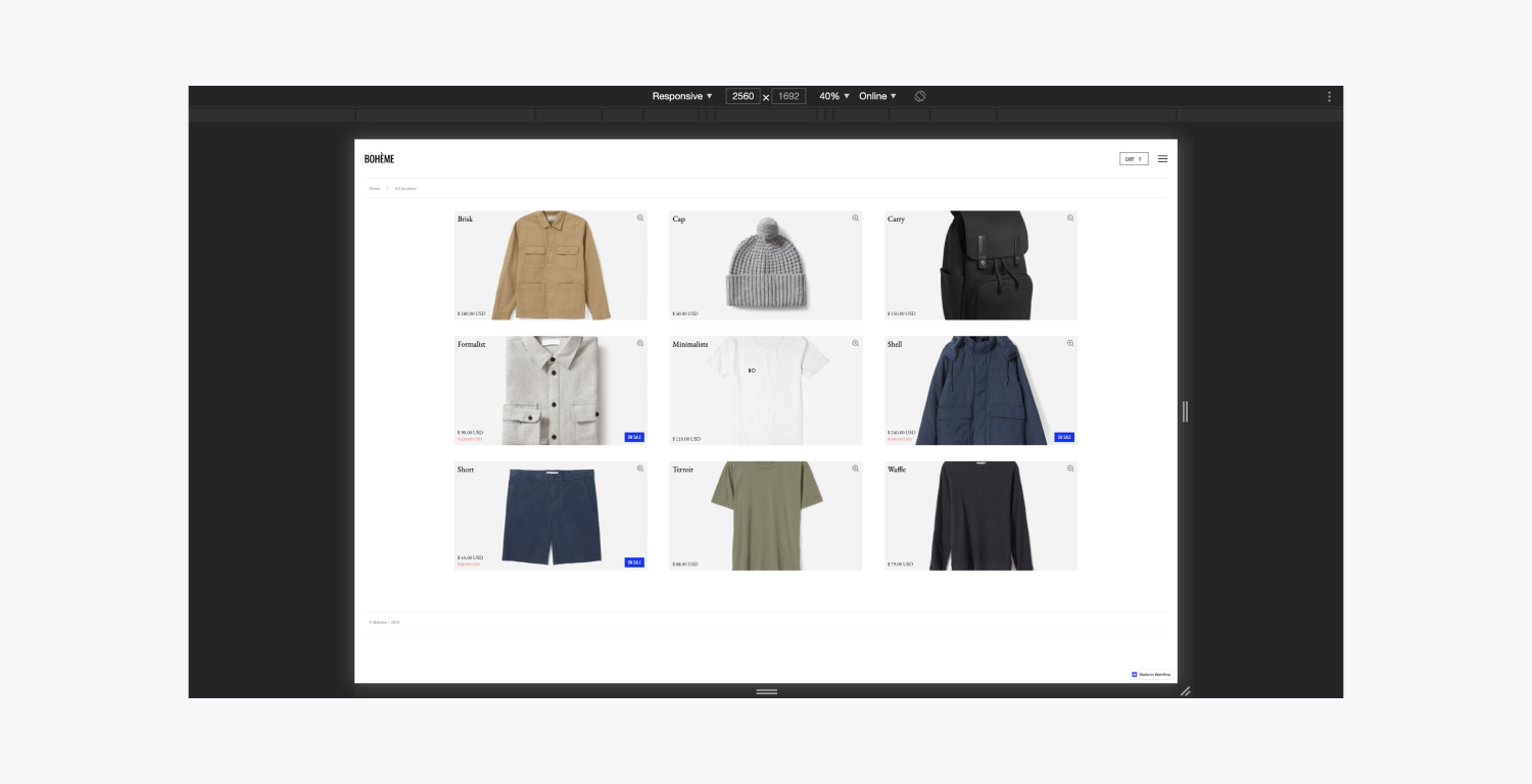
The Device Mode in Google’s browser settings is an approximation of how your page looks and feels on devices. This is similar to changing the Canvas settings because you simulate the user experience of different sized devices right from the browser.
To do this:
- Click the Toggle Device Toolbar to open the UI that enables you to simulate viewports.
- Enter the size of your choice in the top panel (width/height)

By default the Device Toolbar opens in Responsive Viewport Mode. And you can drag the handles to resize the viewport to whatever dimensions you need. Or, enter specific values in the width and height boxes.
But that’s designing for larger displays in Webflow.


