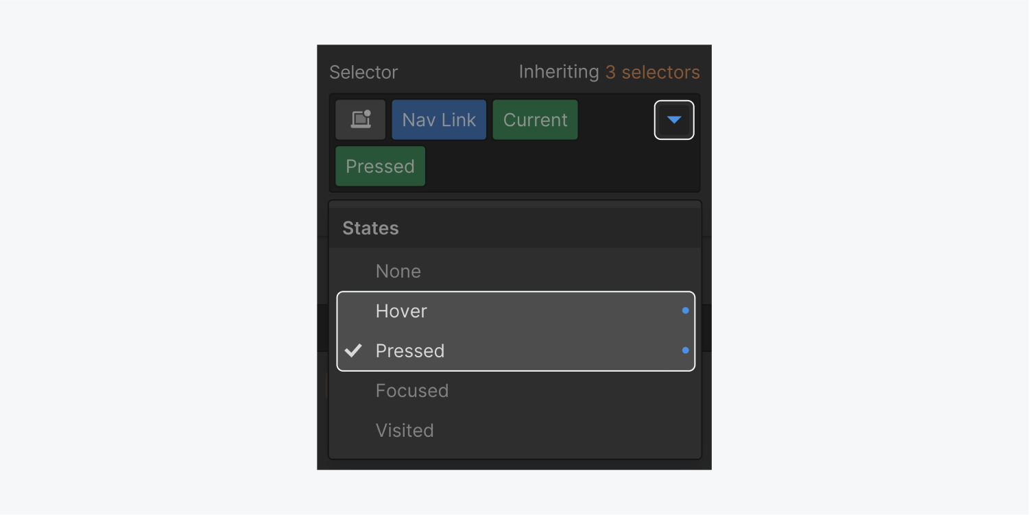
You can add interactivity to your elements by changing the way they look and behave in different states.
In this lesson:
- Style an element in various states
- Return to styling the default state
- Remove styling of an element in a state
- Style the current state of link elements
- Understand where styles are inherited from
Style an element in various states
To apply different styling to an element in different states like the hover state, open the States dropdown menu in the Selector of the Style panel and select the state you want to style.
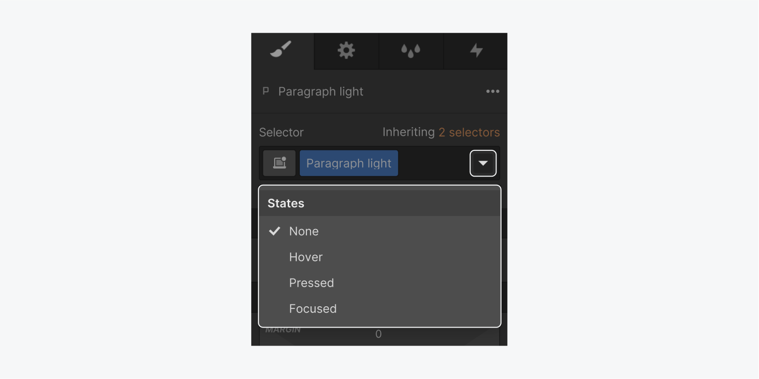
When you select a state from the States dropdown menu in the Selector, a green state class, also called pseudo-class, will appear at the end of the selector field. This indicates that you are now styling that state for your element.

You can make any number of styling choices. The styling changes you make here are what users will see when they interact with this element.
Whatever state you're in, the changes you make will be visible on the canvas until you deselect or otherwise leave the state.
The states menu (dropdown)
Choose the state you want to style from the dropdown menu. Now, any change you make in the Style panel will be saved for the selected state.
None state
The None state is the default state of elements. This is how the element looks by default.
Once you choose and style another state, you can return to styling the default state by choosing “none” from the States dropdown menu.
Hover state
The hover state shows when you hover your mouse pointer on an element. It’s not possible to hover on most touch devices so be aware of this when designing for smaller breakpoints.
Pressed state
The pressed or active state is the state that shows when you click or press on an element. This state inherits styles from the hover state as pressed is actually a state of the hover state.
Focused state
You can focus on certain interactive elements, like buttons and links, without activating them by using your keyboard to tab into them. Clicking interactive elements with your mouse or pointer device both focuses and activates them. This state emulates when an interactive element is focused with either your keyboard or mouse or a finger tap.
Focused (keyboard) state
Like the focused state, this state emulates when an interactive element is focused but not necessarily activated (e.g., by tabbing into the element with your keyboard). Note that it always applies to text input fields when focused, regardless of the manner in which they were focused (e.g. with a mouse, a keyboard, etc.).
In order to make your site more accessible to visitors who rely on a keyboard for navigation, it's important to style this state so interactive element locations are obvious on the page. We suggest setting an outline on interactive elements because it will not affect the layout of the element.
Visited state
The visited state is the state of a link that's been visited. This state inherits styles from the none state.
For the visited state, you can only style the text color, the background color, and the border color. The background color will only appear if it is already set in a different state.
Placeholder
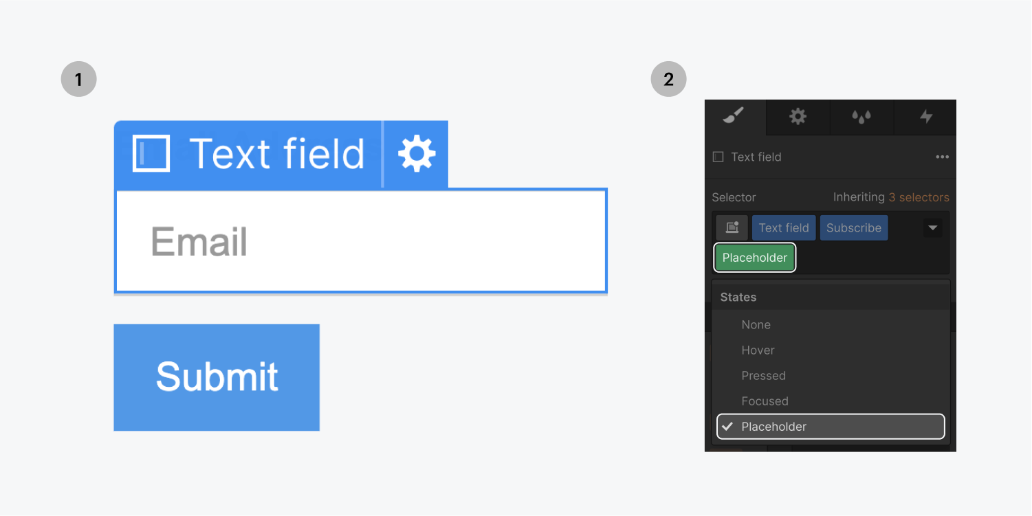
This state will be available in the States dropdown menu for form fields. It allows you to style the placeholder text separately from the typed text which inherits the typography styling of the default state.
For the placeholder text, you can style the typography, the background, and shadows.
Checked state
This state will be available in the States dropdown menu for form checkboxes and radio buttons that have Custom styling enabled in their Element settings. It allows you to style the checked state of the checkbox or the radio button.
Return to styling the default state
When you’ve finished styling your states, you can go back to the default none state by doing any of the following:
- Select “None” from the States dropdown menu
- Press ESC on the keyboard (this also deselects the current element)
- Select a different element
Remove styling of an element in a state
To remove a custom styling or all styling from a state:
- Select the element
- Select the state from the States dropdown menu
- Remove any styling (in blue)
Style the current state of link elements and tabs
Link elements also have a current state. When you add custom styling on the Current state, it will reflect how your link element looks when a user is in that state.
Current state (green tag in the selector)
The Current state is automatically added to the the All Links tag or the class of a selected link element when this element is linked to the current page, section, or tab.
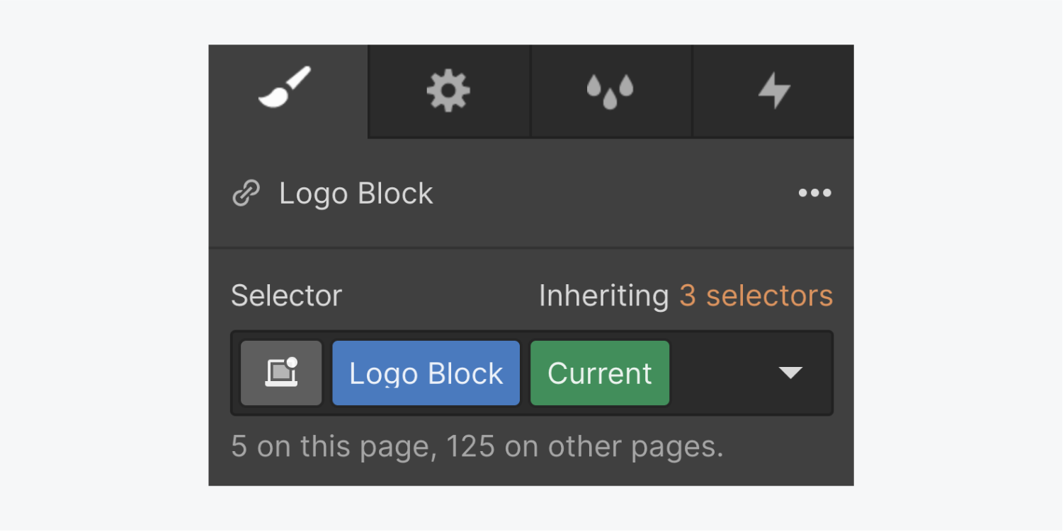
The Current state inherits all styles from the default "None" state.
Selecting the current state of a link
To access the current state of any link block, text link, button, nav link:
- Select your link element and press D to open the link settings
- Select the page option and choose the current page from the dropdown (if your link is on the home page, select the home page)
- Press S to go to the style panel. You will see that the green current state is activated in the selector field if you've applied a class to your link. If not, click in the selector and select the "All links" tag from the dropdown that opens. The current state will be applied to the tag as well.
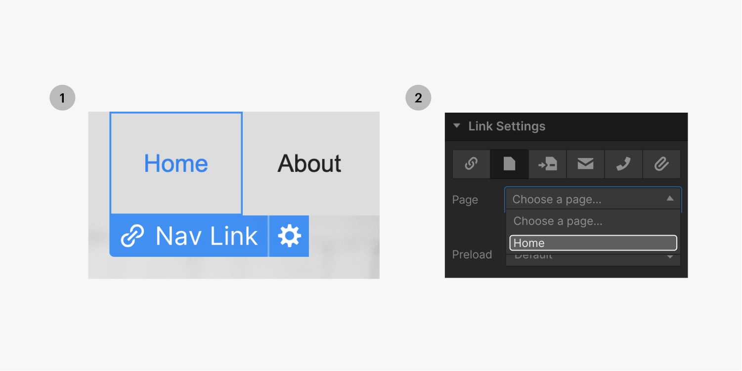
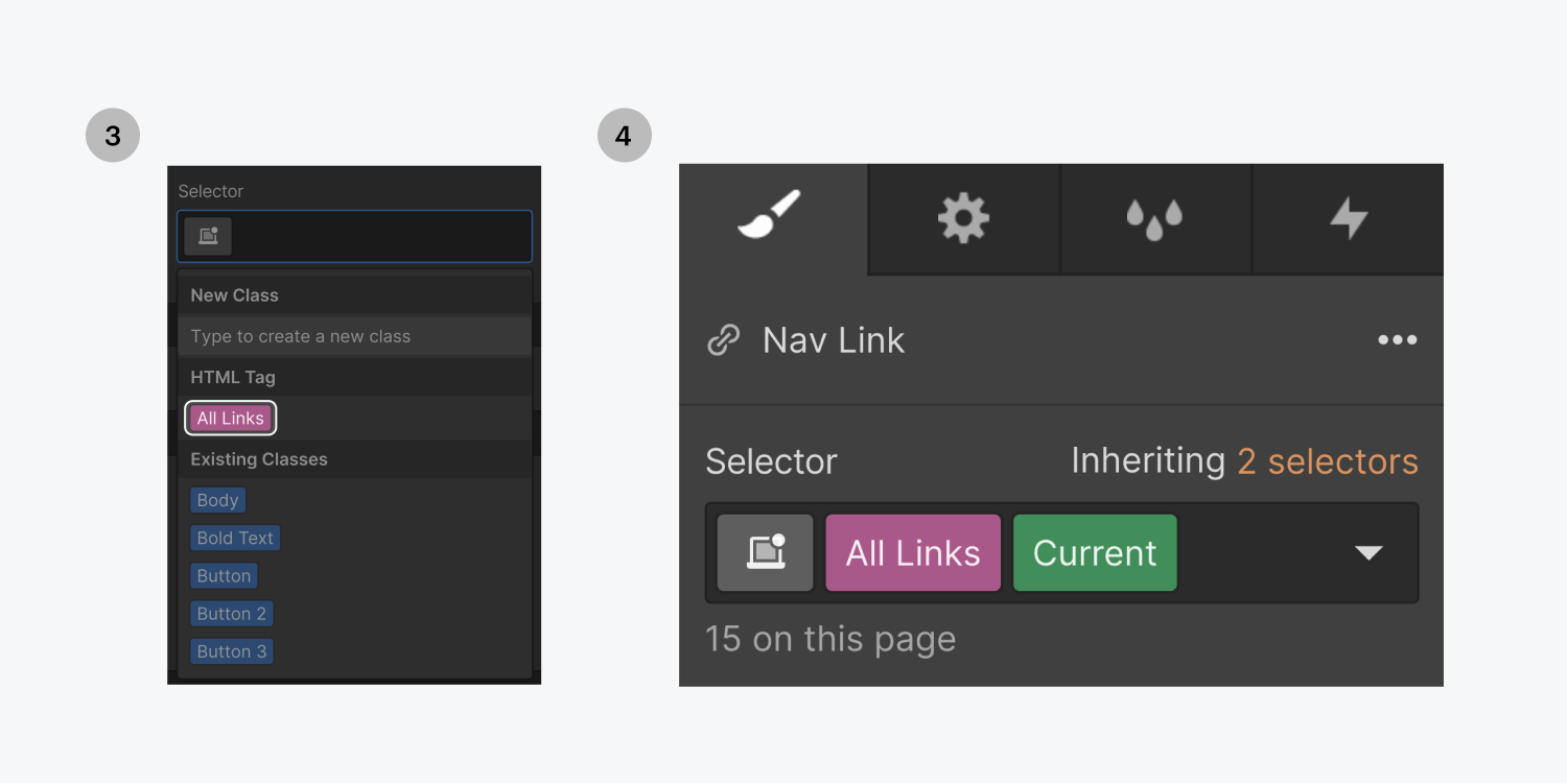
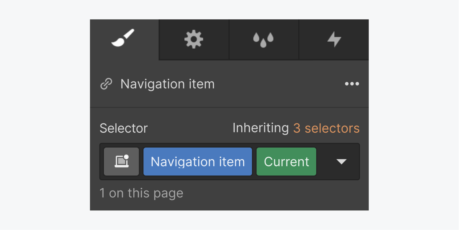
You can also select the page section option in the link settings. The current state will appear in the selector field for that element when you scroll to that section of the page. This is useful for styling buttons or links that are fixed as you scroll.
After you style the current state, you can update the link settings and link your button and link elements to any other pages or page sections.
Selecting the current state of a tab
You can choose to style the Current tab differently than the normal tab to differentiate between active and inactive tabs. For example, you can edit the font color and background color to be different than a normal tab.
To style the Current tab:
- Select the active Tab Link
- Assign it a class. The Current state will automatically appear.
- Style away
Styling the default state of a link when the current state indicator is displayed in the selector
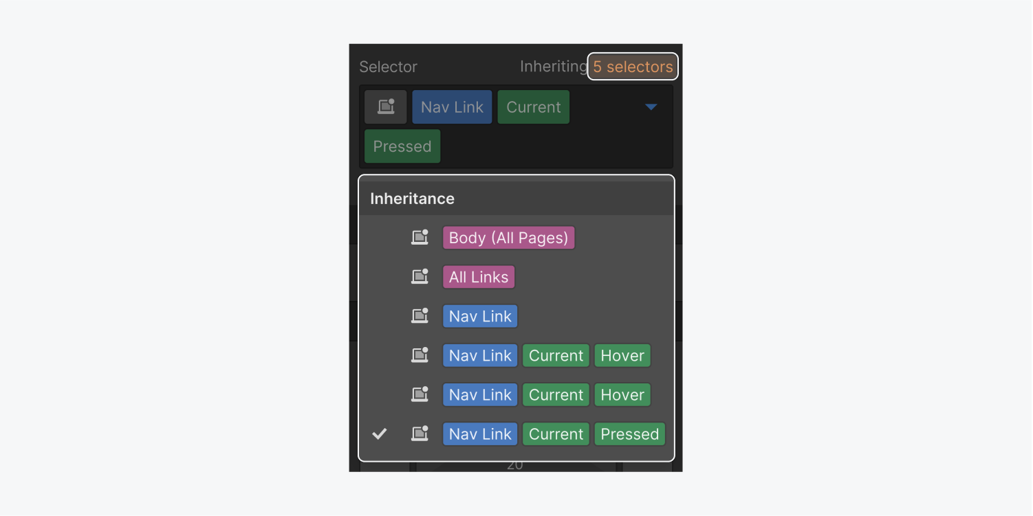
There are several ways to remove the current state when you want to style the default state. The quickest way to do so is by selecting the default, base class in the Inheritance menu.
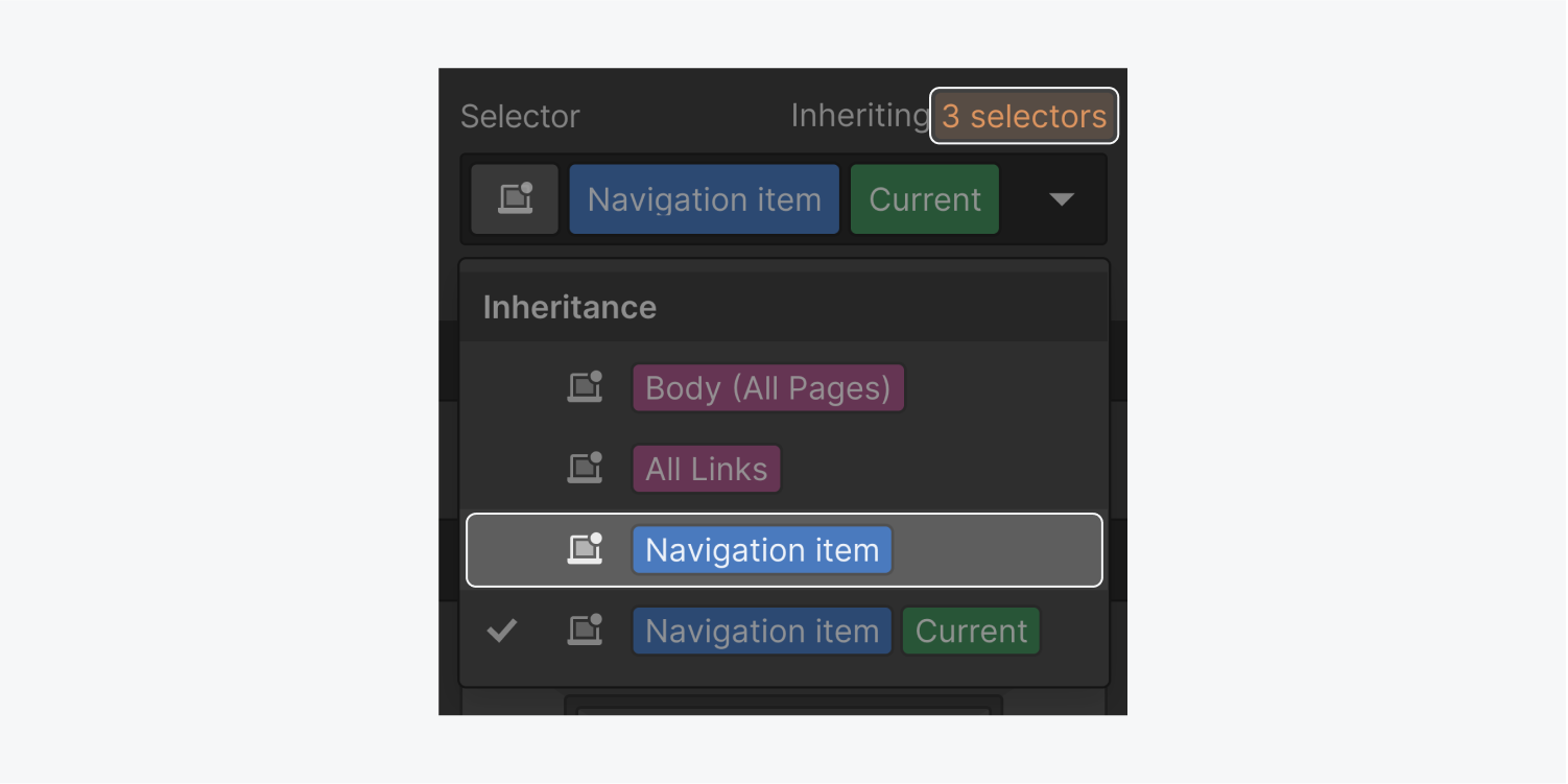
Alternatively, you can temporarily remove the link setting in the Element settings panel, style the link's class, then re-configure the link setting. If you do not wish to remove the link setting, duplicate the link element, remove the link setting on the duplicate element, edit the class, then delete the duplicate element when you’re done.
Understand where styles are inherited from
All states inherit styles from the “none” state. “Pressed” also inherits styles from the “hover” state. You can see from where styles are being inherited from by clicking the inheritance indicator right above the selector field.
After you have added styles to a state, the States menu dropdown icon will turn blue. And when you open the States dropdown menu, you will see blue circles indicating that there are local styles in that state.
