The Style panel, located in the Designer, is where you can control and style every element in your project. Whether you want to change an element’s layout, background color, or typography — you can do it all in the Style panel.
Not only can you style individual elements, but you can also save styles as classes and reuse them throughout your project. We’ll take a look at classes and combo classes before we dive into the anatomy of the Style panel so you know when and how to use classes in your project.
In addition to creating, editing, and styling elements and classes, you can also customize layouts for different devices in the Style panel using Webflow's built-in responsive breakpoints, also known as media queries.

In this lesson:
- Classes overview
- Selector field
- States menu
- Layout and style sections
- Inheritance and applied styles indicators
Classes overview
In the Style panel, you can style individual elements, but manual style changes to elements can be tedious and time-consuming. Enter: classes.
Classes save styling information you can apply to as many elements as you want — throughout your entire project. The moment you begin styling an element in the Style panel, a class is automatically created and applied to the selected element. You can also create and rename your classes manually, which we’ll walk you through below.
In the Style panel, you can also create a combo class that inherits the style values of the original class and allows you to add more styles only on that combo class.
This overview just scratches the surface of what classes are and what you can do with them — we’ll dive into how you can access, create, and edit combo classes in the Style panel below.
Selector field
At the top of the Style panel, the element type indicates whether you’re styling an Image, a Div block, a Form, etc.
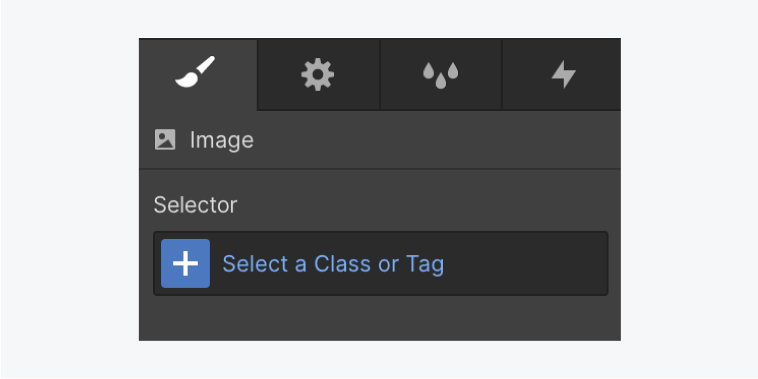
Below the element type is the Selector field, which displays every tag, class, and combo class you applied to the element. You can also create new classes or combo classes in this field.
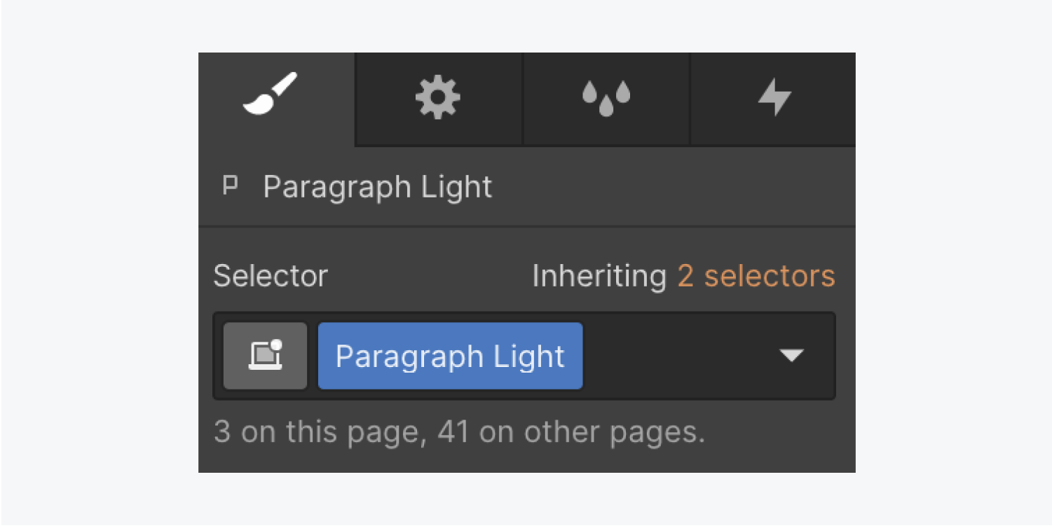
Creating and renaming classes in the selector field
When you begin styling an element, it’s automatically assigned a class name based on the element type. You can rename this — or any other class — in the Selector field by double-clicking the class name in the Selector field and entering a new name.
To create a new class, enter the class name in the Selector field.
Deleting classes
You can remove a class from an element in the Selector field. This won’t remove the class from the Style manager or project because this class can be reused for styling other elements at any time. You can only fully remove classes from the Style manager and project when they’re not connected to an element.
States menu
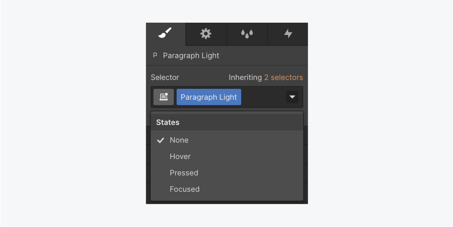
To change the way an element looks and behaves in a specific State, such as Hover or Focused, choose the State from the dropdown menu located in the Selector field.
Learn more about styling States.
Inheritance menu
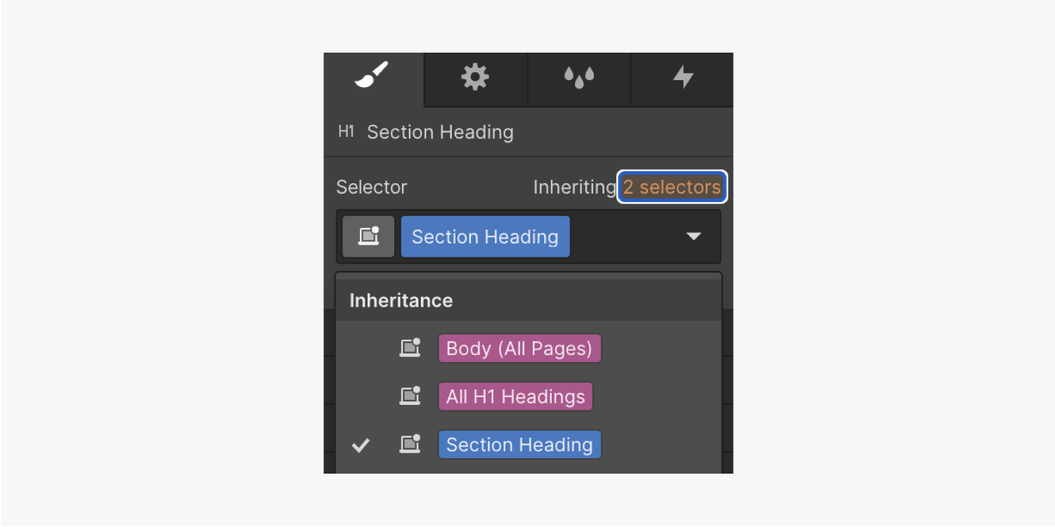
The Inheritance menu sits above the Selector field. Click it to show the parent and ancestor elements of the selected element — all the way back to the global tag (e.g., Body (All pages) tag). From the Inheritance menu, you can also select and update the style of any class.
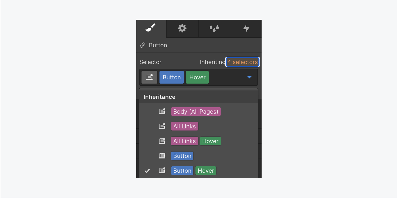
The Inheritance menu also shows you the base class for combo classes. When a state is selected, it indicates which device you’re applying the styling to.
Affected elements
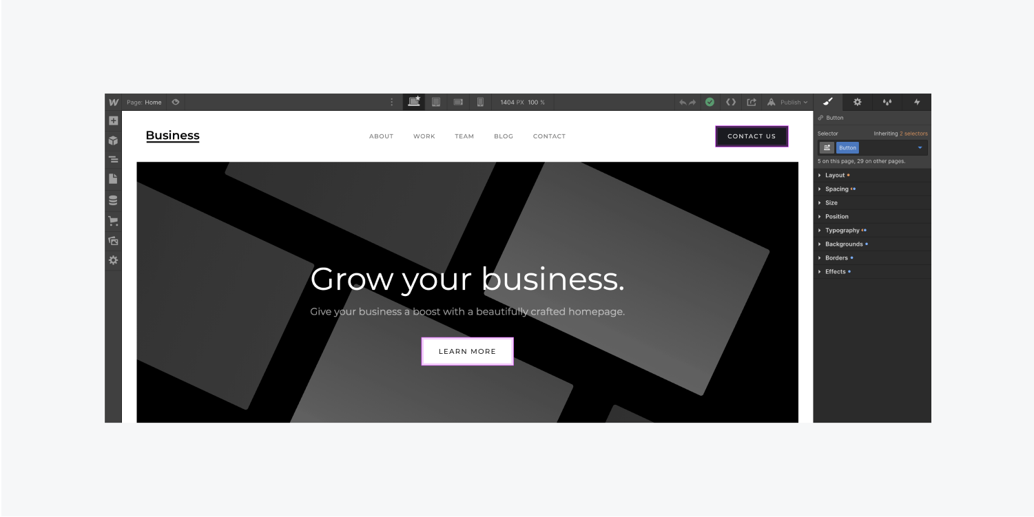
Displayed below the Selector field is the number of times the class or tag in the Selector field has been used on the current page and across the entire project.
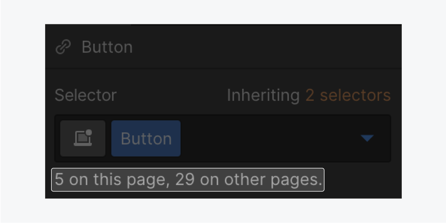
Click the text to toggle outlines around all elements that will be affected by any changes you make to the selected class or tag.
Layout and style sections
Different sections in the Style panel control different types of styles. Each section contains different CSS properties that you can change and preview on the canvas.

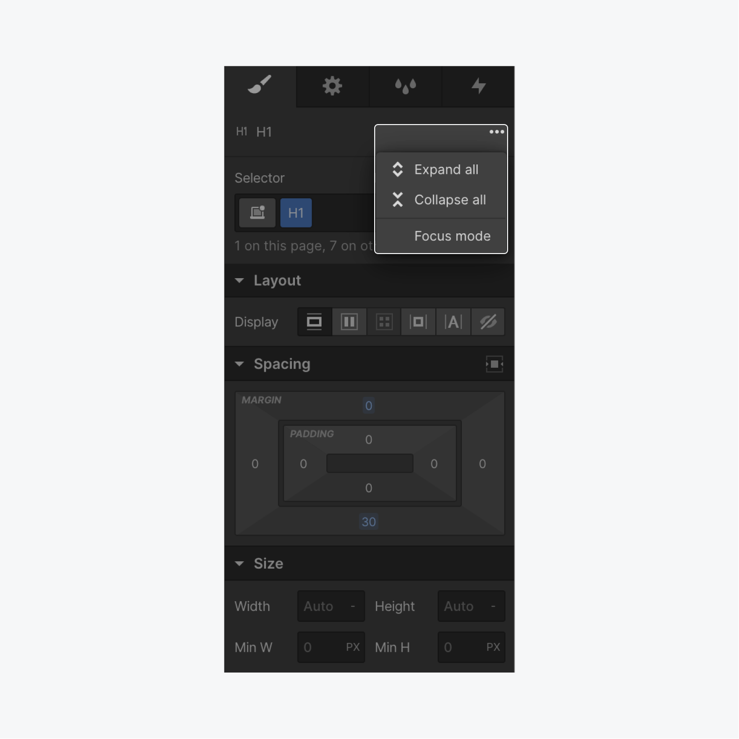
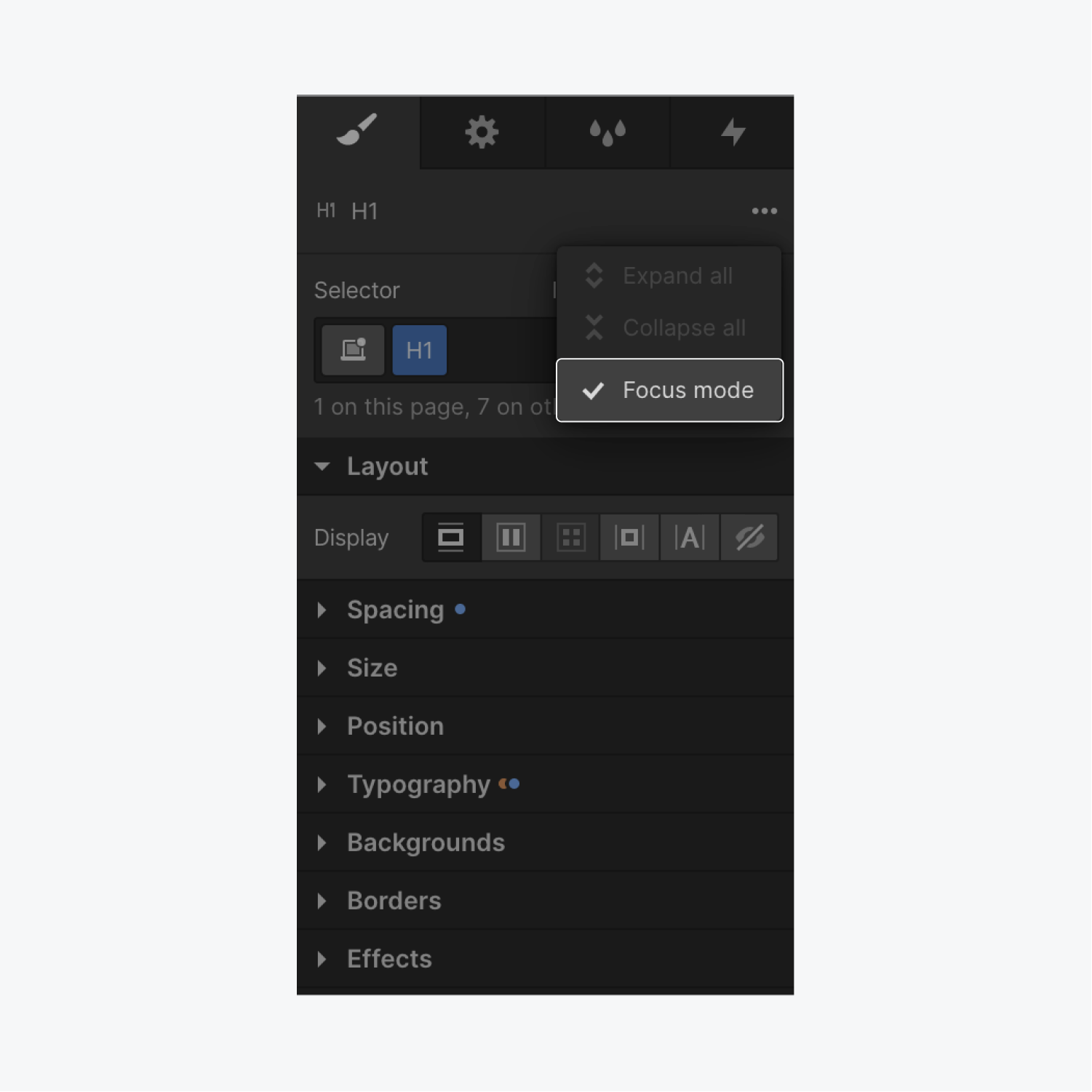
You can expand and collapse each section, expand all sections, collapse all sections, or expand one section at a time in Focus mode.
To enable Focus mode:
- Click the 3 disclosure dots at the top of the Style panel
- Press Focus mode to check that option
- Click any properties section in the Style panel you’d like to open
To disable Focus mode:
- Click the 3 disclosure dots at the top of the Style panel
- Press Focus mode to uncheck that option
Pro tip: Press Alt/Option + S on your keyboard to expand or collapse all Style panel properties sections. Press Alt/Option + Shift + S to toggle Focus mode on and off.
Keep in mind that if you select or deselect Focus mode, your choice will persist across the Designer. For example, if you have turned Focus mode on and you refresh the Designer, Focus mode remains on. The same behavior occurs if you open the Designer in another browser or tab.
Layout
When you add an element to the canvas, its default Display option determines its appearance.
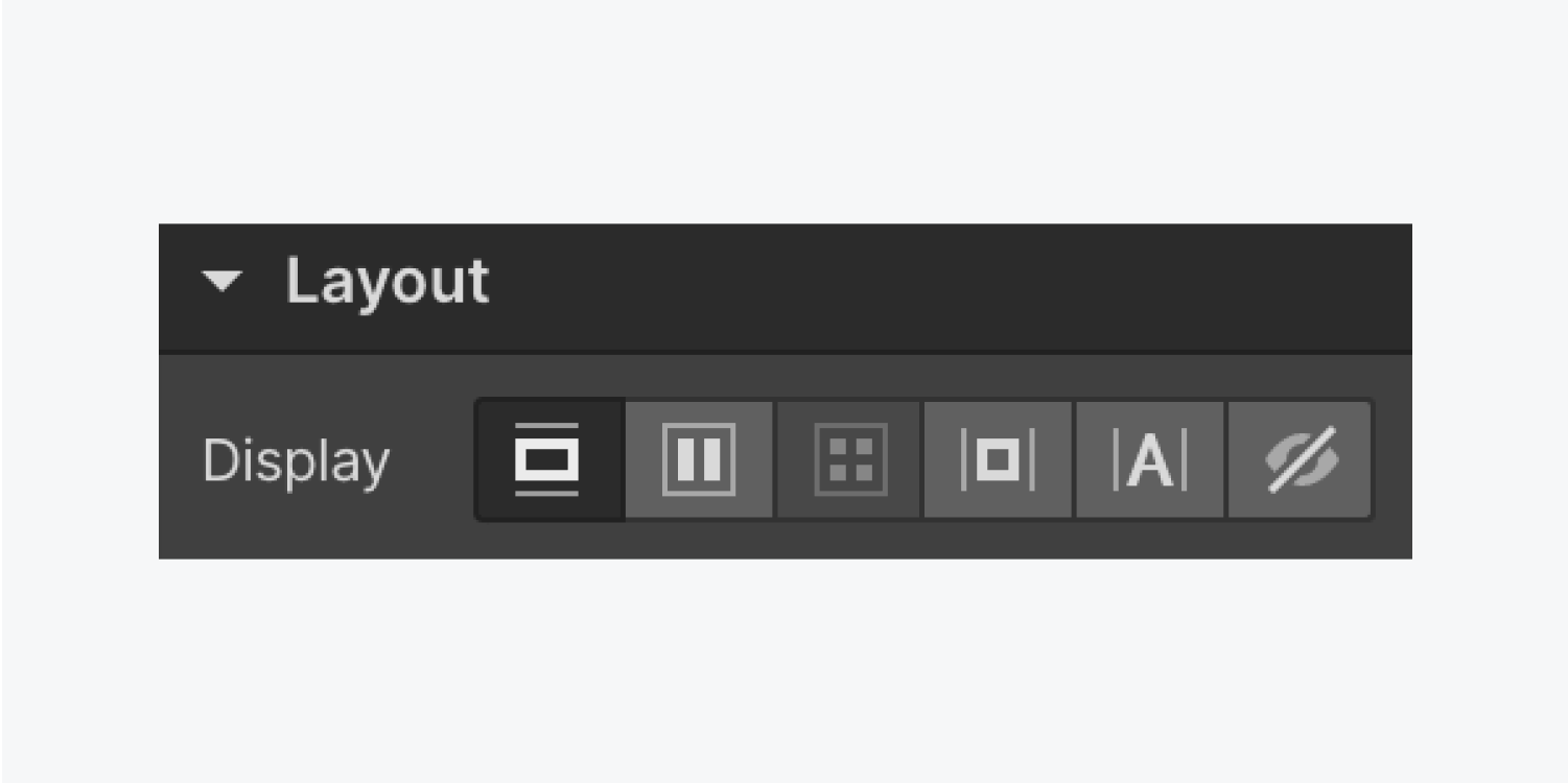
We cover the 6 Display options in more detail in our Display settings tutorial:
- Block
- Flex
- Grid
- Inline-block
- Inline
- None
Spacing
The Spacing section of the Style panel lets you define an element’s spacing — the breathing room outside or inside an element's boundary.
- Margins are the space outside an element's border
- Padding is the space inside an element, between its content and its border
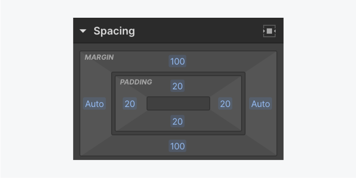
You can add Spacing to the top, bottom, left, and right of an element. You can apply the Spacing values to one side, 2 complementary sides, or all 4 sides.
Learn more about element Spacing.
Size
By default, an element either spans to fill the width of its parent element or takes the size of the content within it. You can customize the Width, Height, and Overflow settings in the Size section of the Style panel.
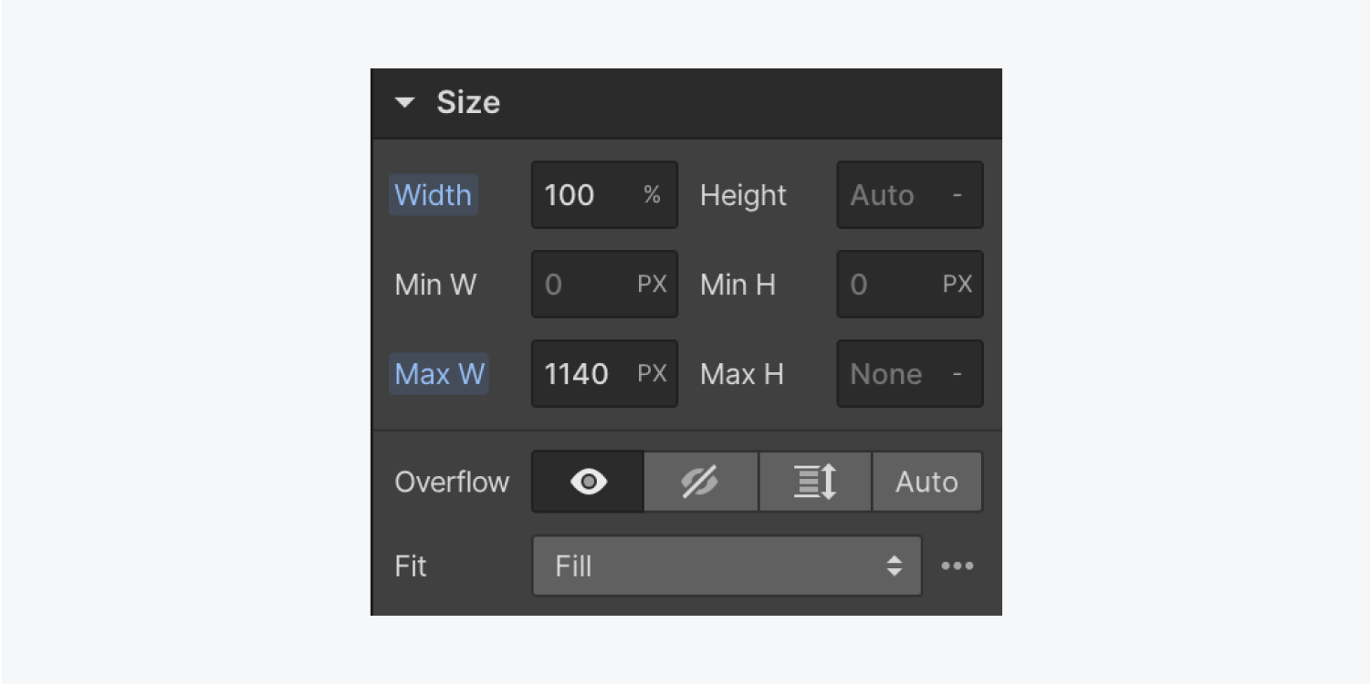
Note: Some Size settings may be disabled for container and columns elements.
Learn more about Size settings in the Style panel.
Position
The Position section in the Style panel allows you to set the positioning of elements, the Float settings, and the Clear settings.
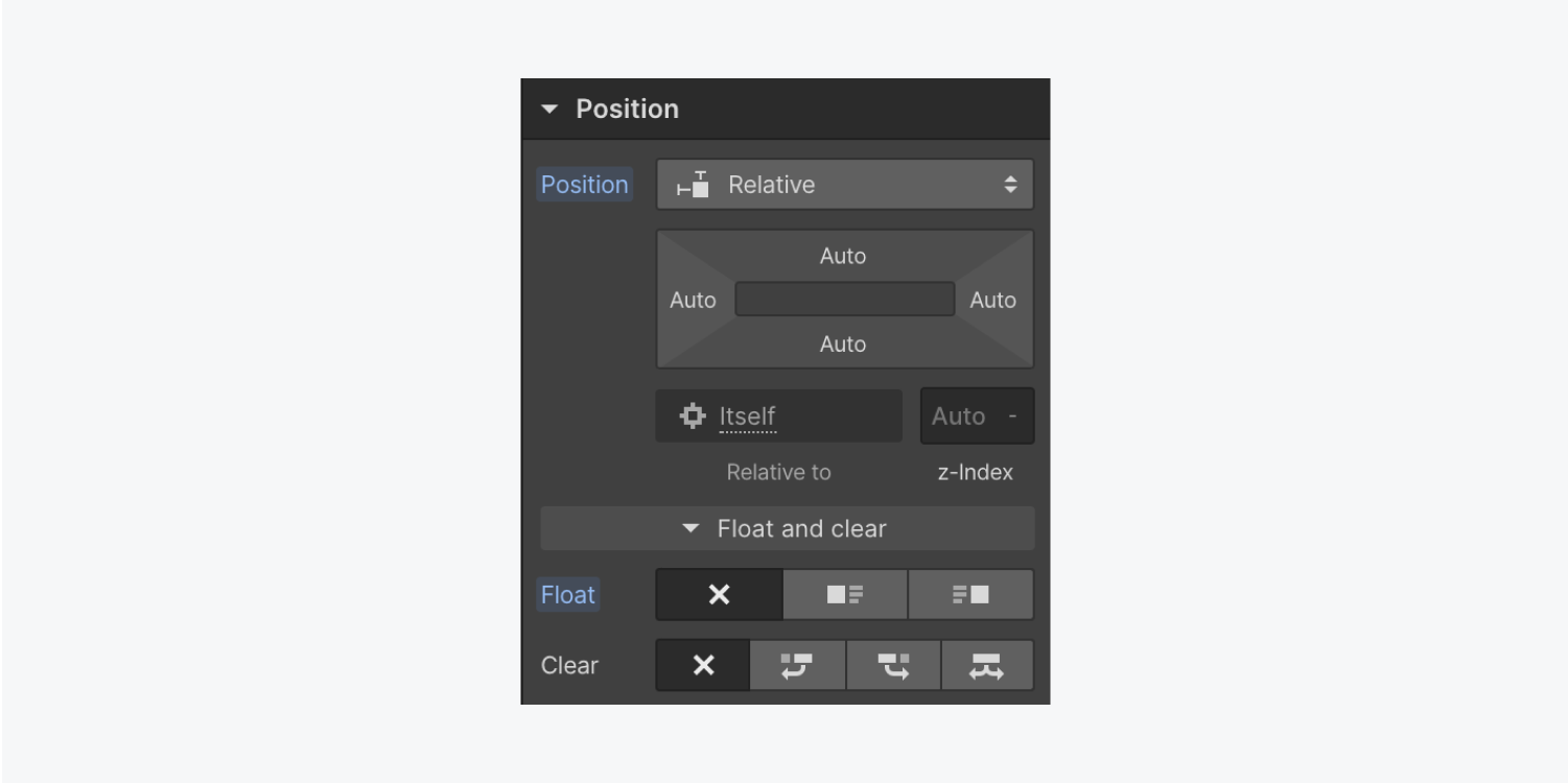
You can set a Position value of: Static, Relative, Absolute, Fixed, or Sticky.
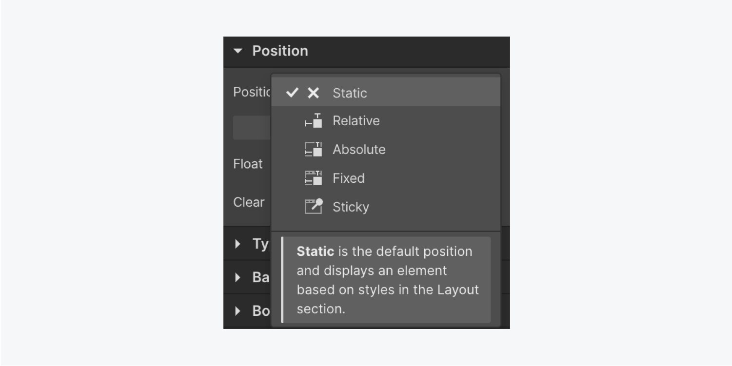
Learn more about Position, Float, and Clear settings.
Typography
You can control exactly how text is displayed in your project in the Typography section of the Style panel.
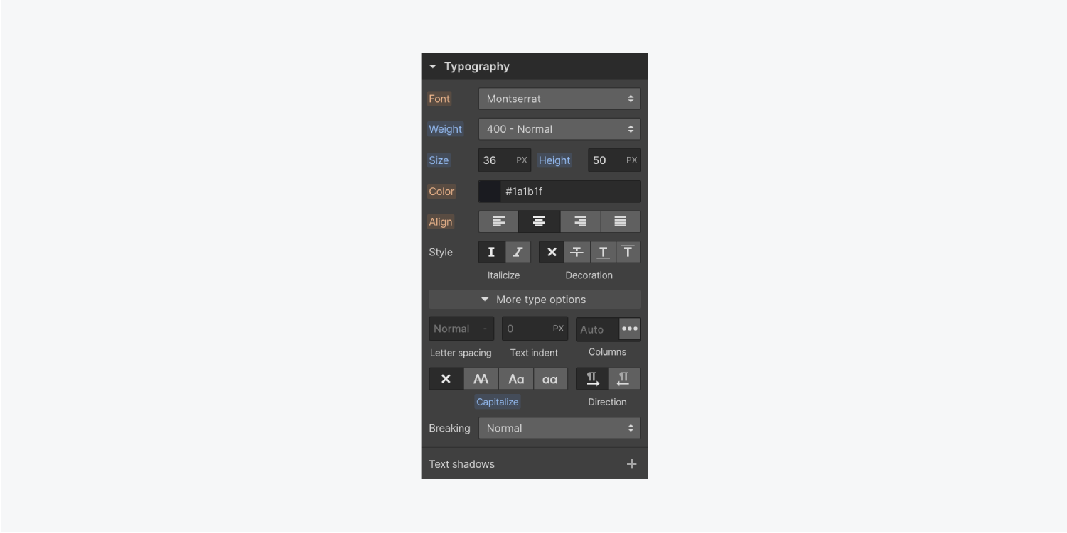
When you adjust any Typography style on an element, the changes apply to all text elements within the selected element and its child elements.
Learn more about Typography settings and best practices.
Backgrounds
In the Backgrounds section, you can add a background image, gradient, or color to any element except media elements, and can adjust its Clipping.
You can also change the Size, Position, and Tile display of any background image.
Learn more about background settings.
Borders
Borders define the radius of an element’s edges or create outlines on one or more sides of an element's boundary.
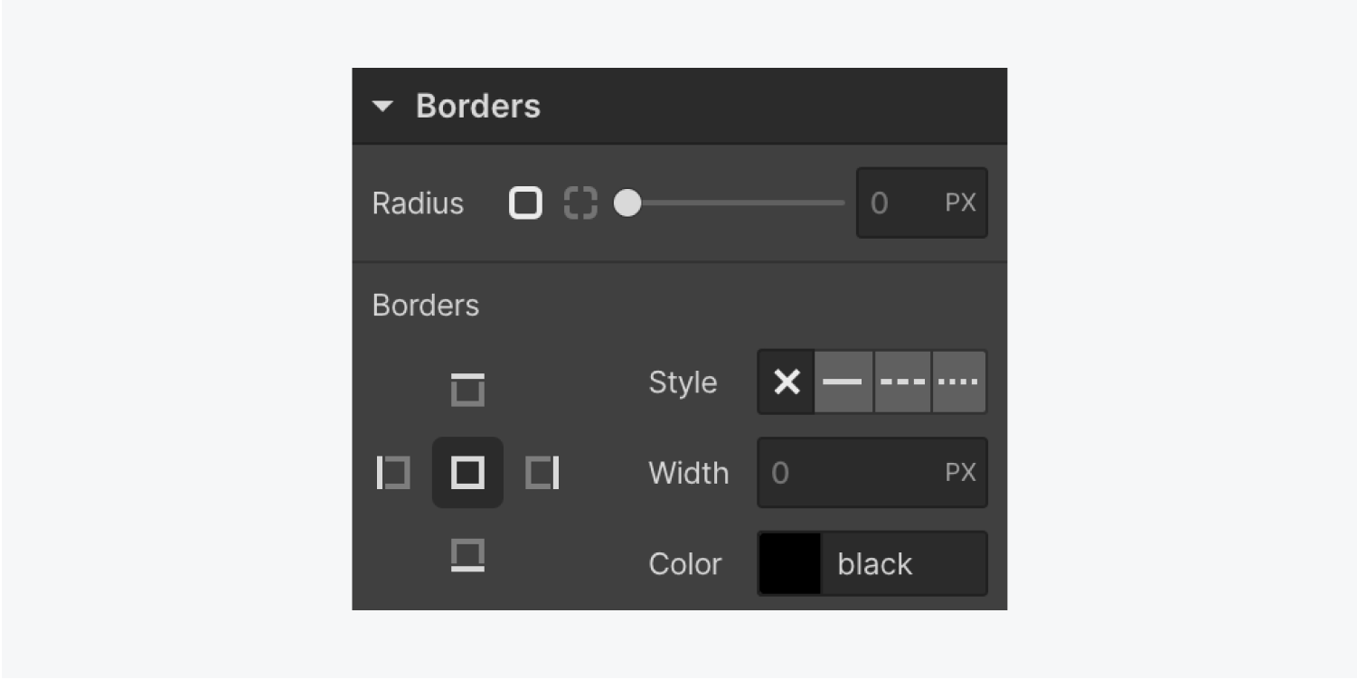
In the Borders section you can define the Radius size, Style, Width, and Color for element Borders.
Learn more about Border settings in the Style panel.
Effects
In the Effects section, you can set different effects on an element. These include: Blending, Opacity, Box shadows, 2D & 3D transforms, Transitions, Filters, Backdrop filters, and Cursor.
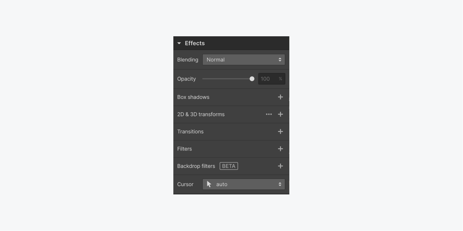
You can also apply an effect to a specific state, such as a Hover.
Learn more about how to set Effects and other styles on different states.
Inheritance and applied styles indicators
Once you collapse a section in the Style panel, colored dots appear next to the section name if there are any local or inherited styles applied to any property within that section. These dots (indicators) identify the source of styling — whether the style is applied to the selected element, or the current class, or inherited from a base class, a parent element, a global tag, or a larger viewport.
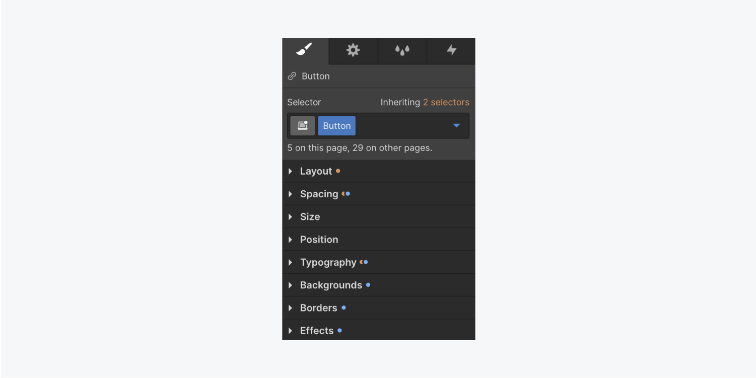
You can add more styles, override inherited styles, or remove any of these styles. You can also edit inherited styles by selecting the source from the Inheritance menu.
Orange indicators
An orange indicator means the current style is applied to an ancestor of the selected element. The selected element’s style is inherited from a tag, a base class, a higher breakpoint, or from a text style on a parent element. Click the orange indicator to show the style’s inheritance.
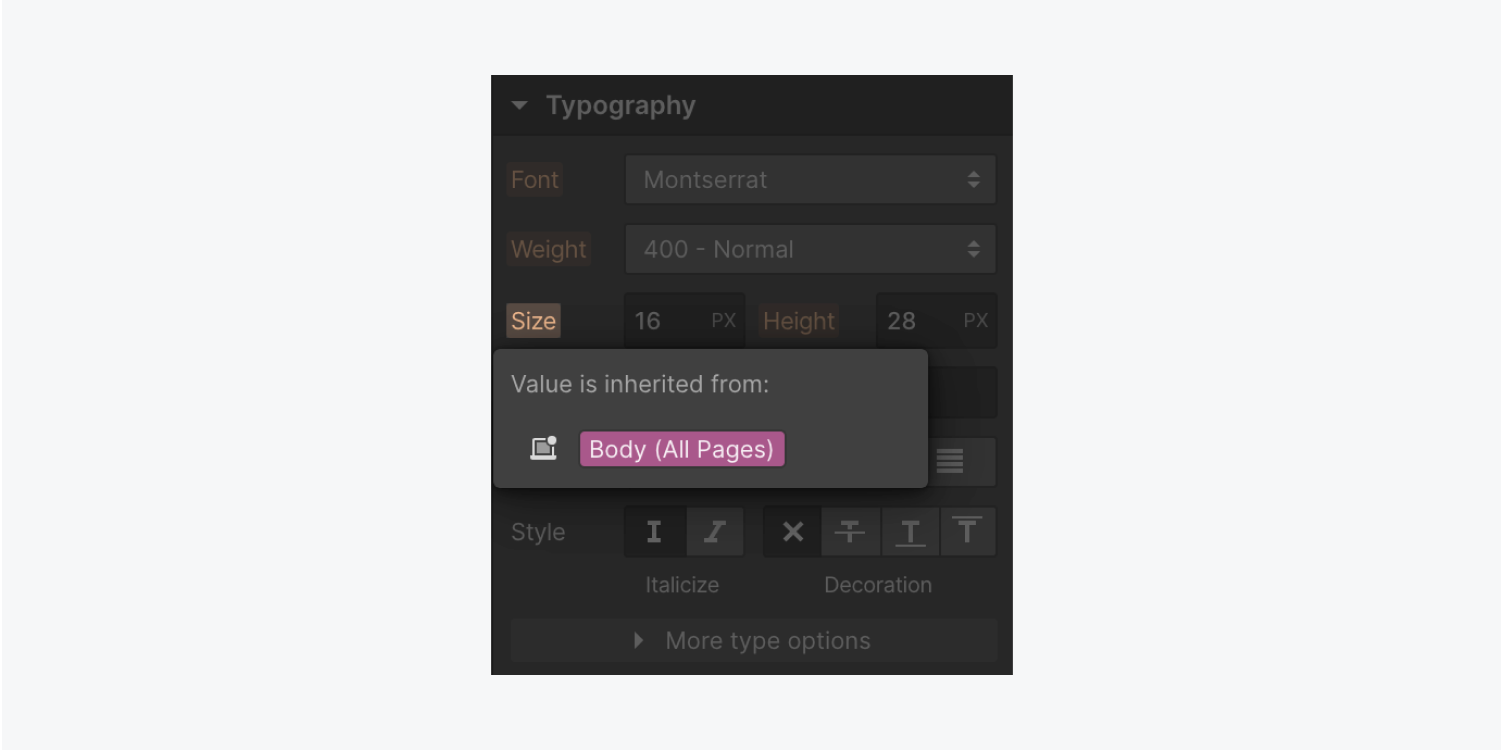
You can either override the inherited styles, indicated by the orange style icon, or go to the class or tag and edit the style there. You can access all the classes and tags that style the current element from the Inheritance menu.
From this menu, you can select and temporarily style a class or tags. For example, with an H1 heading selected, you can show the Inheritance menu and select the All H1 Headings tag.
Blue indicators
If the style indicator is blue, it means the element’s style comes from the current class, tag, or breakpoint. The indicator will also turn blue when you override an inherited (orange) style.
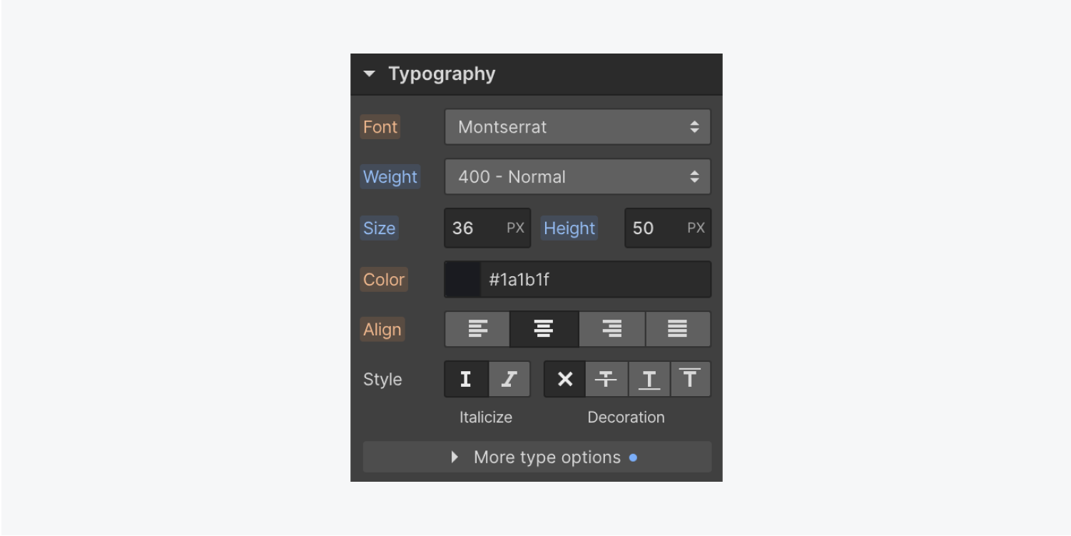
Click any blue indicator to reset and remove the local style.
Pink indicators
Pink style indicators mean that the style is applied to the currently selected element on the current breakpoint. For example, Grid child settings apply only to the selected element, and these styles aren't saved in the class.
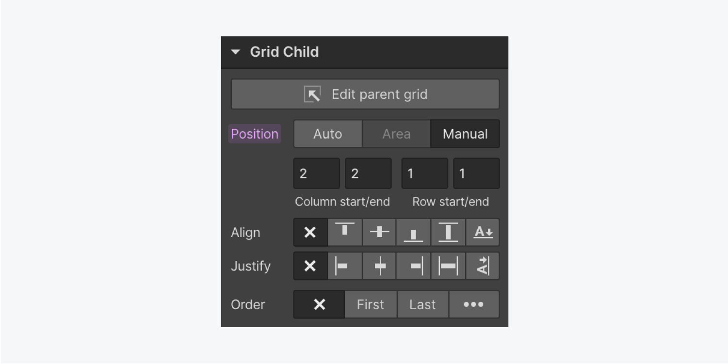
The indicator also turns pink when you override an inherited (orange) style on smaller breakpoints. Click any pink indicator label to reset and remove it.
Pro tip: Use the shortcut key Option + Click (on mac) or Alt + Click (on Windows) to reset styles.
Go forth and make your designs shine with Style panel settings!


