

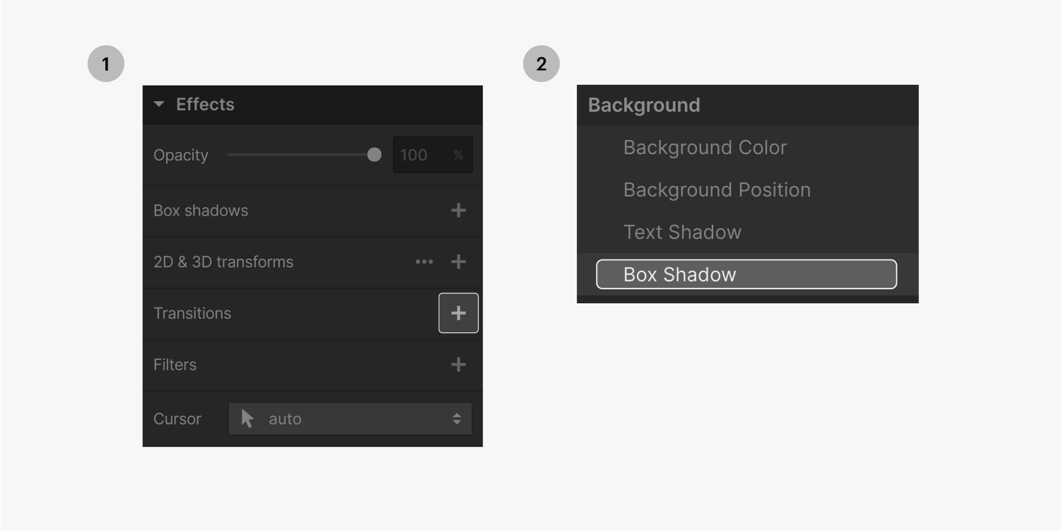
Transitions help create a smooth animation between different states of an element. A duration and easing type can be customized to create a unique transition. A common use case is to create a smooth transition for hover states on elements so that they don’t abruptly change on hover.
In this lesson:
Style the hover state of a button
- Select a button
- Add a box shadow and style it so everything looks just how you want it to look
- Go to the hover state
- Increase the intensity of the shadow, and the distance
- Switch back to the none state
Set a transition to smooth out the animation on hover
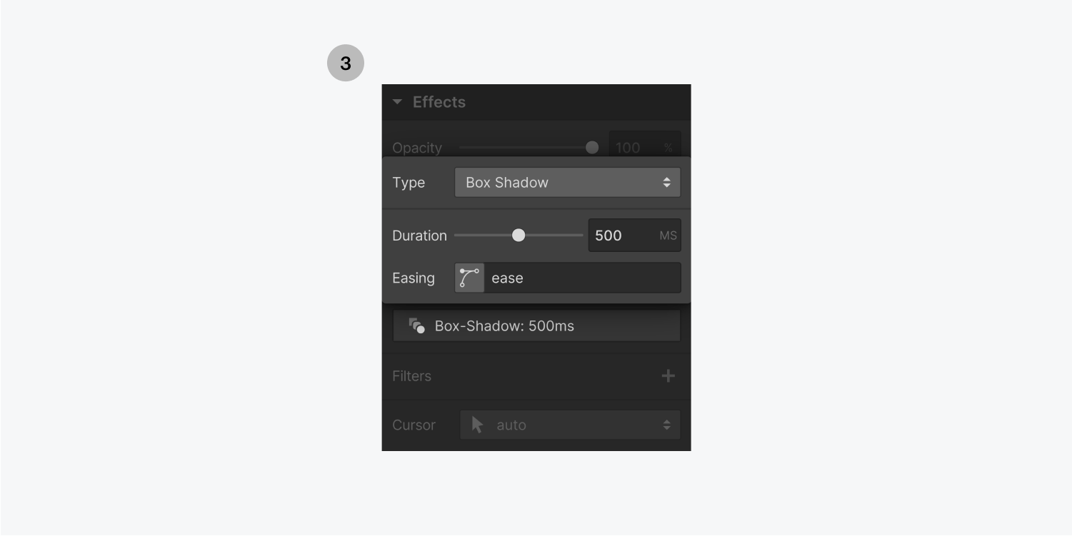
- Add a transition and choose Box shadow from the Property dropdown
- Add a 500ms duration
- Keep the easing as is
- Now, hover over the button, you can see the intensity and distance of the shadow transition smoothly