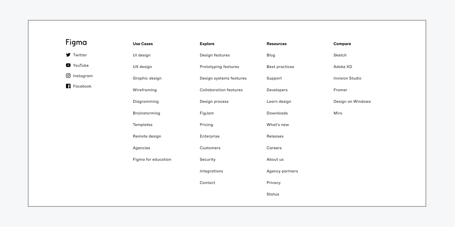
You can add Webflow’s Starter Library layouts to your blank canvas and jump-start your design workflow, or include the layouts in an already-built site. With these Starter Library layouts, you can avoid rebuilding common layouts (e.g., navigation bars, testimonials, footers) from scratch.
In this lesson, you’ll learn about:
How to access the Starter Library
You can access the Starter Library in the Webflow Designer by going to Add panel > Layouts tab or by using Quick find.
How to access the layouts in a Library
The Starter Library comes with layouts (e.g., navigation bars, hero sections, footers) that you can add to your site. To access the layouts:
- Go to Add panel > Layouts tab
- Click Starter library
- Click a layout category dropdown to display the layouts in that section (e.g., if you want to access navigation layouts, click Navigation)

Then, you can use the layouts like you would use any other element. To add a layouts from your Library to the Webflow canvas, you can:
- Click on the layout in the Layouts tab to add it to the canvas
- Drag the layout onto the canvas
- Drag it into the Navigator
Note: If you add a layout to the canvas that has a class that already exists on your site, the class name will appear with an incremented number. For instance, if you already have a “Button” class in your site and you add a layout that contains the same “Button” class, the layout class name will become “Button-2” in the Selector field.
Learn more about using Libraries.
Types of layouts in the Starter Library
The Starter Library is a default, Webflow-built Library of 34 layouts that you can use on any site. The 34 layouts are divided into the following categories:
Navigation
There are 3 types of navigation layouts, called navbars. These are often used at the top of site pages for easy access to website links and the homepage. All 3 navigation layouts contain a logo, links, a dropdown, and a call-to-action button.
Navbar logo center
The navbar logo center layout uses flexbox to organize 2 text links and a dropdown on the left, a logo placeholder in the center, and a text link and call-to-action button on the right.

Navbar logo left
The navbar logo left layout uses flexbox to organize a logo placeholder on the left, 3 text links and a dropdown in the center, and a text link and call-to-action button on the right.

Navbar no shadow
The navbar no shadow layout uses flexbox to organize a logo placeholder on the left, 4 text links and a dropdown in the center, and a call-to-action button on the right.

Additional navbar settings
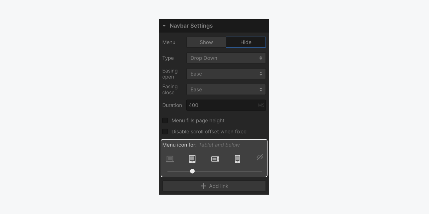
At breakpoints smaller than the desktop breakpoint, everything except the logo will automatically be condensed into a navbar menu button, also known as a hamburger menu. You can override this to make the navbar menu button visible on all or no breakpoints.
To change when the navbar menu button first appears:
- Select the Navbar layout or any element inside
- Open Settings panel > Navbar settings
- Use the device options slider to choose where the menu button first appears
You can also build a navbar interaction that responds on scroll. Learn more about how to show and hide the navigation bar on scroll.
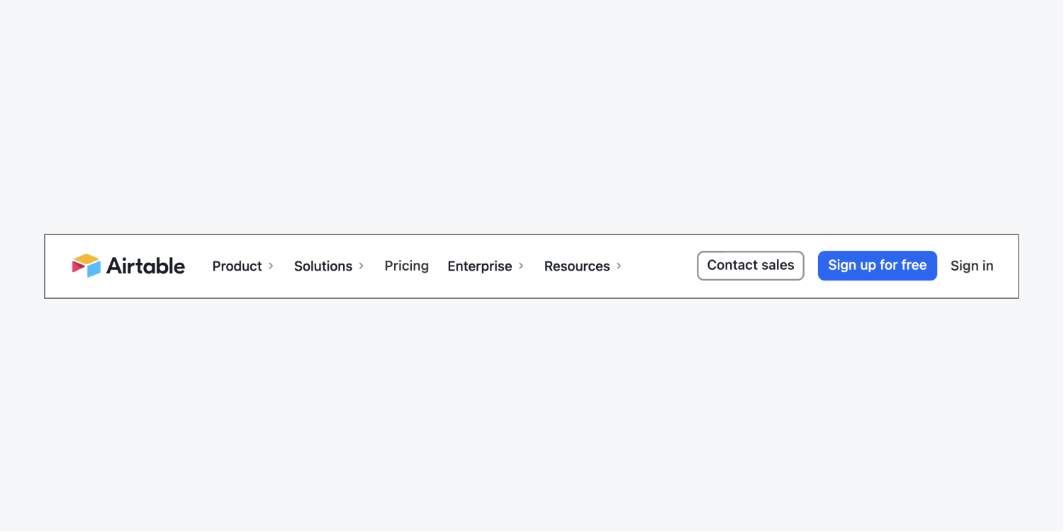
Real life navbar example
Hero
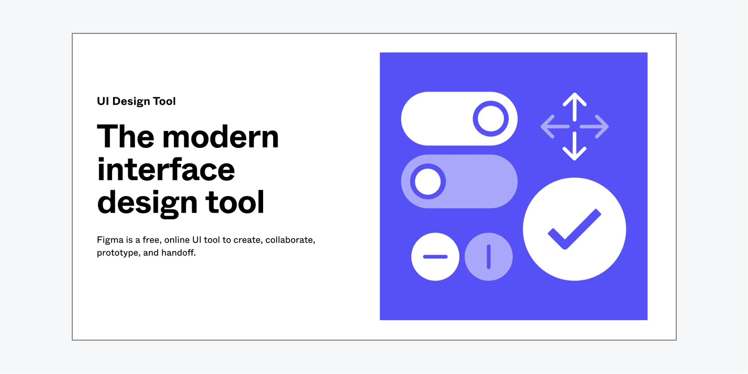
There are 7 types of hero layouts. The hero section is an area that draws site visitors’ attention to content at the top of a site page such as an image, product, or call to action. All 7 hero layouts contain a heading, paragraph, and call-to-action button. Some layouts feature an additional asset placeholder for an image or video, while others have an editable subscription form (e.g., newsletter sign up, product updates).
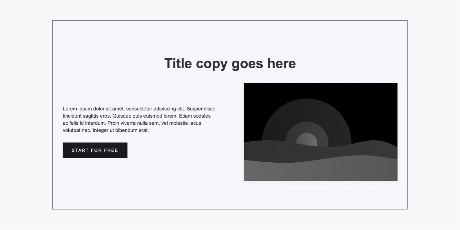
Hero heading center
The hero heading center layout uses flexbox to organize a heading in the center, a paragraph and call-to-action button on the left, and a placeholder image on the right.
Hero heading left
The hero heading left layout uses flexbox to organize a heading, paragraph, and call-to-action button on the left and a placeholder image on the right.
Hero heading right
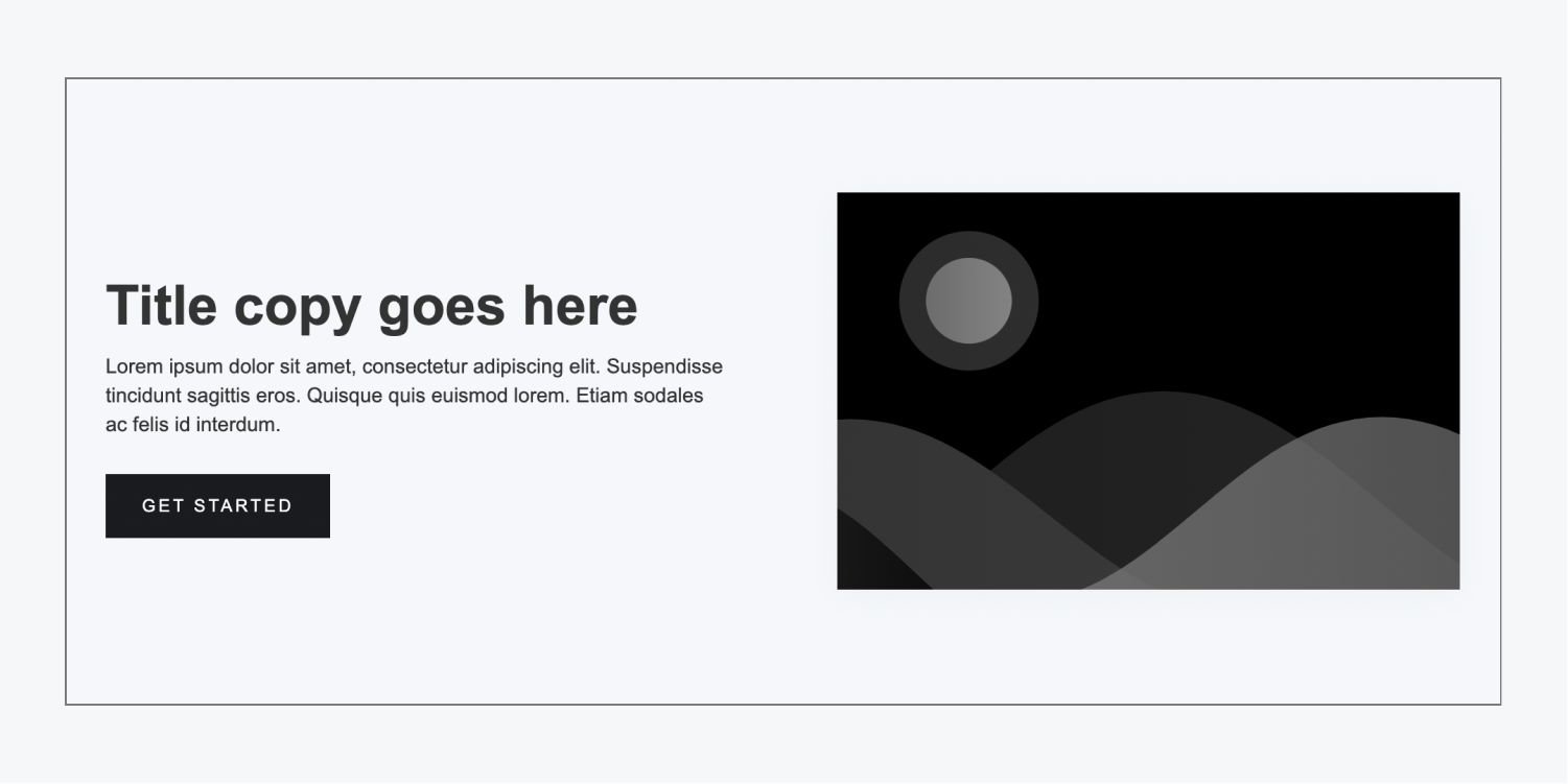
The hero heading right layout uses flexbox to organize a placeholder image on the left and a heading, paragraph and call-to-action button on the right.

Hero stack
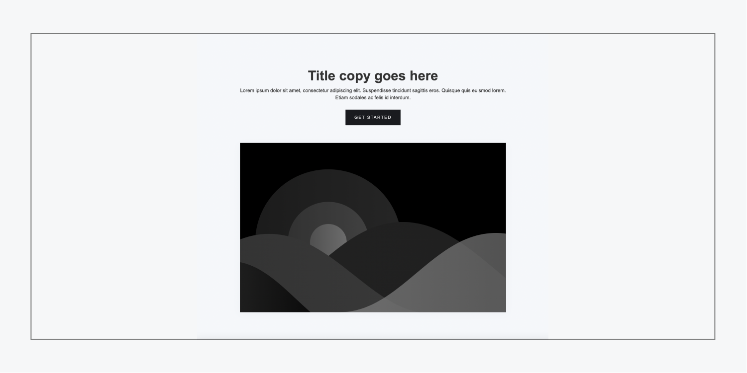
The hero stack layout organizes a heading, paragraph, call-to-action button, and placeholder image in a stack.
Hero subscribe left
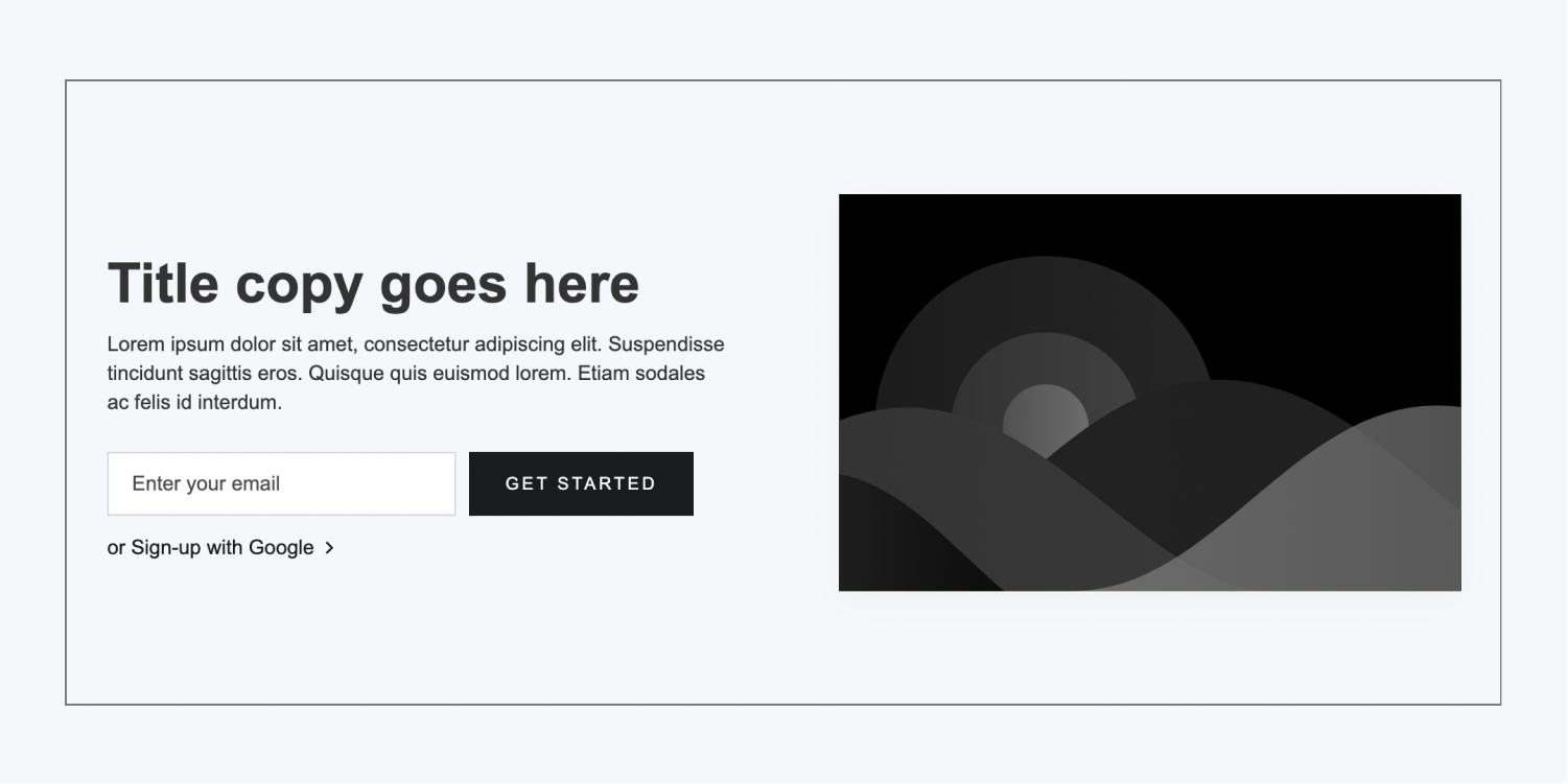
The hero subscribe left layout uses flexbox to organize a heading, paragraph, sign-up form, and “Sign-up with Google” link on the left and a placeholder image on the right.
Hero subscribe right
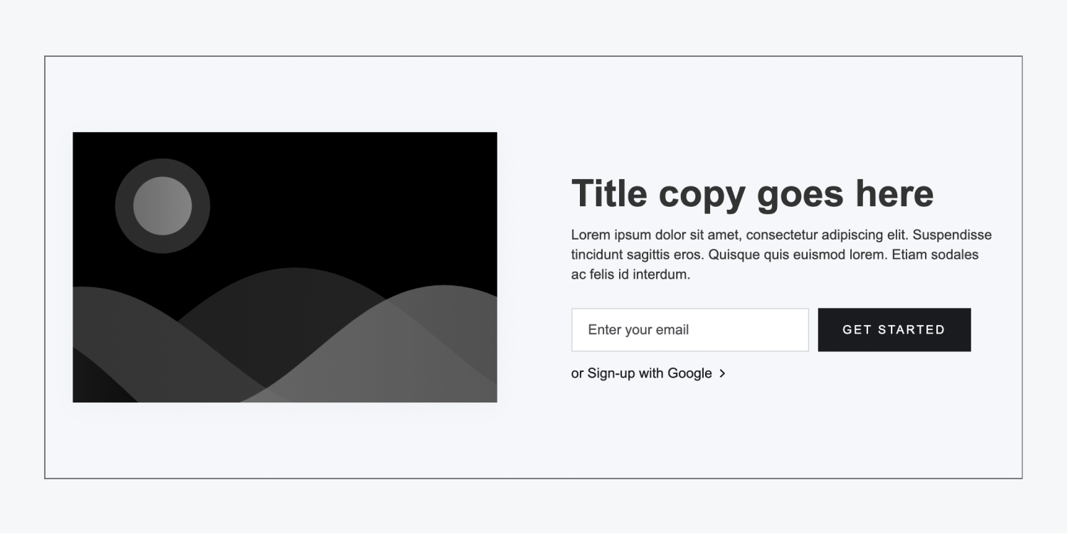
The hero subscribe right layout uses flexbox to organize a placeholder image on the left, and a heading, paragraph, sign-up form, and “Sign-up with Google” link on the right.
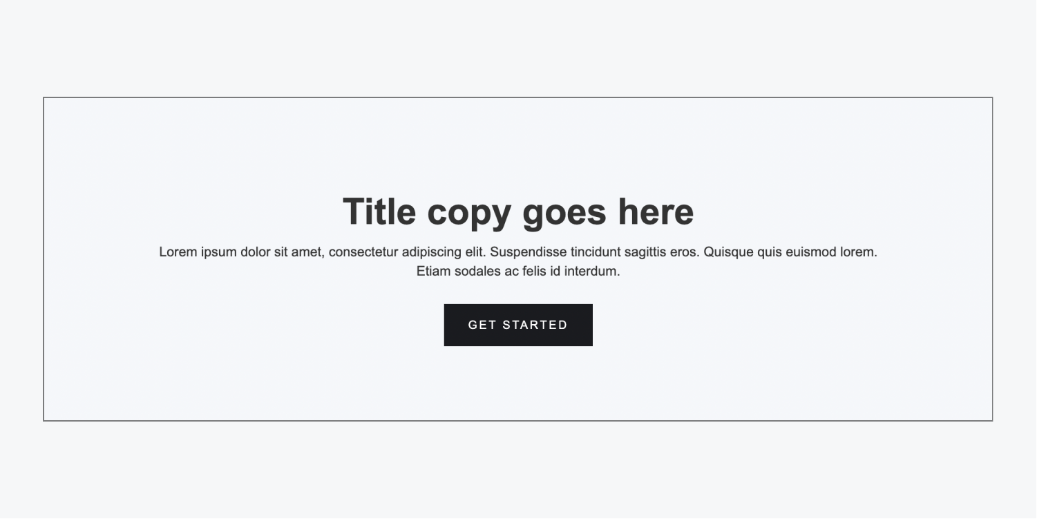
Hero without image
The hero without image layout uses flexbox to center a heading, paragraph, and call-to-action button within the section.
Real life hero example
Team
There are 2 types of team layouts. The team layout is a section that showcases different members of your team and their names, roles, bios, etc.
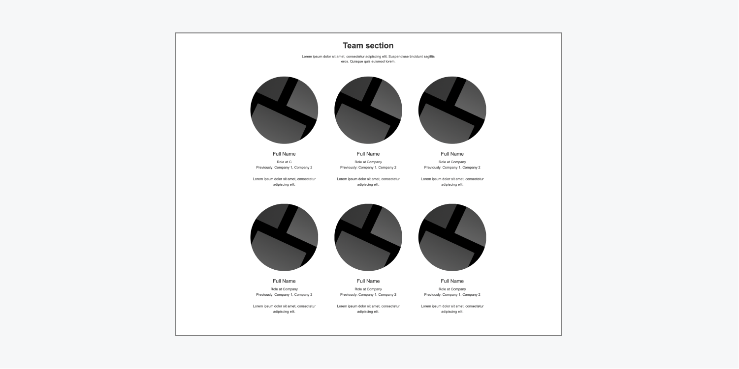
Team circles
The team circles layout has a heading and paragraph at the top, and uses a grid to organize circular placeholder images, team member names, and assorted team member information under each image. The layout has 6 editable team cards.
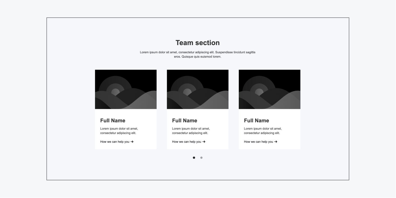
Team slider
The team slider layout has a heading and paragraph at the top and a slider below, with 6 placeholder team blocks. Each team block includes a placeholder image, team member name, team member bio, and “How we can help you” text link, which can be edited to display a different call to action.
Logos
There are 5 types of logos layouts. These are often used to showcase logos of partner companies or your clients, although they can include testimonials, images, etc.
All 5 logos layouts contain logo placeholders that you can replace with your clients’ logos, and 2 of the layouts have a client testimonial container.
Logos quote block
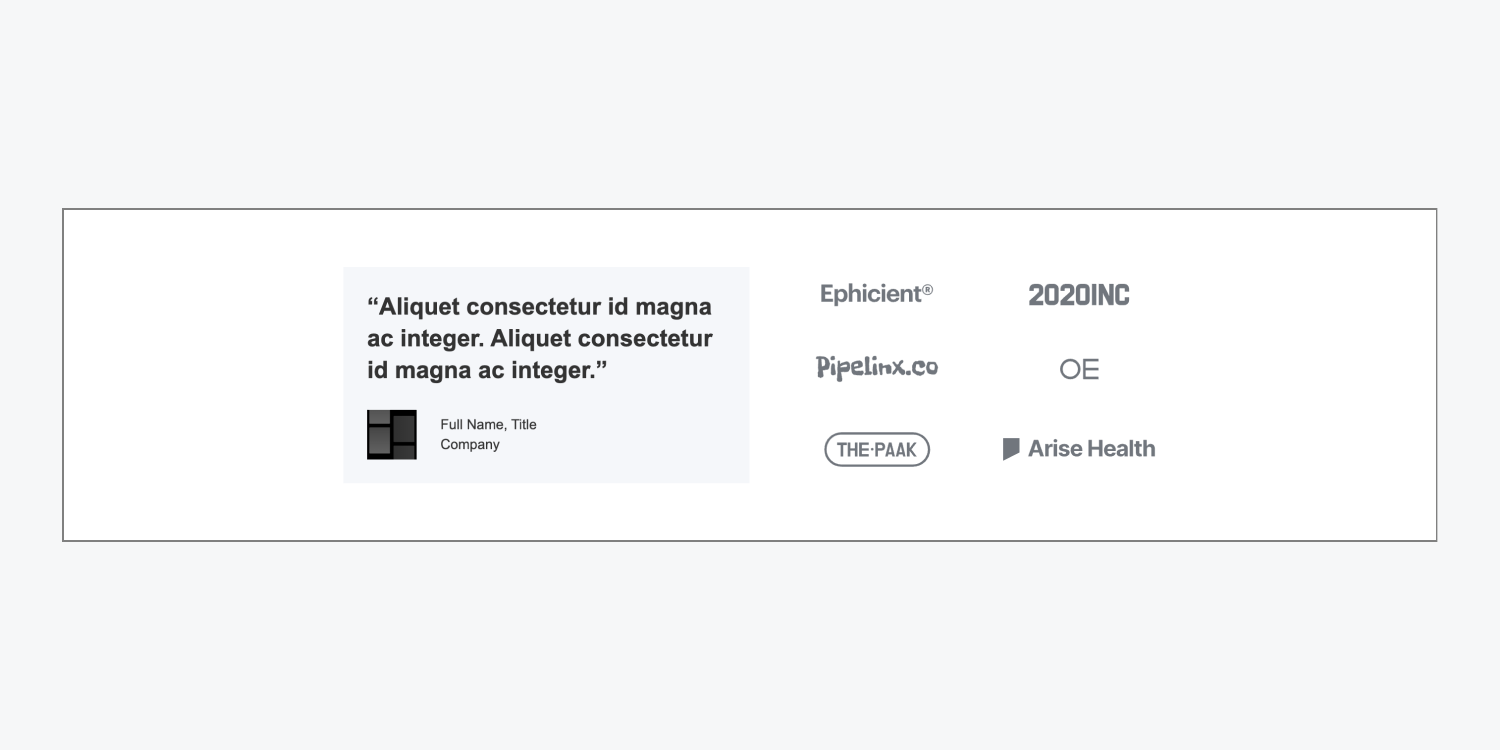
The logos quote block layout uses flexbox to organize a placeholder client quote, client image, and client information on the left, and 6 placeholder logos on the right, arranged in a grid pattern.
Logos quote divider
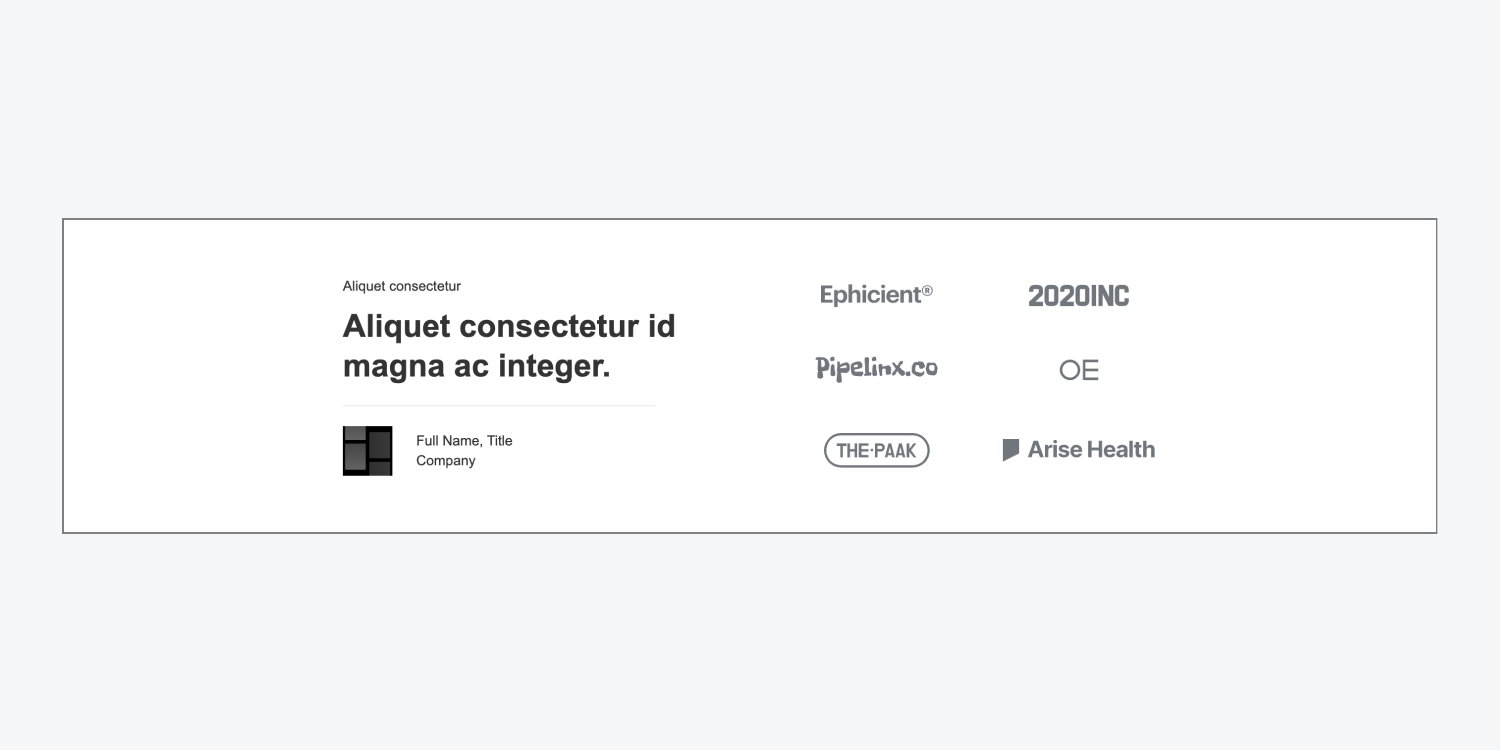
The logos quote divider layout is the same as the logos quote block layout, except the client card doesn’t have a preset background color, and extra placeholder text above the client quote adds more context to the quote.
Logos title large
The logos title large layout has a heading and a div block below it that organizes 5 placeholder logos using flexbox.

Logos title small
The logos title small layout uses the same layout as the logos title large layout except a small text block replaces the heading.

Logos without title
The logos without title layout is the same as the logos title large layout except it does not contain a title placeholder.

Real life logo section example

Gallery
There are 3 types of gallery layouts. These can be used to display multiple images or videos in a section on your site.
The first 2 gallery layouts feature a full screen grid arrangement of placeholder images (at the desktop breakpoint), as well as editable text and links. The last gallery layout uses a slider to showcase 2 images at a time.
Gallery overview
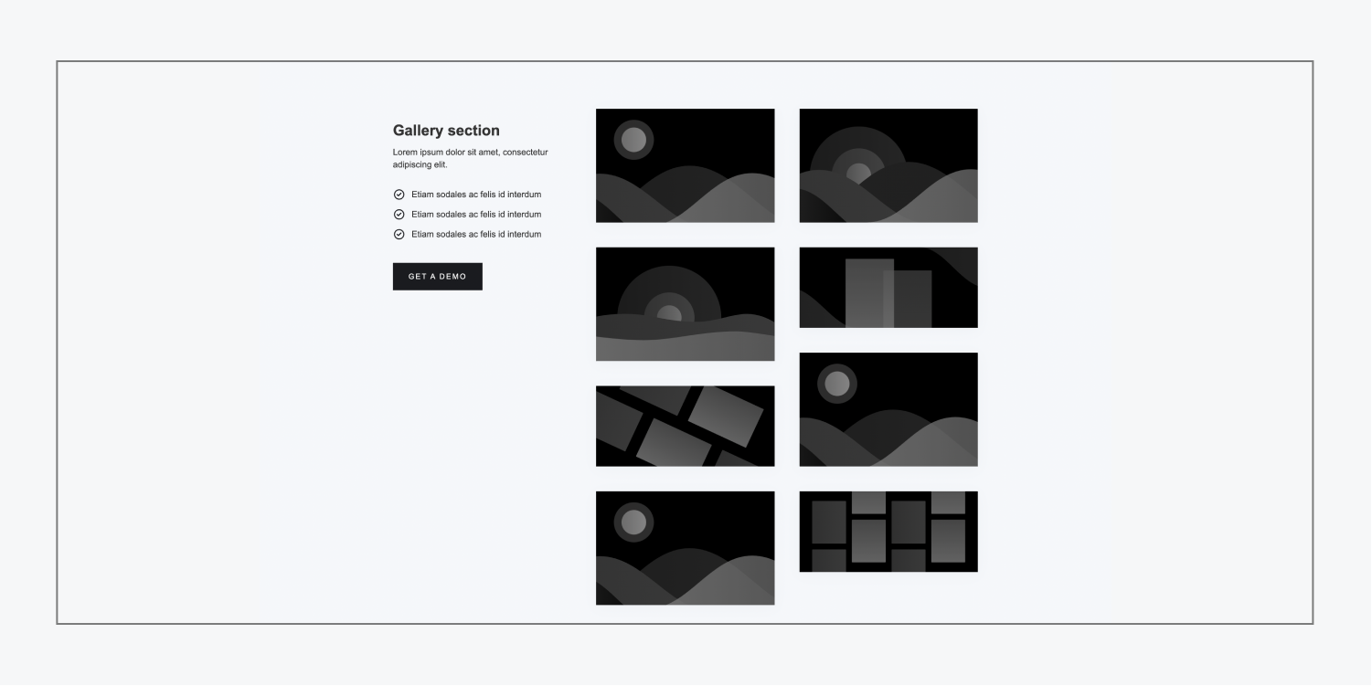
The gallery overview layout uses a grid with 3 columns to organize the content. The left column includes a heading, paragraph, list, and call-to-action button. The middle and right columns are nested grids with a placeholder image in each row.
Gallery scroll
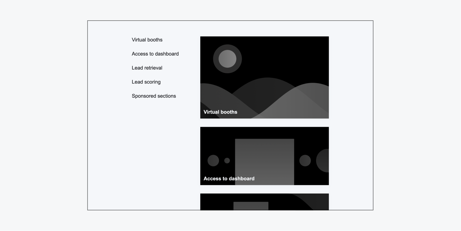
The gallery scroll layout uses a sticky wrapper on the left which has 5 placeholder links. The sticky wrapper ensures that the links will remain in the same location on the screen while the images section scrolls down with the page. The links in the sticky wrapper can also be section linked to the placeholder images in the right grid, so clicking on a link will automatically take a site visitor to that image.
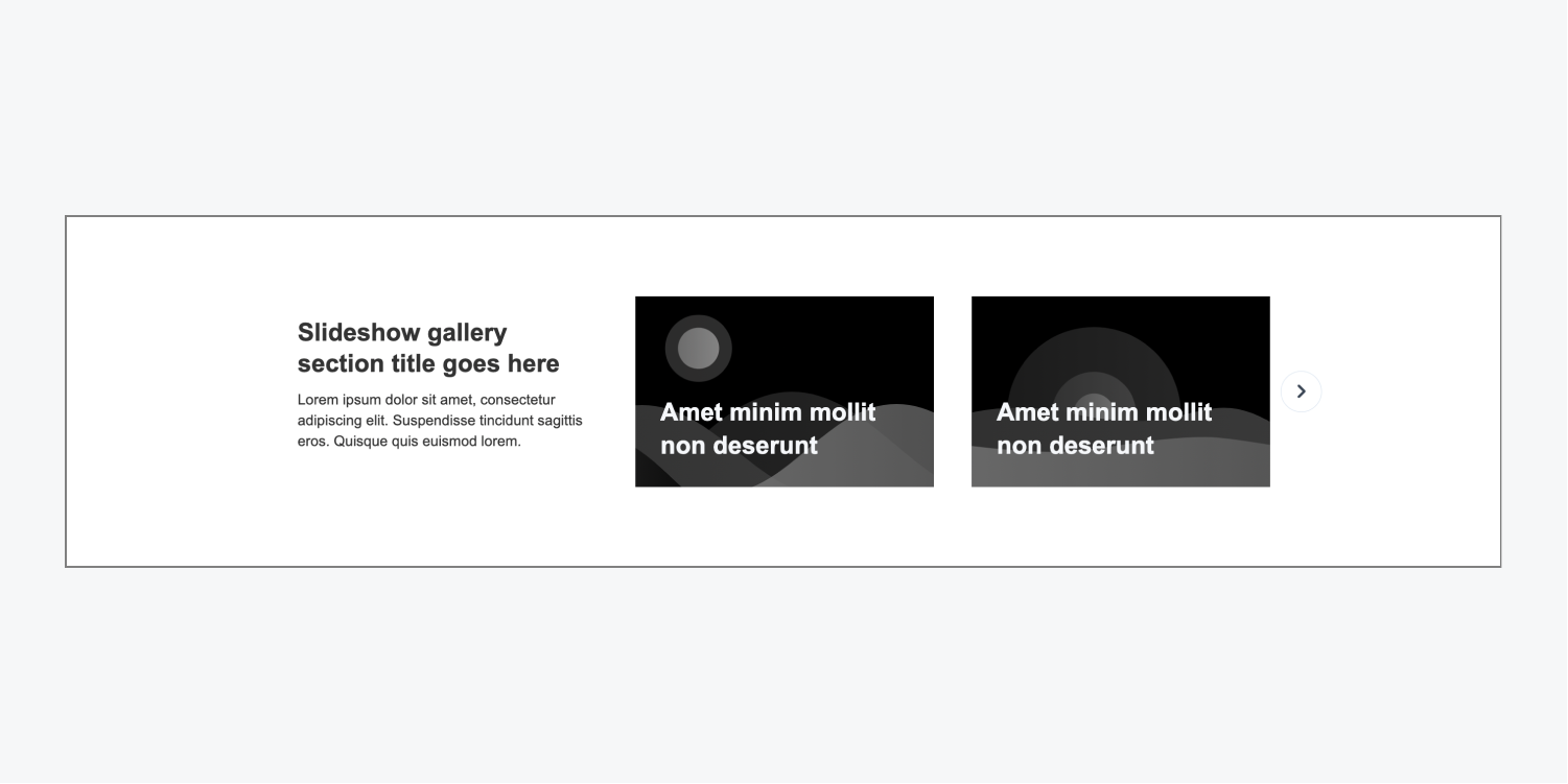
Gallery slider
The gallery slider layout uses a grid with a heading and paragraph in the left column, and 2 slider placeholder images in the right 2 columns.
The slider has 4 images total, 2 on the first slide, and 2 on the second slide. The second slide will appear in place of the first slide when a site visitor clicks the arrow or uses their keyboard to advance the slider.
Real life gallery example
Features
There are 3 types of features layouts. You can use the features section layouts to showcase your company’s or product’s different features.
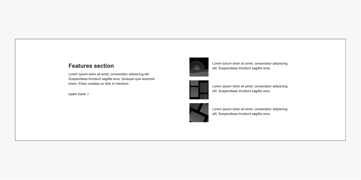
Features list
The features list layout uses flexbox to organize a heading, paragraph, and “Learn more” link on the left side, and a list on the right with placeholder images and text in each list item.
Features metrics
The features metrics layout uses flexbox to organize 4 editable div blocks in a row. These div blocks can feature important metrics that you want visible to site visitors.

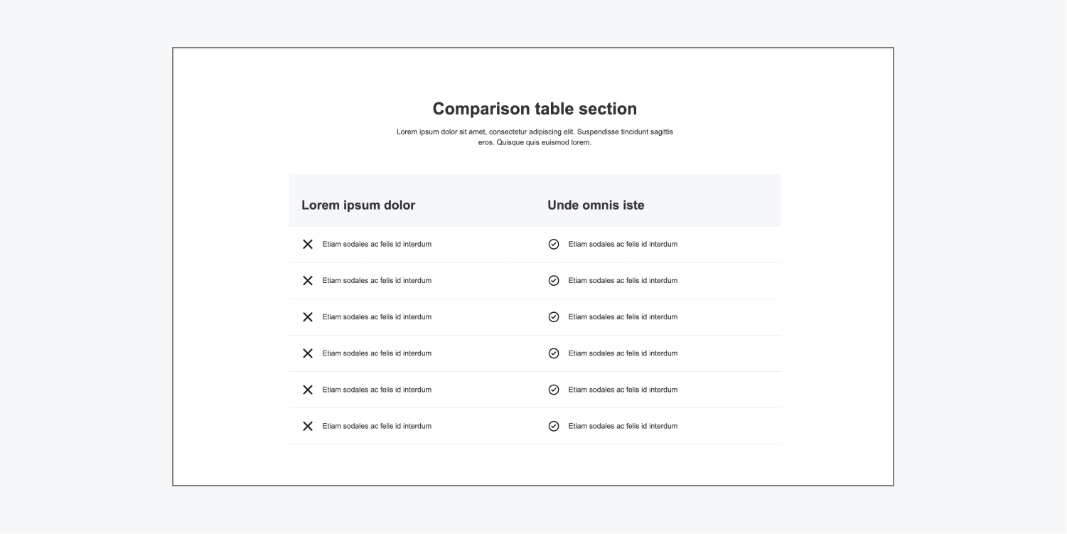
Features table
The features table layout includes a heading and paragraph over the main comparison div block. Each comparison row in the comparison div block is its own grid, consisting of 2 columns and 1 row. This structure allows you to compare or contrast products, features, etc.
Pricing
There are 3 types of pricing layouts. Pricing layouts are often used to show product prices, pricing comparisons, or link to other product pages on your site.
Pricing comparison
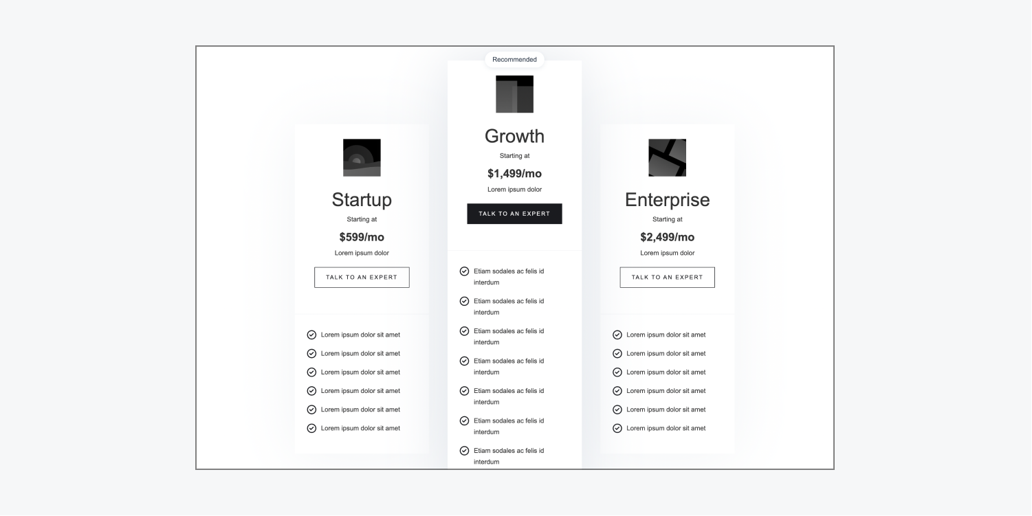
The pricing comparison layout uses a grid to showcase a list of features in 3 different cards. You can use this layout to compare pricing and features for different pricing plans. Each card contains a placeholder image, heading, subtitle, price text block, paragraph, “Talk to an expert” button, and list, which you can edit to highlight plan features.
Pricing items
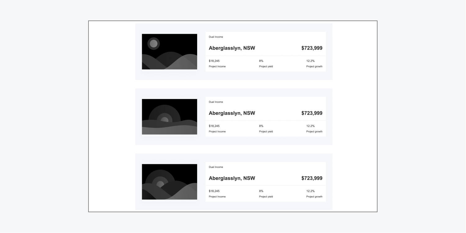
The pricing items layout uses flexbox to center 3 cards. You can use the cards to showcase products and their metrics. Each card contains a placeholder image on the left and a content wrapper on the right. The content wrapper includes elements such as a product heading, large-font price, and pricing details.
Pricing overview
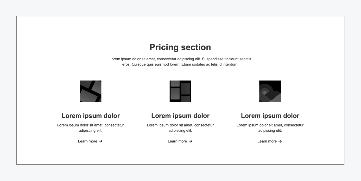
The pricing overview layout includes a centered heading and paragraph and a grid beneath them. The grid contains 3 pricing cards, each of which has a placeholder image, heading, paragraph, and a “Learn more” link.
Testimonial
There are 6 types of testimonial layouts. These are often used to display testimonials about a product or service. The layouts include placeholders for headings, author names and pictures, and quotes.
Testimonial column dark
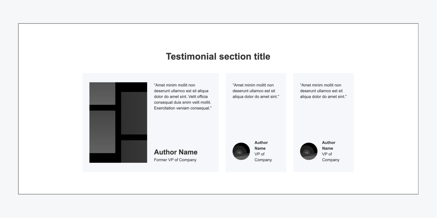
The testimonial column dark layout has a heading and a grid which contains 3 testimonial blocks. The left testimonial block is larger and can be used to display the most important or impactful testimonial. It features a large placeholder image, quote, author name, and explanation text block, which you can use to include the author’s title or company. There are 2 other smaller testimonials on the right, each of which contains a smaller placeholder quote, image, author name, and explanation text block.
Testimonial column light
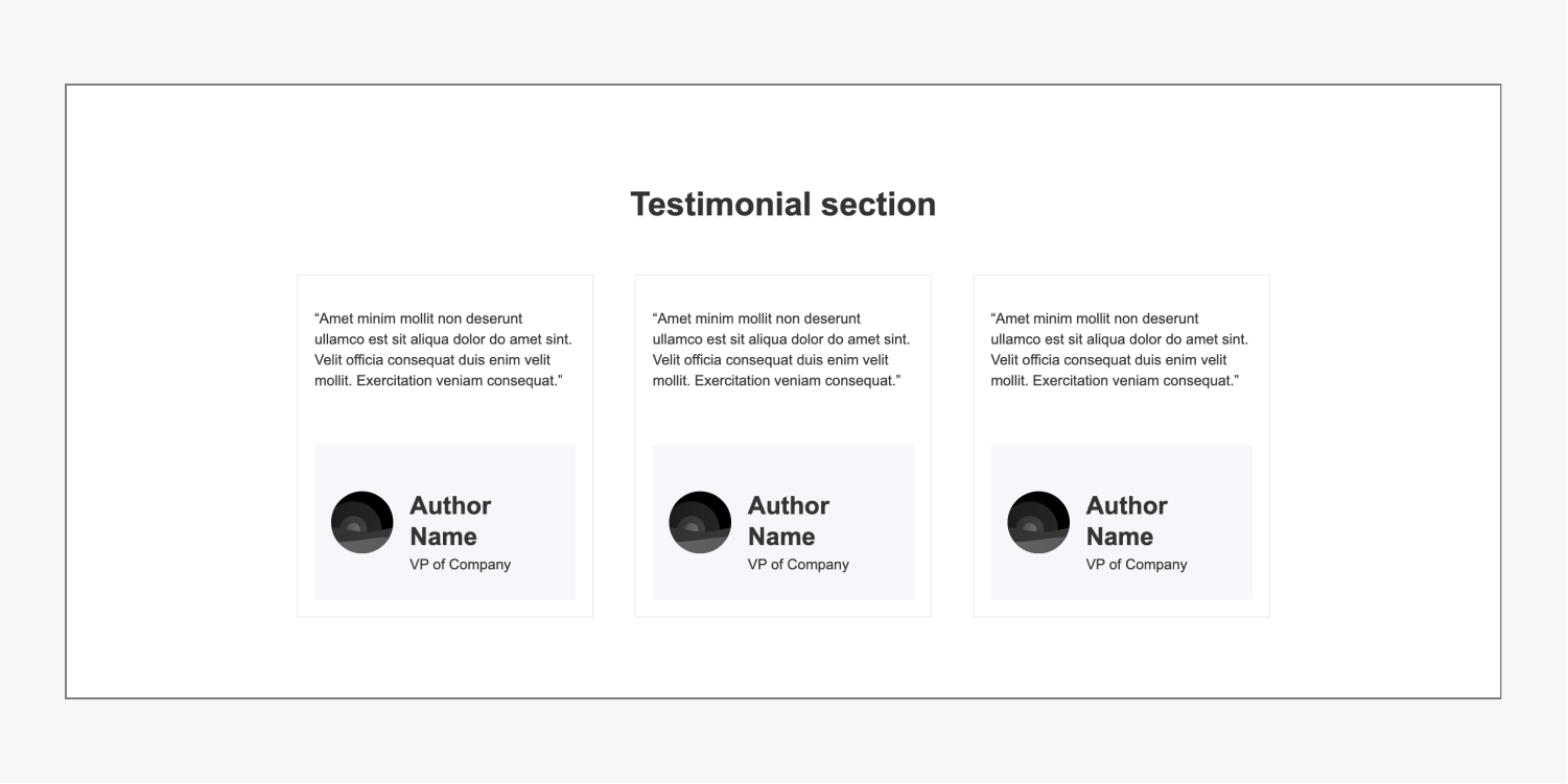
The testimonial column light layout has a heading and 3 equal-sized testimonial cards arranged using a 1 row grid. Each testimonial card has a placeholder quote, image, author name, and author job title.
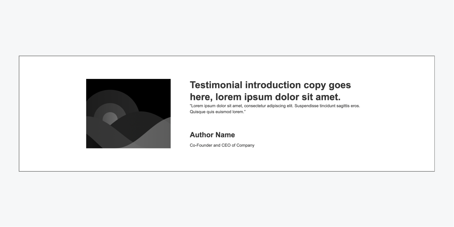
Testimonial image left
The testimonial image left layout displays a main testimonial. It uses flexbox to organize a placeholder image on the left and testimonial introduction copy, quote, author name, and author job title on the right.
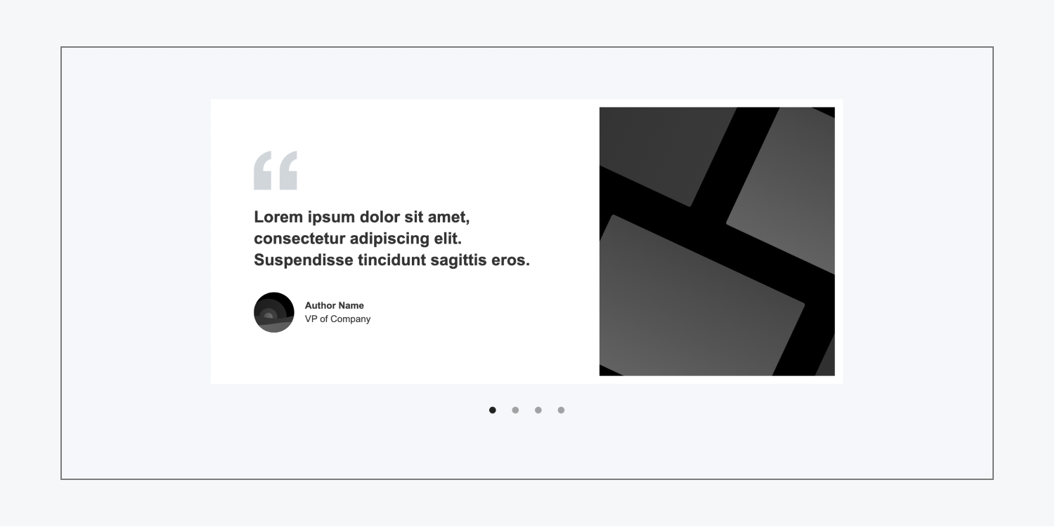
Testimonial slider large
The testimonial slider large layout uses a slider element with 4 placeholder testimonials. Each slider card has a quote, author name, author image, and author job title on the left and a larger image on the right.
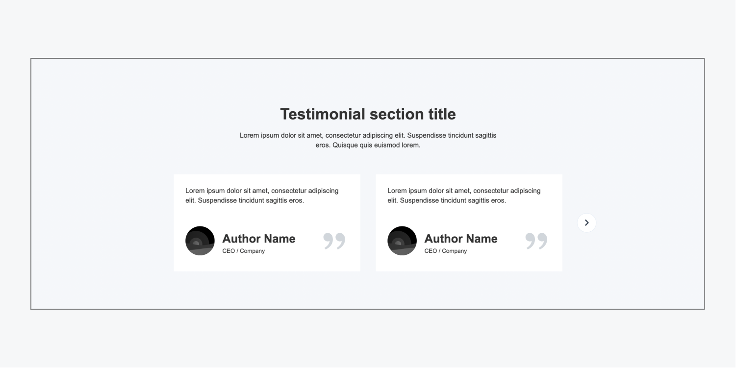
Testimonial slider small
The testimonial slider small layout has a centered heading and paragraph and a slider beneath them. Each testimonial card has a quote, placeholder image, author name, and author job title. There are 2 testimonials in each slide, adding up to 4 testimonials total in this layout.
Testimonial stack
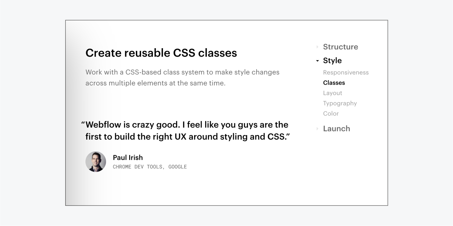
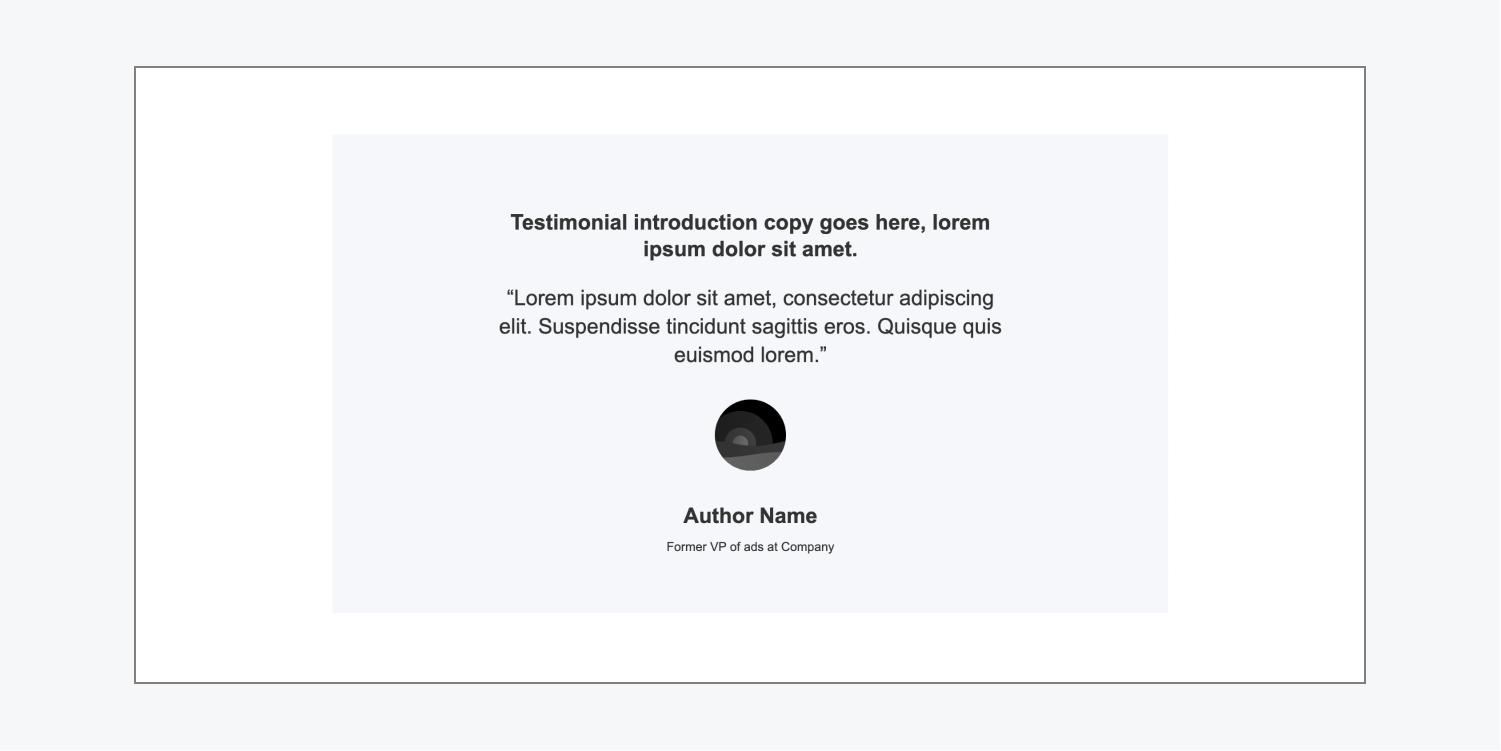
The testimonial stack layout uses flexbox to showcase a single, important testimonial. This layout has testimonial introduction text, a quote, an author picture, the author name, and the author job title.
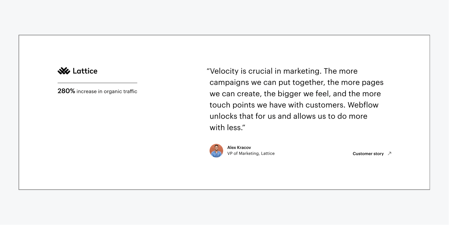
Real life testimonial example
Footer
There are 3 types of footer layouts. These layouts are often used to display page links (e.g., Privacy Policy, Terms and Conditions, etc.) copy, social media links, and copyright information under the main content of your site.
Footer dark
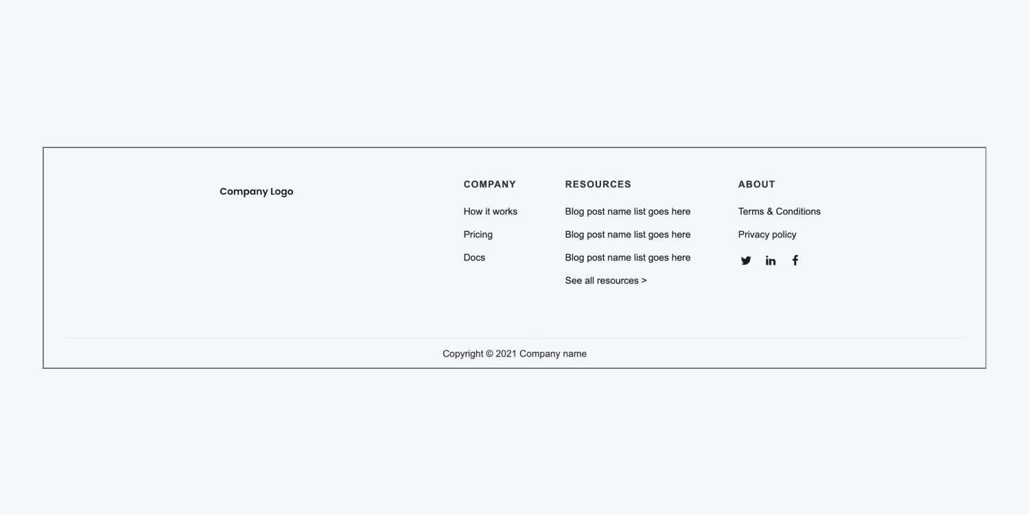
The footer dark layout uses flexbox and a grid to display important links and information. On the left it has a placeholder image for a company logo, and on the right it has a grid with 3 sections (“Company,” “Resources,” and “About”), as well as social media links. The layout also includes a section to display copyright information.
Footer light
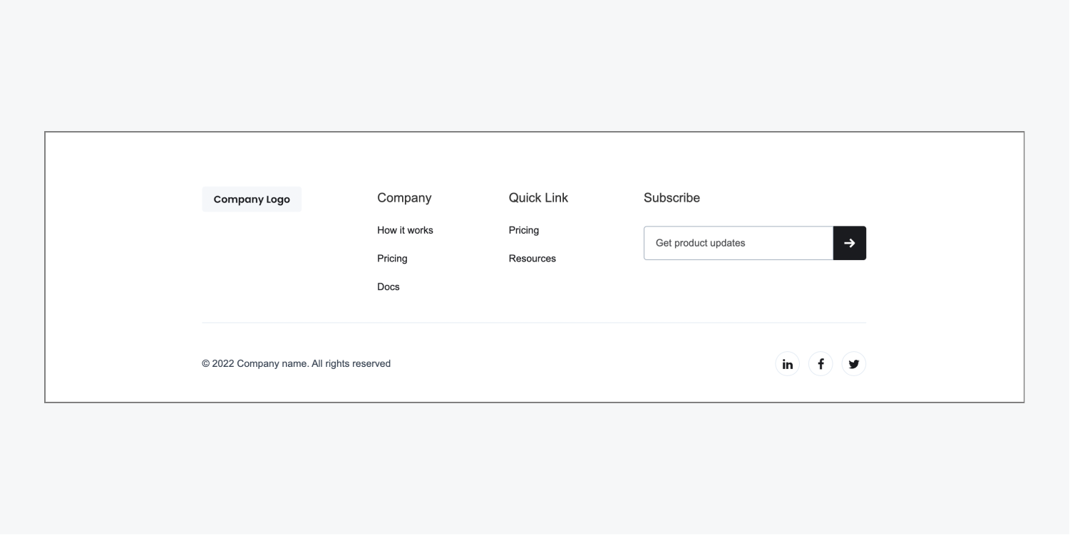
The footer light uses flexbox to display important links and information. On the left it has a placeholder image for a company logo, in the middle it has 2 sections with links underneath (“Company” and “Quick link”), and on the right it has a form where site visitors can enter their email address to subscribe to your content (e.g., product updates, monthly newsletter, etc.). The layout also contains a section below the main footer section to display copyright information and social media links.
Footer subscribe
The footer subscribe layout contains 3 horizontal sections. The top section contains a larger subscribe form. The middle section includes 5 navigation links and social media links. The bottom section displays copyright information, a link to “Terms of Use,” and a link to “Privacy Policy.”
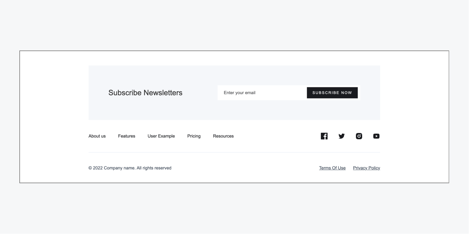
Real life footer example
