Webflow-created variants of an uploaded image. There is an original image and then variants with sizes of 2000px, 1600px, 1080px, 800px, and 500px.
When you upload images to your site, Webflow creates variants of your uploaded images to make sure they’re responsive and load quickly on any device. This can help your mobile pages load up to 10 times faster.
Making an image responsive means that your browser serves a different sized version of that image based on the size of the image on your page and the screen resolution (by adding srcset and sizes attributes to your <img> elements). To give the browser access to different sized versions of images, Webflow creates a set of variants for each image upon upload, then encodes instructions for your browser to know when to serve each variant.
Important: If your original images are compressed enough, Webflow uses your original images.
Manually generate responsive images across a site
Webflow measures your images and generates responsive variants as you work on a site page. But you may make changes that affect images on other pages (e.g., updating a Symbol or class). To ensure that all your images remain responsive, you can either visit the affected page, or use the shortcut Command + Shift + I (on Mac) or Control + Shift + I (on Windows), and the Designer will scan and re-measure all your pages for you.
Generate responsive images for sites built before September 2016
If you created your site before September 14th, 2016, you'll need to walk through a quick process to generate responsive images on your site. The next time you open the Designer, you'll see a modal asking you to start the migration process.
This process can take a few minutes, depending on the size of your site. If you'd rather do this later, you can start the process anytime from the Asset panel or by using the shortcut Command + Shift + I (on Mac) or Control + Shift + I (on Windows).
Disable responsive images
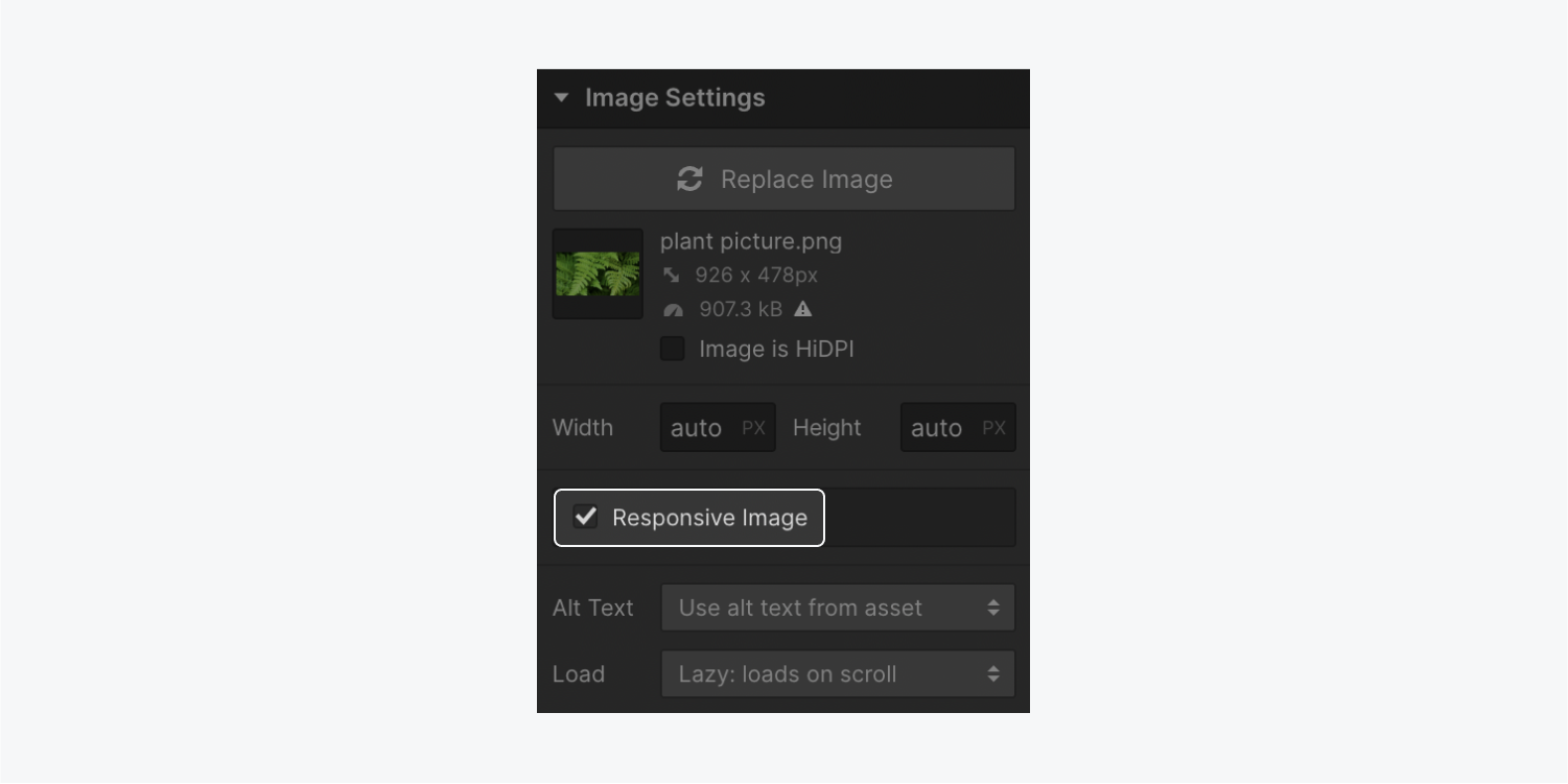
To disable this feature for a specific image (e.g., if you need to force the browser to use the original image size):
- Select the image on the Webflow canvas
- Type Command + Shift + O (on Mac) or Control + Shift + O (on Windows)
- Open Settings panel > Image settings
- Uncheck the Responsive image checkbox

Manage responsive images with interactions
Webflow creates responsive images from their normal states — not their hover states or interactions that may change the size of the image. After adding hover state styles or interactions, it's a good idea to go through your site and make sure everything looks okay before publishing.
In some cases, you may need to add additional styling to override the sizes attributes effect on image element dimensions. For example, you may need to set the image's width to 100% to fill its container.
Common questions about responsive images
What are the supported image types?
This feature generates responsive variants for all inline JPGs, PNGs, and WebP images, except those added via rich text elements. It also doesn't apply to background images. We recommend SVGs and PNGs for high detail or vector based images, since these have lossless compression.
How many variants are generated per image?
The number of variants Webflow generates depends on the image's original size. If it's bigger than 3200px wide, Webflow will generate 7 variants: 3200px, 2600px, 2000px, 1600px, 1080px, 800px, and 500px.
What size images should I upload?
You can upload any image size you'd like, provided it is smaller than our 4MB limit. Your browser will serve whichever variant is best, based on device size and resolution. For example, if you upload a 4000px wide original image but it is only rendered at 300px width on mobile, your browser will serve the 500px Webflow-created variant.
Are responsive variants exported?
Yes, responsive images will have srcset and sizes attributes in the exported site, and the variants will be in the /images folder of the .zip file along with your original images.
Helpful resources
You can learn more about responsive images on our detailed blog post on this topic.
We also recommend Eric Portis' article in A List Apart for those who want to dive deeper into responsive images tech.


