


Buttons are a crucial part of website navigation and serve as a call to action. Creating a custom color gradient border around the most important buttons on your website can enhance their visibility and capture visitors’ attention.
In this lesson you’ll learn:
- How to create a button
- How to apply a linear gradient border
- How to match the button color to the page color
- How to round out the button
How to create a button
Let’s first create a button and add call-to-action text.
To build the structure of the button:
- Drag a Link block from the Add panel onto the Webflow canvas
- Add a Text block inside the Link block
- Double click the default text to change it (e.g., “Contact us”)
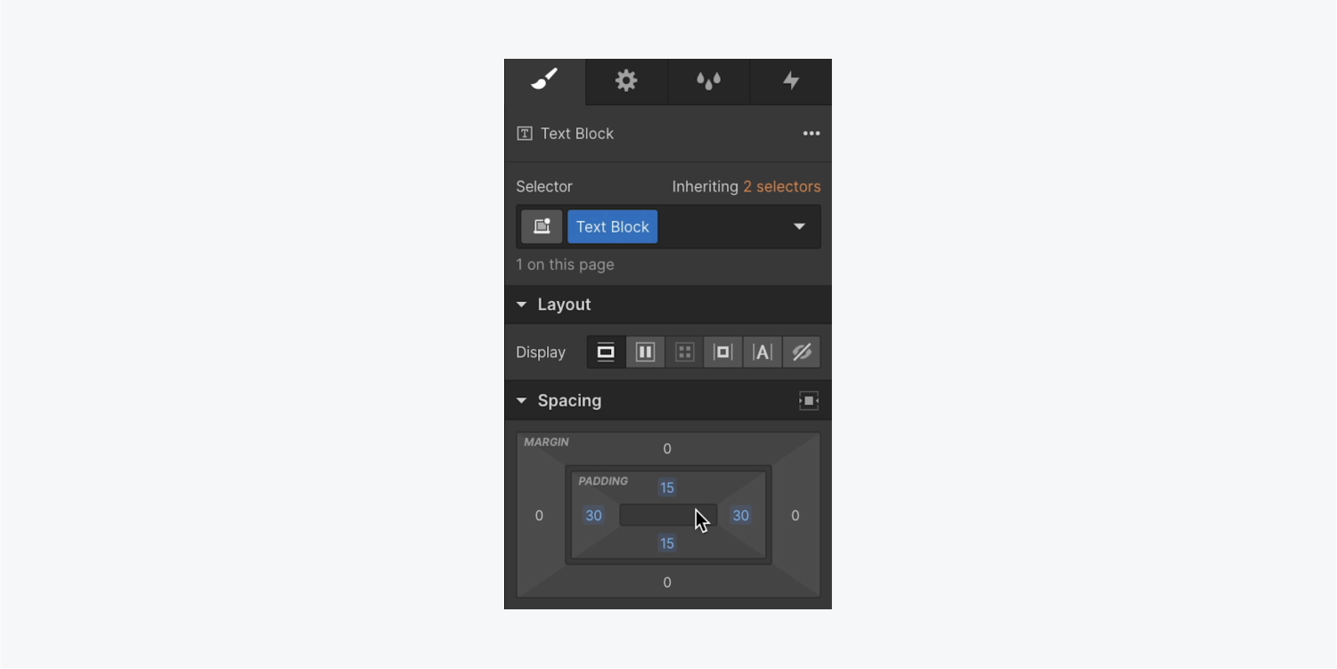
Let’s adjust the size of the button:
- Select the Text block
- Open Style panel > Spacing
- Add top and bottom padding of 15 pixels, and left and right padding of 30 pixels
Learn more about padding in our spacing lesson.
Good to know: To simultaneously increase or decrease margin or padding on complementary sides of an element, use Option + mouse drag (on Mac) or Alt + mouse drag (on Windows).
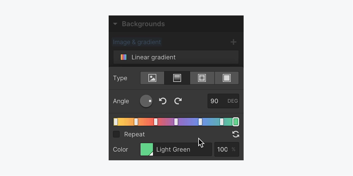
How to apply a linear gradient border
Now you can add a color gradient border to your custom button.
To add the gradient to the Link block:
- Select the Link block
- Open Style panel > Backgrounds
- Press the “plus” icon to the right of Image and Gradient and choose Linear gradient as the Type.
- Change the Angle of the gradient on the direction dial (e.g., 90 degrees)
- Click anywhere on the gradient bar to add a stop
- Click the color swatch below the gradient bar to choose a color for the gradient stop
You can add as many stops and colors as you want — this will create the gradient. Learn more about background gradients.
How to match the button color to the page color
You can match the Text block and page backgrounds to make the button appear transparent:
- Select the Text block
- Open Style panel > Backgrounds
- Click the swatch to open the color picker, and select a color to match the color of your page body background (e.g., “white”)
How to round out the button
Now you can round out the button’s edges:
- Select the Link block
- Open Style panel > Spacing
- Add padding to each of the four sides of the Link block (e.g., 3 pixels)
- Select the Text block
- Open Style panel > Borders and increase the radius (e.g., 50 pixels)
- Select the Link block
- Open Style panel > Borders and increase the radius (e.g., 50 pixels)
That’s it! Now you’ve got an amazing custom gradient border!
