A button serves as your call to action (CTA) and links to pages, forms, assets, and more.
In this lesson, you’ll learn:
- Button basics
- How to use button states
- How to use animated transitions
- How to use multiple buttons
- How to use custom link blocks
Button basics
To add a button to your site:
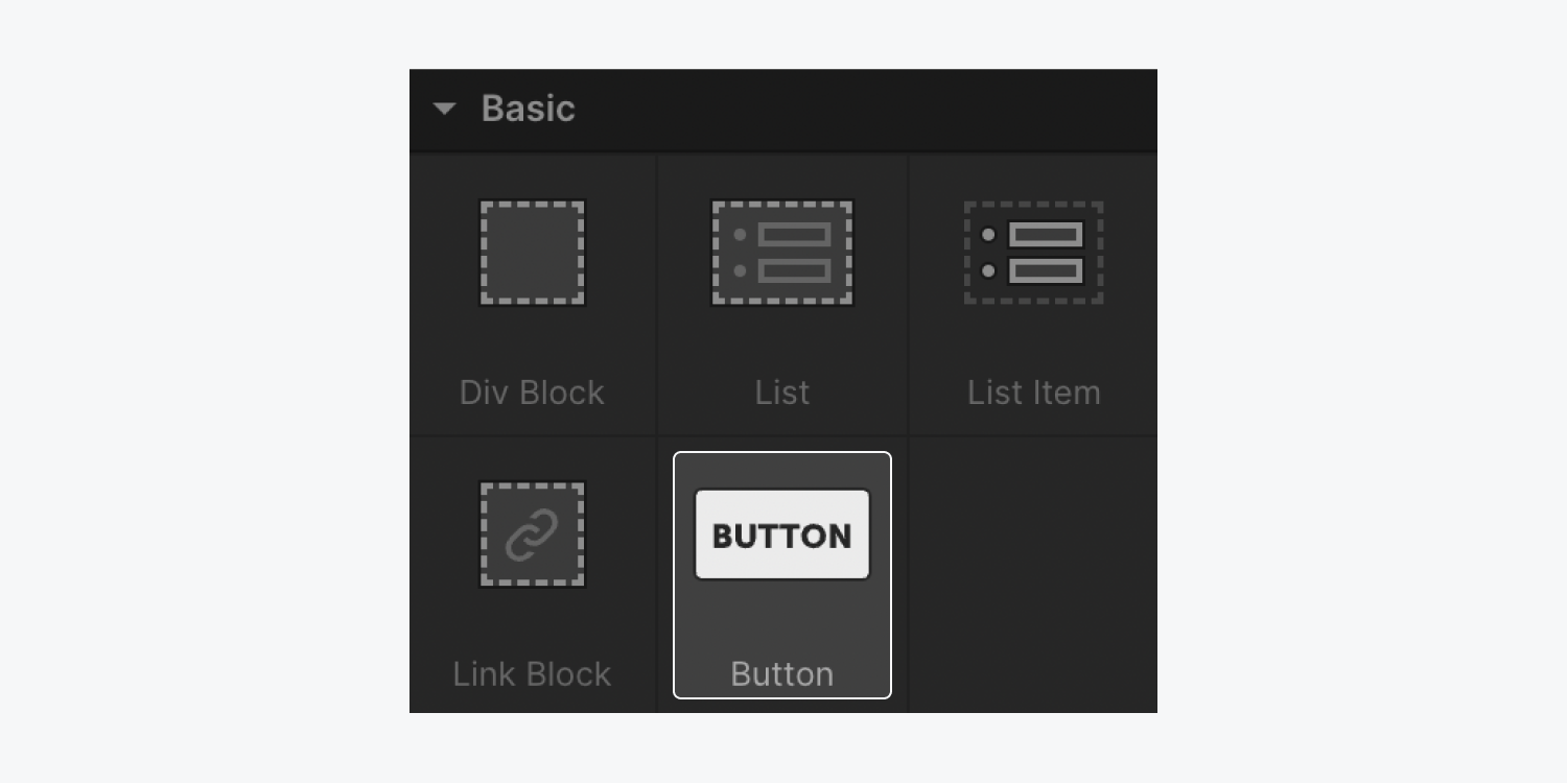
- Go to Add panel > Elements > Basic
- Drag a button element onto the Webflow canvas
You can edit the default button text in two ways:
- Double-click the button and edit the text
- Select the button and press Enter/Return
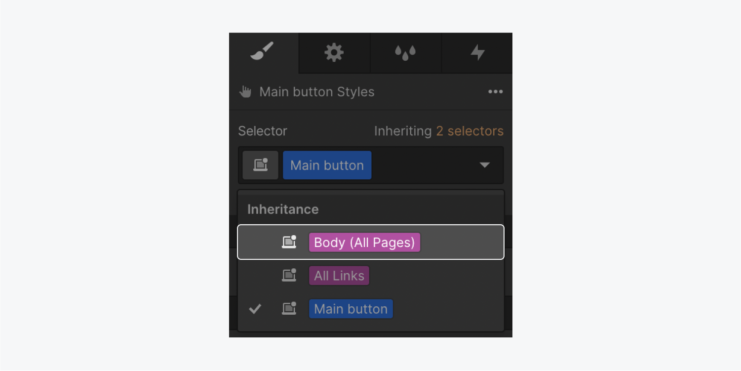
The button font and its typography styles are automatically inherited from the Body (All Pages) tag. You can go into the Body (All Pages) tag in Style panel > Selector field > Inheritance dropdown to set and override the typography defaults. Learn more about the Body (All pages) tag.
You can also change the color of your button. To change the button’s background color:
- Select the button
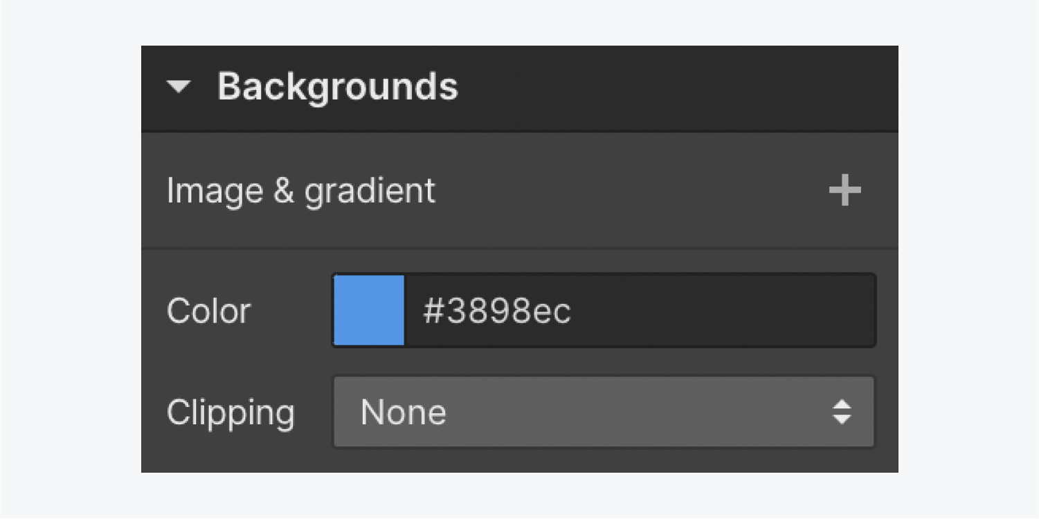
- Go to Style panel > Backgrounds
- Click the swatch to open the color picker
- Choose a color
When you make a change on a new element, a class is automatically created. Classes let you control and override styles. To reuse a style, click the class label and rename it in the Selector field of the Style panel.
The size of a button is determined by the text inside (text length, font size, line height) and padding (the space inside the button).
To override the default padding values:
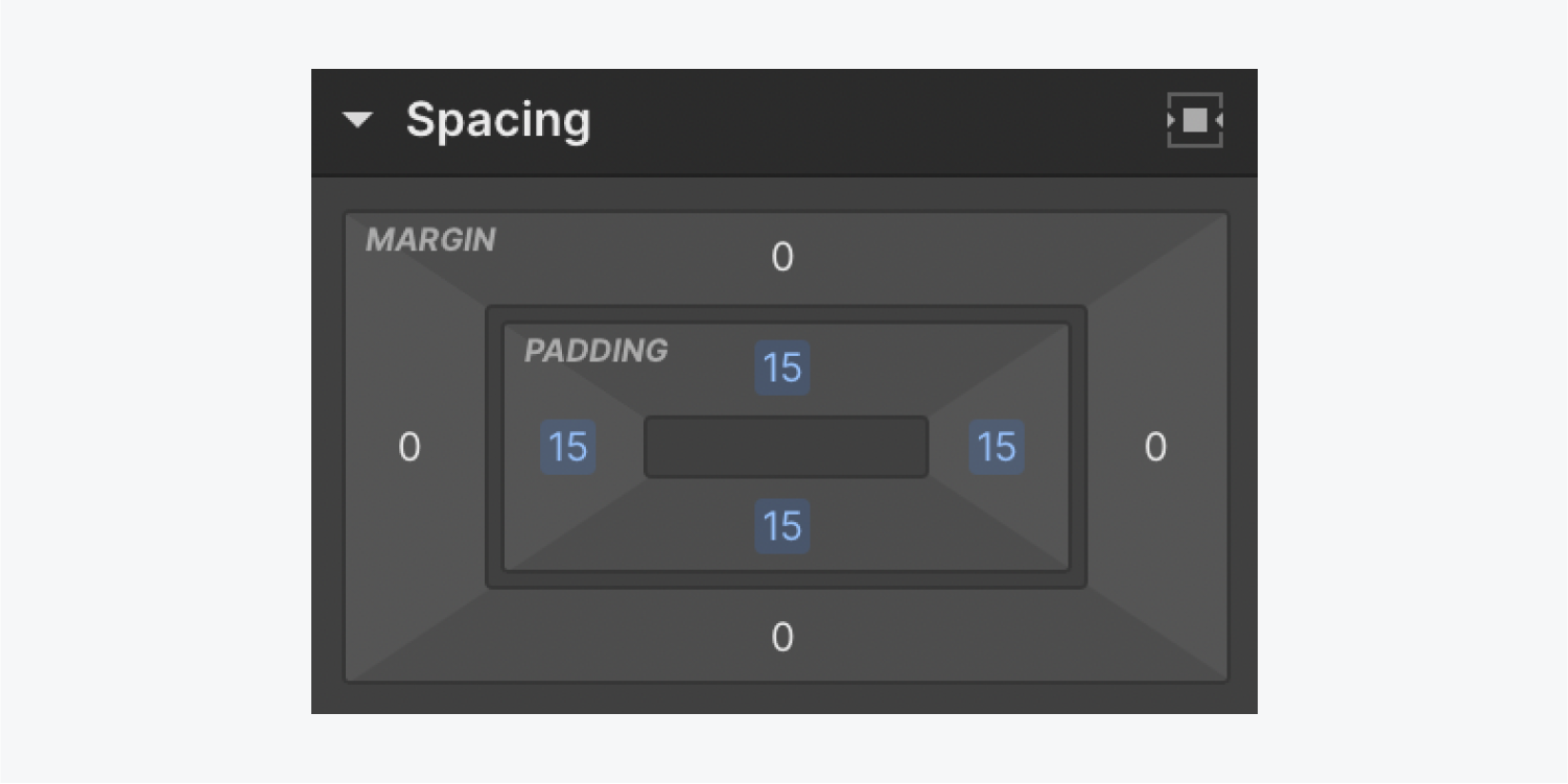
- Go to Style panel > Spacing
- Click and drag the padding control(s) on the side(s) you want to adjust
Pro tip: You can hold Option (on Mac) or Alt (on Windows), then click and drag one of the padding controls. This will adjust both opposing padding values at once (either the sides or the top and bottom). Additionally, you can hold Shift to adjust all 4 padding values at once.
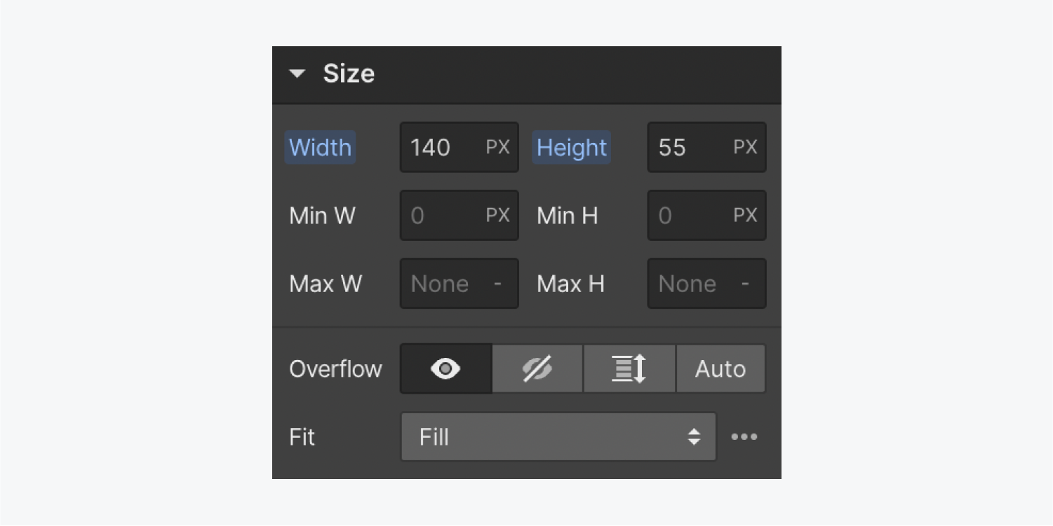
You can adjust the size of the button by changing its width and height in Style panel > Size.
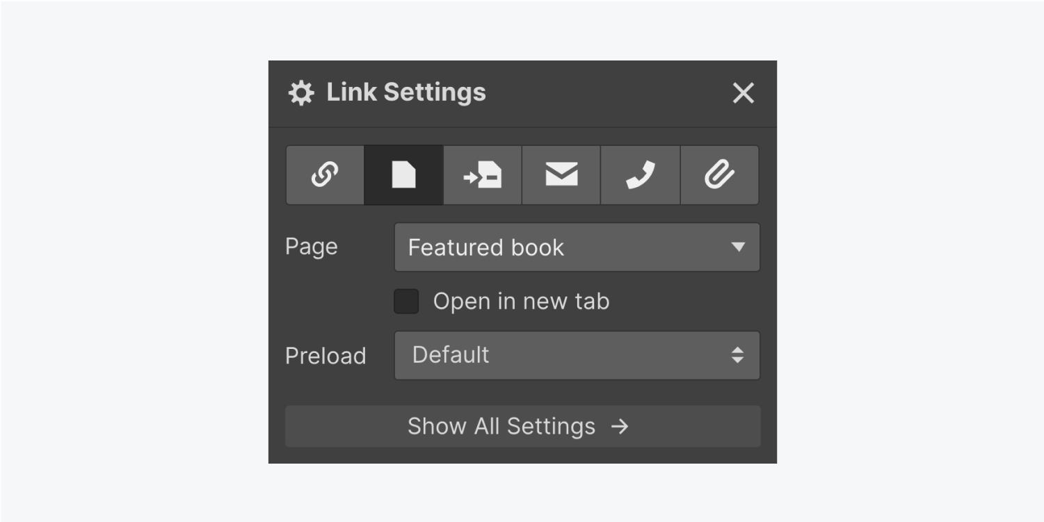
A button can link to a URL, an internal or external page, a page section, a file download, or it can trigger an email or a phone call. You can access these options by selecting the button on the canvas, then going to Element settings > Link settings or by clicking the “cog” icon on the button element on the canvas. Learn more about link settings.
How to use button states
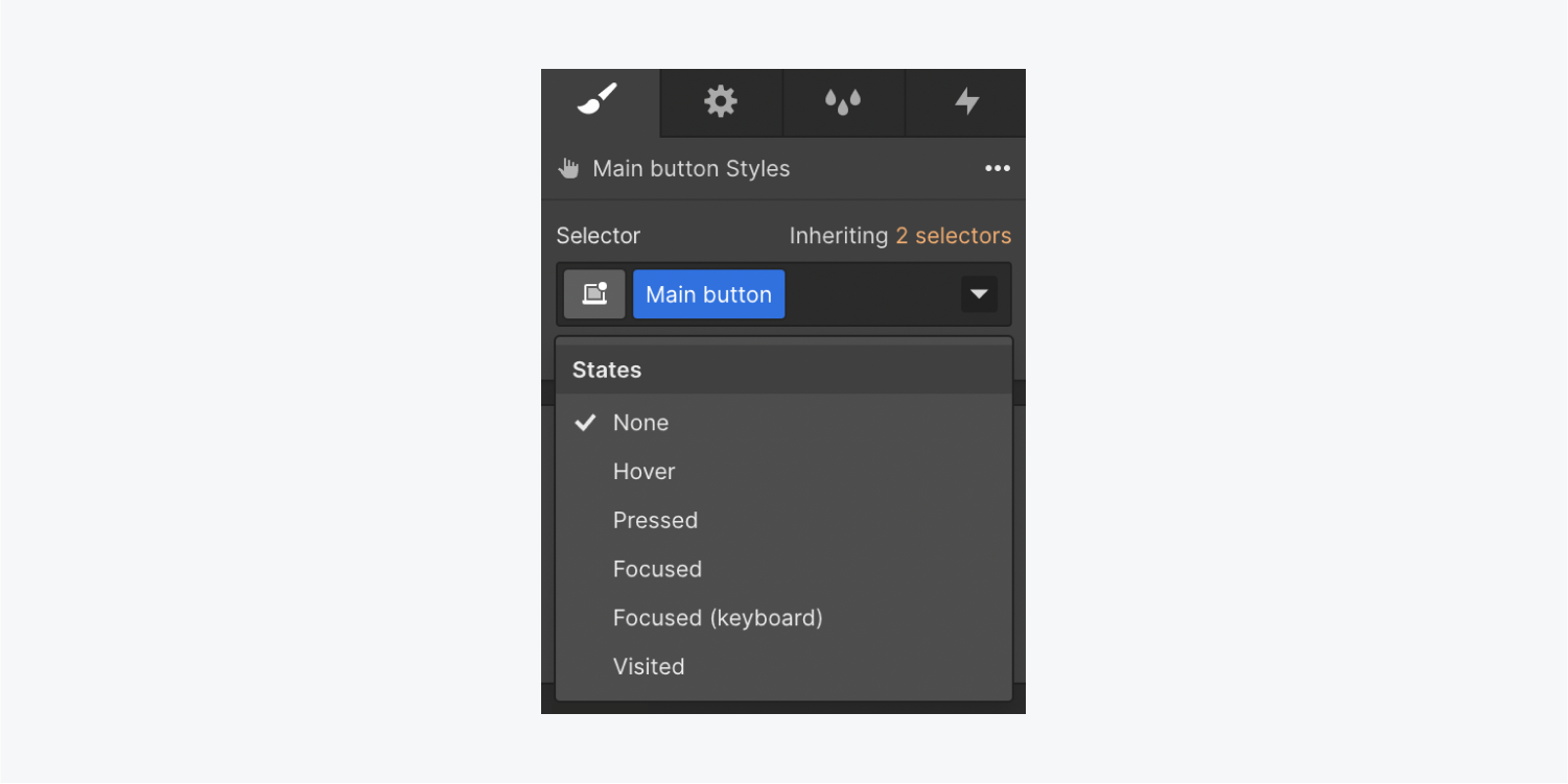
You can see your button states by going to Style panel > Selector field. By default, there’s no hover state styling on a button. There are 6 button states that you can style:
- None
- Hover
- Pressed
- Focused
- Focused (keyboard)
- Visited
You can style the button based on these states. For instance, you can design the button to have a drop shadow when a site visitor hovers over it.
To modify the button’s hover state:
- Select the button on the canvas
- Go to Style panel > Selector field and click the dropdown arrow
- Select hover
- Style the button
Learn more about adding transitions between states.
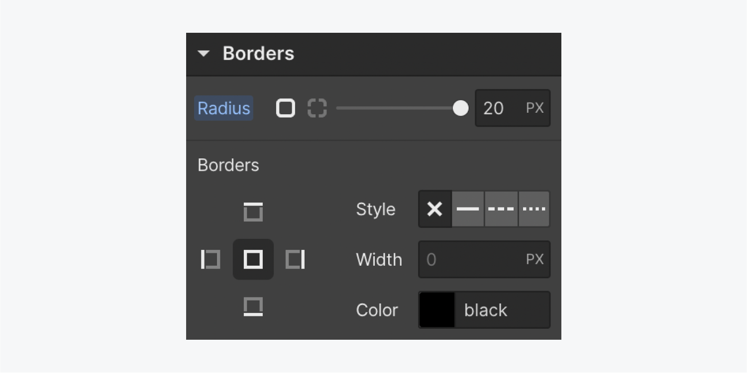
To play around with other button properties, switch out of the hover state to none back in the Selector field dropdown. Then, you can do things like round the button’s corners by changing the radius under the Borders section.
To add a box shadow to your button, go to Style panel > Effects > Box shadows. Here, you can configure the box shadow settings (e.g., soften the blur by setting it to 20px and set the angle to 180 degrees). Since this isn’t the hover state, you can set the distance and color opacity to 0. Later you can add a box shadow that will offset these values and make the hover effect more dramatic.
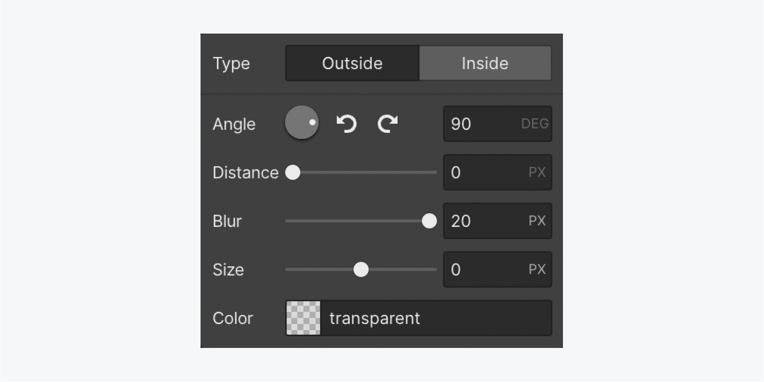
Now when you click back into your hover state, you can modify the same shadow you just created (and tweak the shadow to change on hover). You can increase the opacity (e.g., 20% opacity) and change the distance (e.g., 3px).
Then, return to the none state to test how your button works on hover.
How to use animated transitions
An animated transition makes moving between none and hover state more smooth.
To add a transition:
- Select your button on the canvas
- Go to Style panel > Selector field
- Click the dropdown and choose the none state (always add transitions from the none state)
- Go to Style panel > Effects > Transitions
- Click the “plus” icon
- Open the type dropdown and choose Background color
The default duration is set to 200, which means it will transition over 200 milliseconds. Now, you can hover over the button to test it out.

To animate the shadow, apply a transition to the Box shadow property and change the easing curve. The default is “ease,” but you can try a more dramatic start and a more gradual ending (“ease out circular” is a good choice). Because the start is so dramatic, you may want to expand the timing to 1000ms.
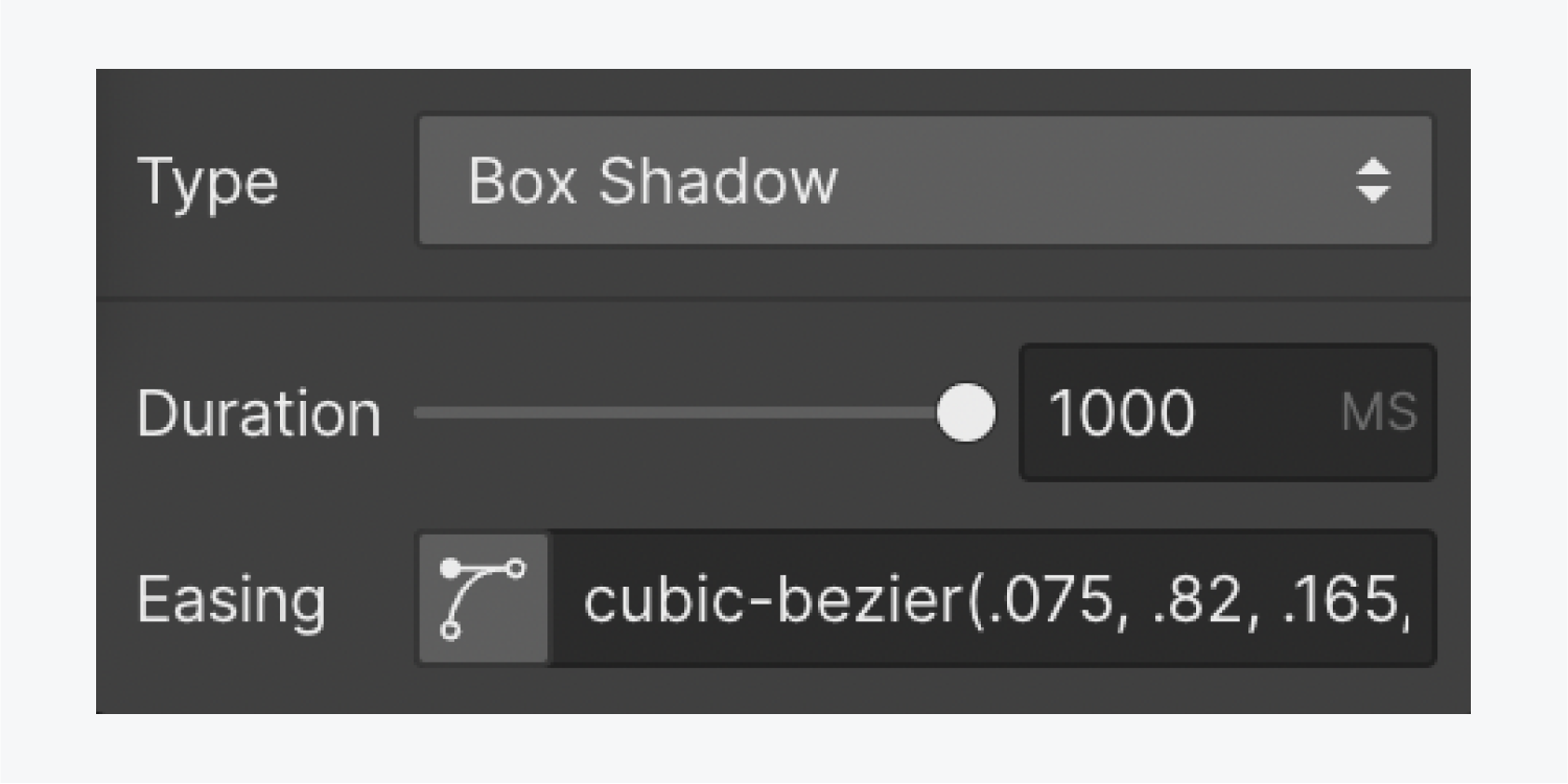
Now, you can hover over the button to preview your work.
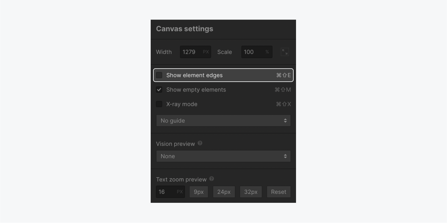
You can always press escape (on Mac and Windows) to deselect an element, but the element boundary (the blue outline when you hover to test) might be distracting. Next to the breakpoints icons, you can click the Canvas settings and uncheck to Show element edges.
To move the button on hover:
- Select the button on the canvas
- Go to Style panel > Selector field
- Click the dropdown to select the hover state
- Go to Style panel > Effects > 2D & 3D Transforms
- Click the “plus” sign
- Add a move value (e.g., 3px on the x-axis).
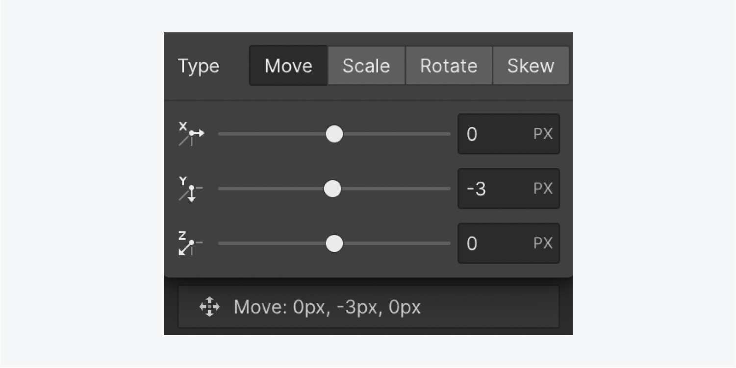
You can also add a transform transition. To add a transform transition:
- Select the button on the canvas
- Go to Style panel > Selector field
- Click the dropdown to select the none state
- Go to Style panel > Effects > Transitions
- Click the “plus” sign
- Choose Transform from the type dropdown menu
- Change the easing (e.g., to “ease out circular”)
- Change the duration (e.g., 1000ms)
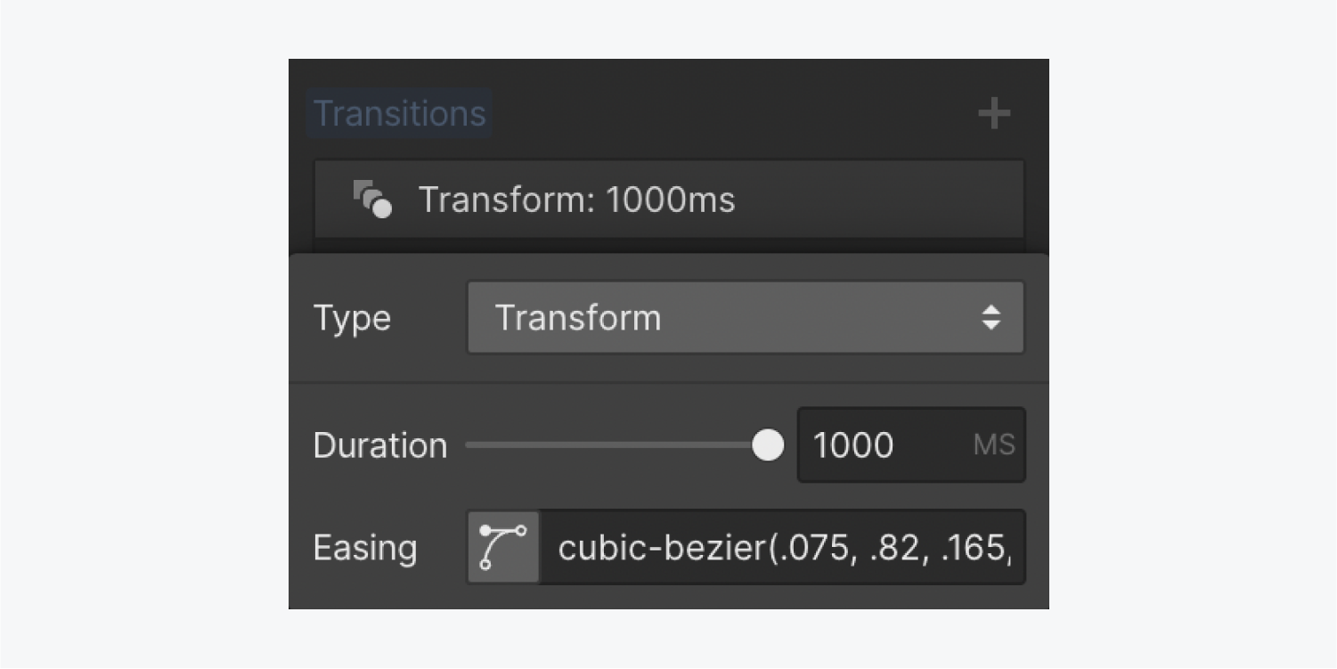
Check out your work in preview mode by clicking the “eye” icon on the top left corner of the Designer.

How to use multiple buttons
You can copy and paste a button to place a new button next to your original button. Remember that style changes you make to any button with the same class will affect all buttons with that class (such as changing the margin or padding).
Instead of adding a special class to buttons in your hero section, you can add a div block, name it (e.g., “Button wrapper”), and drag each button inside. This lets you manage one button class and set a negative margin for perfect alignment.
This works on everything — you can use a button wrapper (with negative margin) to offset any symmetrical margin you’ve set on any other buttons. You won’t have to manage different groups of buttons just because their alignment is different.
How to use custom link blocks
A link block is just like a div block — it’s a box you can put elements inside. Drag a Link block onto your canvas from Add panel > Basic and name it to apply a class.

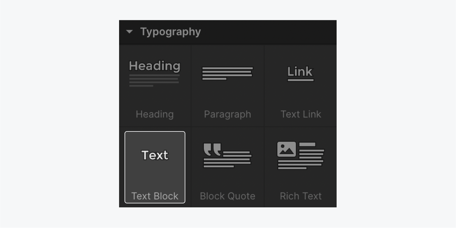
Then go to Add panel > Typography and drag a Text block onto the canvas inside the Link block. You can double click to edit the text. To get rid of the underline, go to Style panel > Typography > Style and click the “X” in decoration. You can also change the link color in Style panel > Typography.
You can add an icon (e.g., an arrow) inside the link block. If you use the Style panel to enter the value instead of clicking and dragging the corner to resize the icon, the class that’s automatically created will let you change the arrow size every time you reuse this link block throughout your site.
To align your icon inside the button, change the settings in Style panel > Layout (e.g., display: flex, align: center) and adjust your margins under Spacing.
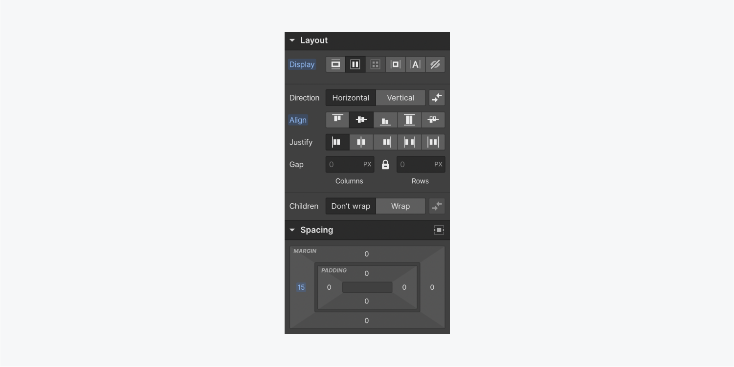
And because you added flex to the main button class, your two buttons on the top will take up the full width of the “Button wrapper” div block. To fix this, choose your “Button wrapper” in the Navigator, and go to Style panel > Layout and set display to flex.
This is just the beginning — there’s so much more you can do, especially with interactions and animations. We have a full course and tons of videos and lessons on these topics — so check those out on Webflow University if you haven’t already.


