A banner serves as a call-to-action and is a way to draw visitors’ attention to important announcements on your website. You can place banners anywhere and style them however you like, but this lesson walks through the structure and animation of a typical announcement banner — one that slides out from under the navbar on page load. We’ll also show you how to animate the banner so it changes color after the slide animation.
In this lesson, you’ll learn:
- How to create a banner
- How to add and style the banner text
- How to hide the banner before animation
- How to add interactions to animate the banner
- How to add interactions to change the banner colors
How to create a banner
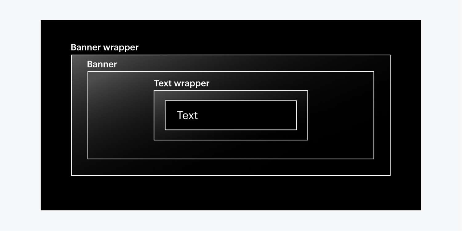
To build the structure of the banner:
- Drag a Div block from the Add panel onto the Webflow canvas
- Add a class to the Div block (e.g., “Banner wrapper”)
- Add another Div block inside the banner wrapper
- Add a class to the second Div block (e.g., “Banner”)
- Open Style panel > Backgrounds and click the swatch to set the banner’s background color
How to add and style the banner text
To add text to the banner:
- Add a third Div block inside the banner
- Add a class to the third Div block (e.g., “Text wrapper”)
- Open Style panel > Size and set a Max W (e.g., 980 pixels)
- Open Style panel > Spacing and set the margin on both sides to auto
Learn more about auto margin in our Spacing lesson.
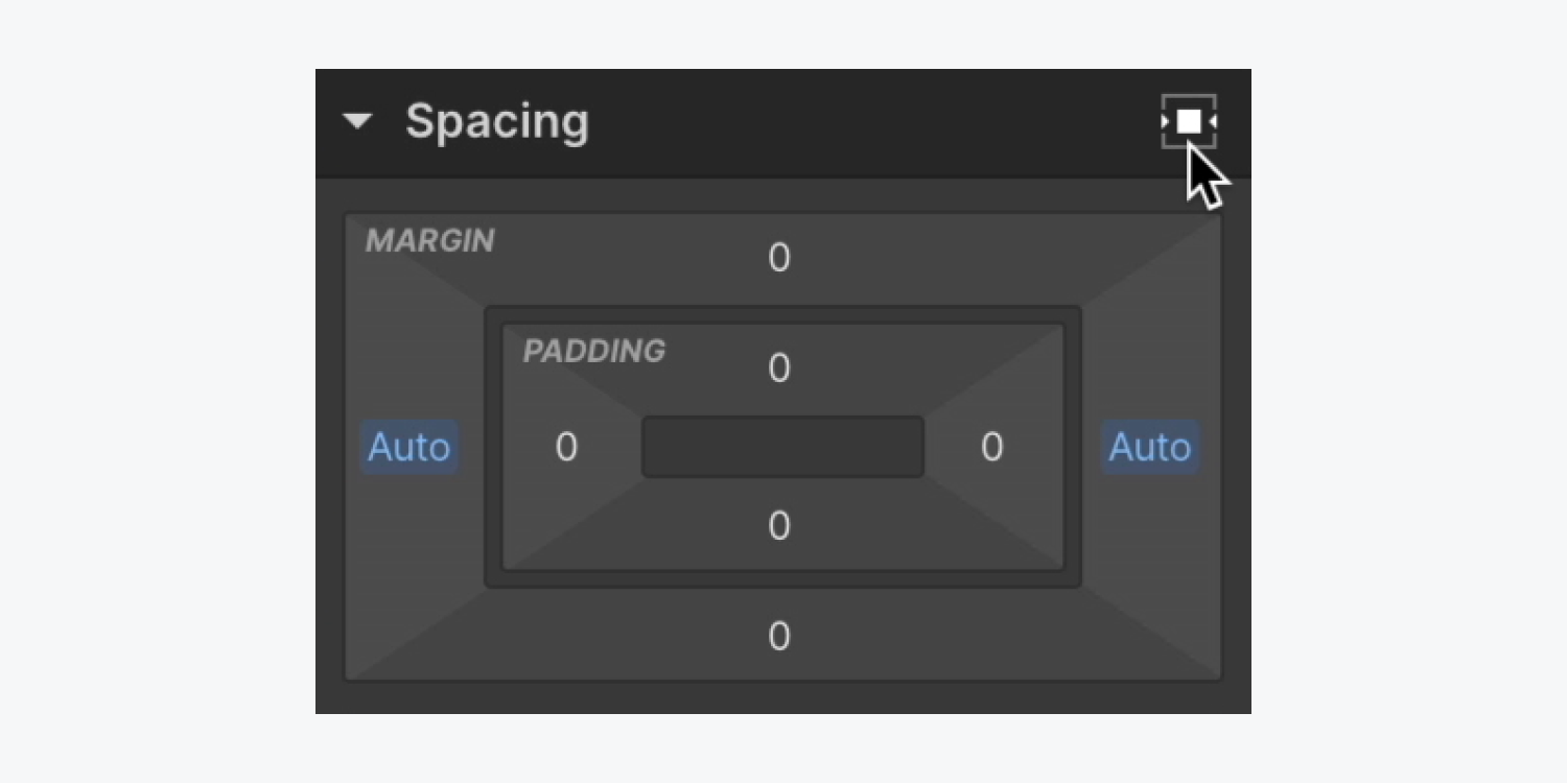
To add and style the banner text:
- Drag a Paragraph from the Add panel into the text wrapper
- Open Style panel > Typography
- Click the color swatch in color to change the color of the text
- Click center in align to justify the text
- Open Style panel > Spacing and change the bottom margin to 0
- Add padding on all 4 sides (e.g., 15 pixels)
Good to know: To simultaneously increase or decrease margin or padding on all 4 sides of an element, use Shift + mouse drag (on Mac) or Shift + mouse drag (on Windows).
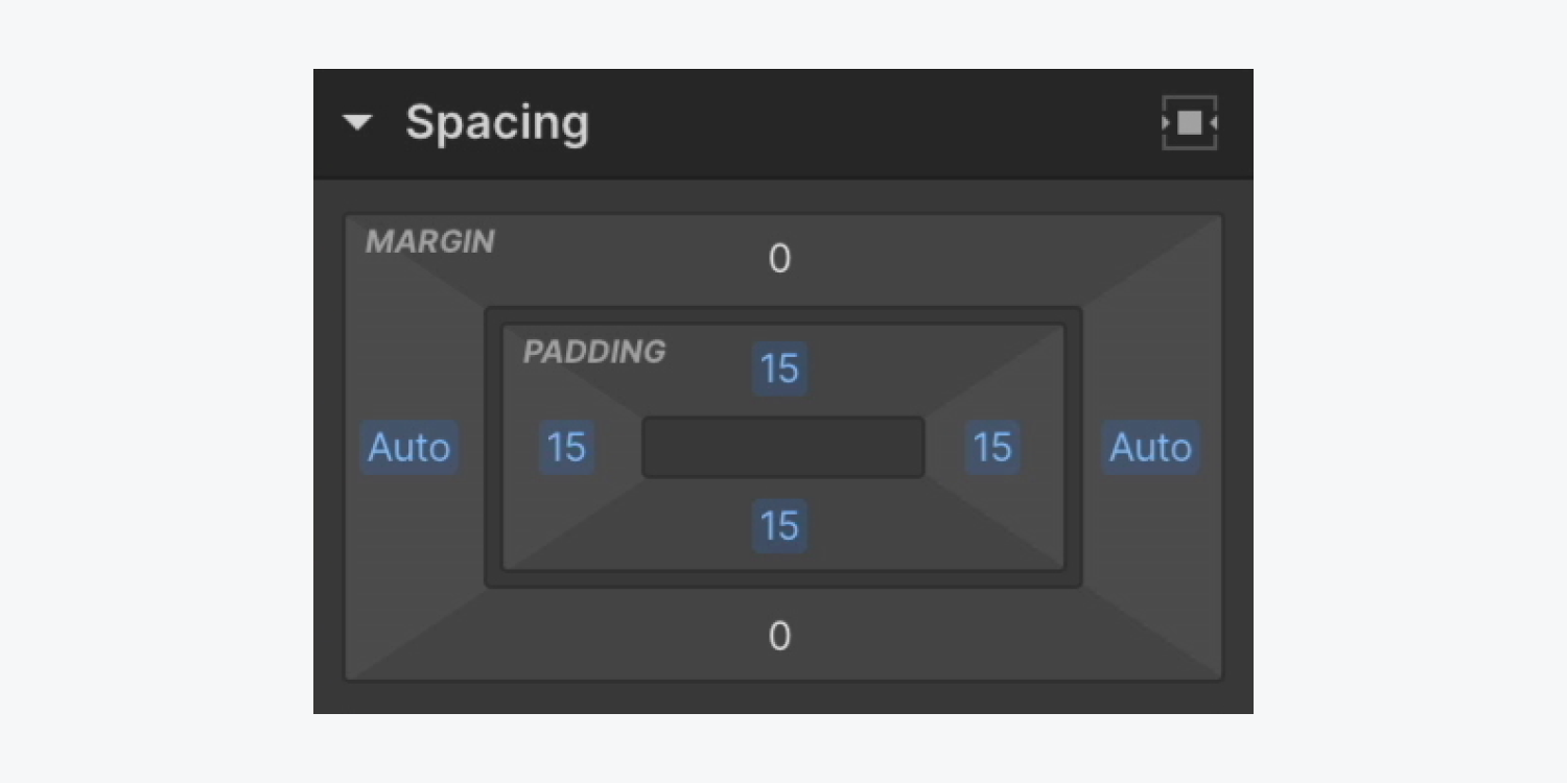
Note: You can add any element (e.g., Text link, Image, Button, etc.) into the banner.
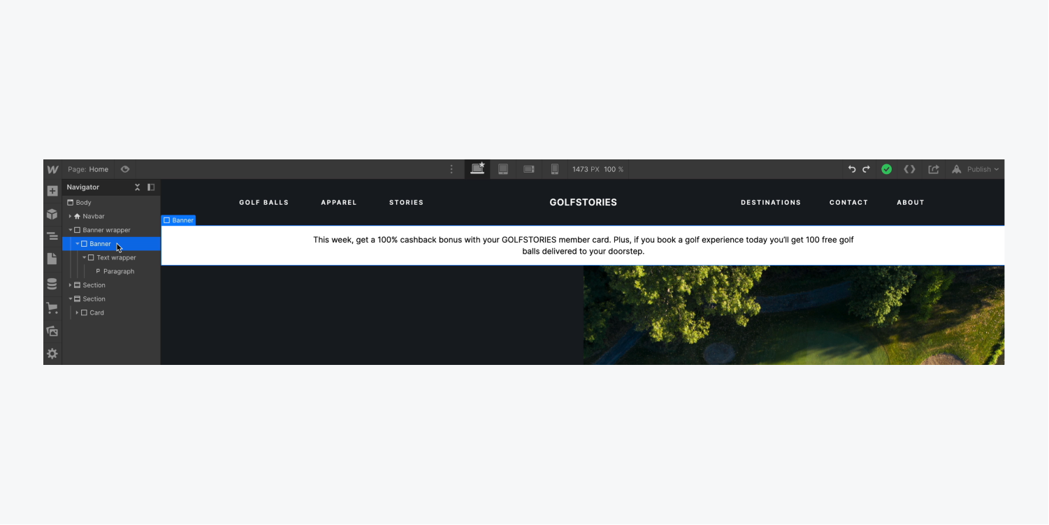
How to hide the banner before animation
To ensure the banner is hidden before the animation starts:
- Select the banner wrapper
- Open Style panel > Size
- Set Overflow to hidden
Learn more about Overflow: hidden.

How to add interactions to animate the banner
To create the initial state where the banner is out of view:
- Select the banner and open the Interactions panel
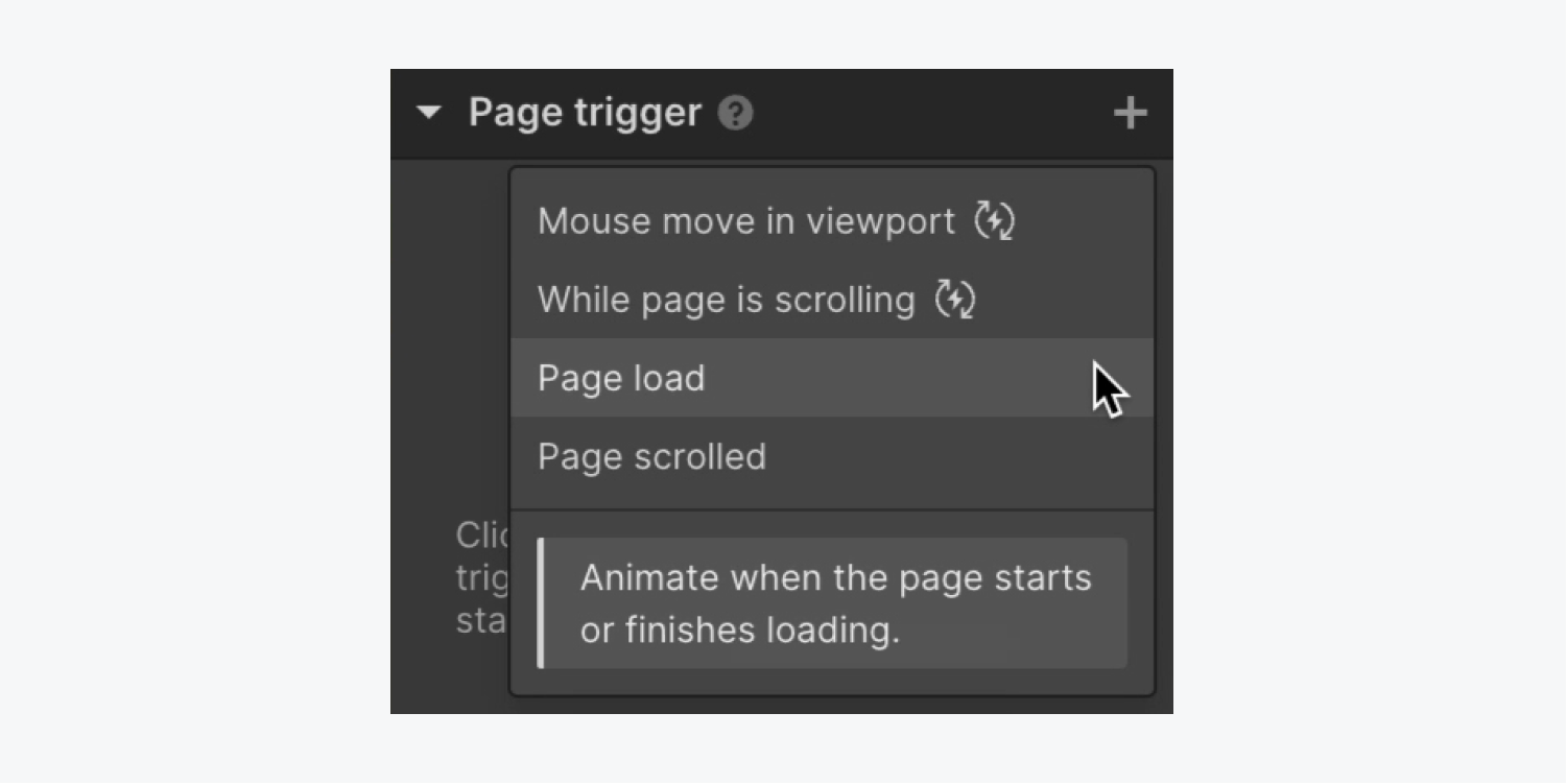
- Click the “plus” icon to the right of Page trigger and select Page load
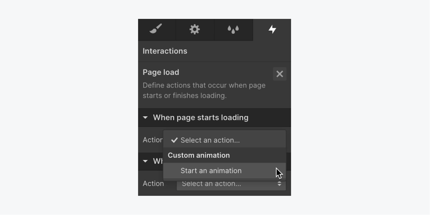
- Click the Action dropdown menu in When page starts loading and choose Start an animation
- Click the “plus” icon to the right of Timed animations and name it (e.g., “Banner slide in”)
- Click the “plus” icon to the right of Actions and choose Transform > Move
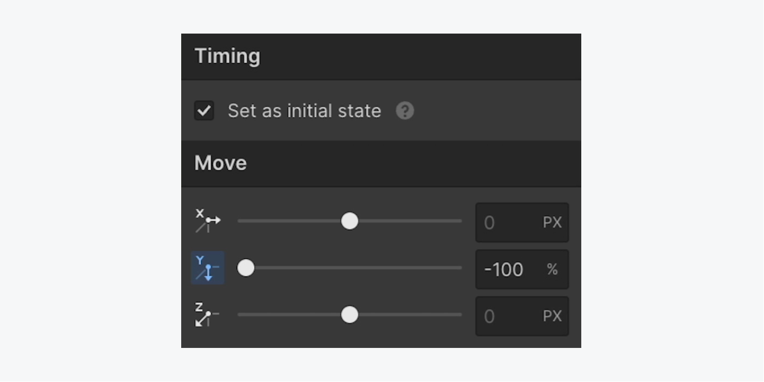
- Set the Y axis to -100% in Move
- Check the Set as initial state checkbox in Timing
In the same Interactions panel animation, you can create the fully loaded state where the banner is in view:
- Click the “plus” icon to the right of Actions and choose Transform > Move
- Set the Y axis to 0% in Move
Learn more about Interactions in our Triggers and animations lesson.
To control your animation further, you can adjust its speed or delay its start after the page loads.
To change its speed:
- Open Timing > Easing
- Choose custom to adjust the easing curve
To delay the animation following page load:
- Open Timing > Start
- Set a delay (e.g., 0.2 seconds)
Learn more about easing in our Interpolation, easing, and smoothing lesson.
How to add interactions to change the banner colors
In the same Interactions panel animation, you can make the banner’s background change colors after it slides into view:
- Select the banner
- Click the “plus” icon to the right of Actions and choose Style > BG color
- Click the swatch and choose a color in Interactions > Background
- Set a delay (e.g., 2 seconds) in Timing > Start
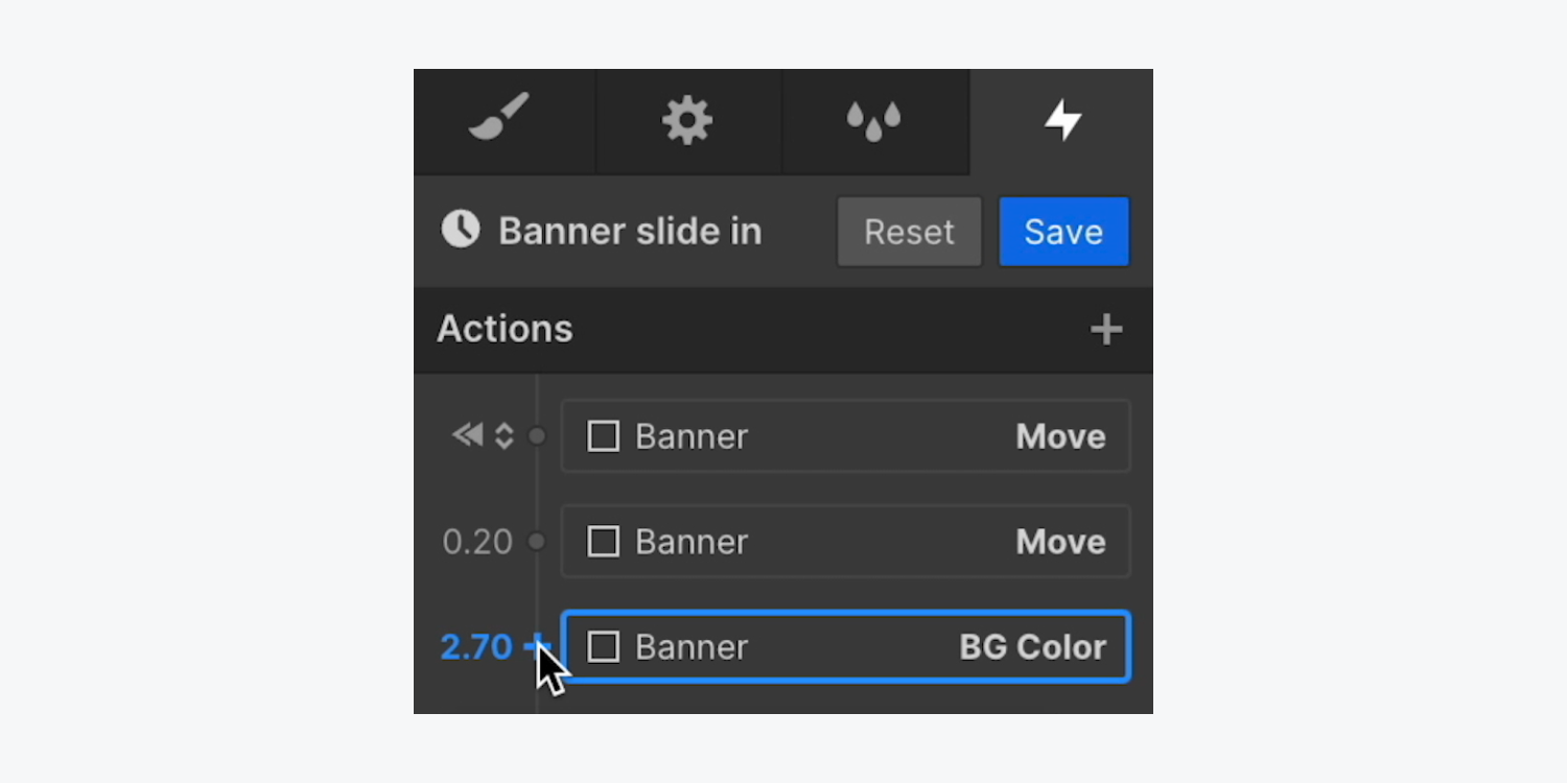
In the same Interactions panel animation, you can also change the text color at the same time the background color changes:
- Select the Paragraph
- Click the “plus” icon to the left of the BG color animation and choose Style > Text color
- Click the swatch and choose a new text color in Interactions > Typography


