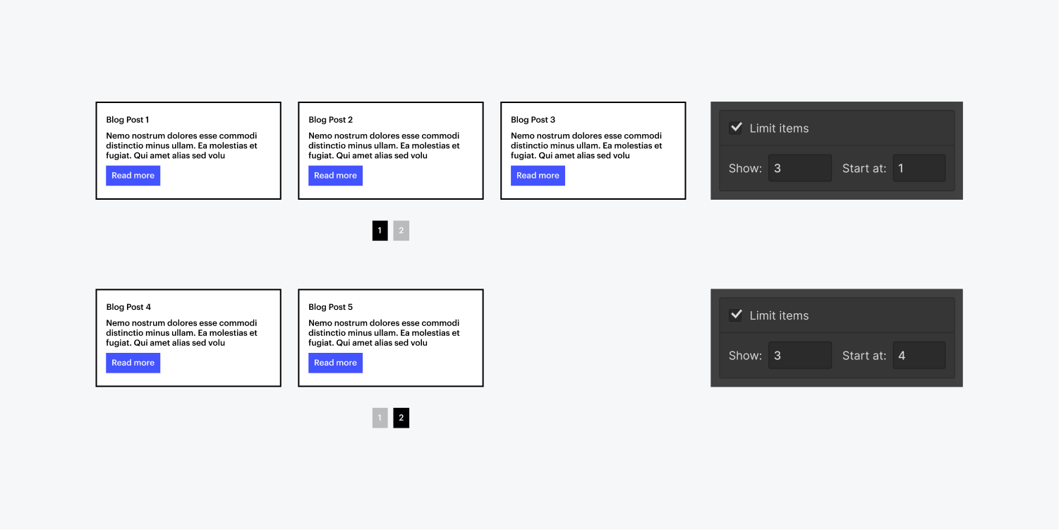
You can paginate a collection list and specify how many items you want to show per collection list page. This has a lot of benefits both when it comes to designing your collections and performance of your pages. With pagination, you’ll be able to:
- Display more than 100 collection Items from your collection in a single collection list
- Display fewer collection items per page so the page performs better and loads faster
- Create custom dynamic sliders for latest arrivals, latest blog posts, products on sale, and so on
In this lesson
- Paginate a collection list
- Understand the anatomy of the pagination wrapper
- Configure pagination settings
- Share the URL of a collection list page
- Add a second pagination wrapper in the same collection list
- Learn about pagination and SEO
- Troubleshoot known issues and FAQs
- Create a custom pagination with numbered pages
Paginate a collection list
To enable pagination on a selected collection list, go to the Element settings panel and check Paginate items. Optionally, you can change the number of items you want to display per page.
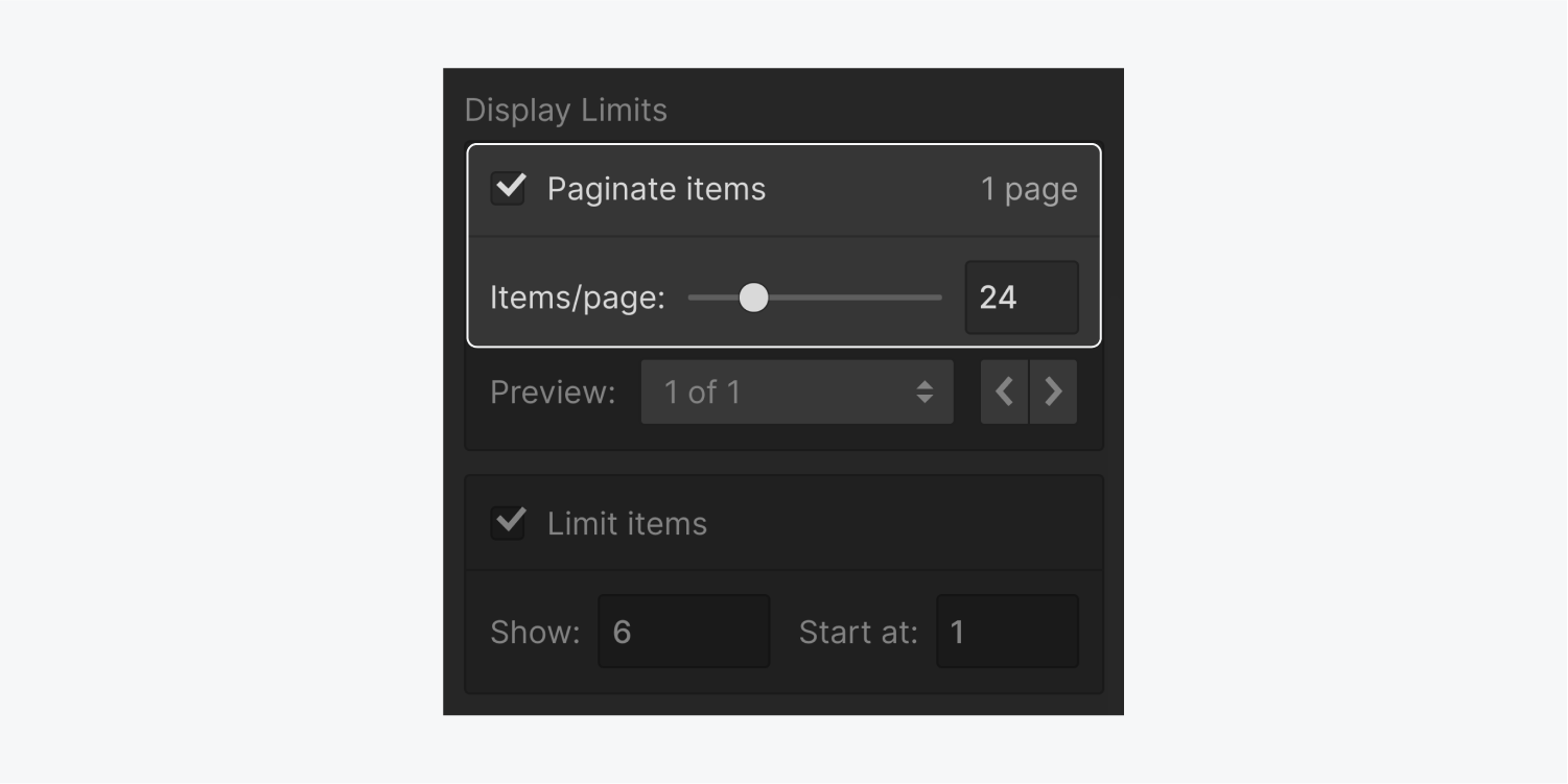
Paginate Items (checkbox)
This checkbox allows you to enable or disable pagination on the selected collection list. Disabling and re-enabling pagination will restore previous settings and component styles.
Number of pages indicator
This read-only text string indicates how many collection list pages will be generated based on the specified Items/page value.
Items/page (slider/number input)
This control allows you to specify how many items to show per collection list page. The minimum number you can specify is 1, the maximum is 100. The setting instantly affects the collection list on the canvas and updates the number of pages indicator in the settings.
Understand the anatomy of the pagination wrapper
Once you enable pagination on a collection list, a new pagination component will be added to the collection list wrapper. You can see this at any time in the Navigator. This component includes two link blocks: the previous and next buttons.
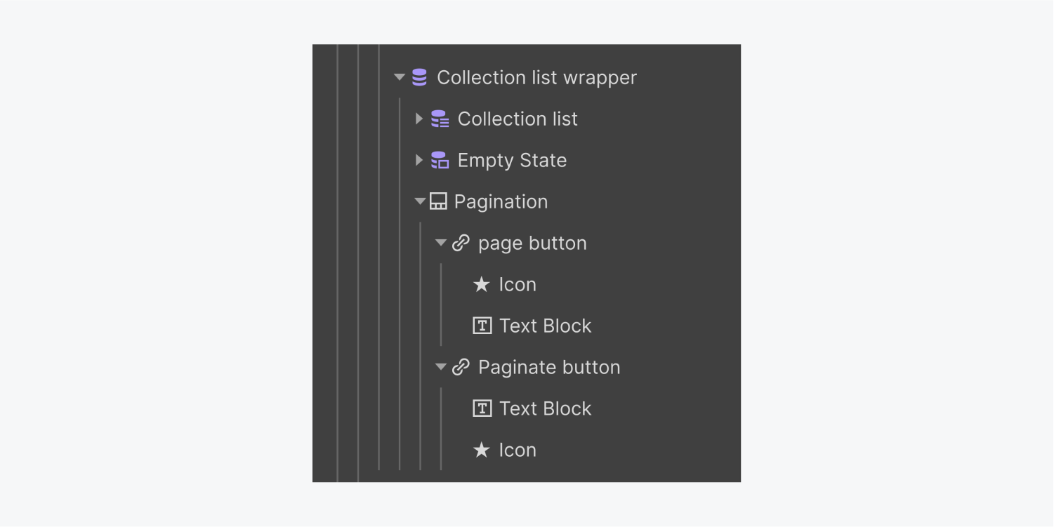
On the canvas, you’ll see the next button if your collection list has more items than the number of items/page you’ve specified in your collection list settings. To see both previous and next buttons, switch to a different page from the pagination settings or by clicking next in preview mode.

Configure pagination settings
When the pagination wrapper is selected on the canvas, you can see the pagination settings in the Elements settings panel. You can also access the settings right on the canvas by pressing enter or double-clicking the pagination wrapper.
Page
This pagination setting allows you to go to a specific collection list page using the dropdown, or switch to the previous or next pages using the arrows. This is useful to gain access to the previous and next buttons when you want to style and customize these buttons. It also allows you to preview the collection list pages right on the canvas.
You can also preview the collection list pages and test your pagination buttons in preview mode.
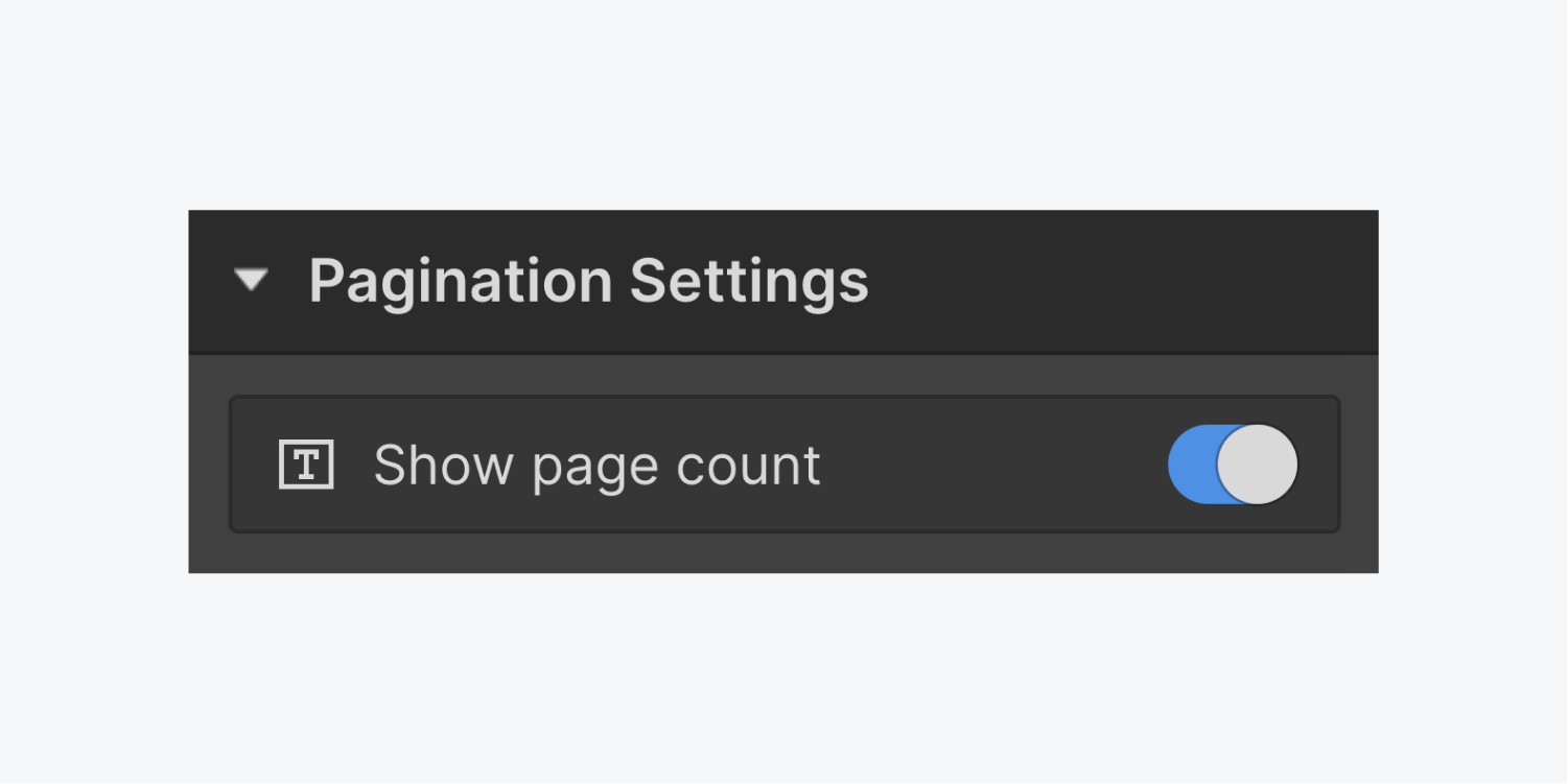
Show page count
This setting allows you to show the current and total pages in your collection list. It adds a new text block to your pagination wrapper which you can move around within the wrapper and style like you would any other text block.

Share the URL of a collection list page
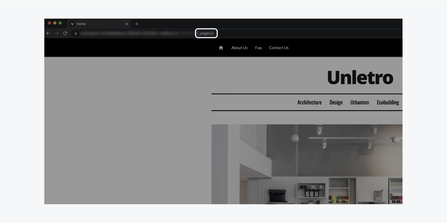
Collection list pages have uniques URLs which allow your site visitors to share a direct link to that page. So, for example, if you happened to come upon a friend’s picture and info on a blog’s authors’ page, and it happens that their name appears on page 3 of the authors’ list, you’ll be able to share that exact page with them by copying the URL from the address bar.
Customize and style the pagination buttons
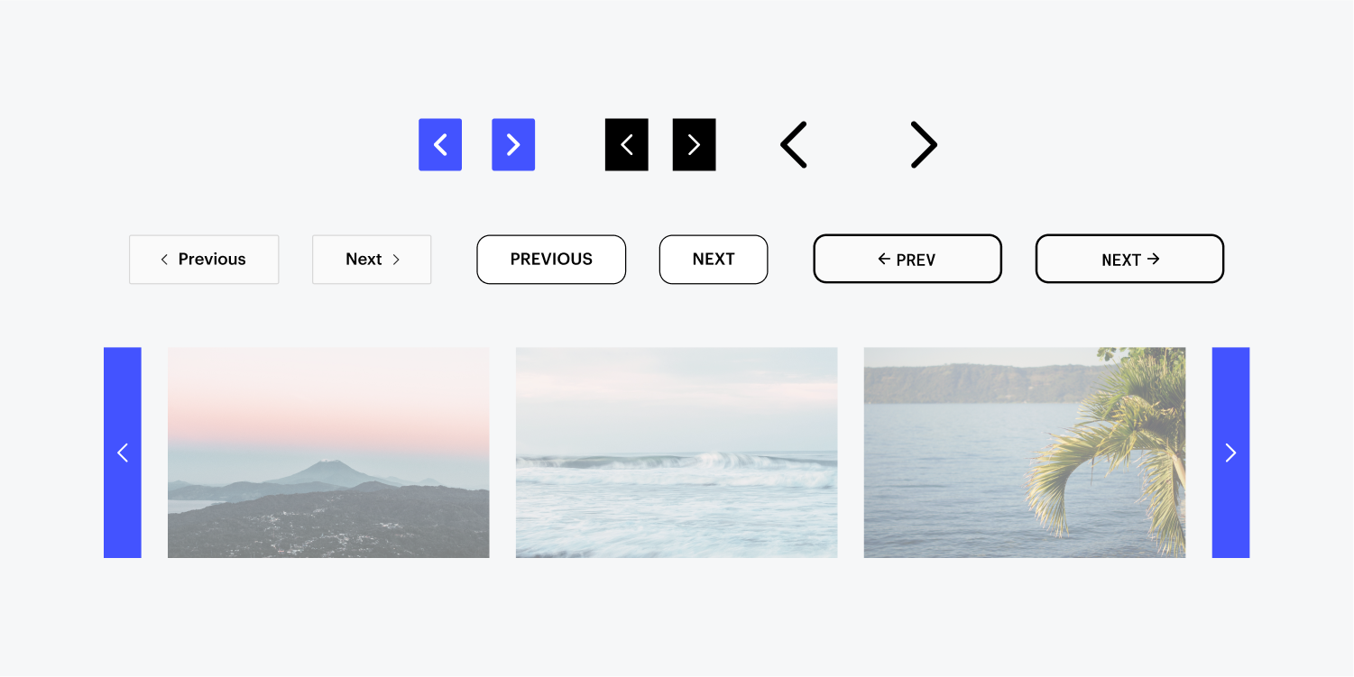
You can style the pagination buttons just like you would style any other button. You can change the color of the icon by applying a font color to the icon or the button link block. You can also replace the icon with any other image from your assets panel. To maintain the default size and position of the icon, you can set the width or height of your image to 20px and add a right or left margin of 4px to create a gap between the icon and the text.
Add a second pagination wrapper in the same collection list
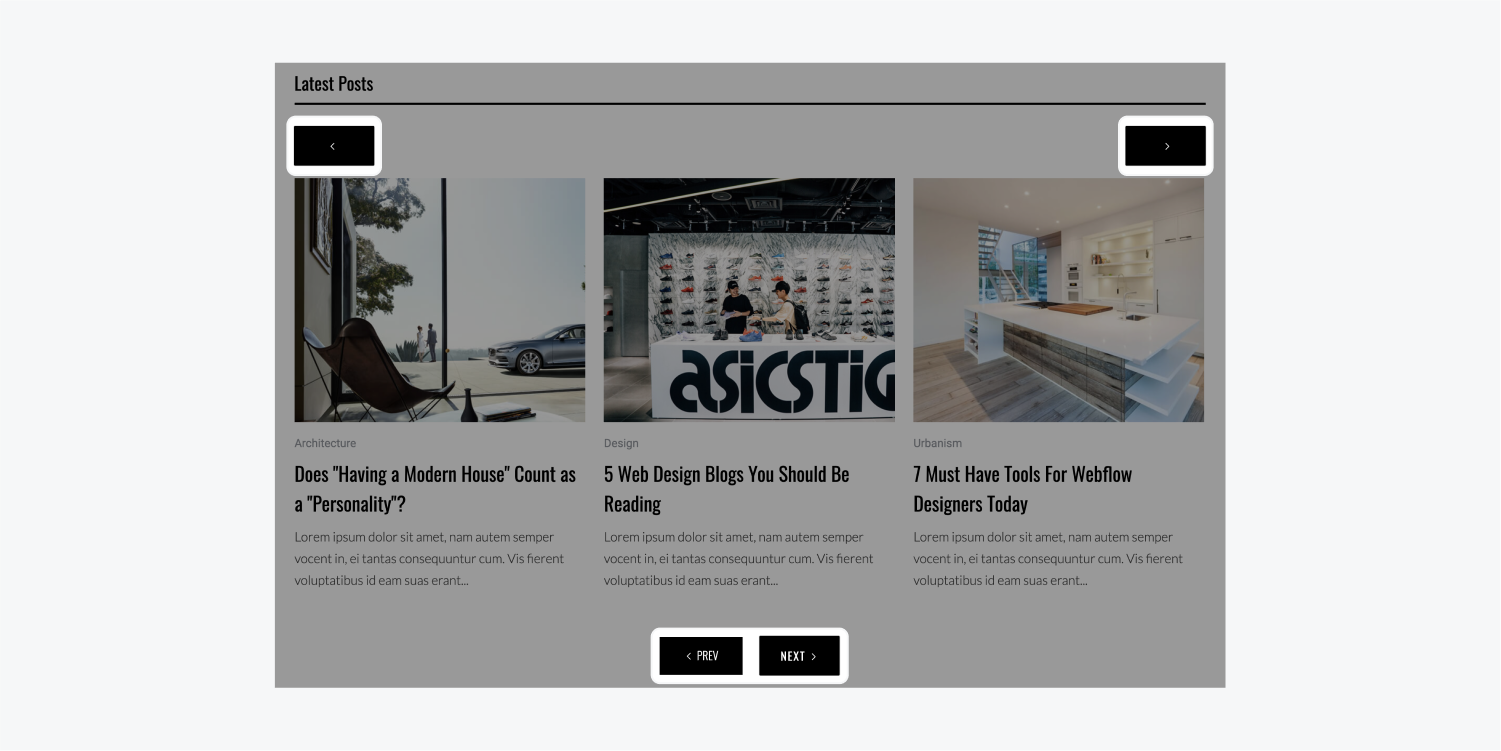
You can duplicate the pagination wrapper and move it anywhere inside the collection list wrapper as long as it remains a direct child of the collection list wrapper.
For collection lists with a large number of items/page, it is useful to add a second pagination to the top of the collection list. You can drag the duplicate pagination list in the Navigator for precision.
Learn about pagination and SEO
Since paginated content is very common on the web, search engines, like Google, index paginated pages and return the most relevant results to searchers.
Advanced SEO setup
Again, you don't need to do anything to index your paginated pages, search engines take care of it for you. However, if you wish so, you can help the search engines by indicating your paginated content.
Resources
Troubleshoot known issues and FAQs
I cannot add more than 100 items per collection list page
By default, a collection list can show a maximum of 100 items at a time. This limit exists for performance reasons and to keep page load speeds to a minimum. To show more than 100 items in a collection list, enable pagination. This will allow you to display all your collection items over multiple pages. However, again, for performance reasons, each collection list page can only show up to a maximum of 100 items.
I cannot see the pagination buttons
The pagination buttons won’t be visible in two cases:
- when your collection list has only one item
- when items/page is larger than the total number of items in a collection list.
Fix for 1 — make sure that you have at least two items in your collection list.
Fix for 2 —set a lower number in the items/page field
Content from collection list pages don’t appear in Webflow site search results
Only the first pagination page will be indexed because that is the one that is shown without any query strings.
I cannot paginate Search results
Support for the Search results list is coming in the near-future.
Can I stop the page from reloading and moving to the top of the page when navigating through a paginated Collection List?
With some custom code, you can. Check out this tutorial on how to create a seamless pagination experience.
Create a custom pagination with numbered pages
The current version of pagination consists of only two buttons: “previous” and “next”. The ability to add customized page numbers and links will be coming in the future. For now, here's a workaround using Sliders and multiple collection lists:
- Add a slider element
- Select the Arrows and set their display to nonw
- Set the background color to transparent in the Styles panel (S)
- Set the slide nav to number labels in Element settings (D)
- Drop a collection list into slide 1 and connect it to a collection
- Create and style your collection list
- Optional: set a sorting order
- Limit the collection to show only 3 items
- Copy the collection List
- Select slide 2 and paste the list
- Set start at to 4
Slide 1 will display items 1, 2, and 3. Slide 2 will display items 4, 5, and 6. If you need more pages, duplicate the slides and set the start at value for each collection list.
