When you're in the Designer, you can interact with elements in your project visually on the canvas. This is an easier way to engage with elements as opposed to locating a snippet of code for an element you want to edit. You can just click the element on the canvas.
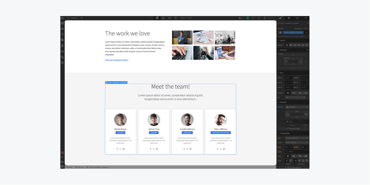
You can also interact with elements in the Designer through the Navigator, and the Navigation bar, but in this article we'll focus on the canvas and the four aspects of interacting with elements on the canvas:
- Selection - clicking on elements to select them
- Hierarchy - viewing and selecting an element’s parent
- Movement - clicking and dragging to relocate an element
- Preview - seeing how an element will appear on a live site
Selection
To select an element on your canvas, point your cursor at the element and just click it.
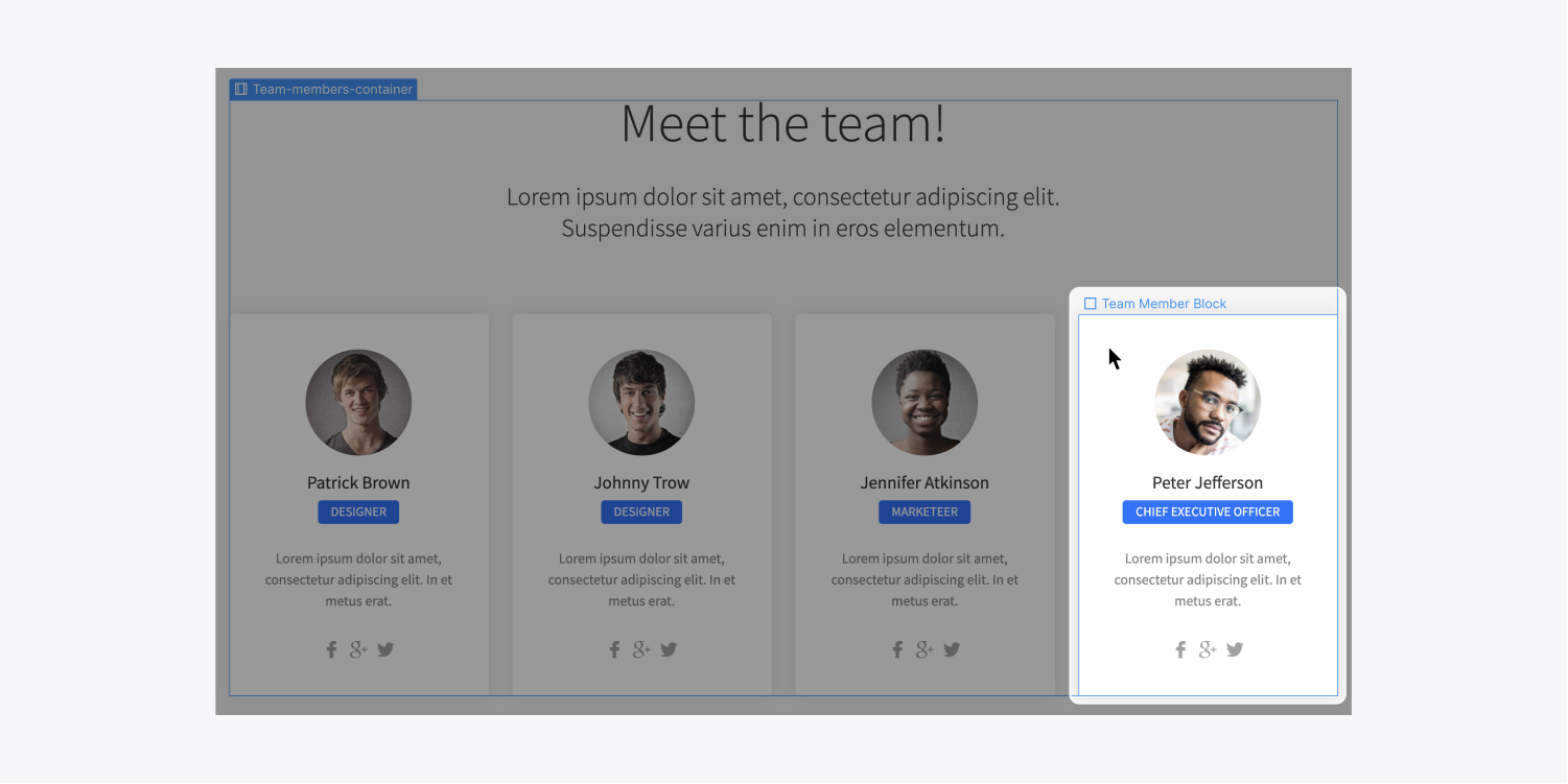
Notice that as you hover over elements on the Canvas, a blue outline highlights the edge of each element. This indicates which element you are selecting on the canvas.
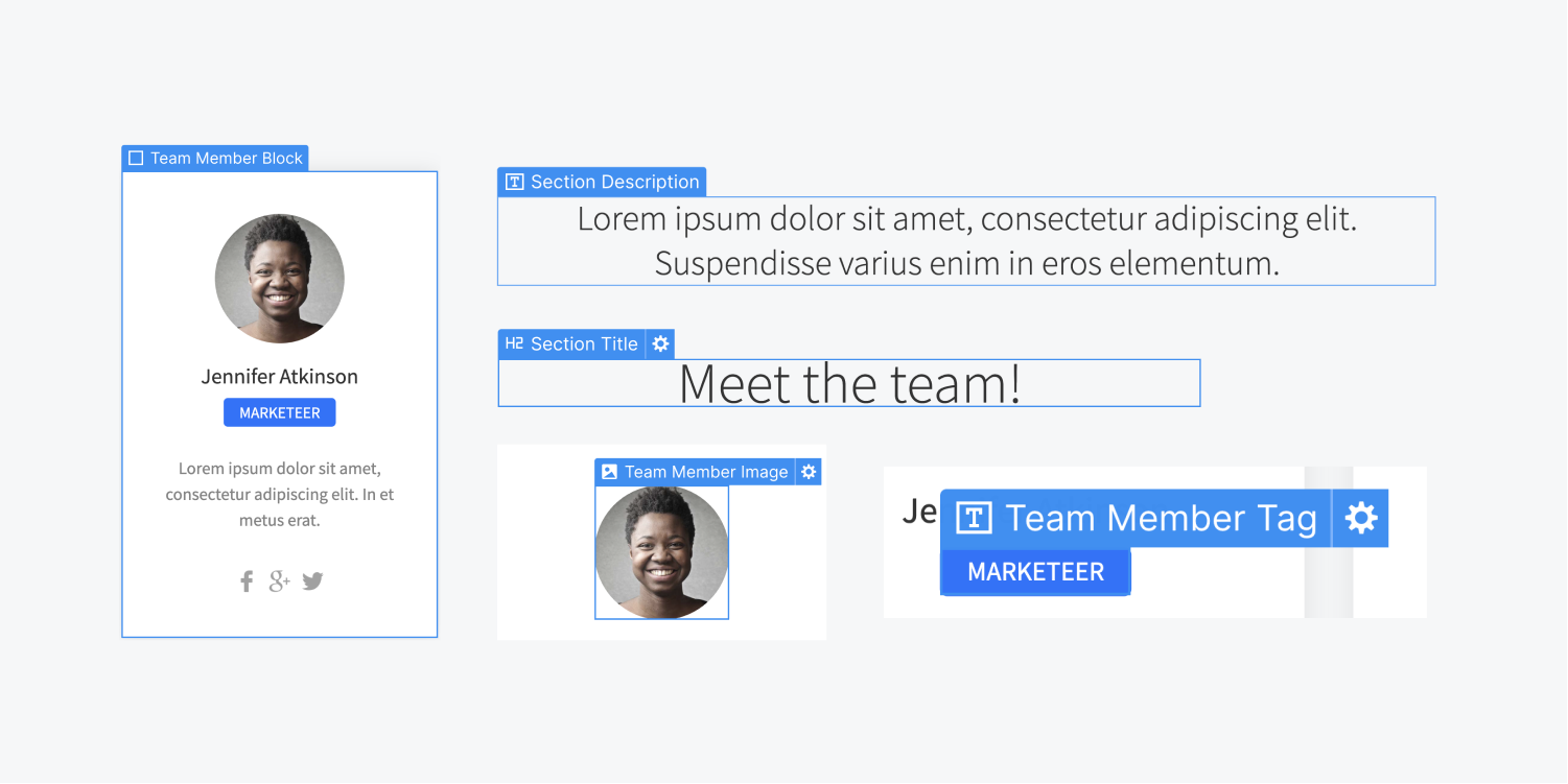
Selecting an element will show the element label at the top-left corner of the selected element. For elements that have more setting options, a gear icon will appear to the right of the label. You can click that icon to access those settings.
Hierarchy
You can view the hierarchy of an element and select its parent or grandparent element in several ways:
- Click the label
- Use the Navigation breadcrumb bar
- Right click the element
- Press the up arrow on the keyboard
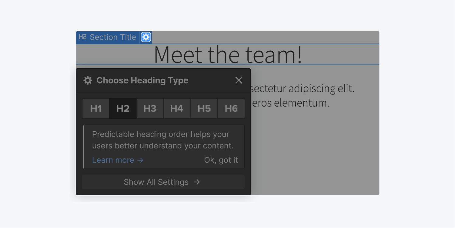
Click the label - when an element is selected, click its label to see the names of its parent and grandparent elements. You can select the parent element by clicking its label in this menu. This is helpful if a child element is sitting inside a parent element that is difficult to select.
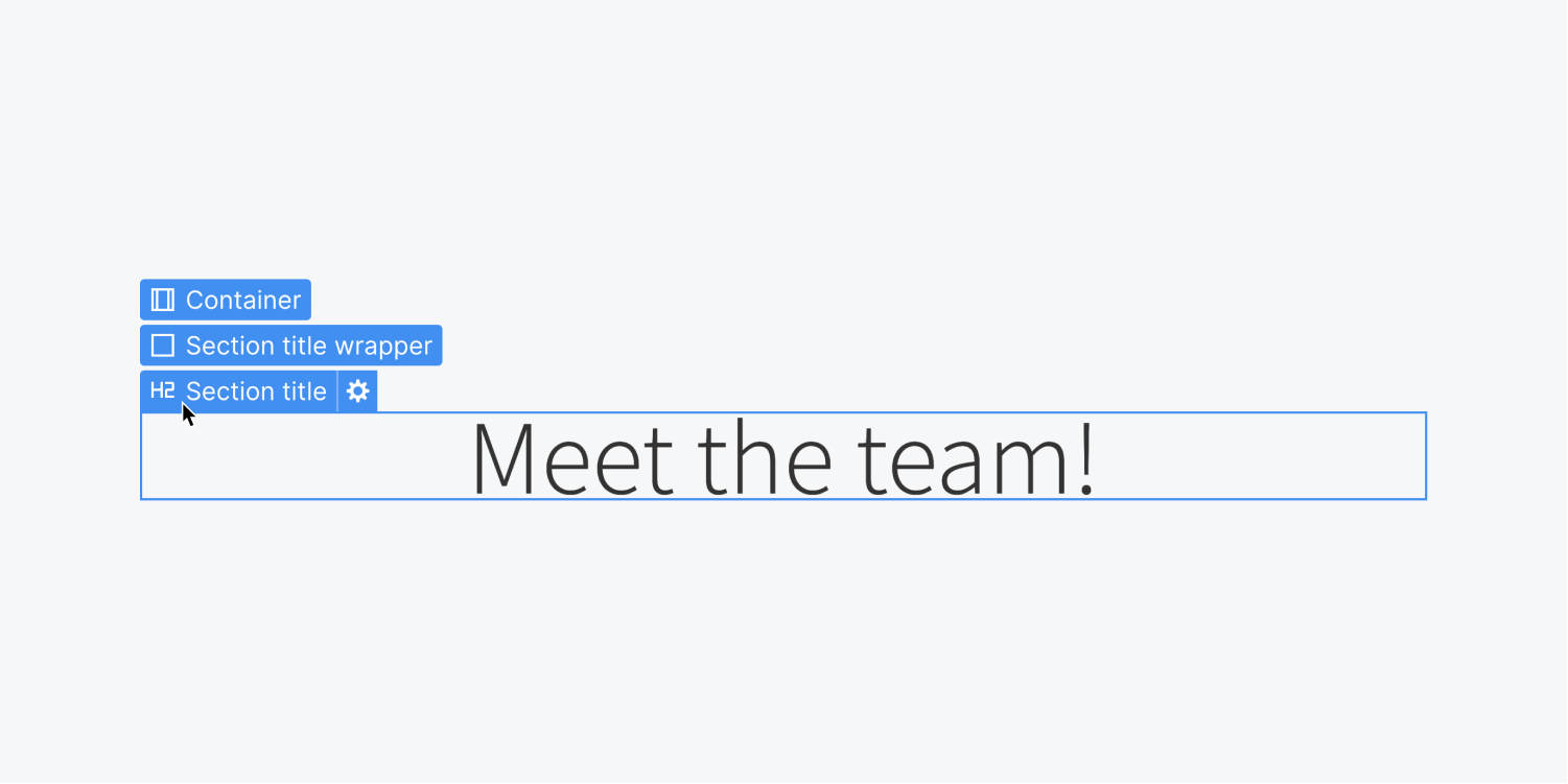
Use the Navigation breadcrumb bar - you can also make these kinds of selections on the bottom navigation right under the canvas.

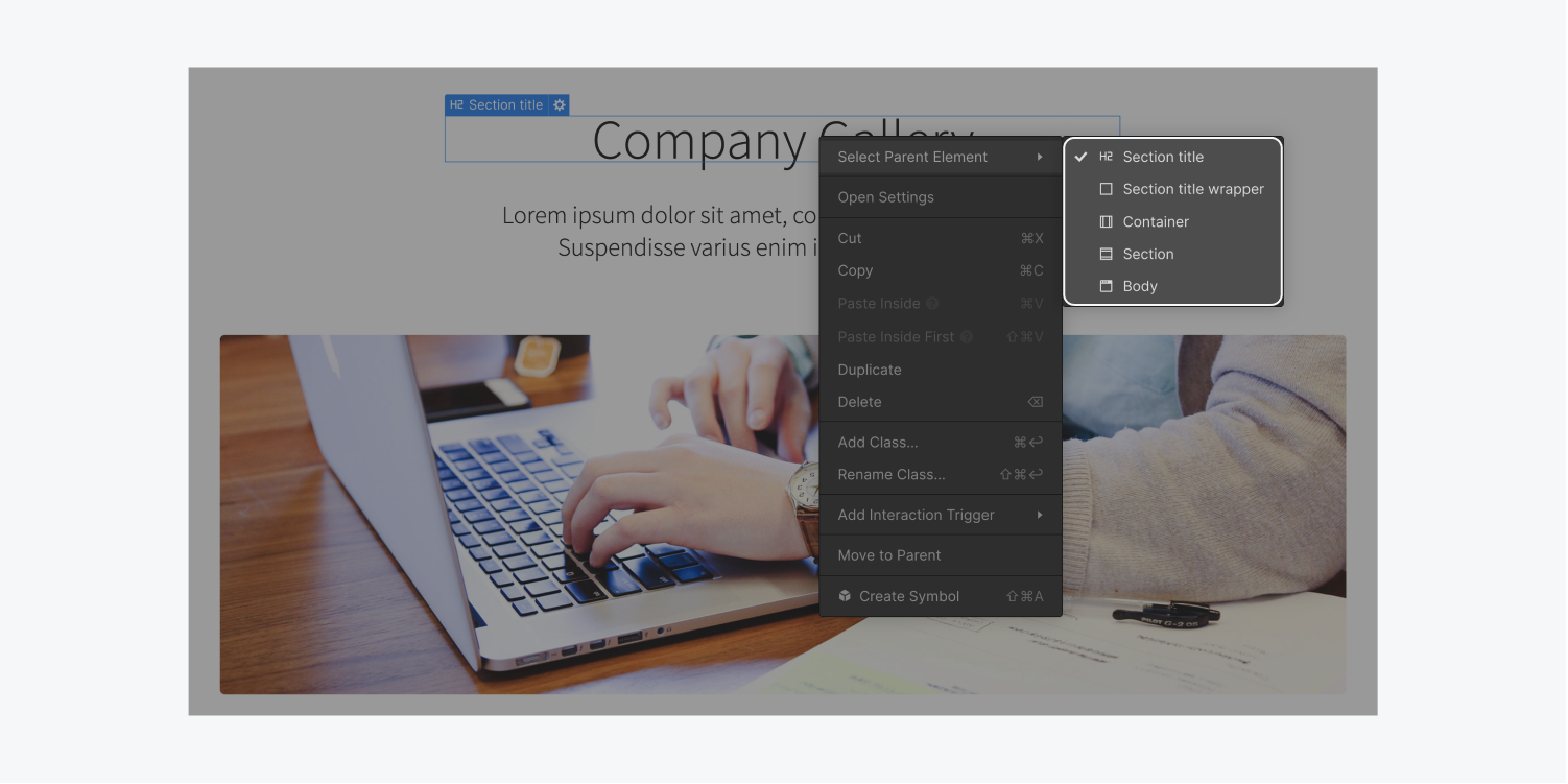
Right click the element - you can also access the hierarchy of an element from the context menu that appears when you right-click it.
Up arrow on the keyboard - this is the fastest way to jump to the parent element. Check out other handy shortcuts.
Movement
If you want to move an element, simply click and drag it into position.
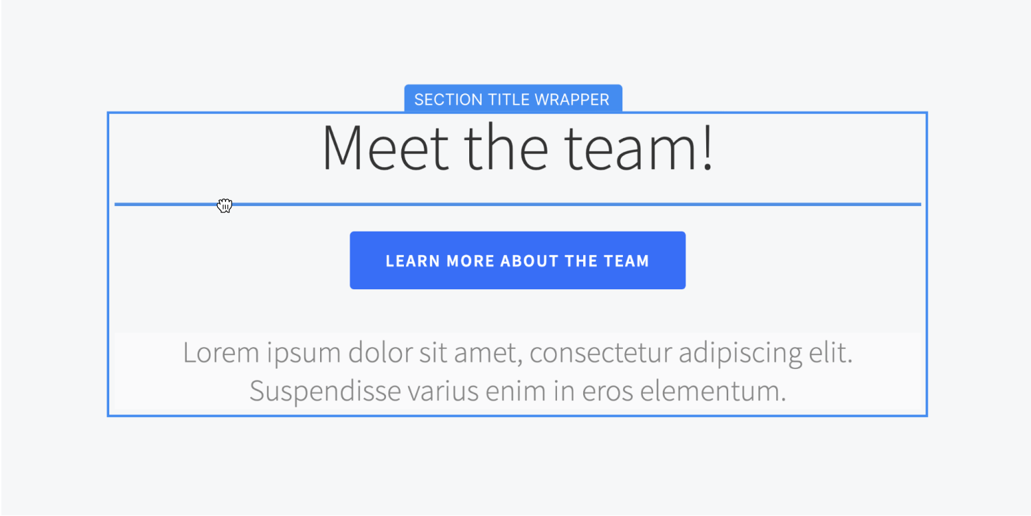
As you move an element around, you can see where you are moving it. On the canvas, the blue indicator shows where you are positioning the element relative to other sibling elements. The orange indicator tells you which parent element you're moving it in or into.
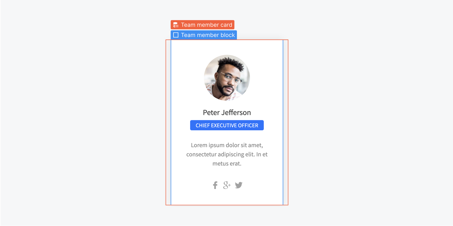
The position of a moved element is dependent on the display setting of the element and other properties. Learn more about how the box model and positioning work on the web.
Preview
With Preview, you can see how your elements will appear on a published site without leaving the Designer.

In preview mode, you can also see how your animations will play on a published site.
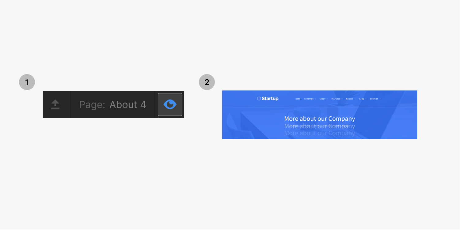
Toggling preview mode hides the Designer interface. This allows you to see your website in full width. It is also possible to hide the rest of the Designer interface by clicking the top-left arrow icon. This will toggle the top bar visibility.

When you're in preview mode, you won't be able to select or modify elements as you would in the Designer. That’s because you are viewing a preview of the page as if it was published.
When you’re done previewing, you can click on the Preview Icon again to go back or just press ESC.


