A beautiful site showing all your fantastic work isn’t worth much if you don’t also make it easy for clients to get in touch with you. The solution? A strong call to action with a front-and-center contact form on your homepage that encourages clients to hire you. Plus, you’ll turn the contact form into a Symbol so you can reuse it as much as you’d like.
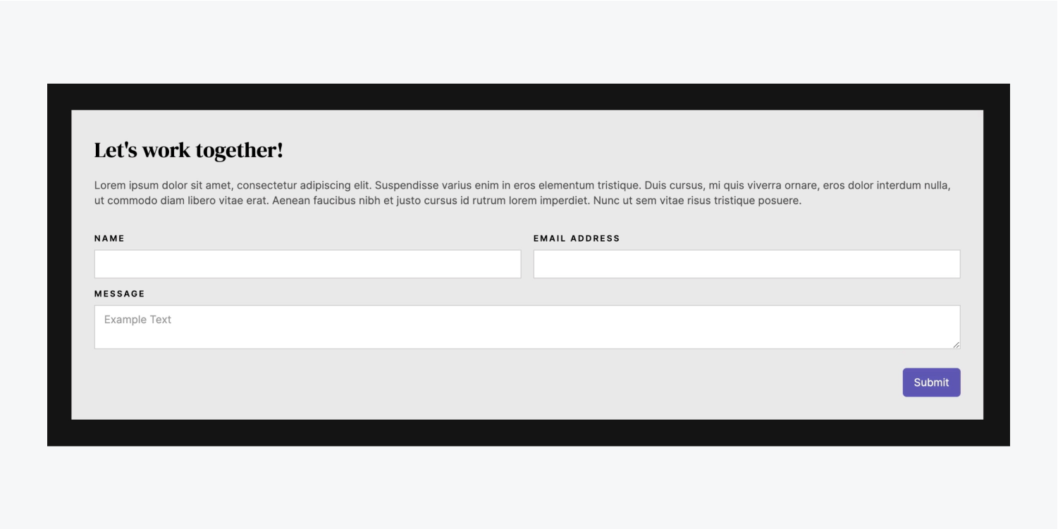
In this lesson, you’ll learn how to add a contact form to your project doing the following:
Follow along and download the assets for this lesson.
Add the Form
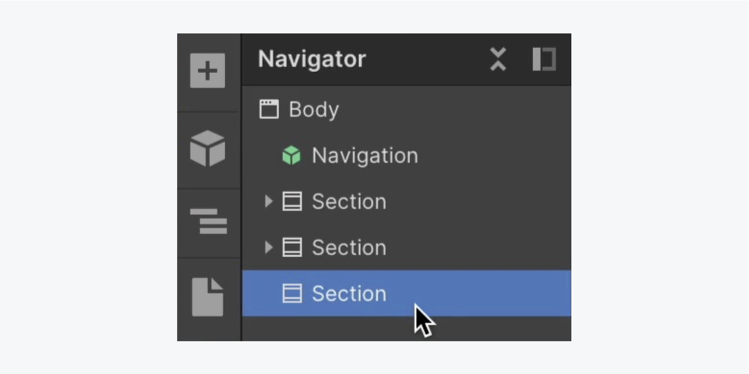
Let’s add a third Section to the homepage:
- Open the Navigator
- Open the Add panel
- Drag a Section into the Navigator and place it at the under the existing 2 Sections
Let’s reuse the “Section” class on our new Section to bring along the 60 pixels of top and bottom padding we had styled before:
- Open the Style panel
- Click into the Selector field
- Choose “Section” from Existing classes
Add a Container to the new Section to keep our elements neatly bound:
- Open the Add panel
- Drag a Container inside the new Section
- Select the Container and click into the Selector field
- Choose “Container” from Existing classes
Let’s add a Form block to the Container:
- Open the Add panel
- Drag a Form block into the Container

Configure the Form
By default, the Form block comes with 2 items — “Name” and “Email address” fields. Let’s add third field and a corresponding label:
- Open the Add panel
- Drag a Text area into the Form (so visitors can add a message)
- Open the Add panel
- Drag a Label into the Form above the Text area field
- Double click the default Label text and update it (e.g., “Message”)
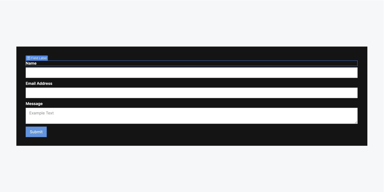
Let’s style our Field label:
- Click the “Name” Field label
- Open Style panel > Typography
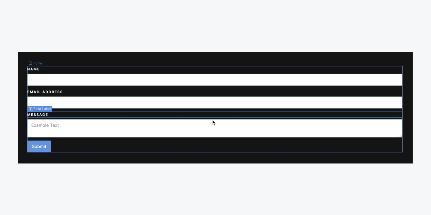
- Open More type options and select Capitalize
- Set letter spacing to 2 pixels
- Decrease the font size to 12 pixels
A “Field label” class was automatically created when we made the above style changes. Let’s apply those changes to the other Field labels in our Form:
- Select “Email Address” Field label
- Open the Style panel
- Click into the Selector field
- Choose “Field label” from Existing classes
Repeat the above steps for the remaining Field label (e.g., “Message”).
Note: You can quickly access the Selector field in the Style panel by selecting your element and pressing Command + Enter (Mac) or Control + Enter (Windows).
Now that the “Field label” class has been applied to all the Field labels in our Form, let’s update the font size (which will affect all elements with the same class applied):
- Select a “Field label” from your Form
- Open Style panel > Typography
- Decrease the font size to 11 pixels
Style the Form
Select the Form block to style it:
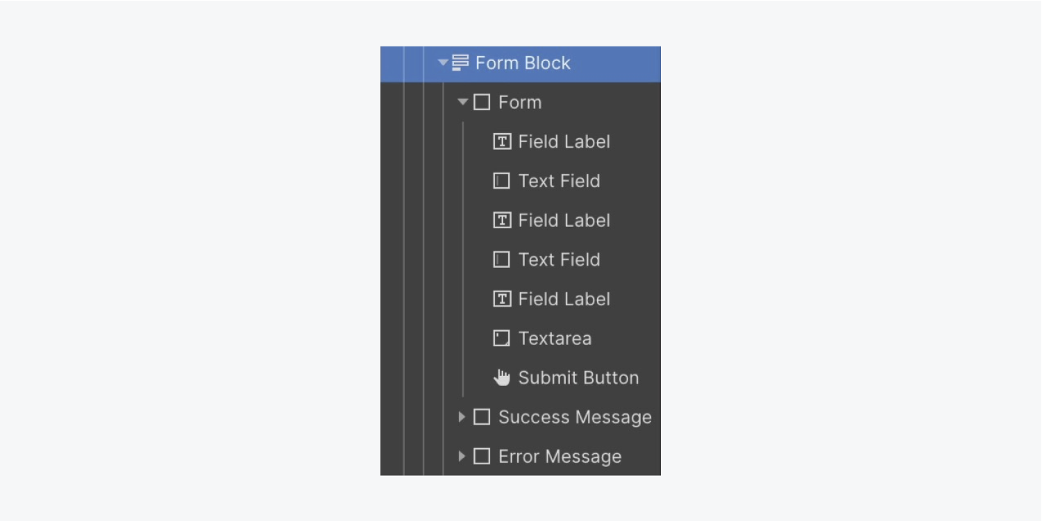
Let’s change its font color:
- Open Style panel > Typography
- Click the color picker and set the font color to black
Change the Background color to make our text legible against it:
- Open Style panel > Backgrounds
- Click the color picker and set it to a light gray (e.g., “#e9e9e9”)
Let’s add some padding:
- Open Style panel > Spacing
- Add 30 pixels of padding on all sides
Note: You can quickly add margin or padding to all sides of an element by holding down Shift, and dragging one of the margin or padding controls.
We’ll also add a Heading to our Form block to encourage our visitors to get in touch with us:
- Open the Navigator
- Open the Add panel
- Drag a Heading into the Navigator and place it inside the Form block at the top
- Double click the Heading to edit the default text (e.g., “Let’s work together!”)
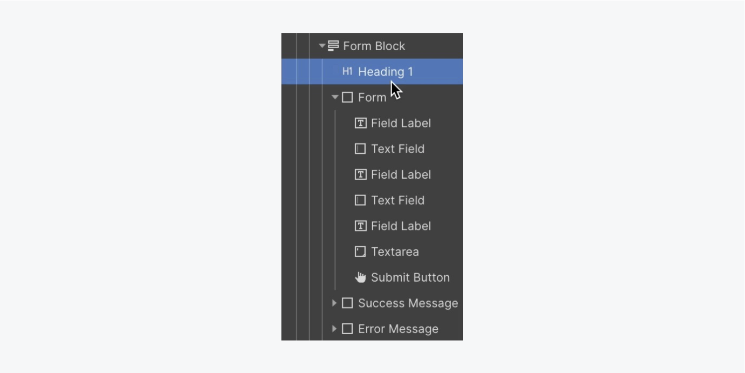
Because we’ve already created a “Secondary heading” class, let’s apply that same class to the Heading in our Form:
- Select the Heading in the Form
- Click into the Selector field
- Choose “Secondary heading” from Existing classes
Good to know: The original “Secondary heading” on your homepage inherits its color (white) from its parent element — the Body (all pages tag). The “Secondary heading” placed in the Form inherits its color (black) from its parent — the Form block.
Let’s add a Paragraph to the Form block:
- Open the Navigator
- Open the Add panel
- Drag a Paragraph into the Navigator and place it inside the Form block and under the “Secondary heading”
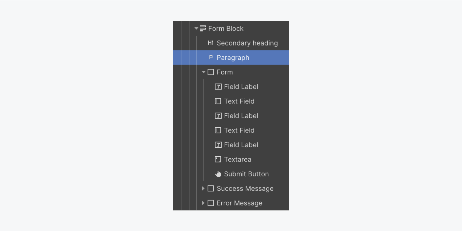
Because we don’t have any previous paragraph styles that would work well inside our contact form, let’s style this paragraph and create a new class for it:
- Select the Paragraph in your Form block
- Open Style panel > Typography
- Click the color picker and set the opacity to 68
- Click into the Selector field and rename the default class (e.g., “Dark paragraph”)
- Open Style panel > Spacing and increase the bottom margin to 30 pixels
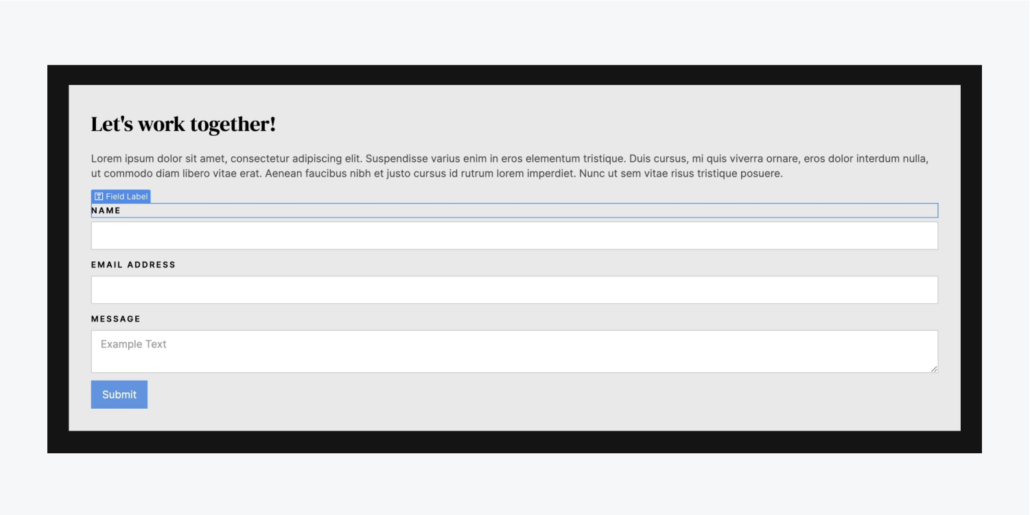
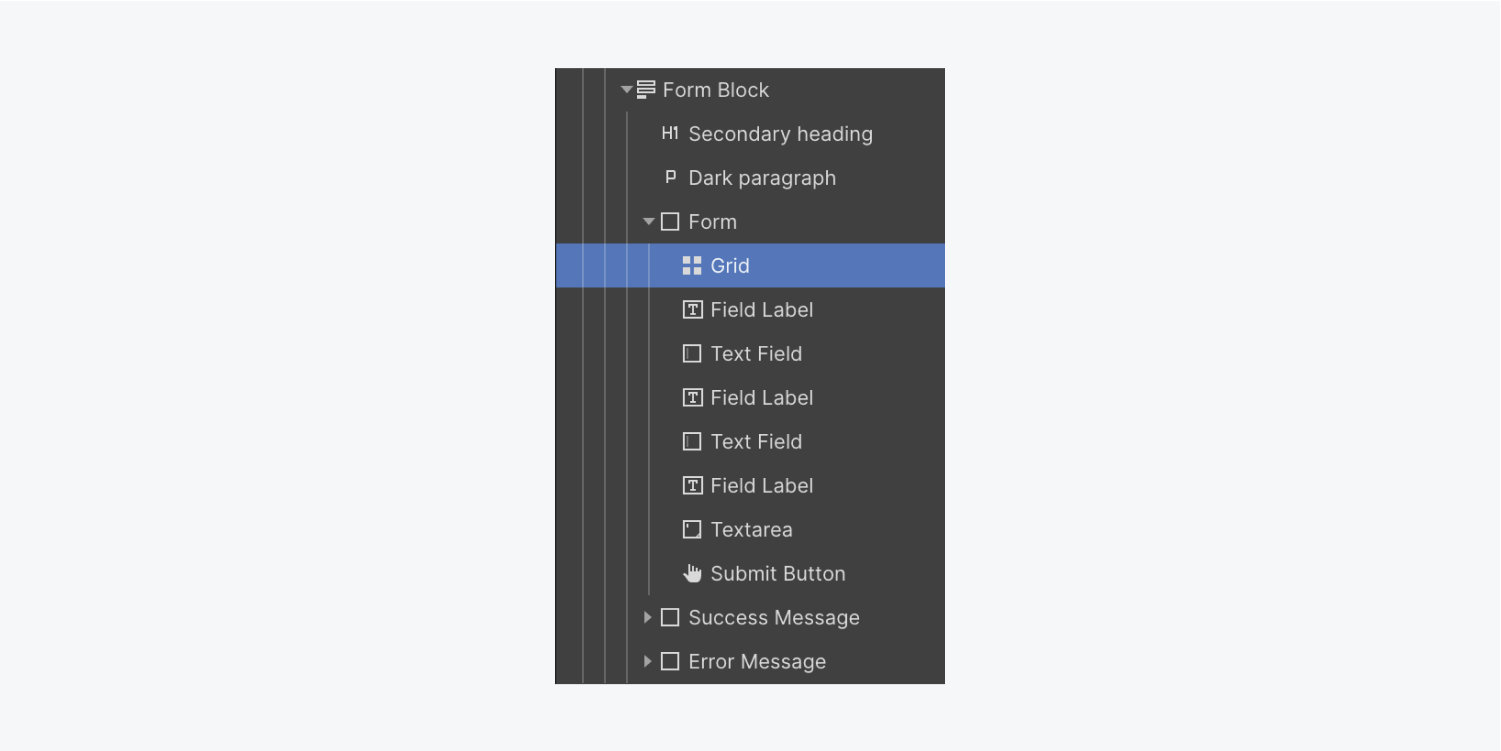
Let’s add a Grid to our Form to make our fields display side-by-side:
- Drag a Grid from the Add panel into the Form and place it at the top
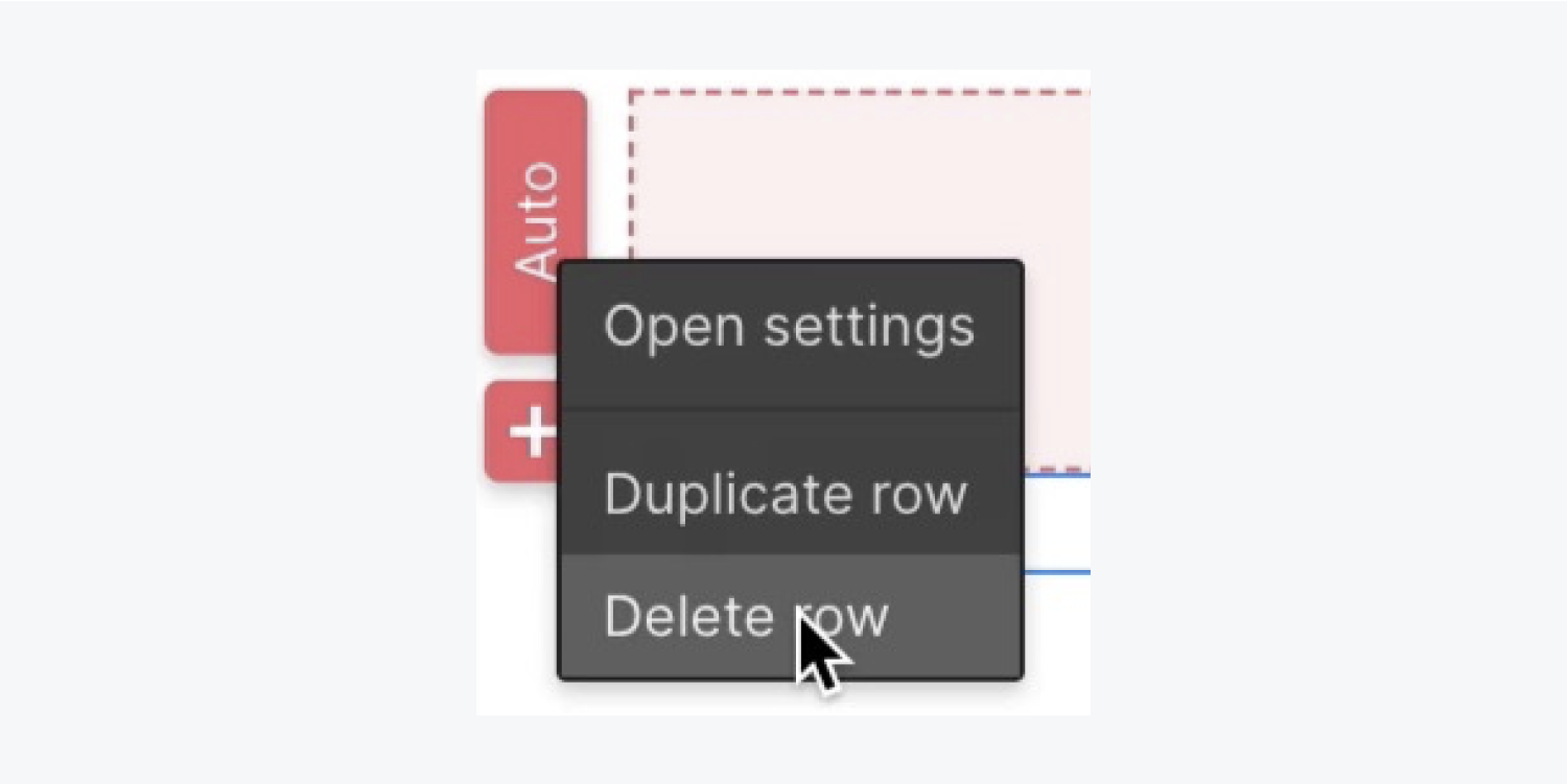
- Right click the second Grid row and select “Delete row” from the settings modal
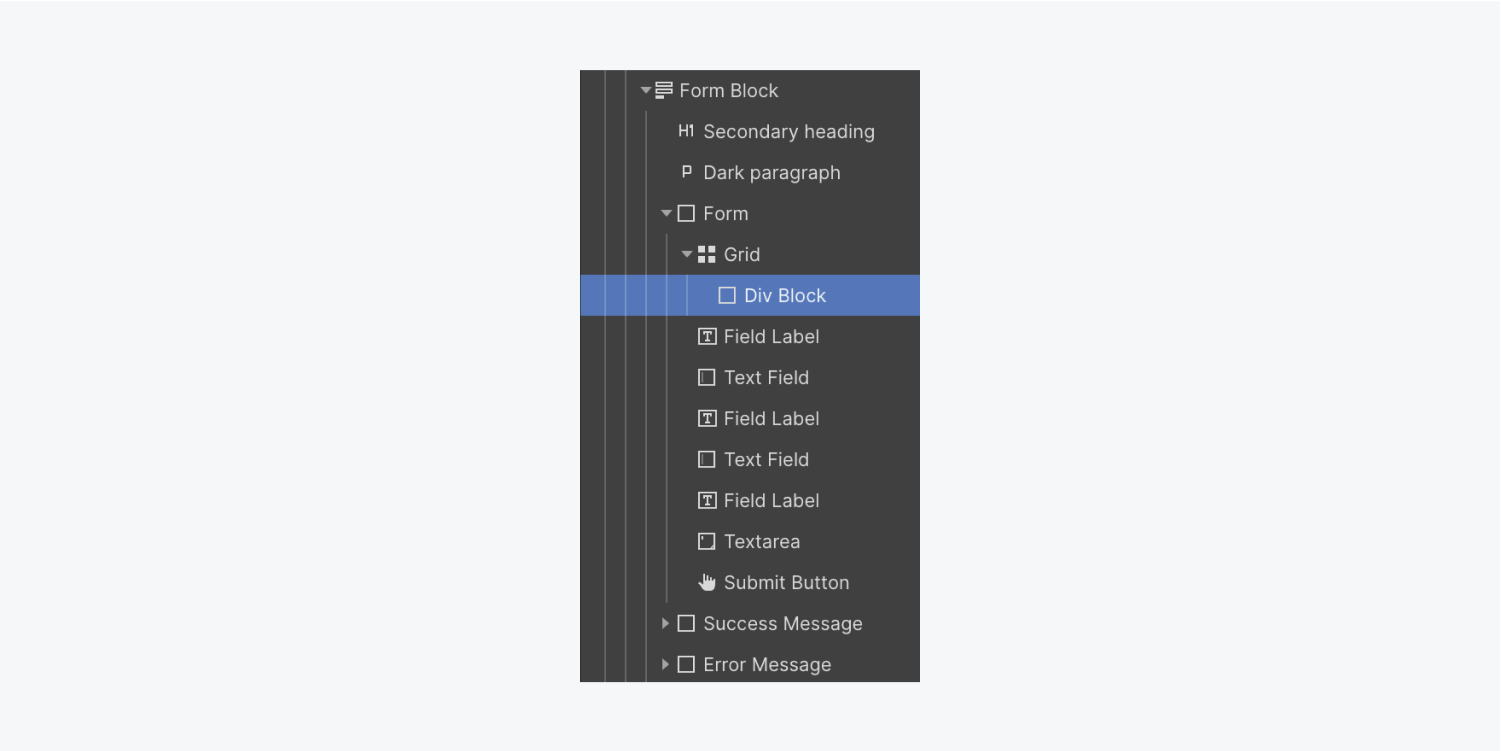
Let’s add a Div block inside the Grid to hold some of our Form elements:
- Open the Navigator
- Open the Add panel
- Drag a Div block into the Navigator and place it inside the Grid
Select and drag the “Name” Field label and its associated Text field into the Div block.
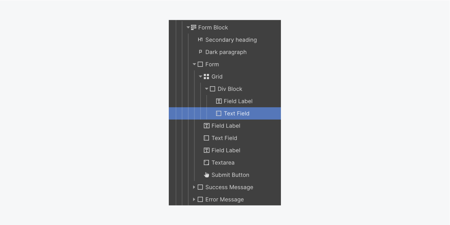
Let’s add another Div block to the second Grid cell so we can place our remaining Form elements inside it:
- Open the Navigator
- Open the Add panel
- Drag a Div block into the Navigator and place it inside the Grid under the first Div block
Select and drag the “Email address” Field label and its associated Text field into the second Div block.
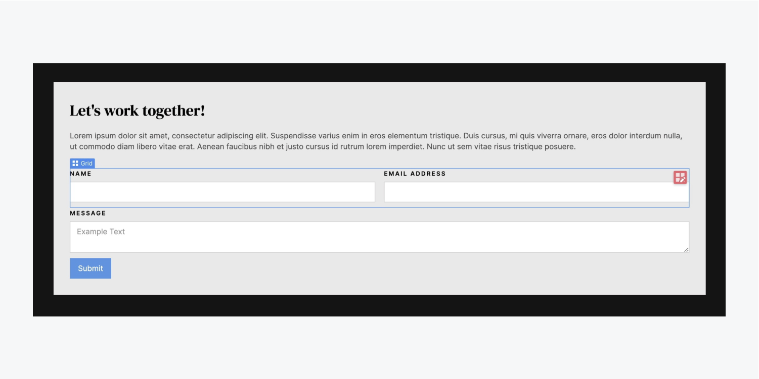
Let’s move the Submit button to the right side of the Form. We’ll start by setting the Form to Flex:
- Select the Form
- Open Style panel > Layout
- Set Display to Flex and Direction to Vertical
We’ll override the Submit button’s child behavior and change its Background color:
- Select the Submit button
- Open Style panel > Flex child > Alignment and order
- Choose right alignment
- Go to Backgrounds and click the color picker
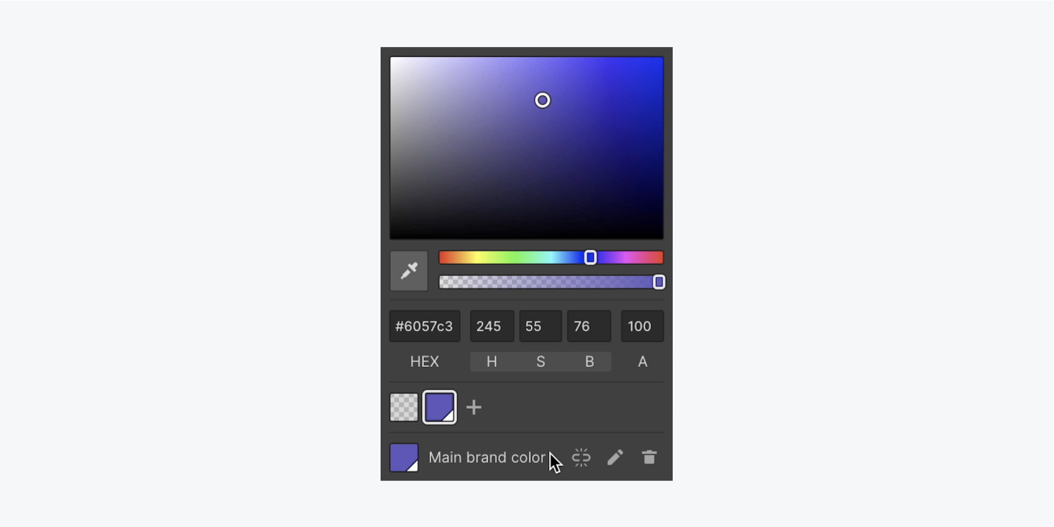
- Change the default color (e.g., “#6057c3”)
While we’re in the color picker, let’s create a swatch so we can reuse the color on other elements:
- Press the “plus” button at the bottom of the color picker
- Rename the saved swatch (e.g., “Main brand color”)
Let’s add some rounding to the Submit button:
- Open Style panel > Borders
- Set the Radius to 5 pixels
To give the button some breathing room, push the button away from the form elements above it:
- Open Style panel > Spacing
- Set top margin to 15 pixels
Make it a Symbol
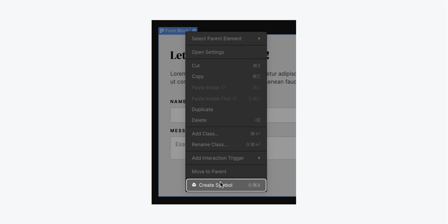
Finally, let’s make the Form block a Symbol so we can reuse it throughout our project:
- Select the Form block
- Right click the Form block’s label
- Choose “Create Symbol” from the menu and name it (e.g., “Contact form”)

There you have it — a contact form just waiting for brand new submissions!


