A homepage hero section gives you the opportunity to immediately engage your site visitors through imagery, text, and call to action buttons (CTAs). You can do all of this even quicker by using a grid to arrange your content.
In this lesson, you’ll learn how to create a grid-based hero section using the following:
- Add a grid
- Add an image
- Create a content block
- Design an overlapping layout
- Update the Body (All pages) tag
Add a Grid
The grid is the main structure of your hero section.
To add a Grid to your page:
- Open the Add elements panel from the left toolbar
- Drag a Grid onto your page
By default, the Grid displays 2 rows and 2 columns, which is what we’ll use for this example.
Save your Grid and name it:
- Click the Done button to save your Grid layout
- Give your Grid a class (e.g., “Home hero section”)
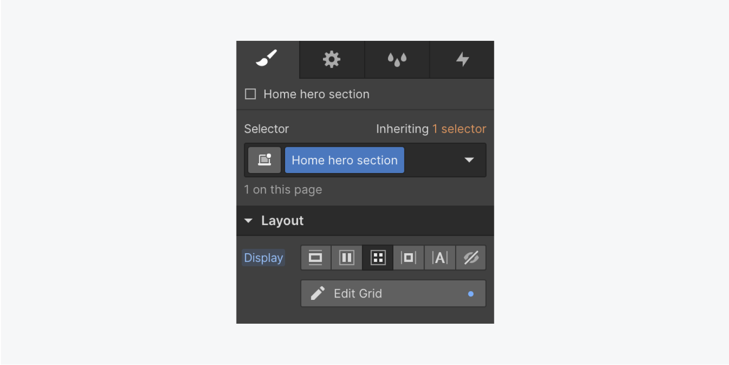
To add or remove columns in the future, you can do that in the Edit Grid menu:
- Click the plus button to add rows or columns
- Hover over an existing row or column and click the trash icon to delete it
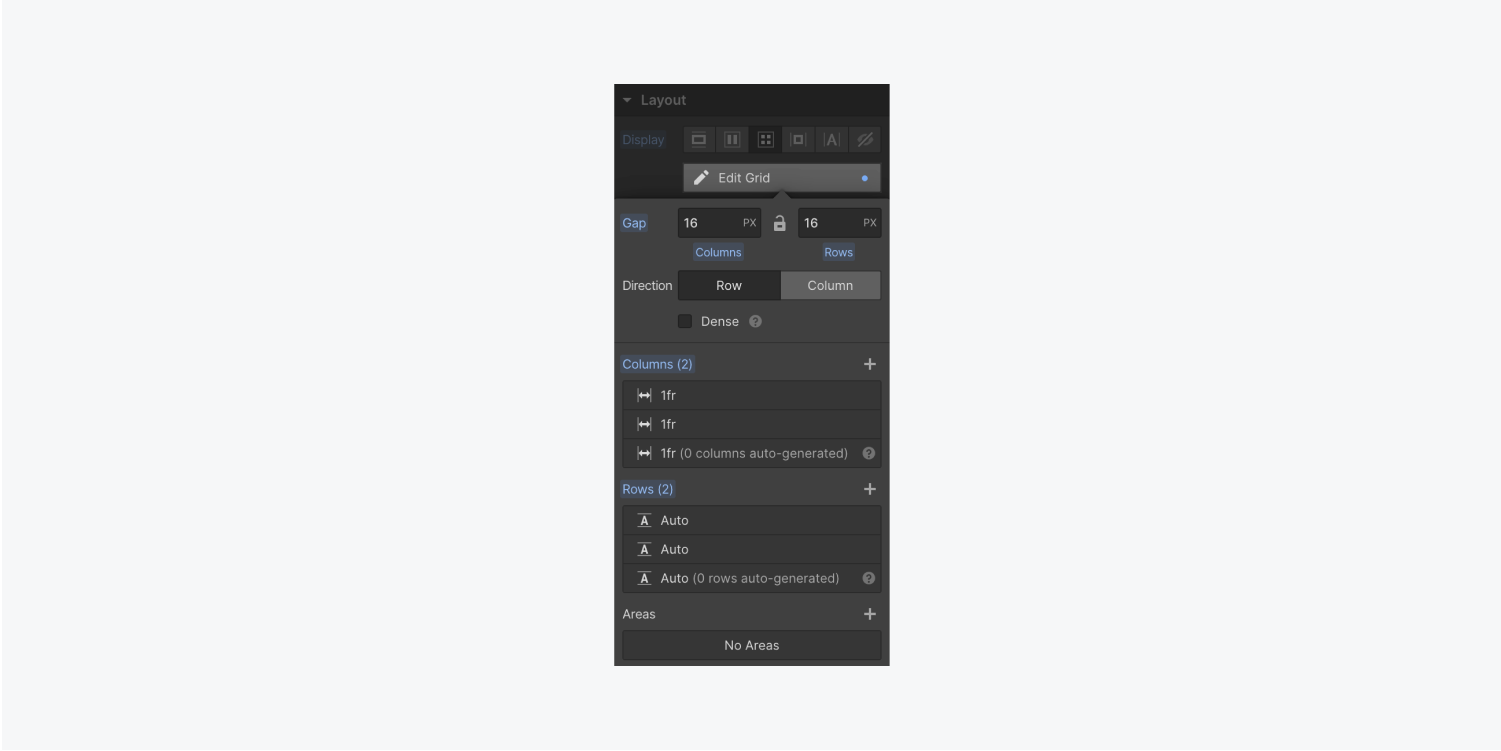
Note: The content inside determines the Grid’s dimensions. For instance, if you add content, the Grid dimensions adjust automatically.
Set the Grid dimensions to match the height of the viewport:
- Select the Grid
- Open the Style panel > Size
- Set the Height to 100 VH (viewport height)
Add an image
Add an image to give visitors more insight to your business.
First, add a Div block to the Grid:
- Drag a Div block from the Add elements panel into your Home hero section
- Give it a class name (e.g., “Home hero image”)
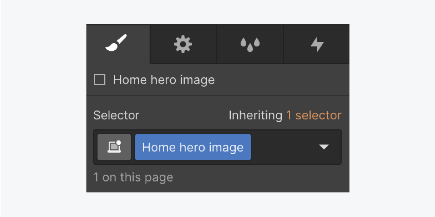
Set a Background image on the Div block you just created:
- Select the Div block
- Open Style panel > Backgrounds and click the plus icon to add a Background image
- Click Choose image to select an Image from the Assets panel
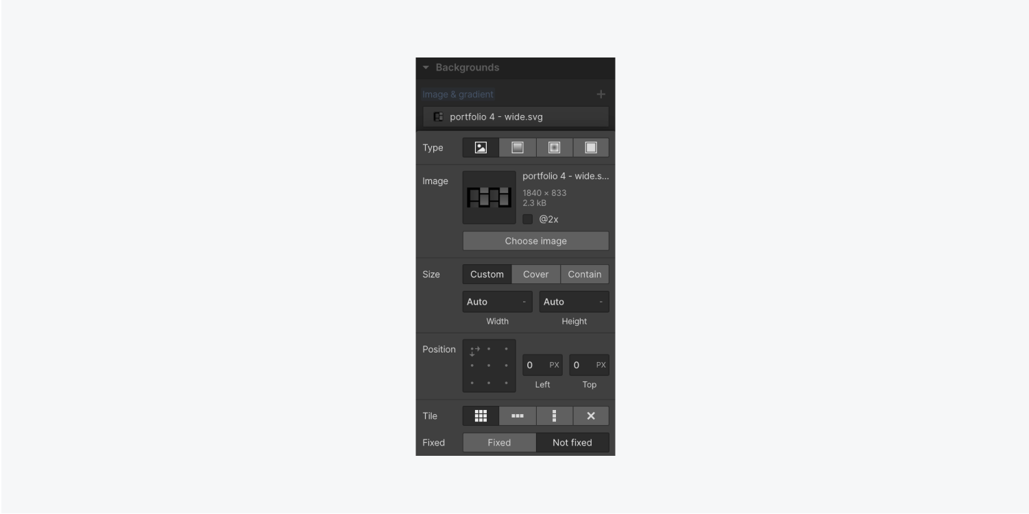
Cover the Div block with the Image instead of tiling:
- Click Cover
- Click the center dot under Position to center the image in the Grid cell
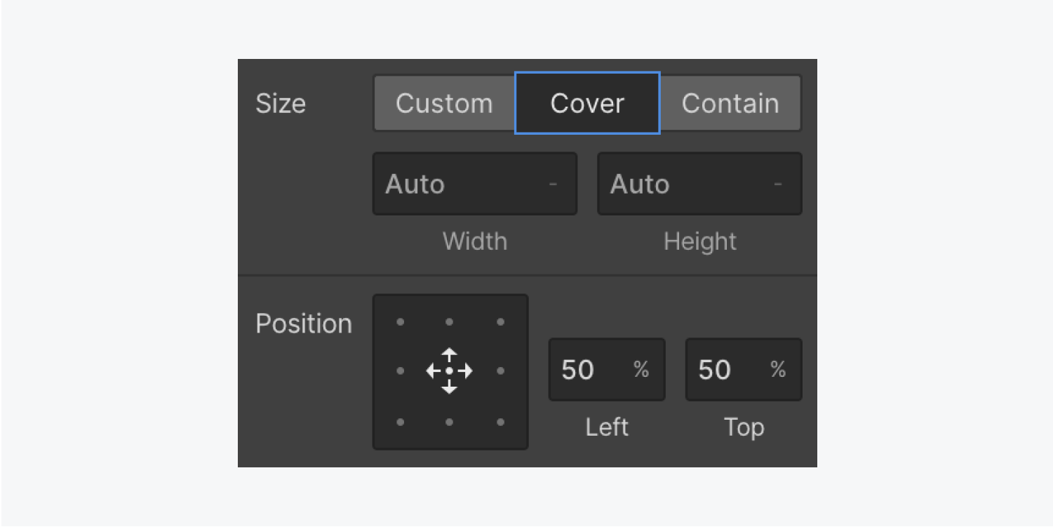
When you set the Image to cover the Div block this allows you to resize the Image or span it across 2 columns or rows. This also keeps the center point of the Image in the center of your layout.
Create a content block
Contain all your hero section content in a content block.
First, create the content block:
- Drag a Div block from the Add elements panel into the upper right corner of the Grid
- Add a class to the new Div block (e.g., “Home hero content”)
Let’s add an H1 Heading, a Paragraph, and 2 different Buttons inside the Div block you just created.
To make it easier to drag your content into the Home hero content Div block (or any specific location in your page):
- Open the Navigator panel from the left toolbar
- Open the Add elements panel
- Drag a Heading directly into the Navigator, and place it in the Home hero content Div block
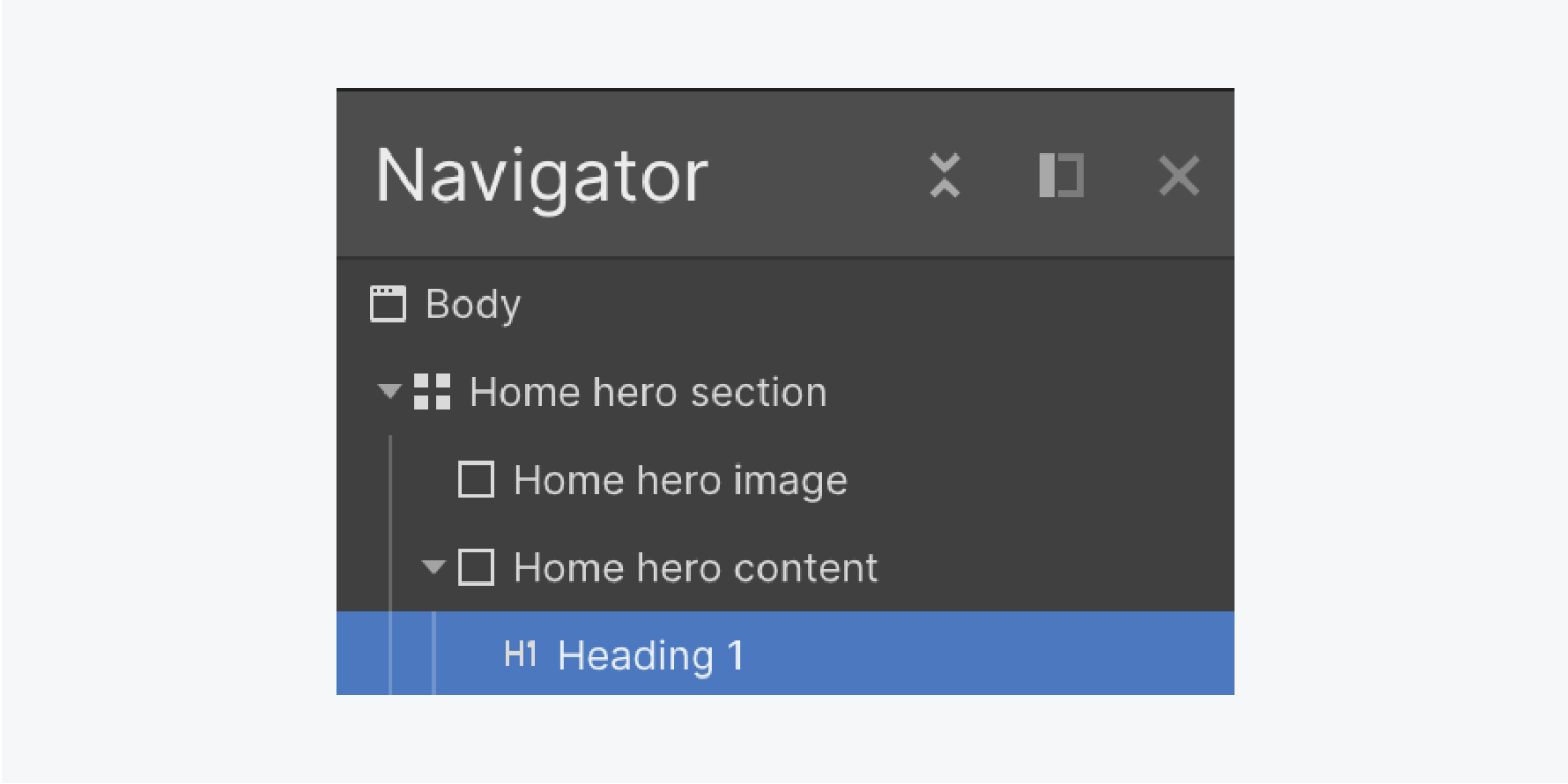
By default, the Heading is an H1. Double click the Heading to edit it, and type your new text (e.g., “We make homes look beautiful”).
To keep things organized, give your Heading a class (e.g., “Major heading”).
Now that the Heading has a class, let’s style it:
- Choose the new font you’d like to use In Style panel > Typography > Font
- Choose your font’s Weight from the dropdown
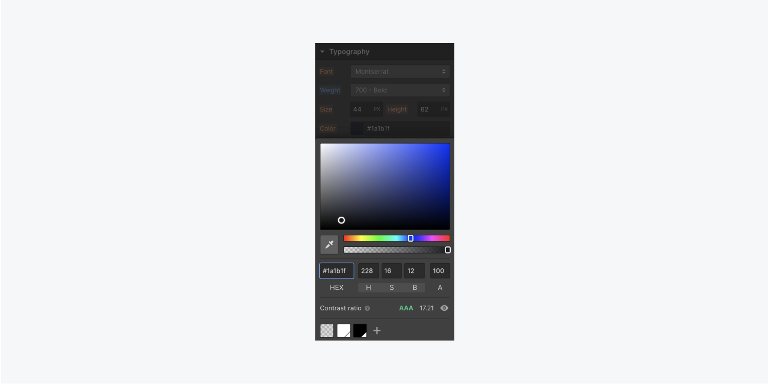
Change the Heading color:
- Click the Eyedropper tool in Color panel
- Hover over the Background image in the first Div block and click a color from the Image
- Adjust the color as needed by dragging the Color and Transparency sliders
- Click the plus icon at the bottom of the Color panel to add it as a swatch for quick adjustment in the future
Let’s add more content to the content block. Add a Paragraph:
- Open the Add elements panel and drag a Paragraph into the Home hero content Div block
- Place it under the Heading you added previously
Add Buttons to the content block:
- Drag a Button from the Add elements panel into the Home hero content Div block
- Place it under the Paragraph you just added
- Double click the Button text to edit, and rename it (e.g., “Let’s chat”).
- Give the Button a class (e.g., “Button”)
Change the color of your Button to maintain design consistency:
- Select the Button
- Click the default color swatch in Style panel > Backgrounds> Color
- Change it to the color swatch you created for your Heading
Let’s create some breathing room for the content you’ve just added.
Add Margin to the bottom of the Heading:
- Click the Heading
- Open Style panel > Spacing
- Set the bottom Margin to 20 px
Because you already added a class of “Button,” you can copy/paste that Button element to create a total of 2 Buttons:
- Select the first Button
- Copy/paste the Button
- Double click the second Button’s text and change it (e.g., “See our work”)
Note: If you make changes on the Button class, it’ll affect both Buttons at once because they have the same class (e.g., “Button”).
For instance, if you add Margin to the right edge of one Button, the Margin increase occurs on both Buttons:
- Choose one of your Buttons
- Open Style panel > Spacing
- Set the right Margin to 10 px
Design an overlapping layout
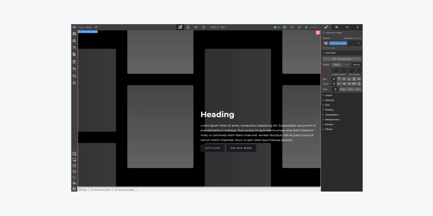
An overlapping layout means some of your Grid elements overlap one another. In this example, let’s make the content block overlap the Background image.
Choose the Home hero content Div block.
Because its Position is set to Auto, it takes up the first available cell in the Grid — the upper right cell.
Let’s place it in the bottom right cell of the Grid:
- Open Style panel > Grid Child > Position
- Set the position of the Home hero content Div block to Manual
- Drag the Div block to the bottom right cell
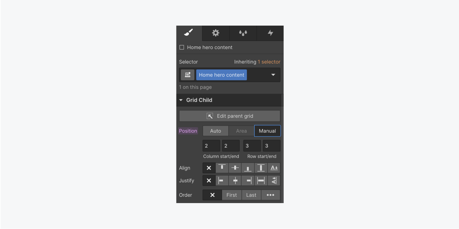
Let’s do the same thing on the Home hero Image:
- Choose the Home hero Image
- Open Style panel > Grid Child > Position
- Set the position of the Image to Manual
- Drag the bottom right handle of the Image across both Grid columns and rows to cover the enter Grid
To make your content visible over the Image, change the Div block background color:
- Choose the Home hero content Div block
- Open Style panel > Backgrounds > Color
- Click the swatch and select a color (e.g., white)
Adjust the sizing or number of rows and columns in your Grid:
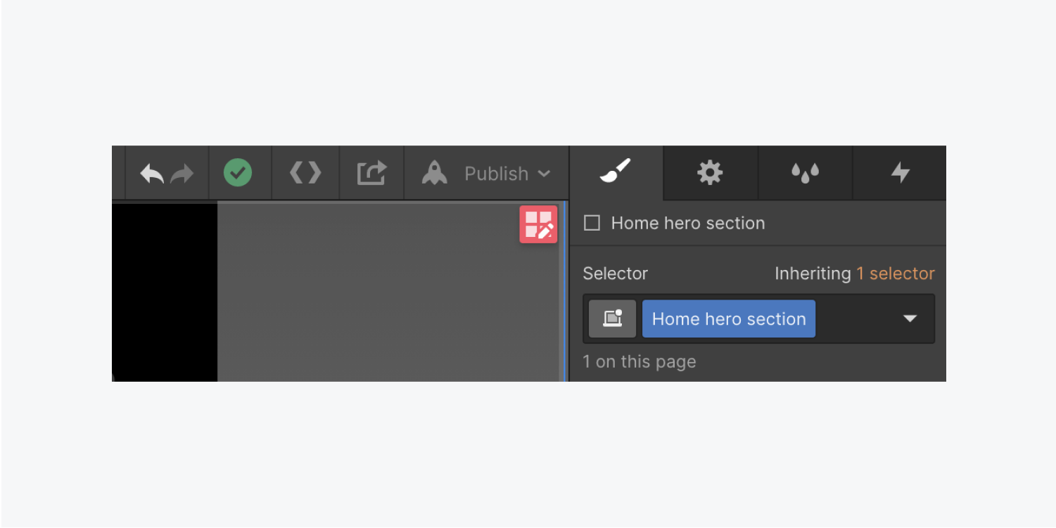
- Choose the Home hero section Div block (the parent element)
- Press Enter or click the edit Grid icon
Currently row height is set to Auto. Let’s change this to a specific size:
- Click the bar that says Auto at the side of the top Grid row to open the row sizing menu.
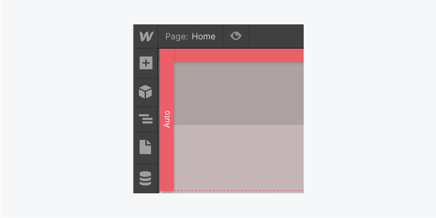
- Set the top row to 1 FR (fraction unit)
- Repeat for the second row
By setting each row to 1 FR, the rows each take up 50% of the viewport height using flexible FRs.
Repeat the above steps to change the row height. If you keep the top row at 1 FR, but set the bottom row back to Auto, the top row takes up all the available space, and the bottom row’s height automatically adjusts based on the content inside.
Press Done to finish editing the Grid.
Now, let’s adjust the content to make it look more appealing.
Change the Heading Margin:
- Choose the Heading
- Open Style panel > Spacing
- Click the top Margin and change it to 0 px
- Click the bottom Margin and change it to 20 px
Change the Paragraph Margin:
- Choose the Paragraph
- Open Style panel > Spacing
- Change the default bottom Margin to 30 px
You can also control spacing of the elements inside the content block — your Heading, Paragraph, and Buttons:
- Choose the Home hero content Div block
- Open Style panel > Spacing
- Adjust its padding (the space inside an element)
- Hold Shift, and drag inside the Padding control to change all 4 sides to 30 px
Update the Body (All pages) tag
Adjusting the Body (All pages) tag prepares your site and saves you time. For example, changing the Font with the Body (All pages) tag selected, affects the default Font for elements across your project.
The Body element is the top level element of any page. To update the Body (All pages) tag:
- Open the Navigator and choose the Body
- Click the Selector field and choose the Body (All pages) tag from the dropdown
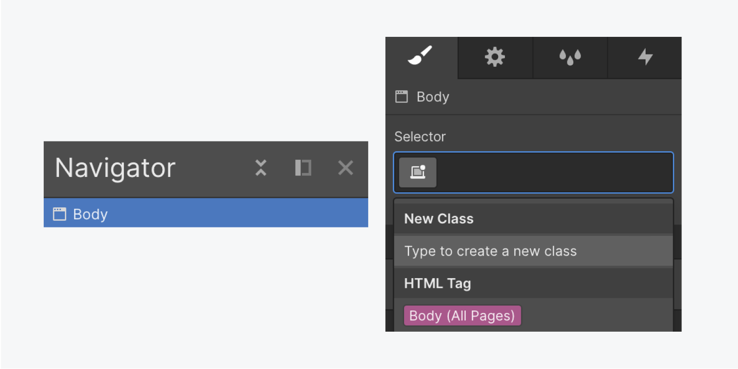
Let’s update the Font for the Body (All pages) tag:
- Click the Selector field and choose the Body (All pages) tag from the dropdown
- Open Typography > Font and choose a font (e.g., “Source Sans Pro)
- Change the Font size to 15 px
- Change the Font line Height to a unitless measurement of 1.4 by typing in 1.4 and a hyphen (-)
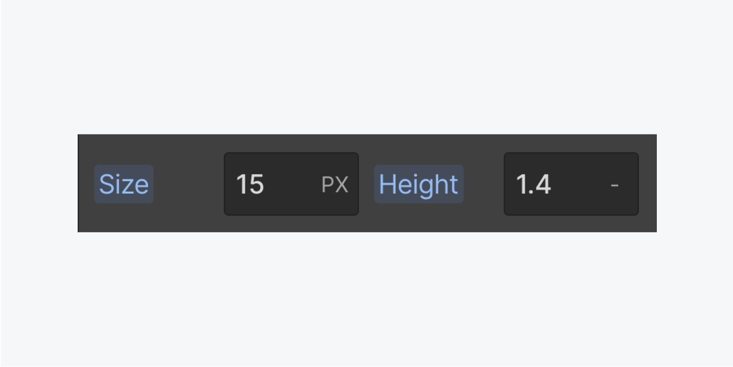
Unitless line height is useful because it scales the Font’s line height with the Font size. Learn more about Unitless line height.
Any text elements without previously set overrides inherited the changes you made from the Body (All pages) tag.
And now you’ve got a hero section — you hero, you!


